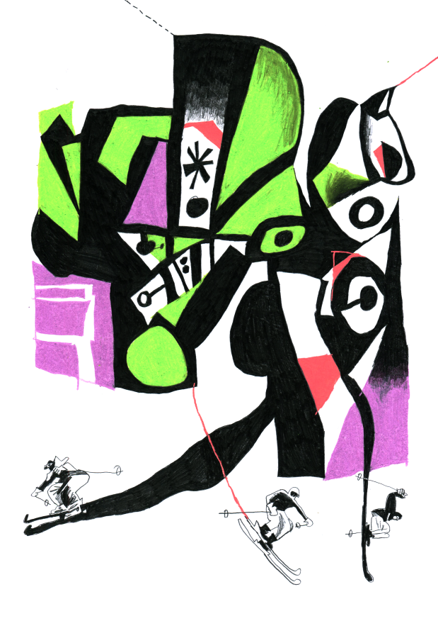
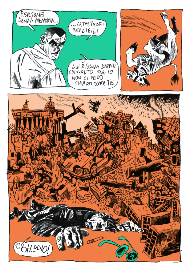
Anteprima di “Remi Tot in STUNT” di Martoz
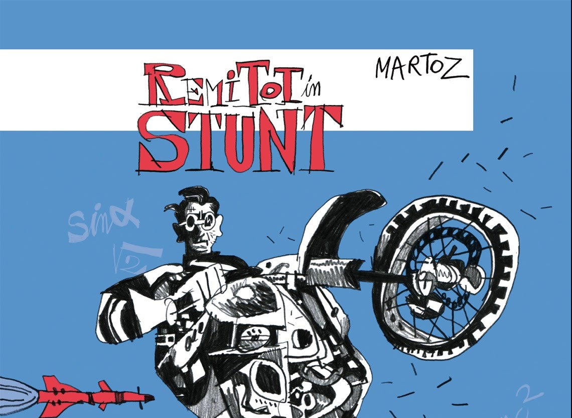
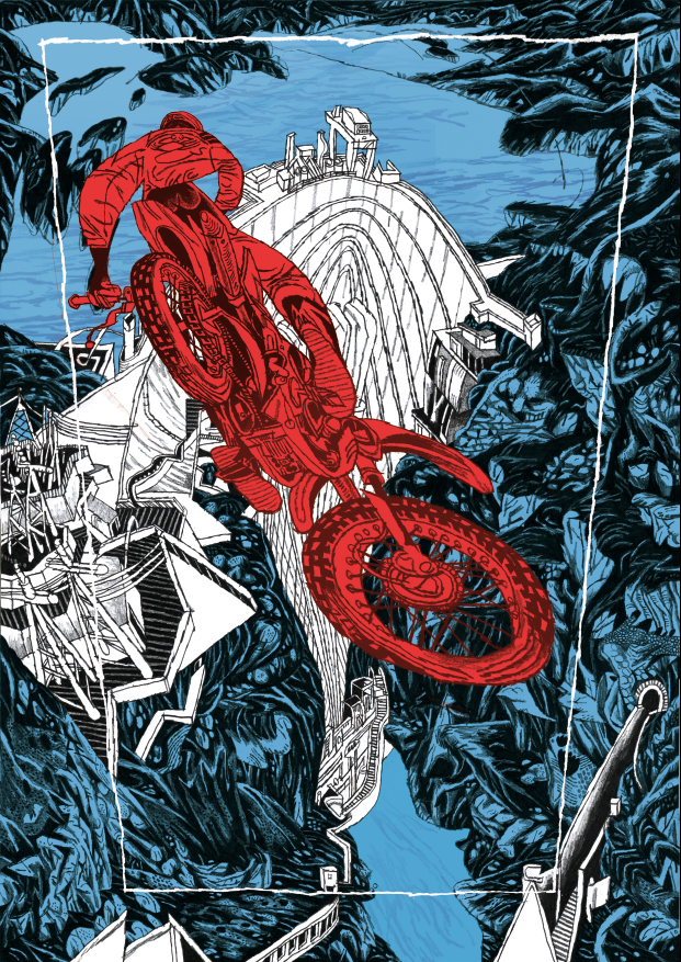
Debutterà questo fine settimana al Bilbolbul di Bologna Remi Tot in STUNT, nuovo fumetto di Martoz edito da MalEdizioni, le cui tavole saranno protagoniste di una mostra dal 19 al 29 novembre presso Ono Arte Contemporanea, con inaugurazione domenica 22 alle 18.30 alla presenza dell’autore. In attesa di avere tra le mani questo volume decisamente stuzzicante, e di cui spero di parlare più approfonditamente in seguito, potete gustarvi alcune tavole in anteprima, intervallate dal comunicato inviatomi dall’editore e dalla biografia dell’autore. Buona lettura/visione.
Remi Tot è uno stuntman della realtà: un geniale matematico in grado di intrufolarsi nelle geometrie segrete degli eventi, uno spregiudicato funambolo dell’imprevisto che si sostituisce a persone coinvolte in immani catastrofi e sopravvive al posto loro. La sua missione è tuffarsi nel caos e uscirne vivo. Ma perché fa tutto questo? Remi è un eroe o è più egoista di quanto non sembri? Assieme a lui scivoleremo sul finimondo, verso il suo misterioso obiettivo.
Il segno potente, dinamico ed espressivo di Martoz spinge il fumetto oltre i suoi limiti, giocando con la storia dell’arte e catapultandoci in un mondo di prospettive spettacolari, colori che bucano la retina e inquadrature caleidoscopiche.
Un fumetto fatto di esplosioni ed equazioni, una storia di azione e avventura che è anche una riflessione sui confini del possibile.
Martoz è un illustratore e fumettista nato ad Assisi. Fa parte del collettivo Lab.Aquattro – con cui condivide il laboratorio – che si occupa di piccole produzioni editoriali, tra cui i volumi Parade e Crisma. Ha collaborato con piccola editoria e autoproduzioni, tra cui Inuit, B comics (IFIX), Squame, Turkey Comix e Lucha Libre. Ha esposto i suoi lavori in gallerie internazionali, tra cui la Galerie Glénat di Parigi, la Hero Complex Gallery e la Gallery1988 di Los Angeles. È nella selezione giovani della biennale ILLUSTRI 2015 e nel 2016 esporrà i suoi lavori in una personale a Mosca, presso la Bratec Lis Gallery, dove terrà anche un workshop di illustrazione.
Street artist nel tempo libero, la sua passione per la carta lo ha portato all’utilizzo della Poster Art, sia per progetti urbani personali che su commissione per performance nei festival di musica, fumetto e illustrazione. Ha elaborato poster anche per Sky Atlantic, nella cornice di Lucca Comics. Il suo vero diletto è la natura: oltre a coltivare la terra, è solito intraprendere avventure indomite assieme al suo fido amico Manfredi Ciminale. Esplorare case abbandonate, navigare in canotto sui fiumi, viaggiare in monopattino. Altrimenti la scrivania si impoverisce…

Potete ordinare Remi Tot in STUNT qui al prezzo speciale di 17,50 euro più spese di spedizione.
Festival dell’altro mondo: Cake!
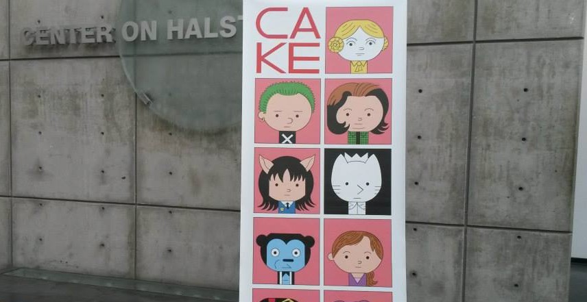
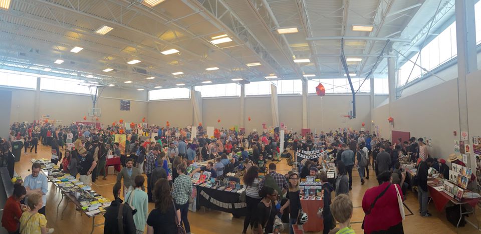
Ho già parlato da queste parti del CAKE di Chicago, una delle convention di fumetti indie e underground più importanti del Nord America. Anche se non ero lì, l’evento dell’anno scorso mi è sembrato di assoluto valore, come potete vedere da questa galleria fotografica che ho pubblicato qualche mese fa. In questi giorni la nuova edizione del Chicago Alternative Comics Expo è già in via di definizione, dato che il termine per presentare la domanda di partecipazione è il prossimo 30 novembre e già sono stati annunciati i primi ospiti, cioè Sammy Harkham, Patrick Kyle, Tyrell Cannon, Ezra Clayton Daniels, Cathy G Johnson e Laura Park. Ne ho parlato con uno degli organizzatori, il cartoonist Jeff Zwirek (autore di Burning Building Comix). Vi rimando a questo link per leggere l’intervista, ovviamente in inglese.
Talking about CAKE with Jeff Zwirek
I already talked about CAKE, one of the most important underground and indie comics convention in the North America. Even if I wasn’t there, last year’s event looked like a big show, as you can see from this photo gallery I published some months ago. In these days, the new edition of Chicago Alternative Comics Expo is already in the works and so I talked with one of the organizers, the cartoonist Jeff Zwirek (author of Burning Building Comix), about CAKE and more.
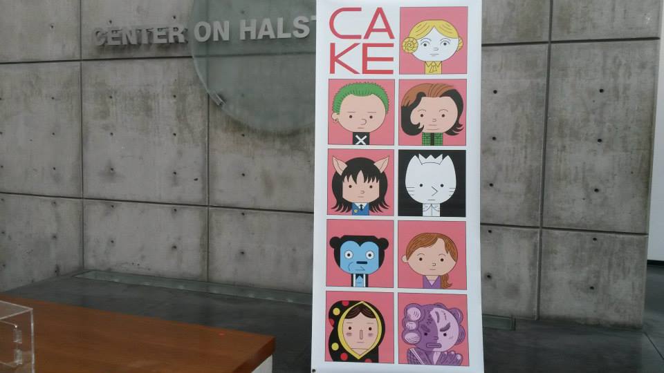
Cake 2015 (photo by Jared Smith)
Ok, let’s start from the most important thing. When next CAKE will take place and when the deadline for application is?
CAKE 2016 is June 11th and 12th. It’s our fifth year and we’re happy to once again be back at the wonderful the Center on Halstead. Applications are open now up until November 30th.
I know the show was founded only in 2012, but now it’s already one of the most important underground and indie comics conventions in North America, maybe thanks to the big comics community of Chicago, where there is also Quimby’s, a store that is a sort of institution for underground and self-published comics… I’d like to know how the idea of CAKE was born and if you had some specific goals for this show.
It’s funny you mention Quimby’s cause it’s there where CAKE was really born. Neil Brideau and Edie Fake were both employees of Quimby’s at the time and started a conversation about Chicago needing a comics convention to highlight all the talent that’s pooled in the city. They recruited some friends that felt the same way like me, Max Morris and Grace Tran. We didn’t really know what we’re doing, but had experience as comics makers and exhibitors at other shows. It was also at Quimby’s that we had our meetings after the store would close. The goal was to make a show for Chicago and the Midwest that highlighted the talent that we have. We’ve always admired other conventions like SPX, that have promoted the alternative comics community and have tried to model ourselves on those types of shows while being true to our Midwestern roots. Most importantly though, the purpose of the show is to promote our exhibitors. They make up the community and it’s that community that makes the show the success that it is.
Speaking of which, when you’re selecting people who are submitting an application, you have a preference for artists and publishers in the Chicago area or the show is equally open to everyone?
The show is wide open to anyone. We encourage a wide a range of applicants as possible so long as they make alternative comics. We do love our Chicago residents and try to get their names promoted as much as possible, but we always have a large portion of our exhibitors from out of town and we always have a show floor stacked with incredible talent. All the CAKE artists are also on the same level, so sometimes you’ll find a first-time exhibitor sitting next to a 30-year vet.
You’re also organizing other events in Chicago and I think this is an important thing to keep the attention about CAKE alive. I’m thinking for example at the event with Keiler Roberts and Edie Fake at the Chicago Architecture Biennial. Do you have other meetings in the works?
CAKE has turned into a series of events throughout the year. We host several fundraisers including drink and draws and our very popular art auction. It’s a chance for the community to get together more and socialize. CAKE has been expanding into other areas like the Architecture Biennial, and we look forward to more partnerships with the city.

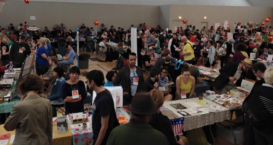
CAKE 2015 (photo by Marco Giampaolo)
How is the comics scene in Chicago? Which spots you would recommend to a visitor? And do you think there are some comics that describe your city or are strictly connected to it?
The comics scene in Chicago is very exciting. With a crew of veteran cartoonists and young fresh faces showing up all the time, there is a wide range of styles and personalities. Chicago has a ton of great comic shops and several are must go to destinations. Quimby’s is legendary as is its sister store Chicago Comics. There’s also the Comix Revolution, Challengers, First Aid Comics, Third Coast, and like a dozen Graham Crackers stores. Edie Fake’s comics are an excellent example. I also think Chris Ware, early Daniel Clowes and Jessica Abel, and Ivan Brunetti are tied to the city in a special way. John Porcellino’s King Cat speaks more to Illinois and the Midwest in general, but his comics and his dedication to the medium have always been very important to CAKE. And of course there is Trubble Club, the Chicago collective who’s crazy comics are made jointly by Chicago cartoonists who meet and draw together regularly.
I saw a first list of guests for next year’s event, including Sammy Harkham, Patrick Kyle, Tyrell Cannon, Ezra Clayton Daniels, Cathy G Johnson, Laura Park. Do you want to disclose some other names?
We’re not ready yet to talk about other names just yet. We’re diligently working on more people to bring to the show with some super exciting names in the mix. We’ll be announcing more names as they get confirmed, so make sure to follow our social media posts to get the latest news.
There will be some changes in next year’s show?
The show evolves and changes a little every year. Last year we saw a big jump in attendance and our exhibitors reported high sales. We also introduced our workshops programs which were a huge hit. We’ll continue to refine those aspects and bring new ideas to the show, but a lot of the good things will be the same. We’ll be in the same amazing space at the Center on Halstead. We’ll still have our show in June, when the weather in Chicago is beautiful, and we’ll continue to keep our table costs low for our exhibitors, and the show free to attend. I’m sure we’ll have new exciting exhibitors, and we’ll have a slate of programming with our special guests that continues to enrich the comics culture here in the city.
And what about you? Are you working on a new comic to debut at CAKE?
One of the ironies of organizing a comics festival is that it gives me less time for my own comics. So debuting a comic for the show has never really worked out. I pluck away at comics as much as I can and go to other great conventions like SPX, Autoptic, TCAF, and SPACE.
CAKE 2015 (photo by Corinne Halbert)
Dracula Mountain – 16/11/2015
Nuovo appuntamento con la rubrica di segnalazioni, link e quant’altro, che per l’occasione cambia nome. In effetti “Il meglio del web” faceva veramente schifo e in più era diventato fuorviante, nel senso che in questa serie di post non stavo riportando soltanto link ma anche notizie varie dal mondo del fumetto, ovviamente sempre secondo il mio personale punto di vista. In attesa di un titolo migliore, ho scelto di utilizzare un’intestazione di volta in volta diversa, vagamente o per niente collegata agli argomenti trattati. Potrete comunque riconoscere la rubrica dalla presenza della data nel post, mentre il sommario renderà noti i principali contenuti, cosa che dovrebbe incoraggiare o scoraggiare la lettura da parte vostra.
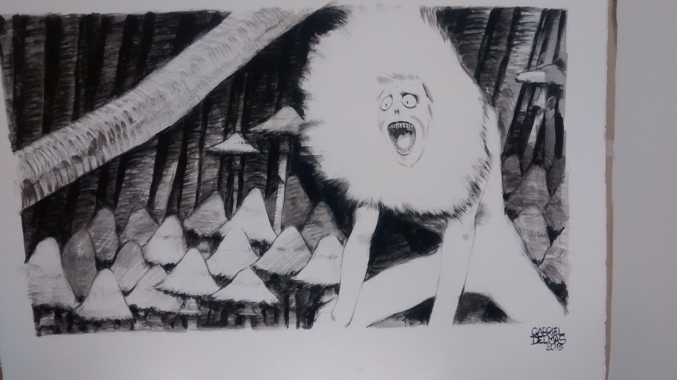
Finita questa doverosa premessa di cui probabilmente non fregherà niente a nessuno, veniamo al sodo. Scrivo queste righe, almeno quelle iniziali perché mi rimane poco tempo prima di dover iniziare a fare altro, di sabato mattina, 14 novembre, mentre sul mio profilo Facebook arrivano continui aggiornamenti sulle persone che per fortuna sono sane e salve dopo i fatti di Parigi e in tv passano le immagini di quanto accaduto ieri notte. Non sono bravo in queste cose, ma mi sento almeno di esprimere la mia tristezza e la mia vicinanza a quelli che erano lì. Tra questi una delle mie più recenti conoscenze parigine, il francese Gabriel Delmas, autore di Largemouths, uscito di recente per la Hollow Press del mio amico Michele Nitri. A Lucca Gabriel ha realizzato una serie di sketch e un impressionante live painting, che potete vedere nella foto che ho scattato dopo aver assistito passo dopo passo al processo creativo. Non c’entrerà niente, ma quando ho saputo quello che era successo, mi è ritornato in mente questo urlo di terrore.
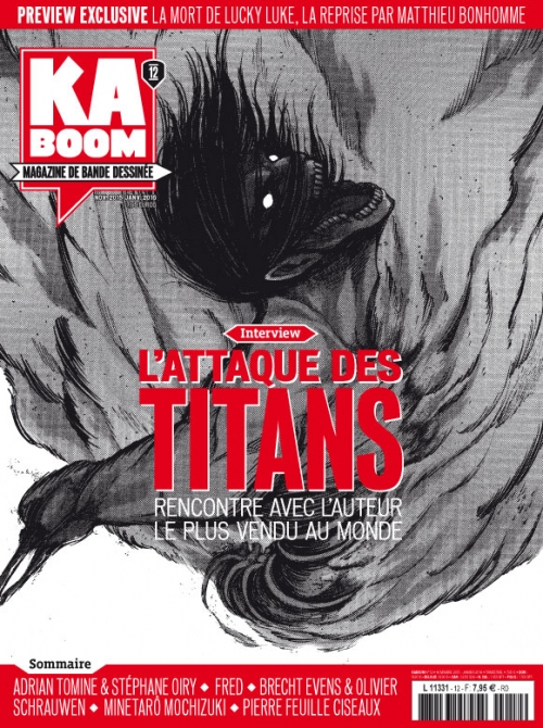
E’ stato poi lo stesso Gabriel a mostrarmi la più recente uscita di Kaboom, rivista sempre di altissimo livello di cui è ora disponibile un bellissimo dodicesimo numero, da non perdere se masticate un po’ di francese. Nel sommario una lunga conversazione tra Brecht Evens e Olivier Schrauwen, un’approfonditissima intervista ad Adrian Tomine condotta da Stéphane Oiry, un reportage dal workshop Pierre Feuille Ciseaux a Minneapolis e tanto altro ancora.
Passiamo ad altro e in particolare a Bilbolbul, appuntamento ormai alle porte e che come al solito promette un programma stellare. Avevo pensato di fare una piccola guida come quella pubblicata in occasione dell’ultima Lucca Comics, ma poi mi sono reso conto che un articolo di questo genere non avrebbe fatto altro che riportare l’intero programma della manifestazione, tante sono le cose interessanti che succederanno a Bologna dal 19 al 22 novembre prossimi. Cito brevemente alcune mostre (Magnus, Giacomo Nanni, Lili Carré, Benoît Preteseille, Olivier Schrauwen, Breakdown Press, Alice Milani, Martoz), i workshop (Paolo Bacilieri, Elisa Talentino, ancora Carré e Schrauwen), i tantissimi ospiti che non sto qui ad elencare, le tavole rotonde, le presentazioni, gli incontri, le proiezioni, oltre allo spazio BBBZine, mostra mercato che ospita sei realtà europee (Breakdown Press, Tieten Met Haar, kuš! komiksi, Peow Studio, Jean Guichon Editeur, Ion Editions). Per il programma completo vi rimando al sito del Bilbolbul.
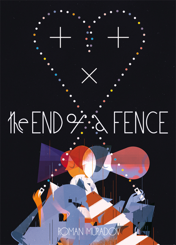
Proprio a Bilbolbul debutterà una nuova collana pubblicata da kuš!, che per la prima volta vedrà la casa editrice lettone impegnata con fumetti “lunghi”. Il formato di kuš! mono sarà ancora l’A6, lo stesso dell’antologia trimestrale š!, e l’onore del debutto toccherà al russo Roman Muradov con le 100 pagine a colori di The End of A Fence. “Cosa succederebbe se fossimo costretti a essere compatibili? Se andassimo d’accordo su tutto, dai tagli di capelli alla filosofia? Se non avessimo motivo di prendere posizione? Cosa rimarrebbe nel mezzo? Ispirato da J.G. Ballard, Ai Weiwei, Jonathan Monk e da tutte le recenti notizie di cronaca. Immaginate una comunità schiava degli algoritmi di OkCupid… O lasciate perdere, perché Roman Muradov l’ha fatto al posto vostro!”. Per un’anteprima più dettagliata vi rimando qui, mentre se non siete a Bilbolbul potete già ordinare il libro a 14 dollari spese di spedizione in tutto il mondo incluse.
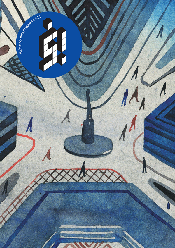
Sempre a Bologna sarà disponibile š! #23, numero fresco di stampa che con il titolo Redrawing Stories From The Past affronterà il tema delle vittime del nazismo, sviluppato anche in una mostra tutt’ora in corso a Berlino. Anche in questo caso vengono messe temporaneamente da parte le storie brevi per lasciare spazio a cinque fumetti dalla foliazione più consistente, realizzati dal lettone Mārtiņš Zutis, dai tedeschi Max Baitinger e Paula Bulling, dal serbo Vuk Palibrk e dalla polacca Zosia Dzierżawska, con una postfazione di Ole Frahm.
Festival che viene, festival che va. A New York il 7 e 8 novembre c’è stato il Comic Arts Brooklyn. Tra gli ospiti di quest’anno Daniel Clowes, che al contrario di quanto annunciato qualche mese or sono non ha fatto in tempo a portare in anteprima il suo nuovo libro, Patience, in uscita nei primi mesi del 2015 per Fantagraphics (da noi lo pubblicherà Bao). Per avere un’idea di cosa è sucesso al CAB, che come lo scorso anno era suddiviso in una giornata di mostra mercato e in una seconda di incontri con gli autori, potete leggere (e guardare) un primo reportage del Comics Journal a firma Frank Santoro e John Kelly, un bell’articolo di Nick Gazin su Vice con un’intervista all’organizzatore Gabe Fowler del negozio Desert Island, un pezzo del Publishers Weekly e la galleria fotografica di The Beat. Tra i cartoonist ritratti in quest’ultima c’è anche Brian Chippendale, che ha portato al CAB una settantina di copie in anteprima del suo Puke Force, disponibile in tutta la tiratura per Drawn and Quarterly il prossimo febbraio. Ed esattamente una settimana dopo il festival newyorkese, Chippendale è arrivato in Italia per una serie di concerti dei Lightning Bolt, devastante duo che ho potuto vedere in azione nella data di sabato 14 novembre all’Init di Roma. Qui sotto un video della parte finale del concerto, per cui ringrazio Luca Sancisi. E con questo è tutto.
Cartoline da Lucca: Richard McGuire
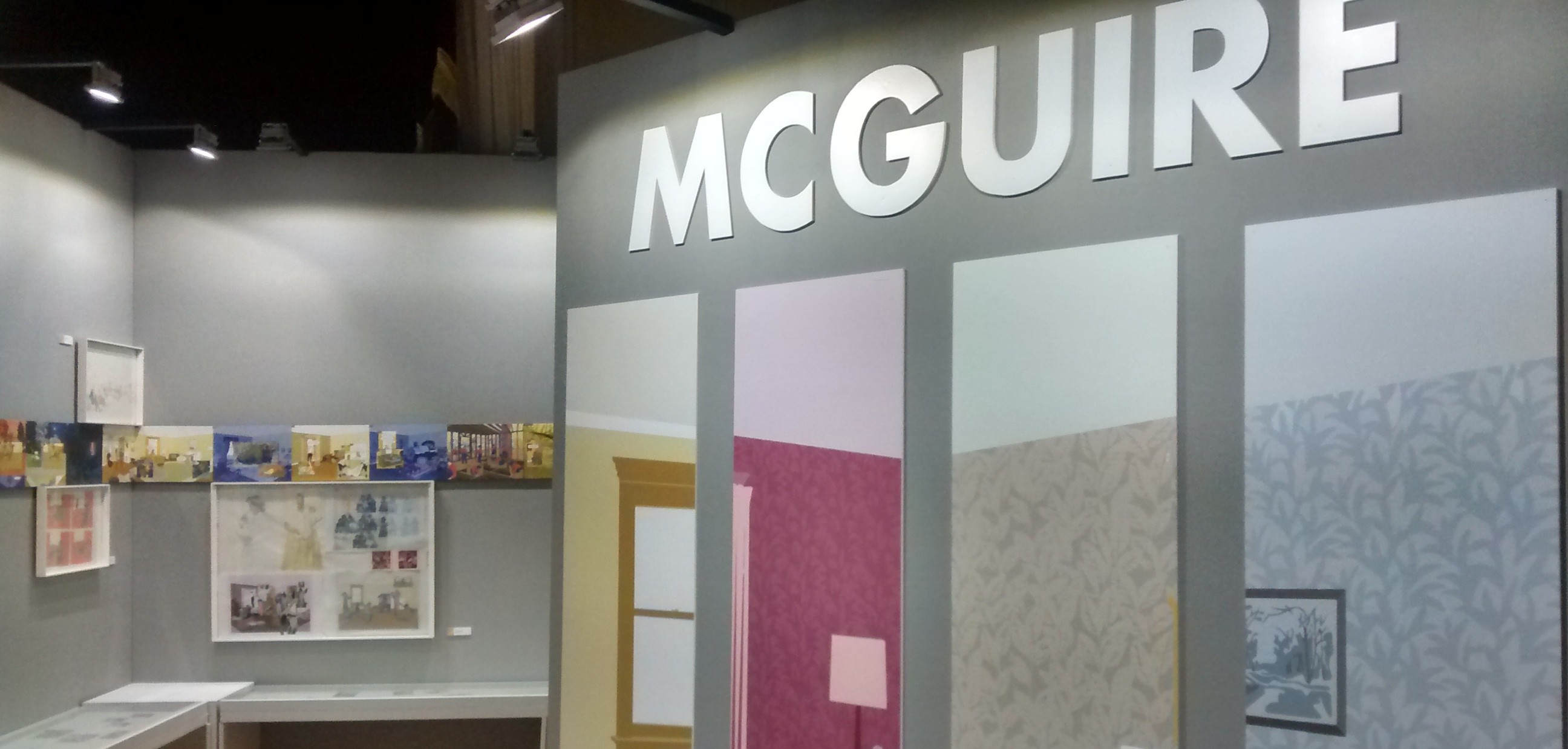
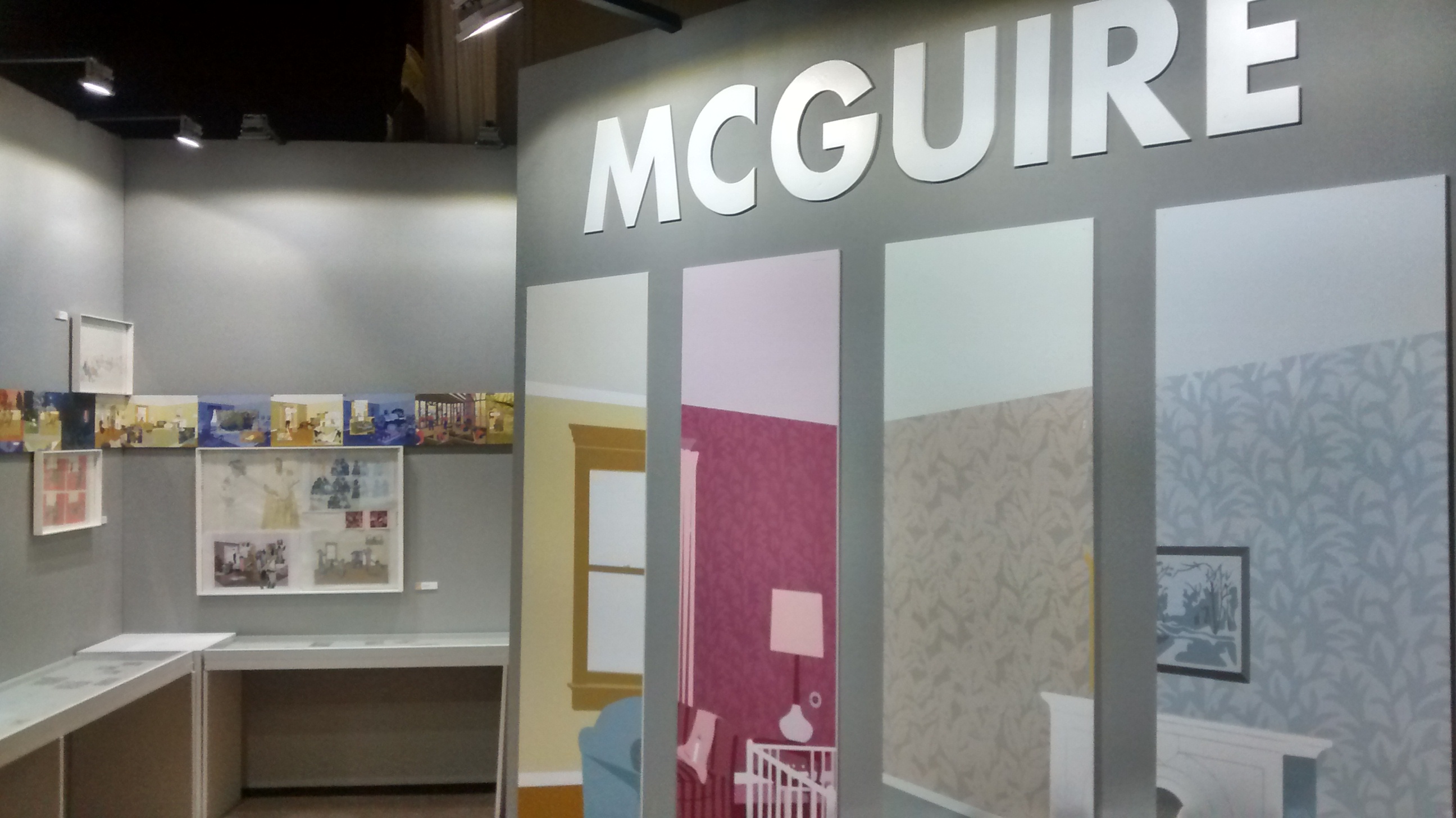
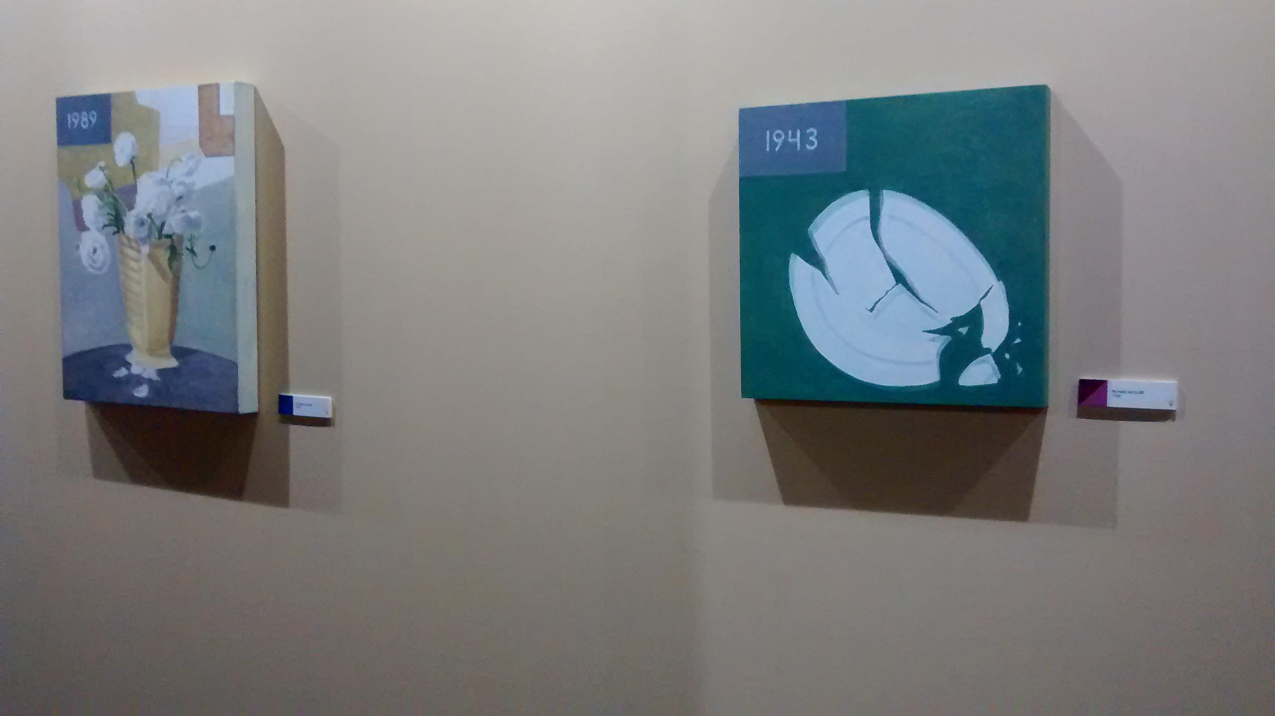
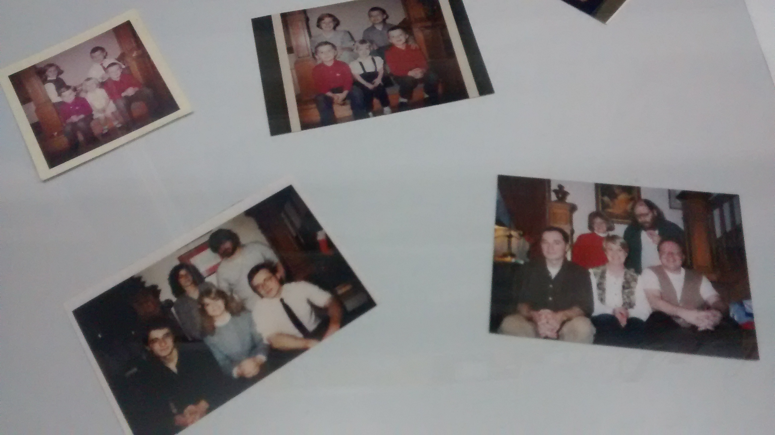
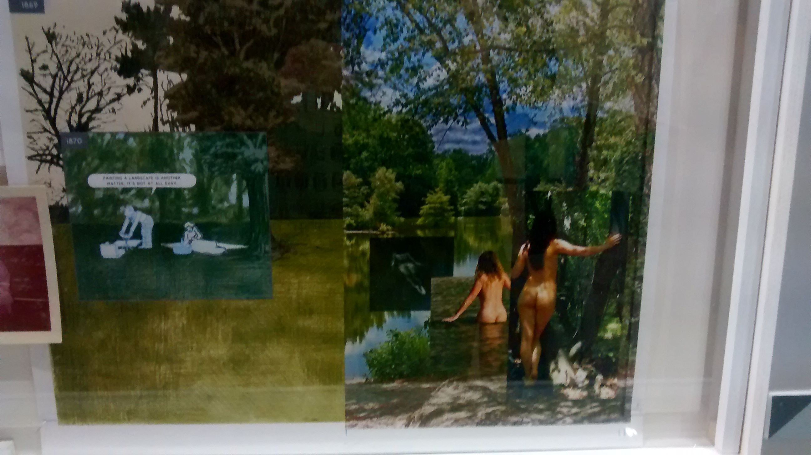
Uno degli ospiti più importanti della recente edizione di Lucca Comics è stato Richard McGuire, illustratore, musicista, regista e ovviamente cartoonist statunitense ben conosciuto agli amanti del fumetto per il suo Here, opera rivoluzionaria pubblicata nel 1989 sul magazine Raw ed espansa in una nuova versione uscita lo scorso anno negli Stati Uniti e qualche mese fa in Italia per Rizzoli Lizard (ne ho parlato qui). McGuire è stato protagonista di una personale a Palazzo Ducale incentrata principalmente sul suo ultimo lavoro e ricca di gustosi retroscena, su tutti le foto di famiglia riprodotte con minuziosa cura, oltre ad appunti, bozzetti, quadri che raffiguravano i particolari di alcune vignette. Un video mostrava inoltre il funzionamento dell’ebook, non una semplice versione digitale del libro ma un suo remake, come ha spiegato lo stesso autore nell’incontro di venerdì 30 ottobre alla Chiesa di San Giovanni, condotto con la solita puntualità e preparazione da Paolo Interdonato. In questa occasione, dopo una mezz’ora dedicata interamente a Here, McGuire si è soffermato su altri suoi lavori, come le tante copertine realizzate per il New Yorker, i libri per bambini e le opere video. Peccato che queste ultime non si siano potute apprezzare perché sul computer utilizzato per le proiezioni non era installato Quick Time. E peccato anche per una traduzione spesso imprecisa quando si dovevano adattare termini tecnici riguardanti il fumetto o riferimenti ad autori, riviste, libri, ecc., non certo colpa di Interdonato, che anzi spesso si trovava costretto a sopperire alle lacune dell’interprete messo a disposizione dall’organizzazione.
Avevo intenzione di riportare l’intera conversazione, ma il continuo riferimento alle immagini proiettate (pagine di fumetto, copertine, ecc.) renderebbe impossibile una piena comprensione. Mi limito così a trascrivere alcune frasi, intervallate da qualche foto scattata alla mostra, intitolata Richard McGuire: il tempo, lo spazio, l’uomo. Ma prima di lasciarvi a tutto ciò vi segnalo che McGuire è ancora in Italia per una serie di appuntamenti che culmineranno il prossimo fine settimana a Bilbolbul, dove incontrerà Franco Minganti per una conversazione intitolata Qui e oltre (sabato 21 novembre ore 11 all’Auditorium della Biblioteca Salaborsa) e dove verranno finalmente proiettate le sue creazioni in animazione nell’ambito di una retrospettiva intitolata Points of View (domenica 22 novembre ore 14 al Cinema Lumière).
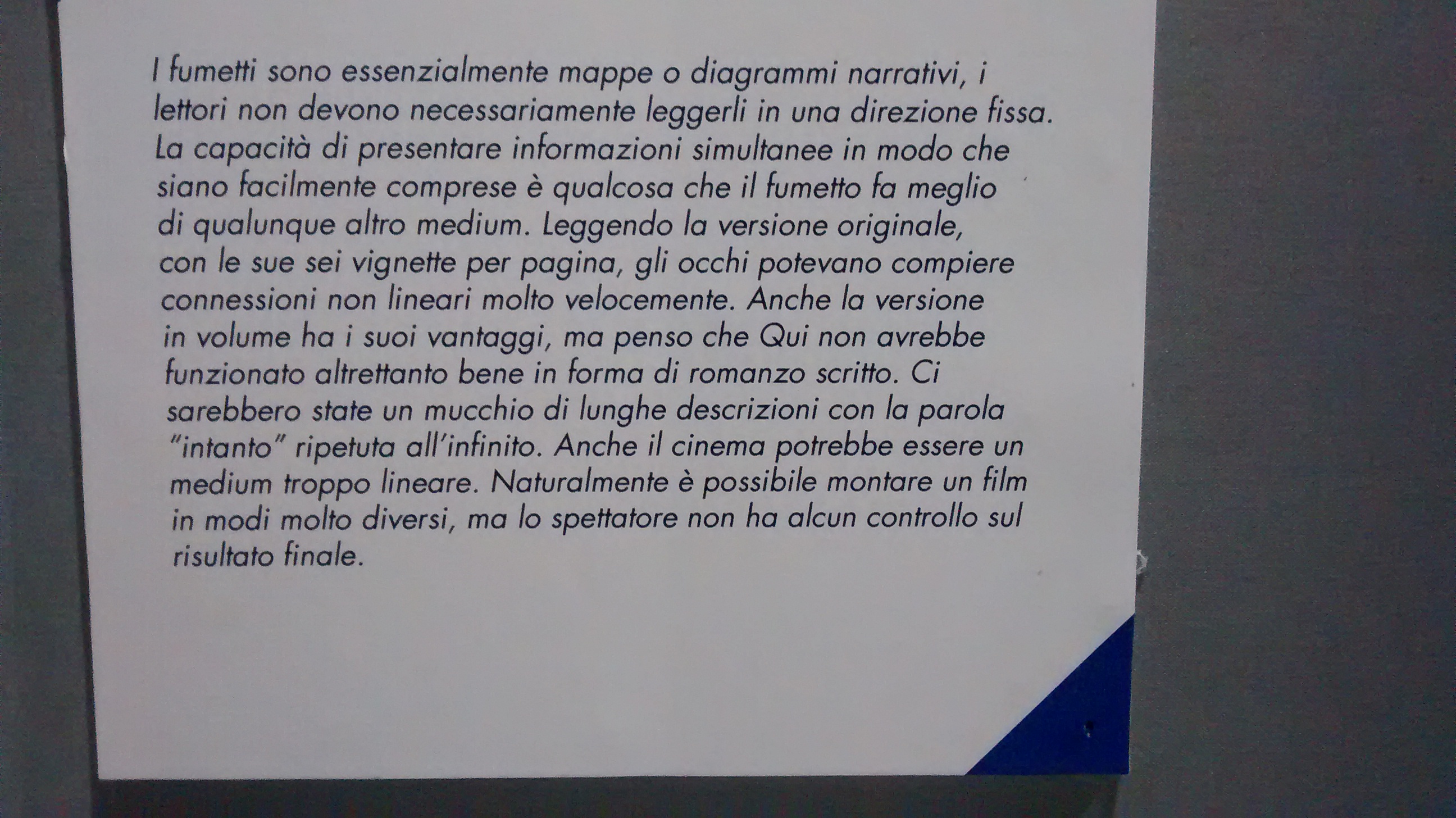
“La prima versione di Here è stata ispirata da una conferenza in cui Art Spiegelman descriveva i fumetti come dei diagrammi. Questa è stata una delle scintille da cui è nata l’idea e quando sono tornato a casa ho guardato l’angolo della mia stanza e ho pensato alla linea che divideva l’angolo della parete come se dividesse lo spazio in un lato che andava avanti nel tempo e un altro che andava indietro. In seguito un amico mi ha parlato del programma Windows e a quel punto ho capito che potevo dar vita a un’esplosione di finestre temporali. E a quei tempi era una cosa piuttosto strana, perché adesso è normale guardare cose di questo genere quando si è al computer, ma allora si trattava di qualcosa di nuovo”.
“Ho usato fotografie della mia famiglia, per esempio quello nell’angolo in basso a sinistra è mio fratello in tre diverse fasi della sua vita (si riferisce a pag. 3 della versione originale di Here, ndr). Ho realizzato la prima versione di Here nel 1989, allora non c’era internet e le foto di famiglia erano una sorta di database”.
“All’inizio Raw era una rivista di dimensioni veramente enormi, ma quando Art Spiegelman ebbe successo con l’edizione in volume di Maus, che era stata pubblicata in un formato più piccolo, decise di ridurre anche Raw, magari perché pensava che quello fosse il formato più adatto a un fumetto per adulti… La mia storia inizialmente aveva delle tavole più grandi ed era di sole tre pagine, ma poi ho dovuto riadattarla per farla andare bene per il nuovo formato di Raw… Nell’originale per esempio c’erano tre vignette per riga”.
“Quando ho inziato a pensare alla nuova versione di Here, avevo intenzione di farla come l’originale, cioè con molte vignette, ma poi ho capito che era meglio in questo modo, perché si poteva entrare direttamente nello spazio della stanza. In passato ho realizzato alcuni libri per bambini e probabilmente mi hanno influenzato nel realizzare il nuovo Here solamente con delle doppie pagine”.
“Mentre lavoravo al libro, lavoravo anche all’ebook, che non è un ebook tradizionale, perché funziona con dei programmi specifici che sono stati scritti appositamente. In realtà l’ebook è una sorta di remake del libro. Potete scorrere le pagine normalmente, ma se cliccate sulle date si aprono nuove finestre in modo casuale, dando vita a combinazioni sempre diverse tra gli sfondi e le vignette. C’è anche un po’ di animazione, per esempio il gatto che si lecca la zampa, ma è comunque una parte marginale del libro, perché ho voluto che fosse più un’esperienza di lettura che la semplice visione di un filmato. Per questo non ho voluto utilizzare suoni”.
“E’ difficile spiegare come ho costruito la nuova versione di Here, molte decisioni sono state dettate dall’istinto ma ci sono state un sacco di cose che mi hanno aiutato durante la stesura, per esempio le fotografie, oppure il lungo pezzo di carta che avevo nel mio studio e su cui ho costruito una linea temporale dove appuntavo gli eventi significativi mentre facevo le mie ricerche. Inizialmente, quando pensavo a come espandere la versione breve di Here in quella più lunga, credevo di dover seguire un unico filo narrativo. In seguito ho capito che questa idea avrebbe rallentato di gran lunga il libro, così ho cominciato a tagliare e a tagliare per far sì che tutto accadesse più velocemente, per tenere vive le emozioni. Alla fine è stata una specie di esperienza musicale, perché avevo attaccato le diverse pagine del libro alle pareti del mio studio e potevo passare dall’una all’altra come in una partitura musicale”.
Cartoline da Lucca: “Tuoneide”
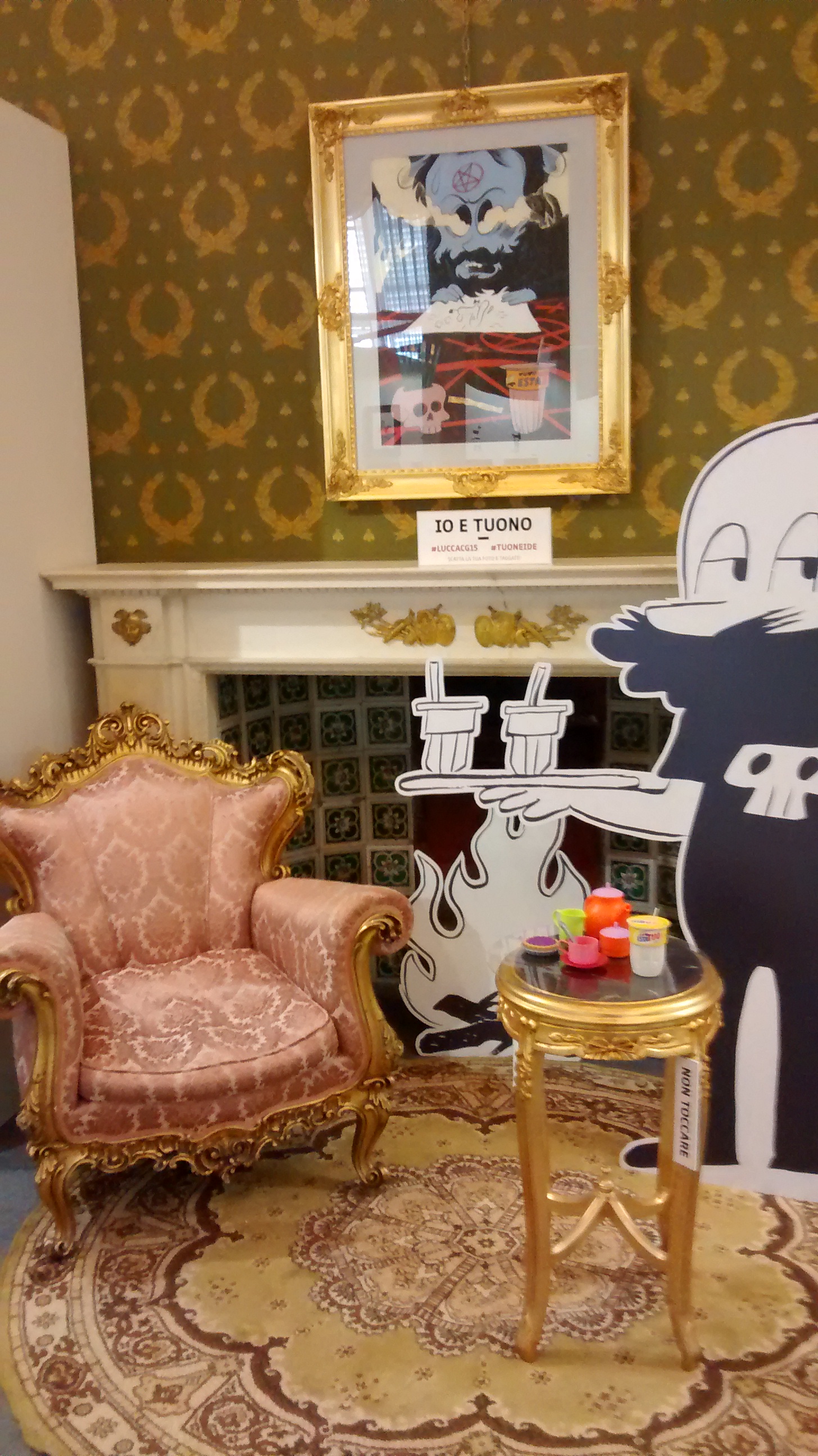
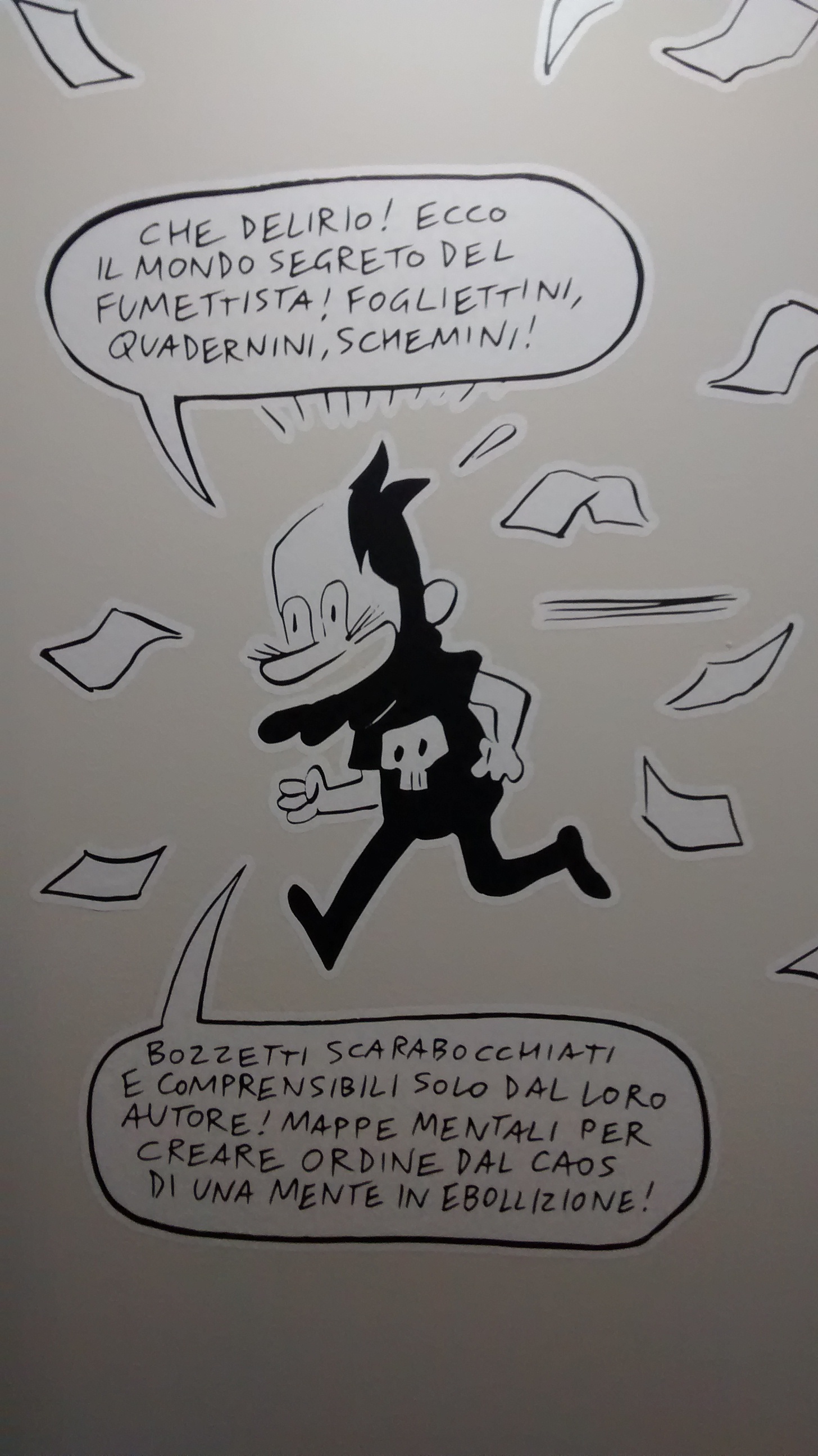
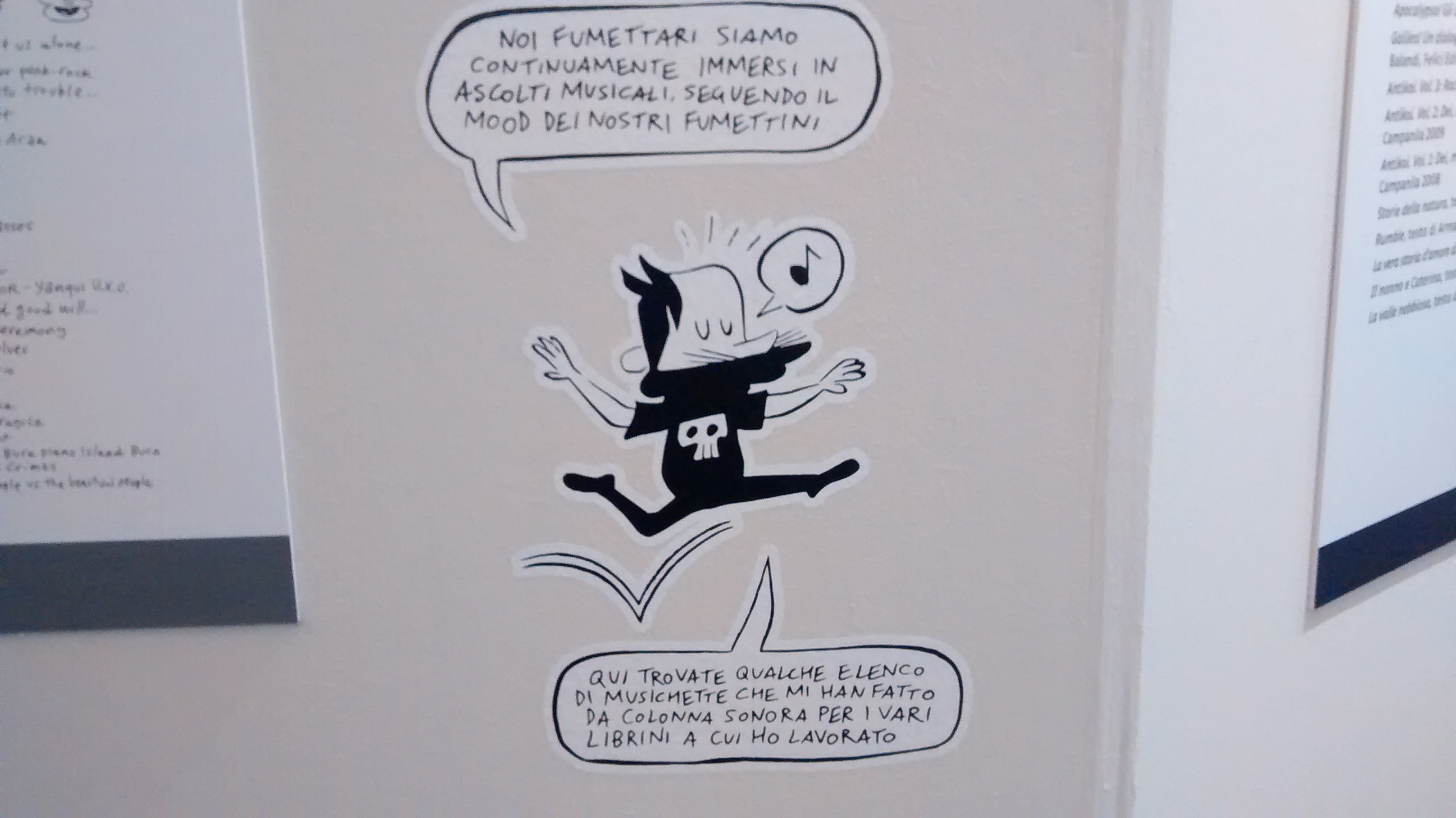
Tra le cose viste a Lucca quest’anno, la personale di Tuono Pettinato – a cura dello stesso autore e di Jacopo Moretti – è stata sicuramente una delle migliori. Raramente capita di vedere una mostra così curata nei minimi dettagli, non un semplice assemblaggio di tavole, disegni e quant’altro ma un percorso ben strutturato in cui è il fumettista stesso a guidare il visitatore grazie al suo alter ego disegnato. Ecco un paio di esempi di Tuono Pettinato novello Virgilio.

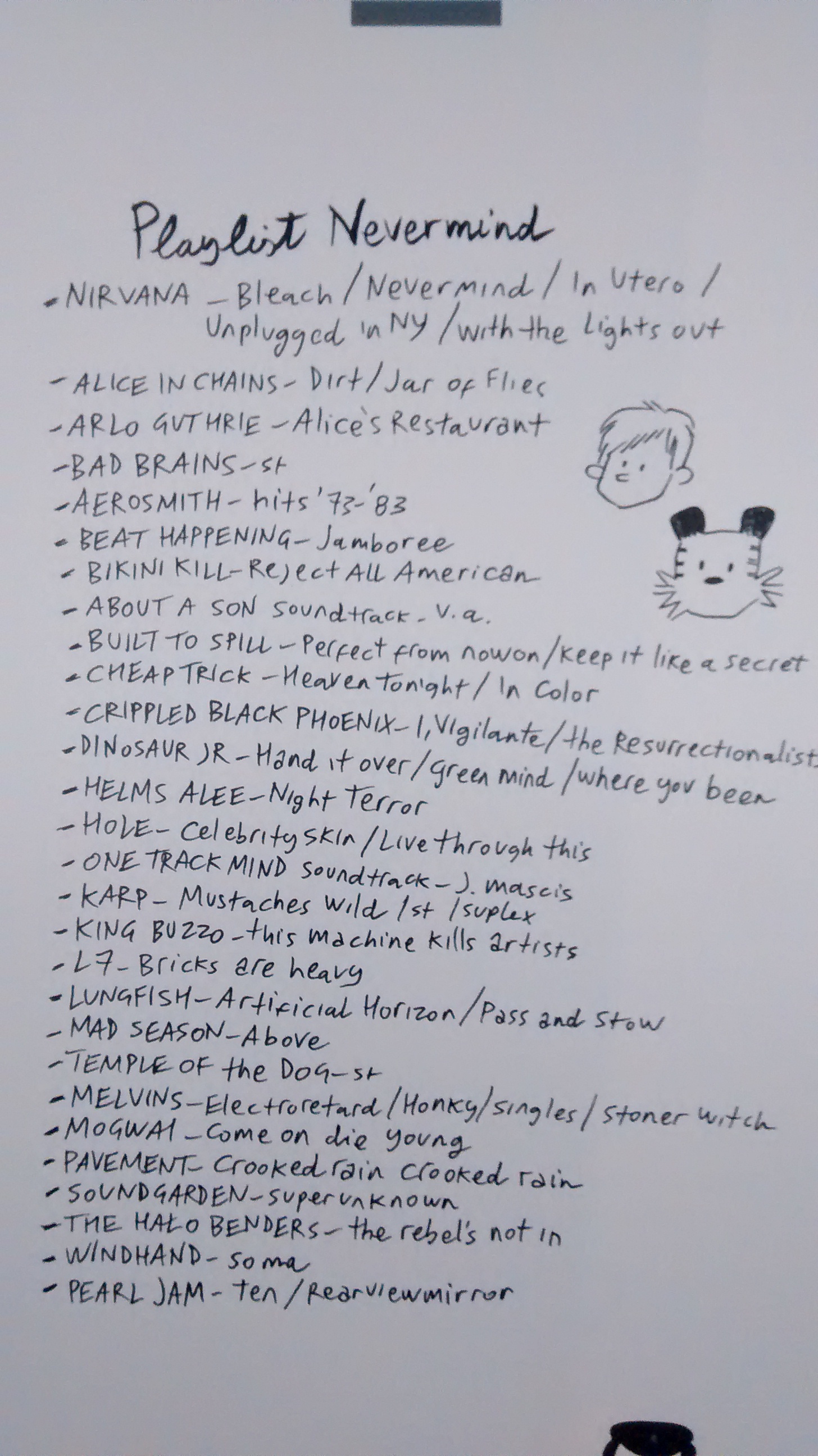
Oltre a mostrarci bozzetti, schemi narrativi e tantissime tavole originali tratte dai vari Garibaldi, Corpicino, Nevermind, la mostra si concentrava sulla figura dell’artista a 360 gradi, con tanto di playlist utilizzate durante la lavorazione dei diversi libri. Mi sono così divertito a scoprire molti punti in comune con Tuono, favoriti probabilmente anche dalla vicinanza anagrafica, che spaziano dai classici dei miei 14-20 anni (Pearl Jam, Soundgarden, Nirvana, Radiohead, Blur) all’indie rock americano di cui ancora sono un convinto fautore (Beat Happening, Built To Spill, Dinosaur Jr., Pavement) fino a pietre miliari del cosiddetto post-rock (Mogwai, A Silver Mt. Zion, Godspeed You! Black Emperor). Nessuna coincidenza clamorosa, dato che non si tratta di misconosciuti gruppi di folk uzbeko, ma ritrovare in questo genere di liste album che ho ascoltato e riascoltato fa sempre piacere.


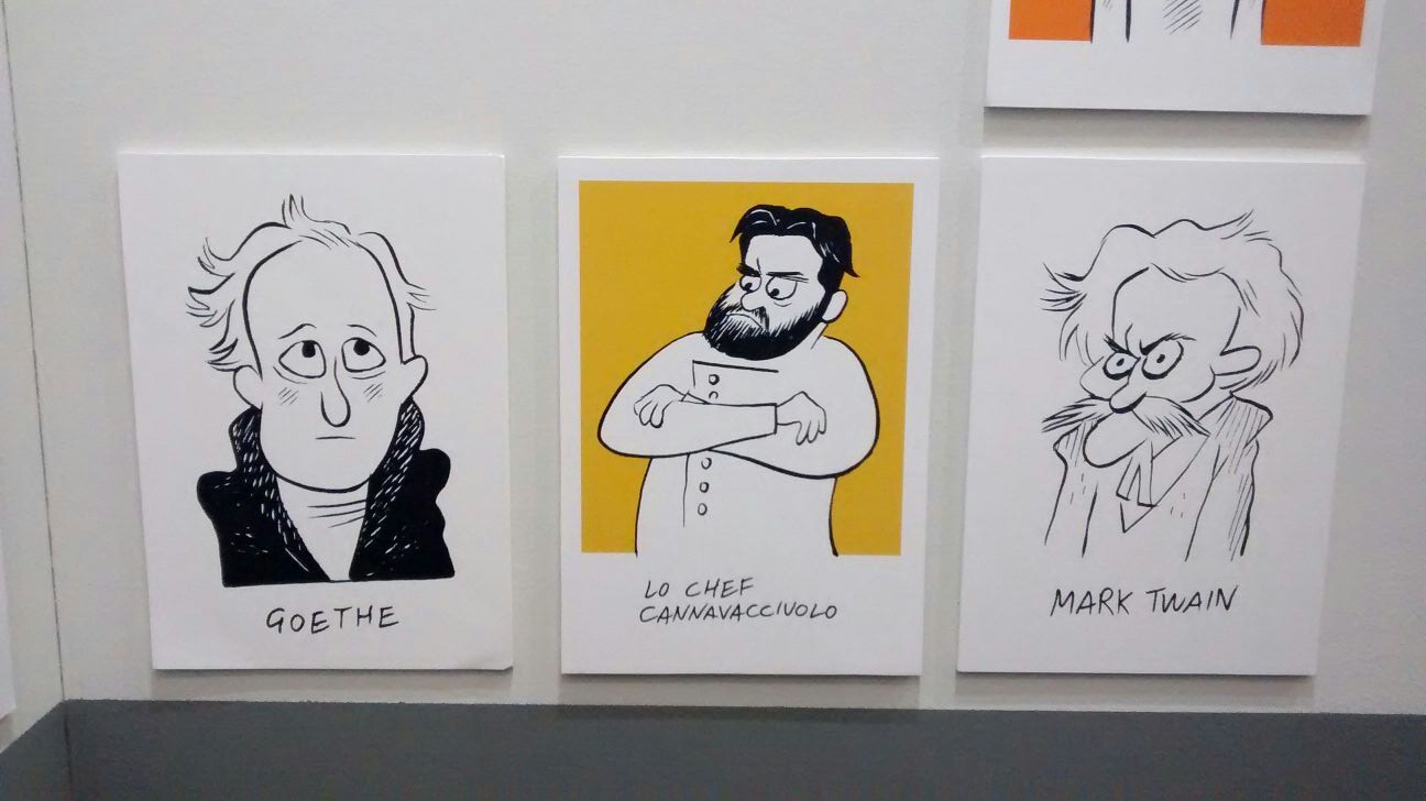
Altro pezzo forte della mostra, la galleria di ritratti di personaggi famosi, che associava i soggetti più disparati riportandoli semplicemente ai loro corpi e alle loro espressioni facciali. Il trittico qui sotto Goethe-Cannavacciuolo-Twain ne è una chiara dimostrazione.
P.s. Scusate per la qualità delle foto, scattate con il cellulare e senza pensare a un’eventuale pubblicazione.
Misunderstanding Comics #1
Inizio con questo post una nuova rubrica di recensioni “collettive”, che spero possa permettermi di aumentare il numero di fumetti segnalati su Just Indie Comics. Sin dagli inizi del blog non sono mai riuscito a occuparmi di tutti i fumetti di cui avrei voluto, spesso trovandomi a tralasciare proprio quelli più interessanti, con la speranza di riuscire a scrivere prima o poi una recensione più approfondita. Speranza che puntualmente veniva vanificata dalle varie situazioni contingenti che ci riserva la folle vita quotidiana nel terzo millennio sul pianeta Terra. Per questo ho deciso di riservare d’ora in poi la maggior parte delle recensioni a questa rubrica, anche per una questione di sopravvivenza personale, nel senso di riduzione del tempo passato al computer. Non abituatevi troppo al format di questo primo episodio, in cui sono riuscito a entrare sin troppo nei dettagli di ogni singolo fumetto, perché come suggerisce il titolo Misunderstanding Comics sarà caratterizzata da giudizi lapidari, lodi sperticate e incomprensibili stroncature.
NOTA: Alcuni dei fumetti di cui scrivo potrebbero essere in vendita presso il negozio on line di Just Indie Comics che gestisco personalmente. In questo caso il link sul nome del fumetto vi porterà direttamente alla relativa pagina del negozio. Potrei dirvi che nonostante ciò il mio giudizio rimane obiettivo, se non fosse che non credo nel concetto di obiettività. Comunque vi assicuro che non sono qui per farmi pubblicità o arricchirmi, anzi… Buona lettura.
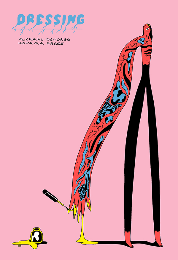
Inauguriamo questa rubrica con tre fumetti di Michael DeForge. Dressing è una raccolta sullo stile di Very Casual del 2013, pubblicata sempre da Koyama Press e che mette insieme una serie di fumetti disomogenei dal punto di vista stilistico e in alcuni casi apparentemente estemporanei. Tuttavia lette una dopo l’altra le storie di Dressing restituiscono l’idea di un corpus compatto, con tematiche ricorrenti della poetica di DeForge, come i mutamenti di identità e di sesso, la satira del mondo delle corporation, l’impossibilità di definire la realtà contemporanea attraverso il linguaggio, l’orrore che si nasconde dietro la patina della normalità. Il tutto con il solito approccio astratto, che rifiuta il realismo per ricondurre le vicende narrate alla loro essenza pura e semplice. Quello di DeForge non è tanto un lavoro sui personaggi – spesso semplici comparse disorientate e rassegnate – ma sui temi, in cui ogni tentazione didascalica è abilmente stemperata dall’uso di una ironia cruda ma che in episodi come Wet Animals diventa anche irresistibilmente divertente. C’è poi ovviamente il lavoro stilistico, che si segnala in episodi come Elves e My Interesting Mother, One Billion Times per l’ardita costruzione della pagina, oltreché per la rinuncia al digitale e il ritorno al tavolo da disegno in un paio di episodi.
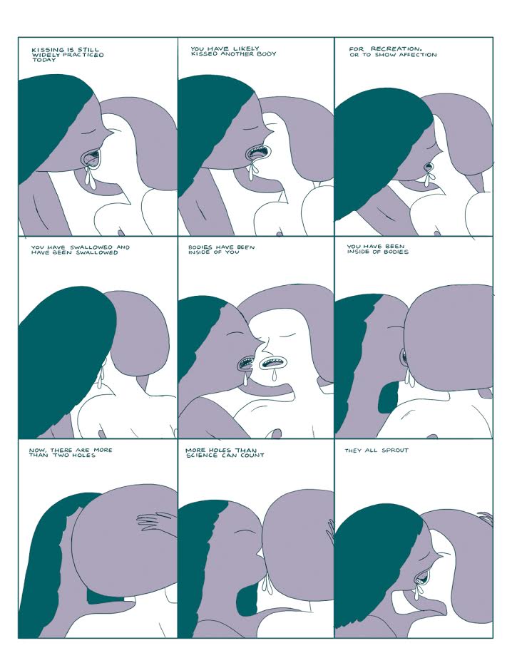
Gli stessi argomenti e lo stesso approccio delle short stories di Dressing tornano in Lose #7, pubblicato sempre da Koyama, e in On Topics, che invece segna l’esordio di DeForge per l’inglese Breakdown Press. In particolare Movie Star, la storia principale del settimo numero di Lose, sembra sviluppare l’idea della Redundancies contenuta in Dressing, indagando la strana relazione tra due fratelli. L’eco di un altro canadese, David Cronenberg, aleggia nel progressivo sviluppo di una relazione simbiotica alla Inseparabili, ma l’atmosfera algida e il gusto per il paradosso ricordano piuttosto alcuni narratori contemporanei (mi viene in mente George Saunders). Forse non è al livello della Me As A Baby contenuta nel numero precedente di Lose, ma Movie Star è una prova comunque di altissimo livello. On Topics raccoglie invece due brevi fumetti realizzati per la piattaforma Patreon e inviati dall’autore canadese ai suoi sostenitori. Riuscitissimo il primo, About Kissing, una sorta di Genesi in versione anale, dato che secondo la teoria di DeForge in principio c’erano i culi, poi nacquero le bocche, che in realtà erano soltanto dei culi deformi in cerca di altri culi per inghiottire i colpi altrui. Dal conflitto tra bocche, culi e quant’altro ecco che si originarono i baci. Chiaro, no? Vabbè, in realtà sono io che non riesco a rendere l’idea, vi assicuro che la storia, per quanto assurda, è di una logica disarmante. Più debole invece il secondo fumetto dell’albo, Regarding Quicksand, a proposito di un uomo sottoposto a ogni genere di tortura mentre affonda nelle sabbie mobili.
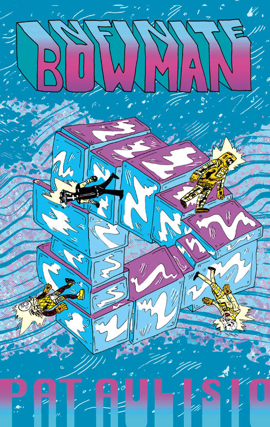
Infinite Bowman è la raccolta definitiva della saga dell’astronauta David Bowman, celeberrimo protagonista di 2001 Odissea nello Spazio scelto dallo statunitense Pat Aulisio come eroe di una serie di mini-comics, qui ristampati da Hic & Hoc con l’aggiunta di 75 pagine inedite. Aulisio è uno degli animatori su quel social network chiamato Facebook (non so se avete presente) di un gruppo chiamato Fort Kirby, che associa i fan del Re con quelli di Fort Thunder. Ebbene, Infinite Bowman potrebbe essere il manifesto programmatico di questa fantasmagorica ibridazione, dato che le vicissitudini kirbyane del protagonista – tra macchine spaziali e divinità celestiali – sono rese con uno stile selvaggio ma che non rinuncia mai all’amore per il dettaglio e soprattutto per lo storytelling. Insomma, per chi la conosce siamo dalle parti di Mickey Zacchilli, altra cartoonist statunitense bravissima nel restituire l’impressione di caos controllato. Impossibile poi non accennare alle trovate ironiche e a tratti trash dell’autore. Per farvi un’idea oltre all’immancabile Monolite di 2001 qui trovate anche cavalli con la testa di Garfield, Bart Simpson, l’origine dell’air-guitar e per finire un incontro di wrestling che deciderà le sorti dello sconto tra il Nostro e Satana in persona. Se avessi un bollino “Consigliato da Just Indie Comics” lo appiccicherei sulla copertina di questo libro.
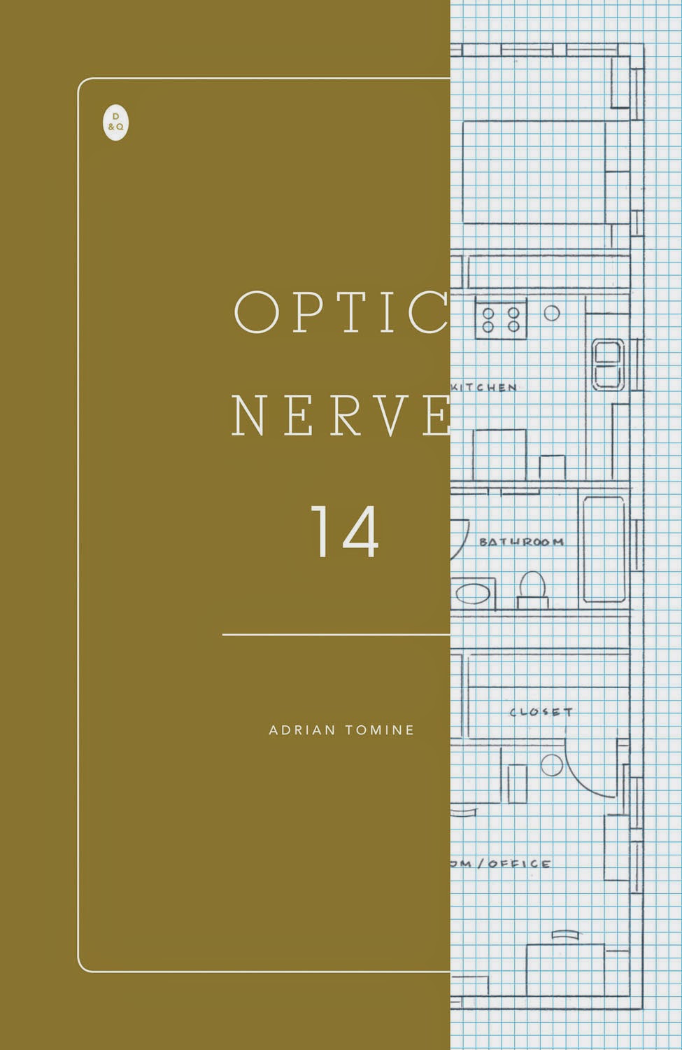
Discorso diverso per il nuovo Optic Nerve, che ormai tanto nuovo non è, dato che è uscita proprio in questi giorni per Drawn & Quarterly Killing and Dying, raccolta degli ultimi tre numeri della serie di Adrian Tomine, che prende il nome proprio dalla storia principale di questo quattordicesimo numero. Il comic book segue la struttura dei precedenti, di cui ho già parlato in questo articolo per Fumettologica: un fumetto più lungo in apertura, in cui l’autore cerca nuove modalità espressive rispetto al passato, uno più breve che ricorda i racconti degli esordi, una tavola autobiografica in cui si parla di processo creativo, idiosincrasia per la tecnologia e vicende familiari. A mio parere Tomine sta sempre più mostrando la corda e questo numero di Optic Nerve è il più debole di sempre. La descrizione di personaggi mediocri e spesso disprezzabili aveva già raggiunto il culmine nella storyline Shortcomings e non capisco sinceramente che senso abbia continuare su questa linea, soprattutto se racconti come il precedente Go Owls e questo Killing and Dying manifestano una fastidiosa sensazione di superiorità dell’autore nei confronti delle persone e delle vicende narrate. Tanto più che questa totale mancanza di empatia tra autore e personaggi non è compensata né dalle situazioni ironiche (malriuscite) né da particolari innovazioni stilistiche (il tratto tende infatti a un preoccupante manierismo). Anche la storiella autobiografica suona trita e già letta. Alla fine si salva soltanto Intruders, storia di 8 pagine dedicata a Yoshihiro Tatsumi che ci riporta ai tempi in cui Tomine scriveva e disegnava bei fumetti. Oggi si trova nel bel mezzo di un preoccupante processo di involuzione, e per me che l’ho sempre apprezzato è davvero un peccato.
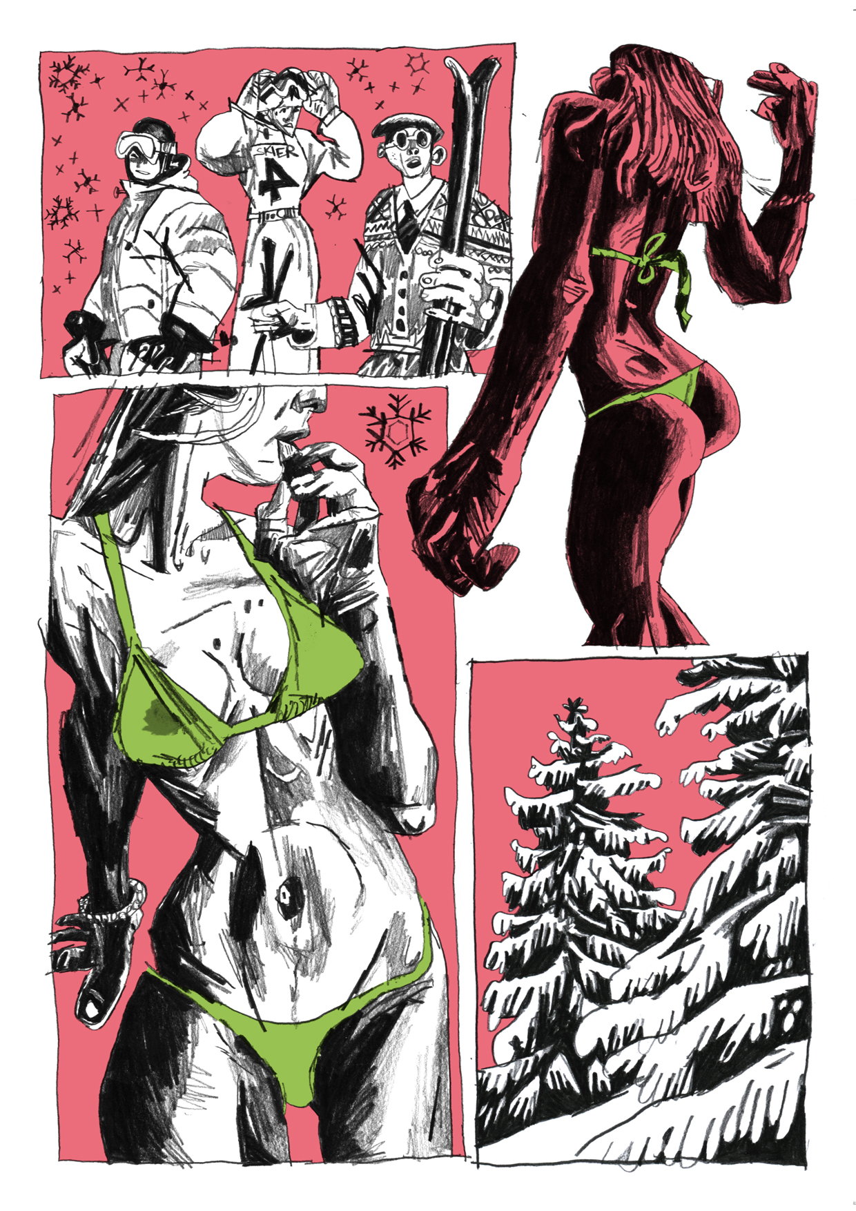
Rimaniamo al formato comic book e arriviamo così al terzo numero di Felony Comics, antologia “criminale” pubblicata dalla Negative Pleasure e il cui primo numero era finito tra i miei fumetti preferiti del 2014. L’editor Harris Smith si sta facendo sempre più strada all’interno della sua creatura, dato che scrive ben due dei fumetti qui presenti. Particolarmente riuscita la collaborazione di The Flash Flight of the Red Swan con Pete Toms, ospite fisso della serie, di cui Smith riprende gli stilemi espressivi, realizzando un processo di immedesimazione che riflette le tematiche delle storie. Le vicende di un ladro trasformista diventano l’occasione per trattare il tema dell’identità in maniera gustosamente straniante, grazie anche a un tratto pulito e alla griglia rigida scelta per la composizione delle tavole. In questo numero troviamo anche la prosecuzione di Poor Little Dum Dum, scritta da Smith con disegni di Thomas Slattery, il punk color neon di Mrsa & Billy di Ben Passmore (immagine in alto) e soprattutto Resistance & Existence di Brigid Deacon, artista inglese che sviluppa il tema del crimine in chiave politica e filosofica, dando forma a quattro pagine di alto livello. Felony Comics è un’antologia mai banale, che merita sempre attenzione. Mentre scrivo queste righe è già alle stampe il quarto numero, che potete preordinare qui. E se non volete sobbarcarvi i costi di spedizione dagli USA ma siete curiosi di dare un’occhiata a questo bel progetto, l’antologia è disponibile anche in digitale e a un prezzo ragionevolissimo su Comixology.
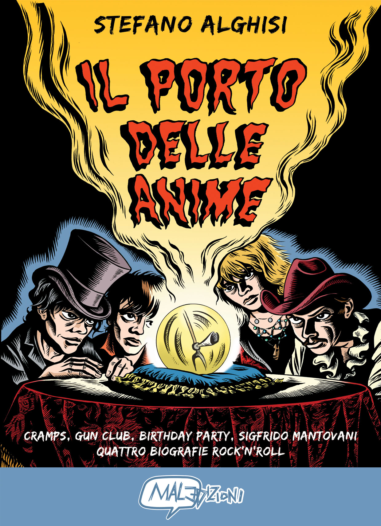
Chiudo questa ampia rassegna sulle frontiere del fumetto contemporaneo con la segnalazione di un albo italiano uscito qualche mese fa. Si tratta de Il porto delle anime di Stefano Alghisi, pubblicato dall’ottima casa editrice bresciana Mal Edizioni, il cui catalogo si distingue per scelte mai banali. Cito per esempio i titoli dedicati all’interessantissima scena portoghese (Airbag e altre storie di Pedro Burgos e Tu sei la donna della mia vita, lei la donna dei miei sogni del duo Pedro Brito-João Fazenda) ma anche Emilia, una bella raccolta di storie brevi del modenese Fabio Bonetti. Il porto delle anime è un libro biografico in cui Alghisi racconta a modo suo le storie di tre famose band rock’n’roll degli anni ’80, i Cramps di Lux Interior e Poison Ivy, i Gun Club di Jeffrey Lee Pierce, i Birthday Party del primo Nick Cave. La bella introduzione dell’esperto Luca Frazzi ci ricorda come Alghisi illustrasse il rock’n’roll più sporco e disturbante sin dai tempi della gloriosa rivista Bassa Fedeltà, che dovrei avere ancora da qualche parte nella soffitta di casa dei miei. Le pagine seguenti ci fanno invece vedere il tratto di un artista talentuoso e maturo, dotato di un tratto corposo che non sfigurerebbe accanto a qualche grande maestro dell’underground americano. In appendice al volume c’è anche la storia di un outsider, Sigfrido Mantovani, venditore di lamette da barba e cantastorie. Da recuperare.
Borda!, la festa dei marginali
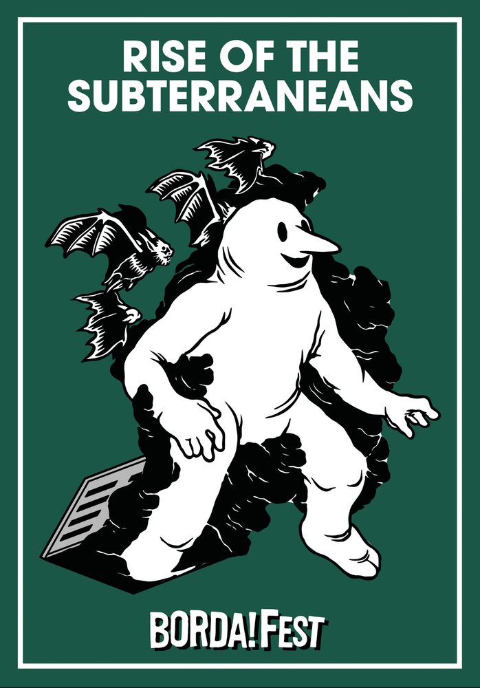
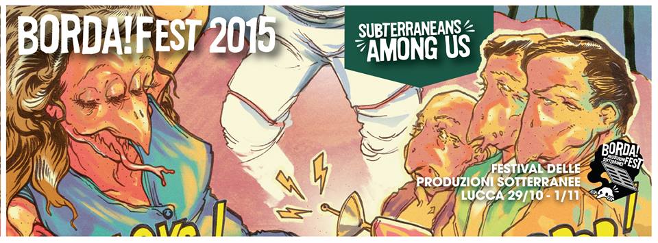 Dopo le mille difficoltà dello scorso anno, il Borda!Fest torna a Lucca negli stessi giorni del più famoso evento dedicato al fumetto, cioè dal 29 ottobre al 1° novembre. E sarà il vero debutto “ufficiale” della manifestazione, perché quest’anno il collettivo dietro al Borda! ha fatto le cose in grande, riuscendo ad avere la disponibilità di Piazza del Carmine, dove verrà allestita la mostra mercato delle produzioni sotterranee, e mettendo insieme un programma ben strutturato ricco di incontri ed eventi. Sembra dunque che finalmente il Borda!Fest riesca a prendere il volo, dopo le difficoltà dello scorso anno, culminate nello sgombero da parte delle forze dell’ordine dell’inChiostro, un immobile abbandonato occupato dai ragazzi in mancanza dell’autorizzazione a utilizzare altri spazi per dar vita all’evento. La storia di quello che è stato il Borda!Fest dello scorso anno la trovate in un libretto, che potete acquistare qui, intitolato Rise of The Subterraneans, una sorta di manifesto per capire quali sono le intenzioni e gli obiettivi degli organizzatori dell’evento lucchese.
Di questi temi si parlerà sicuramente sia giovedì 29 alle 18 in occasione della presentazione del festival, sia nel dibattito di sabato 31 alle 15 “Dal banchetto ai blog d’autore, dal baratto al crowdfunding – Riflessioni sul mondo dell’autoproduzione”, con ospiti Ratigher, Vieni Verso Il Municipio, Lofi comics, Mammaiuto, Valerio Bindi (Crack! Fumetti Dirompenti – Sciatto Produzie) e membri dei collettivi Combat Comics e BORDA!Fest. Il tema dell’autoproduzione è di estrema attualità d’altronde, basti pensare a tutte le polemiche che hanno impazzato in rete in questi giorni a proposito degli accrediti non rilasciati da Lucca Comics & Games ad alcuni autori e che hanno evidenziato che in Italia concetti come “autore”, “libro” e “fumetto” sono spesso intesi, anche da chi organizza manifestazioni di rilevanza internazionale, in maniera datata e retrograda. Benvenuto dunque a un festival off, che non boicotta o ostacola quello più famoso ma dà semplicemente la possibilità di esprimersi ad altre persone e ad altre culture, senza dover essere riconosciuti e approvati da giurie o comitati. Un festival, il Borda!, che si inserisce nel filone del Crack! del Forte Prenestino di Roma e del Foff di Angoulême e che come questi non è solo fumetto ma anche musica, con concerti le sere di giovedì, venerdì e sabato. Di seguito il programma completo dell’evento, che coinvolge tra gli altri artisti come Akab, Marco Galli, Stefano Alghisi e realtà editoriali come Eris e Mal Edizioni. Buon divertimento.
–– GIOVEDÌ 29 OTTOBRE ––
Ore 10:30 – Apertura della mostra mercato delle Produzioni Sotterrenee
Ore 18:00 –
SUBTERRANEANS AMONG US
PRESENTAZIONE DEL FESTIVAL
Presentazione dell’edizione 2015 del BORDA!Fest – Produzioni Sotterranee, del libro Rise of the Subterraneans, della BORDA!Zine #1 e inaugurazione della mostra di tavole de “LA BOLLA di Ventimiglia” di Emanuele Giacopetti. “La Bolla”, pubblicata da Graphic News, è un racconto disegnato del presidio No Borders di Ventimiglia, ad oggi sgomberato.
A seguire Nicola Gobbi e Marco Gastoni presentano
“COME IL COLORE DELLA TERRA“ di Eris edizioni, un libro a fumetti che racconta la storia di due bambini indigeni del Chiapas sullo sfondo della rivoluzione zapatista degli anni ‘90 in Messico.
Dalla prefazione di Pino Cacucci: Con sensibilità e coinvolgimento appassionato, “Come il colore della terra” ci porta nella vita genuina e illuminante di donne e uomini degni, ai quali per troppo tempo era stato negato non solo il futuro ma persino il presente, mentre oggi, nelle terre dove una volpe e un corvo discutono sui comportamenti degli esseri umani, lottare per una realidad fatta di solidarietà e comunanza, comprende anche il diritto di sognare.
Dalle ore 21:00 al Mercato del Carmine si continua con il primo concerto del BORDA!Fest:
TUSCANY PUNK NIGHT
SOUNDS OF SUBTERRANEANS Pt. 1: https://goo.gl/kdiXZA
–– VENERDÌ 30 OTTOBRE ––
Ore 10:30 – Apertura della mostra mercato delle Produzioni Sotterrenee
Ore 14:00 – CALIBRO 9 Limited Edition
Calibro 9 – presentazione della cover del volume uno, Emilio Caccaman Battiato e Pino Rinaldi con stampa numerata ed autografata dagli autori in regalo sino ad esaurimento – presentazione parte zero “Limited Edition”.
Ore 16:00 –
PRESENTAZIONE DEL LIBRO
E PROIEZIONE DEL DOCUMENTARIO
Black Hole – Uno sguardo sull’Underground Italiano
Turi Messineo ci racconterà del suo lavoro di documentazione su musica, politica e sottoculture sviluppatesi sul territorio italiano dalla fine degli anni ’60 a oggi. Sarà presentato il libro “Black Hole-Uno sguardo sull’Underground Italiano” e a seguire sarà proiettato il documentario.
Ore 18:00 –
PRESENTAZIONE DEL FUMETTO Defragment di Akab
Il fumettista milanese Akab presenterà Defragment il suo ultimo lavoro edito per Blu gallery. “Autobiografia acida, fantabiografia infettiva, incubo palpabile a occhi aperti ma anche saggio critico essenziale, accessibile e sovversivo.” Sarà presente una mostra di disegni originali dell’autore.
Durante il pomeriggio
LIVE PAINTING
con The Toxic Exhibition, Elia Buffa, Ark8 e Alex Caligaris
Dalle ore 21:00 si rimane al Mercato del Carmine per il secondo concerto del BORDA!Fest:
HIP HOP NIGHT
SOUNDS OF SUBTERRANEANS Pt. 2:https://goo.gl/sjshPW
–– SABATO 31 OTTOBRE ––
Ore 10:30 – Apertura della mostra mercato delle Produzioni Sotterrenee
Ore 15:00 – DIBATTITO
“Dal banchetto ai blog d’autore, dal baratto al crowfunding – riflessioni sul mondo dell’autoproduzione”
Incontro/dibattito che cercherà di analizzare le dinamiche dell’autoproduzione, gli ambienti dove questa si sviluppa e la loro evoluzione nel tempo.
Interverrano Ratigher, Vieni Verso Il Municipio, Lofi comics, Mammaiuto, Valerio Bindi ( Crack fumetti dirompenti – Sciatto Produzie) e membri dei collettivi Combat Comics, e BORDA!Fest .
Ore 16:30 – DISEGNO COLLETTIVO – Organizza il Collettivo Autonomo Studenti Lucchesi con la direzione creativa del Collettivo Artistico Passaglia
Ore 18:00 – UOMINI NUDI CHE CORRONO AL BORDA!
Presentazione del libro a fumetti spaziali di Tommy Gun Moretti “Storie di ordinata entropia” e dell’ultima produzione targata Uomini Nudi che Corrono, “Sbim! a Rare Zine” Vol.II – Black Magic – uscito in contemporanea nelle vie di Bristol
Dalle ore 21:00 al Mercato del Carmine il terzo concerto del BORDA!Fest:
BOLOGNA VIOLENTA & MORE HC
SOUNDS OF SUBTERRANEANS Pt. 3: https://goo.gl/h3Pkrv
–– DOMENICA 1/11––
Ore 10:30 – Apertura della mostra mercato delle Produzioni Sotterrenee
Ore 15:00 – PRESENTAZIONE DEL VINILE DI Radio Roarr vol.0
Presentazione del vinile di Radio Roarr, web radio del Progetto Rebeldia di Pisa,
Un progetto SIAE-free, che raccoglie le musiche di nove band e artisti della west coast toscana, che vuole sostenere la musica locale, emergente e non, prodotto tramite crowdfunding in 200 copie numerate.
La copertina del vinile è stata realizzata appositamente da Francesco Barbieri, e nel disco sono presenti Maurizio Curadi, Marina Mulopulos, i Misère de la philosophie, Etruschi from Lakota, Miriam Mellerin, La fortuna di Nashira, Rum-Ore, Trebor Noff e i Machine Overdrive.
Ore 16:00 –
“NON SOLO TOMBINI DI GHISA – Brescia e il fumetto underground”
Incontro sul fumetto sotterraneo bresciano con Marco Galli, autore di “Nella camera del cuore si nasconde un elefante” e “Oceania Boulevard”; Stefano Alghisi, autore di “Il porto delle Anime” fumetto su Cramps, Gun Club e Birthday Party; Nadia Bordonali, cofondatrice dell’officina editoriale MalEdizioni; Mattia Ferri, cofondatore di McGuffin Comics, neonata autoproduzione il cui primo volume uscirà a primavera 2016.
Ore 18:00 – LO SGARGABONZI LIVE 2015 + PRESENTAZIONE IN ANTEMPRIMA DE “IL PROBLEMA PURTROPPO DEL PRECARIATO”
Alessandro Gori, scrittore e bloggher aretino si cimenterà nei suoi nuovi monologhi e presenterà in anteprima internazionale il nuovo libro “Il problema purtroppo del precariato”.
_
Il BORDA!Fest – Produzioni Sotterranee è un festival del fumetto e delle produzioni visive, musicali e letterarie dove chiunque può partecipare, senza restrizioni nè selezioni. Non si paga per esporre, nè si paga per venire a vedere.
E’ un festival libero, dove ognuno può proporsi, dove per organizzare una presentazione del proprio lavoro basta parlarne e organizzarsi assieme agli altri.
E’ un festival organizzato insieme, direttamente dagli autori che vi partecipano, e prende la forma delle persone che ne fanno parte.
Dopo il Rise of the Subterraneans 2014 e il #BORDATour 2015 (http://goo.gl/d3vrrk ) Il popolo delle Produzioni Sotterranee torna a invadere Lucca! il tombino è stato forzato, i sotterranei sono ormai tra noi.
–
illustrazione di locandina di Tommy Gun Moretti degli UOMINI NUDI CHE CORRONO –www.tommygunmoretti.blogspot.
Qua http://goo.gl/nK49zN
trovi il manifesto del #BORDAFest
Qui https://goo.gl/k4tzRi puoi vedere i contributi per la BORDA!Zine #1
Qua https://goo.gl/WXDC1Z
trovi il racconto della prima edizione
Qui puoi sostenere il festival:
http://riseofthesubterraneans.
–
BORDA!Fest – Produzioni Sotterranee – LUCCA
bordafest@canaglie.org
https://twitter.com/BORDAFest
Cosa fare a Lucca Comics 2015
Si avvicina Lucca Comics and Games, in programma da giovedì 29 ottobre a domenica 1° novembre, e come l’anno scorso cercherò di offrirvi una guida – ovviamente dal mio personalissimo punto di vista – per farvi strada nel tradizionale caos della kermesse toscana. Inizio in ordine cronologico scorrendo il programma di incontri, showcase, presentazioni e via dicendo, cosa che mi darà occasione di collegarmi anche agli ospiti, alle mostre e alle novità che ritengo più interessanti. Proverò a fare del mio meglio, ma vi chiedo già scusa perché sicuramente dimenticherò qualcosa di fondamentale per fretta, distrazione o ignoranza. Tralascerò anche le lezioni di vestizione kimono, il trucco zombie, le dimostrazioni di spade laser e il tiro con arco e balestra, non per disinteresse ma perché, ahimè, questo sito è dedicato soltanto al fumetto.
Iniziamo da giovedì 29 ottobre, giornata un po’ moscia per quanto riguarda gli eventi. Spiccano comunque le live performance di Kim Jung Gi al Padiglione San Romano, in calendario sia alle 11 che alle 16. L’artista coreano ha uno stile unico, dettagliatissimo, energico, e vederlo disegnare dal vivo dovrebbe essere uno spettacolo. A chi non lo conosce e vuole farsi un’idea consiglio di dare immediatamente un’occhiata al suo sito. Sempre giovedì, alle 18 allo spazio Showcase della Chiesa dei Servi, c’è l’incontro con Paolo Cattaneo, di cui è uscito per Canicola L’estate scorsa, uno dei titoli da mettere sulla lista dei desideri di Lucca 2015.
Un’illustrazione di Kim Jung Gi
Venerdì 30 inizia ancora con Kim Jung Gi, che evidentemente è stato portato in Italia come ospite per essere costretto ai lavori forzati, dato che alle 10, sempre alla Comics Artists Area del Padiglione San Romano, farà un’altra live performance di tre ore. Ancora alle 10 altro autore di Canicola allo spazio Showcase della Chiesa dei Servi, Vincenzo Filosa, che ha appena pubblicato per l’editore bolognese Viaggio a Tokyo. Alle 11 iniziano le sessioni di autografi di Shintaro Kago, ospite di Hikari e al debutto con il suo Diari di massacri. Alle 13 alla Sala Tobino del Palazzo Ducale Matteo Stefanelli nelle vesti di moderatore riprende il titolo della sua intervista a Michele Nitri per Fumettologica (tradotta in inglese su queste pagine) nell’incontro Fare editoria alternativa di fumetto, oggi: il caso Hollow Press, con ospiti lo stesso Nitri, Ratigher, Paolo Massagli (che debutta a Lucca con l’albo solista Toxic Psycho Killer) e il francese Gabriel Delmas, ospite della rassegna lucchese e di cui è uscito il voluminoso Largemouths sempre per la casa editrice di Under Dark Weird Fantasy Grounds. Alle 15 alla Chiesa dei Servi RW Edizioni ci riporta ai tempi gloriosi della Vertigo chiacchierando con Mark Buckingham, storico disegnatore di Sandman, Death, Shade ma anche della run di Miracleman scritta da Neil Gaiman (in uscita da dicembre per Panini Comics). Alle 16 ancora Kim Jung Gi! E basta! A questo punto mi vado a vedere i tornei d’armi e di giochi popolari medievali che iniziano mezz’ora prima. Ma l’incontro più importante della giornata è alle 16,30 alla Chiesa di San Giovanni, dove Paolo Interdonato incontrerà Richard McGuire, l’autore di Here (l’ho recensito qualche mese fa), che ha anche una personale a Palazzo Ducale. Alle 18 alla Sala Tobino arrivano invece gli ospiti Bao, cioè Matt Fraction, la moglie Kelly Sue DeConnick, Chip Zdarsky, Emma Rios. Sarò sincero, l’unico che conosco abbastanza è Fraction, di cui mi è piaciuto soprattutto Hawkeye. Trattasi comunque di un incontro alla moda, quindi indossate i vostri migliori orecchini e non mancate. Serve invece la felpa con il cappuccio delle grandi occasioni per andare alle 19,30 al Teatro del Giglio per la premiazione dei Gran Guinigi. Se non me la macchio prima del tempo, ci sarò senz’altro.
Richard McGuire
Con un po’ di fatica arriviamo dunque a sabato 31 ottobre. Indovinate un po’ chi c’è alle 10 al Padiglione San Romano? Piuttosto vado a colorare il mio segnalibro o a imparare a disegnare i My Little Pony al Family Palace. Poi succedono diverse cose, incontri e disegni con l’autore de Il Corvo James O’Barr, il nuovo Corto Maltese, i programmi editoriali di qualche grossa casa editrice italiana. Ma ci interessano? Mah, direi di no, meglio approfittare per andarsene al Borda!Fest (di cui trovate i dettagli in quest’altro post), oppure alla Self Area, dove trovate i vari Canemarcio, Delebile, La Trama, Mammaiuto, Studio Pilar con tante novità editoriali. Potrebbe essere per esempio l’occasione giusta per acquistare l’antologia Sunday
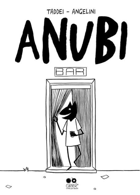
La copertina di “Anubi” di Taddei-Angelini
E siamo a domenica, che si apre con la live performance di Voi-Sapete-Chi. Alle 12 alla Chiesa di San Giovanni incontro con saldaPress: tra gli ospiti Ratigher, che presenta la ristampa di Trama, da recuperare assolutamente se non avete la prima edizione. Sinceramente non conosco l’opera dei fratelli israeliani Asaf e Tomer Hanuka, che da noi hanno pubblicato per Bao, ma se voi la ritenete interessante potete incontrarli alle 13 alla Chiesa dei Servi. Nota di colore, al Cinema Astra alle 13,30 viene proiettato un film che si chiamaMezzogiorno meno un quarto. E a questo punto, che fate, lo andate a vedere o imparate a disegnare i Pokemon? Io vi consiglierei di farvi un giro allo stand Coconino Press dove trovate tra gli ospiti Alessandro Tota, Manuele Fior, Paolo Bacilieri e Igort, mentre tra le novità c’è il debutto italiano di Noah Van Sciver conSaint Cole, uscito già da qualche settimana. Oppure potreste andare da Eris Edizioni e procurarvi la versione nostrana di Safari Honeymoon del canadese Jesse Jacobs, in assoluto una delle novità più attese di questa Lucca. E mentre alle 15 il solito coreano riprende a disegnare senza ritegno, voi potreste approfittarne per entrare nelle sale di Palazzo Ducale e vedere la mostra di Tuono Pettinato, di cui esce per GRRRz la ristampa di Corpicino. Io probabilmente a quell’ora, come per buona parte della manifestazione, sarò allo stand della Hollow Press, quindi se volete mi trovate lì in tutta la mia (scarsa) fisicità. E con questo è tutto, passo e chiudo.
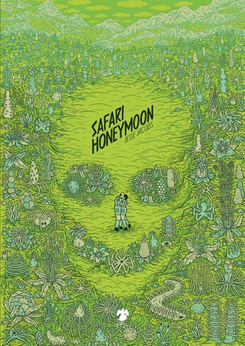
“Safari Honeymoon” di Jesse Jacobs
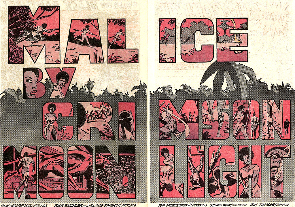
“Pantera Nera” di McGregor, Buckler, Graham
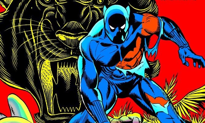
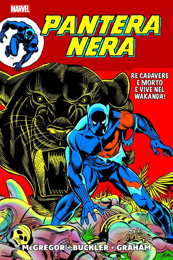
Dopo aver gettato le basi del suo universo negli anni ’60, la Marvel esplorò nel decennio successivo nuovi territori, affidando le proprie testate ad autori che facevano della creatività e dell’innovazione i loro punti di forza. E’ stato probabilmente Jim Steranko alla fine dei ’60 a mostrare cosa si potesse fare con un fumetto di “supereroi” o simili, raccontando le avventure della superspia Nick Fury sospesa in una realtà incredibilmente sexy, fatta di film di James Bond, pop-art e sfondi optical. Da quel momento l’universo Marvel non è stato più lo stesso e ha cominciato a descrivere foreste dai colori irreali, trip cosmici, santuari buddisti, fughe on the road, paperi fuori di testa. Serie come Jungle Action di McGregor, Captain Marvel e Warlock di Jim Starlin, Shang-Chi del duo Moench-Gulacy, Howard The Duck di Steve Gerber hanno fatto la storia dei comics e oggi sono fonte di ispirazione più per fumettisti di provenienza indie che per i nuovi scrittori di casa Marvel. Per questo ho deciso di occuparmi di tanto in tanto di questo materiale, ampliando il mio usuale raggio d’azione. La mia opinione è che in certi fumetti di 40 o più anni fa si trovino elementi molto più rivoluzionari di quelli che si vedono oggi in tanti prodotti apparentemente alternativi ma in realtà pieni di stereotipi e manierismi. Quindi non storcete il naso se leggete su un sito che si chiama “Just Indie Comics” recensioni di fumetti Marvel d’annata. Anche perché il pallone è mio e decido io.
Dopo questa doverosa premessa, veniamo dunque al volume Pantera Nera (352 pagg. a colori, 29.90 euro) uscito di recente per Panini Comics e che ristampa le storie scritte da Don McGregor per la serie Jungle Action, dal numero 6 (settembre 1973) fino al 24 (novembre 1976), con disegni prima di Rich Buckler e poi di Billy Graham, con una breve parentesi a firma Gil Kane. Piatto forte del volume è la maxi-saga Panther’s Rage (La rabbia della pantera), 13 episodi in cui McGregor rompe più di un tabù dei fumetti Marvel dell’epoca. Come racconta Sean Howe in Marvel Comics – The Untold Story (in Italia sempre per Panini con il titolo Marvel Comics – Una storia di eroi e supereroi), in quel periodo parecchi scrittori erano anche correttori di bozze. Lo stesso McGregor era entrato alla Marvel come redattore e poteva avvalersi di un tacito accordo con altri colleghi: tu non tocchi le mie storie, io non tocco le tue. In più Jungle Action era un titolo poco considerato, che prima dell’avvento di McGregor ristampava brevi storie degli anni ’50 ambientate nella giungla e anche piuttosto razziste. Ecco dunque che prendendone le redini, il nuovo scrittore poteva farne più o meno ciò che voleva. E ciò significava ambientare tutta l’azione nello stato africano ma tecnologicamente avanzato del Wakanda, scrivere interminabili didascalie in cui non mancavano contenuti politici, avvalersi di un cast di soli neri (ad eccezione di Venomm, uno dei nemici con cui se la deve vedere il protagonista), creare una velata gay story interraziale, raccontare la crisi del suo matrimonio attraverso i problemi familiari di W’Kabi – uno dei consiglieri del re – e la moglie Chandra.
La serie si presenta rivoluzionaria sin dall’incipit, in cui il re/eroe è messo duramente in discussione dai suoi sudditi, che lo accusano di averli abbandonati per trasferirsi a New York e unirsi ai Vendicatori. Anche la donna che T’Challa porta con sé come sua compagna, la cantante Monica Lynne, è osteggiata dagli abitanti del Wakanda come esponente di una cultura diversa e nemica. Le matite dinamiche di Rich Buckler, impreziosite dal sempre efficace lavoro di Klaus Janson alle chine, portano subito Pantera Nera al centro dell’azione, impegnato a combattere Killmonger, l’arcinemico che costituirà la nemesi del protagonista per tutti e tredici gli episodi della saga. Ma prima dello scontro definitivo con lo stesso Killmonger, T’Challa dovrà vedersela con i suoi tirapiedi, oltre che con una natura selvaggia e ribelle che gli causerà più di un problema. E per fare questo, non potrà contare sull’aiuto di altri eroi, ma soltanto su quello dei suoi sudditi e compagni, neri e africani come lui.
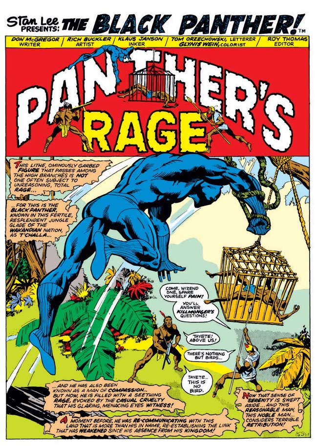
Nonostante le pressioni di alcuni influenti membri del Marvel Bullpen, McGregor si rifiutò infatti di coinvolgere altri personaggi dell’universo Marvel. “In sostanza – scrive l’autore nella lunga postfazione al volume – volendo ambientare le storie nel Wakanda, tutti i personaggi principali avrebbero dovuto essere wakandiani. E questo significava che tutti i personaggi, tranne uno, sarebbero stati neri. Fu una decisione sofferta, durante la stesura di La rabbia della pantera. Un cast interamente nero in un fumetto di un’importante società, proprio in quel periodo? Impossibile. Credetemi: nessuno, nelle sacre sale della redazione, approvava quell’approccio. Anzi, non ricordo nemmeno una parola di incoraggiamento da parte della redazione durante tutto il ciclo. (…) Numero dopo numero, la redazione voleva sapere dove fossero i bianchi in quelle storie. Mi chiedevano sempre: “Dove sono i bianchi?”. E la mia risposta era: “Questa è una nazione africana segreta e tecnologicamente avanzata. Cosa c’entrano i bianchi?”. Volevano dei Vendicatori. Volevano che i bianchi aiutassero i neri. Di sicuro pensavano che, con degli ospiti d’onore bianchi, le vendite sarebbero schizzate in alto. Non so se fosse vero o meno. Forse sì. Forse no. Ma il punto è che stavamo facendo qualcosa senza precedenti nei fumetti e quelle testate tiravano avanti anziché chiudere come era stato previsto. E forse, soltanto forse, a qualcuno, da qualche parte, stavamo dando qualcosa in più. Avevo la sensazione che quello che facevamo fosse importante. Era una mia decisione. Non volevo che l’eroe nero dovesse affidarsi agli eroi bianchi per salvarsi. Restai saldo sulla mia posizione allora, e lo resto tuttora”.
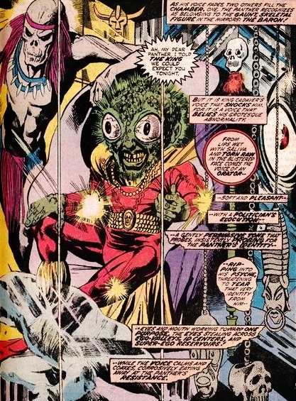
Al di là dell’assenza di altri eroi Marvel e del cast “all black”, la struttura di queste storie risulta fortemente innovativa. Più che ricalcare le impostazioni dei fumetti dell’epoca, McGregor inscena un viaggio catartico della Pantera Nera nel Wakanda e dentro se stesso, che ricorda non tanto i fumetti di supereroi quanto le più classiche saghe fantasy. Al tempo stesso, con il susseguirsi di pittoreschi nemici con cui il protagonista deve confrontarsi prima di arrivare alla resa dei conti finale con Killmonger, McGregor anticipa i meccanismi dei giochi di ruolo e dei videogame, linguaggi incorporati vent’anni più tardi dal fumetto statunitense grazie alla scuola underground di Fort Thunder. Episodio dopo episodio T’Challa si trova di fronte il viscido Venomm, la sensuale Malice, lo scheletrico Barone Macabro, il mostruoso Re Cadavere (“E’ una vista spaventosa, un ammasso di carne rigonfio, un volto osceno, con ghiandole simili a sacche!”), il minaccioso Lord Karnaj, l’ultraterreno Sombre, il deforme Salamander K’Ruel, oltre a una vasta schiera di lupi, gorilla bianchi, coccodrilli, dinosauri, pterodattili. Superate queste prove potrà finalmente regolare i conti con Killmonger, colui che vuole spodestarlo dal trono per instaurare un regime del terrore su tutto il Wakanda. Ci si aspetterebbe una gloriosa vittoria del protagonista, una distruzione totale del nemico, ma nelle ultime pagine della saga la Pantera è messo a dura prova e sembra sul punto di soccombere. Sarà un bambino, il piccolo Kantu, a salvarlo dalla morte e a sancire la fine di Killmonger, determinando in questo modo il trionfo di tutta una nazione e non dell’unico “superuomo”. La rabbia della pantera è la storia di un uomo alla ricerca di se stesso e delle prove che deve superare per ritrovare la sua identità pubblica e privata, ma senza tutto il cast di comprimari, senza i suoi sudditi, Re T’Challa non sarebbe niente.
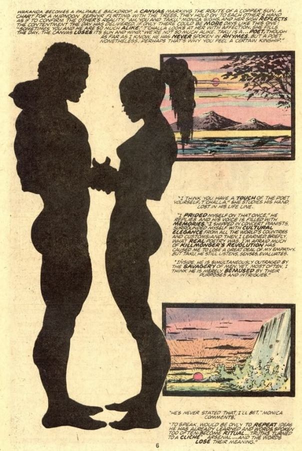
La prosa di McGregor è densa di raffinati aggettivi, dettagliate descrizioni, momenti poetici. Prendiamo ad esempio And All Our Past Decades Have Seen Revolutions! (Tutti i decenni del passato hanno conosciuto rivoluzioni!), disegnato da Billy Graham. Le prime cinque pagine sono tutte dedicate all’idillio tra T’Challa e Monica. L’eroe è tornato a pezzi da un viaggio al centro del Wakanda, in cui ha dovuto affrontare nemici e prove di ogni tipo. Ora si può concedere un momento di relax insieme all’amata Monica. Lei è in un costume color giallo, lui nella divisa nera d’ordinanza. Nella prima pagina il titolo scolpito sui monti del Wakanda va a cadere in acqua, mentre i due cavalcano tartarughe marine. In alto un sole rosso infuocato, in basso il mare blu e poi verde smeraldo. “Certi amanti abbisognano di rivoluzioni! Certi amanti forgiano il proprio impegno reciproco con lo stesso fervore compulsivo che mettono nel raggiungimento dei propri obiettivi. I cori e gli slogan sono le loro canzoni d’amore. La Pantera Nera e Monica Lynne sentono l’acqua calda chiudersi sopra le loro teste, mentre le maestose tartarughe scendono in profondità, ignare della presenza di quei bizzarri cavalieri. La corrente vortica in allettanti tesori turchesi dalle striature scarlatte. E’ una scena da cartolina, di idilliaca purezza, combinata alla realizzazione di fantasie romantiche”. A pag. 2 Graham realizza una tavola unica che raffigura i due protagonisti tornare in superficie trainati dalle tartarughe marine, mentre bolle d’acqua mostrano i particolari dei loro corpi e dei loro volti. Usciti dall’acqua, a pag. 3, T’Challa e Monica iniziano a parlare, seduti su uno scoglio, mentre si asciugano al sole. E’ il prologo del bacio che occupa le pagg. 4 e 5, su uno sfondo bianco in cui sono mostrate prima le silhouette dei due, poi in alternanza i particolari dei loro volti e una natura sconosciuta all’uomo occidentale. “Il Wakanda diventa uno sfondo palpabile – scrive McGregor – una tela che segna il percorso di un sole color rame, una mappa per uno zaffiro di mezzogiorno che flirta con gli alberi. Si tengono per mano, come a confermare l’esistenza concreta dell’altro”. Seguono pulsioni sessuali neanche troppo nascoste, corpi umidi, desiderio.
Graficamente la coppia Buckler-Janson unisce a una grande resa delle scene d’azione e delle anatomie dei personaggi soluzioni grafiche di grande impatto, come il titolo a doppia pagina dell’episodio Malice by Crimson Moonlight (Crudeltà sotto una luna cremisi), ispirato chiaramente alle trovate di Steranko su Nick Fury (e ovviamente anche ai titoli dello Spirit di Will Eisner). Ma anche Billy Graham è autore di pagine mai banali, dal tratteggio più sporco ma spesso costruite su layout fantasiosi e di grande impatto visivo, che raggiungono il culmine in Of Shadows and Rages (Ombre e furie). Sui colori il lavoro di Glynis Wein è eccezionale, perché riesce sia a rappresentare le meraviglie selvagge del Wakanda che a creare delle atmosfere irreali, spesso con l’uso di toni sul rosso/rosa/cremisi che costituiscono il contraltare del verde di alberi e foreste. Un plauso anche alla Marvel che ristampando queste storie in volume non ha manipolato i colori con effetti che ne avrebbero fatto perdere il fascino retrò.
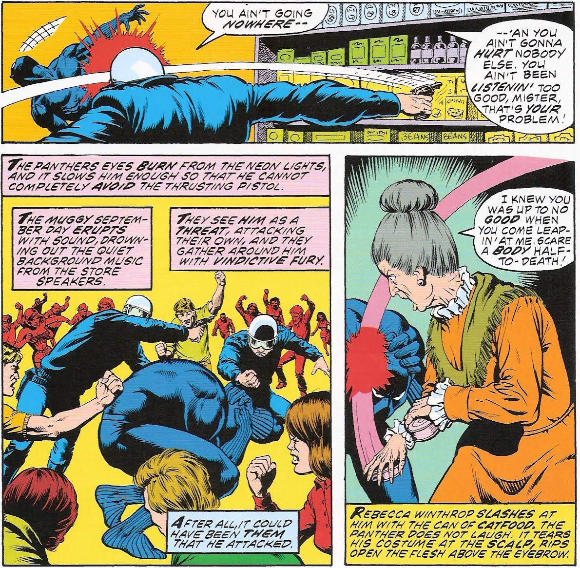
Non ho ancora parlato della seconda storyline inclusa nel volume, in cui la Pantera se la deve vedere direttamente con il Ku Klux Klan, finendo addirittura crocifisso. Ambientata in Virginia, La Pantera contro il Klan vede T’Challa tornare negli Stati Uniti per indagare sulla morte della sorella di Monica, il cui apparente suicidio nasconde in realtà un legame con lo stesso Klan e con un’altra misteriosa setta di incappucciati, il Cerchio del Drago. Gli scenari naturali del Wakanda lasciano spazio a un’ambientazione urbana ma comunque lontana dalla Manhattan degli altri supereroi Marvel. Ora Pantera Nera non deve più affrontare esseri mutanti e deformi da cartoon ma le vere minacce dell’America del tempo. Come sottolinea Grant Morrison nel suo per molti versi discutibile Supergods, il realismo di questa nuova saga raggiunge il suo culmine nella scena del supermarket di Jungle Action 20 (intitolato They Told Me a Myth I Wanted to Believe), nella quale Pantera Nera viene ferito alla testa con una scatoletta di cibo per gatti da una vecchietta bianca. “Era una sequenza impressionante – scrive Morrison – dopo anni trascorsi ad assistere a scontri tra pianeti, il realistico e terribile taglio di cinque centimetri sul cranio di Pantera aveva un impatto così viscerale che i fragorosi e fin troppo familiari pugni spaccamontagne di Kirby non potevano più reggere il confronto”.
McGregor non ebbe però la possibilità di andare oltre il quinto episodio di La Pantera contro il Klan, lasciando la storia incompiuta. Jungle Action fu infatti cancellato per lasciare spazio a una nuova testata di Pantera Nera realizzata da Jack Kirby e in cui veniva spazzato via tutto il lavoro di McGregor sul personaggio. Poco incline a scendere a compromessi e tormentato dai tanti problemi personali (in primis la crisi del suo matrimonio), lo scrittore non ebbe la possibilità di opporsi a questa decisione, motivata sia dalle scarse vendite che dalle pieghe che stavano prendendo le storie: alla Marvel non vedevano di buon occhio l’introduzione del Ku Klux Klan in un loro fumetto, che andava a toccare temi considerati delicati e inopportuni. A poco servirono i disperati appelli alla libertà di espressione del giornalista Kevin Trublood, personaggio introdotto proprio in queste pagine come alter ego dello stesso McGregor: Jungle Action chiuse con il numero 24 del novembre 1976. Più di dieci anni dopo, McGregor tornò a lavorare sul personaggio per altre due saghe, Panther’s Quest e Panther’s Prey, in cui poté sviluppare con maggiore libertà alcune delle idee che era stato costretto a mettere da parte in precedenza. Ma questa, appunto, è un’altra storia.