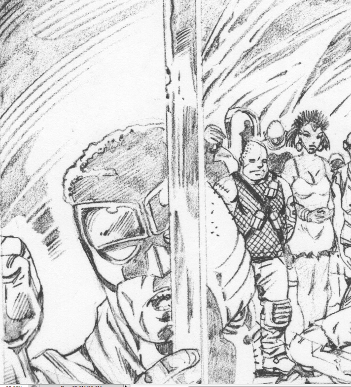
L’ultimo lavoro del grande Herb Trimpe
Herb Trimpe è stato uno dei disegnatori più importanti della Marvel degli anni ’70, famoso soprattutto per la sua lunga run su The Incredible Hulk. Trimpe ci ha lasciato lo scorso 13 aprile, mentre stava ultimando le matite di una storia per una nuova linea di fumetti chiamata All Time Comics, ideata dal newyorkese Josh Bayer, editor dell’antologia autoprodotta Suspect Device e autore di fumetti underground come Raw Power e Theth. Bayer è un grande fan dei fumetti Marvel di trenta o quaranta anni fa e ha ideato tra le altre cose numerosi bootleg di Rom, personaggio che in Italia ben conosciamo per la sua pubblicazione sulla storica antologia All American Comics edita dalla Comic Art. Le sue storie con protagonisti i cartoonist del Marvel Bullpen sono state spesso un’occasione per farci vedere l’uomo dietro l’artista, oltreché per denunciare il modus operandi della Marvel nei confronti di autori come Jack Kirby, Steve Ditko e Steve Gerber. Alcune scene dei suoi fumetti vedono Steve Ditko urlare “La Marvel e la Disney… sono il governo!” e una ragazza circondata da Deathlok, U.S. Agent, Howard The Duck e altri personaggi Marvel minori che dice “Facciamocene una ragione, qui siamo superflue come i disegnatori, gli inchiostratori e gli scrittori che hanno dato vita all’industria della Marvel Comics”.
Bayer di recente ha ricordato così Herb Trimpe sulla sua pagina Tumblr:
“L’anno scorso ho contattato Herb Trimpe e gli ho chiesto di disegnare una storia per una linea di fumetti che sto scrivendo ed editando. Eravamo in grado di offrirgli una tariffa decente e incredibilmente ha detto di sì, così che tra qualche mese pubblicherò quello che, a quanto ne so, è il suo ultimo fumetto. Il lavoro di Trimpe era dappertutto quando ero ragazzo, nei comic-book che uscivano e nelle ristampe, e i suoi personaggi fumettosi, spavaldi, monolitici, fluidi ma anche un po’ traballanti rappresentavano in pieno quella che era la mia idea di fumetto. […] Mentre mi arrivavano le mail con i suoi disegni l’anno scorso, ero rincuorato che a settant’anni stesse facendo uno dei suoi migliori lavori di sempre, pieno dei passaggi, delle luci e dello storytelling per cui era conosciuto. “Te lo devo dire, me la sto spassando… Era da parecchio tempo a questa parte che non facevo qualcosa di così divertente”, mi ha scritto, e io ne ero felicissimo. Ero contento per giorni ogni volta che lo sentivo. Continuavo a guardare il suo lavoro. Le linee erano sicure e potenti, il suo storytelling era ricco di quel tipo di inventiva che è il risultato delle migliaia e migliaia di pagine che aveva disegnato prima che entrassimo in contatto. Per me, avere l’approvazione sua o di altri professionisti come Rick Parker e Al Milgrom, ha significato avere tutto ciò che volevo dai fumetti, un cerchio senza fine tra passato e futuro. Soltanto in un’industria strana come questa qualcuno nella mia posizione, al livello più basso della piramide, può coinvolgere in un suo progetto artisti con anni e anni di esperienza e riconoscimenti alle spalle”.
Per il testo completo vi rimando alla versione inglese di questo post. Tutte le immagini sono tratte da Crime Destroyer Giant Size di Josh Bayer, Herb Trimpe e Benjamin Marra, in uscita a ottobre 2015.
Una serata con Charles Burns

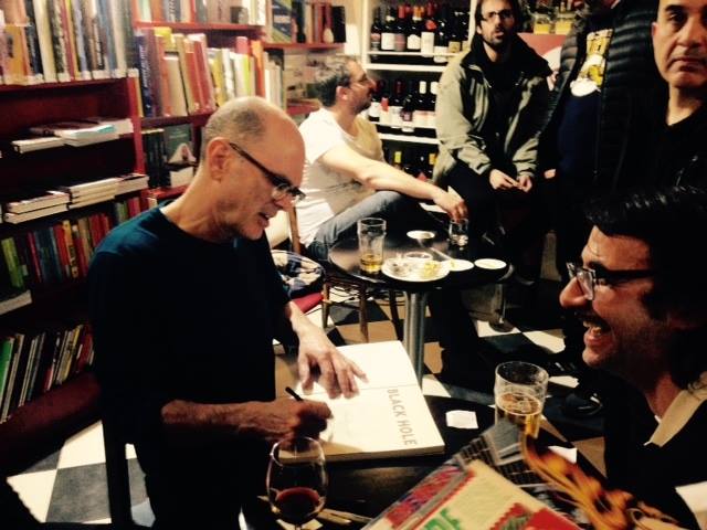
Giovedì 19 marzo la Libreria Giufà di Roma ha ospitato un incontro con Charles Burns, cartoonist statunitense che non ha bisogno di presentazioni. Burns, che i più conosceranno per la serie Black Hole, è arrivato a Roma per accompagnare la moglie Susan Moore, artista e insegnante di pittura, proprio come successe negli anni Ottanta, quando la coppia passò un paio di anni in Italia e Burns si unì al gruppo Valvoline. Più che un amarcord, la serata è stata l’occasione per far conoscere l’artista al pubblico romano, approfondendo il suo processo creativo e i temi dei suoi fumetti. A condurre la chiacchierata lo scrittore Francesco Pacifico, che fungeva anche da traduttore, mentre a occuparsi delle domande e delle digressioni sull’arte di Burns erano il critico di fumetti ed editor di Castelvecchi Alessio Trabacchini e il ben noto fumettista italiano Ratigher. Alla fine dell’incontro Burns si è trattenuto per ore a parlare con i lettori firmando dediche e soprattutto disegnando sketch, mostrando una disponibilità e una cordialità esemplari.
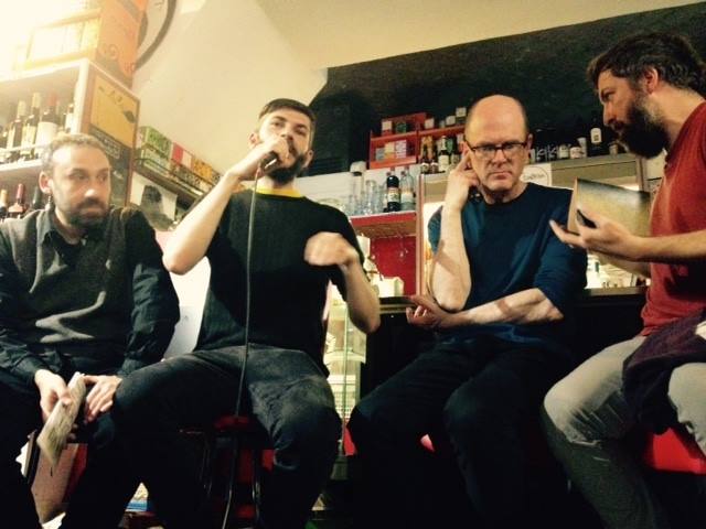
Da sinistra a destra: Trabacchini, Ratigher, Burns e Pacifico
Alessio Trabacchini: Charles Burns è importante perché è un autore che sa raccontare la complessità. Ha trovato una forma narrativa e un segno per raccontare le ambivalenze, dei sentimenti, delle cose, del mondo. Vorrei chiedergli come è riuscito a raccontare un aspetto che nei fumetti è molto difficile da rendere, che è quello relativo al sesso, alla sessualità, alla bellezza e al desiderio. Penso che qui quasi tutti conosciamo le opere di Burns e lo associamo a qualcosa di molto estremo, o all’abiezione o a qualcosa di perverso: è vero a metà, perché in realtà Burns ha saputo raccontare benissimo la parte migliore dei sentimenti. Nelle opere di Burns e in particolare in Black Hole ci sono alcune delle rappresentazioni migliori del sesso che si possono trovare nei fumetti. E quindi vorrei domandargli qual è il suo approccio a questo aspetto della vita umana e alla sua rappresentazione.
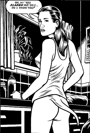
Charles Burns: Quando sono riuscito a sentirmi a mio agio nell’esprimere qualcosa di veramente personale, ho voluto farlo cercando di essere il più possibile libero e aperto. La sessualità è nella vita di tutti, ma io non volevo fare qualcosa di totalmente gratuito o pornografico. Volevo che il sesso fosse una parte naturale della storia. In Black Hole per esempio ci sono delle scene molto forti ma la storia nel complesso non è gratuita, non è fatta per provocare o titillare il lettore. Mi piace l’idea di mettere in una storia di tre-quattrocento pagine dieci pagine focalizzate su qualcosa di molto forte, ma non di più. Ci sono stati dei momenti, mentre scrivevo, in cui pensavo “non so se la gente vuole vedere questo”. Pensavo che la mia visione delle cose fosse troppo cupa ma volevo allo stesso tempo essere più onesto e aperto possibile. All’inizio non ne ero molto consapevole, ma nelle mie prime opere mi sono abbastanza censurato, avevo delle idee che erano molto forti e forse disturbanti ma mi trattenevo dall’esprimerle. Ho cercato in tutti i modi di superare quel blocco, di fare qualcosa di forte e onesto… Comunque non ho mai incontrato una donna con la coda…
Ratigher: La mia prima domanda è simile ma su un altro aspetto. Io considero Burns il fumettista che più ha saputo raccontare l’occulto, il bizzarro. Se nel cinema c’è Lynch, nel fumetto c’è Burns, sono loro i custodi del mistero, dell’incubo, di tutto un mondo onirico e oscuro. Io immagino che lui abbia iniziato perché era attratto probabilmente dalle storiacce, dalle situazioni malsane, però visto il livello che ha raggiunto gli voglio chiedere se c’è stata una sorta di evoluzione tipo quella dei giochi di ruolo, cioè se da occultista, da amante delle cose bizzarre e oscure, senta di avere il potere di uno stregone, di poter far paura alle persone, di poter fare dei libri che abbiano delle forze oscure dentro.
Burns: Per qualche ragione le mie storie si muovono verso l’oscurità, ma io non voglio spaventare intenzionalmente qualcuno. Sin da piccolo sono stato attratto da un lato oscuro dell’America, un lato nascosto della cultura americana. C’è una facciata in cui tutto sembra a posto, ma sotto a questa c’è a volte un lato oscuro e nascosto. Sono stato sempre interessato a questa facciata e a ciò che rappresenta. Ed ero interessato anche alla realtà, la realtà in cui sono cresciuto, la realtà che sentivo mia e che non aveva niente a che fare con lo status quo e con la visione normale di una famiglia sicura e felice. Nessuna delle mie storie è molto felice.
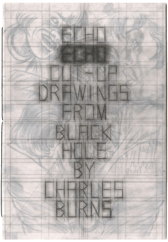
Trabacchini: Un’altra cosa che volevo chiedere riguardava la linea. Ovviamente questo c’entra con il modo di raccontare che dicevo prima, perché per un autore di fumetti la prima scelta di stile per decidere come vuole raccontare è decidere il tipo di segno che utilizzerà. Il segno di Burns che conosciamo è netto, molto netto, con contrasti molto forti di bianco e nero, lo è diventato sempre di più nel corso degli anni ma era già abbastanza definito sin dall’inizio. Nonostante ci siano le ombre, questa è in qualche maniera una sua versione della linea chiara francese, un richiamo che nell’ultima trilogia diventa esplicito, perché c’è un mondo onirico in questi tre libri che è una sorta di mash-up fra la Tangeri di William Burroughs e Il Cairo che Hergé racconta ne Il granchio d’oro come scenario delle avventure di Tin Tin. Stavo riguardando poi questa cosa qua (mostra Echo Echo, una raccolta degli schizzi preliminari di Black Hole, ndr), che è interessante perché si capisce qual è il modo di arrivare alla linea chiara, cioè a partire da disegni che sono comunque un groviglio di segni, di incroci di linee, dove tutto è molto forte, molto istintivo, e questi disegni diventano quel segno di Black Hole che è così controllato da rimanere coerente, omogeneo per un’opera che è durata dieci anni. In realtà guardando le matite di Tin Tin sono molto simili, sono piene di segni, di linee incrociate, per arrivare a qualcosa di chiaro e preciso. E quindi è così che penso che la linea riesce a trattenere tante inquietudini, tante tensioni. Mi piacerebbe che ci parlasse di come si arriva a quel segno.
Burns: Credo che lo stile del mio lavoro emuli lo stile americano degli anni Cinquanta e Sessanta. Sin dall’inizio mi sono ispirato a Harvey Kurtzman, a Mad Magazine e a quelle meravigliose linee molto scure che si vedevano all’epoca. D’altro canto mi piacevano le splendide linee chiare di Hergé, il che è piuttosto insolito per un americano della mia generazione. Comunque rispetto alla linea chiara francese, il mio stile è più per una linea scura e spessa ottenuta con l’uso del pennello. Mi è stato fatto notare che anche Hergé quando disegnava aveva una linea molto grezza, molto aperta, che poi veniva distillata e distillata fino a diventare questa linea più specifica. Il libro che hai mostrato è una collezione di disegni preliminari, alcuni sono più puliti, altri più grezzi, molto gestuali. Partono da un’idea molto legata al gesto di disegnare e poi si raffinano via via che lavoro.
 Ratigher: Anche io rimango su una domanda tecnica, ma che poi tecnica non sarà. Da fumettista in erba la cosa del lavoro di Burns che mi ha cambiato il modo di vedere i fumetti è stato il fatto che il suo disegno molto tecnico, che piace tanto e lo fa amare da un gran numero di persone, sia sempre un disegno in ogni vignetta narrativo. Anche nelle illustrazioni, quando disegna il volto di una persona, tu ti immagini la vita di quella persona, non è mai un disegno fermo e non è mai un disegno fatto per dare sfoggio della sua tecnica. Ogni pagina è molto studiata, con i bianchi e i neri perfetti, però ogni vignetta racconta sempre un pezzo di storia, non c’è un piacere fine a se stesso nel disegno. Quindi volevo chiedere se questa cosa è vera, se lo rispecchia e come ci ha lavorato.
Burns: Per me il fumetto è tutto incentrato sulla storia. So che la gente guarda il mio lavoro e dice “guarda questa linea”, “guarda quanto è bravo a disegnare”, ma dal mio punto di vista la storia è sempre l’elemento più importante. Raccontare la storia è un processo di distillazione continua, si inizia da una bozza e poi le idee e il lavoro vengono pian piano rifiniti. Ci sono momenti in cui voglio disegnare una bella immagine, ma se non è parte della storia non ci entra.
Ratigher: Ma è una cosa innata? Perché vista da fuori, ogni vignetta è disegnata in maniera eccelsa, però continua a essere narrativa, anche nelle sue storie vecchie. Voglio sapere se lui ci ha ragionato, perché l’alchimia è quasi solo sua, qui ci sono un sacco di lettori di fumetti e chiedo anche a loro se ci sono disegnatori così tecnici e al tempo stesso narrativi, a me viene in mente tra i grandi americani soltanto Robert Crumb, che ha un controllo del disegno sempre bello, sempre ricco ma sempre devoto alla storia. Quindi voglio sapere se per lui è stato uno sforzo oppure se ha culo e gli è venuto da quando è nato.
Burns: Io sono nato con… niente (in italiano, ndr). Credo che si siano dei cartoonist che partono da un aspetto visuale e altri che partono dall’aspetto letterario. Io ho cominciato dall’aspetto visuale e poi ho dovuto insegnare a me stesso il linguaggio dei fumetti per poter raccontare una storia. Quest’anno compirò sessant’anni e non ho ancora ben capito come si fa, ma comunque ci provo. Quando le parole e le immagini si combinano perfettamente, le immagini diventano invisibili. Il lettore si trova nel mondo della storia e non pensa più alla tecnica con cui è stata realizzata, non pensa “oh, che splendido disegno”… E’ immerso. E’ la stessa cosa che succede con i bei film o con i bei romanzi, con qualsiasi cosa. La tecnica diventa invisibile.
Pacifico: A questo punto ti chiedo se puoi darci degli esempi di film e romanzi in cui la tecnica è diventata invisibile. A me per esempio viene in mente l’ultimo film di Paul Thomas Anderson, Inherent Vice, in cui sembra che lui abbia cercato di proposito di cancellare tutta l’idea di un regista che fa le grandi scene per farci sentire solo la storia.
Burns: Per me è sempre impossibile indicare con precisione le cose che mi hanno influenzato. Potrei citare dei fumetti in particolare di cui mi piacciono la tecnica, la linea, l’aspetto, ma in realtà sono stato influenzato un po’ da tutto. Io cerco di fare del mio meglio per raccontare la mia storia, non la storia di Ernest Hemingway o di Nabokov o di Murakami.
Ratigher: Quello che volevo sapere io, riallacciandomi alla domanda di prima, è sapere se Burns a volte si siede e fa un disegno che non sia un fumetto, che non sia narrativo. Se gli capita mai che magari gli piace un fiore e decide di disegnarlo.
Burns: Mi piacerebbe farlo, ma no. Sfortunatamente il mio è un processo lentissimo. Per esempio, il mio amico Chris Ware mi ha raccontato che lui ha questo grande foglio di carta bianca, si mette seduto e inizia a disegnare. Questo per me è impossibile, io ho appunti su appunti e foglietti con piccoli disegni, schizzi, bozze. Il mio processo non è assolutamente naturale, è lento ed elaborato. Penso che la mia vita sarebbe molto più semplice se avessi un approccio più diretto ma non è possibile.
Valerio Bindi (fumettista italiano e curatore del Crack! Festival): Stavo già accennando prima a Burns quello che penso del suo lavoro, cioè che lui è profondo nella struttura della storia, che ha sempre molti livelli – il richiamo agli anni Cinquanta e Sessanta, l’adolescenza, il bosco, le metafore, i luoghi oscuri – e poi è invece quasi superficiale nel disegno e questa superficialità dà a questo mondo uno sguardo molto ampio. C’era questa riflessione che faceva Deleuze su Lewis Carroll, in cui diceva che Lewis Carroll è ampio e non è profondo. Burns usa tutte e due le armi e in questo modo ha un segno molto affascinante. Per la mia generazione lui non è il disegnatore dell’inquieto e dell’oscuro ma il disegnatore che ha portato le tematiche anni Cinquanta verso il mondo dell’underground. Io e il mio gruppo di disegnatori che negli anni Novanta cominciavano a fare fumetti, come il Professor Bad Trip, trovavamo in lui una rilettura dei racconti dell’underground in una chiave fredda, sintetica e chiara che era proprio il nostro sentire degli anni Ottanta e Novanta. Adesso però mi sembra che l’underground si sia spostato, mi sembra che il movimento dell’underground nel fumetto in questo momento parli europeo, mi sembra che l’America sia in qualche modo seguendo le nostre cose. Volevo sapere che cosa ne pensa lui, se vede un underground oggi e se sì dove lo vede.
Burns: L’undergound per me significava avere tredici-quattordici anni e scoprire Robert Crumb e i fumetti che guardavano oltre il mondo commerciale, in cui gli autori cercavano di esprimere se stessi. All’inizio i fumetti underground dovevano essere per forza trasgressivi, perché essere underground voleva dire occuparsi di sesso, droga, politica. Adesso è diverso, perché ormai è dato per scontato che chiunque può scrivere qualcosa di veramente personale senza doversi preoccupare di appartenere a un genere predefinito… Non so se il mondo dei fumetti underground è mai esistito realmente. L’underground sembra un qualcosa di difficilmente accessibile, ma da ragazzino mi bastava semplicemente salire su un autobus e andare in un negozio per comprare Zap, i fumetti di Crumb o qualsiasi fumetto hippy e più tardi punk. Mi piace l’idea che qualche ventenne non sappia chi è Robert Crumb o chi sono io e che guardi a qualcosa di nuovo, muovendosi in altre direzioni. Non c’è nessun bisogno di conoscere i classici. Non sono interessato ai giovani artisti che citano continuamente le loro influenze. E’ un piacere quando le cose vanno avanti, progrediscono. Anni fa ricordo che il mio caro amico Art Spiegelman mi disse che noi dovevamo superare Will Eisner, guardare oltre. L’underground è un ragazzo di diciassette, diciotto, diciannove o anche vent’anni che non ha mai sentito parlare di me.
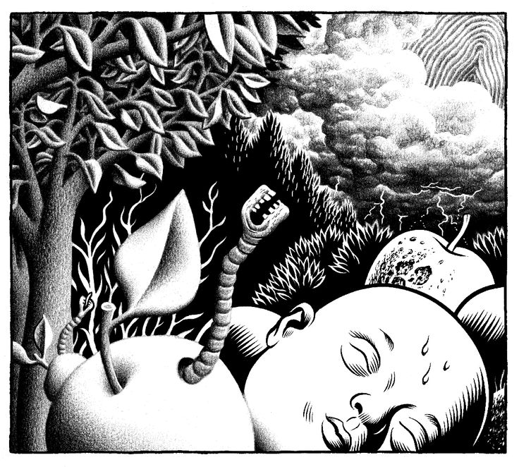
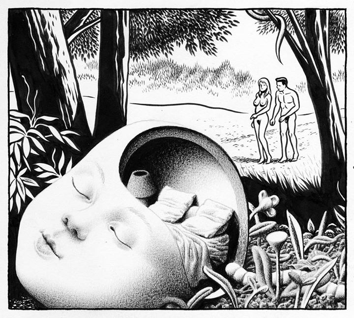
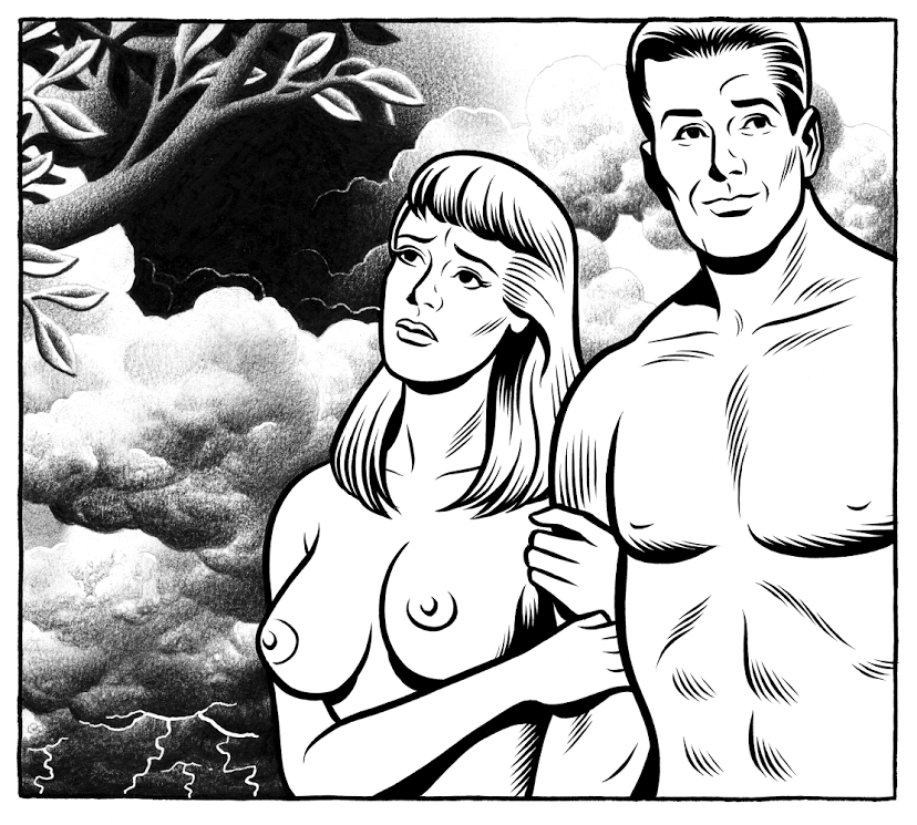
“In the Garden of Evil”: un’anteprima
Nell’ottavo numero di Mon Lapin, rivista pubblicata dai francesi de L’Association, Patrice Killoffer chiamava a raccolta fumettisti come Philippe Druillet, Ludovic Debeurme e Lorenzo Mattotti, dando vita a collaborazioni a quattro, sei o anche otto mani poi protagoniste di una mostra presso la Galerie Anne Barrault di Parigi. Tema principale dei lavori di Mon Lapin era il bosco e tra gli artisti coinvolti non poteva dunque mancare Charles Burns, che con Killoffer realizzava una serie di disegni ispirati al tema del Giardino dell’Eden e intitolati In the Garden of Evil. Adesso la Pigeon Press di Alvin Buenaventura raccoglie questa collaborazione tra due maestri del fumetto contemporaneo in un art-book rilegato a mano di 28 pagine in formato quadrato (7.25 x 7.25 pollici, ossia 18.42 centimetri per lato). Stampato in 1000 esemplari numerati e firmati dai due autori, il volume conterrà anche un 7″ flexi-disc con una canzone inedita di Will Oldham, cantautore statunitense conosciuto sotto una vasta schiera di pseudonimi (Palace Brothers e Bonnie Prince Billy i più noti). In the Garden of Evil debutterà al Toronto Comics Art Festival del 9 e 10 maggio prossimi, alla presenza dei due autori. Subito dopo verranno messe in vendita on line 200 copie, a un prezzo ancora da definire.
Per ora l’unica immagine ufficiale rilasciata dalla Pigeon Press è quella di apertura, ma suppongo che nel volume ci saranno tutti i disegni visti su Mon Lapin, come quelli che potete vedere nel reportage dalla mostra alla galleria Barrault di Le Blog de Shige e quelli in basso, trovati qua e là sul web.
Viaggio nel fumetto portoghese – š! #20
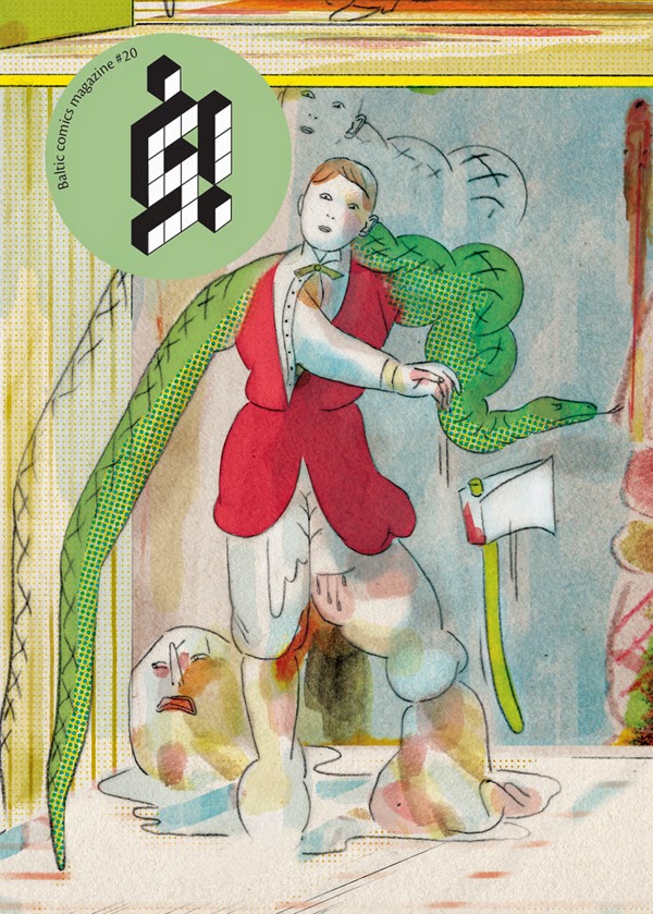
La cover di “š!” #20, a firma Daniel Lima
Dopo l’ottavo numero realizzato esclusivamente da cartoonist finlandesi, l’antologia lettone š! torna a dedicare un’intera uscita ad autori di una sola nazione, mettendo insieme con l’aiuto del guest editor Marcos Farrajota del collettivo Chili Come Carne una serie di fumetti realizzati da autori portoghesi e incentrati sul tema dell’inquietudine, ispirato dal Livro do Desassossego di Fernando Pessoa. L’aderenza al tema e il suo sviluppo sono mutevoli ed eterogenee, ma questa non è certo una novità per š!, pubblicazione che numero dopo numero ci ricorda cosa si può fare con il fumetto, mostrando i tanti approcci possibili al medium e al suo linguaggio. Ci sono così artisti come Amanda Baeza, Filipe Abranches e Paulo Monteiro che lavorano su una griglia prefissata di vignette, altri come Rafael Gouveia e Daniel Lima che adattano rispettivamente i testi letterari di Bernardo Soares e Paul Ableman, mentre Cátia Serrão e João Fazenda giocano con spazio, forma, colori e Bruno Borges crea una storia partendo da una serie di scarabocchi.
João Fazenda
La vignetta non è la regola nelle pagine di š! e infatti troviamo fumetti costruiti con illustrazioni a tutta pagina o anche con fotografie, come nel caso dei contributi di Tiago Casanova e Joana Estrela. In particolare le sei pagine della venticinquenne Estrela sono una delle cose migliori dell’antologia, dato che combinano brillantemente immagini tratte da un film anni Cinquanta con un testo incentrato sull’inquietudine del giovane cartoonist dei nostri tempi, tra ritratto sociologico e parodia. La Estrela è tra gli autori più giovani della raccolta, mentre il titolo di veterano spetta a Tiago Manuel, autore di una serie di notevoli illustrazioni narrative che ricordano stilisticamente vecchi libri di medicina. Manuel è anche un personaggio tipicamente portoghese, in grado con i suoi oltre 25 progetti eteronimi di poter rivaleggiare con lo stesso Pessoa. L’ombra di Pessoa si avverte in parecchi di questi fumetti e soprattutto in quello di Francisco Sousa Lobo. L’autore della graphic novel The Dying Draughtsman delinea la figura di Fausto M. Fernandes, un misterioso pioniere del fumetto lusitano. Probabilmente è questo il miglior contributo del lotto, dato che centra perfettamente il tema dell’inquietudine ritraendo un protagonista problematico, è poetico senza essere retorico, suscita domande sull’autobiografia e la natura stessa dell’arte.
Francisco Sousa Lobo
Arrivati alla fine del volumetto abbiamo un’idea più chiara del panorama fumettistico portoghese, o forse non ne abbiamo idea… D’altronde come potrebbero due sorelle cilene che vivono a Lisbona (Amanda e Milena Baeza), una scienziato sociale precario con una linea accattivante (Daniel Lopes), un fotografo (Tiago Casanova) e una studiosa di linguistica (Cátia Serrão) creare uno stile condiviso? Ci sono un sacco di “lupi solitari” da queste parti – come Marcos Farrajota fa notare nel saggio introduttivo – e forse è questa la bellezza dei fumetti portoghesi e del fumetto indie in generale. Così, più che essere una visione d’insieme di una scena, questo numero di š! è la storia dinamica di un medium in una nazione. O è anche, se preferite, il racconto di una lotta, quella fatta dal fumetto per uscire fuori dalle stanze, dalle case e dagli studi degli autori per arrivare faticosamente ma gioiosamente tra le mani dei lettori.
Uno sguardo a š! #21
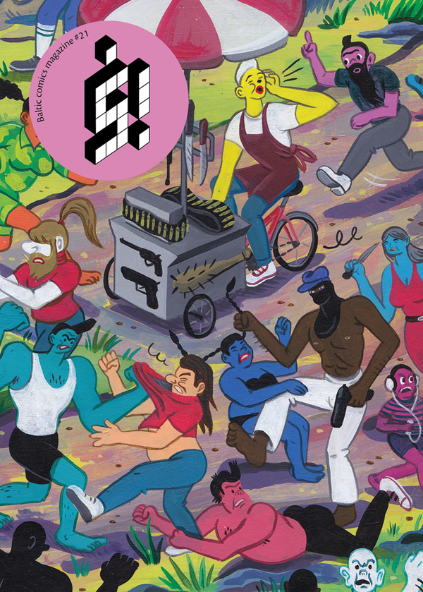
Dietro a una bella cover del belga Brecth Vandenbroucke – conosciuto ai più per il suo White Cube, uscito anche oltreoceano per Drawn and Quarterly – arriva il prossimo primo maggio il 21esimo numero dell’antologia baltica š!. E dato che l’uscita è fissata per la festa dei lavoratori, il tema del volumetto, nel solito formato di 164 pagine in A6, sarà il business. Tra gli artisti coinvolti l’argentino Berliac (già autore dello splendido mini kuš! #19 Inverso), il polacco Maciej Sieńczyk (visto in Italia con Avventure sull’isola deserta pubblicato da Canicola), il canadese Chris Kuzma, il finlandese Roope Eronen, lo spagnolo Sergi Puyol. E poi Ann Pajuväli (Estonia), Anna Haifisch (Germania), Anna Vaivare (Lettonia), Disa Wallander (Svezia), Harukichi (Giappone), Jeroen Funke (Olanda), König Lü.Q. (Svizzera), Lai Tat Tat Wing (Hong Kong), Laura Ķeniņš (Canada/Lettonia), Līva Kandevica (Lettonia), Lote Vilma Vītiņa (Lettonia), Olive Booger (Francia), Rūta Briede (Lettonia) e Zane Zlemeša (Lettonia).
Di seguito alcune immagini da š! #21, che potete già ordinare qui al prezzo di $14 dollari spese di spedizione incluse.
Berliac
Chris Kuzma
Anna Haifisch
Sergi Puyol
Anna Vaivare
Harukichi
Jeroen Funke
Lai Tat Tat Wing
Līva Kandevica
Olive Booger
Il meglio del Web – 23/4/2015
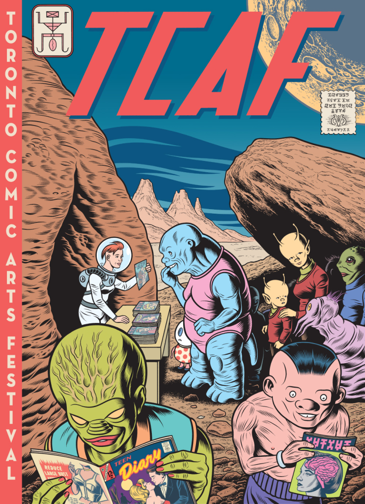
Inauguro con questo post un appuntamento dedicato alle segnalazioni dei contenuti più interessanti trovati in giro sul web. Iniziamo ancora una volta da Charles Burns, protagonista assoluto di questa prima serie di articoli. L’immagine che vedete in alto è il manifesto realizzato per la nuova edizione del Toronto Comic Arts Festival, in programma il 9 e 10 maggio, in cui Burns ci fa scoprire che anche gli alieni leggono i romance comics…
Sempre a proposito del cartoonist statunitense, vi segnalo l’articolo Charles Burns: Show, don’t tell dello scrittore Francesco Pacifico, pubblicato sul nuovo magazine on line Prismo.
Passando ad altro, proprio oggi Fumettologica ha pubblicato Fare editoria alternativa di fumetto, oggi: il caso Hollow Press, un’esaustiva intervista di Matteo Stefanelli al mio amico Michele Nitri, in cui si parla di Under Dark Weird Fantasy Grounds, Mat Brinkman, l’underground e… Paolo Bacilieri.
A proposito di festival, il 18 e 19 aprile a Portland nell’Oregon c’è stato il Linework. Gli organizzatori hanno pubblicato sul sito della manifestazione una lunga serie di brevi ma spesso interessanti interviste, tra cui vi segnalo quelle a John Pham, Malachi Ward e Marnie Galloway. Per un mini reportage e qualche foto date un’occhiata invece a quanto raccontato da Tyler Chin-Tanner su Broken Frontier.
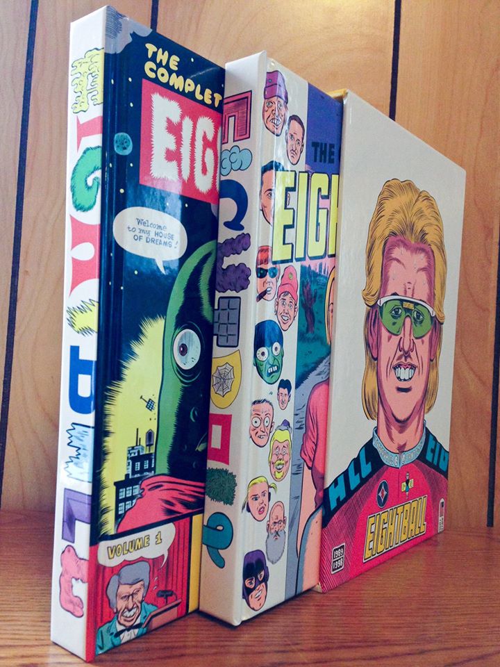
Sempre al Linework Fantagraphics ha presentato in anteprima la raccolta extra-lusso dei primi 18 numeri dell’Eightball di Daniel Clowes, ospite del festival. Sul Flickr della casa editrice potete dare un’occhiata più dettagliata a questo prezioso cofanetto. Per due recenti interviste a Clowes vi rimando invece ai siti di The Stranger e The New Yorker.
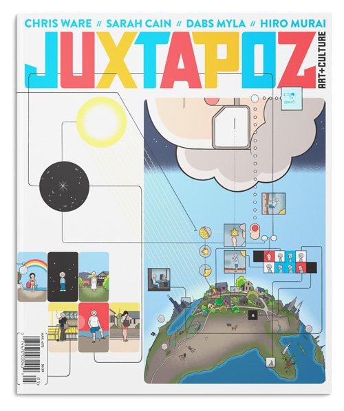
Il nuovo numero della rivista americana Juxtapoz sfoggia una copertina di Chris Ware, di cui si parla nella rubrica Beyond the Cover, con tanto di intervista all’autore di Jimmy Corrigan.
Intanto sono state annunciate le nomination agli Eisner Awards 2015, che non brillano certo per originalità.
Per concludere un paio di contenuti critici di qualità, entrambi a firma Rob Clough, rispettivamente su Ur di Eric Haven e Saint Cole di Noah Van Sciver.
Il nuovo fumetto di Daniel Clowes… e “The Complete Eightball”
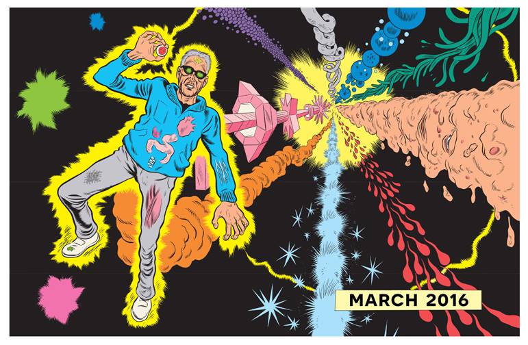
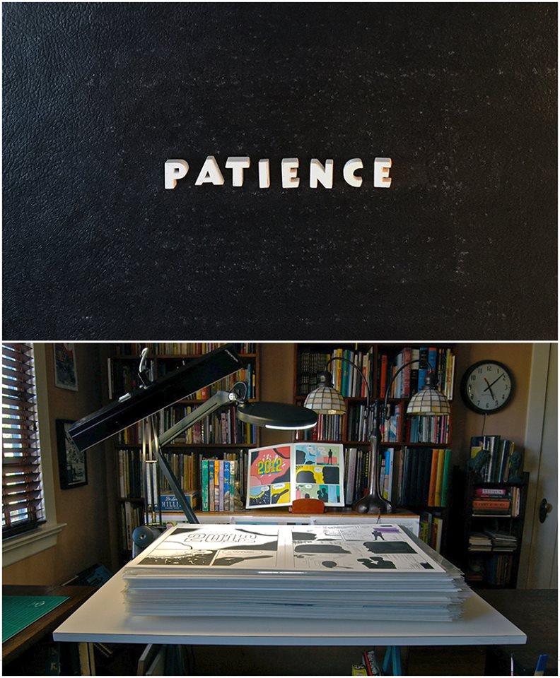
All’inizio di aprile la Fantagraphics ha annunciato la pubblicazione, prevista per marzo 2016, del nuovo fumetto di Daniel Clowes. Senza dare alcun dettaglio riguardo ai contenuti o al numero di pagine (sembrano numerose, a vedere la pila di originali sul tavolo…), la casa editrice di Seattle ha postato sul suo sito internet e sui vari social network l’immagine qui sopra, accompagnata dalla didascalia “Coming in March 2016. Five years in the making”. Unico altro messaggio, quel “Patience” lì in alto, probabilmente più un invito ai lettori che il titolo del nuovo volume. Da allora è stato possibile vedere in giro sul web una nuova immagine, quella in basso, che aumenta l’attesa per la nuova opera del cartoonist statunitense, autore di Like a Velvet Glove Cast in Iron, Ghost World, David Boring, Ice Haven e tanti altri fumetti che hanno fatto la storia recente di questo medium. Le forme visibili nella prima tavola, i colori psichedelici della seconda e le reminiscenze di Steve Ditko, da sempre un punto di riferimento per Clowes, potrebbero lasciarci pensare a una storia metanarrativa che parla di un artista outsider apparentemente visionario ma che si rivela un profeta quando la terra si trova a fronteggiare un’invasione aliena? Mah, forse no…
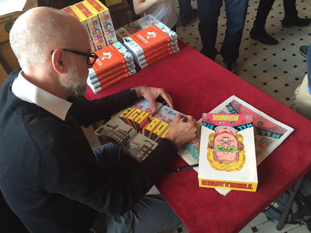
Intanto Clowes continua a girare gli Stati Uniti per presentare il suo The Complete Eightball. La foto in basso è tratta dalla session di autografi presso il Fantagraphics Bookstore and Gallery di Seattle. A seguire una delle immagini di presentazione del cofanetto e una copia autografata.
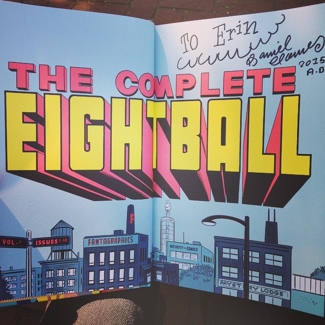
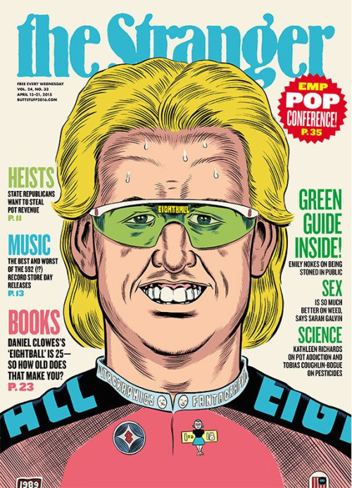
Mentre la raccolta dei primi 18 numeri di Eightball sta per essere distribuita nelle librerie, fioccano le interviste all’autore, come quelle già segnalate nel mio Il meglio del Web del 23/4, rilasciate a The New Yorker e The Stranger. Quest’ultimo è un settimanale gratuito di Seattle che ha anche dedicato la copertina a Clowes, adattando un suo vecchio disegno.
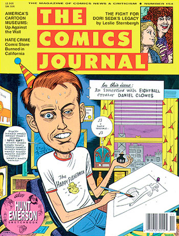
E per concludere vi segnalo la riproposta di questa intervista realizzata da Gary Groth e pubblicata nel novembre del 1992 sul Comics Journal dietro a un’ormai storica copertina gialla.
An evening with Charles Burns
On Thursday 19 March Giufà Bookshop in Rome hosted a panel with Charles Burns. Black Hole‘s creator came to Italy to accompany his wife, artist and painting teacher Susan Moore, just as he did in the Eighties, when the couple spent a few years in Italy and Burns joined the Valvoline group (he spoke about this experience in this interview with Darcy Sullivan). The evening was an opportunity to introduce the American cartoonist to Italian readers, deepening his creative process and the themes of his comics. Novelist and journalist Francesco Pacifico translated the conversation while comic critic Alessio Trabacchini and Italian cartoonist Ratigher asked the questions. At the end of the discussion, Burns signed and drew sketches for hours, showing an extraordinary willingness. I’ve translated and sometimes summarized the questions, whereas Burns’ answers are (more or less) his original words.
Left to right: Trabacchini, Ratigher, Burns and Pacifico
Alessio Trabacchini: Charles Burns knows how to tell complexity. He found a narrative form and a line to tell the ambivalences of feelings and of the entire world. I would like to ask how he managed to tell a particular aspect of human life, the one related to sex, sexuality, beauty and desire. In Black Hole there are some of the best representations of sex ever seen in comics. So I’d like to know his approach to this aspect of human life and to its representation.
Charles Burns: When I finally reached the point in my life where I felt comfortable about expressing something very personal, I wanted to be as free and open as I could. Sexuality is in everybody’s life but I didn’t want to do something that was purely gratuitous, purely pornographic. I wanted it was a natural part of the story. So, for example, in Black Hole there is a very strong scene but the entire story is not gratuitous, is not about provoking someone or making something that is titillating. I like the idea that in a three-four hundred pages story you would have ten pages focused on something that is very strong. There are moments when I was writing stories that I felt like “I don’t know if the world needs to see my vision”. It seemed too dark to me sometimes, but I wanted to be as honest and open as possible. I think in earlier works I wasn’t aware of it but I know that I was censoring myself, stopping myself from ideas that were very strong and maybe disturbing, but I tried hard to push that away, to make something strong and honest… And if I’ve to be honest I’ve never met a woman with a tail…
Ratigher: My first question is similar but on another aspect. I consider Burns the cartoonist who depicted the occult and the bizarre better than any other. He’s for the comics what is Lynch for the cinema, they are the keepers of mystery and nightmare. I’d like to know if he thinks to have reached a new level over the years, if he had an evolution like in the role-playing games, from an occultist – a fan of bizarre and dark things – to a wizard with the power of frightening people, making books with dark forces inside.
Burns: I find that my stories for whatever reason move toward the darkness, but I’m not intentionally trying to scare someone. Growing up I was attracted to a darker side of America, an underside of American culture. There is a facade that I grew up with where everything is ok, but underneath that sometimes there is a dark underside. I was always interested in that facade and what it represented. And I was interested in reality, the reality I grew up with, the reality that I felt and that had nothing to do with the status quo and with the normal vision of a happy and secure family. None of my stories is very happy.
Trabacchini: Another thing I’d like to ask is about the line. Your style is very sharp, with strong contrasts of black and white. Even if there are a lot of shadows, it seems a personal version of the French ligne claire, an explicit reference in your last trilogy, where you created a dreamlike world that is a sort of mash-up between William Burroughs’ Tangeri and the setting of Herge’s The Crab with the Golden Claws. Then I was looking at this one again (Echo Echo, a collection of preliminary drawings from Black Hole) and it’s interesting because it shows how you arrive at your ligne claire, with a series of lines, marks, sketches. And this strong and instinctive way of drawing becomes the restrained and well-defined style of Black Hole, so distinctive to remain coherent and uniform in ten years. The pencils of Tin Tin have this same peculiarity, they’re full of marks and crossed lines but then they come to something clear and precise. I’d like to know how Burns works to create his own line.
Burns: I think my work was emulating ’50s and ’60s American style I saw very early… Harvey Kurtzman, Mad Magazine…. There is this style with very thick, beautiful dark lines. On the other side of that, it was a very unusual situation for an American of my generation to see Hergé and his beautiful ligne claire, the colors, the characters… So, I was always very attracted to Hergé and the clear line, but my style definitely makes towards this very dark line with the brush. It’s been pointed out to me that when Hergé was drawing he had this very rough, open line. He started with drafts and then distilled, distilled, distilled down to a very specific line. The book you’re showing is a collection of preliminary drawings, some are very clear but some are more rough, very gestural… They start from a very gestural idea and then are refined and refined as I work.
Ratigher: I also have a question about the style. I think his drawings show a high technical ability and this is one of the reasons a lot of people like his work. But his illustrations are also narrative, he doesn’t draw to show off his craft, every panel tells a piece of the story. Even when he draws a face, the reader can imagine the life of that person. I’d like to know if this is true and how he worked on it.
Burns: For me comics are all about the story. I know that people look at my work and say “look at this line, look at the drawing ability” or something like that, but the story is always most important. Telling a story is a distillation, it starts with something very draft and refining, refining, refining. There are moments when I want to draw a beautiful picture but if that beautiful picture is not part of the story I can’t put it in the comic.
Ratigher: But I’d like to know if this was a natural and innate skill or he had to reason about it, because it’s rare to find artists that are so technical and also narrative. Perhaps only Robert Crumb has this kind of control on his drawings, always detailed, elaborate but also devoted to the story. I don’t know if Burns had to work on this aspect of his art or if he was born with this ability.
Burns: I was born with nothing… “niente”. I think there are cartoonists that start on a very visual side and cartoonists that have a very literary side. I started with the visuals and I needed to teach myself the language of comics to tell a story. I’m turning sixty this year and I still don’t understand it… But I’m trying. When words and images come together perfectly, the images become invisible. You’re IN THE WORLD, you’re not thinking to technique, you’re not thinking “oh, this is a beautiful line”… You’re immersed. It’s the same way with the good movies, with the good novels, with anything. The techinque becomes invisible.
Pacifico: At this point I’m asking if you can give us some examples of movies or novels where the technique became invisible. I’m thinking about the latest movie by Paul Thomas Anderson, Inherent Vice, where it seems he deliberately wanted to delete the idea of a director that shots big and structured scenes to make us feel only the plot.
Burns: It’s always impossible for me to point very directly to influences but I can talk about the technique, the lines, the look I liked in some specific comics. Actually I could be influenced by everything. In my case I’m trying to do my best to tell my story, it’s not Ernest Hemingway’s story or Nabokov’s story, or Murakami’s story.
Ratigher: But what I’d like to know, coming back to my latest question, is if Burns sometimes sits down and draws something that isn’t a comic, that isn’t narrative. If it happens sometimes he likes a flower and decides to draw it.
Burns: I would love to do that, but no. Unfortunately it is a slow, slow process. For example, my friend Chris Ware told me he has a large sheet of paper and he starts drawing. This is impossible for me. I have notes and notes and tiny drawings and everything. There is nothing natural about my process. It’s very slow. I think my life would be much more simple if I had this direct approach but it’s not possible.
Valerio Bindi (Italian cartoonist and coordinator of Crack! Festival): I remember Gilles Deleuze said about Lewis Carroll that he was wide but not deep. I think Burns is both wide and deep, because he accurately builds the structure of the story, that has many layers – adolescence, wood, metaphors, dark places – but at the same time his drawings are fascinating for everyone, and this makes his art wide. For my generation of cartoonists who started making comics in the ’80s, he is the artist who took the themes of ’50s and ’60s in the underground, creating a cold, clear and synthetic style. Now I think the underground has moved from Usa to Europe and that people from Usa are mostly following the European underground movement. I’m asking what he thinks about it, if he sees an underground today and if yes where he sees it.
Burns: For me, growing up, my sense of underground was being thirteen or fourteen years old and discovering Robert Crumb and comics that moved away from the commercial world, something vey self-expressive. I think early they were transgressive because they had to deal with sex, drugs, politics. I think now it’s established that you can write something very personal and it doesn’t have to fit in a genre… I don’t know if the world of underground comics ever existed. Underground seems very inaccessible but for me, growing up, I could take a bus and find a store and get every Zap comic, Robert Crumb’s comic, every hippy comic and later every punk comic. I like the idea that someone who is in his twenties has no idea who Robert Crumb is, has no idea who I am, looking at something new, moving in other directions. There is no need to know the classics. I’m not interested in a young artist who talks about his influences. It’s a pleasure when everything moves on… When I was younger I remember Art Spiegelman, my close friend, saying that we had to move past Will Eisner. The underground is someone seventeen, eighteen, ninetheen, twenty years old who has never heard of me.
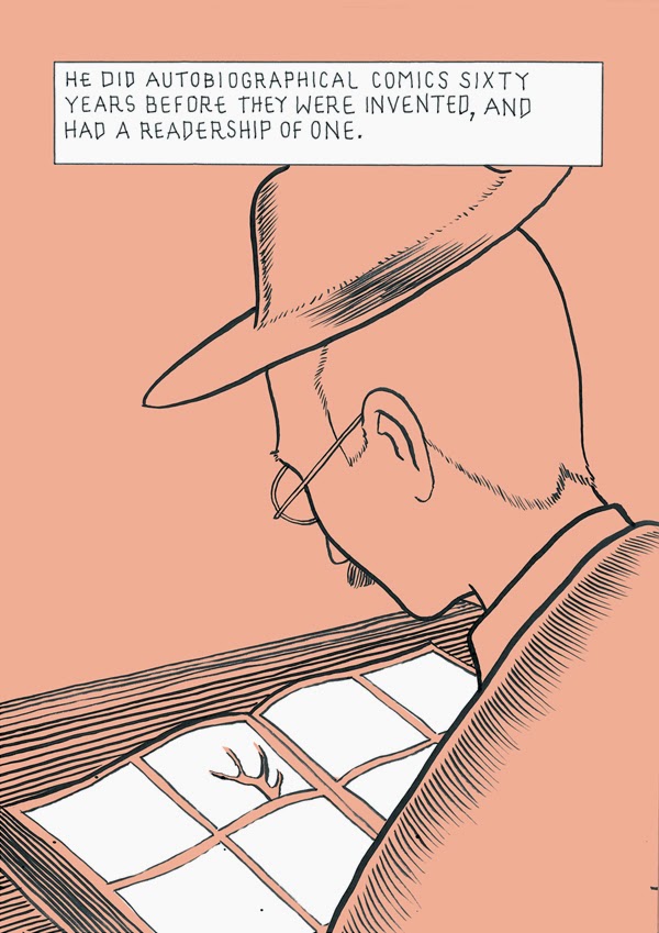
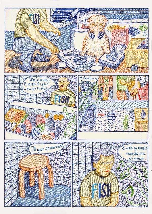
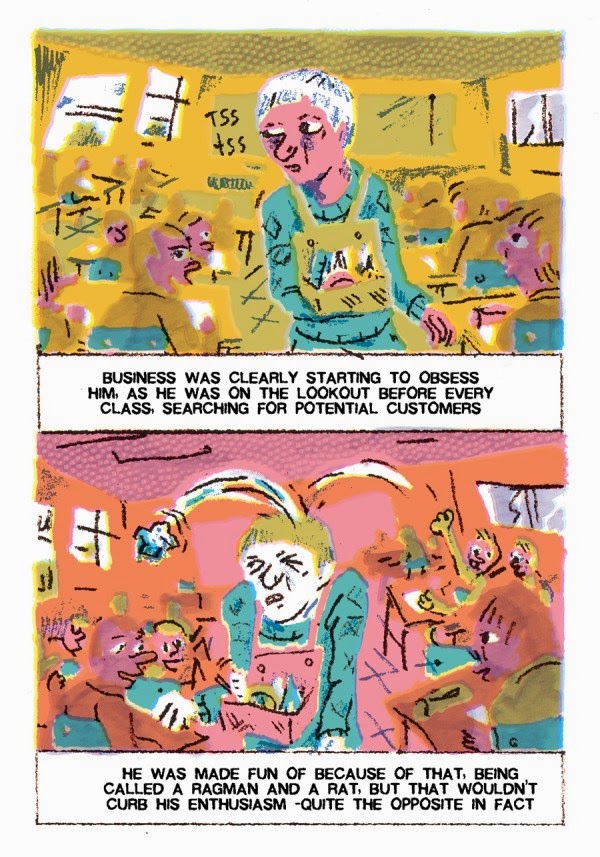
Herb Trimpe’s last great comic
Herb Trimpe was one of the most important artists at Marvel Comics in the ’70s, mostly known for his work on the series The Incredible Hulk. Trimpe died on April 13, 2015, after completing a story for All Time Comics, a new line of books created by New York-based cartoonist Josh Bayer, editor of Suspect Device and author of comics as Raw Power and Theth. Bayer is a huge fan of Marvel comics from thirty-forty years ago and he also created his own bootleg stories, starring Rom, Conan and the cartoonists of the Marvel Bullpen, often denouncing the way creators as Jack Kirby, Steve Ditko and Steve Gerber were treated by Marvel industry. Some scenes from his comics include Steve Ditko screaming “Marvel and Disney… are the government!” and a girl surrounded by Deathlok, U.S. Agent, Howard The Duck and other characters saying “Face it. Around here, we’re as disposable as the pencilers, inkers and writers who make up the Marvel Comics industry itself”.
This is how Bayer remembered Trimpe on his Tumblr. All the pictures are from Crime Destroyer Giant Size by Josh Bayer, Herb Trimpe and Benjamin Marra, due out by October 2015.
“Last year I contacted Herb Trimpe and asked him to draw a book for a line of comics I’m editing and writing. We were able to offer him a decent page rate and astonishingly he said yes and I’ll be publishing later this year what is (as far as I know) his last comic. Trimpe’s work was everywhere when I was growing up, in reprints and in current books on the stands, and his swaggering, cartoony, monolithic, half-rickety, half-fluid characters were ubiquitous with what I thought comics were. He maybe was one of the first people I saw who liked to make his characters WIDE, the chunkiness that is so fun for cartoonists to express (everyone from Frank King to Crumb to Gary Larson is part of this tradition) is intact in Trimpe’s pencils. The mouths were wide, the faces were wide, the fingers were wide. He was a Kirby protégé and was smart and humble enough to be proud of his ability to swim alongside his heroes without seeming to aspire to greater heights. It seemed to be fulfilling enough to be a steady artist, a provider for his family, a vet who served in Vietnam, and a deacon in his church.
Kirby was a leader, and Trimpe was like a soldier, but as much as he might have recognized himself as merely a professional, skilled at drawing everything from technical equipment to horses to architecture to sweeping urban panoramas, he wasn’t merely a dependable illustrator. He also drew with the inventiveness and enthusiasm of a kid. A freedom that many artists will never have. Looking at his work, you know his personality as much as you know R Crumb’s. It’s warm and familiar. The correspondence he creates between the reader and the work is more like Crumb or Basil Wolverton than many of his slicker, smoother peers. And like Crumb, his stuff might reflect the real world at times, but it’s never gonna let you forget it’s a cartoon.
As photocopies of his new pages began to arrive in my email last year, I was so heartened that in his seventh decade he was doing such peak work, full of the transitions, lighting and sequencing he was known for. “I have to tell you, I’m having a ball… it’s the most fun I’ve had doing non mainline work”, he wrote to me, and I was so glad. I would be happy for days every time I heard from him. I kept looking at the work. The lines were confident and powerful, his storytelling brimming with the sort of visual inventiveness that results from having completed thousands and thousands of pages of work before we connected.
To me, getting approval from him, and from other professionals like Rick Parker and Al Milgrom, has been everything I’d hope for in comics, a seamless circle between the past and future. Only in a lopsided industry like this one could someone in my position at the low end of the ladder attract a string of creators with decades of experience and accomplishment behind them.
Trimpe’s work helped to keep the American industry afloat, in a very visible way. He was one of the top six artists at Marvel and one of the most steady and visible. He slowly was eclipsed by younger artists, but his contributions were undeniable and should have set him up for life. Last year, a page of art appeared on the market by a collector who had been hoarding it for 35 years, the final page of Hulk 180, showing the first appearance of Wolverine, which was inscribed to the collector by Herb. Apparently it had been given to the collector by Herb himself in 1983. The art resold for over 600,000 dollars, breaking a record for original comic art sales set a few years prior by a Frank Miller Batman page. The collector had said he was going to give a large portion of the money to an organization for older artists and I’d been hoping he secretly was going to give the money to Herb Trimpe to counterbalance the way he never took part in the massive profits his life work generated for the industry. I don’t know what the result of the sale was but it would be so satisfying for Herb to know his work had brought about a long term security for his family that was the dream of almost everyone in his generation.
A lot of my own comics are about creators of the past. I’ve always been fascinated with how people face age and the changes life brings on in its third act, and the difference between the face of public figures and their interior life. I’ve done stories interpreting a fictional version of the Marvel Bullpen, showing my versions of Steve Ditko, Bill Mantlo, Bill Everett and Stan Lee, and mostly they are protest cartoons about the way creators are treated as disposable. The whole time we worked together I wondered if Herb ever saw the comic I did about him, “Trimpe Survives” (earlier published as “Trimpe Loses”), that I did in 2011, a year or two before I contacted him. I kind of doubt it, but you never know.
It detailed a metaphorical battle by Herb to stay alive in a barren wasteland, surrounded by flesh-eating Image Comics-style adversaries. The comic ends with Trimpe, determined to outlive the younger predators waiting on the horizon and drawing, (as he did in 1992), an issue of a Fantastic Four Unlimited in the style then made popular by his younger competitors. This instance of a creator of his stature attempting to stay current when work was disappearing is just wrong. I never forgot it.
When we began to collaborate, I was afraid he’d think I was making light of a painful period of his career, and that I was taking a shot at him. I never broached the subject. The vibes were running positively and I didn’t want to screw it up. But I’d always thought I would eventually get a chance to tell him how much admiration I have for him, how his career is a testament to the triumph of personality over slick modernization.
I never wanted to explain that I meant no disrespect portraying him as a man whose head was attached to Godzilla’s body, since that could have been seen as a jab at him, you know, the “old dinosaur” of comics. I was responding to the portrait of himself he’d etched in his article in the NY Times, in which he described a world that had left him, at age 56, seemingly condemned to obsolescence. It seemed traumatic but I thought he fought back with resourcefulness, self-reflection and bravery, and I always wanted to tell him. But I thought there’d be time later. Clearly Herb had many, many good years left in him.
Man, I’m so consumed with loss right now. I’ve been sad all week. I never met him, but I feel like I’ve lost a friend”.
Josh Bayer, April 18, 2015
“In the Garden of Evil”: a preview
For the eight issue of Mon Lapin, the magazine published in France by L’Association, Patrice Killoffer summoned cartoonists as Philippe Druillet, Ludovic Debeurme, Lorenzo Mattotti and many others, creating a series of collaborative drawings, whose originals were exposed at the end of last year at the Galerie Anne Barrault in Paris. The wood was the theme of these works, so it was quite obvious that Killoffer had to call Charles Burns to start a fruitful collaboration. The works by Burns and Killoffer were inspired to the Garden of Eden and now they’re reprinted in a collection by Alvin Buenaventura’s Pigeon Press. In the Garden of Evil will be a hand-bound, 28-page, 7.25 x 7.25 art book, published in 1000 numbered and signed copies including a 7″ flexidisc by Will Oldham. The book will debut at the Toronto Comic Arts Festival next 9 and 10 May, at the presence of the two authors. After the show, Buenaventura will sell on line 200 of the 1000 copies, at a still unknown price.
At the moment the only official image released by Pigeon Press is the one above, but I think we’ll find in the book all the drawings from Mon Lapin, including the ones exposed at the Galerie Barrault (you can see them in this report posted on Le Blog de Shige) and these below.