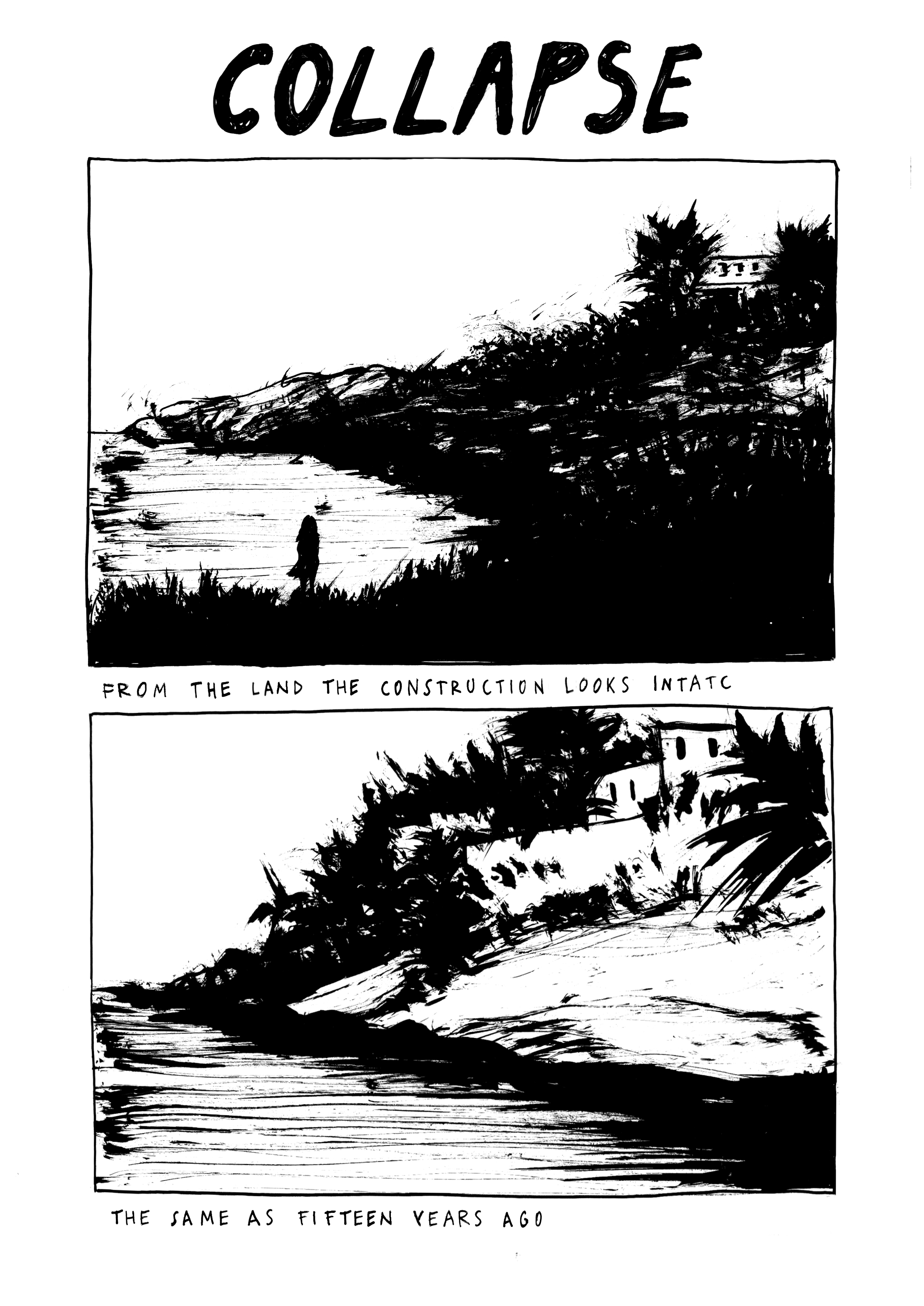
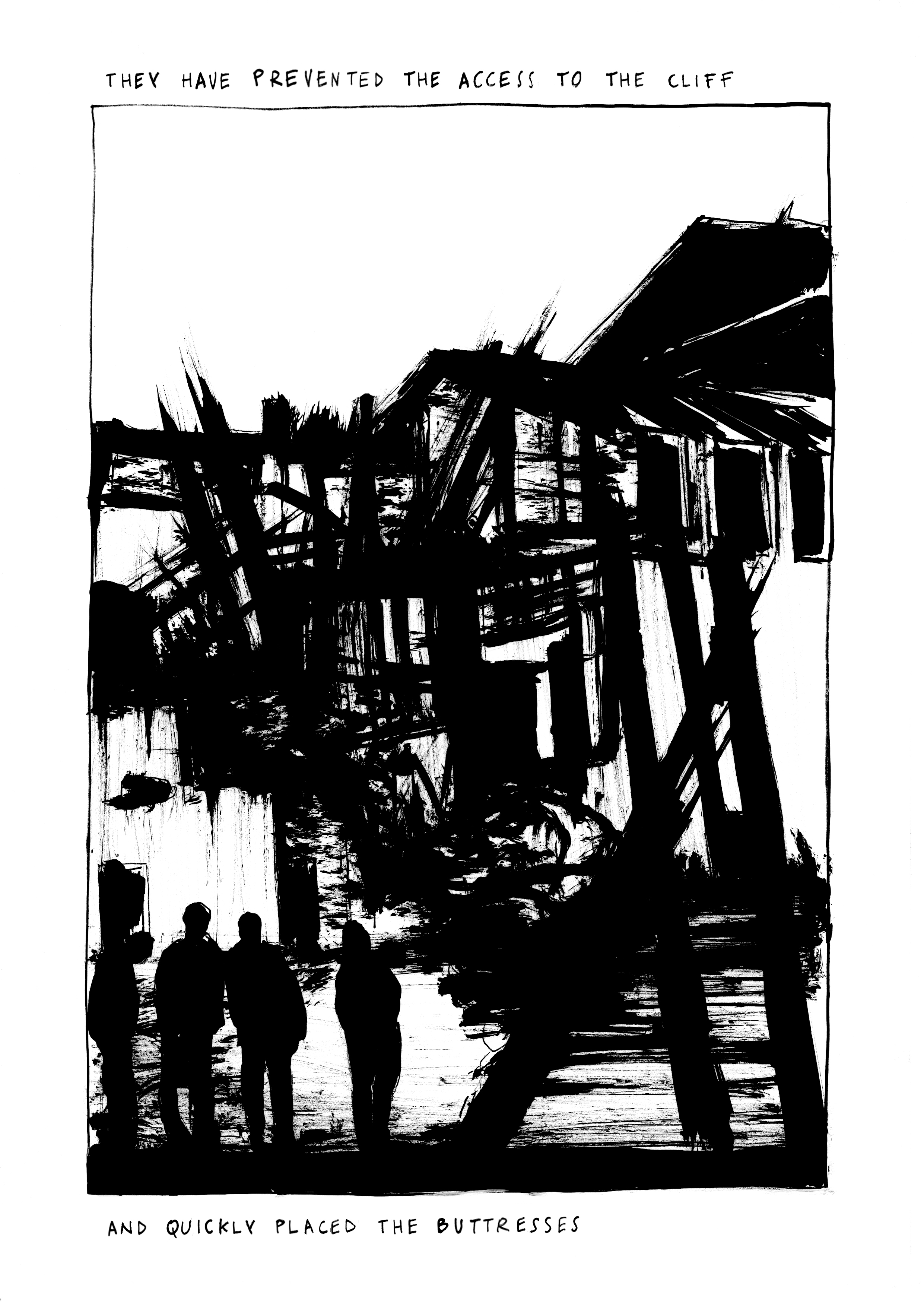
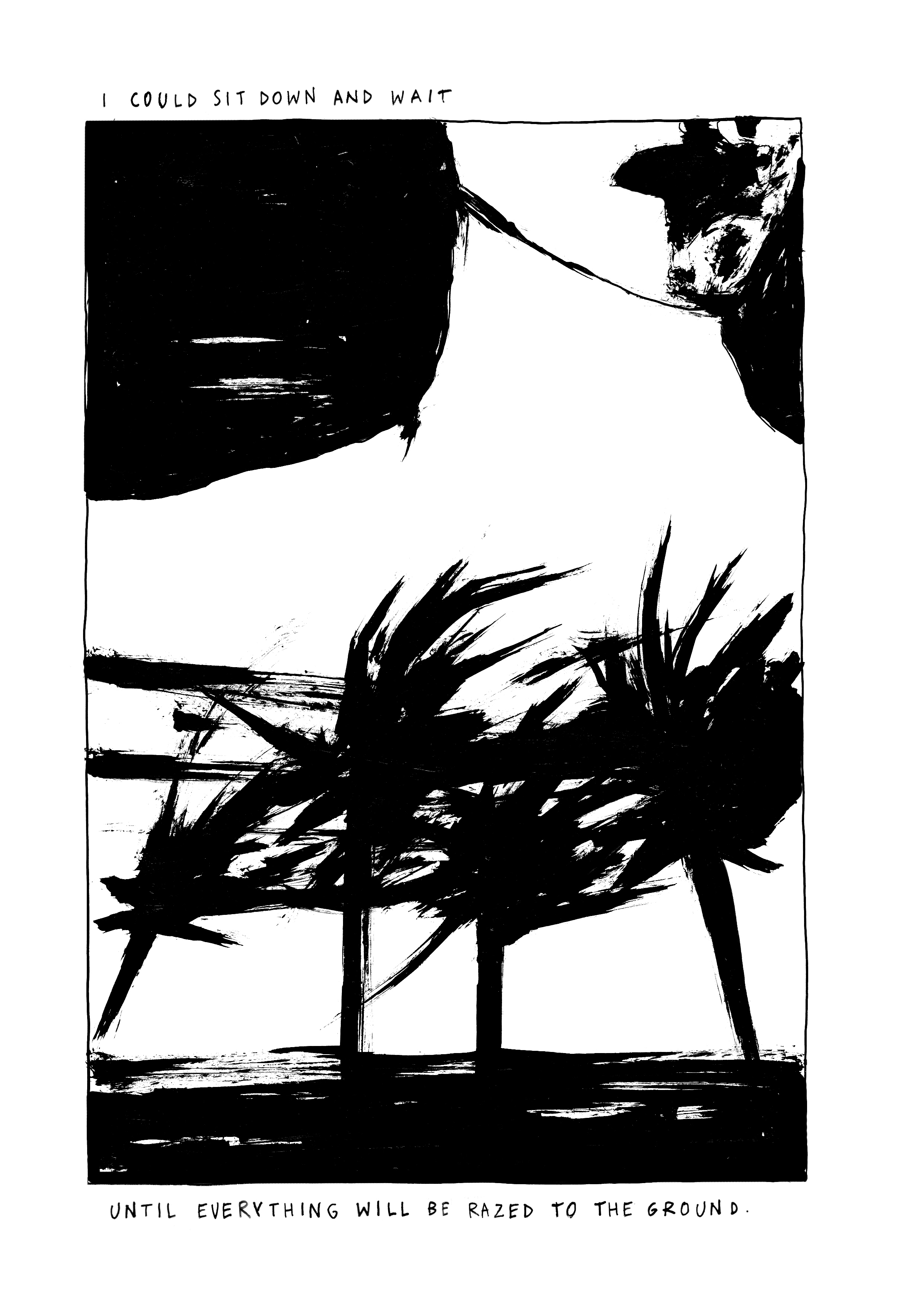
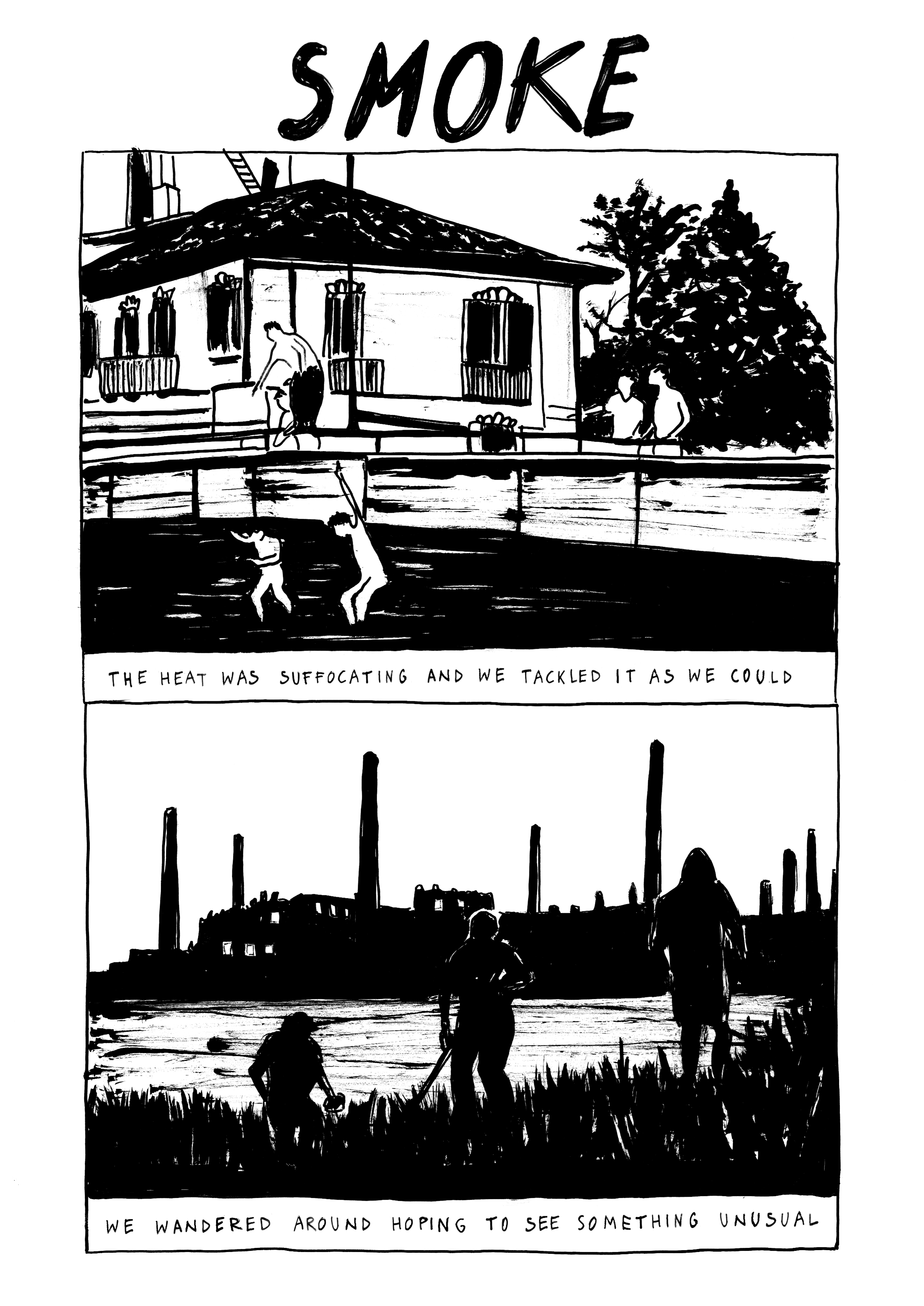
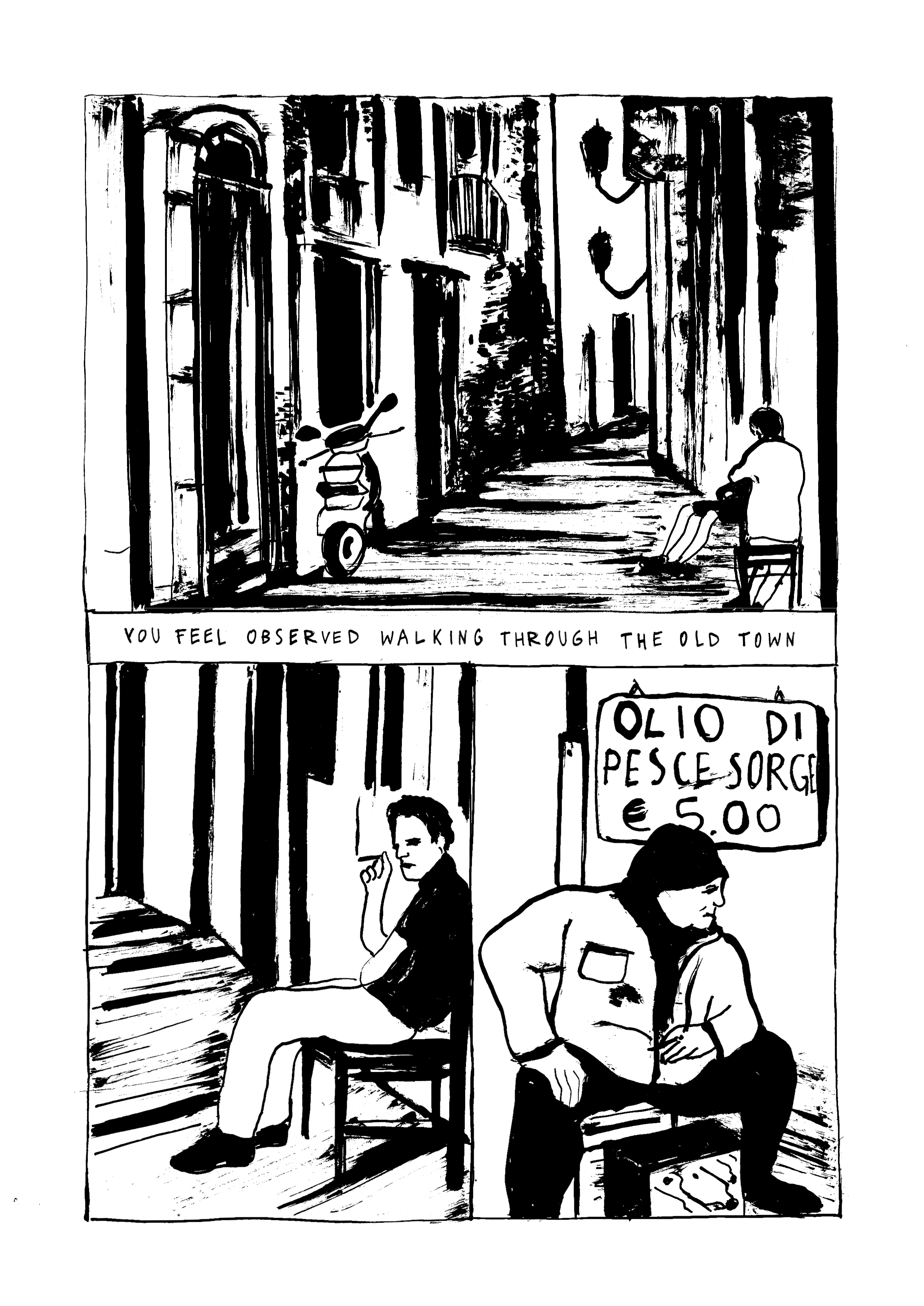
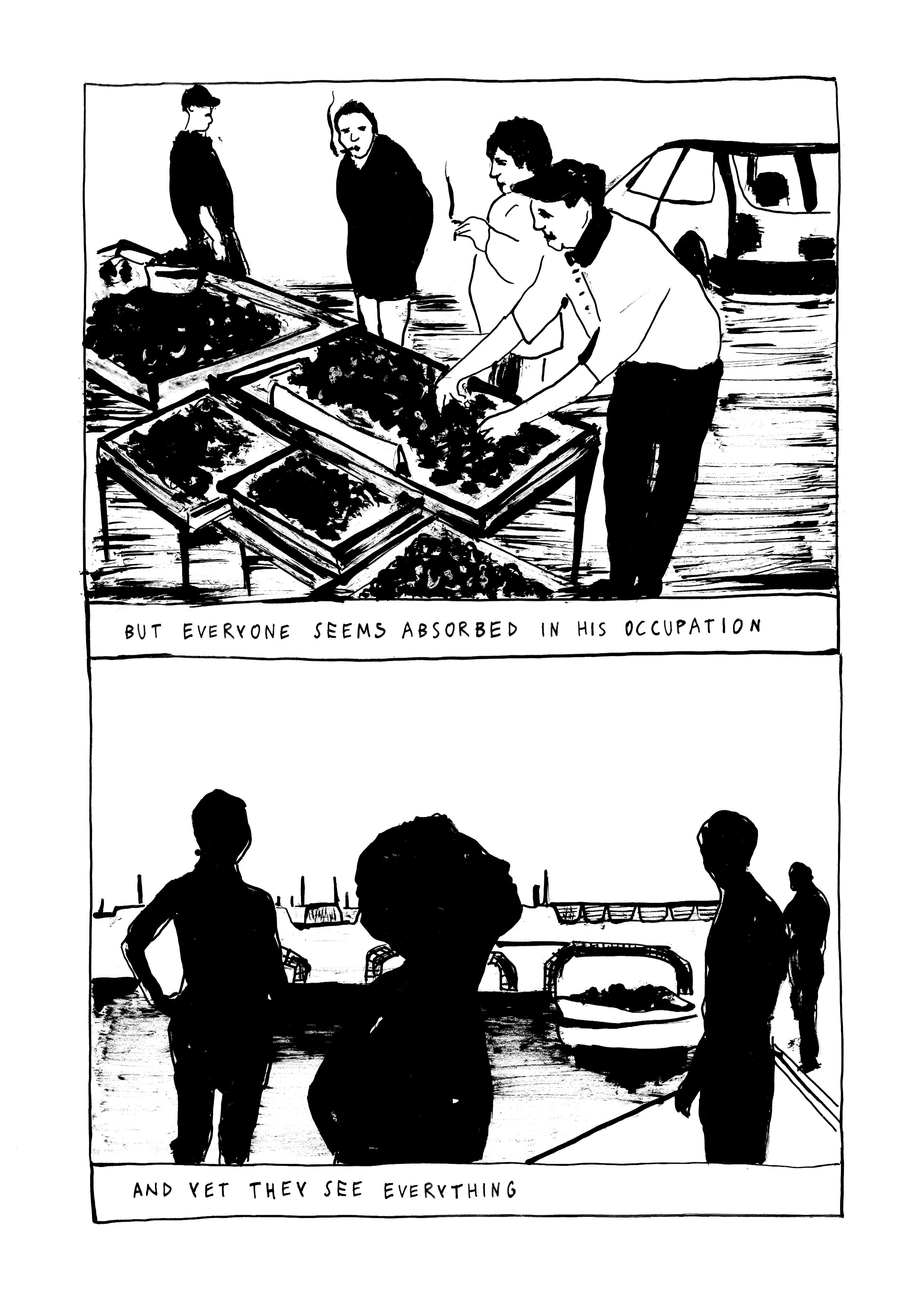
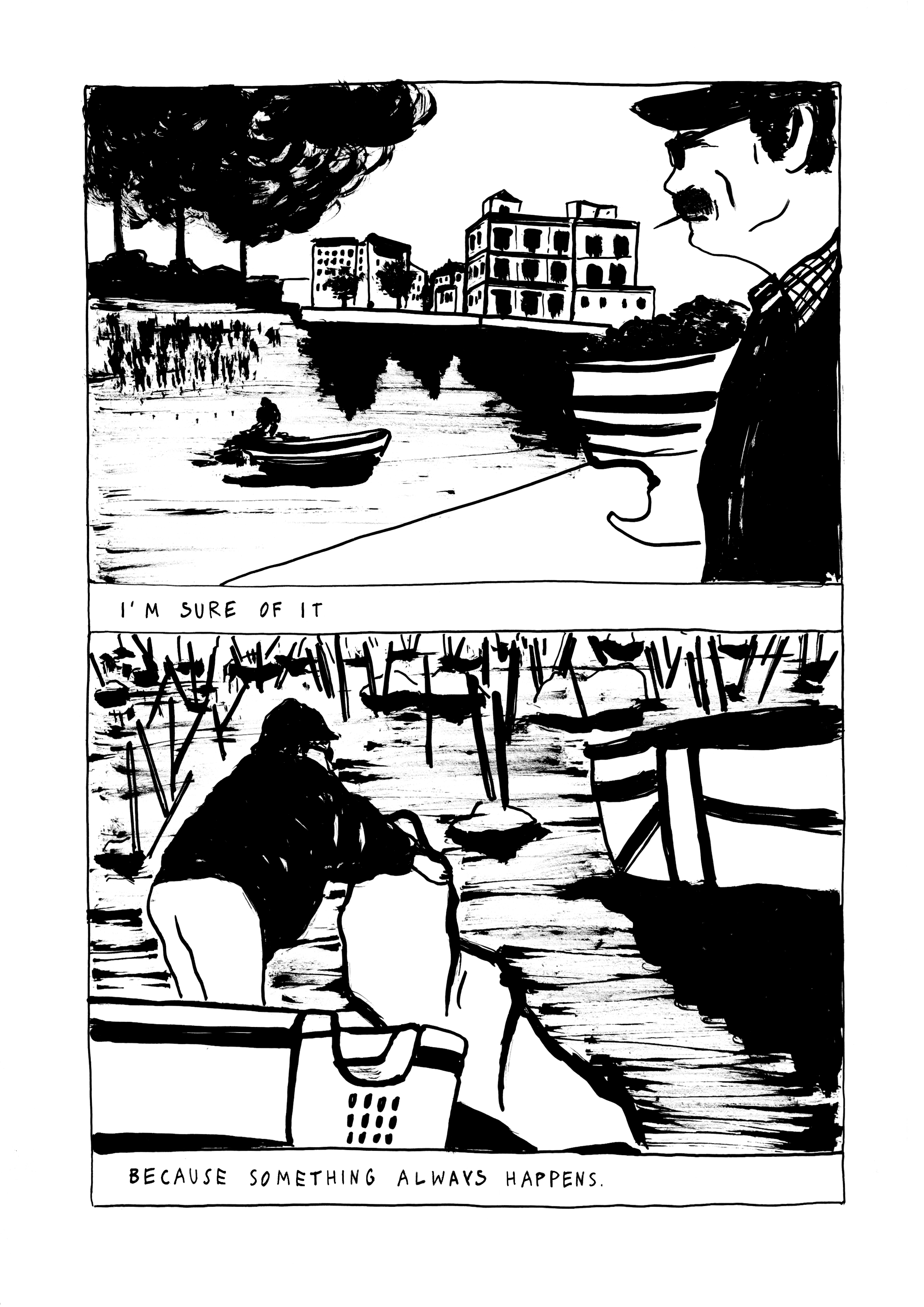
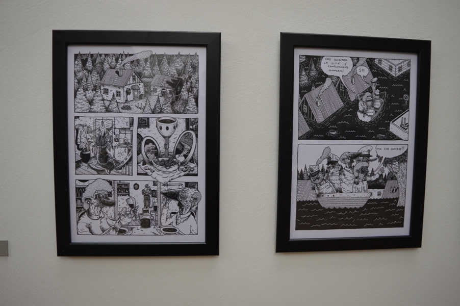
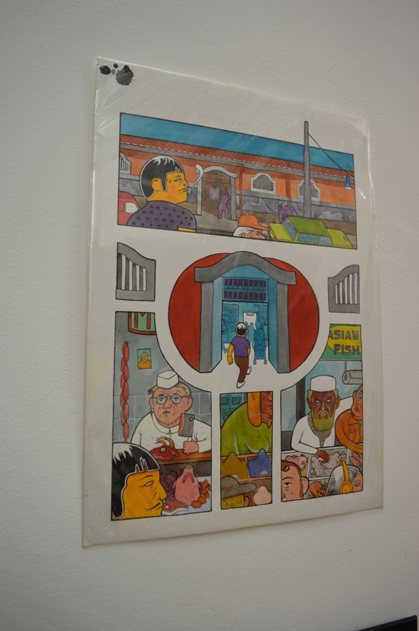
“Drift” by Serena Schinaia
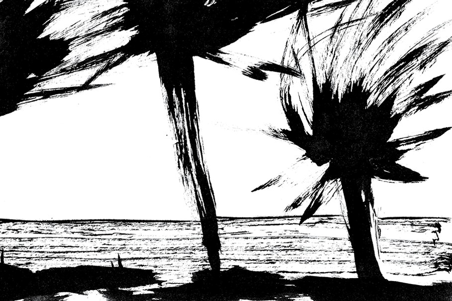
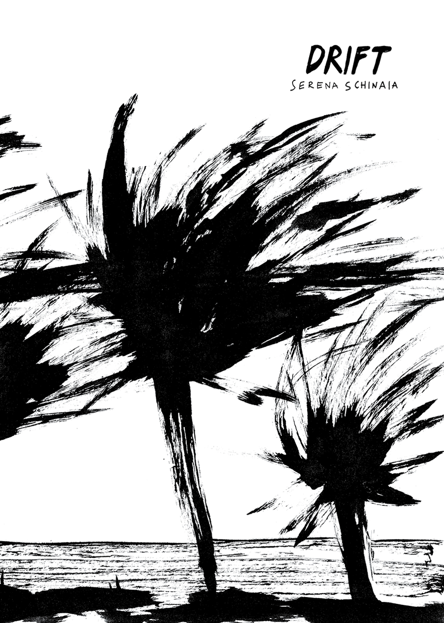
I already wrote about Serena Schinaia on Just Indie Comics when I reviewed her latest solo effort, the comic book Ceniza/Cenere published by Ediciones Valientes and in this post about Una giornata scorsa, the collective project she developed at the Real Academia de España in Rome with Martín López Lam, Silvia Rocchi and Roberto Massó. Schinaia is an artist born in Taranto, 1986 and after studying Aesthetic Philosophy and Theory of Comics in Bologna she moved to Rome, where she currently lives and works. She was featured in several anthologies, collaborated with Lo Straniero, Hamelin, the Goethe Institut and exhibited in various festivals, such as Bilbolbul, Komikazen, Napoli Comicon. She won the prize Reportage for Reality Draws 2012 and the contest Coop for Words 2014. In her work she doesn’t use balloons but only laconic sentences that aren’t simple captions, as they don’t just describe the drawings but give power to what she represents, creating a deeply evocative result. If the recent Ceniza showcases a more defined line, a blue/gray color palette and the use of Italian and Spanish simultaneously, her first self-published 32-page comic book, Drift, is representative of the first phase of her production, marked by an intense black and white made up of impressionist brushstrokes. Below you can read two of the five stories of the comic book, which is available in Just Indie Comics online shop, where you can also find some copies of Ceniza. In the meantime, have a good read.


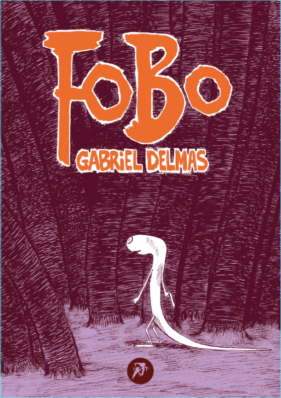
“Fobo” di Gabriel Delmas
di Weedzie Kalashnicock
Fobo è una metafora della follia dell’amore, una canzone sullo squilibrio chimico, un poema per tutti coloro che cercano e un lamento per coloro che trovano. In sintesi, un’allucinazione metafisica.
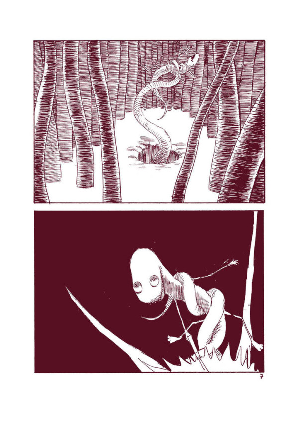
E’ anche il divertente racconto di uno spermatozoo che, come tutti gli spermatozoi prima di lui, ha assolutamente bisogno di trovare un uovo per assicurarsi un posto nell’eternità. Ma, mentre tenta di compiere il suo destino, diventa ossessionato da qualcos’altro. Ciò che vuole veramente è penetrare il cuore dell’universo. E questo desiderio lo porta a inseguire ogni barlume, ogni bagliore, ogni buco nero, ogni punto lontano, fino a dove e fino a quando riesce a farlo.
All’inizio è pieno di speranza. Riesce ad attraversare ogni paesaggio immaginabile. Incontra la donna con un occhio solo, la insegue, gioca con lei. E’ aiutato da una vegetazione amichevole, i cui tentacoli ricurvi lo salvano quando pensava che stessero per strangolarlo. Viene mangiato da strane creature fluttuanti con i ventri rigonfi e i volti sorridenti, un po’ stupide ma anche affettuose, che in realtà non vogliono fargli del male, dato che lo portano verso nuovi e ancor più stimolanti territori. E’ costretto a fermarsi, incapace di proseguire, ma poi riprende la sua corsa. Riesce a prevenire ogni catastrofe e a muoversi sempre più avanti nella sua ricerca. Le sue avventure sono spaventose e divertenti. Sembra essere (e comincia a credersi) invincibile. Diventa il capo di alcune creature che incontra lungo la strada. E’ così euforico da sentirsi onnipotente, sembra che non ci sia niente che non possa fare.
Fobo si sente tutt’uno con l’universo e con le creature intorno a lui. Sembra che tutti facciano il tifo per lui. Si sente coccolato.
Ma cosa sta succedendo? E’ vero che sono tutti dalla parte di Fobo? Ogni creatura lo porta più vicino, ma a cosa? Tutto ciò è amore o un inganno? Dove si trova?
Fobo guarda le cose sotto un’altra luce. Ciò che sembra essere una cosa, subito dopo comincia a sembrarne un’altra. Ogni volta che Fobo emerge da una cavità, ne trova un’altra e un’altra ancora. E sono le cavità a guardare Fobo, non il contrario. Ne può penetrare una ma ce n’è sempre un’altra dietro l’angolo. Sia che guardi giù o su, che entri o che esca, non è mai dall’altra parte. E’ imprigionato, proprio come tutti gli altri esseri in questo labirinto umido e oscuro.
E’ forse un clone? O un drone? Pensava di essere migliore! Diverso! Che cos’è?
Prima Fobo trovava tutto eccitante, folle e misterioso mentre ora pensa: “Devo essere provocato e stimolato in eterno? Riuscirò mai a penetrare il mistero che sto cercando di comprendere? Devo essere preso in giro per il resto dei miei giorni, e tutto il mio tempo, tutti i miei sforzi non serviranno a niente?”
Questa non è la storia di una razza che cerca di sopravvivere, e neppure la storia di una selvaggia lotta per essere il miglior spermatozoo dell’universo. E’ la storia della disillusione del vincitore. La sua sofferenza è esistenziale.
La verità è che Fobo ha una pistola sempre carica ma può sparare soltanto a salve, per l’eternità.
Questa è la storia dell’Orrore.
“Fobo” by Gabriel Delmas
by Weedzie Kalashnicock
I think Fobo is a metaphor for the madness of love, a song of chemical imbalance, a poem to all those who would seek and a lament for those who find. In short, a metaphysical mindfuck.
It’s also a comic tale of a sperm, who, like all sperm before him, has a primal urge to find an egg, to secure his spot for all eternity, but who in the process of completing his destiny, becomes obsessed with something else. He wants nothing less than to penetrate the heart of the universe. And this desire has him chasing every glimmer, every flash, every black hole, every distant point as far and as long as he can.
He starts out with high hopes. He manages to climb in and out of every imaginable landscape. He chases and plays with the one-eyed woman. He’s helped by friendly flora, whose curling tentacles lift him out of danger when he thought they might try to strangle him. He’s eaten by strange floating creatures with bloated bellies that are filled to the brim with smiling, slightly idiotic (but endearing) faces, but clearly, they mean him no harm, since he is carried even closer to different and more exciting landscapes. He’s thwarted at various points, but only temporarily. He manages to avert every disaster and move further in his quest. His adventures are scary and fun, and he seems to be (and starts to feel) invincible. He even appoints himself the leader of various creatures he meets along the way. The euphoria swells his head, there seems to be nothing he can’t do.
Fobo feels at one with the universe and all the creatures around him. Everyone seems to be cheering him on. He feels kissed.
But what is really happening? Are they really on Fobo’s side? Everyone brings him closer and closer but where is he really? Is this love or trickery? Where is he?
Fobo looks at the thing in another light. What seems to be one thing is now another. Every time Fobo emerges out of one hole, he finds another and another and another. An endless series of holes stare back at Fobo. He can penetrate the one, but there is always another around the corner. Whether he looks up or down, or goes in or comes out, he is still not on the other side! He’s caught, just like all the others in this sticky, impenetrable labyrinth.
Is he a clone? A drone? He thought he was better! Different! What is he?
What seemed exciting and crazy and mysterious before, now Fobo feels, am I to be perpetually tantalized? Am I never to penetrate the mystery I seek to know? Am I to be teased as long as I live, and all my time, all my efforts, count for nothing?
This is not the story of a race to survive, or even a story about a fierce competition to be the fastest and most successful sperm in the universe. It’s about the disillusionment of the victor. His suffering is existential.
The truth is, he has a loaded gun but perpetually shoots blanks into the universe.
This is a horror story.
Fobo is the latest book by Gabriel Delmas. It’s a 64-page paperback, 15×21 cm, published by Hollow Press
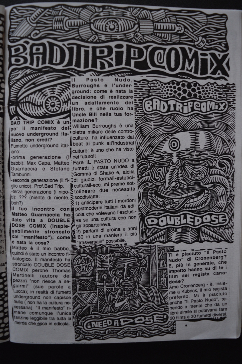
Un’intervista al Professor Bad Trip
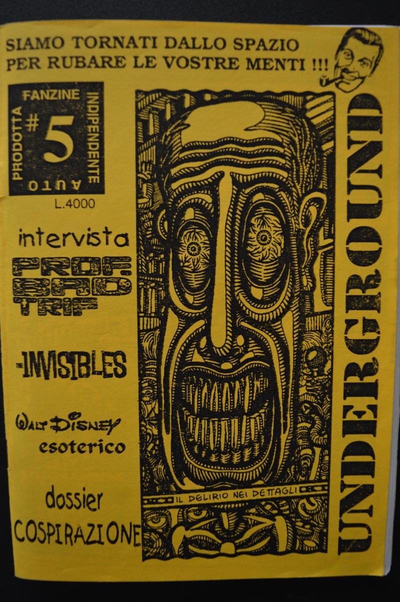
Colgo l’occasione della mostra A Saucerful of Colours, personale dedicata al Professor Bad Trip dalla Tekè Gallery di Carrara, per recuperare una vecchia intervista realizzata al Prof dal sottoscritto e da Giuseppe Marano e pubblicata nel marzo 1995 su Underground #5. Incontrammo Bad Trip (vero nome Gianluca Lerici) in occasione di diverse edizioni di Lucca Comics, sulle gradinate del Palazzetto dello Sport, dove allora ci si metteva a vendere le fanzine, nonostante i continui inviti da parte dell’organizzazione a togliere il disturbo. Gianluca ci consentì di utilizzare un suo disegno per la copertina di Underground #5, che si apriva proprio con un’intervista realizzata via posta e montata a collage sullo sfondo dell’arte del Prof, come potete vedere dalle foto che accompagnano l’articolo. Sicuramente non sarà esaustiva come l’intervista realizzata da Vittore Baroni per l’Almanacco Apocalittico di Mondadori e ristampata in versione integrale proprio nel catalogo di A Saucerful of Colours, ma spero che sia comunque l’occasione per recuperare un contenuto oscuro e a suo modo utile per inquadrare uno dei più importanti artisti dell’underground italiano, scomparso a soli 43 anni il 25 novembre 2006. E a questo proposito vi raccomando di visitare la mostra della Tekè, che sarà aperta fino al prossimo 30 luglio il martedì e il mercoledì dalle 17 alle 20, dal giovedì alla domenica dalle 18 alle 24. Per il momento, buona lettura.
Professor Bad Trip: raccontaci vita opere e miracoli in una autobiografia completa.
Il Professor Bad Trip nasce a La Spezia il 21-5-63. Per tutti gli anni ’80 è conosciuto in zona come “Gianluca Punk”. E’ stato:
– DJ a Radio Popolare Alternativa (La Spezia, 79/83)
– cantante del gruppo hardcore “The Holocaust”
– denunciato per: occupazione, danneggiamento, corteo non autorizzato, resistenza a pubblico ufficiale (2 volte!), oltraggio a pubblico ufficiale, violenza a pubblico ufficiale (per un totale di 7 denunce più 4 giorni di prigione)
– diplomato all’Accademia di belle arti di scultura a Carrara.
Influenze, ispirazioni, aspirazioni?
Influenze grafiche: Stefano Tamburini, Robert Crumb, Joe Coleman, Paul Mavrides, Robert Williams, Basil Wolverton, Ed Big Daddy Roth, Matteo Guarnaccia, C.Burns, F.Masereel, D.Kitchen, Rick Griffin, Raymond Pettibon, W.Smith, ecc.
Ispirazioni (per via mentale, orale, polmonare o acustica): hashish, Max Stirner, Karl Marx, LSD, William Burroughs, George Orwell, Aldous Huxley, marijuana, The Germs, Ballard, Kropotkin, Fear, Hakim Bey, Bob Dobbs, Jerry Rubin, Timothy Leary, Robert Anton Wilson, Crass, Stanley Kubrick, David Cronenberg, ecc.
Aspirazioni: segrete (basta denunce!)

BAD TRIP COMIX è un po’ il manifesto del nuovo underground italiano, non credi?
Fumetto underground italiano:
– prima generazione (i babbi): Max Capa, Matteo Guarnaccia e Stefano Tamburini
– seconda generazione (il figlio unico): Prof. Bad Trip
– terza generazione (i nipoti): ??? (niente di niente, boh?)
Il tuo incontro con Matteo Guarnaccia ha dato vita a DOUBLE DOSE COMIX (inspiegabilmente stroncato dal “Manifesto”): come è nata la cosa?
Matteo è il mio babbo, quindi è stato un incontro fisiologico. “Il Manifesto” ha stroncato DOUBLE DOSE COMIX perché Thomas Martinelli (autore del pezzo) “non riesce a seguirmi” (sue parole a Lucca); in realtà di fumetti underground non capisce nulla (non ha la cultura necessaria). “Il Manifesto” rimane comunque l’unica fanzine leggibile tra tutta la merda che esce in edicola.
“Il Pasto Nudo”, Burroughs e l’underground: come è nata la decisione di realizzare un adattamento del libro, e che ruolo ha Uncle Bill nella tua formazione?
William Burroughs è una pietra miliare delle controculture; ha influenzato dal beat al punk all’industrial culture: è uno che ha visto nel futuro!!
Fare IL PASTO NUDO a fumetti è stata un’idea di Gomma di Shake e, al di là di giudizi formali-estetici-culturali-ecc. mi preme sottolineare due necessità soddisfatte:
1) anticipare tutti i merdoni postmoderni italiani da edicola che volevano l’esclusiva su una cultura che non gli apparteneva.
2) parlare di eroina e anni ’80 in una maniera il più “trasversale” possibile.
Ti è piaciuto “Il Pasto Nudo” di Cronenberg? E, più in generale, che impatto hanno su di te i film del regista canadese?
Amo Cronenberg – è, insieme a Kubrick, il mio regista preferito. Mi è piaciuto anche “Il Pasto Nudo”, tenendo a mente che da un libro simile si potevano fare 20 films e 30 fumetti diversi.
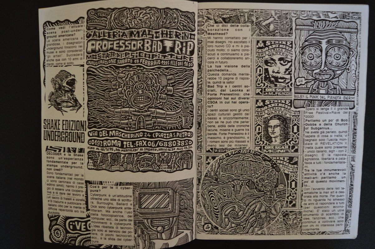
Come vedi l’attuale scena post-underground americana?
La scena americana è grandiosa, i disegnatori underground finiscono nei musei e sono considerati “gli artisti”. Succederà anche qua con 10 anni di ritardo, come al solito.
DECODER e la Shake sono un’esperienza fondamentale per la stampa underground, non credi?
Sono fondamentali per la scena italiana (nel mondo ci sono centinaia di case editrici simili): hanno il pregio di essere una cooperativa e di dare del lavoro a un sacco di fratelli e sorelle e di tradurre e pubblicare in italiano cibo per la mente di difficile reperibilità e/o traducibilità.
Cos’è per te il cyberpunk?
Cyberpunk è un’attitudine oltreché uno stile di scrittura. Burroughs, Ballard e Dick sono cyberpunk ante-litteram. Ma anche l’uso della fotocopiatrice, dei computer, ecc., da parte dei movimenti è cyberpunk. L’idea ribaltata di tecnologia solo al servizio del potere, di pochi tecnocrati, ecc. è la sfida del cyberpunk.
Che ci dici della collaborazione con i Meathead?
Mi hanno contattato per i miei disegni. Ho ascoltato il loro nuovo CD e mi è piaciuto molto; ci siamo conosciuti e continuiamo a piacerci e collaboreremo ancora in futuro.
La tua visione della psichedelia…
Questa domanda meriterebbe 10 pagine di risposta, quindi la salto!
Bad Trip e i centri sociali, dal Leonka al Forte Prenestino: che opinioni hai sui diversi CSOA in cui hai operato?
I centri sociali sono gli unici spazi culturali gestiti dal basso e orizzontalmente: non se ne può che parlar bene, al di là delle croniche lacune, miserie e guerre tra bande. Forte Prenestino è il massimo, è grandissimo, e i romani sono più rilassati e meno tesi dei milanesi. Spero si tenga lì il grande Free Festival+Rave del 2000!
Parliamo un po’ di Bob Dobbs e della Church of Subgenius…
Ne avete già parlato, quindi sapete di cosa si tratta; vi segnalo solo l’uscita mondiale di REVELATION X (nella quale sono presente – unico italiano, sigh – con 2 disegni). E’ la risposta agnostica, libertaria e patafisica a tutti i fondamentalismi.
Tra le tue innumerevoli attività c’è anche la mail-art: parliamo un po’ di questo movimento…
Con l’avvento delle reti telematiche la mail art è destinata alla morte. Per quanto mi riguarda ho smesso da anni di rispondere a tutti (per questioni economiche). E’ stato un utile strumento di scambio di idee, fanzines, ecc., che continuo a coltivare solo con chi mi interessa particolarmente.

An afternoon with Steven Gilbert
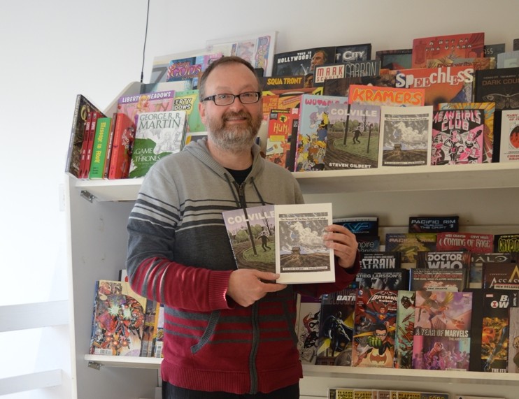
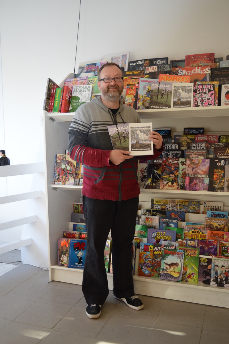
Steven Gilbert is a Canadian cartoonist author of The Journal of the Main Street Secret Lodge, a 2014 Dough Wright Awards winner, and of Colville. Back in the ’90s, he self-published six comic books of a series called I Had a Dream, plus two single issues, Gardenback and The Cult of Gardenback, where he developed the characters and the situations of the previous series. Between the two Gardenback comics, he published Colville, a 64-page comic book that received some good critics at the time. But after 1998 the world of comics lost Gilbert’s tracks and it was very difficult to find informations about him on the web until a few years ago. The most important source, if we can call it in this way, was a 2011 post at the Comics Comics website where Frank Santoro included “the guy who drew a comic from the mid-’90s called Colville” in a list of Good Cartoonists Gone. The same Gilbert contributed at the discussion writing this: “Wow, it’s nice to be remembered…I’m the guy who did the Colville comic. Glad you liked it Frank. I was an exhibitor at the SPX back in ’98 and sold a bunch of Colvilles there. I still draw comics when I can find the time, in fact, there is an entire second chapter of Colville completed (about 48 pages) plus about 25 penciled and lettered pages for a third chapter. Someday it’ll get finished and I’ll get a table at TCAF or sumthin’. Since 1999 I’ve owned and managed my own comics shop here in Newmarket, Ontario called Fourth Dimension. That takes up most of my non-sleeping time. Unfortunately, the drawing board has been back-burnered. I’m probably better at selling other peoples’ comics than I am at making my own!”. But Gilbert came back to comics in 2013 with a 128-page book, The Journal of the Main Street Secret Lodge, which won the Dough Wright Award for Best Spotlight Work the following year. And in 2015 he finally self-published, after nearly two decades in the making, the Colville book, including the original 64-page comic from 1997 and over one hundred pages of new material with the completion of the story.
I found out about Colville online and I was very curious about it for a long time, so when my friend Francesco (best known as the Italian cartoonist Ratigher) told me he had sent an e-mail to Mr. Gilbert ordering a copy of his books, I did the same and asked him if I could also sell Colville in my webshop. Ratigher wrote a review of Colville here at Just Indie Comics and from that moment a lot of people ordered the book or asked me about it. It was very funny to see a lot of Italian comic fans interested in a so obscure work, that it’s hard to find even in North America (Gilbert hasn’t a website and his books have no distribution at the moment). I exchanged some e-mails with Steven in the months after and when I went in Canada for this year’s TCAF I asked him to do an interview in Newmarket, a little town near Toronto where he lives and runs the comic shop Fourth Dimension, in 237 Main Street South. The interview took place on Monday 9th May at the presence of my friend Michele Nitri of Hollow Press and of Gilbert’s girlfriend Stacey.

The Main Street in Newmarket, Ontario
Let’s start from the beginning. Are you born here in Newmarket?
I wasn’t born in Newmarket but I lived in Newmarket literally my entire life, my parents are resident in Newmarket and I always lived here.
And when did you start reading comics?
I was very young. My first recollection of comics is getting my hair cut at the barber and seeing this stack of Archie Comics and Disney Comics with the cover stripped off. But I had no affection for them at that time. When I was a kid I loved cartoons, I watched Bugs Bunny cartoons all the time. I was maybe more interested in animation at that very young age. When I was about 9 years old I had my tonsils removed at the hospital and my mom bought me a Spider-Man comic, that was kind of when I really became interested in comics.
Well, I read comics since I was very young but I was definitely hooked into them with a Spider-Man comic too, it was an issue with Doctor Octopus in the Bill Mantlo-Al Milgrom run.
Sure sure, Al Milgrom, yes… Mine was a Marvel Team-Up with Spider-Man and Doctor Strange.
Ok, and so when you started drawing?
As a young child, I remember drawing a lot before I was in the comics. I liked cartoons, so I doodled all the time. My dad used to bring home stacks of office paper, there was the letterhead on one side so I used the back of the sheets. I think at that age I was really into ninjas, I liked monster movies and I remember being obsessed by werewolves movies for quite a long time. I had tons of drawings with werewolves and monsters and stuff like that.
And this was still before comics?
Yes, and then when I discovered the comics I used to draw recreations of the cover artworks to try to figure out how that style worked. It was probably a little bit more when I was getting into twelve, thirteen, fourteen years of age that I started trying to make my own comics. When I was in high-school age I seriously started drawing comic books. My brother once wrote the script for a sequel to the Frank Miller’s The Dark Knight Returns, it was for a class project. And when I understood it would be about 30 pages I said “I won’t draw 30 pages for free”, so I charged him 200 dollars (laughs). I think my parents gave him the money to pay me, so they technically funded it.
Do you remember the story?
Oh no, it’s been a long time ago, in high school. I remember only I was trying to ink like John Totleben in Swamp Thing. It didn’t look like Frank Miller’s artwork, it looked like John Totleben from Swamp Thing. I should have the artworks somewhere at home but I never look at them and I don’t really want to look at them. The teacher made maybe a dozen of photocopies at the time and I’m petrified that somebody could have a copy of it. It was horrendously awful. Then I remember doing a comic book about the Travis Bickle character of Robert De Niro in Taxi Driver and then I drew another book with Grendel. My big dream at the time was that Matt Wagner could hire me to draw Grendel.
Were you a Matt Wagner’s fan?
Well, Grendel was a comic I read when I was fourteen-fifteen, and it was maybe the first step away from totally mainstream comics, because it was basically a super-hero comic but for grown-ups. The interesting thing is that Matt Wagner, who was a very skilled artist himself, was allowing other cartoonists to draw his character and so I thought “It can be my big chance”. I also thought to send my artworks to Matt Wagner but I never did it. My Grendel comic was a sort of remake of the movie Die Hard but with Grendel in it (laughs). I’m pretty sure the comic ended with the character blowing at the top of a building and it was totally ripped off from the end of Die Hard, I saw it like a month before and it was in my head.
And did you like also Sandman Mystery Theatre by Matt Wagner? It was one of my favorite comics back in the ’90s.
I actually read only a few pages of it, I knew at the time he was doing it because I worked in a comic shop but I never really read it. It was published in a period of my life when I didn’t read any Vertigo stuff, because alternative comics are the blast at the time for me.
So did you learn to draw by yourself, right? You didn’t take lessons or attended some school.
Well, in high school I had an art teacher who was very sympathetic to comics and encouraged me to do them. Well, he is in Colville, I drew this scene where there are my art teacher and my high school. He actually came into the store about two weeks ago, someone showed him the comic and he visited me specifically to say “Don’t put me in your comics anymore”. I think he was ok with the book until he arrived at the last 40 pages… However, in high school I was lucky to have an encouragement to draw comics but I didn’t get any specific instructions, I was purely absorbing from as many comics as I could, lots of copying and trying to figure how to put things on the page.
And what happened until I Had a Dream #1? You self-published it in June 1995 with your own imprint King Ing Empire but you created comics even before I guess, so I’m curious if you made something before that issue.
I tried several times to get a comic put together. I was in my mid-twenties when I published the first issue of I Had a Dream, so it was a lot of time after high school. In the meantime, I worked at a comic store and I also drew comics.
But only for yourself.
Yes, it was my training ground, I drew hundreds of pages of comics and illustrations but I never showed them to anybody, maybe just at few friends. There was a couple of crime comics I worked on, a sort of murder mystery stories I was trying to figure out how to develop and at a certain point the actual events that inspired Colville occurred and I immediately thought “This is the story I want to do”.
And this is before I Had a Dream.
Yes, it was long before I Had a Dream but I already drew a cover for that story, even if it was a different cover both from the one of the Colville comic book than from the one of the Colville graphic novel, but more similar to the latter. At the time I thought the comic should be called Warning Shot but I had this intuition I wasn’t still good enough to do the story I had in my head, because at the time I never drew a comic that was more than 25 pages. I needed to figure out how a comic book works. So, it happened that a friend of mine, one I knew from years without really knowing he drew comics, came in the comic shop…
What was his name?
His name is Jason Williams.
Ah ok, I thought he was him, his name recurs in your first comic books.
Yes, so he came in the shop and showed me a Spider-Man comic he drew, and maybe it was the worst comic I did ever see. It showed me also a rejection letter from Marvel. Then, he started drawing a comic called Underterra and he wanted to publish it but he wasn’t really ready to publish a comic. He also gave me the pages of the first issue asking me to edit them. I read it and it was full of mistakes, so I wrote a lot of notes and at a certain point I begged him to redraw it, proposing to co-write and ink but at the end he published the first Underterra how it was, with all the mistakes. And he printed five thousand copies per issue, distributing all the six issues with Diamond. But I think he sold only 90 copies each.
So, was that an inspiration for you? (laughs)
Well, what I got from him basically was… the name of his printer (laughs). He gave me this contact information and so I made the decision “If this guy can do a comic, I better get off my ass and do a comic”. I already had the first versions of the first three issues of I Had a Dream drew very rough because I made them like 24-hours comics. So I completely redrew them. Looking back, now I’m not satisfied with the results and probably I shouldn’t have published them but at the time they helped me learning cartooning. However I think there is a big shift in the fourth, fifth and sixth, I managed to put my ideas on the pages, the artworks got better. But with those sixth issues I felt I was done with that, I thought I was ready to do the Colville comic. But then I drew a really big picture for a friend of mine as a birthday present and it was a very big comic with like 40 panels. That became the first Gardenback comic and I published it before Colville.
From “I Had a Dream” #1, June 1995
But looking still at the first three issues of I Had a Dream, these follow the same patterns of the newspaper strips, there are these two “guys” in another dimension who face each other, with a lot of situations which can remind Krazy Kat or some cartoons.
I’m sure Krazy Kat didn’t have any kind of influence on me at the time, but as I said before I loved the Warner Brothers-Looney Tunes stuff, just absurd violence, things crashing together, walls being knocked down and so on… They surely influenced me. You know, the firsts I Had a Dream were very nonsensical, I was a huge Chester Brown fan and I remember reading an interview where he talked about his process of doing comics and he said he drew panel after panel, without having a precise idea of the whole…
Yes, like in Ed The Happy Clown…
Exactly, so I worked in that way too.
Then with I Had a Dream #4 you started Slipstream, a very different two-part storyline about Roswell, psychological operations, Russians, conspiracy theories. Did you plan it from the beginning?
Absolutely not. I was probably watching some X-Files episodes and reading about the Kennedy assassination, I read about 40-50 books about it. I was obsessed by conspiracy theories in my twenties, these things took a lot of my attention at the time and comics in some way are what got me out of interest. After doing those comics I never got interested anymore. That was the end of it for me.
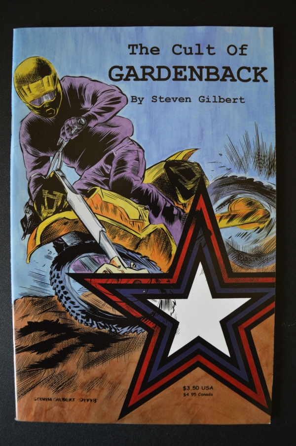
“The Cult of Gardenback”, April 1998
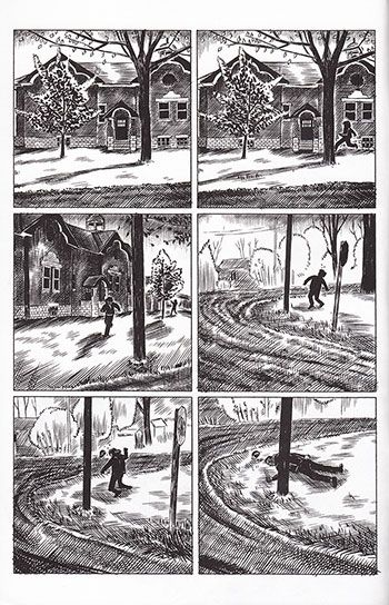
Between Gardenback and The Cult of Gardenback you published the first issue of Colville, right? It should be from 1997…
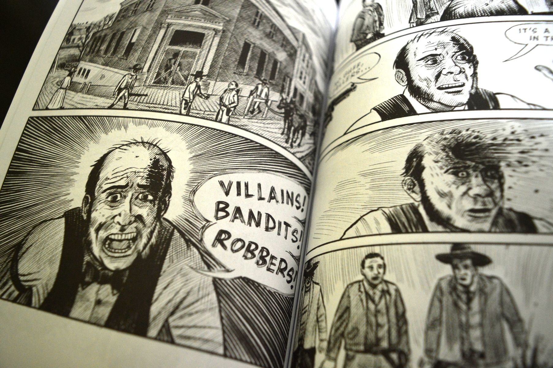
Yes, in the beginning it should have been much smaller, like 25 pages, and it had to be only about the confrontation in the schoolyard. It was loosely based on a true crime story, I clipped the newspaper article when it was happening because I remember reading it and thinking “It could be an interesting comic”. But those were just the bare bones, the story began to grow around the episode of the shooting in the schoolyard. I thought to do a 64-pages comic and I had the bones of the story and a lot of the imagery was in my head. I went up to Keswick, a small town 20 minutes up the highway from Newmarket where the facts actually occurred. My friend Jason Williams lived there, so he knew all the neighborhoods. We drove there one day and took photo references I used for the comic.
Do you use a lot of photo references, right?
Yes, these researches are part of my methodology, because I don’t write scripts…
Never?
I tried but I never successfully wrote one, when I finish and read a traditional script with panel descriptions, dialogues and so on, usually the ideas just seem stupid and I can’t use them. The only way I can make comics is to sit down and draw. My process of writing is the creation of the comic.
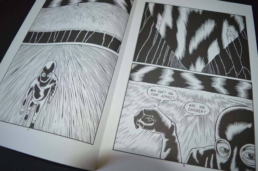
The 64 pages of the Colville comic book from 1997 are exactly the first pages of the 2015 book or you changed something?
Yes, the first 64 pages of the graphic novel are the same of the comic book, except for maybe one or two extremely tiny revisions of the artworks.
That comic book was really different from I Had a Dream. There is a new feeling in it, like the inspiration came more from the movies than from other comics or conspiracy theories. I can feel the mood of some American movies from the ’70s or the early ’80s, I think to Brian De Palma, Martin Scorsese or also David Lynch of Blue Velvet.
 I usually deny any influence and I don’t think for cartoonists is a good idea to look at cinematic references, because comics are their own thing. But, having said that, at that time I was a huge fan of David Lynch and of the Blue Velvet movie in particular, that was a small town perverted crime story. I was also a big fan of the Twin Peaks tv show and I can tell you a little trivia about that. I decided on the title Colville from the Canadian painter Alex Colville, even if there isn’t really any direct visual correlation to the comic, it was more about the mood and the atmosphere. But there is a scene in the Twin Peaks tv show where they’re describing the geography of where Twin Peaks is and – it’s been a long time since I watched it but the line of dialogue should say “In the North-East corner of Washington state right on the border with Montana and just below the Canadian border”. And for some reason, I decided to get out a map to look at what’s there and there is a town called Colville. You can look at a map, it isn’t a joke. This was after the Colville comic book was drawn, so I thought “Well, the force of the universe are working together…” (laughs). This is about the Lynchian influence, about Brian De Palma, well, I co-dedicated the graphic novel to Brian De Palma and Nick Cave, and the first is largely for the use of the tracking shot in his movies. I’m a bit of a sucker for tracking shots when I’m watching the movies… The second chapter of the book begins with the character recording with the video camera, so you can read the entire chapter as a long tracking shot, as if the camera never leaves.
Ok, we’ll say more about Colville later, when we’ll arrive to present days. Now I’d like to talk about your long pause if it isn’t a problem. In less than three years, from June 1995 to April 1998, you published 6 issues of I Had a Dream, Gardenback, the first issue of Colville and The Cult of Gardenback. Then between April 1998 and 2013…
Nothing!
Yes, exactly (laughs). Nothing until The Journal of the Main Street Secret Lodge came out in 2013. Fifteen years is a long break.
When I finished the 64 pages of the Colville comic book, I realized that there was room for a couple of more connections. Initially I saw Colville as a 64-pages story with completion and nothing more, but as I was maybe about two-third of the way through I started thinking about it as the first chapter of something larger. But I had also an attachment to the Gardenback comics and I got this idea I should rotate between the two and each year I would do one or the other. So I drew and self-published The Cult of Gardenback in 1998, it was a pretty quick process to draw a comic, then self-publish and sell it through Diamond…
Did you use Diamond since the first issue of I Had a Dream, right? And also Capital City Comics at the time.
Yes, at the beginning I was distributed also through Capital City but then Diamond swallowed everyone up. However, after The Cult of Gardenback was published, I started working at the second chapter of Colville. My plan was that my next book would be Colville #2. In the meantime I was working at a comic book store, The Comic Wizard here in Newmarket, just across the road from where we sit now. Yes, my whole life is in this corner basically (laughs)… As I was working there, the store changed ownership but I continued to work in the shop. The manager bought it in December of 1996 but the business was failing and the store wasn’t doing very well. He owned the store for a couple of years and he struggled to keep it alive. At a certain point I thought to buy the store but then I realized it wasn’t possible. So, I was going to be out of job and I had absolutely no marketable skills to work in the real world. The only thing I ever did at that point was selling comic books, so I decided to open my comic shop.
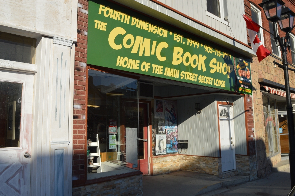
Fourth Dimension, Steven Gilbert’s comic shop
So, did you open Fourth Dimension after The Comic Wizard closed?
Well, it was basically at the same time. At one point it was clear that the comic shop was closing in two weeks, so I immediately signed a lease on my store and called distributors to set up accounts and everything. But the owner of The Comic Wizard attempted to keep things going and so there was actually a very weird time where I opened my store but he was still open trying to liquidate.
So, there were two comic shops? (laughs)
Yeah, within a block, in the same street. But one was closing and I was just getting things started… What happened with cartooning, well, I never worked that hard in my life, opening a business was just insane because I was doing it on my own. My plan was to put the comics aside for six months and then get back to them. But the store was so much hard work, at the end of the day I was exhausted and I couldn’t work on comics when I was at home. That period of six months turned in two years and then three, four, five… I remember pulling out those unfinished pages with the intention of completing the book but I looked at them with my pencil for twenty minutes without drawing a single line and then I put them away. And then a year would go by before I tried again. It happened in 1999, 2000, 2001 and continued for several years. I still did some drawings and caricatures of customers in the store purely for my own enjoyment, but not comics.
And landscapes? There are a lot of landscapes in The Journal of the Main Street Secret Lodge book, did you work at them in those years?
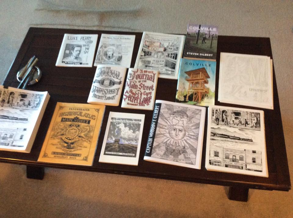
No, no landscapes. I don’t even know, they were mostly wasted drawings. At a certain point I remember having the realization “I’m not a cartoonist anymore, it’s a long time since I’ve done a comic”. But then, after some years, I did start drawing seriously again, when I invented the fanzine Journal of The Main Street Secret Lodge. It was about 2003 when I self-published one of them, just for fun, to give it to friends and customers. Maybe I photocopied a couple of them even before, they were a sort of merchant newsletters. I was interested in the historical side of Main Street, the buildings, and the atmosphere. I started to do it fairly regular, creating little stories about Captain Woodrow Gilbert and his adventures, following more or less the same formulary, usually bad guys coming in Newmarket to rob the bank and Woodrow going to fight and kill them. It was totally for my own amusement. They started to become more and more ambitious, I changed format, some were published like digest size, some had 24 pages, then 36, some 48…
How many of these zines did you publish?
I think I did five or six of them after the one of 2003. The last one was still photocopied but it had 84 pages and I took about a year to finish it. It had a ton of illustrations and a long hand-lettered short story. It was just pure insanity to do that and just photocopy. When one of my customers who used to write comics himself back in the ’80s read it, he came in the store and he gave me a three-pages letter that basically said “You’re an idiot for not doing comics because this is great but it’s not what you should be doing” (laughs). And I just laughed, because these zines were purely for my own self, I didn’t care about people reading it, I produced them only for my satisfaction, to do something creative. But I think at that point I did have the idea for The Journal of the Main Street Secret Lodge. Actually it was an idea that has been in my mind since while I was working on Colville, I thought at this western bank robbery story using Newmarket as the backdrop. And it sat there in my head for years. Then, it happened I found out that article on the website Comics Comics, probably I saw the link on another website I was on, because at the time I didn’t use so much the web, I never googled anything I guess (laughs).
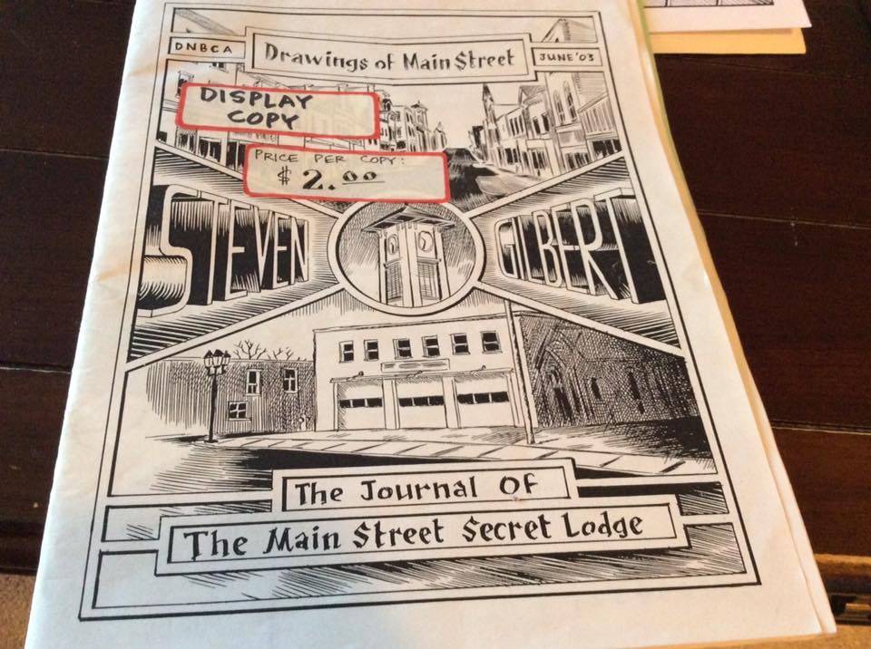
A fanzine from 2003
So, did you know the Comics Comics website?
No, I had never seen that website before. The only thing I knew was that Comics Comics was a print publication, they did a couple of magazines I had in the store but sold out before I even read them. I didn’t know Frank Santoro was involved with them at all, I knew Santoro for his comics like Storeyville that I was a big fan of. However, I think I saw it on Heidi MacDonald’s page, The Comics Beat, there was this link saying something like “Frank Santoro at Comics Comics has an article about cartoonists from the ’90s gone”. I remember I had the mouse cursor over that on the screen thinking “If my name is on that list I’ll shit my pants”. And I clicked on it and I found “The guy who did Colville“. So, I thought “Shit, I’m on this list and that means someone remembers my comics”. And I just knew, it was like a light switch going off in my head saying “You’ve to do another comic book”. So, I immediately started working on The Journal of the Main Street Secret Lodge.
It was 2011, right?
I think so, I’m not so good at archiving things in my mind. However, I started drawing with the idea to do another photocopied zine. The previous one consisted of 21 pieces of paper put together, stapled and then folded to make 84 pages, plus the cover. I had to staple some zines three times and it really pissed me off. So I thought 84 pages were the limit and while working on the Journal I paid attention to the pages and as I got to 70, then 75, 80 and so on, I started worrying. And when I finally finished it and it was 130 pages, I showed the work to my friend Eddie and he told me “This has to be a book, it can’t be just some photocopy bullshit you put near the counter giving away to people who enter the shop”.
Did you think to propose it to a publisher or did you want to self-publish it from the beginning?
I never really thought about sending it to anyone, self-publishing was really my only idea at the time. I thought of something like print on demand or at a very small print run, because I was selling a hundred of the photocopied zines, so I thought I would need a hundred copies even this time. I did a lot of researches about print on demand but when I talked to some people at comics conventions everybody seemed not satisfied with the resulting product, they talked about problems with the binding, the glue and so on. While I was doing these researches on printing, I found somewhere the name of the printer I dealt with 15 years earlier and I thought for the first time to do a proper offset printing. I contacted the same guy I talked 15 years before but I found an old e-mail because somewhere along the line he changed printing company, but he was looking at this old e-mail once in a while and e-mailed me back. Well, I don’t know where I’m going with this answer…
Well, I think this is the point when you decided to do it in offset.
Yeah! (laughs). Well, I think a big fact was the affordability because printing in offset the minimum was typically a thousand copies, you know, it’s a bit more an investment doing that financially that a hundred print on demand copies. But I found out that the costs of print on demand were really high. It was 9 dollars per copy, plus 2 dollars to ship to Canada since it was a USA printer, so I had to pay 11 dollars per copy, plus the exchange rate while to do one thousand copies in offset I would need 2200 Canadian dollars. It was a really good deal. So, that was the point when I said “Ok, I’m going to print it, for real”.
“The Journal of the Main Street Secret Lodge”
That book won the Dough Wright Award for Best Spotlight Work, right?
Yes, things went a little bit crazy, because initially I was just selling it only on the counter here in the store. I had plans to go to TCAF the following year but I didn’t have any thoughts of submitting the book for consideration for Dough Wright Awards. Then a friend of mine, who lives in Winnipeg, had a copy of the book and told me there would be a Chester Brown signing there in a couple of days and I said him “Damn, I’d love to give Chester a copy of the book, but I couldn’t send you one in time” and he said “Well, I’ll give him my copy and you can send me another one”. So he gave a copy to Chester and he e-mailed me “Oh, Chester was so happy to hear you made a new comic”.
You already met Chester Brown at that point, I guess.
Yes, I knew Chester very formally and casually at signings and talked to him. He knew my comics from the ’90s too. I don’t know how many time passed but one day I had this phone call from Chester at the store and he was very complimentary about the comic. And he said he was on the nomination committee of the Dough Wright Awards and he asked me to submit The Journal sending five copies to the members of the committee. He even joked that he tried to buy some copies at The Beguiling in Toronto but they didn’t have it and they didn’t know how to get. I said “I know how to get copies, I’ve boxes full of them” (laughs).
So at that point you hadn’t even sent copies to The Beguiling.
No, I actually called Peter of The Beguiling right after that and I asked if he wanted some copies and he said “Yes”. When the nominations for the Dough Wright Awards came out, it was 2014, my name was on the list with some pretty awesome cartoonists. And it was very very weird to me, there was a lot of disbelief that I had my name written down with those other cartoonists. Well, you know, the Dough Wright Awards people invite you to the party at TCAF because you’re nominated and I said “Well, it would be probably bad form to not be there when you’re nominated and you’re exhibiting at the show”. And they reserve seats for you like in the front row in a sort of VIP section, but even on the day of the awards I wanted to seat in the back because I figured that it could be an easy escape afterwards. We went there with Stacey but we sat midway, we didn’t sit in the VIP section, I didn’t feel it was appropriate for whatever reason…
You found a compromise…
Yeah yeah, midway back. Then, it seemed pretty surreal to me what was going on. The category I was nominated for, there were four other cartoonists that I think they are amazing, there were Dakota McFadzean, Connor Willumsen and… Oh man, I’m drawing a blank on…
But the category Best Spotlight Work was for young cartoonists, right? (laughs)
Yes, it was for upcoming cartoonists, which was a little bit of a joke, I found it was kinda funny. But if you watch the page of the awards, there is no age specify, the category is for emerging cartoonists but they don’t have to be young. I don’t’ really have any nerves about this nomination until I was there, then it was really terrible. In the days before the awards, Stacey looked at me and told me “You’re gonna win” but this seemed totally impossible to me. But she knew it.
The award didn’t change your style, because after that you worked on and finished the Colville book but you didn’t think to propose it to some publisher, right?
Well, not to digress back, but after the Colville comic book in 1997, I sent copies to Seth and Chester Brown, and Seth mailed me a little postcard where he wrote “You should send this to Chris Oliveros at Drawn and Quarterly, I think he’d like to see this”. So I sent a copy to Chris Oliveros and he wrote back saying he saw some merit in it, asking me to keep him informed on my future projects. Of course, right after that I stopped making comics for a long time. But Drawn and Quarterly is probably my favorite publisher of comics and I felt like they were beyond what I thought of my own stuff. Part of me feels like my comics aren’t good enough to be published by the publishers I like…
Do you really think this?
Probably yes, you know, I like Drawn & Quarterly, I like Fantagraphics, I like Conundrum, I like Koyama Press and maybe in a few days at TCAF I’ll give them some copies of the books, I don’t know… I know some of the people know who I am but I’ve never sent a submission. Maybe I can do that with the next Journal, probably I would like to see my comics having wider distribution. I got some ego and I’d like to see a few more people having access to my books easier than finding my e-mail at the bottom of a review. But I also like self-publishing because it’s entirely my own creation, I don’t have to change anything for anybody that I don’t want to change, every single line can be whatever the line that I want to be. I’m grateful also that both Colville and The Journal have broken even, they sold enough copies through the store, TCAF and a handful of locations to cover the costs of printing. And in some way that was my goal, when I did The Journal I thought “If someday I can break even of the printing price, I can consider it commercially successful”.
Very small ambitions (laughs)…
I mean, I never submitted my new books to Diamond Comics for distribution, maybe it’s the fear of possible rejection, that Diamond could say “We don’t think this is good enough to carry”…
Well, you don’t have to care about Diamond’s opinion!
But Diamond represents a huge avenue in the comics stores in North America and around the world, every English language comic store is ordering from Diamond. I mean, I don’t really care about an aesthetic judgment from Diamond… Well, I’ll get around to it, I have the contact information, so at some point I think I’ll do it.
Speaking of The Journal of the Main Street Secret Lodge, the main character is Captain Woodrow Gilbert. Is he based on a real person?
At this point, he totally exists in my head. In full disclosure, the character is completely stolen from this tv miniseries with Tommy Lee Jones and Robert Duvall called Lonesome Dove. It’s a western, and probably it’s the best western I’ve ever seen. It is based on a novel of the same name by Larry McMurtry. In Lonesome Dove, the main character is a cowboy, a former Texas ranger named Captain Woodrow F. Call. The characters go from Mexico to Montana to establish a ranch and all the story is about this giant cattle drive. When I saw this movie, I used to joke with my friend who is now in Winnipeg, James, saying that I would close my store to go in Mexico, rustle five thousand cattle and make my way up to Montana. The two characters in Lonesome Dove are Woodrow and his friend Augustus and I thought the only thing keeping me to go in this cattle run is I don’t know if I’m Woodrow or Augustus. James looked at me one day, like if he was considering the question, and he said “You’re Woodrow”. So I developed this odd idea that I had a distant relative who was this former Texas ranger who had been on a cattle drive and at some point in his old age moved from Montana to Newmarket operating in The Northern American Hotel on Main Street. And he became the character I wrote this Journal story about. The idea of the character is totally taken from Lonesome Dove but I feel like if I made it into something different.
The book includes this main story with Woodrow but also a lot of landscapes, a hand-written text about hotel robberies, women portraits by William Bobo…
Well, I try to satisfy all interests…
Yes, there is a bit of everything. But do you think the real main character is Newmarket?
I think so, and even more as time is going on, I feel like a big part of doing The Journal is drawing the town. There is much more emphasis on this in the second book I’m working on, it’ll be a real travelogue, a visual representation of so much more of the town. It’s a 250-page comic and about 150 pages of it are just touring the town, there are a lot of scenery from real references of Newmarket.
Did you search for actual references to depict Newmarket in the past?
I have tons of reference material of the history of the town and a lot of visual representations. Being a life-long resident, it was very easy to understand what this journey through the town would be. I could sit, close my eyes and know exactly every corner, every location. It isn’t hard to find the locations since I live here, I can go and photograph if I need something, it’s pretty easy to do.
Zines and comics by Steven Gilbert
Ok, let’s talk more about the Colville book. I think the story is really more impressive read as a whole because the reiteration of the key scene is very important and gives power to the entire work. This wasn’t an idea from the first comic book, right?
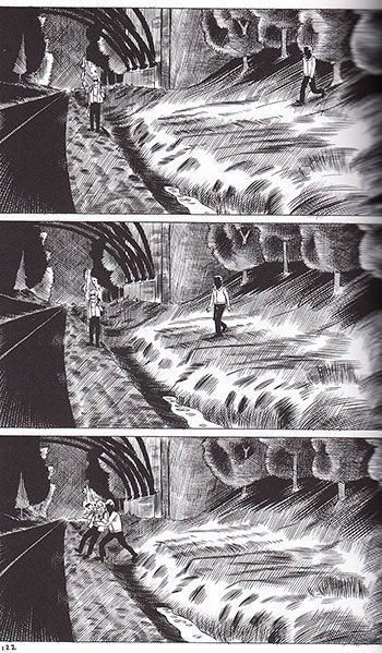
When I had the idea of developing a follow-up to the first comic book I hadn’t any clue visually on how I could connect the story more directly. There was a point in those first 64 pages, when I introduced the Paul Bernardo character, that was a very disturbing thing to do, because he is a real person, he was actually a serial killer and serial rapist in the Toronto area in the early ’90s. His favorite tool was the video camera and when I decided he would play a bigger role in the second and in the third chapter, I had this idea of replaying the crime, so it just seemed the right thing to use this guy in the bushes recording. He really used to do stuff like that, following people, recording them and so on. Colville is a story in three sections but originally I was working on another section, a whole chapter following the police officers who investigate. I actually drew about 25 pages and then scrapped them because they were getting away from the visual replay of that crime. Once I drew them for the second time, they became like in the movie Rashomon, where they replay the same crime from four different perspectives. So at that point it was something that immediately suggested itself as a way of spinning the plot line out in the other characters.
Yes, it’s interesting because this works as a connection between different stories and this makes me think the main character is still the town, Colville, as Newmarket was in The Journal.
Well, I put a lot of effort into making the environment a part of the story, I like stories about a specific region, where you’re finding enough about the characters but you’re also seeing the landscapes, the geography and so on.
And it’s not only about the city but also about the “town criminal organization”, as is the title of the book sent by David’s girlfriend along with his adaptation of Twilight of Superheroes, a never-published comic by Alan Moore…
Well, I call it the Watchmen‘s ending…
In fact it’s very similar and I wanted to ask you about this. Did you want to insert a sort of quotation or to literally reply the Watchmen‘s final scene?
I wasn’t consciously thinking of it as a direct reference, there was a period like years ago, back in the 90’s, when I used to fantasize about the ending of the comic, and I knew there would be this scene where the girl Tracy mails the artwork to me. Initially, I thought about doing that the kid had drawn a mini-comic about this criminal activity, then I thought there would be no book because I wanted to draw this scene in the post office but it should be difficult to take some photo references inside a post office…
And so you used the mail box…
Yes, I thought “I can do it without drawing a post office”. The title of the book, Nomenclature of a Small Town Criminal Organization, was a little bit of a note to my JFK’s days, there was a self-published book I purchased, it was just a photocopied book that you can order through mail, it was called Nomenclature of an Assassination Cabal and I’ve always said “That’s a fucking awesome title”. And so this little idea of this Nomenclature of a Small Town Criminal Organization was a little detail I had in my mind for ten or fifteen years. But definitely as I was drawing it I thought “This is kinda Watchmen‘s ending”.
And this nomenclature is also in the book, page after page the reader is meeting more wicked criminals, so we’ve David, Van, Alan Gold and then Paul, who is the scary guy… Did you imagine it like a sort of crescendo?
I hadn’t the idea of an escalation, no… But I think one of the reasons I didn’t do the book for so long was that I was very uncomfortable with what I decided the ending was gonna be. Originally I decided to draw ten pages of Paul Bernardo in the basement with the girl but I didn’t feel like I had whatever I needed to draw how awful those ten pages were, so I kinda rejected to finish it for a long time. It’s a horrible subject matter.
But you had decided this subject matter had to be in the book.
It’s funny because I could have changed this to do something different but once I decided some years ago that this was the ending, there was no changing option to me.
This could be another reason because you stopped making comics…
You know, opening the store is a big part of it but probably I also felt like I just didn’t have whatever I needed to draw those pages, it was a pretty sickening material to me. I read some books about Paul Bernardo so I knew how horrific the crimes were, so when I came to interpret them fictionally in the comic, to make this character of the girl as a victim of Bernardo, I knew it wouldn’t be pleasant to draw. I didn’t want it to be titillating or exciting, I wanted it to be horrible. And I felt horrible drawing it and I talked to people who felt pretty horrible reading it, so I suppose it was successful if it’s possible to say this.
Finishing the book was a sort of liberation?
I’m glad that I’m done with it and I don’t really have any interest in doing that kind of story again. To me, The Main Street Journal stories have extremely gruesome violence but in the meantime there is a sense of fun and play to them, there isn’t any level of seriousness for the most part.
Yes, and even the drawings are very different, Colville is more realistic.
Well, I think Colville is the best I’ve ever drawn. I’m also very pleased about some pages of the next Main Street Journal but I don’t think I’ll ever put the kind of work I put into Colville into anything else.
I suppose the pages from Colville needed more time than those from The Journal, the cross-hatching is very detailed, especially in the second and third part. And the cross-hatching is a sort of trademark for you.
The Colville pages were drawn much larger for the most part and yes, they took forever. As for the cross-hatching, well, I wouldn’t recommend it to anybody. I think sometimes comic books’ artists put a lot of lines on the page to disguise the fact they can’t draw. But I figure any bad drawing in my comics is there for anyone to see. There is no intention to disguise bad drawings, I’m using the cross-hatching more to create a kind of mood. I think in my earlier comics this was more stylized, then it became more realistic and now I’m going back to a sort of stylized in the next one. I’m going to print in gray tones, drawing in separate black and white layers, a little bit different from the past. It’s hopefully a positive progression, even if I’m sure the next book I’ll do after the new Journal will be the most massively cross-hatching thing I’ve ever done.
So, you’re going back and forth, I guess.
Yeah, I think so (laughs).
Steven Gilbert in his comic shop
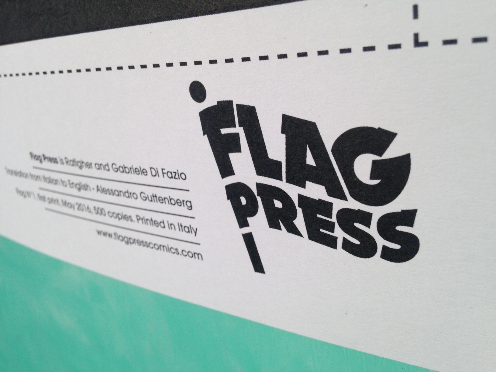
E’ nata Flag Press!
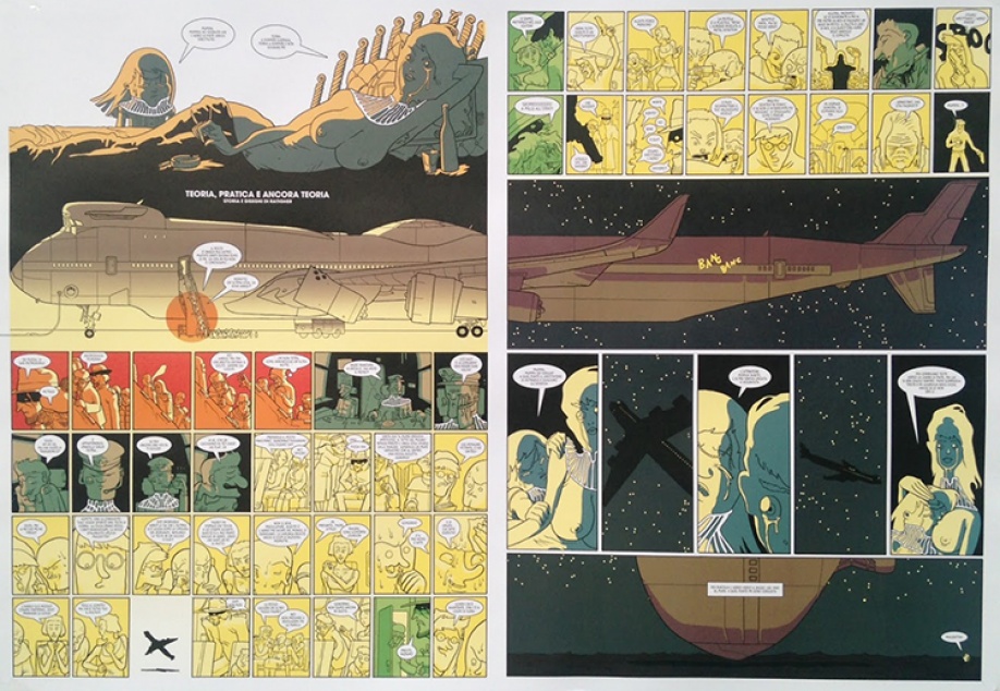
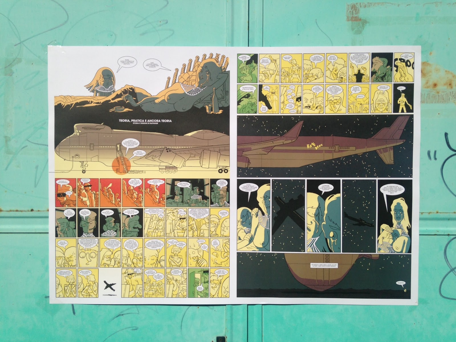
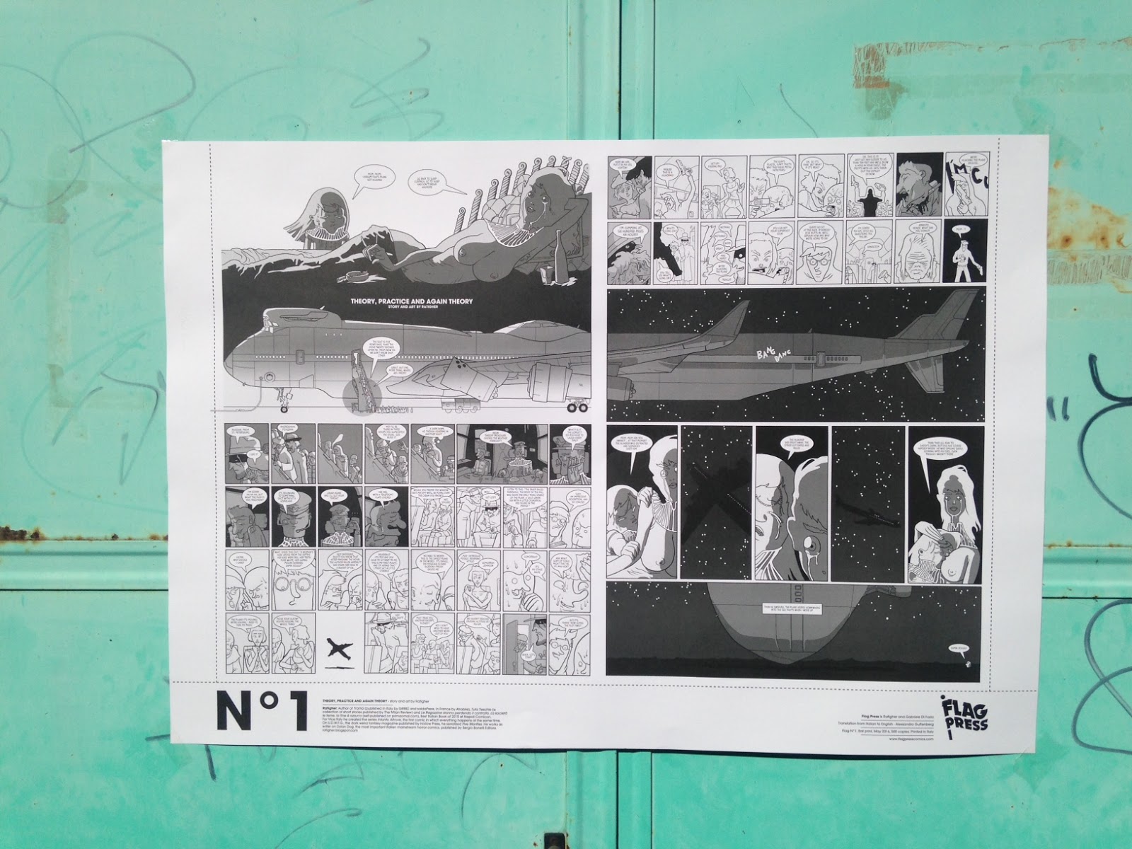
Forse non tutti sanno che insieme a Ratigher ho fondato una piccola casa editrice, la Flag Press, che si propone di pubblicare fumetti in un unico formato, poster orizzontali 70×100 con due pagine affiancate. Abbiamo presentato il progetto all’Arf! di Roma sabato 21 maggio e subito dopo ha debuttato il nostro sito, dove è possibile acquistare il primo poster della serie, intitolato Teoria, pratica e ancora teoria, a firma dello stesso Ratigher.
Probabilmente molti di voi avranno già notato la notizia sui vari social network, siti di informazione e soprattutto sul blog del mio socio, a cui vi rimando per leggere le cose come veramente stanno. Qui mi preme dire che il mio coinvolgimento in Flag Press nasce per volontà dello stesso Ratigher, che covava il progetto da un bel po’. Mi ricordo, anzi, che quando lo incontrai al Fumetto Festival di Lucerna del 2015, mi disse che aveva un’idea e aveva disegnato già il logo per una piccola casa editrice che avrebbe coinvolto autori internazionali e pubblicato fumetti “in un formato un po’ strano”.
![]()
Io già pensavo a cubi, scatole o telefoni ma in realtà no, si trattava di poster, come mi avrebbe rivelato qualche mese dopo invitandomi a diventare la sua spalla nell’impresa (a proposito non provate a fregarmi l’idea della Phone Press, fumetti a forma di telefono). Da allora abbiamo pensato bene a cosa volevamo fare con Flag Press e, al di là della scelta degli autori, la nostra idea si è concentrata sul concetto di “storia”. A tutti e due piacciono le sperimentazioni, i fumetti assurdi e a volte anche apparentemente senza senso, ma quello che qui ci preme realizzare è raccontare su un poster, far diventare narrativo un oggetto che è sempre stato principalmente figurativo, dando inoltre la possibilità agli autori di sbizzarrirsi graficamente sul formato editoriale più grande possibile. E credo che Teoria, pratica e ancora teoria di Ratigher sia veramente il “manifesto” di questa nostra idea, con una storia piena di personaggi, i dialoghi incalzanti, le piccole vignette e l’aereo gigante che viene tagliato in due dallo spazio bianco tra le tavole. Ah, sul retro del poster trovate in bianco e nero la traduzione in inglese della storia. In futuro, se il fumettista scriverà in inglese, sul retro troverete la traduzione in italiano.
Quali autori pubblicheremo con Flag Press? Innanzitutto stiamo lavorando con Ruppert&Mulot, Manuele Fior e Dash Shaw. E poi? Ai poster l’ardua sentenza!
B Comics in mostra a Studio Pilar
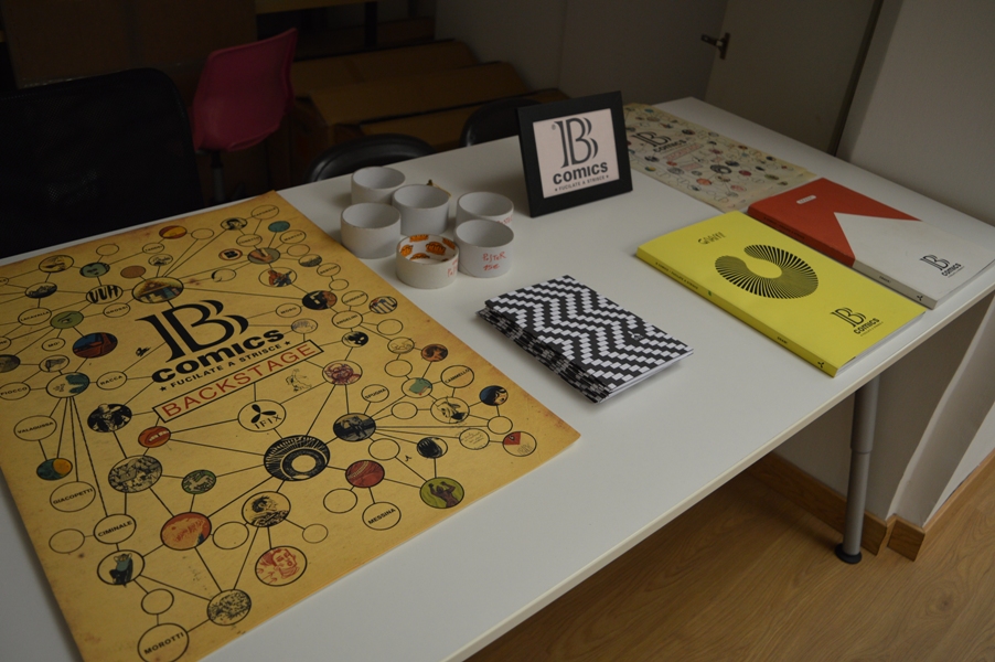
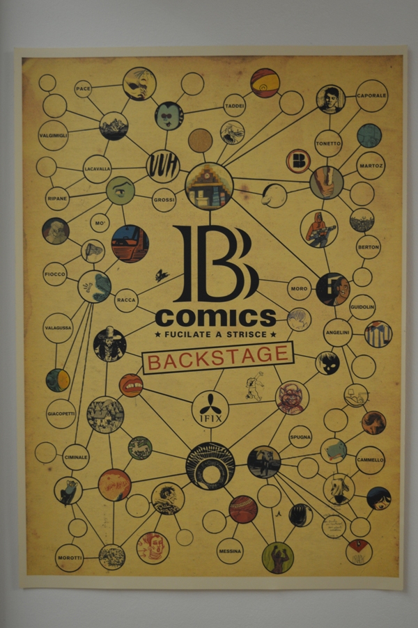
Se vi trovate a Roma in questo periodo, non potete perdere il dietro le quinte dei due volumi di B Comics, a cura di Maurizio Ceccato e pubblicati da Ifix nel 2014 e 2015. Il backstage, ricco di materiali, è iniziato lo scorso venerdì 10 giugno e sarà aperto dal giovedì al sabato dalle 11 alle 20 presso Studio Pilar, in via Panfilo da Castaldi 16 a Testaccio, con festa di chiusura in programma sabato 2 luglio dalle 19 alle 24.

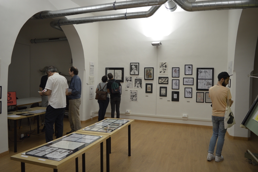
Ho visitato la mostra e fatto un po’ di foto, che potete vedere di seguito. I due volumi di B Comics, Crack! e Gnam!, raccolgono in grande formato i lavori di artisti italiani che vengono dal mondo dell’autoproduzione o addirittura esordienti, anche se alcuni di loro si sono nel frattempo affermati pubblicando per case editrici o realizzando progetti di illustrazione di primo piano. Ceccato nella costruzione di queste antologie ha guardato soprattutto all’originalità e alla forza del segno e infatti molti degli autori di B Comics vengono dal mondo dell’illustrazione, cosa che ha comportato in molti casi un metodo di lavoro ben diverso da chi invece utilizza le strutture del fumetto tradizionale.
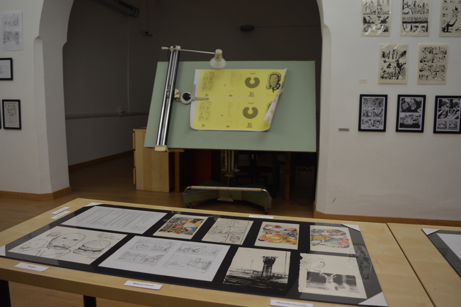
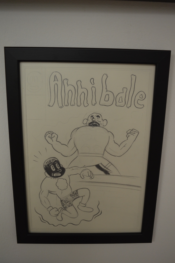
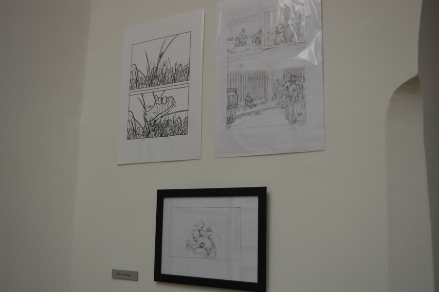
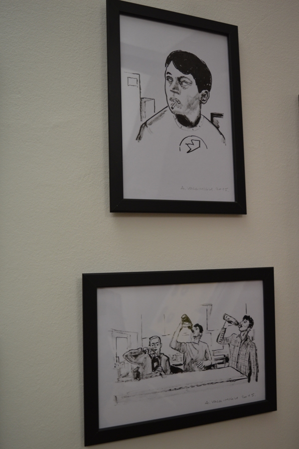
Guardando i lavori esposti sulle pareti dello studio e sfogliando le pagine di un ricchissimo portfolio, ciò che si nota innanzitutto è la differenza di approccio tra autori diversi. Questo backstage diventa così un’occasione per capire i mille modi in cui può nascere un fumetto. C’è chi come il duo Marco Taddei-Simone Angelini si affida a una sceneggiatura tradizionale, chi come Emanuele Giacopetti dà forma a sketch ricchi di testo, chi come Alberto Valgimigli disegna, disegna e disegna fino a scegliere per la sua storia soltanto una piccola parte del materiale realizzato. Oltre ai materiali di lavorazione ci sono ovviamente anche tanti disegni e tavole originali dei vari Spugna, Martoz, Lorenzo Mò, Elena Guidolin, Alessandro Ripane, Maurizio Lacavalla, Roberto Grossi, Manfredi Ciminale e tanti altri. Buona visione.
Alessandro Ripane
Elena Guidolin

Marco Taddei e Simone Angelini
Maurizio Lacavalla
Emanuele Giacopetti
Manfredi Ciminale
Spugna
Spugna
Lorenzo Mò
Lorenzo Mò
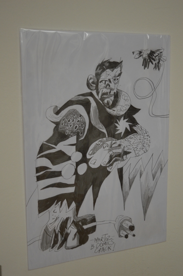
Martoz
Roberto Grossi
Alberto Valgimigli

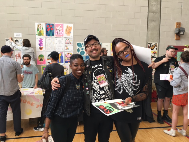
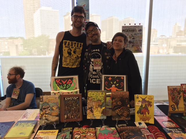
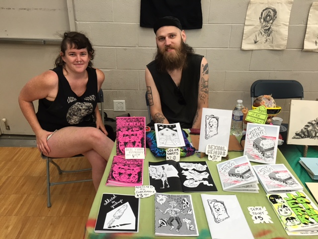
Chicago Alternative Comics Expo 2016
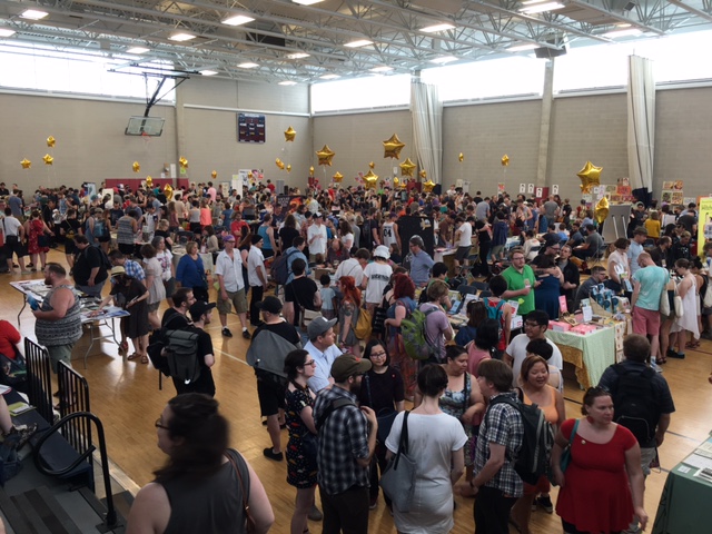

La fumettista Corinne Halbert, una degli organizzatori del CAKE 2016, si è prestata a fare da inviata per Just Indie Comics in occasione di uno dei più importanti festival alternativi del Nord America, che si è svolto a Chicago nel weekend 11-12 giugno. Potete vedere le sue foto e leggere il suo reportage, ovviamente in inglese, a questo link. Grazie a Corinne e buona lettura a voi.
Pics & Words from CAKE 2016
by Corinne Halbert*
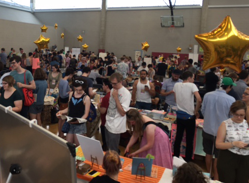
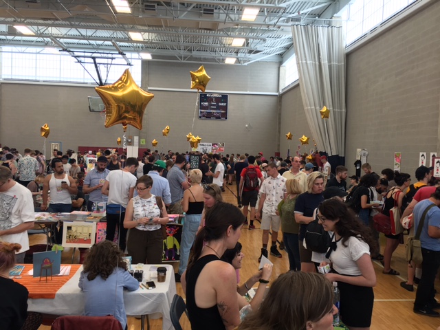
CAKE 2016 was a huge success and a ton of fun, here are some highlights from the 5th installment of the Chicago Alternative Comics Expo.
Chester Brown was signing books and celebrating his newest Graphic Novel Mary Wept Over the Feet of Jesus at the Drawn and Quarterly Table. Leslie Stein and Paco Roca were at the Fantagraphics table. John Pham and Sammy Harkham were slinging the fantastic Kramers Ergot #9 as well as several gorgeous books by Pham. Gabby Schulz was at the Secret Acres table signing his new gut wrenching and exquisitely rendered Graphic Novel Sick. Sacha Mardou and Ted May were at Alternative Press/Revival House Press table. Sadly Trina Robbins had to cancel her appearance due to health issues but Scottish Cartoonist Eddie Campbell, creator of From Hell was able to make a guest appearance and fill in for her panel. Ed Luce of Wuvable Oaf had so many fantastic publications. Krystal DiFronzo created the artwork for CAKE 2016 and had beautiful books available at her table with the amazingly talented Lale Westvind tabling right next to her.
John Pham at Kramers Ergot Table
Krystal DiFronzo
Lale Westvind
Quimby’s, the legendary Chicago bookstore, celebrated their upcoming 25th anniversary with a panel discussion with Liz Mason, Gabby Schulz and Laura Park moderated by Jake Austen. Chris Gooch and Sarah McNeil from Melbourne Australia were the CHIPRC inbound TRANSIT artists in residence. Sparkplug Books celebrated 14 years of excellent publications and Cathy G. Johnson lead a roundtable discussion about journal comics.
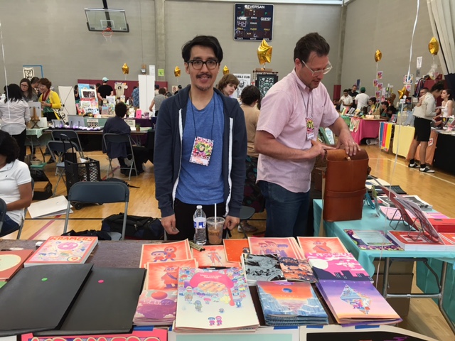
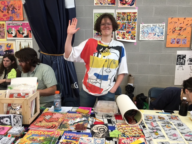
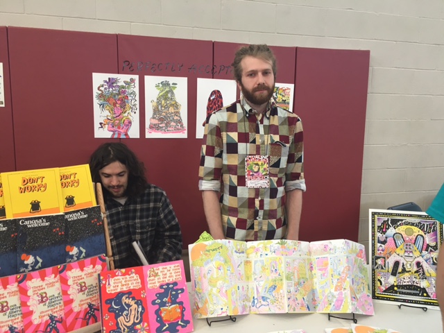
There were so many great small publication debuts this year at CAKE. Jon Drawdoer had his comic hello, Anya Davidson with her gorgeous comic Gloom Planet risographed by Perfectly Acceptable Press, Lisa Hanawalt with her book Hot Dog Taste Test, Lane Milburn with Broken Panels #1 , Victus #4 by Tyrell Cannon, Bad Dog!!/Good Kitty! by Mike Freiheit and Isabella Rotman, Coin-Op #6 by Peter and Maira Hoey to name a few. A more extensive list can be found here. There were even more debuts than the 30 listed as I know there were artists working up till the last minute to finish up their books.
Jon Drawdoer
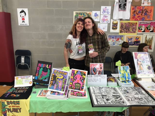
Anya Davidson and Lane Milburn
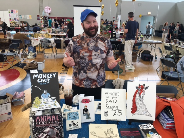
Mike Freiheit

Coin-Op
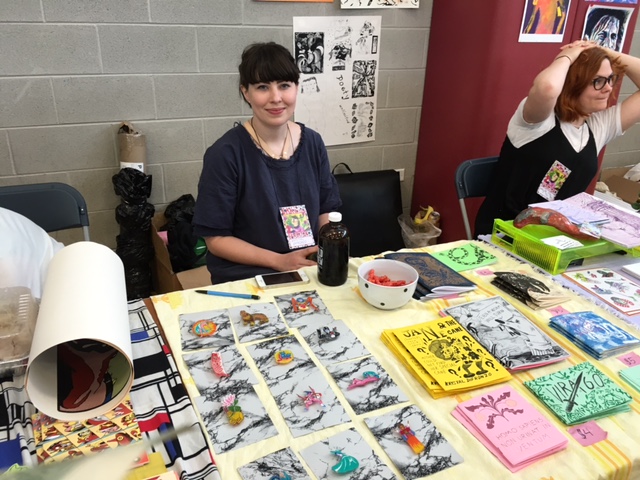
To mention a few Chicago staples Trubble Club was there debuting their amazing Nate Beaty themed comic Tiger Beaty. Prolific illustrator and comics artist JB Roe was representing Chicago but hanging with the incredibly cool Providence publishers Hidden Fortress Press. Dynamite illustrator and comic’s creator Johnny Sampson had his killer debut Total Fuck Up. Onsmith and Nudd were stirring up trouble as usual and Laura Park had her gorgeous debut Do Not Disturb My Waking Dream #5.
JB Roe and friends
Hidden Fortress Press
Onsmith, Nudd and Chris Cilla
Chris Cilla
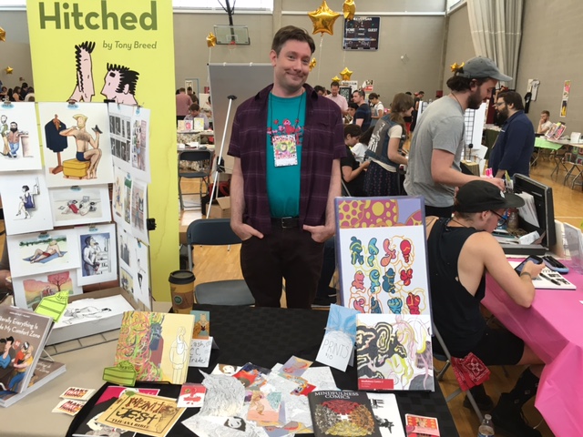
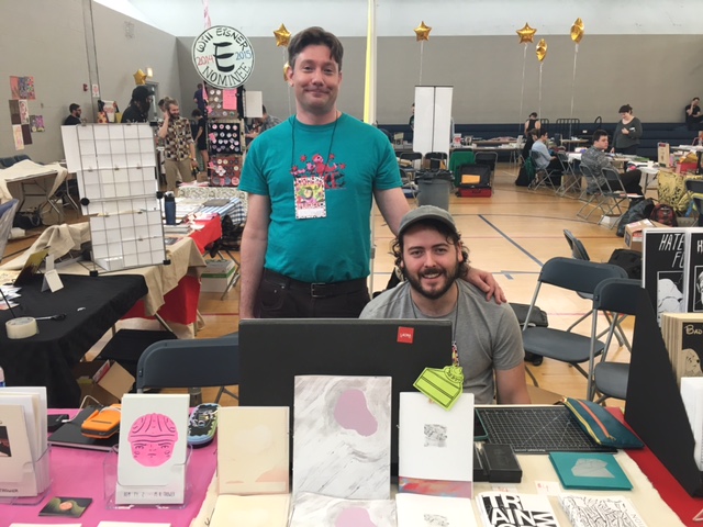
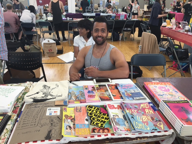
Spudnik Press was slinging fabulous publications as usual and Tan and Loose Press had some sexy ass prints for sale. Keith Herzik creator of Alamo Igloo had incredible hand-screen printed books and posters available and Eddy Rivera had his sexy anthology zine Puddin #3 on debut. Scott and Keiler Roberts, Brad Rohloff, Chloe Perkis, Grant Reynolds, Brett Manning, The Ladydrawers, Odin Cabal, Jonathan Bell Wolfe, Cathy Hannah, Gina Wynbrandt, Kevin Budnik, Chris Cilla, Math-you-Land-vote, Jessica Campbell, Danielle Chanette, Josh Cotter, Henry Guerra, Amy Peltz, Tony Breed, Radiator Comics, RJ Casey of Yeti Press, Dave Scheidt, Scott R. Miller, Ian McDuffie, Matt Davis of Perfectly Acceptable Press and Kelsey Choo were all there with beautiful books to list some more.
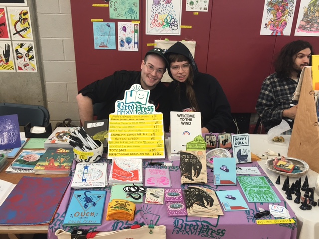
Brad Rohloff of Bred Press and Chloe Perkis
Dave Scheidt
Gina Wynbrandt
Grant Reynolds, Hannah Chavez and Onsmith
J.D. Lee
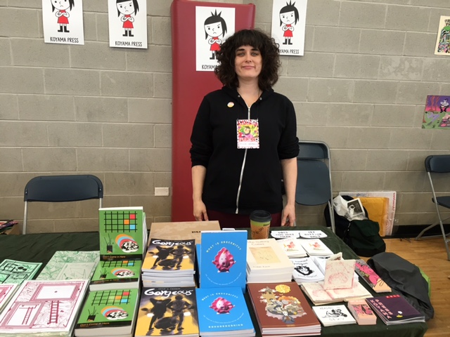
Jessica Campbell at Koyama Press table
Jon Drawdoer and Jonathan Bell Wolfe
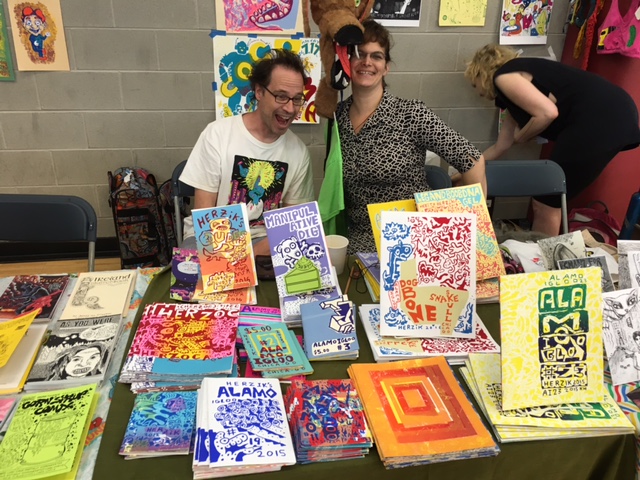
Keith Herzik and Gina Herzik
Math-you Land-vote
Matt Davis (Perfectly Acceptable Press)
Odin Cabal
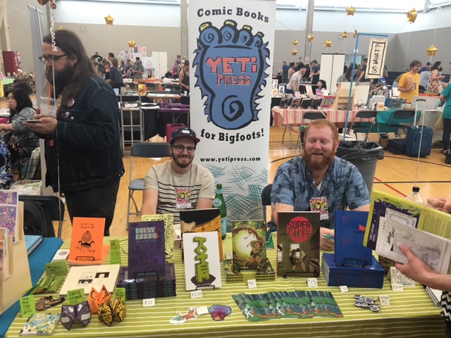
RJ Casey (Yeti Press)
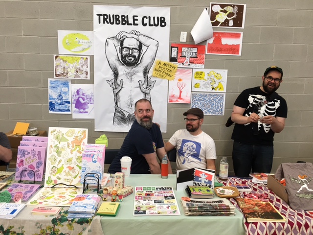
Trubble Club
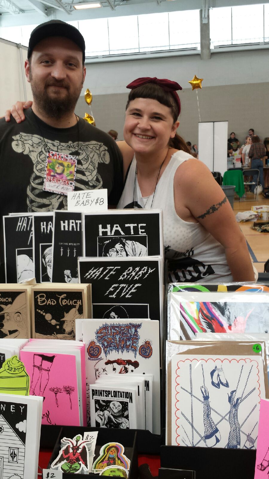
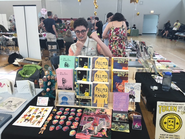
Scott R. Miller and Corinne Halbert
I’d like to take a moment to mention some of the current core organizers of CAKE. Jeff Zwirek, Neil Brideau, Max Morris, Ben Bertin and Alli Alleman. Without their tireless efforts and undying commitment to the alternative comics community in Chicago CAKE wouldn’t be possible. They are all wonderful, generous and devoted people and their continued support of artists both local and from all around the world should be recognized and celebrated.
In addition to support the core organizers are the other kick-ass CAKE coordinators Jessica Campbell, Brian Cremins, Mike Freiheit, Amy Peltz, Chris Lopez, Matthew Brady, Isabella Rotman, Henry Guerra, KT Hawbaker-Krohn, Marnie Galloway, Jon Mastantuono. There were too many talented artists to list them all! Thanks to everyone who made it out to CAKE 2016, I hope to see you all in 2017!
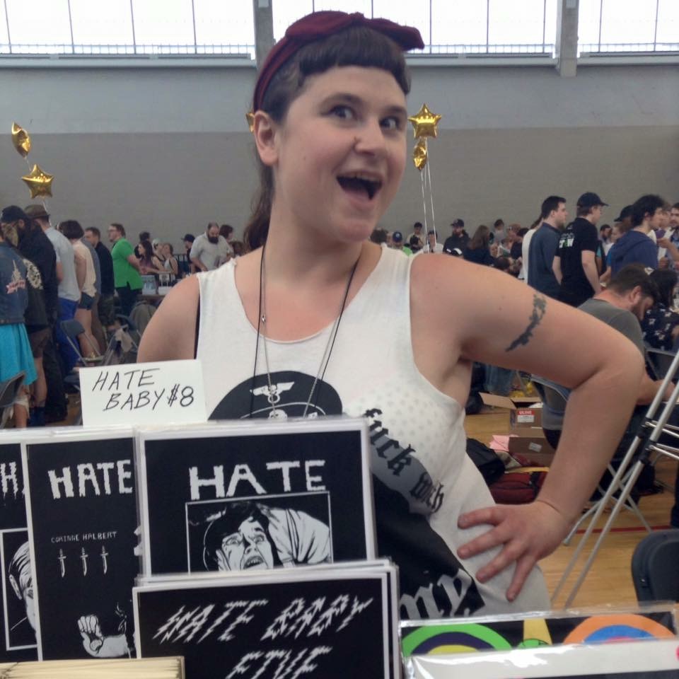
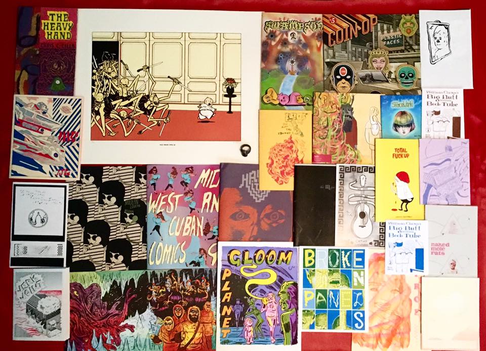
*Corinne Halbert is one of CAKE coordinators and exhibited at the show with her mini-comics Honey, Hate Baby and Bad Touch (the latter in collaboration with Scott R. Miller). Below Corinne at her table and her haul at the festival.
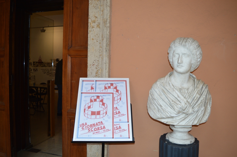
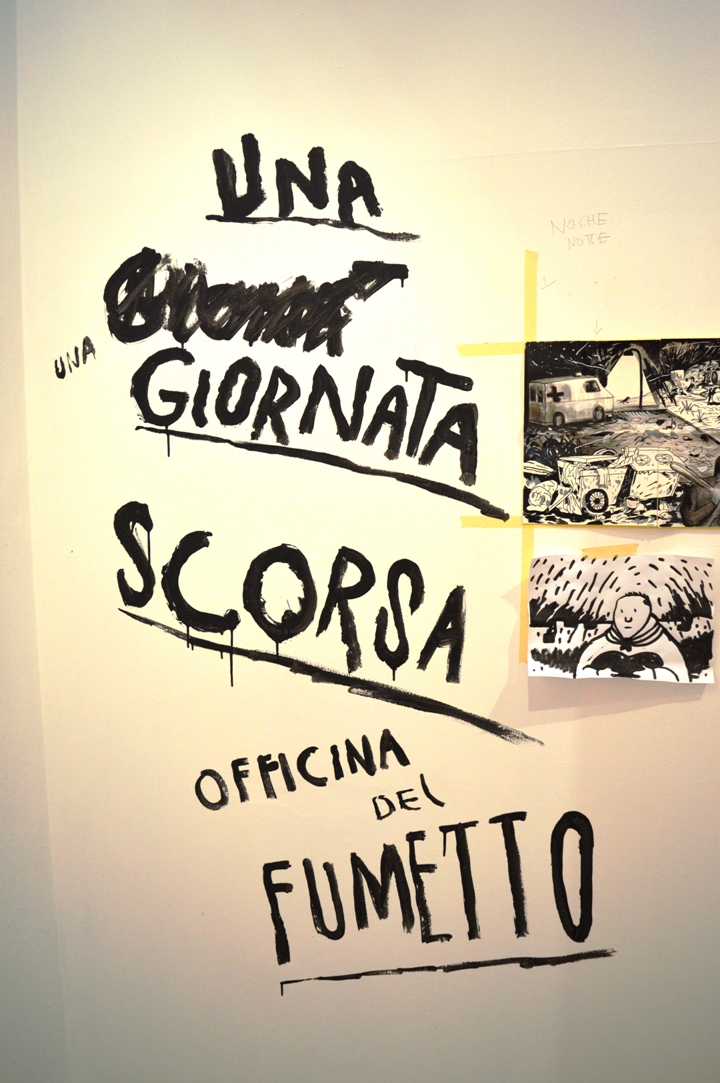
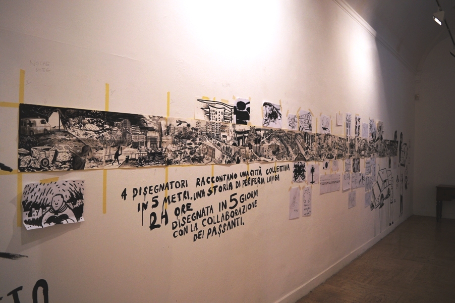
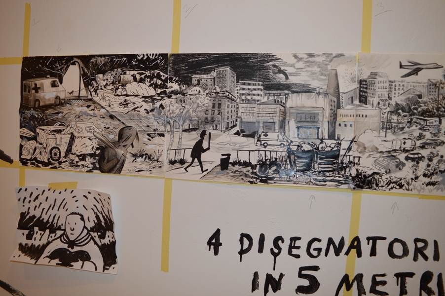
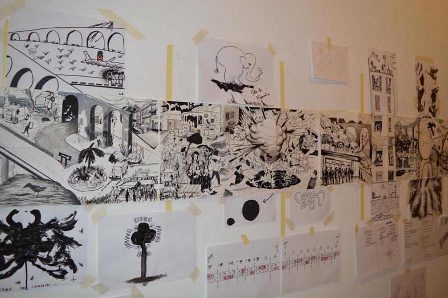
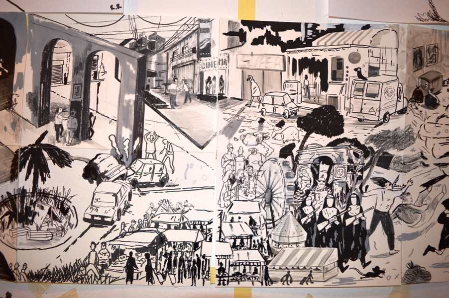
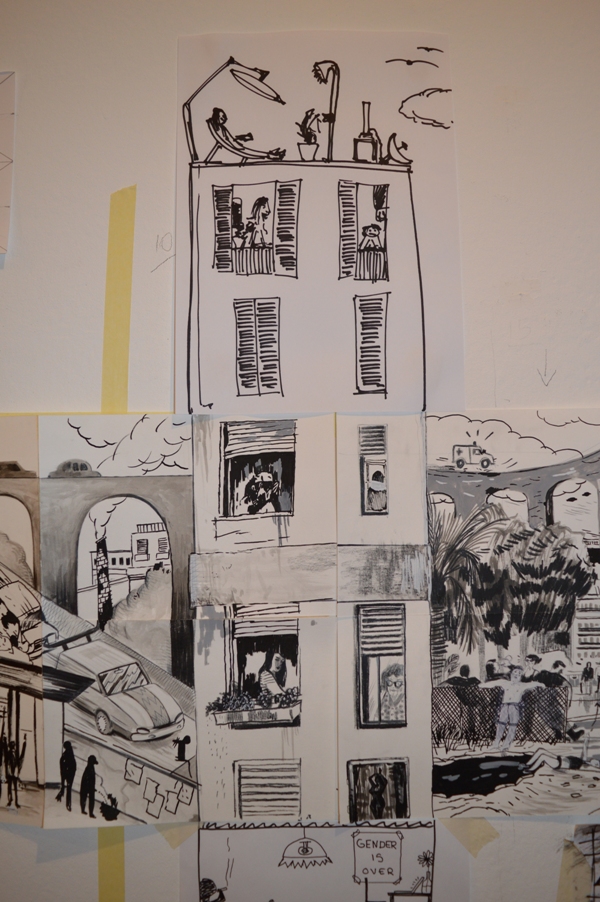
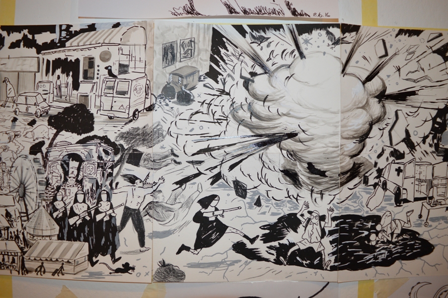
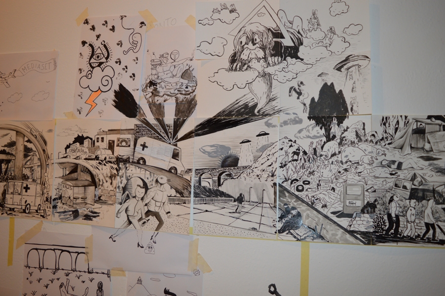
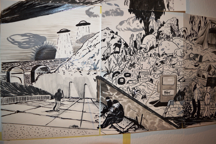
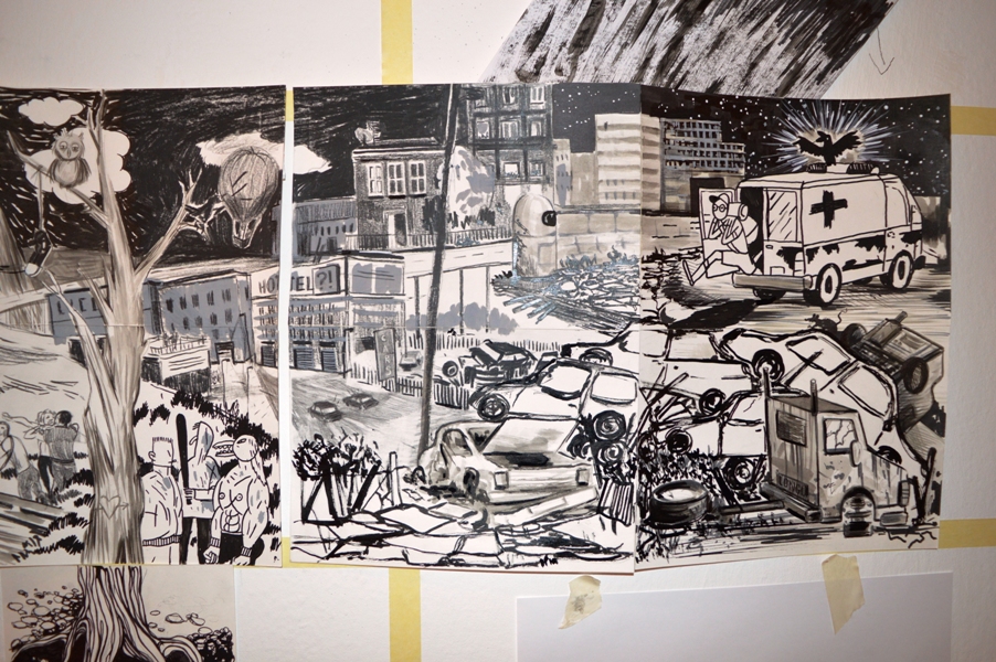
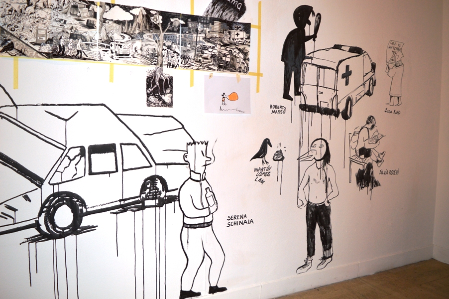
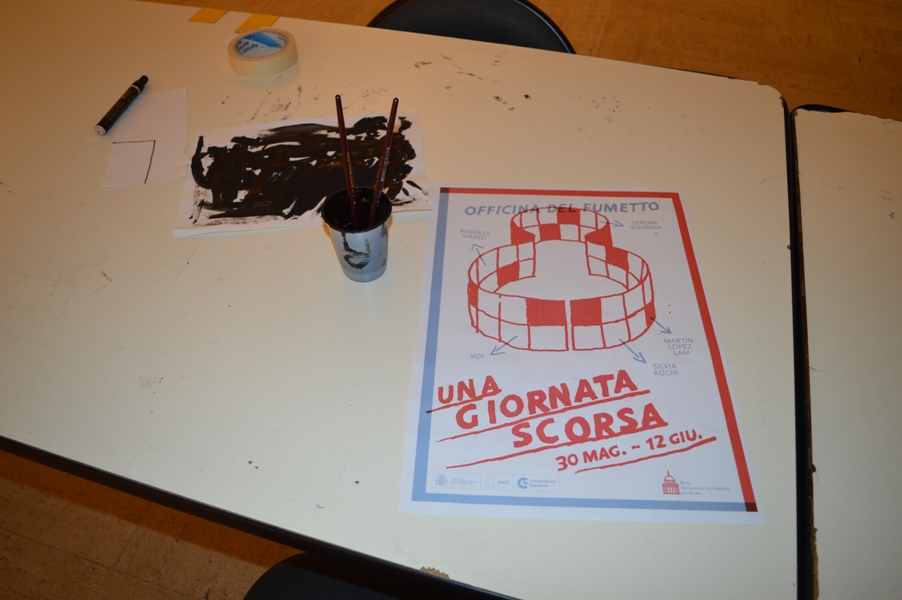
Una giornata scorsa
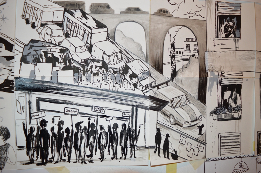
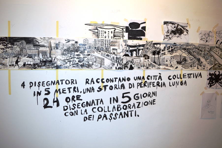
Da martedì 31 maggio a sabato 4 giugno i fumettisti Serena Schinaia, Silvia Rocchi, Roberto Massó e Martín López Lam hanno “occupato” le sale dell’Accademia di Spagna a Roma per realizzare un fumetto a 8 mani, intitolato Una giornata scorsa. Utilizzando 64 piccoli segmenti, i quattro hanno dato forma a un lavoro collettivo lungo 5 metri, che è stato esposto nei giorni seguenti presso l’Accademia e che verrà pubblicato in un leporello in occasione del prossimo Crack! Festival, al Forte Prenestino di Roma dal 23 al 26 giugno. Ma lo spirito collaborativo si è sviluppato anche verso l’esterno, dato che i quattro hanno invitato i visitatori della mostra a contribuire con idee, disegni, schizzi e appendici: scopo del progetto infatti era non soltanto illustrare e raccontare ma anche mostrare la genesi di un progetto di gruppo e le dinamiche di collaborazione tra artisti di diversa estrazione. Se il lavoro di Schinaia, Rocchi, Massó e López Lam si è sviluppato in orizzontale, quello dei vari ospiti ha ampliato in verticale le idee dei quattro, dando forma a radici degli alberi, palazzi a più piani, divinità, ufo e altro ancora. Tra i vari collaboratori vi segnalo Bambi Kramer, Valerio Bindi, Luca Ralli e tanti degli artisti residenti in Accademia. Il progetto nasce infatti dalla residenza di López Lam presso l’istituto spagnolo, di cui ha già parlato su queste pagine Serena Di Virgilio a proposito dell’incontro e della mostra organizzati di recente a Bologna.
Tema di Una Giornata Scorsa è la periferia urbana come luogo di passaggio. Osservando il risultato finale, si nota comunque una dimensione narrativa preponderante, resa possibile dall’uso di una struttura predefinita su cui i quattro artisti hanno comunque avuto la libertà di improvvisare e divagare. I personaggi ricorrenti (il losco figuro incappucciato con la mazza da baseball in mano, il bambino, l’autista dell’ambulanza ecc.) danno unità alla lunga panoramica e catturano lo spettatore, impegnato a ricercarne le tracce e a partecipare attivamente a quello che essenzialmente è un gioco. Qua e là affiorano inevitabilmente i tratti di una Roma periferica, ingarbugliata, caotica, probabilmente dovuti a Schinaia e López Lam, che negli ultimi tempi hanno vissuto nella capitale. Ma a parte questo non sempre è facile capire chi ha fatto cosa, perché tutti hanno disegnato sopra gli altri, cercando di scomparire dietro a uno stile unico. Certo, magari si riconoscono nel bambino le forme arrotondate di Massó o nelle donne alla finestra le linee della Rocchi, ma in generale l’impressione è quella di una coesione forte, segno che l’idea iniziale ha trovato perfetta applicazione.
Una Giornata Scorsa è in mostra fino al 12 giugno all’Accademia di Spagna di Piazza San Pietro in Montorio 3, con orario 10-18. Successivamente verrà esposto al Crack!, dove chi vorrà potrà contribuire a sua volta disegnando sopra, sotto e a lato delle creazioni dei quattro artisti. Nel frattempo, un po’ di foto scattate sul posto.