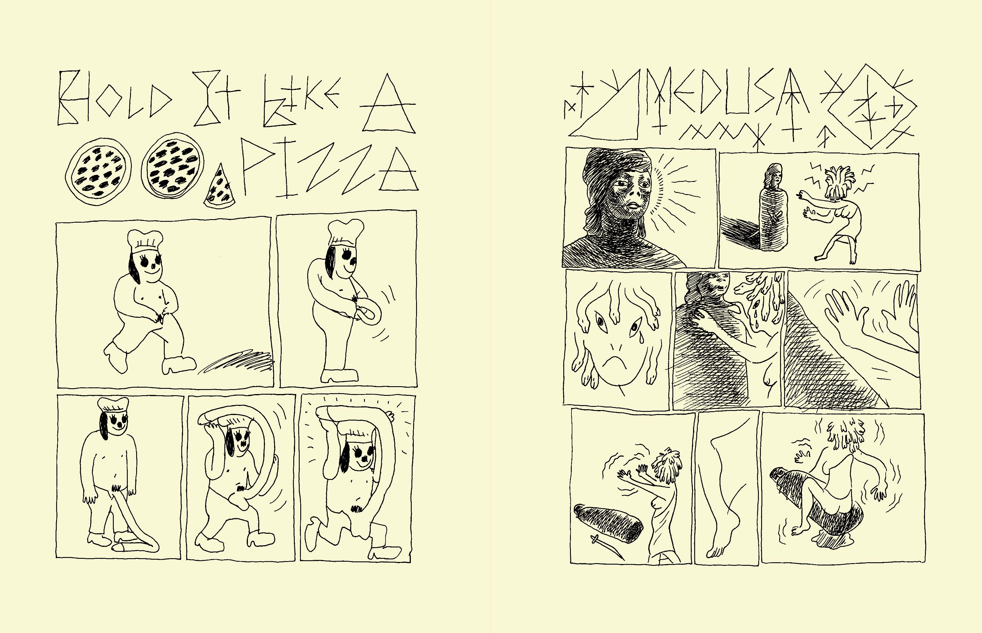
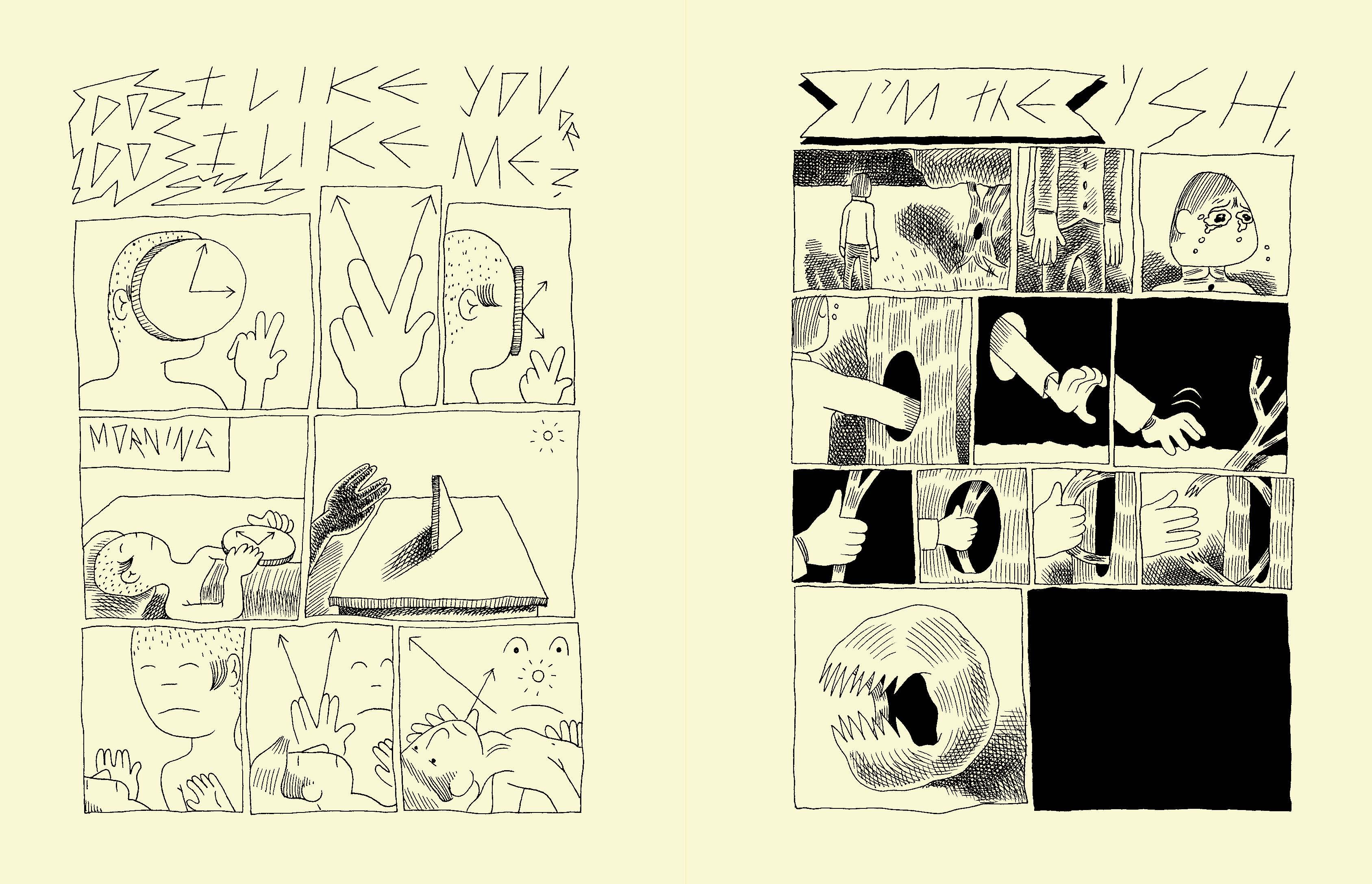
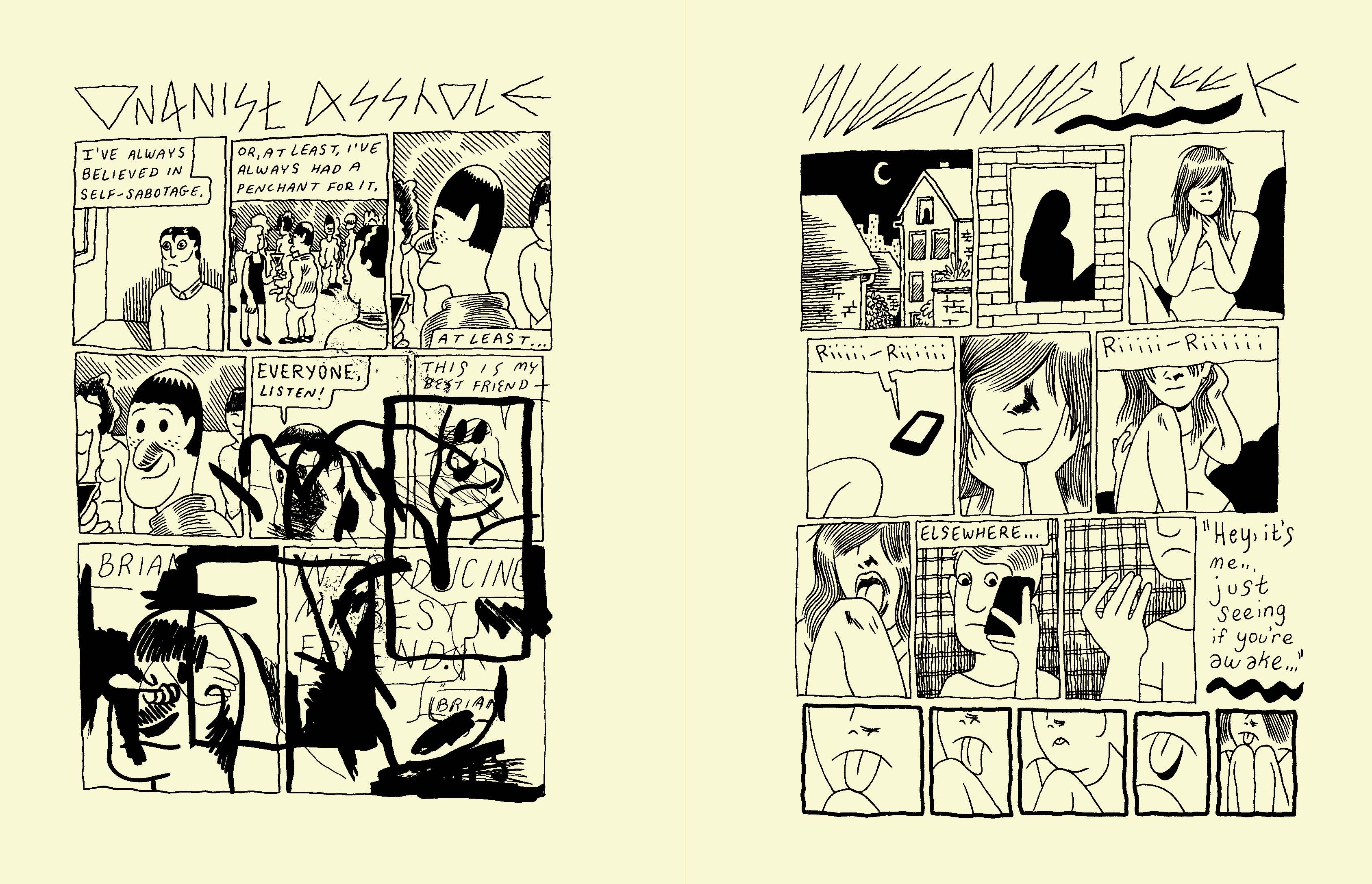
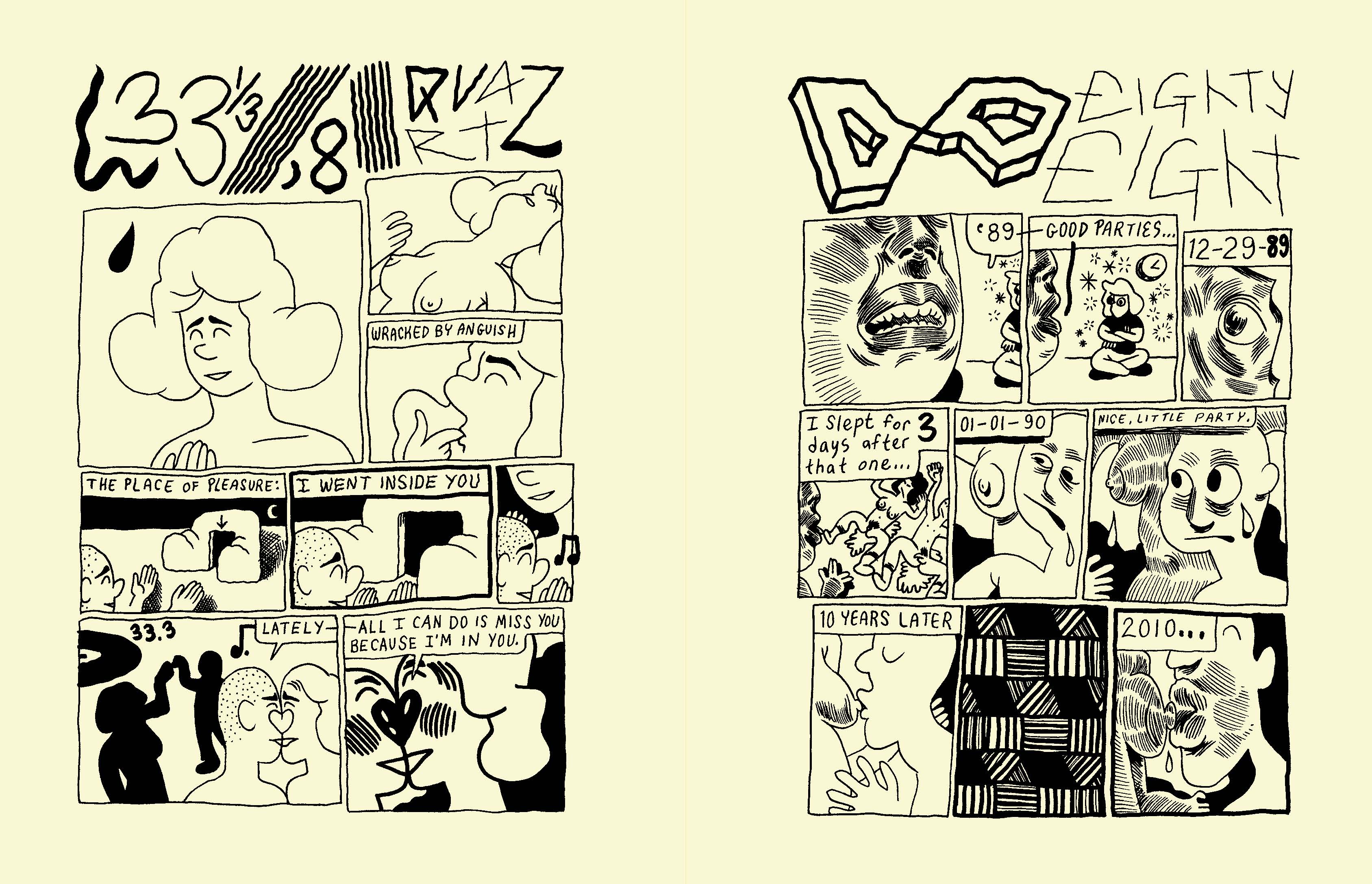
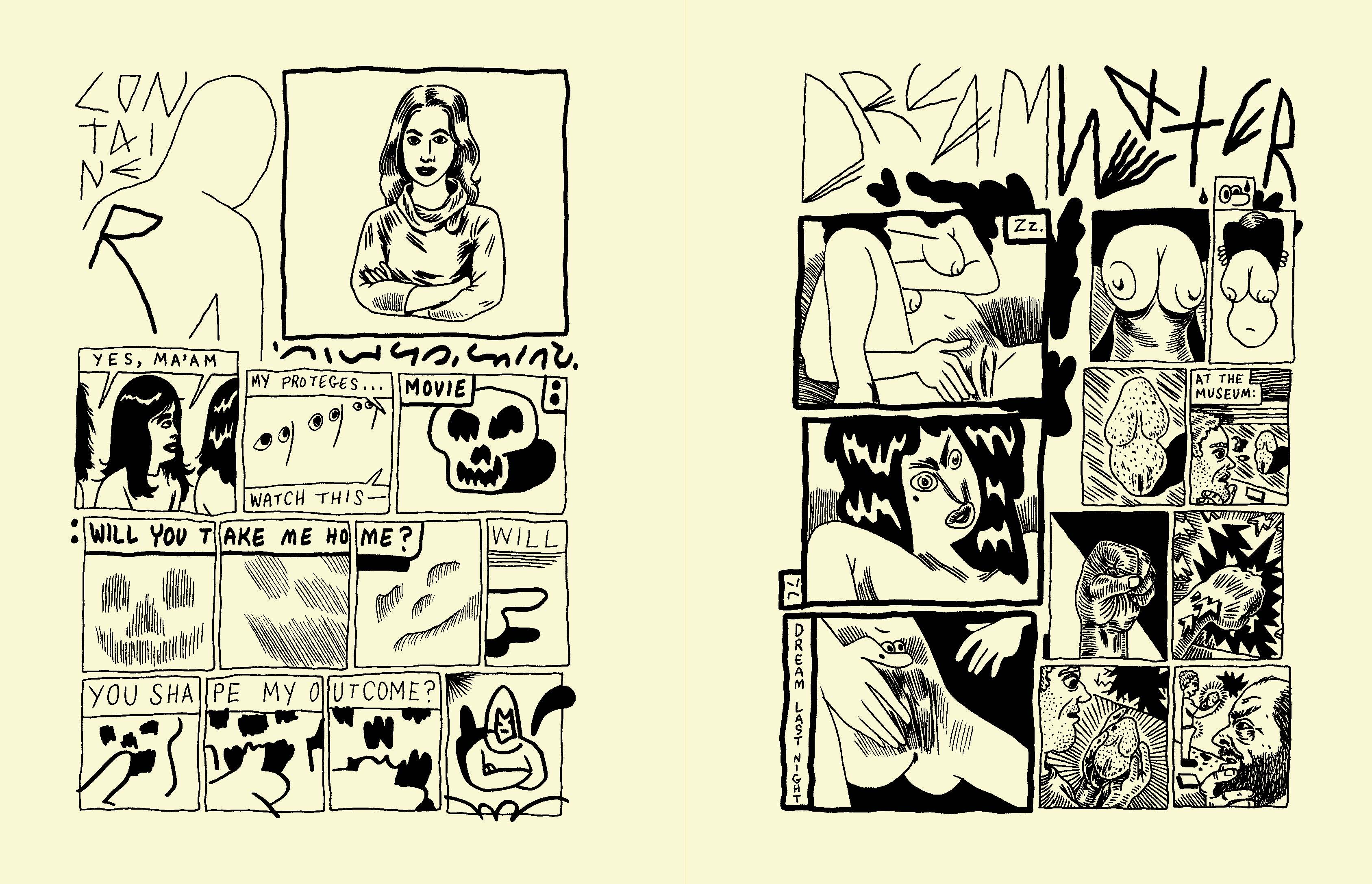
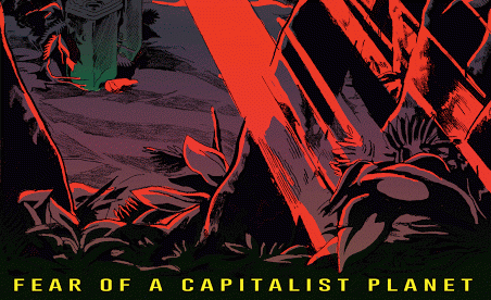
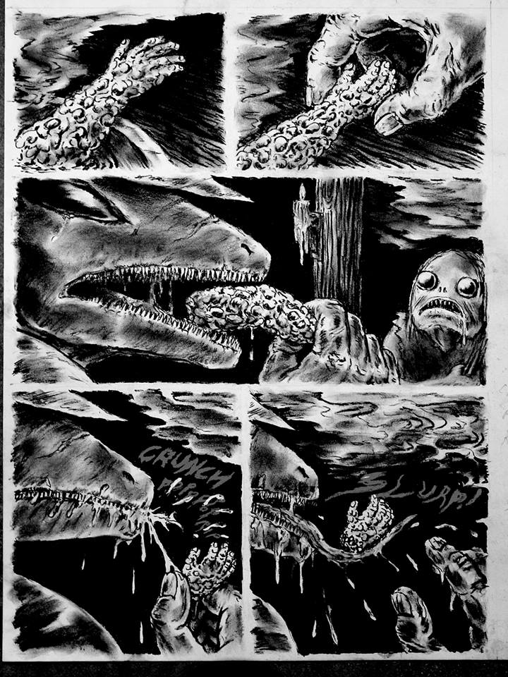
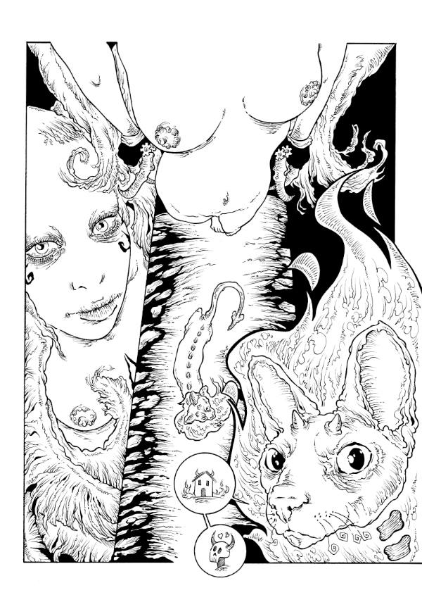
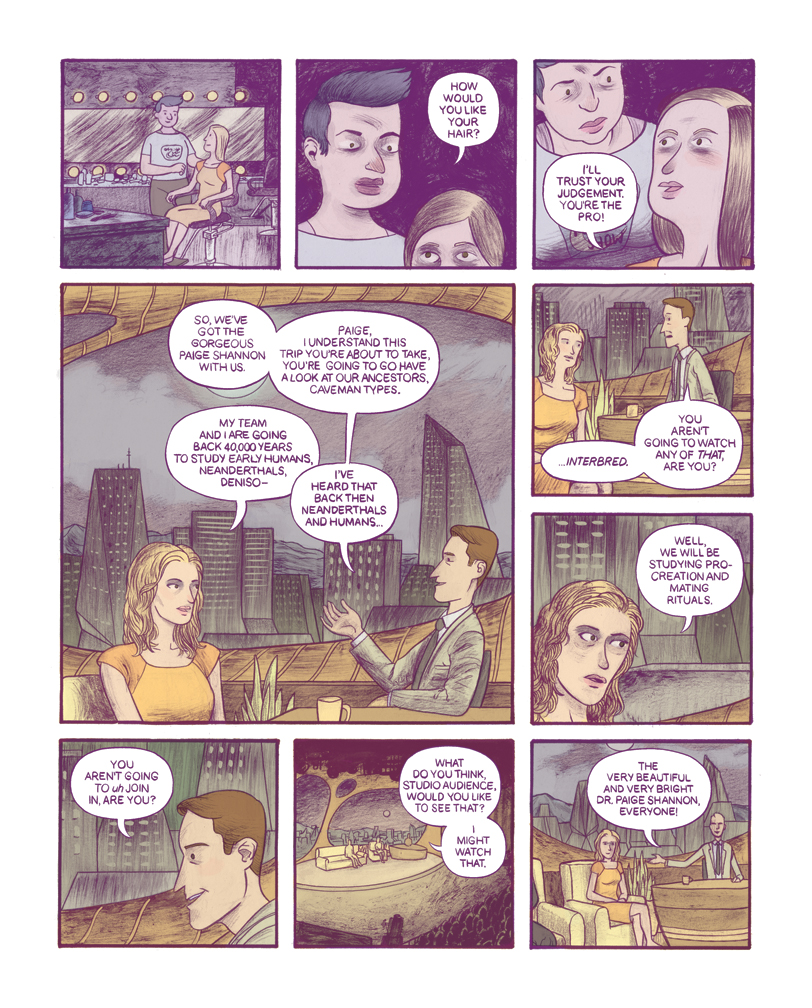
Anteprima di “Qviet” di Andy Burkholder
Ha debuttato al CAKE di Chicago lo scorso weekend del 5-6 giugno Qviet, un volume pubblicato dalla 2D Cloud di Minneapolis che raccoglie una serie di strip realizzate a partire dal 2011 da Andy Burkholder su Tumblr, poi ristampate in alcuni mini-comics. Misterioso all’inizio, anche perché l’autore chicagoano si firmava semplicemente “Tracy”, il lavoro di Burkholder si è via via fatto notare per uno stile inconfondibile, che in brevi flash di una pagina rivisitava e rileggeva con piglio avanguardistico il linguaggio sintetico e convulso delle strip. I segni, le linee, le forme sono senz’altro il centro del suo lavoro, soprattutto nella produzione iniziale, ma al tempo stesso rappresentano un punto di partenza per passare dall’astratto al corporeo, andando a sviscerare tematiche sessuali con ironia e affilato realismo. Nel corso del tempo il segno si è fatto più corposo ed è arrivato così a creare tavole estremamente efficaci e più compiute esteticamente. Di seguito alcune pagine in anteprima di Qviet, la cui data di uscita ufficiale è il 15 giugno.
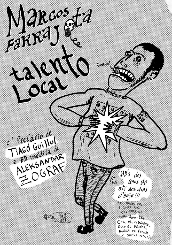
Marcos Farrajota e la scena portoghese
Marcos Farrajota è l’editor di š! #20, il numero speciale dell’antologia lettone dedicato ai fumetti portoghesi (di cui ho parlato in quest’altro post), ma è anche la persona dietro a un sacco di interessanti progetti in Portogallo, un bibliotecario alla Bedeteca de Lisboa – uno dei migliori luoghi legati al fumetto in Europa – e un cartoonist, autore di tantissimi mini-comics e della raccolta Talento Local. In Italia si è fatto notare per la collaborazione con il Crack! Festival del 2009 che è sfociata nella pubblicazione dell’antologia Crack On e per il suo contributo a Quadradinhos, un’antologia curata da Alberto Corradi che faceva da complemento alla mostra sul fumetto portoghese realizzata in occasione del Treviso Book Festival del 2014 (qui potete leggere la prefazione dello stesso Corradi). Ho intervistato Marcos per parlare di fumetti portoghesi e altro.
Inizierei questa intervista facendo ordine tra i tuoi vari progetti, dalla fanzine Mesinha de Cabeceira, nata nel 1992, al collettivo Mmmnnnrrrg, di cui nel 2015 si festeggiano i 15 anni, fino a Chili Com Carne, che forse è la realtà più conosciuta fuori dal Portogallo e che ha anche un aggiornatissimo blog. Puoi dirmi come sei passato da un progetto all’altro e come stai dedicando tempo e spazio alle diverse etichette al momento?
Beh, in realtà è tutto molto organico, nel senso che non c’è obbligo di pubblicare ogni anno un Mesinha de Cabeceira, per esempio tra il 1997 e il 2000 ci sono voluti tre anni per far uscire un nuovo numero… Inoltre, Mesinha è pubblicato a volte da CCC, altre da MNRG… Una confusione per i bibliotecari e i collezionisti, credo.
CCC coinvolge anche più persone e così possiamo dividerci il lavoro… E MNRG siamo Joana Pires e io – siamo una coppia, quindi possiamo parlare a casa delle nostre idee.
Tutti i progetti sono “hobby”, non lavori professionali che ci fanno guadagnare la pagnotta… Ci rilassiamo quando ci dobbiamo rilassare e agiamo quando c’è bisogno di agire!
A vederla da fuori, guardando le vostre pubblicazioni e gli eventi che organizzate, la scena portoghese sembra decisamente vivace. Eppure nell’introduzione a s! #20 sottolinei più volte il fatto che fare fumetti sia un processo solitario, arrivando a definire il medium come “una forma di tortura, uno sforzo inutile privo di cause e conseguenze, che non offre gloria né nessun’altra forma di ricompensa personale”. Mi sembra un concetto legato in qualche modo alla citazione di Pessoa che dice “tutto quello che facciamo, nell’arte o nella vita, è una forma difettosa delle nostre ambizioni iniziali”, come se questa idea dell’inutilità del fare fumetti ti sia arrivata nel corso di questi anni di attività come autore e come editore…
C’è stato un periodo più buio nella scena portoghese, ma ora ci sono nuove persone piene di energia e di idee… Questi ultimi cinque anni sono stati eccitanti, dopo una fase in cui sembrava non succedesse nulla dal 2005 al 2010. Ora ci sono i “professionisti” che lavorano per il mercato statunitense, piccoli editori che crescono e fanno ben sperare per il futuro, i medi editori che tornano e una crescente attenzione per il mercato del graphic novel. Speriamo che questo permetta di avere sempre più fumetti sperimentali e d’avanguardia… Perché altrimenti si creerebbe soltanto un grosso buco nero, gli artisti si sentono senza sbocchi perché il loro lavoro non interessa a nessuno, neanche agli appassionati di fumetto, che in realtà sono i lettori peggiori perché sono degli stronzi conservatori che collezionano merda infantile. Penso che proprio per questo ho sempre guardato al di fuori del Portogallo, in modo da avere più prospettiva e più feedback. I cartoonist della nuova generazione, come Amanda Baeza, già lo davano per scontato, non a caso il primo libro di Amanda è stato pubblicato in Lettonia, cosa che trovo veramente fantastica.
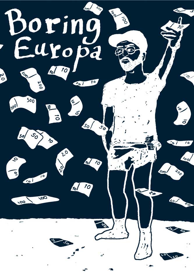
La pubblicazione di antologie come Mutate & Survive e Boring Europa, che univano agli autori portoghesi altri artisti da tutta Europa, risale ormai a diversi anni fa, mentre l’ultima esperienza in questo ambito, Futuro Primitivo, è del 2011. Ultimamente invece Chili Com Carne si sta dedicando sempre più a libri realizzati da un unico autore. Pensi che questa sia una tendenza attuale del mercato, che formati come l’antologia o la rivista interessino ormai a un numero di appassionati sempre più ristretto mentre con il cosiddetto graphic novel è più facile guardare anche al lettore occasionale?
Pura coincidenza. Sono state le forze cosmiche a far venir fuori i graphic novel di David Campos, Francisco Sousa Lobo, André Coelho e Nunsky… Ed è anche vero che fare un’antologia in modo interessante (scegliendo un tema, per esempio) è un duro lavoro per l’editor! Stiamo ancora lavorando a delle antologie, come la serie QCDA o il prossimo volume di Zona de Desconforto, una serie in cui autori stranieri parlano delle loro esperienze in Portogallo. Quest’anno usciranno anche diversi libri realizzati da un solo autore, il che è ottimo perché in questo modo ci sono più libri da scoprire e da leggere.
Per quanto riguarda il mercato, è chiaro che i graphic novel sono IL formato che ha venduto di più negli ultimi dieci anni, ma anche nel mondo della letteratura esistono le antologie e vendono di meno perché sono per un pubblico più ristretto, cioè per le persone della “scena”, non per una grande audience. Per il nostro piccolissimo mercato (in Portogallo) e per la nostra bassa tiratura (di CCC o MNRG) al momento non c’è grande differenza, la gran parte delle nostre antologie sono esaurite mentre ci sono tanti fumetti monografici che sono ancora disponibili – ma è anche vero che i graphic novel risalgono al massimo a tre anni fa…
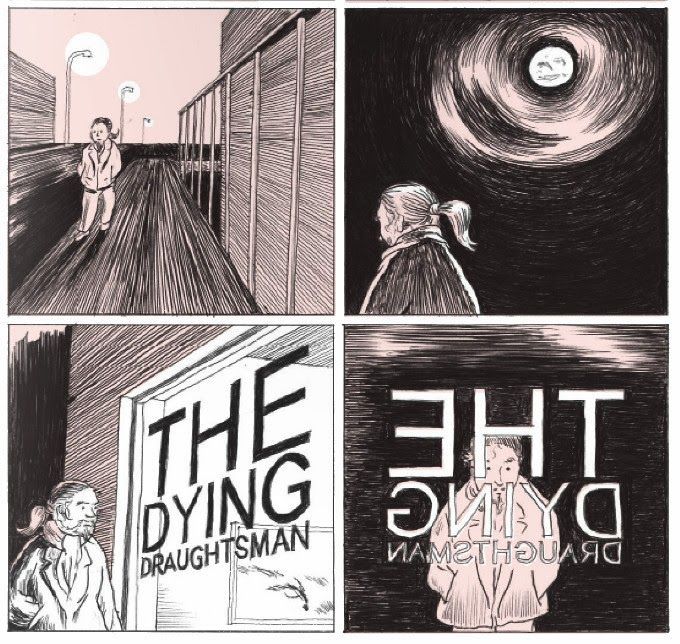
Alcune delle ultime cose che avete pubblicato sono diverse dalle vostre pubblicazioni “storiche”, dato che si distaccano dall’estetica e dalle tematiche underground prevalenti in passato. Parlo per esempio di The Dying Draughtsman di Francisco Sousa Lobo e di Askar, O General della colombiana Dileydi Florez, il primo un romanzo grafico intimista e profondo, il secondo un lavoro molto curato graficamente che guarda alla rappresentazione delle grandi battaglie storiche tipiche dell’arte del passato più che al fumetto.
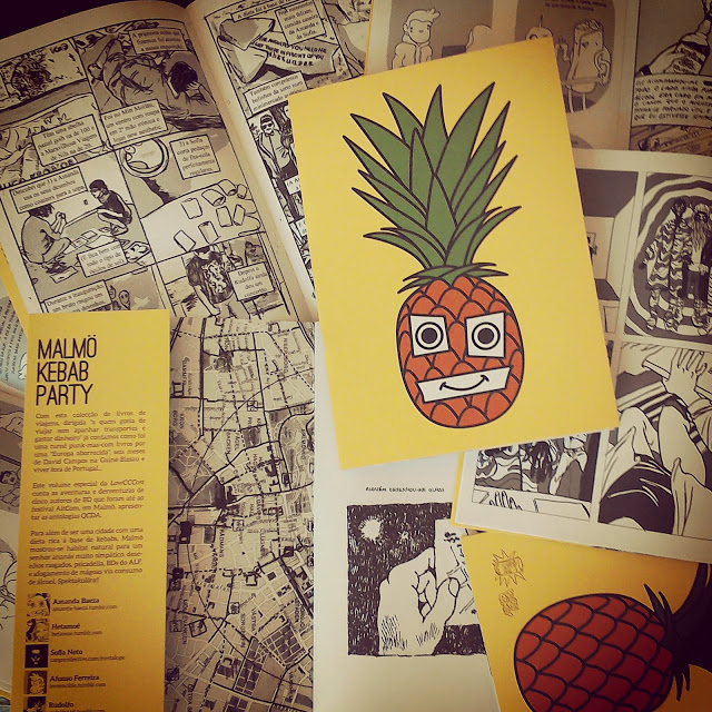
Stiamo diventando vecchi?!? Nemmeno per sogno, Papá em África di Anton Kannemeyer è pieno di cazzi neri, Erzsébet è pieno di sangue di vergine, Rudolfo vomita un sacco in Malmö Kebab Party e se pubblicherò un mio nuovo libro quest’anno sarà pieno dei miei brutti disegni (e di cazzi!)… Ancora devi vedere una nostra fase “pulita”, o qualche libro “pulito”. Aspetta e vedrai, ahahahah!!!
Seriamente, gli autori fanno quello che vogliono, noi non imponiamo nessuna estetica… D’altra parte non avrebbe senso, a meno che non fossimo una specie di editore commerciale di sesso&violenza o di merdosi libri a due-colori pseudo-artistici o di qualsiasi altra cosa…
Ok, forse mi ero perso un po’ di cazzi vari nei vostri fumetti… Comunque, cambiando argomento, parlami invece della tua attività alla Bedeteca de Lisboa (il link è a un sito non autorizzato, quello ufficiale è inattivo dal 2011). So che avete una bella collezione di fumetti e che fino a qualche tempo fa organizzavate corsi, eventi, ecc.
Sì, lo facevamo… Dal 2005 è andato tutto in malora, adesso sono soltanto un buon vecchio bibliotecario della Bedeteca. Comunque se capiti a Lisbona vienici a trovare! C’è un bel giardino, bei sofà e belle sedie, 9000 tra fanzine, riviste, libri, albi, CD, DVD e altri oggetti legati al fumetto e all’illustrazione. Perché sprecare tempo visitando le trappole per turisti quando puoi venire a rilassarti alla Bedeteca? Tra l’altro abbiamo libri in portoghese, inglese, francese, italiano, finlandese, svedese, polacco, ecc.
Il periodo d’oro delle pubblicazioni, dei grandi festival, delle mostre e tutto il resto è ormai passato (ne ho parlato in un’intervista pubblicata su Stripburger) ma la biblioteca è ancora interessante.
Dato che parliamo di fumetto portoghese, mi piacerebbe sapere cosa è popolare o mainstream in Portogallo oggi. Noi in Italia abbiamo fumetti come quelli della Sergio Bonelli Editore che sono il concetto di “popolare” per eccellenza, non so se conosci Tex o Dylan Dog. Poi c’è una grande diffusione dei manga, vengono pubblicati parecchi supereroi e ultimamente c’è il boom del fumetto ironico, satirico o in generale comico. Da voi cosa significa “fumetto popolare”?
Penso che le strisce umoristiche siano le più popolari (Calvin & Hobbes, Dilbert, Adam, Cathy…). Poi c’è questa roba pedofila franco-belga per gente dai quarant’anni in su, i supereroi fascisti per i trentenni, i manga per i ragazzi… Dopo qualche anno è tornata anche la Disney, ma credo che si rivolgano a persone nostalgiche di una certa età, i ragazzini non sono così stupidi da leggere ancora quella merda. Molti portoghesi leggono l’inglese, il francese e lo spagnolo e così comprano le edizioni straniere perché il mercato non fornisce abbastanza libri di qualità. Abbiamo anche edizioni brasiliane di schifezze Bonelli, non so chi legge quella roba e nemmeno voglio saperlo. Mi chiedo se possiamo parlare di un “mainstream” (eccetto che per le strisce umoristiche) perché a quanto ne so i trade paperback di Batman vendono quanto A Viagem di Baudoin. Forse quell’idiozia di Saga venderà di più perché è divertente e, lo sai, i comics dovrebbero essere… comici! Eh, che ironia…
Si può dire che un libro che vende 3000 copie è popolare o mainstream? Sinceramente non lo so…
Passando dal popolare al personale, mi piacerebbe sapere quali sono gli autori portoghesi che tu ammiri di più e ti sentiresti di consigliare ai lettori.
Vecchi e nuovi tutti mischiati, vivi o morti, con dei libri solisti o no: André Lemos, Janus, Ana Cortesão, João Fazenda, Nunsky, Filipe Abranches, Bruno Borges, Carlos Botelho, Pedro Brito, Pedro Nora, Amanda Baeza, José Smith Vargas, Jucifer, Pedro Burgos, Tiago Manuel, Rafael Bordalo Pinheiro, Francisco Sousa Lobo…
 Beh, sicuramente c’è molto da esplorare per gli stranieri come me… Come vedi invece la scena europea al momento? A me sembra che ci sia un’attenzione sempre maggiore e spesso eccessiva per gli aspetti puramente estetici e tecnici del fumetto, favorita anche dalla diminuzione dei costi di stampa che ha consentito la diffusione del colore. Questo a mio parere ha influito pesantemente anche nell’ambito delle autoproduzioni, dove si trovano tanti prodotti conformisti, che poco hanno di alternativo…
Sì, i grapich novel hanno portato i fumetti a somigliare al mondo della letteratura: pieno di cose leggere, best-seller e così via… Devi scavare più a fondo per trovare le cose migliori, ma è sempre stato così, no? Le persone diventano nostalgiche se pensano a quando hanno scoperto Daniel Clowes o Joe Sacco negli anni ’90 e adesso ci sono tutti questi cloni o sottoprodotti di Clowes e di Sacco, ma poi basta guardare a realtà come Canicola o alle antologie come Glomp o a qualche tizio serbo o croato e c’è ancora abbastanza energia e originalità in giro da essere entusiasti come negli anni ’90. O guarda anche a Olivier Schrauwen, che è riuscito a unire “la quantità di pagine che ti permette di essere rispettabile” con aspetti estetici e formali. O a Ruppert & Mulot o a Tommi Musturi… O a Jarno Latva-Nikkola, che può essere etichettato come “caricatura” ma che ha una profondità degna di un graphic novel…
E’ vero che i grapich novel hanno sempre più peso nel mercato librario con “mia mamma era una puttana fatta di crack” o con la biografia di Pinochet, proprio come i libri di cucina o i gatti che salvano il mondo sono diventati i nuovi best-seller… Se tutti i graphic novel fossero di qualità (una cosa che qualche anno fa era il sogno della Fantagraphics o de L’Association) il mondo sarebbe perfetto, ma sai, là fuori ci sono ancora McDonald’s, la guerra, la fame, l’ultimo film di Batman, il razzismo, Berlusconi…
Come al solito abbiamo bisogno di critici – bravi critici – che possono filtrare tutta questa “nuova industria del libro disegnato”, ma dove sono?
Se ti va concluderei parlando dei progetti futuri. Ho letto che ci saranno parecchie iniziative per i 15 anni di Mmmnnngggr, me ne puoi parlare? E da Chili Com Carne cosa dobbiamo aspettarci?
Le celebrazioni per il quindicesimo anniversario di MNRG sono quasi finite… Abbiamo fatto un tour con due band punk, fatto uscire uno split-tape e la mia nuova zine, Anton (Kannemeyer, autore di Papá em África, ndr) ha partecipato a Lisbona a una conferenza con qualche polemica e io ho fatto il DJ al Beja festival. A questo punto ci daremo da fare per pubblicare i nuovi libri di Aleksandar Zograf, André Ruivo e Tiago Manuel… E qualche altra cosa arriverà di sicuro!
Per quanto riguarda Chili Com Carne ancora non lo sappiamo… Ma speriamo di pubblicare nuove graphic novel di Francisco Sousa Lobo e José Smith Vargas, parecchi altri libri e zine, poi ci sarà una mostra all’Amadora Fest e all’Università di Salamanca in Spagna. Ma solo dopo giugno avremo le idee più chiare…
Annunciato “Kramers Ergot” #9
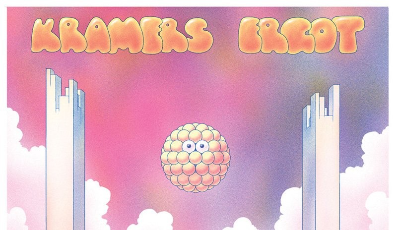
Dopo la pubblicazione dell’ottavo numero di Kramers Ergot nel 2011 per Picture Box, nel giugno dell’anno successivo l’editor Sammy Harkham annunciava con un tweet un imminente seguito, descrivendolo come “350 pages of wicked wanda and Ian Svenonius essays” (Svenonius, conosciuto ai più come frontman dei Nation of Ulysses e dei Make-Up aveva già contribuito al numero 8 con il saggio Notes on Camp, part 2). Da allora Picture Box ha chiuso, Harkham ha pubblicato dopo un’altra lunga attesa il quarto numero di Crickets, e di Kramers Ergot non si è saputo più nulla, almeno fino a oggi, quando su Amazon è comparsa questa copertina (che credo sia opera di John Pham) e la possibilità di prenotare il nono numero della fondamentale antologia che nel corso degli ultimi quindici anni ha ospitato i migliori talenti dell’underground statunitense e non solo. Il nuovo editore sarà Fantagraphics e la data di uscita prevista è il 18 marzo 2016, per 250 pagine (e non 350 a quanto pare) a opera di Michael DeForge, Noel Freibert, Steve Weissman, Anya Davidson, Stefan Marx, Abraham Diaz, Leon Sadler, Julia Gfrörer, Adam Buttrick, Kim Deitch, Ben Jones, Andy Burkholder, Antony Huchette, Trevor Alixopulos, Antoine Cossé, Archer Prewitt, Kevin Huizenga, Renée French e altri che verranno annunciati in seguito. Che dire, la lista è come al solito impressionante e a questo punto non ci resta che attendere.
Marcos Farrajota and Portuguese comics
Marcos Farrajota is the editor of š! #20, the special issue of the Latvian anthology dedicated to Portuguese comics (you can read my review here), but he’s also the guy behind a lot of cool projects in Portugal, a librarian in Bedeteca de Lisboa – one of the best comics place in Europe – and a cartoonist, as you can see in his collection Talento Local. I’ve interviewed him to talk about comics in Portugal and some other stuff.
I’d like to start this interview sorting out all your various projects, from the fanzine Mesinha de Cabeceira, born in 1992, to Mmmnnnrrrg collective, which is celebrating 15 years right now, up to Chili Com Carne, perhaps the label best known outside Portugal and with a frequently updated blog. Can you tell me how you’ve evolved from project to project and how you’re giving your attention at the different labels/publications at the moment?
Well, everything is very organic, I mean, there isn’t an obligation to release every year one Mesinha de Cabeceira – like between 1997 and 2000 it took three years to release a new issue… Also, Mesinha is sometimes published by CCC, others by MNRG… A mess to librarians and collectors, I guess.
CCC has also more people involved so we can split work… And MNRG is me and Joana Pires – we are a couple, you see? So we manage at home our ideas.
All projects are “hobbies”, not professional works that put bread on the table… We relax when we have to relax and we act when we need to act!
Looking at your books and at the events you organize, the Portuguese scene seems quite lively. Yet the introduction to š! #20 emphasizes that making comics is a solitary process and describes the medium as “a form of torture, a useless effort devoid of causes or consequences that offers us neither glory nor any sort of personal reward”. It’s a similar concept to Pessoa’s “Everything we do, whether in art or in life, is a defective version of what were our initial ambitions”, as if you came at this idea of the futility of making comics during these years as an artist and as a publisher…
There’s been a darker time in the Portuguese scene but now there’s a new breed full of energy and ideas… It’s been exciting these last five years I guess, after a period of “nothing seems to be happen” from 2005 to 2010. So there are the “pros” working for USA, small publishers growing and keeping the light alive, medium publishers coming back and a growing attention on the graphic novel market. Let’s hope this helps to more experimental and cutting edge comics to develop even more… Because if not, it’s just a big black hole, creators feel hopeless since nobody will understand or care – even the people who state they like comics – those are actually the worst because they are conservative assholes that collect juvenile crap. I guess that’s why I always looked for people outside Portugal so that you may have more perspective and feedback. New generation like Amanda Baeza by instinct already knew that and her first book was published in Latvia, which is an awesome and interesting situation.
Anthologies as Mutate & Survive and Boring Europa, which connected Portuguese cartoonists with artists from all over Europe, date back to several years ago, and the last experience in this field, Futuro Primitivo, is from 2011. Recently Chili Com Carne is focusing more on books made by a single author. Is this a precise choice or only a coincidence? Do you think this is a current trend in the market, that now is harder to sell an anthology or a magazine than a so-called “graphic novel”?
Pure coincidence. It was by cosmic forces that graphic novels of David Campos, Francisco Sousa Lobo, André Coelho and Nunsky appeared… And it’s also true that to make anthologies in an interesting way (by the theme, for example) is some hard work for the editor! We still do anthologies like the QCDA series or the next volume of Zona de Desconforto (about foreign comics authors experiencing live in Portugal). New solo books will happen this year which is good just because in this way there are more different books to read and experience.
As for market, it’s obvious that solo graphic novels are THE market format to sell in the last 10 years but you can imagine that in literature world there are also anthologies and they sell less because they’re for a more restricted public like the people of the “scene”, not for a big audience. For our very small market (in Portugal) and printrun (of CCC or MNRG) actually there’s no big difference, most of our anthologies are sold out and solo books are still available – but then again, solo graphic novels are like only three years old…
Some of your latest books are different from your past publications, since they don’t have the typical underground contents or aesthetics of the past, in the sense that they aren’t provocative or “dirty”. For example Francisco Sousa Lobo’s The Dying Draughtsman is an intimate and deep story, while Askar, O General by Colombian artist Dileydi Florez is a very well-finished graphic work looking at the representation of the great historical battles of the past that we find in painting more than in comics.
We are getting old!!!
No way man… Come on, Papá em África by Anton Kannemeyer is full of black dicks, Erzsébet is full of virgin blood, Rudolfo is puking a lot in Malmö Kebab Party and if I’ll publish a new book this year there will be loads of my bad drawings (and dicks!)… You’ve just got to see some of “clean” phase of ours, or some “clean” books. Wait and see! Hahahahaha!!!
Man, authors do what they like, we don’t impose any aesthetics… Otherwise it won’t make sense unless we were some kind of commercial publishers of sex& violence or artsy-fartsy-two-colours books, whatever…
Well, it seems dicks are everywhere in your comics! However, let’s talk about your activity at the Bedeteca de Lisboa (this is an unoffical website, the old address is now closed). I know you’ve a big collection of comics and that you organize events, classes and so on…
Used to… Since 2005 it’s just going down the drain as for others activities. Now, I’m just a good librarian dude in Bedeteca. If you go to Lisbon, please come by! It has a nice garden, good sofas and chairs, 9000 volumes of zines, mags, books, albums, CDs, DVDs and related items to comics and illustration. Why waste your time visiting tourist’s traps when you can come and relax reading books in Bedeteca? Actually we have books in Portuguese, English, French, Italian, Suomi, Swedish, Polish, etc…
The golden days of publishing, making big festivals, exhibitions and all that it’s gone (I did an interview in Stripburger about that) but the library is good and interesting, come on!
Since we’re talking about Portuguese comics, I’d like to know what is popular or mainstream in Portugal today. In Italy we’ve comics as Tex or Dylan Dog, published by Sergio Bonelli Editore, that represent perfectly the concept of “popular”, I don’t know if you’ve ever seen them… Then there is a large diffusion of manga, we’ve a lot of superheroes and a lot of satirical, ironic and in general funny (or supposed to be funny…) comics. What is “popular” in Portugal?
I guess humour strips are the most popular (Calvin & Hobbes, Dilbert, Adam, Cathy…). And then this pedophilic french-belgian stuff for the 40 uppers, fascist super-heroes for the 30’s up, manga for kids… Disney returned after some years, but maybe they’re selling to nostalgic grown-ups, kids aren’t that stupid to read that crap anymore. Many Portugueses read English, French and Spanish so they buy foreigner editions since the market doesn’t supply enough good books. We’ve also Brazilian editions of Bonelli trash, don’t know who consumes that and I really don’t want to know. I wonder if we can talk about a “mainstream” (excepts humour strips, I guess) because I know that Batman trade paperbacks sold as much as Baudoin’s A Viagem. I guess moronic Saga will sell better than these examples because it’s funny and, you know, comics are supposed to be… comical! Oh, the irony…
Can we say that 3000 copies sold of a book is popular or mainstream? I don’t know…
Moving from the popular to the personal, I’d like to hear from you some names of Portuguese cartoonists you admire and you can recommend to the readers.
Old and new all mixed up, active and inactive, dead and alive, with solo books or not: André Lemos, Janus, Ana Cortesão, João Fazenda, Nunsky, Filipe Abranches, Bruno Borges, Carlos Botelho, Pedro Brito, Pedro Nora, Amanda Baeza, José Smith Vargas, Jucifer, Pedro Burgos, Tiago Manuel, Rafael Bordalo Pinheiro, Francisco Sousa Lobo…
So there’s a lot to discover for foreigners like me… And on the other hand, what do you think of the European scene at the moment? I believe there is a greater and sometimes exaggerated attention to the aesthetic and formal aspects of the comics, probably thanks to the decrease of printing costs and the consequent diffusion of the color… I think this has influenced also the self-published comics, where now we’re finding a lot of conformist products, which are everything but alternative…
Yup, graphic novels made the comics looks like literature world: full of light literature, best-sellers and all that… You have to dig depper to find good stuff but that was always like that, no? People get nostalgic when they think they found Daniel Clowes or Joe Sacco in the 90’s and now there are all this Clowes and Sacco clones or subproducts but man, look at Canicola crew, or Glomp anthologies or some Serbian and Croatian guys and there’s still energy and originality to be as exciting as the 90’s. Or look to Olivier Schrauwen that actually can combine the “graphic novel loads of narrative pages to be respectable” with aesthetic and formal aspects at the same time. Or Ruppert & Mulot or Tommi Musturi… Or Jarno Latva-Nikkola who can be pigeonholed as “caricature” but has a full graphic novel depth…
It’s true that graphic novels are growing in the book market with “my mom was a crackwhore” or Pinochet biography, juts like best-sellers are now cook books or cats that saves the day… If all graphic novels were good (a thing that Fantagraphics or L’Association wanted back in the days) the world would be perfect, but as you know there’s still McDonald’s, war, hunger, latest Batman film, racism, Berlusconi out there…
As usual, we need critics – good ones – that can filter all this “new graphic books industry”, where are they?
If you want, I would close this interview speaking of your future projects. I read you’re setting up a lot of initiatives for the 15th anniversary of Mmmnnngggr, can you tell me something more? And what can we expect from Chili Com Carne?
15th MNRG celebrations are almost gone… We made a punk tour with two bands, released a split-tape and my new zine, Anton was in Lisbon in a conference with some public polemics and I’m DJing next week at Beja festival. After that it’s hard work making new books of Aleksandar Zograf, André Ruivo and Tiago Manuel… And something else that comes on the way!
As for Chili Com Carne we still don’t know… But we’re hoping to have new graphic novels of Francisco Sousa Lobo and José Smith Vargas, loads of other zines and books and some exhibition in Amadora Fest and University of Salamanca (Spain). But only after June we’ll have clear ideas…
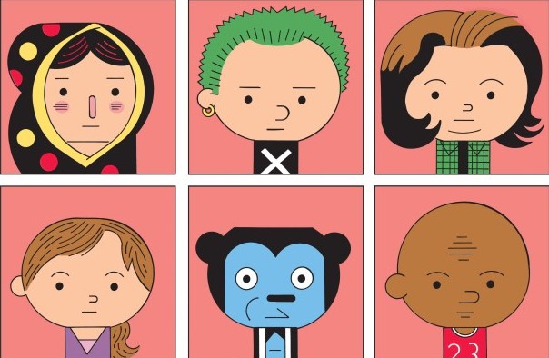
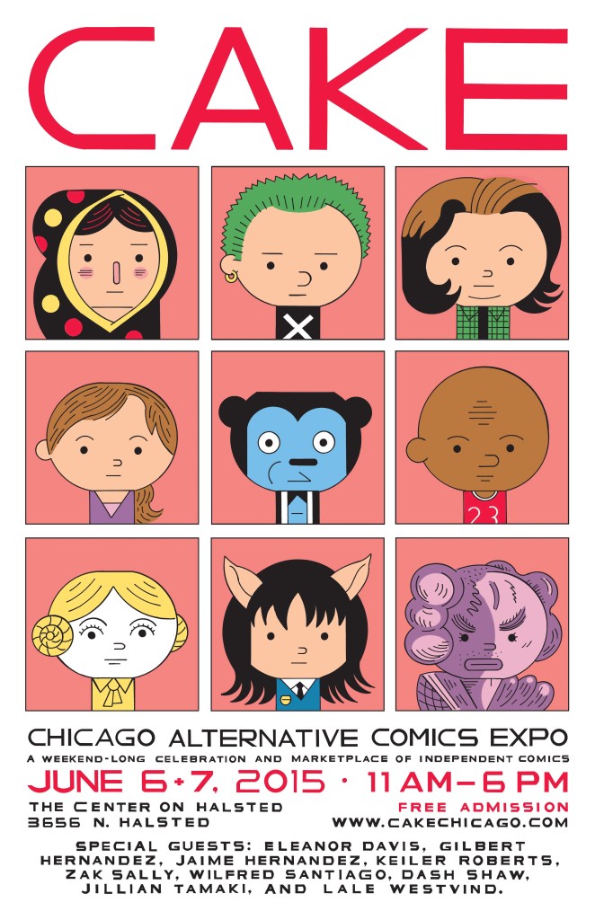
Il meglio del web – 4/6/2015
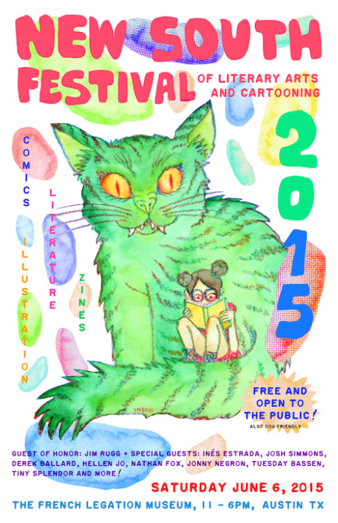
Dopo qualche settimana di assenza, torna questa scintillante rubrica, in cui cercherò di mettere insieme le notizie e i link più interessanti degli ultimi tempi. Iniziamo dai festival in giro per il mondo, che questo weekend sono davvero tanti. A Chicago c’è uno dei principali eventi del fumetto underground, il CAKE, con un poster di Ivan Brunetti, ospiti come Gilbert e Jamie Hernandez, Dash Shaw, Lale Westvind, Eleanor Davis, Keiler Roberts, Zak Sally, Jillian Tamaki, incontri, disegno dal vivo, lezioni di tecniche di stampa e tante novità al debutto. Per approfondimenti vi rimando al blog della manifestazione. Gli artisti ed editori americani che non potranno raggiungere Chicago si divideranno tra la terza edizione del Grand Comics Fest di Brooklyn, l’Olympia Comics Festival e il New South Festival of Literary Arts & Cartooning di Austin in Texas, con un bel poster disegnato da Inés Estrada.
In Europa sono invece in programma il Copenhagen Comics, con ospiti di altissimo livello come Art Spiegelman, David Lloyd, Herr Seele, Simon Hanselmann, Tommi Musturi, il Munchen Comic Festival, incentrato su autori inglesi come Dave McKean e Bryan Talbot, e il Crouch End Cartoon Arts Festival di Londra, di cui Andy Oliver ci fornisce un’esauriente anteprima. Dall’11 al 13 giugno arriverà poi l’Oslo Comics Expo, che avrà come ospite ancora Hanselmann ma anche Ed Piskor, Lando, Aisha Franz, Paul Paetzel, Antoine Cossé, Joe Kessler. Passando ai festival già conclusi, su Broken Frontier ci raccontano del Klaxon di Anversa, mentre Robyn Chapman di The Tiny Report e Zainab Akhtar di Comics&Cola scrivono da Toronto. Sempre su Comics&Cola vi segnalo un paio di articoli su un’artista che a me piace parecchio e di cui prima o poi vi parlerò, Lala Albert: si parla del recente R.A.T. e della sua libreria.
Veniamo dunque a qualche approfondimento di rito sugli ultimi articoli pubblicati su JustIndieComics e in particolare sulla chiacchierata con Dylan Horrocks dello scorso 22 maggio alla libreria Giufà di Roma. Il passaggio di Horrocks in Italia per il tour di presentazione di Sam Zabel e la penna magica ha prodotto qualche altra interessante intervista, come quelle pubblicate su Bad Comics e Fumettologica, in cui vengono toccati anche temi rimasti fuori dalla conversazione romana.
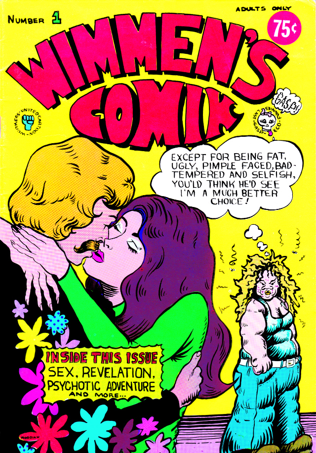
A proposito di interviste, ormai non si contano più quelle a Daniel Clowes e forse me ne sono persa anche qualcuna: tra le ultime ci sono quelle a Boing Boing, a Vulture e a The Guardian, secondo cui l’autore di Eightball “scrive i più divertenti fumetti tristi o i più tristi fumetti divertenti del mondo”. Inoltre Clowes ipotizza anche di ritornare, un giorno o l’altro, ai suoi vecchi personaggi, come Enid e Rebecca di Ghost World, o anche Lloyd Llewelyn, mentre Wilson diventerà un film con Woody Harrelson e Laura Dern. Intanto l’organizzazione del Comic Arts Brooklyn, in programma il prossimo 7 novembre, annuncia che Clowes sarà ospite del festival e che in quell’occasione si vedranno in anteprima le prime copie del suo nuovo libro, Patience. Come già saprete a pubblicarlo sarà la Fantagraphics, che nel frattempo ha rinnovato il suo sito. La stessa casa editrice di Seattle annuncia la raccolta di Wimmen’s Comix, fondamentale antologia underground.
Mentre su Boing Boing anticipano qualche pagina da un lavoro inedito – e purtroppo ancora incompiuto – di Joe Matt tratto dal libro celebrativo per i venticinque anni della Drawn & Quarterly (di cui spero di parlare prossimamente), a Pittsburgh esce l’ottavo numero del sempre interessante Comics Workbook Magazine, con un’intervista agli editor di š! a firma Laila Milevski, un saggio su Julie Doucet a opera di Daryl Seitchik e un’intervista al cartoonist “misterioso” GG di Jamie McMorrow. La rivista è distribuita da Copacetic Comics, nel cui shop virtuale potete trovare anche BW, una nuova zine assemblata dal cartoonist Jim Rugg che mette insieme una serie di spettacolari immagini tratte da misconosciuti fumetti anni ’80 e di cui ha parlato anche Frank Santoro sul sito del Comics Journal.
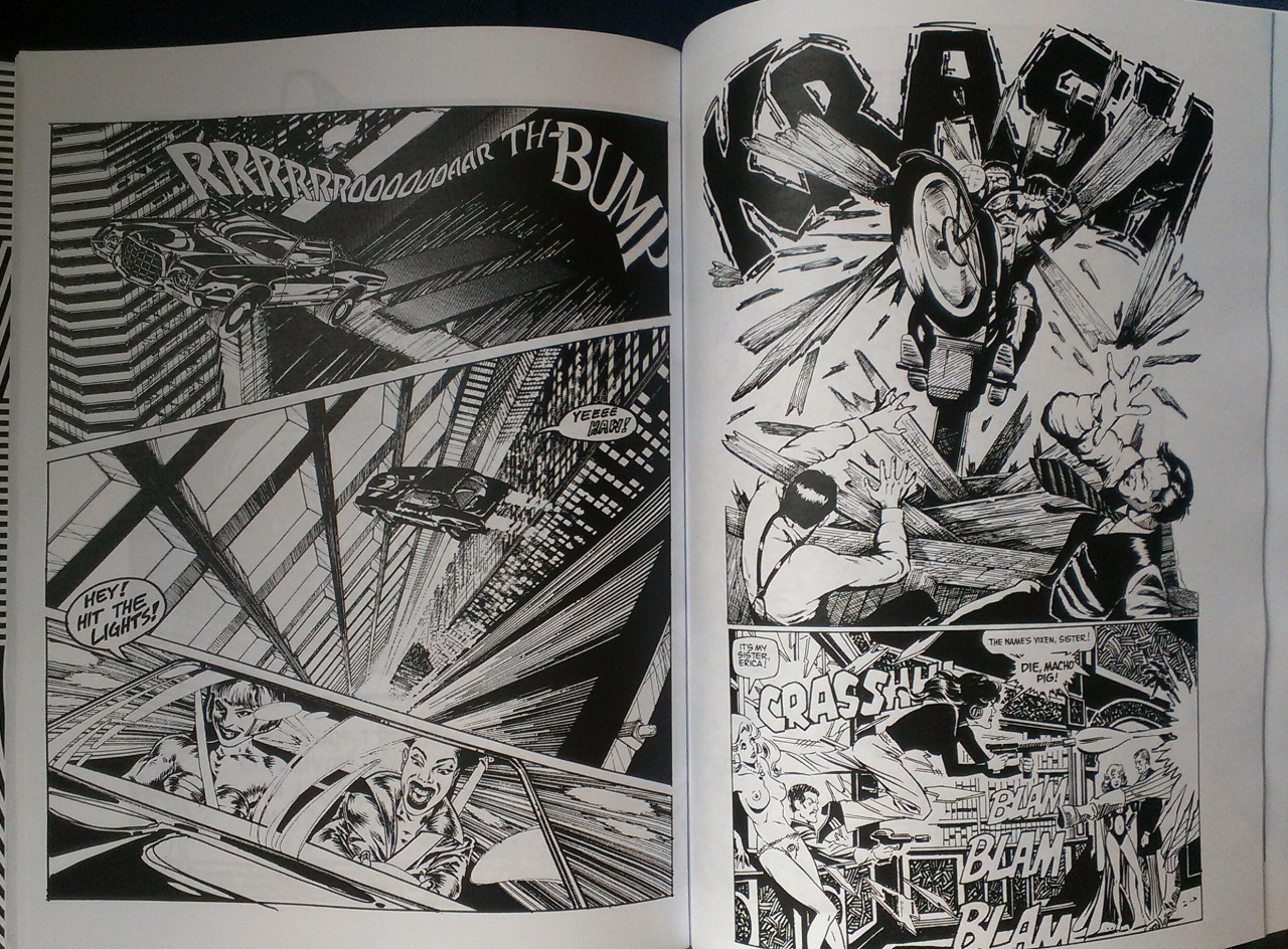
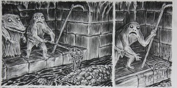
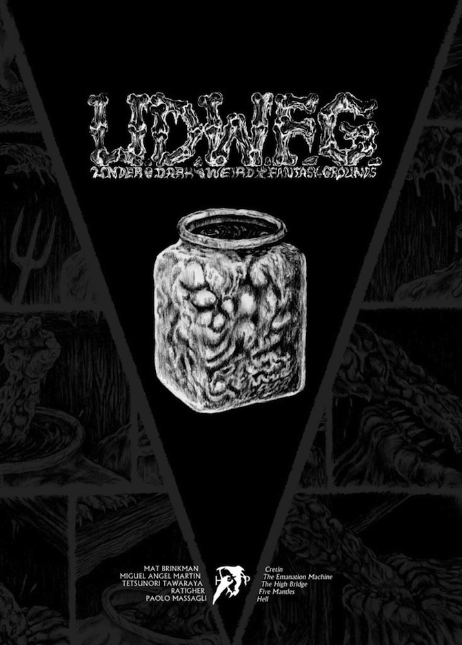
Cinque tavole da “UDWFG” #3
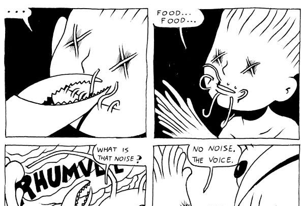
Di Under Dark Weird Fantasy Grounds ho parlato a più riprese su queste pagine, prima con la recensione del numero di debutto, poi inserendo le prime due uscite tra le migliori cose lette nel 2014 e quindi traducendo in inglese un’intervista a Michele Nitri realizzata da Matteo Stefanelli e pubblicata su Fumettologica. Se negli scorsi mesi la Hollow Press ha ampliato le sue proposte editoriali con due libri a firma Shintaro Kago e Tetsunori Tawaraya (qui ne avevo fatto un’anteprima), il terzo numero di UDWFG inizialmente previsto per aprile ha subito un paio di mesi di ritardo a causa degli impegni di alcuni degli artisti coinvolti. Ma adesso le pagine sono tutte pronte e tra qualche giorno saranno dati alle stampe i nuovi capitoli delle storie di Mat Brinkman, Miguel Angel Martin, Tetsunori Tawaraya, Ratigher e Paolo Massagli. Di seguito, senza far torto a nessuno, una tavola per ogni artista. Buona visione.
Mat Brinkman
Miguel Angel Martin
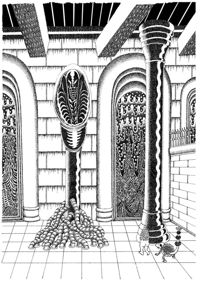
Tetsunori Tawaraya
Ratigher
Paolo Massagli
Five pages from “UDWFG” #3
I already talked about Under Dark Weird Fantasy Grounds several times, for example with this review of the debut issue, or putting the first two books in my best of 2014 list, or recently translating this interview with Michele Nitri made by Matteo Stefanelli for Fumettologica. If in the last months Hollow Press expanded its editorial projects with Industrial Revolution and World War by Shintaro Kago and Tetsupendium Tawarapedia by Tetsunori Tawaraya (here my preview), the third issue of UDWFG – initially due for April – has been delayed for the overwhelming commitments of a couple of artists. But now the comics are ready and in some days the new chapters of the stories by Mat Brinkman, Miguel Angel Martin, Tetsunori Tawaraya, Ratigher and Paolo Massagli will be printed. Below you can take a look at five pages, one per artist. Enjoy!
Mat Brinkman
Miguel Angel Martin
Tetsunori Tawaraya
Ratigher
Paolo Massagli
“From Now On” con Malachi Ward
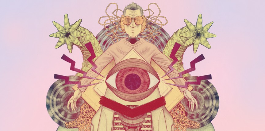
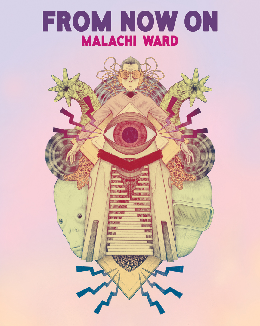
Malachi Ward è l’autore di Ritual, una serie pubblicata dalla Revival House Press, e di From Now On, una raccolta di storie brevi che uscirà a giugno per la Alternative Comics. Insieme a Matt Sheean ha creato un’altra serie, Expansion, e ha realizzato alcune storie per il Prophet di Brandon Graham. Negli scorsi giorni ho scambiato alcune e-mail con Malachi e ne è venuta fuori l’intervista che segue.
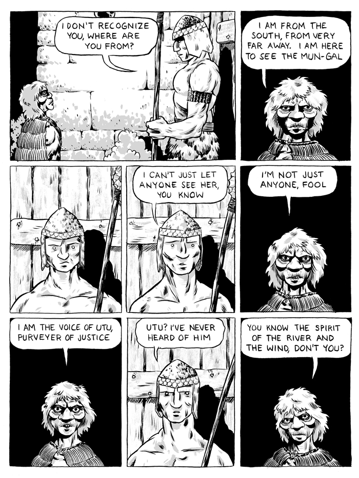
Dato che hai già parlato della tua formazione come artista e delle tue ispirazioni in questa intervista con Dave Nuss della Revival House Press, salterei questi argomenti e inizierei subito da From Now On. Questo è il tuo primo libro vero e proprio e sarebbe interessante presentarlo ai lettori. Dando un’occhiata al sommario, l’antologia si apre con Utu, una sorta di classico nella tua produzione, dato che è uno dei primi fumetti se non esattamente il primo che hai stampato. Pensi che l’uscita di Utu nel 2009 possa essere considerata un momento chiave della tua carriera?
Dopo il college iniziai a leggere molti più fumetti e a flirtare con l’idea di diventare un cartoonist. Ovviamente con il termine “fumetti” si può intendere quasi qualsiasi cosa e io non sapevo ancora cosa fare di preciso. Non so come poter definire il mio stile dell’epoca… Forse stravagante? Comunque, tra il 2007 e il 2009 avevo più o meno focalizzato ciò che volevo fare e così nel 2009 iniziai Utu e cominciai a lavorare anche a The Scout, per l’antologia Hive di Jordan Shiveley. Li finii entrambi in tempo per l’Alternative Press Expo del 2009. Entrambe queste storie rappresentarono un’importante svolta per me. Erano i primi lavori che finivo e che mi sentivo di stampare e far vedere in giro. E in qualche modo ancora mi piacciono.
Penso che Utu sia veramente originale, perché inizia in un modo e poi si sviluppa in una direzione completamente differente. Inoltre utilizza parecchi registri, inizialmente sembra una sorta di racconto mitologico, poi diventa divertente e alla fine è anche triste. Hai cominciato a lavorare alla storia con l’intenzione di utilizzare diversi toni e atmosfere, oppure la trama è venuta fuori di getto, in modo naturale?
Per me una delle attrattive di Utu era proprio quella biforcazione della trama, infatti sembra un certo tipo di storia e poi di colpo diventa tutta un’altra cosa. Non sono un grande appassionato dei colpi di scena, ma a chi non piace quando una storia ti sorprende, specialmente se tutto è al posto giusto? Sono molto attratto da questo espediente narrativo… E’ qualcosa che cerco di inserire spesso in una storia, anche se non funziona! Ognuna delle storie di Ritual ha in misura diversa un elemento del genere.
Prima hai citato The Scout, un fumetto del 2009 che sarà riproposto in From Now On, in cui hai trattato a modo tuo i concetti di tempo e di ripetizione. The Scout è basato su una griglia di sei vignette per ogni pagina e, guardando le tue vecchie cose, ti sei avvalso di una struttura ben definita anche in molte altre occasioni. D’altra parte, il lavoro più recente utilizza un layout regolare ma sicuramente meno rigido. Pensi che questo possa riflettere un tuo miglioramento come cartoonist o si tratta semplicemente di una coincidenza?
Per quanto riguarda The Scout, ero preoccupato di dover raccontare la storia in poche pagine (dato che era per un’antologia e avevo uno spazio limitato) ma al tempo stesso di renderla leggibile e scorrevole, senza farla sembrare troppo compressa. E penso che questo sia più facile mantenendo un layout regolare. Ho fatto lo stesso per un’altra storia di From Now On intitolata Henix, per ragioni simili. Inoltre credo che un layout di sei vignette funzioni bene in un mini-comic di 5.5″x8″. Anche se sono sicuramente migliorato da allora, tornerei ancora a un layout rigido come quello se si adattasse al fumetto che sto realizzando. Anche quando i miei fumetti presentano vignette di varie dimensioni e utilizzano composizioni di volta in volta diverse, di solito seguono una struttura regolare da cui non mi discosto.
Un altro fumetto in From Now On è Top Five, una specie di metanarrazione fantascientifica a tema Star Trek, che per te è una passione oltre che una fonte di ispirazione. Anche Sweet Dreams e The Oviraptor sono reinterpretazioni di alcuni stereotipi della fantascienza. Penso che questa cosa contribuisca a rendere i tuoi fumetti freschi e originali, mi riferisco cioè al fatto che usi alcune idee prese dai film di fantascienza e dalle serie tv e li rivisiti secondo la tua sensibilità, creando un mix che non è così diffuso attualmente nel mondo dei fumetti alternativi…
Qualche volta, per me, una storia inizia pensando a come posso maneggiare un tropo tipico di un certo genere. Forse l’obiettivo è trovare il nucleo dell’idea, qualunque essa sia, quel momento emotivo che fa scattare qualcosa, gli elementi tematici o di atmosfera che possono coinvolgere il lettore, e poi partire da lì evitando tutti i tipici errori in cui può cadere una storia di fantascienza, fantasy o horror.
Oltre a quelle di cui abbiamo parlato finora, non conosco le altre storie di From Now On. Puoi presentarne qualcuna a me e ai lettori?
C’è un nuovo fumetto interamente a colori intitolato Disconnect (di cui trovate una tavola inedita qui sotto, ndr) che si svolge nello stesso mondo in cui sono ambientate Top Five, The Oviraptor e Hero of Science, seguendo le avventure di uno degli altri personaggi che sono scomparsi quando la squadra ha viaggiato indietro nel tempo. Tra le altre storie c’è Beasts of Kay-7, in cui racconto la mia versione di un team alla Star Trek che esplora un nuovo pianeta abitato da mostri misteriosi. Henix, a cui accennavo prima, è una storia dai forti connotati fantasy a proposito di un prigioniero deformato (almeno agli occhi dei protagonisti) che nasconde dei segreti sulla famiglia reale.
A questo punto possiamo passare a Ritual, la serie che pubblichi per la Revival House Press, in cui ogni numero è una storia autoconclusiva di 20-30 pagine. Prima di comprare Ritual #2 – The Reverie, avevo visto il tuo lavoro soltanto su internet e quando ho letto quella storia sono rimasto veramente colpito… Era grandiosa! Poi ho letto altri tuoi fumetti e con il senno di poi posso dire che The Reverie è probabilmente la storia più “seria” e toccante che hai realizzato fino ad ora. E, a differenza degli altri numeri di Ritual, si basa su una narrazione estremamente lineare. Mi piacerebbe sapere come sei arrivato a raccontare questa storia, se è nata dalle tue paure o magari da un incubo.
The Reverie è incentrata su una tragedia familiare, quindi rispetto agli altri miei lavori contiene sicuramente delle situazioni molto più forti dal punto di vista emotivo. La morte di un familiare è un espediente narrativo a buon mercato, su cui si basano spesso le motivazioni del protagonista di una storia, quindi ho cercato di permeare con più empatia possibile il crescendo e poi la ricaduta relativi a questo tipo di situazione. L’idea mi è venuta dal mio interesse per la gamma di comportamenti di cui una singola persona è capace, e anche da come l’opportunità determina la nostra capacità di agire in modo morale. Ha anche a che fare con il concetto di rimpianto – ho sentito parecchie persone parlare di cosa avrebbero dovuto fare con le loro vite, o di come pensavano che le cose sarebbero dovute andare. Per me questo è sempre stato un sentimento completamente estraneo, qualcosa che ho grossi problemi a comprendere. E’ un’idea che molto probabilmente esplorerò più a fondo in futuro.
In The Reverie il tuo stile sembra meno controllato e definito del solito e per me questa non è una cosa negativa, perché in alcune sequenze hai fatto un bellissimo lavoro nella raffigurazione dei panorami e della rabbia del protagonista. Ma forse stavi cercando di fare un po’ di sperimentazione…
Penso che la prima metà di quel fumetto sia ancora abbastanza controllata. Tutto ciò che succede al di fuori della dimensione del titolo (la “Reverie” è una dimensione creata da uno scienziato in cui ogni desiderio si avvera e dove si rifugia uno dei personaggi dopo la morte della moglie, ndr) è inchiostrato con un brush e disegnato in maniera abbastanza accurata. In realtà non avevo molto tempo mentre stavo lavorando alla storia e la gran parte della seconda metà è stata disegnata nel giro di un paio di settimane. Inizialmente avevo intenzione di cambiare un po’ lo stile all’interno della dimensione del desiderio, per esempio inchiostrando con una penna invece che con un brush, ma a causa del poco tempo che avevo a disposizione quella parte della storia risulta stilisticamente più approssimativa.
Ritual #1 – Real Life e Ritual #3 – Vile Decay sono abbastanza simili nella struttura, mentre per quanto riguarda i contenuti Real Life rappresenta una situazione quotidiana che si sviluppa in modo veramente spaventoso, mentre Vile Decay parla del futuro e di come le persone stanno rovinando il mondo. Nel complesso questa serie tratta tanti temi importanti, come la famiglia, le relazioni, la morte e – nel terzo numero – anche la politica e l’ecologia. Ma tutti e tre i numeri di Ritual parlano soprattutto delle tue paure. O almeno è il modo in cui la vedo io…
La mia intenzione iniziale con Ritual era di creare un’antologia horror. In realtà, alla fine soltanto Real Life ha degli elementi che potrebbero essere ricondotti all’horror, ma ogni numero è essenzialmente legato al concetto di paura. Real Life prende spunto da incubi che ho fatto veramente: mia moglie che mi abbandona in maniera rabbiosa, e io che divento “malvagio”. Anche The Reverie nasce da un’idea simile, infatti all’epoca stavo riflettendo su come potrei facilmente diventare una persona meschina se si presentassero certe situazioni. Vile Decay, se apparentemente parla del degrado della società, in realtà è incentrata più sulla mia paura di disconnettermi dal mondo, basata sul fatto che invecchiando diventerà sempre più facile farlo.
Un altro modo di leggere il primo e il terzo numero di Ritual è considerarli degli episodi pilota di una serie tv, ma in realtà i tuoi fumetti non avranno mai un seguito, così il lettore deve immaginare o cercare di interpretare le storie sfogliando avanti e indietro le pagine…
Ritual #3 utilizza uno stile narrativo molto sfuggente… Può essere una lettura poco soddisfacente per parecchie persone. Se il lettore pensa che ne valga la pena, ci sono abbastanza elementi che gli consentono di comprenderlo, o almeno il fumetto invita a mettere insieme i diversi pezzi della storia. Nei miei prossimi fumetti sto reagendo in qualche modo a questo approccio (che tendo ad avere per non so bene quale ragione), creando delle storie con delle risoluzioni molto più definitive.
Stai lavorando anche al quarto numero di Ritual?
Ho già una bozza dettagliata di cui sono molto soddisfatto. Al momento l’unica cosa che devo fare è trovare il tempo per disegnarlo. Per ora il titolo di Ritual #4 è The Left Hand Path.
Quindi potrebbe essere sulla tua paura di diventare mancino…
Come fai a saperlo??? Quella è la mia vera paura più profonda.
Il nuovo numero userà due colori come il precedente? Mi è piaciuto tantissimo il rosa/arancio di Vile Decay, l’uso del colore ha contribuito a creare un’ambientazione vaga e irreale.
Dave Nuss e io stiamo pensando di stampare Ritual #4 a colori, anche se con una gamma limitata.
So che stai lavorando a una serie di nuovi progetti con il tuo amico Matt Sheean, con cui hai già collaborato per Expansion e per il Prophet di Brandon Graham. Ho letto che tu e Matt vi dividete totalmente le differenti fasi del processo creativo e sono curioso di sapere come riuscite a fare una cosa del genere.
Per il progetto su cui stiamo lavorando adesso (Ancestor, che farà parte dell’antologia Island pubblicata dall’Image), Matt e io ci dividiamo il lavoro in questo modo. Innanzitutto parliamo della trama di ogni numero e buttiamo giù una bozza, di solito insieme. Se la bozza richiede delle parti importanti di dialogo, prendiamo una sequenza ciascuno e la scriviamo. Poi, in un paio di giorni molto intensi, facciamo gli schizzi per l’intero numero. A quel punto Matt disegna, io inchiostro e coloro, e Matt aggiunge gli effetti di luce. Quando la pagina è finita, io aggiungo il lettering.
Mi sembra un modo molto interessante di sviluppare una collaborazione… Ancestor sarà una storia lunga?
Alla fine Ancestor sarà più lungo di qualsiasi cosa abbia mai fatto, probabilmente 120 pagine quando sarà finito.
Oltre ad Ancestor stai lavorando ad altre storie lunghe o continuerai con le storie brevi?
Al momento sto lavorando agli schizzi di un fumetto a colori che sarà di circa 80 pagine. Ho in programma di fare soprattutto storie lunghe da questo momento in avanti.
Mi piacerebbe concludere questa chiacchierata parlando di cosa ti piace al momento, se stai ascoltando della musica in particolare, o se c’è un fumetto, un romanzo o un film che ti ha entusiasmato negli ultimi tempi…
Ho appena finito di rileggere Going Clear di Lawrence Wright, un libro con cui mi sono abbastanza fissato. Poi sto facendo alcune ricerche sulla cultura indoeuropea, che trovo veramente interessante. Nel mondo del fumetto ho trovato fantastica e stimolante Sex Coven, la storia di Jillian Tamaki per l’antologia Frontier. Lo stesso vale per il nuovo numero di Crickets di Sammy Harkham. Non ho visto molti film che mi hanno veramente entusiasmato quest’anno, ma mi è piaciuto molto Ex Machina, e Mad Max: Fury Road è stato divertentissimo. Mentre scrivo sto ascoltando l’album del 1988 Encounter di Michael Stearns e anche un sacco di Jean-Michel Jarre.
I numeri 2 e 3 di Ritual sono disponibili nello shop di Just Indie Comics.
I territori oscuri della Hollow Press
Per chi fosse interessato, propongo su queste pagine la versione inglese di un’intervista realizzata da Matteo Stefanelli a Michele Nitri della Hollow Press, che potete leggere su Fumettologica nella sua veste originale in italiano. Qui trovate invece la traduzione, fatta soprattutto con l’idea di far conoscere meglio questo ottimo esempio di editoria made in Italy a chi legge da altre parti dell’Europa e del mondo. Grazie a Matteo e a Michele per avermi dato il permesso di tradurre l’articolo e per i preziosi consigli. Buona lettura.
“From Now On” with Malachi Ward
Malachi Ward is the creator of Ritual, a series published by Revival House Press, and the author of From Now On, a collection of short stories which is coming in June from Alternative Comics. He also collaborated with Matt Sheean at the series Expansion and at some issues of Brandon Graham’s Prophet. The interview that follows took place at the end of May via e-mail.
Since you talked about your formation as a comic artist and your inspirations in this interview with Dave Nuss, I’d like to begin this chat with some questions about From Now On. This is your first “book” and I think it would be nice to introduce it to the readers. I saw the summary and the very first story will be Utu, a sort of classic in your production, in fact it’s one of the first comics or exactly the first comic you printed. Do you think that self-publishing Utu in 2009 could be considered as a key moment in your career?
After college I was reading a lot more comics, and flirting with the idea of making them. Of course, “comics” can be almost anything, and I didn’t have much of an idea about what I wanted to do. My art at the time was kind of… whimsical I suppose? Anyway, throughout 2007-09 I kind of honed in on what I wanted to do. I started Utu in 2009, and traded off working on that and The Scout, for Jordan Shiveley’s Hive anthology. I finished them both in time for APE 2009. So both were a big breakthrough for me. It was the first work that I finished and was ok printing up and presenting to the world. I still kinda like those stories too.
I think Utu is a really original story, because it starts in a way and then moves in a completely different direction. And it has a lot of different registers, in the beginning it seems a sort of mythological tale, then it becomes funny and in the end it’s also sad in some way. I’d like to know if you started it with the intention to use different atmospheres and genres, or if the plot came out as a natural process.
One of the appeals to me of Utu was that bifurcation in the plot – that it feels like it’s one kind of story and then quickly becomes a totally different one. I’m not really into plot “twists”, but who doesn’t like a story surprising them, so long as it all fits? I’m drawn to that narrative device a lot… It’s something I often try to insert into a story, even if it doesn’t work! Each of the Ritual stories kind of has an element of that to varying degrees.
Before you mentioned The Scout, another story from 2009 that will be in From Now On, where you examined the concepts of time and repetition. This comic is based on a fixed grid of six panels per page and, watching your old things, you used a rigid structure several times. On the other hand, your recent work is based on a less regular layout. Do you think this could reflect your improvements as a cartoonist or it’s only a coincidence?
For The Scout, I was concerned with telling the story in as few pages as possible (since it was for an anthology with limited space) while still making it read naturally and not seem too compressed. I think keeping a regular panel layout like the one in The Scout helps with that. I did the same thing for another story in From Now On called Henix for similar reasons. I also think that the 6-panel layout just works well for a 5.5″x8″ mini-comic. While I certainly think I’ve progressed in my comics skills, I would still return to a rigid panel layout like that if it suited the comic. Even when my comics have a lot of varying panel sizes and arrangements, they usually follow regular tier breakdowns that I don’t deviate from.
Another comic in From Now On is Top Five, a sort of metanarrative sci-fi story about Star Trek, definitely an inspiration for you. Sweet Dreams and The Oviraptor are also reinterpretations of some science fiction stereotypes. I think this is what makes your comics fresh and original, that you use some ideas taken from sci-fi movies and tv series but you treat them in your own way, creating a mix that isn’t so widespread in the world of alternative comics at the moment…
Sometimes, for me, a story starts with me thinking about how I might handle a genre trope. I think the goal is to find the core of whatever that idea is, the emotional element that clicks, the thematic or atmospheric qualities that could register with the reader, and then to work out from there while avoiding all the typical pratfalls a science fiction/fantasy/horror story can fall into.
Besides the ones we talked until now, I haven’t read the other stories in From Now On. Can you introduce them or some of them to the readers?
There’s a new full color comic called Disconnect (a preview page below, editor’s note), which takes place in the same world as Top Five, The Oviraptor, and Hero of Science. It follows one of the other characters that disappeared when the team jumped back in time. Some other stories include Beasts of Kay-7, which is sort of my take on a Star Trek type of a team that is exploring a new planet inhabited by mysterious monsters. Henix, which I mentioned earlier, is a high-fantasy kind of a story about a deformed (to the eyes of the main characters) prisoner with secrets about the royal family.
Let’s talk about Ritual now, the series published by Revival House Press, where every issue is a stand-alone story of 20-30 pages. Before picking up Ritual #2 – The Reverie, I had seen your work only online and when I read that story I was shocked… It was fucking good! Then I read others of your comics and I noticed that The Reverie is probably the most “serious” and touching comic you’ve made until now. And unlike the other issues of Ritual, this one follows a very linear narrative. I’d like to know how you came to tell this story, if it moves from your fears or from some nightmare you had.
Because The Reverie centers around a family death, it certainly contains a lot more emotionally potent situations than in my other work. Something like the death of a family member is frequently used as a cheap motivation for a main character, so I tried to be careful to imbue the build up and fallout from that event with as much empathy as possible. The idea for the story came from my fascination with the range of behavior a single person is capable of, and how opportunity shapes our ability to act in a moral way. It also deals with some notions of regret – I’ve heard people talk about what they should’ve done with their lives, or how they think things should’ve gone. It’s always been a profoundly alien feeling to me, something I have trouble understanding. It’s an idea that I’ll very likely explore with more depth in the future.
In The Reverie your drawing style seems less controlled and defined than usual. This is not a bad thing to me, because I think in some sequences you did a beautiful work depicting the landscapes or the rage of the main character. I think maybe you were doing some experimentation…
The first half of that comic, I think, is still pretty controlled. Everything that takes place outside of the titular dimension is inked with a brush and pretty carefully drawn. I actually didn’t have much time while I was working on the book, and most of the second half was drawn over the course of a couple weeks. I knew that I wanted to change the style a bit inside the wish dimension, like inking with a pen instead of a brush, but because of the limited time that part of the story also took on a much looser quality.
Ritual #1 – Real Life and Ritual #3 – Vile Decay are quite similar in the structure, while for the contents Real Life is – as the title tells itself – a true life story turning out in a very frightful way and Vile Decay is about future and how people are fucking up the world. As a whole this series talks about a lot of big themes, as family, relationships, death and – in issue three – also politics and ecology. But I think all three issues of Ritual so far are mostly talking about your fears. Or this is the way I see it…
My starting point for the Ritual series is that it’s a horror anthology. Really, I only think Real Life ended up feeling anything like something one would identify as part of the horror genre, but every entry is certainly related to fear in a fundamental way. Real Life is inspired by actual nightmares: my wife hatefully abandoning me, and me turning “evil”. The Reverie kind of spins out from that, I was thinking about how easily I could succumb to being a pretty scummy person if the right situations presented themselves. Vile Decay, while ostensibly about the degradation of society, was more about my fear that I’ll completely disconnect from the world as I grow older and it becomes easier to do so.
Another way to read Ritual #1 and #3 is as pilots of a tv series, but your comics will never have a follow-up, so the reader has to imagine it or try to interpret the stories browsing through the pages…
Ritual #3 has an especially elusive narrative quality to it… it could be a very unsatisfying read for a lot of people. I think there’s enough in that one that a person can unpack if they think it’s worth it, so hopefully the comics invite the ready to do that. In the next group of comics I’m making I’m kind of reacting to that (something I tend to do for whatever reason) and creating stories that have much more definitive resolutions.
In this group of comics there is also Ritual #4?
I’ve got a pretty detailed outline that I’m really excited about. Right now it’s just about finding time in my schedule to actually draw it. Ritual #4 is tentatively titled The Left Hand Path.
So it could be about your fear of becoming left-handed…
How’d you know??? That’s my real deepest fear.
Do you think the new issue will use two colors as the previous? I loved the pinks and the oranges of Vile Decay, they contributed to create a nebulous and unreal setting.
I think Dave Nuss and I are planning for Ritual #4 to be printed in full color, but it will retain a limited palette.
I know you are working on a couple of new projects with your friend Matt Sheean, with whom you already collaborated for Expansion and for Brandon Graham’s Prophet. I know you and Matt are totally sharing the different tasks of the creative process and I’m curious how you’re doing this.
For the project we’re currently working on (Ancestor, which’ll be part of the Island anthology for Image) Matt and I break the work down like this: We both talk through the plot of each issue and come up with an outline, usually together. If the outline calls for any important chunks of dialogue, we each take a sequence and write it out. Then, over the course of a couple intense days, we do thumbnails for the whole issue. From there Matt pencils, I ink and do flat colors, and Matt adds lighting effects to the colors. I then letter the final page.
This is a very interesting way to develop a collaboration… Ancestor will be a long story?
Ancestor will end up being longer than anything I’ve done in awhile, probably about 120 pages when it’s done.
Besides Ancestor are you working on other long stories or you’ll going on with short ones?
Currently I’m thumbnailing a full color comic that’ll be around 80 pages. I’m planning to do mostly longer stories from this point forward.
I’d like to conclude talking about what is exciting you at the moment, if you’re listening to some music in particular, or if there is a comic or a novel or a movie you enjoyed a lot recently…
I just reread the Lawrence Wright book Going Clear and I’m pretty obsessed with it. I’m doing some research about Indo-European culture that’s really interesting. In the comics world I thought Jillian Tamaki’s Sex Coven story for Frontier was really inspiring and fantastic. Same goes for the newest issue of Crickets by Sammy Harkham. I haven’t seen many movies I really loved this year, but I really liked Ex Machina, and I thought Mad Max: Fury Road was a lot of fun. I’ve been listening to the 1988 album Encounter by Michael Stearns while I write, as well as a lot of Jean-Michel Jarre.