Conor Stechschulte on “Ultrasound”
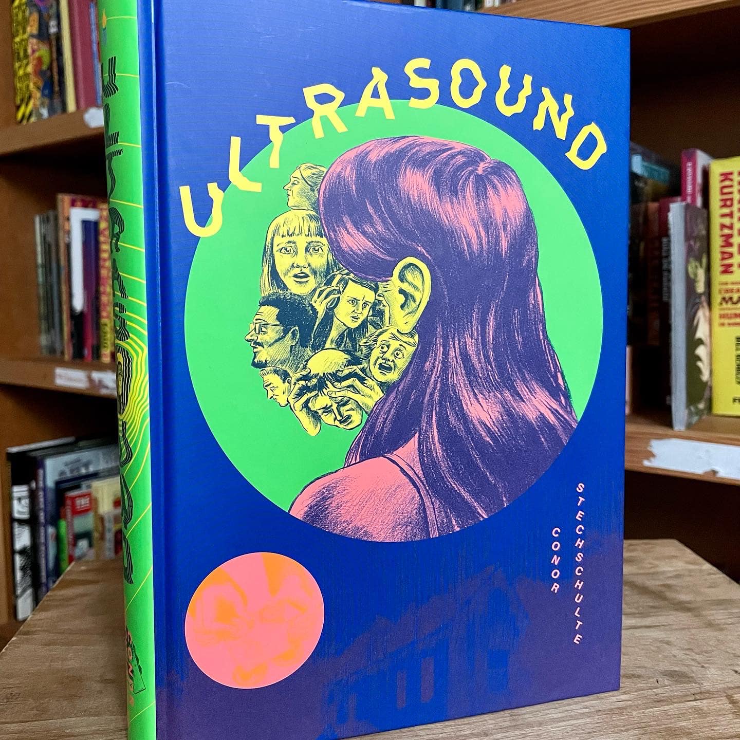
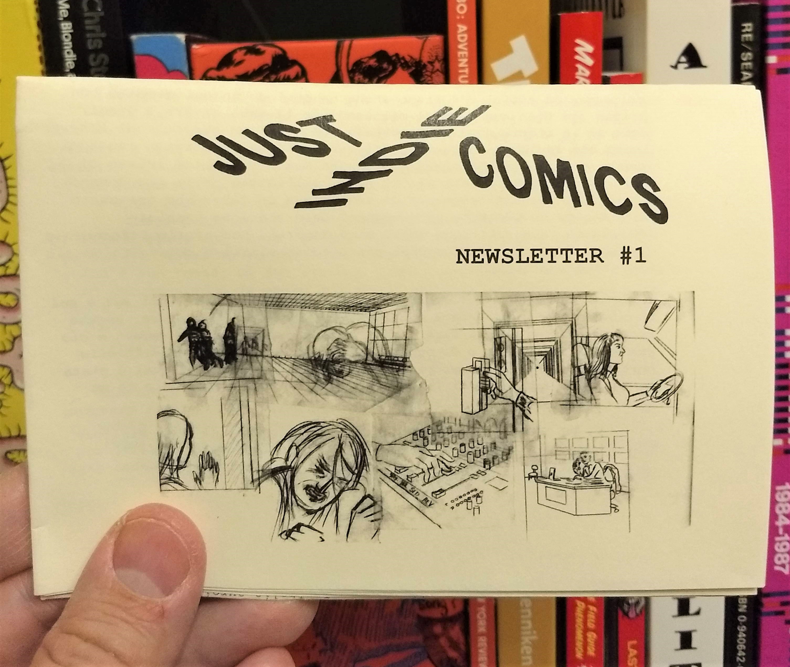
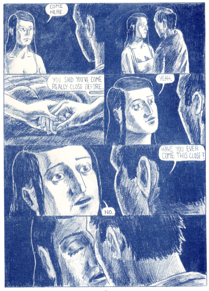
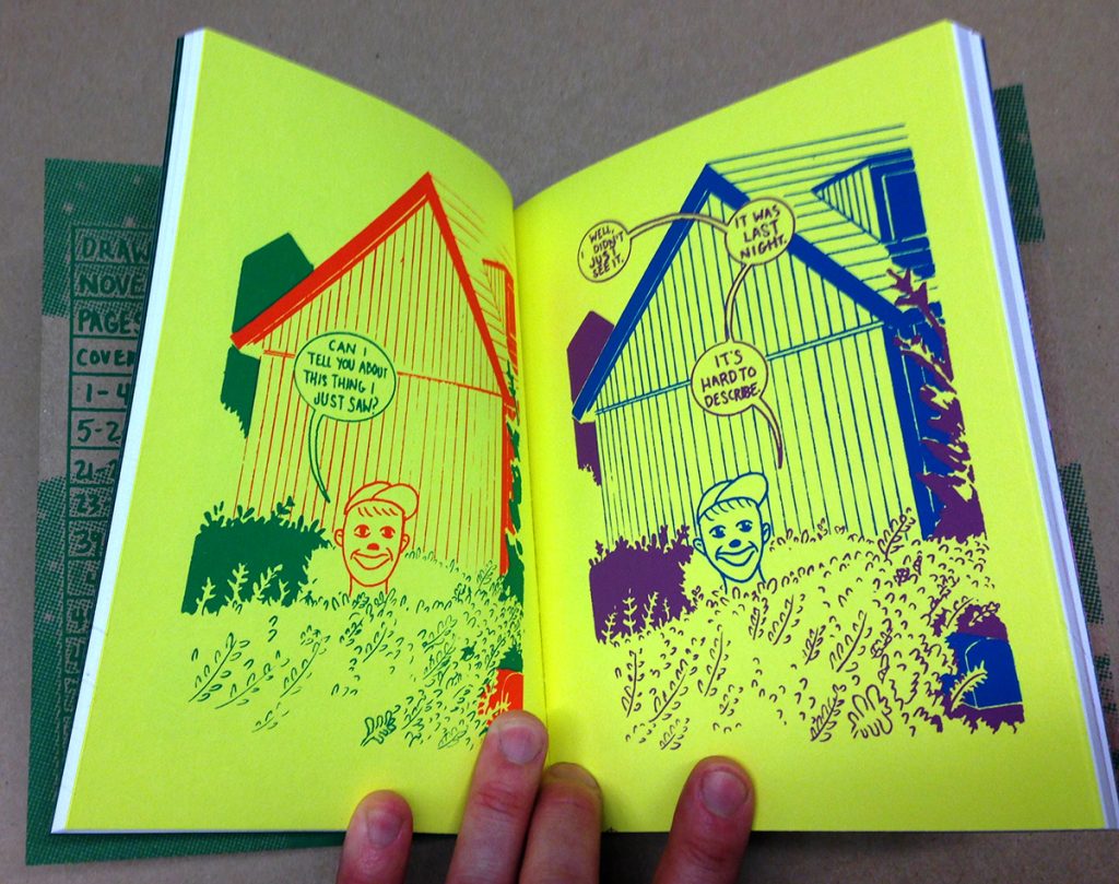
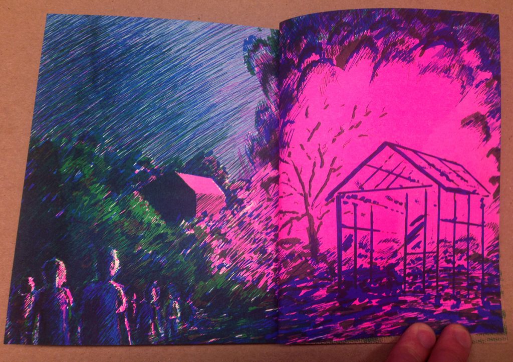
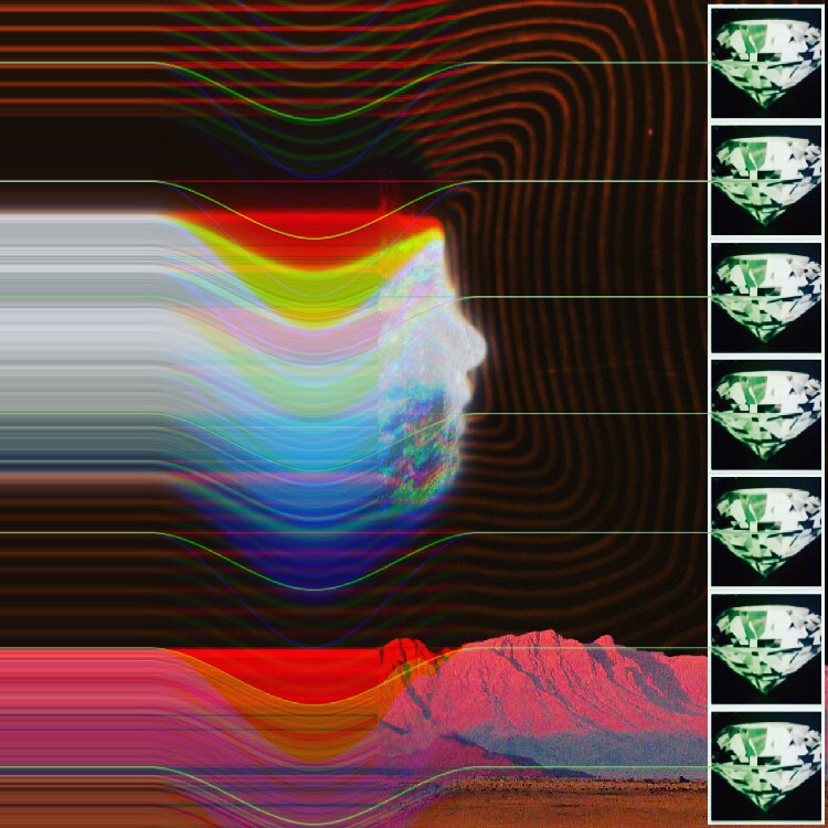
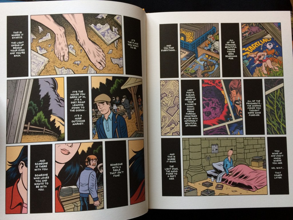
Last year in December I interviewed Conor Stechschulte by e-mail to talk about the ending of his series Generous Bosom published in London by Breakdown Press and the adaptation of the comic in a movie called Ultrasound, directed by Rob Schroder and written by Conor himself. The interview was published in Just Indie Comics Newsletter #1 (in Italian), where Generous Bosom #4 was at the top of my Best of 2021 list. Conor was kind enough to provide the newsletter cover as well, sending a collage of the tracing paper drawings used in making Generous Bosom #4. Now that the comic has been published in the USA by Fantagraphics in a single 376-page volume (with the same title of the movie), I think it’s the moment to offer the original version of the interview. And sorry if the questions aren’t perfect but well, I’m Italian and always in a hurry. Note for Italian readers: the book will be published as Scollatura profonda by Coconino in the next few months.
Your comics reflect on the notion of identity. You manage to describe very well the moment in which we are no longer ourselves, in which everything we believe in seems wrong, decided by others, or meaningless. The moment in which we act like a different person. Or maybe in which we express our true hidden self. Even the plot of Generous Bosom has something schizophrenic, it starts in one way and then it takes a completely different direction. Now try to look back. It’s 2012 again. You are still living in Baltimore and you’re beginning to draw the first issue of the series. How much did you know then about the full story and how much did you figure out during the process?
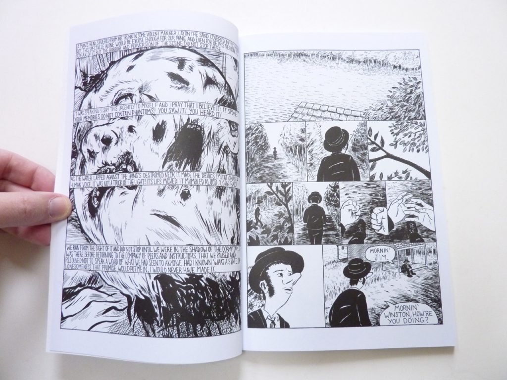
When I first sat down, I had the first volume in my head and not a whole lot beyond that. Pretty soon into the process I figured out that I wanted the characters to end up at some kind of facility and that there was hypnotism involved though not much of the how or why. There was also a period where I was playing with the idea of Glen never being able to leave Art and Cyndi’s house, that the story would become a sort of surreal version of Misery.
I think the long period of time it took me to finish the book is largely to blame for why it’s somewhat schizophrenic. Personally, I often encounter the moment you describe at the top of your question so sometimes it felt like I was working on a book that a total stranger had begun. Because I changed so much over the course of nine years, it became necessary to reframe the focus of the narrative so that I could remain engaged with the material.
I know it’s hard to say because you worked on it yourself, but I guess that being on set and then watching the movie was also an experience in some way as a spectator for you, because you couldn’t help but compare what you saw to what you had imagined and then drawn. What was the best thing about watching your comic become a movie and what was the thing that you liked the least?
Yes, it was very strange and psychedelic! I think the best thing was getting to meet all of the people collaborating on the movie, not just the actors – though all the actors totally blew me away and gave me so much more ideas about their characters and story material to work with – but everyone was there trying to lend their expertise to telling the story from the focus puller to the costume designer. It was a fucking blast to talk to Katherine Doty, the script supervisor who had gone through the script and was nailing down the details for continuity to a granular level, so amazing! I think more than an editor, graphic novelists should sit down with a script supervisor and get grilled about what exact time of day each scene takes place!
The thing I liked the least was seeing what I’d written fall flat when a person had to actually say it out loud. It didn’t happen too much, and thankfully the actors all were so good, they could find ways to change the line or make their performance work. But it’s funny, working on comics you get a sense for what feels real and right on the comic page and that is different than what seems like it works on the page of a script and that is different from what works in someone’s performance. So I was building new muscles in that sense and thankfully everyone on set is there trying to make the better, so you’re not alone in solving problems the way you are at a drawing desk.
Generous Bosom will be released in the USA by Fantagraphics in 2022 as a single book called Ultrasound. You worked on this story for about 10 years, so there was probably something you wanted to change or maybe to add. Did you edit some dialogues or drawings? Or did you draw some new pages as you did for the Fantagraphics edition of The Amateurs?
I just finished this process and it was really tricky. I thought of this metaphor the other day, I think an Italian reader will understand it better than most… Making a long comic (at least how I’ve drawn them) is a lot like painting a fresco: you have a very limited of time to get the ideas into/onto the material and then it hardens and you have to move on. As opposed to writing a movie script or a novel which, I think, is a lot more like oil painting where you’ve got a lot more flexibility: slower drying time, you can remove layers and glazes and adjust all parts of the painting right up until the end. If you want to go back and change something in a fresco, you’ve to sand down or crack off a whole section of the painting which will likely leave visible seams.
For this reason, I tried to be delicate about the older material and not try and make the comics I’d drawn eight years ago into the comics I would draw today. It’s my lettering that always embarrasses me, so I re-lettered a lot of stuff from the first two volumes. Eric Reynolds helped me correct grammatical mistakes, there are about 2-300 more commas in the collected edition! I also redrew two or three full pages and a lot of individual panels and details throughout, I changed some of the color coding to make more consistent sense across the whole book, and I added one page very close to the end that is the most dramatic intervention.
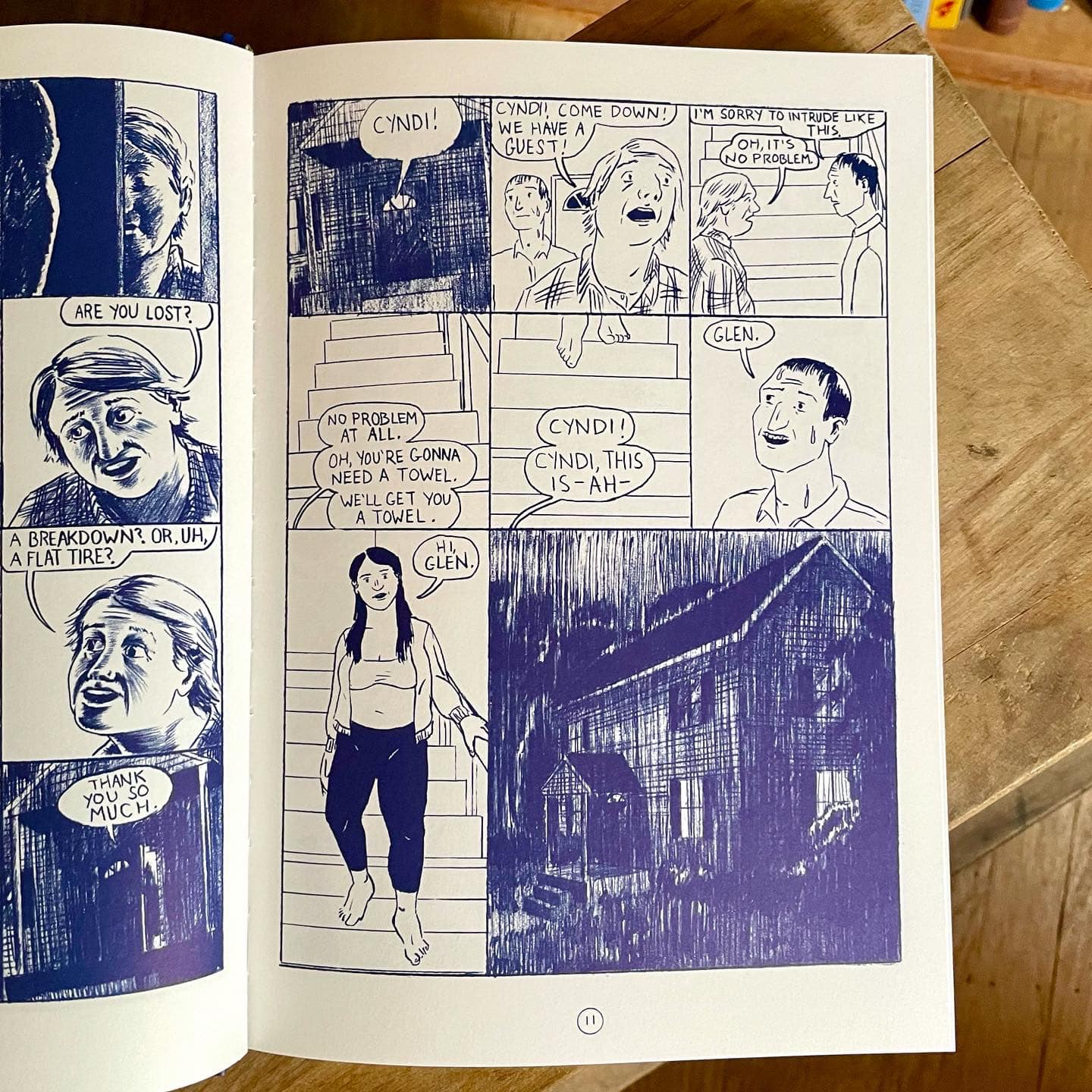
Now I want to ask you something very specific… In Raymond Chandler’s The Big Sleep there is a scene in which Philip Marlowe is driving in the rain and at a certain point he gets two flat tires. He gets out of the car and finds some nails on the road, near the repair shop of Art Huck. If I’m not wrong there are several details in common between this scene and the beginning of Generous Bosom. Is it a quote from the book or just a coincidence?
That’s really funny, I hadn’t read or seen The Big Sleep before starting on Generous Bosom, though I watched the Robert Mitchum movie this past summer (and totally missed that connection, by the way!). A weird thing was going on while I was completing the book during lockdown in 2020 where it felt like the things I was reading and watching were inspiring the book back in time or something. I read Who’s Afraid of Virginia Woolf? and it felt like the first volume of Generous Bosom is a funhouse mirror version of that play… There were other examples I can’t recall now. But now I do believe that artistic influence can travel backwards in time.
What are your next projects? Are you already working on something new?
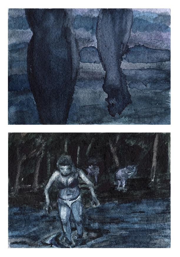
Most recently, the edits for the collected edition have taken up all my time. I’ve got a lot of notes for new longer stories that I’m going to work on fleshing out and I’ve got about fifty pages of a wordless watercolor comic I was working on in 2019 that I want to finish soon. I’m looking forward to making some self-published comics in the near future, I’m itching to make some books with my own hands.
“Tinfoil Comix” #1
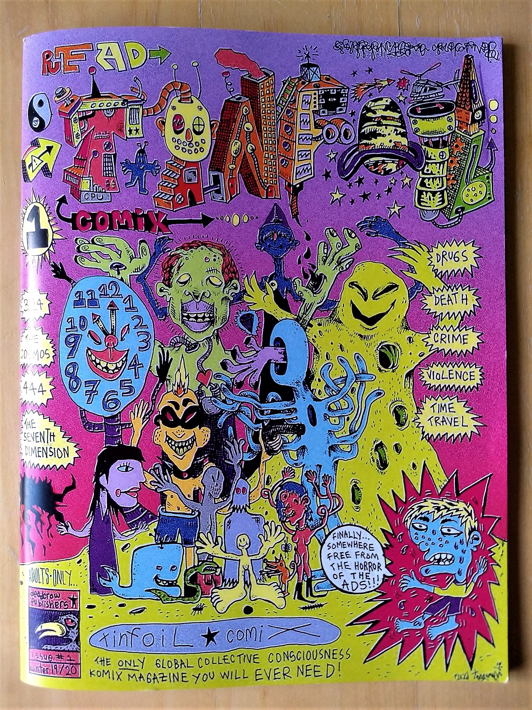
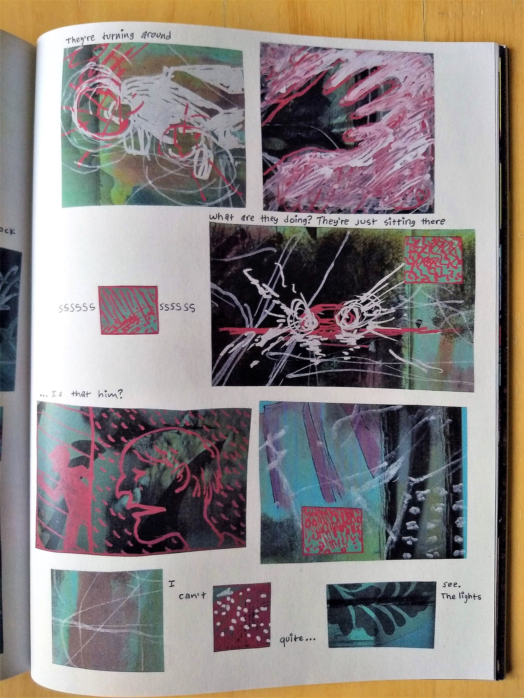
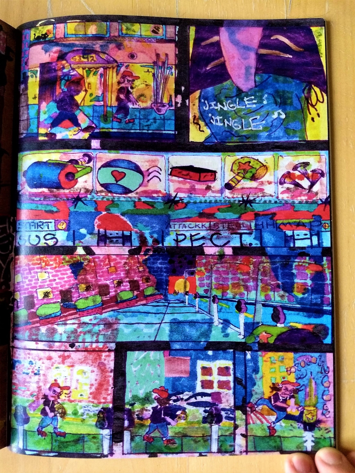
A new anthology coming from San Francisco, Tinfoil Comix showcases mostly unknown cartoonists but beats a lot of similar and much more renowned efforts. I haven’t seen for a long time such a combination of talent, strangeness, urgency and lucidity in one shot: almost all the artists in Tinfoil know what to do and how to do it, they have something to say and they aren’t smooth talkers. The comics show varied themes and styles but have substantial points in common. The first that comes to mind is an unusual attitude towards everyday life, exemplified in a sequence by Jade Mar: “Everything was one/We ate things/We farm things/We wait in lines/We advance/Were all these screens always here?/I’ve moved into this cave. The rent is incredibly affordable and/I feel at home”. The drawings are simple, indie and childish at the same time. And Mar insists a few pages later: “I can only tell a story from my perspective/I could try to tell one from yours but/I don’t think it would feel right”.
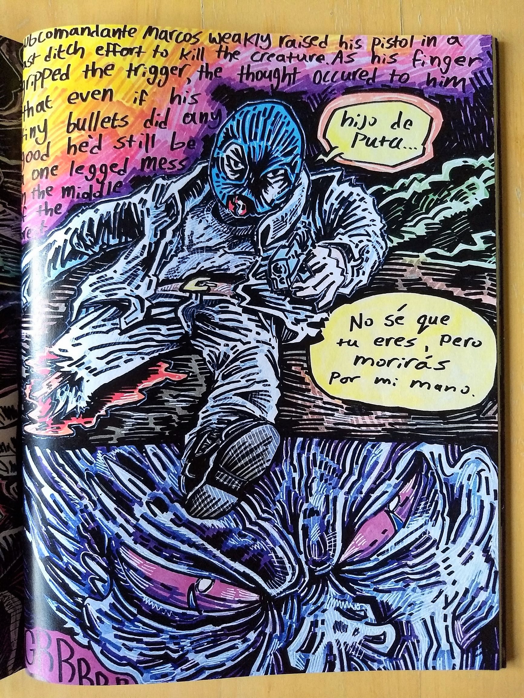
Tinfoil tells stories from the author’s point of view, and if this is obviously true of everything, it is particularly true here, because they are defined, strong, raw perspectives. Perspectives different from any others, often influenced by drugs or pills, as in the slightly retro contribution by Fried Feet that opens the book, or which portray altered states achieved through suffering, as in the case of a powerful five-pager dedicated by Virgil Warren to Subcomandante Marcos. Warren’s art is made of thick black lines that scratch the colors to create a ’70s look that would easily fit in an All Time Comics floppy.
Sometimes the pagination isn’t perfect and so we miss the edges of Hope Kogod’s comic (and someone else’s too). Kogod’s two-pager opens vertically and look likes a poster. At the end the author states: “It’s 2020, I deleted Instagram, email me”. Tinfoil‘s artists are old school, so that it’s difficult to track them on the internet. These stories don’t talk about the “virtual” but are mostly about the “real” world, and in fact there are many urban-themed comics, such as the four-pager by Nick Fowler, influenced by Bill Sienkiewicz, and the colorful Jeremy McBrian’s contribution, inspired by graffiti and video games. Editor Floyd Tangeman uses a lot of colors too, and, in order to take nothing for granted, reminds: “This comic reads from left to right”.
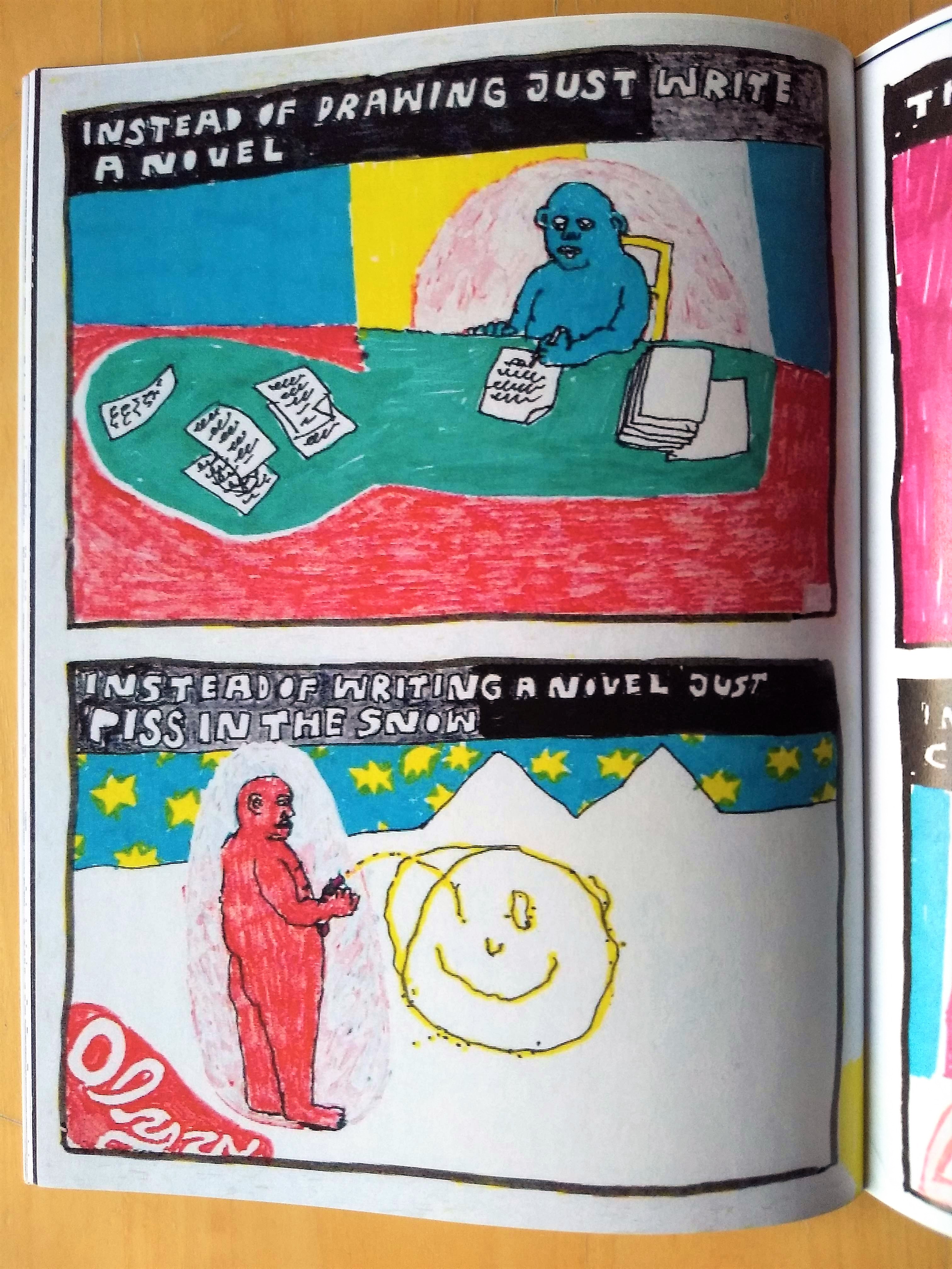
These cartoonists don’t look at contemporary comics as a reference point but mostly use a naive attitude, as that of outsider artists. The effect is refreshing, because for once we are not dealing with the copy of a copy, whether it’s of Olivier Schrauwen, Jesse Jacobs or Tara Booth. The feeling is they have more to do than stay home reading the latest comic from Fantagraphics. And from these pages it comes exactly this, an incredible and unstoppable and irresistible urge to DO. In this sense Olga Corcilius creates the perfect manifesto using simple colored markers: “Instead of drawing just write a novel/Instead of writing a novel just piss in the snow”. And the drawing appears on a white background, a few yellow lines shaping a smiling face. Are we witnessing the rise of a new revolutionary generation of artists? This is the first impression, and I hope that next issues (the second is already printed) will provide some confirmation.
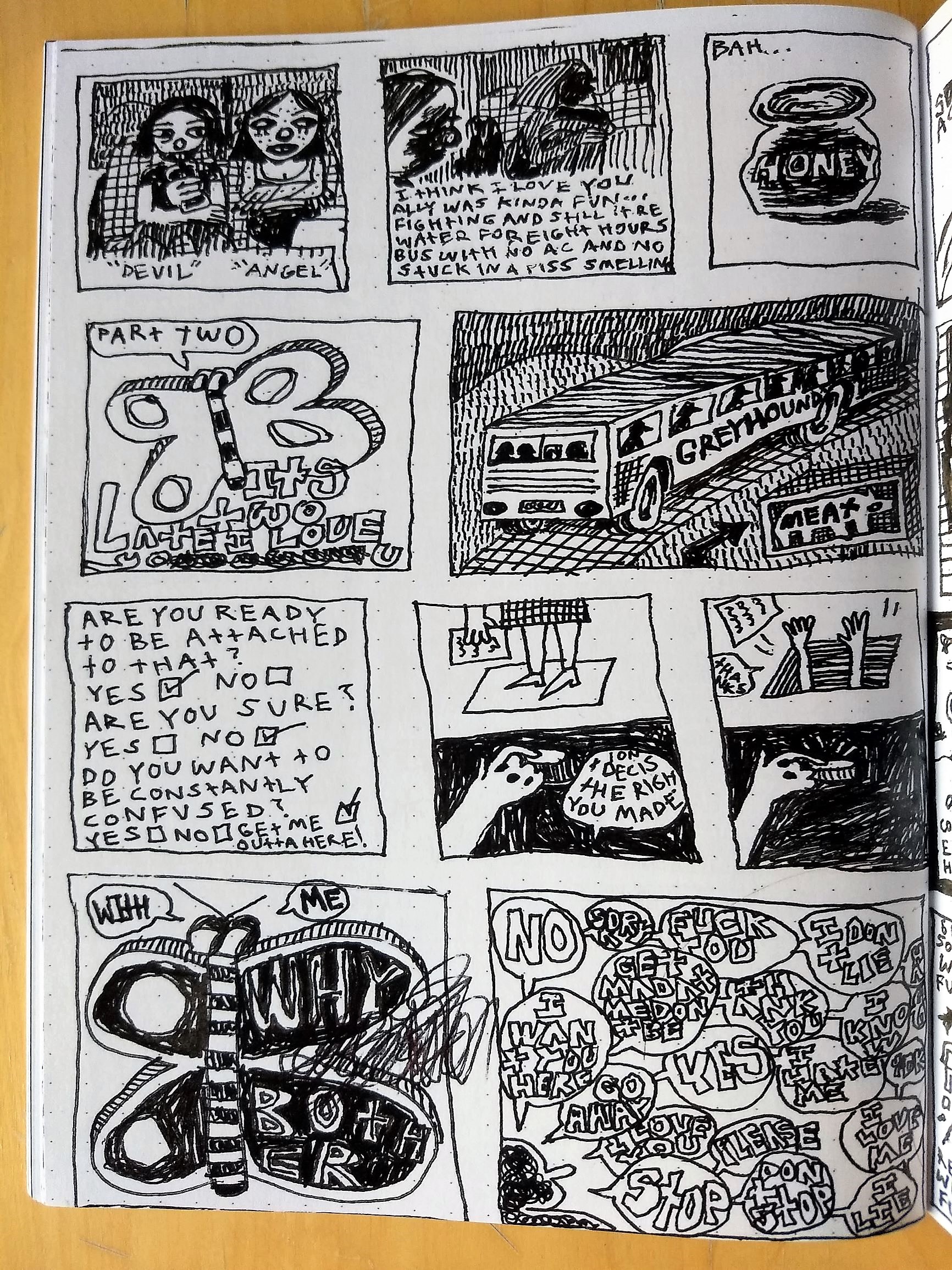
The comics follow one another seamlessly, there is only a list of cartoonists in order of appearance in the inner sleeve, like Sammy Harkham used to do in some issues of Kramers Ergot: it’s our job to understand where one ends and the other begins. Around the end here comes Lemonhed, whose work can recall in some way that of E.A. Bethea, an artist well known to the readers of this website: small, square panels that alternate drawings and text only.
If the comparison works for the layouts, it doesn’t fit for the language, which is not poetic in its very own way like in Bethea’s art but it’s rather autobiographical, although it sounds always nervous, like it can’t focus on a particular topic. The writing digresses, breaks down into simple letters or numerical series, and the drawings are like doodles, until the author confesses: “So heres the thing the year is two thousand and nineteen I was gonna do my laundry but instead I/took some Adderal and decided to make this comic so that maybe I can figure some things out”. Comics become a therapy, and perhaps Tinfoil Comix is a therapy for all its readers.
Tinfoil Comix is created by Floyd Tangeman, who is also the editor of the magazine with Virgil Warren. Some copies of this first issue are available in the Just Indie Comics webshop.
“Art Comic” by Matthew Thurber
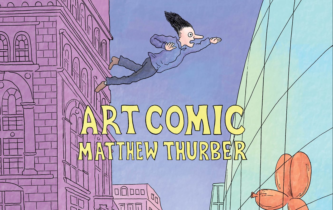
Matthew Thurber is one of the most brilliant, crazy, stimulating, classic, experimental and funny cartoonists around. Or maybe it’s the only one who sums up all these features in one go. His 1-800-Mice, first published in comic books and then in a 2011 hardcover collection by PictureBox, was inspired from the Fort Thunder scene for the pseudo-fantasy setting – still the citadel typical of Brinkman, Chippendale & co. – but mixed it with a lot of film and literary references: first of all Thomas Pynchon, from whom Thurber takes over his obsession with secret societies, religious cults and conspiracies about which little or nothing the common man (and so the reader) can understand. The following Infomaniacs remains to this day, despite being from 2013, the most accurate essay in comic form on our digital existence. Serialized as a web-comic and then collected by PictureBox, the comic explained how the Internet has become more real than reality with a classic style – most of the pages are four panels – and without looking for far-fetched stylistic innovations that often in many comics of today, copied once on Tumblr and now on Instagram from the copy of the copy of the copy, are only empty form and no substance.
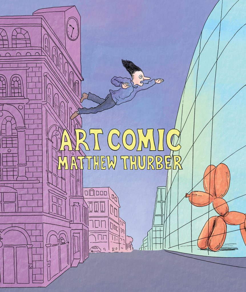
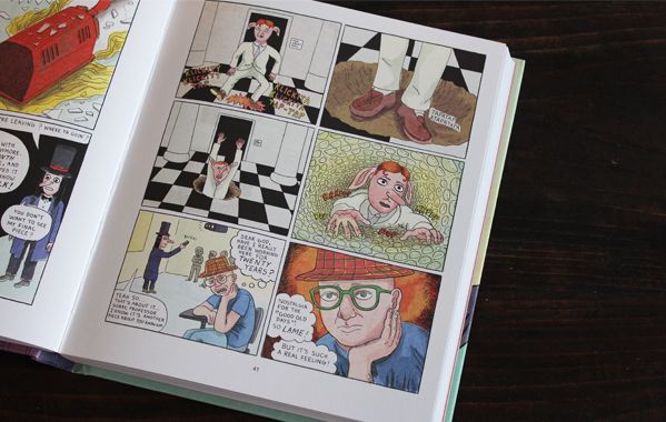
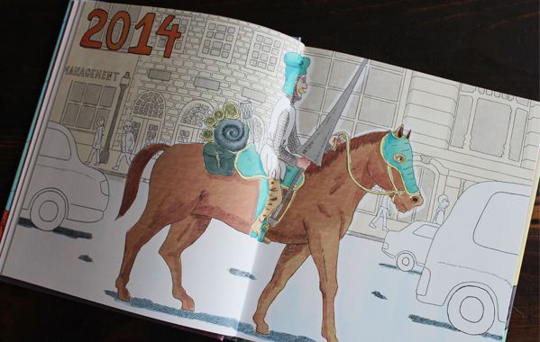
Thurber’s comics are extremely complex, yet there is always a moment when the character looks into the eyes of the reader and asks the simplest question. In Art Comic – now a full-color hardcover book out for Drawn & Quarterly after being serialized in five black and white comic books by Swimmers Group between 2014 and 2017 – the main character Cupcake asks: “Is it possible to become a great artist without turning into an asshole?”. This is a serious issue, and it’s also one of the many topics of the book. Another one is if art can still be revolutionary in a system where a single piece is worth even hundreds of thousands of dollars and where art schools are only accessible to rich people. Thurber also examines the age-old problem of what it’s art and what is not, starting from the Dadaists’ ready-made, here called “a tool of magical wealth generation” able to turn “shit into gold”, to get to Matthew Barney, with whom Thurber’s satire unleashes at the point of sadism. All serious issues taken sideways, from the beginning, from the bottom, from behind, and always with an infectious sense of humor. Just think of the first chapter of the book, where Thurber, in a sort of automatic writing trance, introduces as usual several characters, settings and in this case even time plans. So we meet Cupcake, a student of Cooper Union in 1999 (Thurber’s own college) and a big fan of Matthew Barney, only interested in creating works with references to the creative universe of the “master”. Among his colleagues, all students of the creepy Professor Password (former a Robert Rauschenberg’s disciple), stand out the promising Russian Boris Snegovoi and Tiffany Clydesdale, a Christian student who makes only works about faith. Meanwhile, the crew of the television show Drunk T.V. and a group of pigs called Free Little Pigs make a mess at the opening of Damien Hirst’s exhibition. And so we are in 2014, where a former student of Cooper calls himself Ivanhoe and rides a horse dressed in armor, followed by an intern hired for a mysterious mission. While 2014’s Tiffany summons Jesus with a prayer/work of art, in Miami a duo of bodyguards working for Zobchik, an alien from planet Qaxb, is bringing to Art Basel two robots having sex with the aim of getting the lady-robot pregnant in time for the fair. And this is only the first part. Among the various and absurd situations of the following chapters, we can’t forget the appearance of the Group, a secret society that boycotts the emerging artists through art schools, led by a certain R. Mutt, whose name could sound familiar to most of you…
The many storylines sometimes alternate with clear cuts, others converge into one another, or are resumed after pages, cross completely, only partially, not at all, and it isn’t important if something remains unresolved, unclear, vague: after all who are we to understand eveything of the silly complexity that surrounds us? It’s easier to be carried away, stunned by the flow of ideas and by the whirlwind of gags that follow each other relentlessly, while we laugh almost at every page and make our way through references to artists, groups and art movements of the last hundred and a half years, in a system of special guests and flashbacks that intertwines with narration without ever being an end in itself. Art Comic comes out for the same publisher and in the same year of Sabrina but represents its complete opposite. While in Drnaso the characters seem deliberately emotionless, nearly without facial expressions, in Thurber they look caricatural, exaggerated, hilarious and beatifully designed one by one. While Drnaso regulates everything through an obsessive logic, Thurber gives rise to an unbridled explosion of creativity: he is deeply interested in building a narrative but he likes to develop a loose structure, so that his book looks totally different from the usual “graphic novel” people are used to see in bookstores today.
Thurber’s endings are often sudden, almost cut off, and never definitive, as in the tradition of post-modern literature. In the comic book edition of Art Comic, Cupcake figured out – after an encounter with Mr. Colostomy, the talking horse recurring in every Thurber’s comic – how to turn a toilet bowl into gold, finding members of Gelatin art group inside it. When they invite Cupcake to join them, he dives into the toilet, as in Trainspotting via the Atalante by Jean Vigo. Put at the end of Art Comic #5, this was an unexpected ending, even for Thurber, since a lot of narrative threads remained totally unsolved. I spent months wondering (while I was also thinking about something else, of course) if it was really over and so it was a pleasant surprise to discover a never-seen-before sixth chapter of 33 pages, which leads to the conclusion (or almost) of the story. In the book you’ll find even some new “special contents”, i.e. 6 pages in which the characters and Thurber himself reflect on the story we’ve just finished to read. Instead we can’t find in the book the beautiful essay/editorial written by Thurber for the fourth issue of the series on the theme of the mystifying historicization of art. But these are minor details for those who haven’t still read Art Comic and, if you are among them, you’ve to do it as soon as possible. As expected, it is absolutely my best of 2018, without competitors.
An interview with Conor Stechschulte
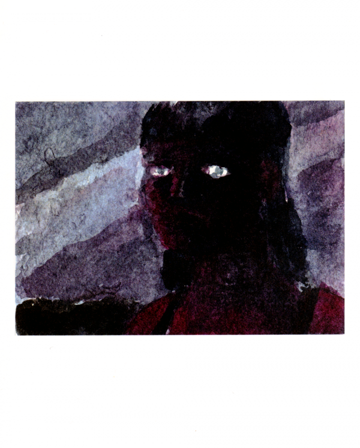
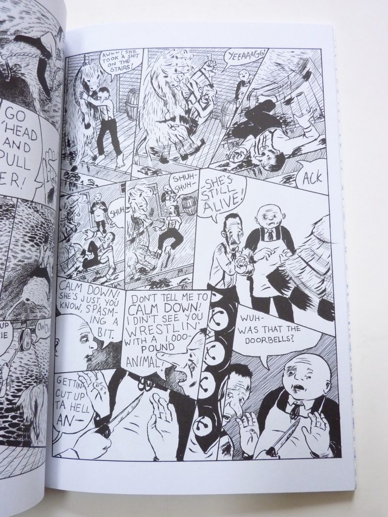
Conor Stechschulte is the author of The Amateurs, a graphic novel published by Fantagraphics in 2014, of Generous Bosom, a series for Breakdown Press now at its third installment, and of several self-published comics. Conor will be in Italy for BilBOlbul festival in Bologna, where he will have Il peso dell’acqua (The Weight of Water), an exhibition of his works open from 24th November until 20th December at the Spazio & gallery. And in the same days 001 Edizioni will publish I Dilettanti, the Italian translation of The Amateurs.
We asked some questions to Conor to introduce him to the Italian audience. The interview was conducted by e-mail between September and October 2017 by Gabriele Di Fazio, Elisabetta Mongardi and Alessio Trabacchini.
The Amateurs reflects your ability to introduce mystery in everyday life. The story seems to illustrate through the various characters (both in the main plot and in the frame) different ways to relate to the mysterious and non-rational aspect of existence. We don’t know if you agree with this interpretation, but we would like to begin this interview talking about your relationship with this element and how you think it can be communicated, displayed or evoked through art.
Fiction can help demonstrate ways to look sideways at what we’re experiencing. This is a great gift I’ve gotten from art and one I’m trying to pass on. Similarly, I really enjoy when I dream about something really banal – that I’ve moved a small object in my apartment or retrieved something from the car – and because it fits right in with reality, it’s like a weird boring time bomb that goes off with a light pop. It makes the rest of my day feel a little unreal. This just happened to me recently, I dreamt that I’d accidentally sent a bunch of pictures from my phone to a stranger and he’d replied simply, “Ha”. Several days after the dream I had a real moment of panic that this lightly embarrassing thing had actually occurred.
So, if dreams of objects from ordinary life are important for your art, it’s also true that the beginning of The Amateurs shows the opposite process, since something strange pops in everyday life. In fact the head found in the river kicks off a series of extraordinary events, as it happens with the severed ear found in the field at the beginning of David Lynch’s Blue Velvet. Your comics reveal the permeability between dreams and reality, but can you tell us more about how dreaming experience goes into your work? And do you look at some artists in particular who have taken this road?
I’d really like to lucid dream, though so far I’ve not had any success with it except in the early-morning time between hitting “snooze” on the alarm. I’ve come up with a lot of solutions to story problems and images in this space (one I can recall for sure is the final image from The Dormitory of the guy smoking in the basement window).
An author that immediately springs to mind on this subject is Jesse Ball. I had the privilege of advising with Jesse during my last semester at the School of the Art Institute this past spring and I just read Sleep, Death’s Brother, his book on lucid dreaming. He has much more interesting and useful things to say about dreaming than I do but I am especially excited by his idea of the dream-space as a training ground for the will; his book on dreaming is in fact intended for children and incarcerated persons for the exercise of the will under restricted circumstances.
Most of my favorite authors and artists have “taken this road.” Kobo Abe is an important favorite of mine, I’m thinking a lot about his book Secret Rendezvous in the most recent volumes of Generous Bosom. In his journals, Werner Herzog makes no distinction between everyday events and dream imagery (though he claims not to dream at night). The originating idea for The Amateurs sprung from a scene I read in his journals where he describes inept butchers on the banks of a river in Iquitos. In comics, I think that Olivier Schrauwen is a master of dreamlike/fantasy/subjective points of view and playing with the humor of their discontinuity with outside reality. Other important books/authors/artists for me in this vein are J.G. Ballard’s Unlimited Dream Company, Solaris by Stanislaw Lem, The Journey to the East by Hermann Hesse, Wind up Bird Chronicles by Haruki Murakami, Borges of course, Philip K. Dick, Apichatpong Weerasethakul, Tarkovsky, Lynch of course… And lots of others I’m forgetting.
The Fantagraphics edition of The Amateurs shows some differences from the first version you self-published in 2011. The most significant is the replacement of the hand-written introduction with a completely new storyline about two schoolgirls finding a man’s head in the river, the same river where they will perform a graduation ritual along with their classmates. Why did you decide to revise the original comic and how did you create this other storyline?
It started with simple dissatisfaction with the letter visually. It was one of the last things I had added to the comic and the more I looked at it the more unconvinced I was. A couple months after I’d self-published the book, I had the idea for that second storyline and thought, “Well if I ever have the chance to reprint it, I’ll include that”. So when the opportunity came along with Fantagraphics, it was one of the first things I did.
Animals have a key role in The Amateurs, they look strong and aware, while Jim and Winston, the two butchers who are the main characters of the story, are weak and confused. This, and the use of brutal violence in some sequences where animals are considered only as food, seem to imply a condemnation of eating animal meat. It should be interesting to understand if you wanted to convey a sort of “message” or if the interpretation is more metaphorical.
I made Jim and Winston butchers because it’s a profession that deals intimately with death. I wanted to talk about how people, rather than reckoning with death, will externalize it and locate it in the body of another, this always leading to harm on both sides of the equation.
That said, at the time I made the book I’d been a vegetarian for twelve years. I’ve since starting eating meat again. Haha, not sure if that shines any kind of light on the content… If someone were to decide become vegetarian after reading the book, that’d be great.
While reading The Amateurs, the impression is that the gender of your characters is not randomly chosen. In addition to some obvious hints (the all-girls school, the two customers…), all the animals that at some point rebel against humans are female (the sow, the mare, the cow), while the male are somehow more subdued (the pig walks into the slaughter of its own accord; the turtle gets tortured in the woods). It also seems like whatever the sinister power of the river is, it doesn’t affect women: they bathe, wash their clothes and make rituals in it, and nothing seems to happen to them. On the other hand, when Winston and Jim go into the water, they get literally shredded. There is also a scene where Winston – right after he has grinded his own fingers – yells at the two customer, saying he won’t put up with a woman telling him his work is not good enough. Not to speak of the fact that he remembers the two customers dressing him up as a girl when they were all kids. It seems to me that your book is filled with subtle references to men-women relationships (or to the general opposition between masculinity and femininity). Was that intentional or we are overthinking it? And does the river have anything to do with the representation of femininity in your book?
Thank you for such a close reading. You’re absolutely right that, at least in terms of my intentions, gender was a primary thing I was trying to address.
At the risk of over-explaining and squeezing out better and more interesting interpretations, I’d say that The Amateurs is an attempt to lampoon, ridicule and take apart (literally, haha) the idea of self-reliant, non-relational masculinity – the man who has all the answers. This is the character that Jim and Winston try to perform for the women in the book.
A huge influence on The Amateurs was the book Flesh of my Flesh by Kaja Silverman. She argues for replacing the Oedipus myth with the Orpheus myth with regards to gender – a story based on mortality rather than castration. She says our mortality allows us to relate to one another analogously, through our resemblances rather than metaphorically which always presumes a hierarchy. I was trying for a lot of these ideas and borrowed imagery from the Orpheus myth (i.e. the head washed up on the shore).
Thank you for pointing out this pattern in the gender of the animals, I don’t think I consciously set that up. I think a similar sort of pattern is emerging in Generous Bosom as well, where the main character and “Hero” of the story is actually very passive.
As for the water, I think of the water as being representative of an ecstatic/transcendent/undefined state rather than being specifically gendered.
Water, of course… It is a recurring element in your comics, and sometimes plays a major role. It may be the ritual river in The Amateurs, the rain from which the facts of Generous Bosom develop, the lake of impalpable but sharp tensions in Glancing, the sea where the games of Water Phase unfold, and Christmas in Prison’s narrative stream. If we consider water as a symbol, it is necessarily multifaceted, fluid, and seems to be related to desire, change, epiphany. It is the place where things happen, stories are told, secrets come to light. Why is water so important to you?
Thank you for tracking this image so comprehensively throughout my work! You’ve done such a good job of outlining how I’ve used water that I’m not sure if I can add anything…
Of the symbolic meanings you’ve listed I identify most with the idea of change. Water is a place where boundaries break down, things dissolve, definitions shift.
With how clear and declarative one must be in telling a story, especially with comics (here’s a guy, now here he is again, see? He’s wearing the same shoes and hat, except now he’s dropped his umbrella, and here he is again but now he’s bending to pick it up), water provides a needed space for vagueness. It’s a place where the closure occurring between each panel might be suspended (or maybe it’s a way of depicting that no-space in between). You can draw a clean, clear black-outlined character for most of your book but if you reflect the same character in a bowl of water, their lines go all wavy. They can be different.
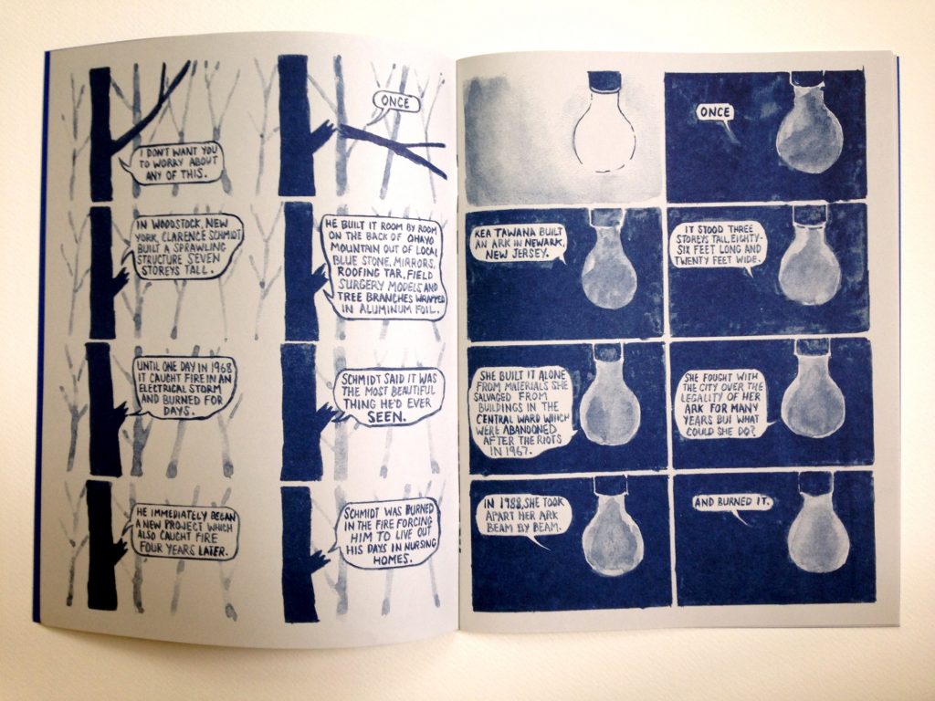
This confirms your are constantly looking for new ways of telling a story. For example another rule-breaking work is your most recent one, Tintering, where you didn’t draw characters but you told the story of five self-taught artists using different broken objects, with the single panels very similar to each other, while the content is mostly developed with text balloons. How did you come up with this, and why are you focusing your attention on objects?
The subject matter for the comic all came from an art history class I took which was taught by Lisa Stone, who is an incredible, generous, brilliant scholar on the subject of self-taught and vernacular artists. The way a lot of these artists related to objects was different from how we do (or must) in everyday life. Kea Tawana, for example, meticulously and respectfully took apart these old buildings in Newark. She had immense sensitivity to craftsmanship and couldn’t stand to see good materials go to waste. Much of the work of self-taught artists serves as a response to our culture’s massive generation, disregard and waste of objects.
I was originally thinking the comic might look like some of the stuff that I’d made for Christmas in Prison, with a character sort of delivering a monologue to the reader. I drew a guy standing behind a tree and then I thought maybe he’d reach out and break a branch off. Then it seemed more correct for the broken branch to talk. Most of the stories of these artists begin and end tragically – they undergo a loss, they make something beautiful which is itself destroyed. It seemed right that something broken would tell those stories and that they’d speak from the site of their injury.
In Generous Bosom, one of your recurring themes is explored thoroughly. We could call it “voyeurism” but it would be simplistic, it is a permanent question about “who watches” and the dynamics of watching. This theme can be found in a lot of your books and is essential in the self-published short story The Dormitory. But who is the real voyeur in your comics, the author or the reader? Or who else?
This is a tough question to answer succinctly. Mostly because it’s still an open one for me since I’m still trying to work these things out…
I don’t think anyone gets to just watch anything without, knowingly or not, participating or altering whatever it is they’re watching. I’m not sure if I can say who is the “real” voyeur.
Maybe comics are based on the fact that the act of watching affects the things you watch at. Can you tell us about your experience as a reader? How do you like to read/watch comics?
I think you’re right. In a comic, there’s no escaping the fact that whatever is on the page was put there by someone and through the act of drawing there’s no difference between what is seen and how it is seen.
That said, on the reading side of it I really like that comics are an elective medium. It doesn’t happen to the audience the way movies do, the audience/reader is the one who animates the action. To answer the question above, I think Generous Bosom is about this dynamic in the reading of comics – that you can pretend that you’re watching something happen both as the reader and creator but in actual fact you are making that thing happen.
I like reading comics over and over. I like that it’s a medium that allows and encourages this; it’s always easy to find a favorite scene again, because there it is. I like that in reading a comic you can go very quickly from the what to the how of a story. The density and depth of really good comics are immediately accessible.
So, this is your idea of reading comics, but what about making them? Your work finds a unique and original way to balance flow and structure, and it is very difficult to understand where you started, if from the plot or from the drawings. Glancing, a work based on the juxtaposition of wordless watercolors, could be an excellent example. What is your idea of comics and narration?
Thank you! I think my idea of comics and narration may go back to your earlier questions about water and the mysterious or irrational arriving in the everyday. Structure = The Everyday = The main narration of a comic/ consistent drawings/ Clarity, while Flow = Mystery = Water/ Change/ Irrationality.
With comics, I’m trying to get things across, to tell an actual story and to do that you have to establish rules that the reader can follow and rely on (I think this is what you mean by “Structure”). These rules start to stack up and can very quickly become impediments to freedom and to feeling like there’s possibilities in the world I’ve created which is where the energy to make more story comes from. At this sort of point it’s time for me to change the rules, insert a different story with different rules, or to maybe work on another project with different or as-yet-undecided rules.
Making Glancing felt very fun and active in this way where I made three or four drawings and then could make more drawings in between those drawings, or after them, or before. I could look at the whole thing laid out on the floor and get a feeling for it comprehensively. I want to make more comics this way.
Another reason of interest in your work is that you generally avoid the opposition between narrative and non-narrative comics – and between fiction and poetry comics – alternating the two approaches or demonstrating their substantial identity in the medium. Do you agree with this perspective?
Thank you again! Yes, I think this also relates to the answer above. I might add that decisions about the structure, whether something is “poetic” or “narrative”, etc. are made by tracking my own excitement about what I’m working on. Bringing in something mysterious/ poetic/ irrational/ non-narrative is often a solution to my becoming bored with a portion of a story or wanting to skip over a part that doesn’t feel compelling to make or to read.
Your work considers both the literary comics developed in the ‘90s and the formal experimentation diverging from the standard of the “graphic novel”, such as Fort Thunder and the output of “art comics” in general. But what is your background? And we aren’t talking only about comics, obviously.
My most important influence is the group of friends that I found at the Maryland Institute College of Art, the folks that made up the Closed Caption Comics group. We all sorted out how to make comics together at a young age. This was exactly the same time that PictureBox was starting up and a lot of the stuff surrounding Fort Thunder was coming to light and that was perfect for us – the immediacy of that work and how it was really visually-oriented spoke to us. Kramers Ergot 4 & 5, the old Fort Thunder Website and meeting CF and Brian Chippendale at SPX gave us all the sense that this was an art world that we could find a place in. And for a good while, I’d say that was about the size of the art world I cared about, it was my circle of friends and those couple guiding lights outside.
Other than that, growing up in rural Pennsylvania has had a huge influence on the imaginary worlds of my books. I also read a lot of literature. I just finished a master’s degree at the School of the Art Institute of Chicago… But are you more interested in my education/influences or in my biography?
Especially your influences, but also your biography, to the extent that it has influenced your work…
Beyond Closed Caption Comics, I’ve been involved in other collaborative art projects that have had a huge impact on my life. Shortly after school, I helped to found the Open Space gallery in Baltimore. We curated shows, held performances, established a zine library and put on a publications and multiples fair. I’m also helping to organize the first Chicago Art Book Fair here.
I was also in a band called Witch Hat for seven years which I started with Noel Freibert and Lane Milburn. Lane left the band after three years and Chris Day joined. Chris and I are in a new band called Lilac with Anya Davidson and Kenny Rasmussen here in Chicago (Chris and I moved here at the same time). When I got involved in the underground comics scene, there was a lot of crossover with the underground music scene. I met lots of musicians through comics and lots of cartoonists through music.
Do you think your art or your approach to art changed since you moved from Baltimore? Chicago has a big comic scene and a long tradition of contemporary art, we can think to Hairy Who first of all but there is probably much more we don’t know about in Europe.
My art and my approach have definitely changed a lot since moving from Baltimore. I’ve been in school the last two years, so just being exposed to tons of new work and people and ideas has been totally invigorating and overwhelming. I think I’ll be digesting all of it for years to come.
On a basic, lifestyle level, moving here and attending school has allowed me to stop working a non-art-related day job (at least for now). That’s a great gift that I didn’t previously think was within reach for me. I think I’m now more dedicated to the idea of trying to make, or at least to make and to teach, art full time.
As for Chicago, it’s an amazing city for cartoonists. There’s a beautiful supportive community and stuff like the Zine Not Dead reading series run by Matt Davis and Brad Rohloff which carries on the tradition of performative comics reading started by Lyra Hill with her Brain Frame series. I mean just in my neighborhood I’m about five blocks away from a house where Anya Davidson, Lane Milburn, Margot Ferrick and Andy Burkholder all live (Edie Fake used to live there in the attic). A couple blocks in a different direction are my dear friends Molly O’Connell and Chris Day – both of them with beautiful diverse practices that include but aren’t limited to comics and bookmaking.
10 debut books from SPX 2017
The Small Press Expo is the major US festival dedicated to the world of independent and alternative comics, and the home of the Ignatz Awards, a prize that recognizes the most interesting authors and books of the past season. This year’s event will take place next 16th and 17th September in the usual location of Bethesda North Marriott Hotel, near Washington DC. During SPX publishers present an impressive number of “debut books”, showcased from the same SPX organization in this list. Here I’m trying to select – from my humble, personal and very far point of view – the ten most interesting books announced until now, listing them in alphabetical order. If I already had the opportunity to read some of them, some others are totally new and I can only imagine their content. So, take this “best of” as a sort of game, like a lot of “top ten” lists are.
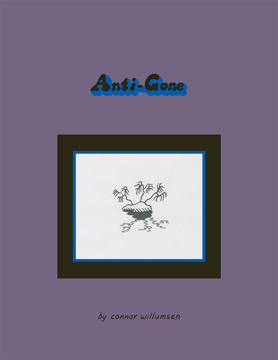
1. Anti-Gone by Connor Willumsen
Between Sammy Harkham and Lando, to mention two contemporary cartoonists, the style of the Canadian Connor Willumsen explodes in all its majesty in Anti-Gone, a vision of a dystopian future that reshapes the atmosphere of the Treasure Island series projecting them into a futuristic as decadent metropolitan environment. Synthetic drugs, post-consumerism, street riots but no internet… Did it broke down, finally? I’ve read it only in PDF at the moment but Anti-Gone is already one of the books of the year for its capacity to synthesize tons of contemporary comics in one perfect story.
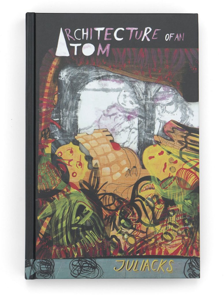
2. Architecture of an Atom by Juliacks
The publication of the massive hardcover book Architecture of an Atom by 2dcloud is the culmination of a long-running project by multi-disciplinary artist Juliacks, carried out with projections, performances, exhibitions in galleries and contemporary art museums. Defined as excessive, mysterious, poetic, crude and dreamy, the book overcomes the boundaries of the comics world to reach an unknown as fascinating territory.
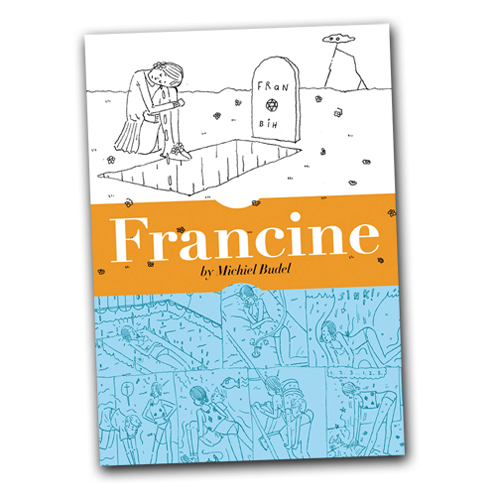
I have a thing for cartoonists who do the same thing over and over again (as well as for bands who play always the same song) and Michiel Budel is one of them. His webcomic Slechte Meisjes was already translated in the comic book format by Secret Acres in two issues of Wayward Girls and now by the same publisher comes Francine, a new volume of 80 densely-penciled pages. “Teens can be deceiving, and Francine is exceptionally so – says the press kit – She murders her bully, fakes her own death, steals her best friend’s mother and makes any situation uncomfortably sexual”. One of those comics where it’s difficult to enter but, once you did it, it’s impossible to get out.
4. Good News Bible by Shaky Kane
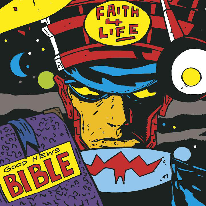
Keep your eyes open, because there is a lot to see here. After the debut at the Safari Festival in London, the collection of strips and illustrations by British master Shaky Kane arrives in North America. Good News Bible showcases the work created for the ground-breaking Deadline magazine. When I saw Deadline in the early ’90s, Kane’s art was a portal in another world filled with dreams and expectations, and now it’s a pleasure to come back there. But if you aren’t familiar with this material, the large-sized format book published by Breakdown Press will offer an unmissable opportunity to appreciate an artist who interpreted with a punk feeling the Jack Kirby’s lesson.
5. I Am Not Okay With This by Charles Forsman
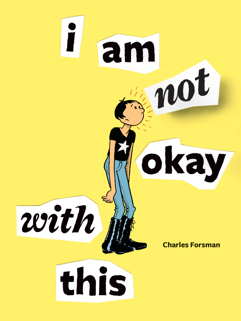
Charles Forsman returns to the comic strips style used in the critically acclaimed The End of the Fucking World, recently a tv show on the UK’s Channel 4, to tell another story of struggling teenagers. But this time the young Sydney has also telekinetic powers… Could I Am Not Okay With This be the perfect blend of the first Forsman and the one recently seen in Revenger and Slasher? We will find out reading this book, a collection of mini-comics created by the author for his Patreon supporters.
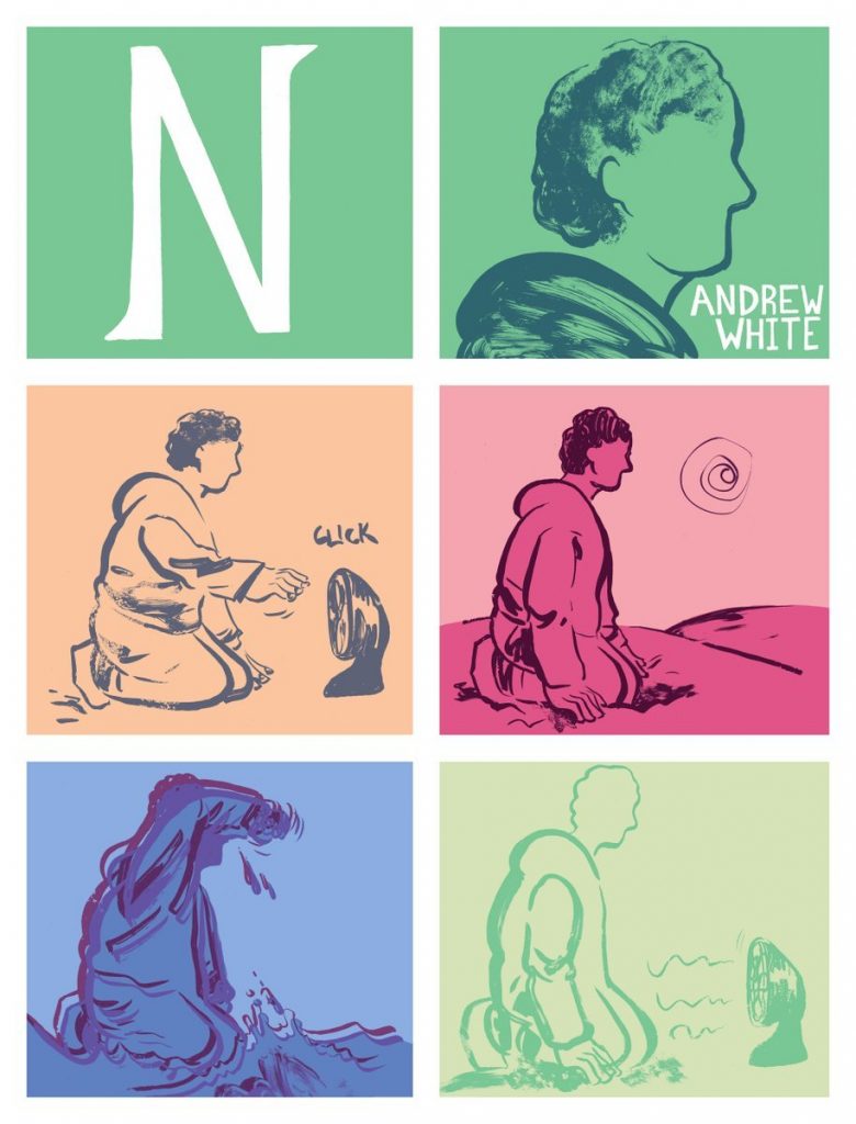
Experimental, poetic, steadily looking for new formal solutions but without losing sight of emotion, Andrew White’s comics look to Frank Santoro’s teachings and comics-as-poetry. N is a new 46-page color comic, the ideal follow-up to M from 2015, described by the same artist as “a comic about storytelling, family, and coming home” as well as “three short stories drawn in different styles but actually one long story drawn in the same style”. And that’s not all, because at the SPX White will also debut with All There Is, a mini-comic collecting drawings, diagrams and essays about Kevin Huizenga’s Ganges.
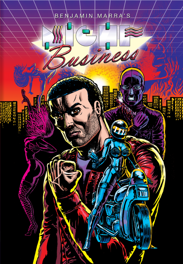
7. Night Business by Benjamin Marra
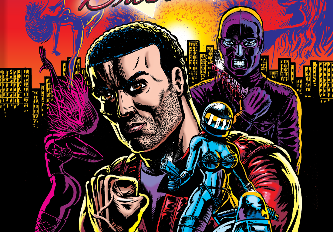
The official release is due only in December, but at SPX Fantagraphics will make available some preview copies of Benjamin Marra’s Night Business, a 250-page hardcover book that reprints the first four self-published issues of the same series, unfinished since 2011, and six new chapters. Less absurd than Terror Assaulter but still excessive and ironic, Night Business is an exciting trip to 1983’s New York City populated by knife-wielding killers, nightclub dancers, hideous businessmen, drugged heroes, and motorcycle heroines. So, what else do you need?
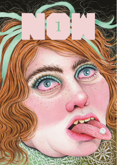
The debut of a new anthology is good news today, since the classic format of the magazine collecting miscellaneous contributions from different artists is at least a commercial risk by now. But fortunately Fantagraphics doesn’t care about market laws and is starting a new ongoing series with Now, still curated by Eric Reynolds, formerly editor of the fondly remembered Mome. The first issue will include new works by well-known artists and promising new talents from around the globe, such as Eleanor Davis, Noah Van Sciver, Gabrielle Bell, Dash Shaw, Sammy Harkham, Malachi Ward, JC Menu, Conxita Herrerro, Tobias Schalken, Antoine Cossé, Tommi Parrish, Sara Corbett, Daria Tessler, Kaela Graham, and Rebecca Morgan. The hope is that the anthology will keep the promises of high quality and also of periodicity, as it is intended to be published three times a year.
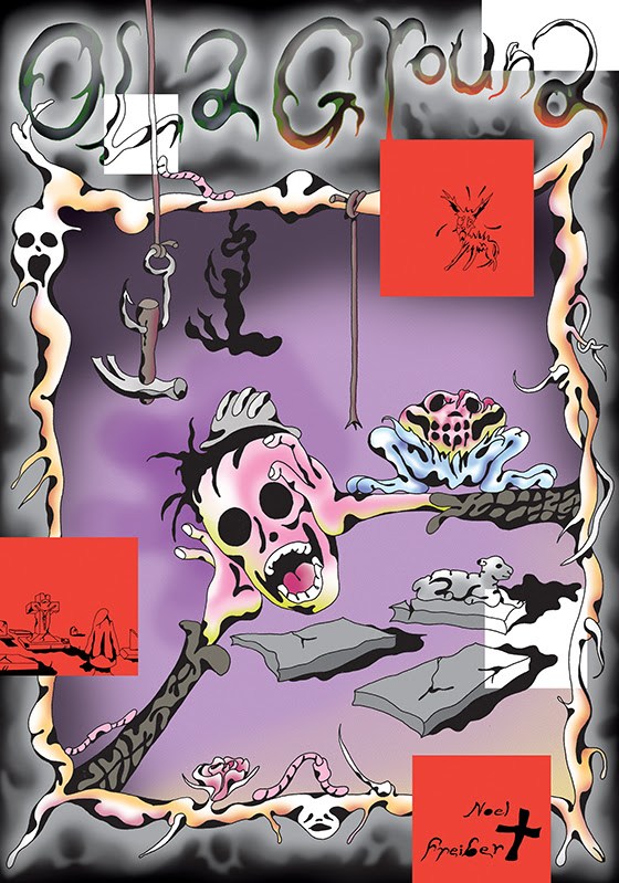
9. Old Ground by Noel Freibert
Another publishing house with an impressive schedule for SPX is Koyama Press. To the aforementioned Anti-Gone I’ve to add at least Everywhere Disappeared, an anthology of short stories by Patrick Kyle, and Language Barrier, a collection of comics and zines by Hannah K. Lee. But if I have to select another book for this top ten, my choice goes to Old Ground by Noel Freibert, one of the founders of the Closed Caption Comics collective and editor of Weird magazine. Working on a graphic novel, Freibert staged with his liquid and inimitable line a slapstick comedy that is actually a contemporary sequel to the most tragic of gothic novels.
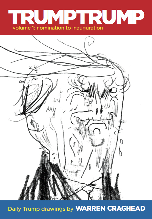
10. TRUMPTRUMP vol.1 by Warren Craghead III
On the trumptrump.tumblr.com page, Warren Craghead III shares every day Donald Trump’s iconoclastic portraits, accompanied by quotations from his speeches or interviews. The effect is parodic, strange, often horrific. Some of these drawings are now collected in a massive 200-page hardcover that Retrofit Comics is releasing for SPX along with other cool books as Tales from the Hyperverse by William Cardini, How To Be Alive by Tara Booth, and Yuichi Yokoyama’s Iceland.
PopOok! An interview with Hamo Bahnam
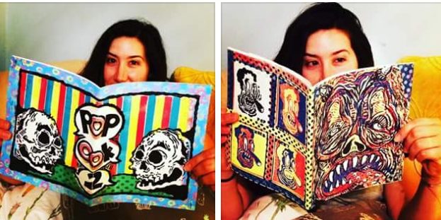
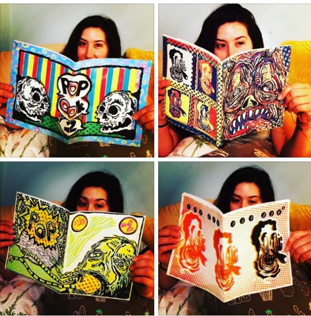
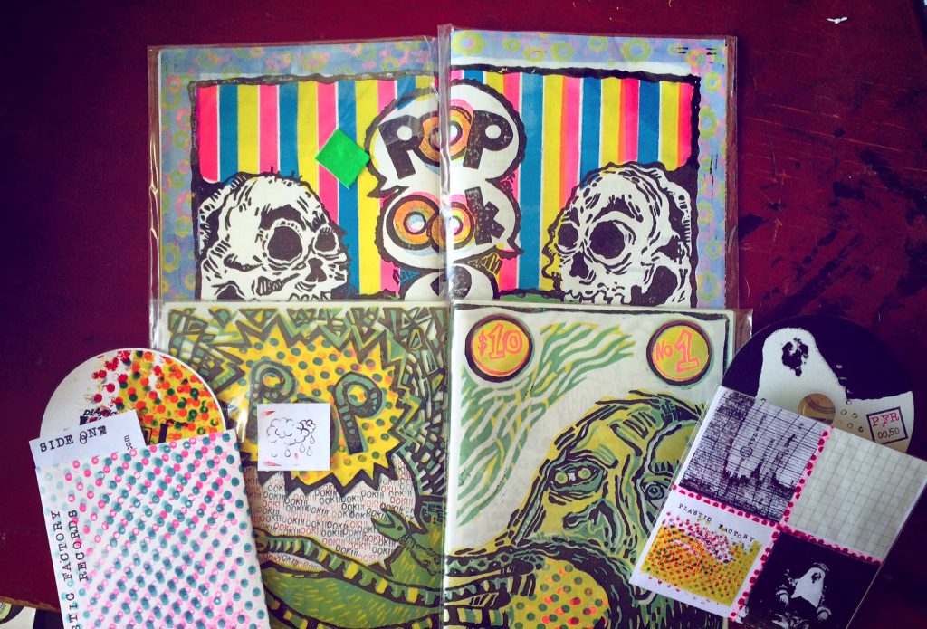
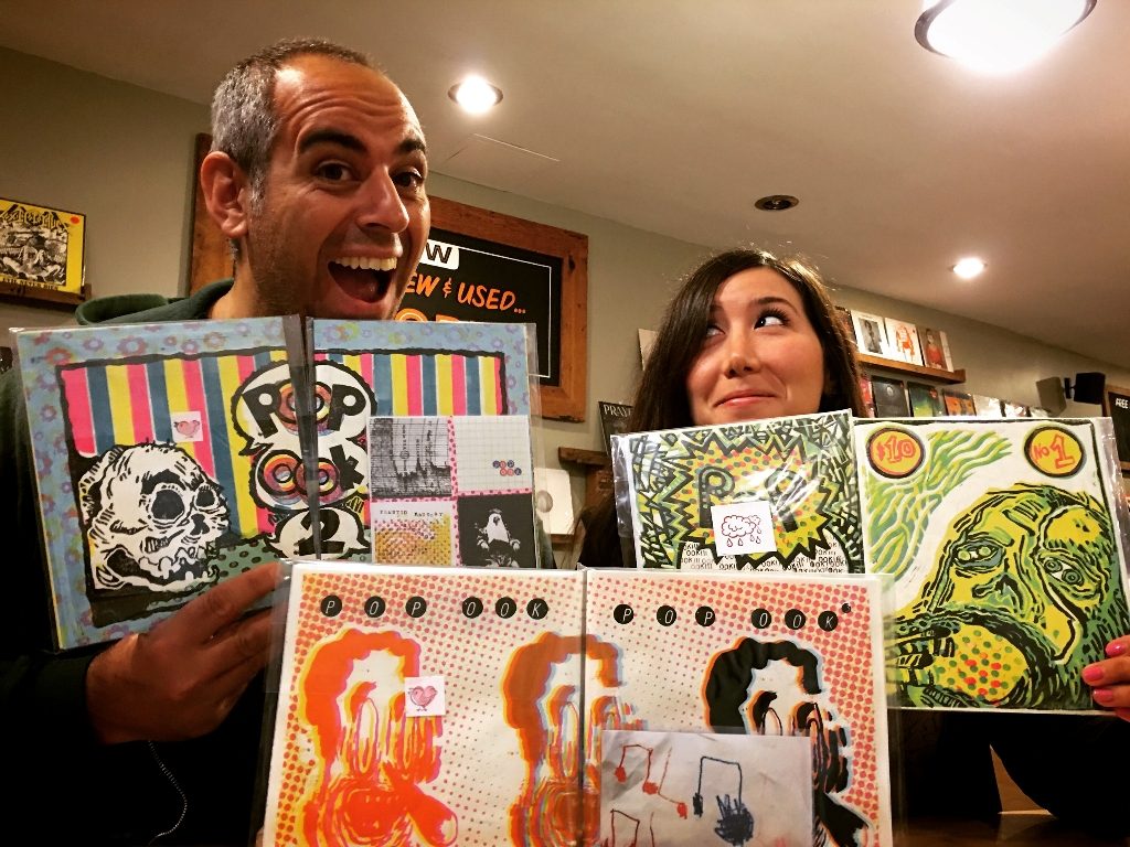
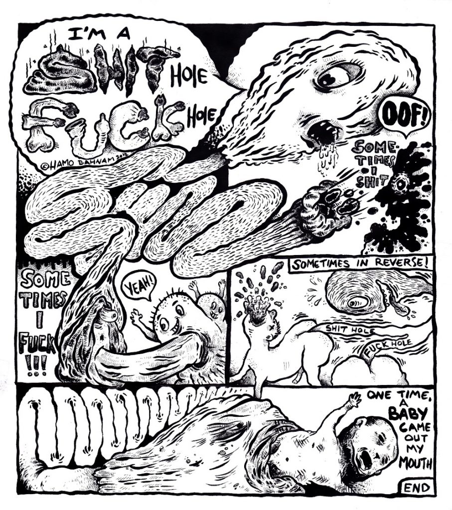
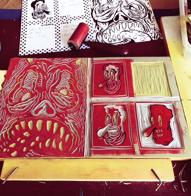
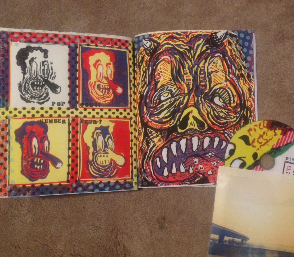
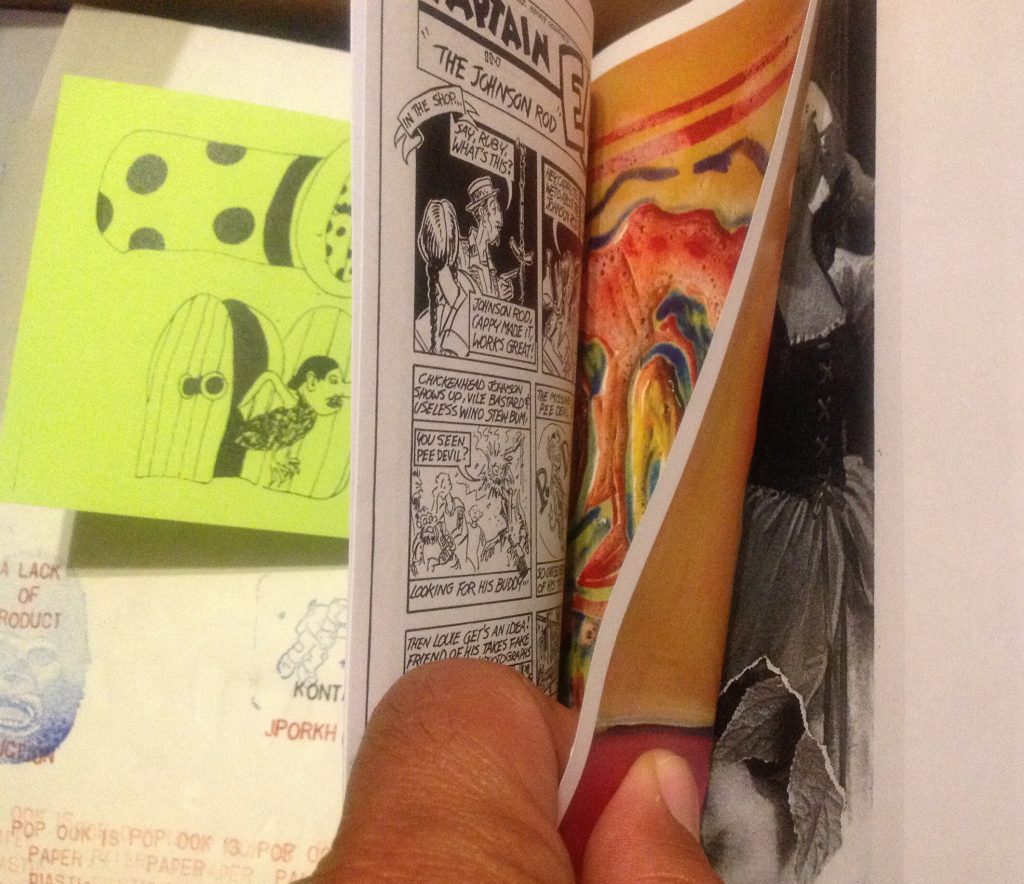
PopOok! is a Los Angeles-based zine self-published by Hamo Bahnam since 2012 and now arrived at its fourth and recent issue. When Hamo introduced me to his project, I wasn’t aware of it and I think a lot of other people really into self-publishing, zines etc. still don’t know about Pop Ook!. In fact, in a world where you can find almost everything on the social networks and in a scene where every cartoonist knows his peers, PopOok! is an exception, the kind of publication that can’t live anywhere else but on paper and whose creators don’t aggressively promote it, because they simply want to do it, without caring too much about the audience’s acceptance. Inside the issues of PopOok! there are very different contents: comics looking directly to the underground revolution like the ones created by Bahnam, the strange cartoons of Rusty Jordan already known for Alamo Value Plus published by Revival House Press (I talked about it on the old website), the nightmares of Marcel Dejure and the “wet dreams” of Yara Zair. And then collages, illustrations, inserts on colored paper, plus a cd of ambient-noise-experimental rock music coming with every issue. All this comes wrapped up in hand printed covers. Not every page is completely accomplished but there is a feeling here of something going on, a love for the subject matter that isn’t related to self-realization but only to real love for comics, music and illustration. I’ve talked about PopOok! with its master Hamo Bahnam in an interview conducted via e-mail in the latest months.
The first issue of PopOok! was published in Spring 2012 but you made comics long before. Can you tell me when you started to create comics, where you published them and how the idea of starting PopOok! was born?
Comics have always been a big part of who I am as an artist. Not really as a fan knowing the hippest books and artists but as an aesthetic, a way of working. I’m more interested in music as a fan than I am in any kind of art. But my wanting to be an artist comes from buying my first copy of Mad magazine when I was 10 years old. I put out my first comic in 1994. I called it Grow Up! (comix and funnies). That first comic was a precursor to what I’m doing with PopOok!. The idea that I could publish my own comics and zines came out of the punk/hardcore culture I grew up around. Comics and degenerate music have a long history together. From 50’s horror comics and juvenile delinquents listening to rock’n’roll to the 60’s underground comix and psychedelic music to punk (Punk magazine’s John Holmstrom and Gary Panter) to 90’s garage and even noise music has artists and cartoonists involved. Low forms of culture breads other low forms. In the early 90’s met two artists, Amos and Marcel Dejure, who were publishing books under the No (Know) information Network. They published me first in their HO! Comix. They hooked me up with other artists and that’s where the idea of Grow Up! came from. I stopped making comics for a while and concentrated on painting and printmaking, however, comics were usually a theme in the format I was working in. Around 2005 I started making comics again for a leftist newspaper in Knoxville TN. The comic came out twice a month. It was called Juicy Pork Head. About a corrupt industrialist named Harry Bowels, who hypnotized children into killing their parents, then turned the dead parents into ice cream. That scenario would fit into todays’ political climate quite well actually.
I started PopOok! in 2010 when I moved back to Los Angeles after being gone for 12 years. I needed an artistic direction and a focus after separating from my ex-wife. I met Meredith Wallace who was a co-worker with me at a local library. We began talking and it turned out she had a small zine distribution company. She eventually became instrumental in starting the L.A. Zine fest and I just figured this would be a great moment to start making comix again. I invited some old friends to contribute and met some new folks and Bingo! PopOok! was born. I took what I learned from years of printmaking, comix reading and my love for music and now I’m working on a fourth and fifth issue.
The zine is “a lack of Product production”, while the music cds coming with every issue are credited to Plastic Factory Records. Are only you behind these labels or there is someone else?
Yes, it’s just me behind those labels. Artist and musicians send me their work and I put it all together. I create comics and music too then I assemble the whole thing, I hand print the covers then cut, staple or glue. I’m the owner/publisher/editor/labor and janitorial staff. But I couldn’t do it without all the talented people who contribute to it. I make enough money from sales to cover my costs and the contributors get no salary. They do it for free and I guess they trust me to make a product they can stand behind. I love them all for believing in this project.
And so, how you select these artists? Are they people you know in the “real life” or you contact them on the internet? Because, seeing it from the outside, PopOok! seems the expression of a scene and it could seem a zine of another time, when social networks still didn’t exist. I don’t see in it “famous internet people”…
Most of the people involved are friends and acquaintances that I’ve known for some time. Some of these friendships go back 20-30 years. Others I’ve just recently met because of my doing PopOok! Or friends at work who are creative types. Some people I meet at zinefests and music spaces where I see/hear their work or they see mine. And also others are people I’ve never met that I have admired their work from seeing/hearing it on the internet. As far as a “scene” goes most of the artists/musician have never met each other! Some do know and are aware of each others work but it’s mostly a scene comprised of many cities and countries and PopOok! provides the glue that binds them together.
What are your inspirations both as an editor and as a cartoonist? Ok, you were influenced by Mad magazine but I guess you also love the underground comics from the 60’s or the 70’s, because most of the works in PopOok! can rememeber Zap Comix and sometimes they have a psychedelic style or a punk feeling. On the whole your zines seem a sort of “old school” work, as if the people who created them love the classics while they aren’t really interested in the latest tendencies of cartooning. And this is pretty strange in a world where everything looks like something else…
Yes, Punk and Underground Comix culture are two big influences on me. As a cartoonist my influences are many and they are one’s that I’ve held on to for a long time. Robert Crumb is godhead to me. He’s just an incredible talent and genius that changed me forever. Of course with Crumb comes the Zap artists: Clay Wilson is fantastic as well as Gilbert Shelton. The Harvey Kurtzman years at Mad, especially the cartoonists Will Elder and Jack Davis. Later Mad artist Don Martin was a childhood favorite only replaced when Crumb walked into my life. George Herriman and the absurdity of Krazy Kat. I love absurdity in everything! And also the raw energy of Savage Pencil and Gary Panter are always present for me.
As an editor my two influences would be Robert Crumb and Art Spiegelman. Crumb’s embrace of punk cartoonists and punk culture when he published Weirdo plays a huge part on me with PopOok! And Art Spiegelman’s RAW magazine is great too. The multifaceted aspects of Spiegelman’s work is top notch. As an editor my influences do come through in the contents of the comic and music cd. I think the old school aesthetic comes from my age and what I grew up on. I’m old enough to have been alive for those things to be new. Those artists are my teachers.
Another feature of the zine is that every issue is very “physical”, the packaging is really accurate and there are a lot of inserts, you use different paper colors, the covers are mostly printed using linoleum blocks and hand stenciling, and one is silkscreened (#3). These are books you absolutely can’t read as a PDF…
Right. And that goes back to Spieglman’s Raw. I have a copy of #7 where he tore a piece of the cover off and taped it to the inside. And the original chapters of Maus where printed and stapled inside the bigger comic as a mini book. So that playing with the medium, how he deconstructed/tore-apart comics is fascinating to me. I’m also a printmaker and make assemblage paintings so the physical object is very important to me. The human artifact speaks to me and the need to touch things to have an actual experience with art is what I’m going after. I’m strictly a 20th Century boy. PDF comics are bullshit.
Would you like to present to the readers of Just Indie Comics some of the cartoonists you’re working with for PopOok!?
Sure. All the artists are worth mentioning and there are so many but we can talk about some of them.
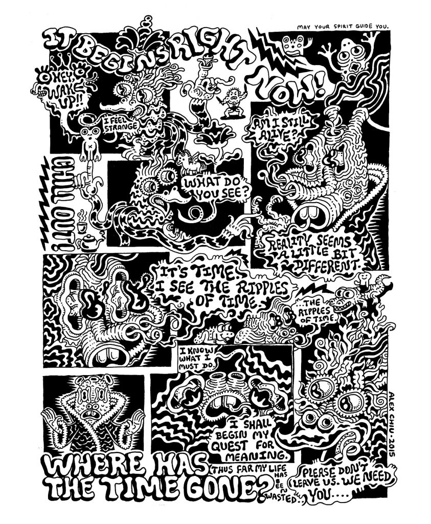
Alex Chiu and Rusty Jordan are two artists I met while they lived here in Los Angeles. They both moved up to the state of Oregon a while back. Alex is a prolific artist who creates complex, fanatical drawings in a crazed, almost a free associative, doodle style. He not only paints, teaches, does comics, runs a small publication press called Eyeball Burp but also is creating illustrations for children’s books all while having a YouTube cooking show with his daughter!
Rusty is a cartoonist whose work features characters who remind me of the people that occupy the world of writer Bohumil Hrabal. With absurdist, lonely yet loveable “everyman” losers in a very American setting. Rusty is a sign painter by trade but also publishes comics. I first saw his work in a collaborative comic named Moulger Bag Digest. He also puts out Alamo Value Plus and created the anthology series Shitbeams on the Loose.
Marcel Dejure and Amos. Marcel’s comics are claustrophobic punk rock acid trips. Roller skaters, burnouts, porno queens, meth-heads, drugged out animals and other Los Angeles dissidents make up his transgressive world. Marcel rarely makes comics anymore but when he does they’re for Popook! He spends countless hours working on a fashion line of clothing that combines the erotic with cartooning. He’s also the creator of the live puppet performance group Cinnamon Roll Gang.
Amos’ work mixes dystopian landscapes with bebop jazz and drugs. He loves his cats who once in a while make it into his comics. I’ve been a great admirer of his work for many, many years. He’s a printmaker as well and has worked for the legendary print collective Self-Help Graphics in East Los Angeles.
David James-Dimitrov is a Canadian cartoonist and painter. I met him online and he sent me copies of his incredible no text comic A Sunburned Heart in the Skin Celled Desert. His work is incredibly detailed and lovingly rendered. Science fiction dream stories… Mixing a weird combo of Twilight Zone and Alejandro Jodorowsky.
And what about the musicians?
Bryan Davis makes music as Bleeding Gorgon. I first met Mr. Davis in Knoxville, Tennessee when he was video taping my band for his public access show Kill Your Television. An artist and filmmaker, I never knew he made music until he submitted some prerecorded, phone called, industrial noises to the first PopOok! His more rockin’ tunes are a combination of the bands Chrome and the Humpers. He writes songs of loss, rejection, abandonment and loves horror movies and punk.
In the years 2005-2011 Grant Capes co-ran the alternative art/music space Echo Curio in Los Angeles. The Echo is where the seeds of PopOok! germinated as I met artists and musicians that would fill the pages and sounds of the comic/cd. His current project is Borne on a Train, a podcast series where he showcases live performances from some of Los Angeles’ premier experimental musicians. He has contributed to the first four issues of PopOok!, mostly under the Sleepwalkers Local moniker. Sleepwalkers Local is an improv situation involving Grant and whatever instruments are about. The set of songs included in the new issue of PopOok! comes from an old piano and a newly acquired harmonium and chord organ all processed for your enjoyment.
I’ve been waiting a long time now for Charlie Finch (Professor Husband) to release the vinyl debut of his The Diamond Trip multimedia project. A bit ambient, a bit spacerock, some motoric and krautrock via the American South whatever it is it’ll be monumental! Charlie is a musician and graphic designer living in Knoxville, Tennessee. The Diamond Trip consists of the Electric Jeanni and Professor Husband, who play music and visuals. They say some influences include birds, grains, grass, ghosts and mirrors…
Another Knoxvillian, Jason Bowman, is the first person I ever knew who made music with a sliver mac. A musician, filmmaker and artist, he is amassing a warehouse of “library” music: incidental soundtracks for all your living pleasure. I’m always looking forward to hearing what he creates.
Mark Cannariato is an artist and sound maker from Brooklyn, NY. I first encountered him in the swamp hell that is Tampa Florida. All black rubber and wood assemblage. Imagine yourself in the last trek of Disneyland’s train ride through the primordial landscape. Giant mosquitoes buzz passed your head in the sweltering heat and the natives are restless… all set to a crazed beat created by the roar of the train.
I’ve yet to meet Maria or Dylan, a duo known as The Vaginals. I’ve yet to see them play live. They live about 3 hours away from me in the city of San Diego. I’m afraid that if they met me they would want to beat me up. They might be street tuffs with switchblades. Their music is categorized as danceable confrontation. I love it!
I haven’t seen it yet but I know you recently published a fourth issue… What can we expect from it?
More of the same quality artwork. Lots of new people are joining the troupe. I’m reaching out to woman. I think they are under appriacted in comics. Also woman musicians are playing a bigger part in the next few issues. The ugliness and hate of the current world political climate is also effecting my work. I’m hoping to voice some truth against these hateful bastards. Hopefully some of the other artists will voice their opinions as well.
To buy PopOok or for any info, you can visit the Facebook page or contact Hamo Bahnam through his Instagram account.
Preview of “Tales from the Hyperverse”
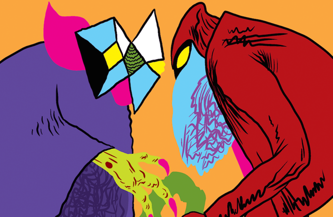
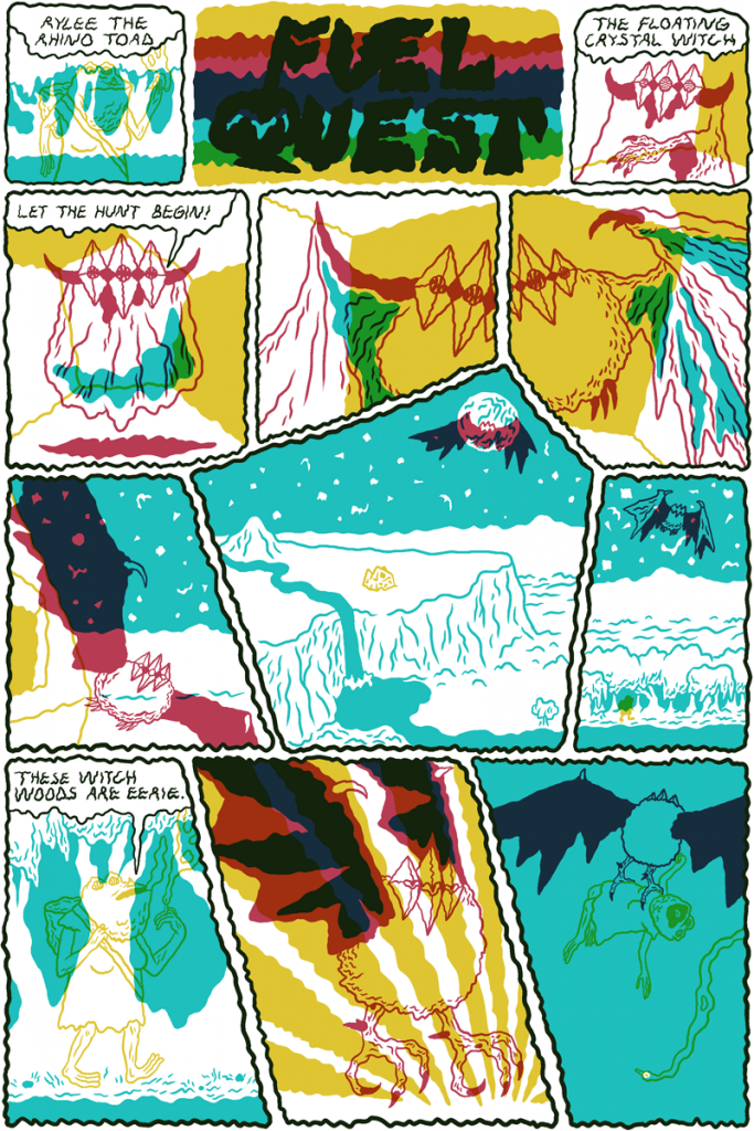
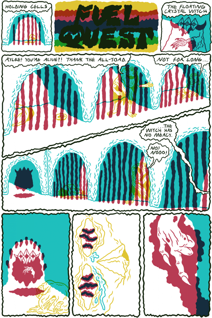
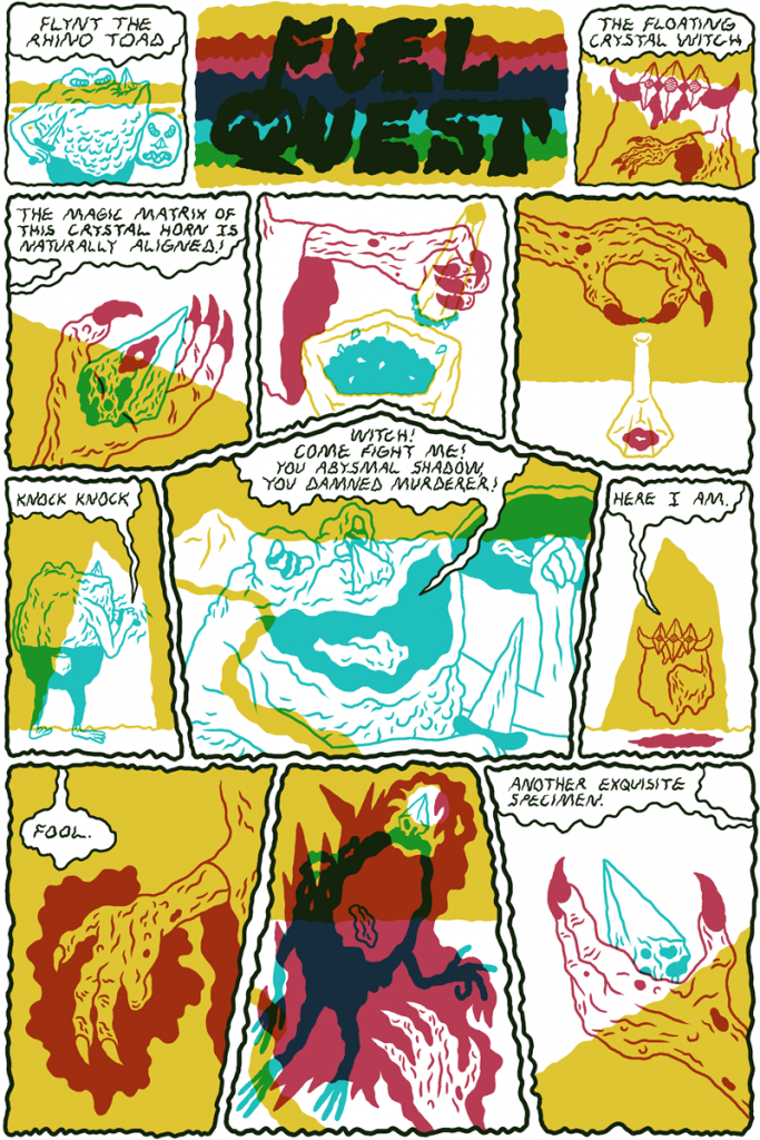
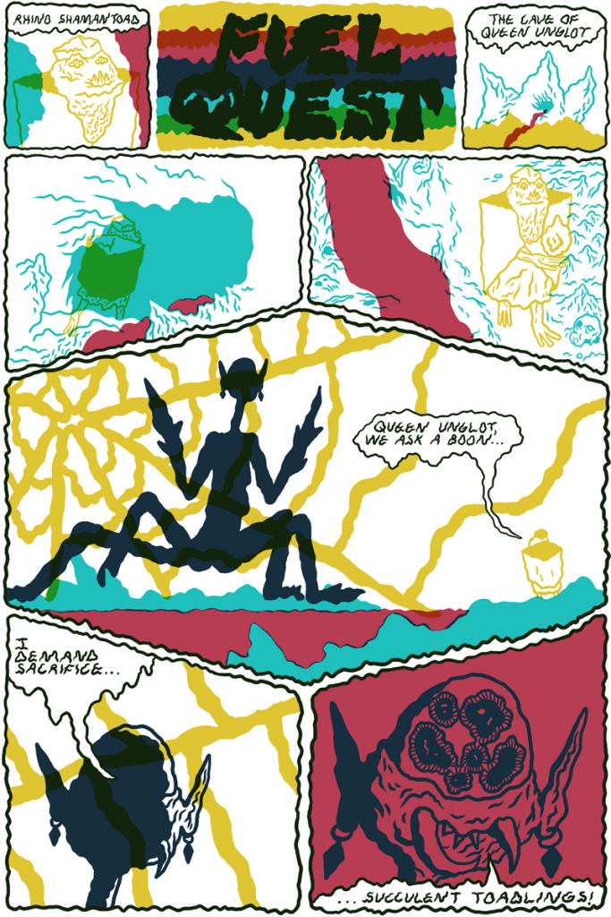
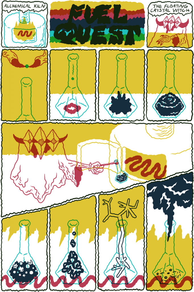
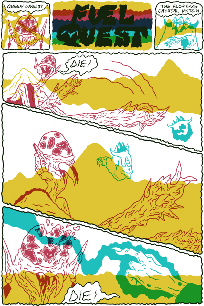
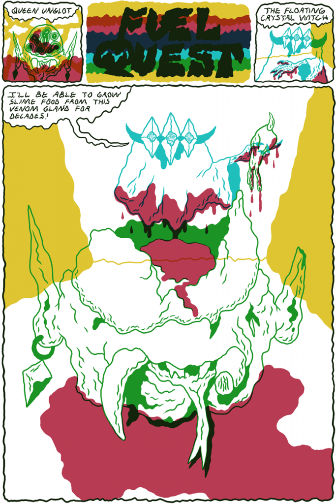
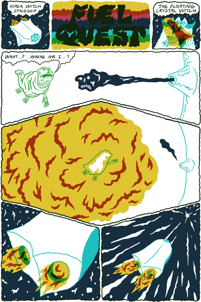
A floating crystal witch looking for magic energy battles rhino-toads in a fantasy future world ruled by a spider queen. This is the plot of Fuel Quest, one of the comics from Tales from the Hyperverse by William Cardini. This 40-page anthology is part of the new Retrofit comics Kickstarter and collects a series of short comics that Cardini has been sporadically drawing from 2009 to now. The comics take place in the same psychedelic space fantasy cosmos, the Hyperverse, where the American cartoonist already set his graphic novel Vortex. It includes comics published online at Study Group and Arthur Mag, in newsprint anthologies such as Smoke Signal and Secret Prison, and 14 new pages. All the comics that were originally black and white will now be in color and Cardini has enlisted his frequent collaborator Josh Burggraf to add his own painterly colors to 5 pages.
For a review of Vortex you can check the old Just Indie Comics blog here. And if you want to support Retrofit Comics Spring Kickstarter you can check their campaign. It also includes great comics as the first English translation of Iceland by Yuichi Yokoyama, How To Be Alive by Tara Booth, Combed Clap of Thunder by Zach Hazard Vaupen, Steam Clean by Laura Ķeniņš and TRUMPTRUMP vol. 1: nomination to inauguration by Warren Craghead III. And now, enjoy Fuel Quest.
“Vortex” and “Love Nest” by Charles Burns
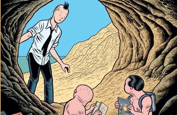
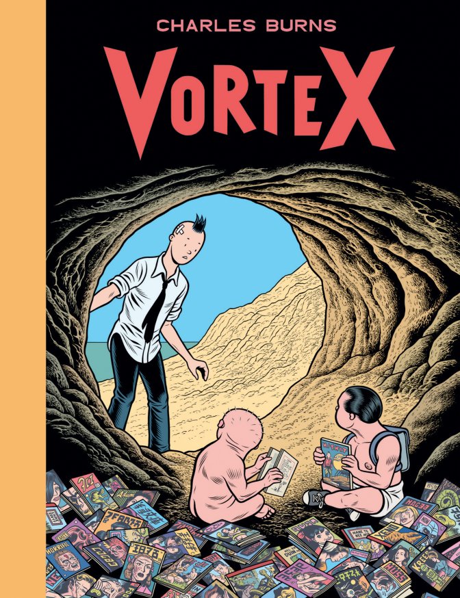
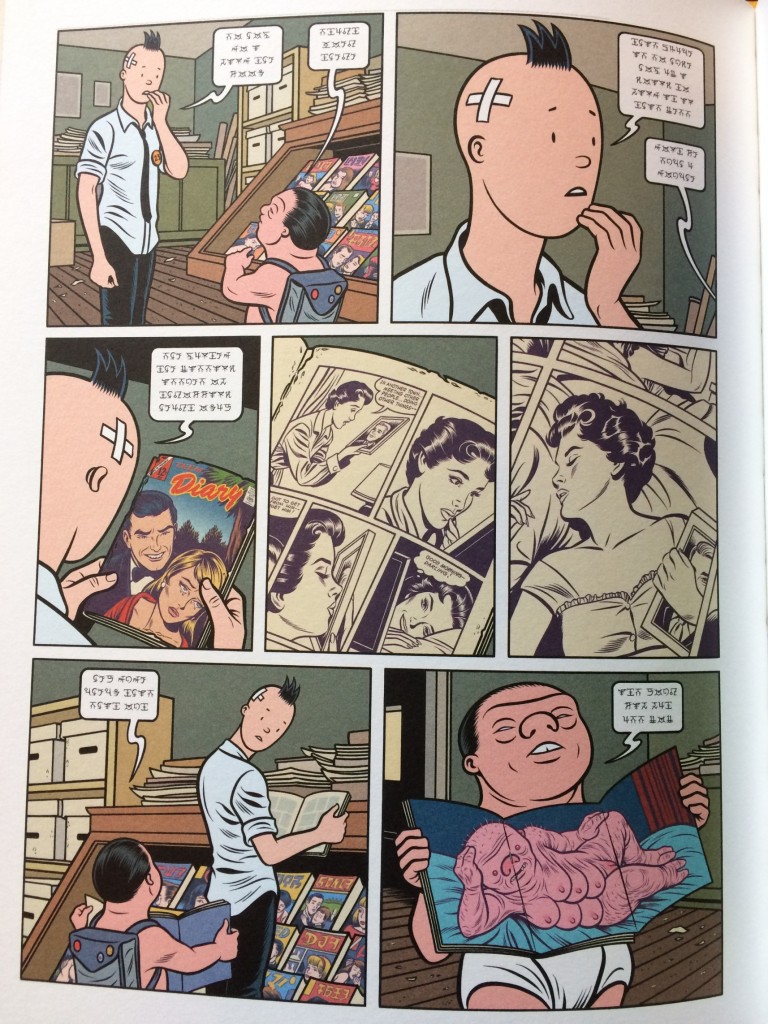
Vortex and Love Nest, out last November for the French publisher Cornélius, are the latest books from Charles Burns, new chapters of a particularly intense moment for the creator of Black Hole. Both published on the occasion of a personal exhibition at Galerie Martel in Paris, the books deepen the figurative features of Burns’ art, in the style of recent works as the Incubation sketchbook and Free Shit, a booklet still published in France by Le Dernier Cri, which reprinted the small-run zines made by the artist for friends and fans. Vortex is instead a book that, starting with the elegant hardcover format and the use of color, recalls the aesthetics of the Last Look trilogy. It could look like a fourth chapter but it doesn’t include a story. And on the other hand Vortex isn’t even a simple sketchbook, because the drawings are refined according to Burns’ renowned “slow process”, or an ordinary artbook, since the contents don’t just show but are meant to expand and enrich an already stratified and complex universe. The connection between the pages is suggested without being explicit, it’s pre-logical, and doesn’t seek a meaning but an atmosphere, establishing a link between the different elements that only those who have read X’ed Out, The Hive and Sugar Skull can completely appreciate. The beginning of the book is an appropriate introduction to all this, with a two-page comic characterized by a lyrical and dense text ideal for taking back the reader in the world of Last Look.
In the following pages there are fake covers inspired by Tin Tin, manga imagery, illustrations already used for the covers of some notebooks, pages written in the same alien language of the book Johnny 23 released in 2010 from Le Dernier Cri, imitations of erotic magazines, various size illustrations, postcards, photo stories, romance comics going beyond the traditional sense of decency.
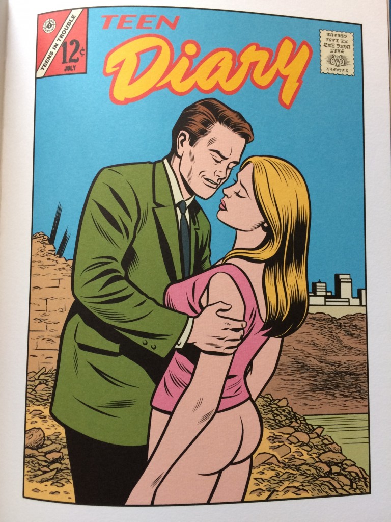
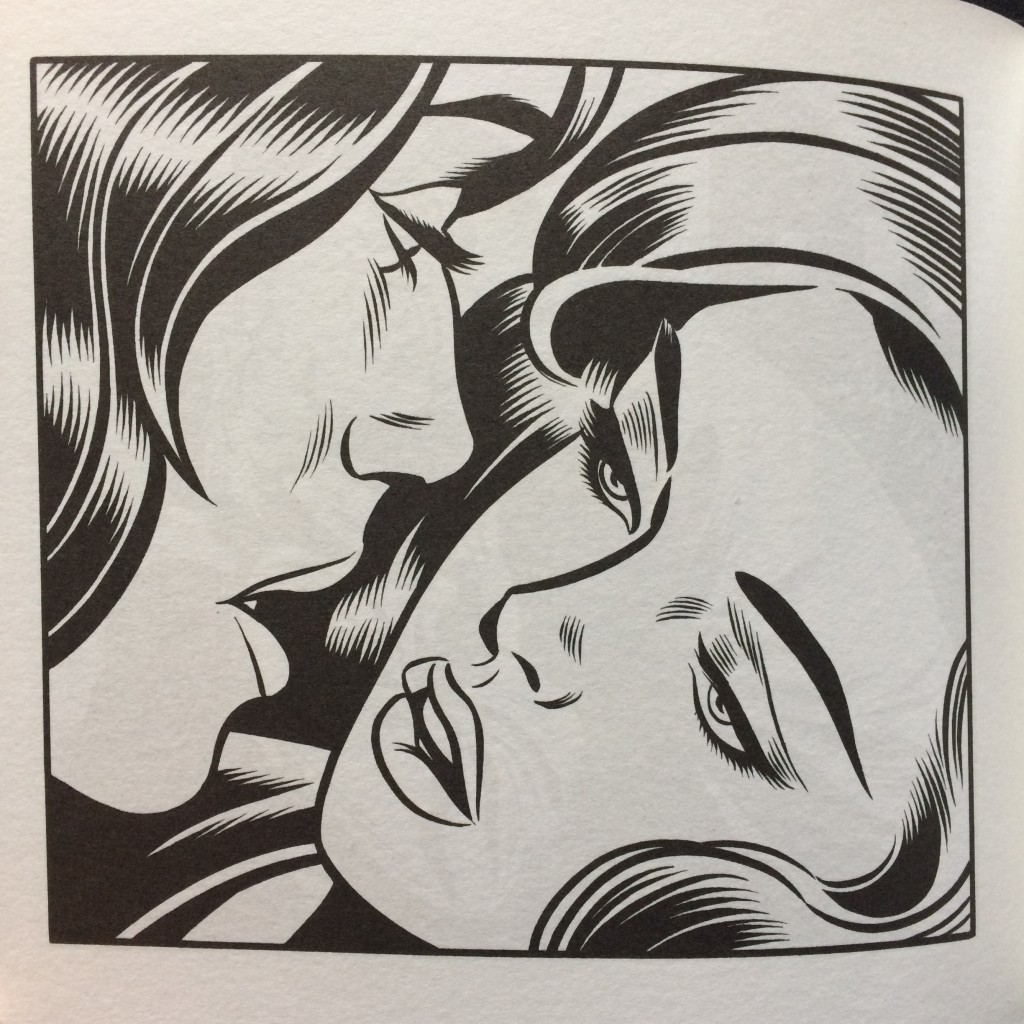
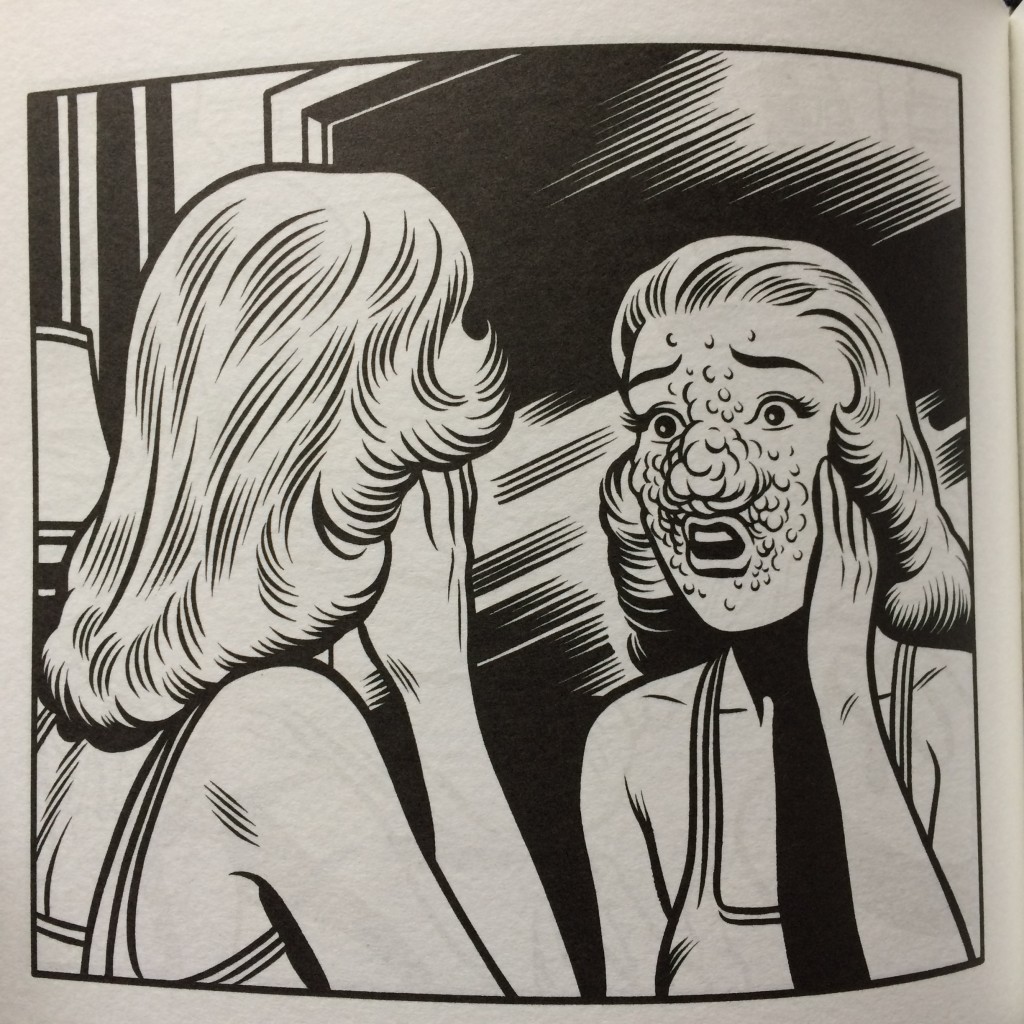
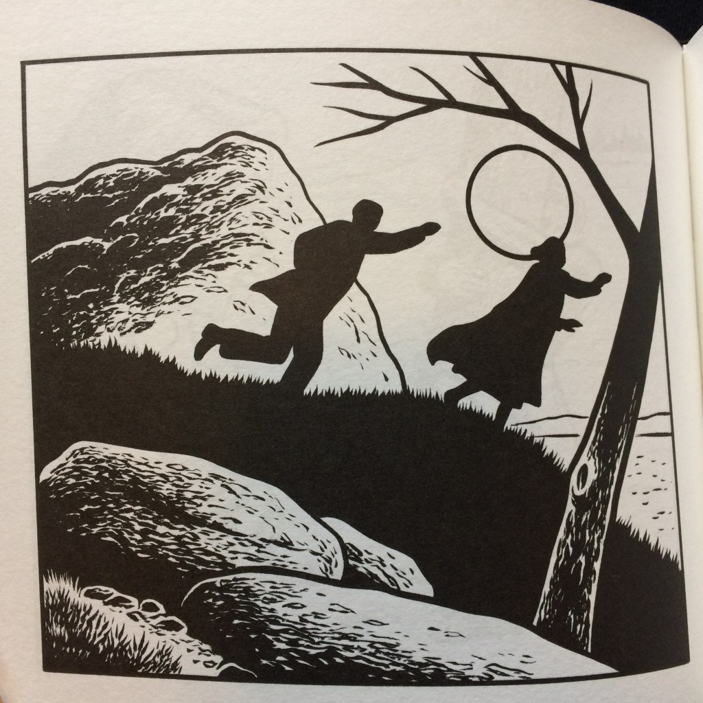
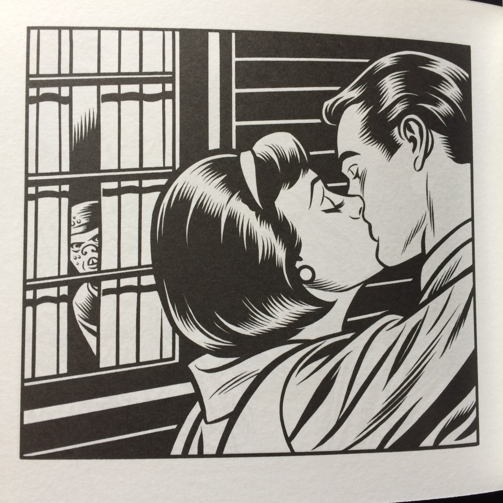
The world of romance is also at the heart of Love Nest, a 15×17 cm book that showcases 124 illustrations in black and white combining the sentimental imagery of movies and comics of the 1950s with the b-movies of the same era. The themes can remember El Borbah, Big Baby and Skin Deep, as if this book could be a return to Burns’ roots or a sort of Black Hole twenty years before. But the approach is actually different this time, because Burns doesn’t rework the original source material but, simply juxtaposing one image to another, completely immerse himself in this habitat. Even the drawing style breaks sometimes the usual schemes, abandoning the typical hatching of Burns’ black and white in favor of a thicker and simpler line, perfect mimicry of the comics (and later of the pop art) of that period. More organic than the other book, Love Nest is a fascinating and sometimes unsettling project, with illustrations that dare much more than it was allowed at the time of romance comics, including nudity, voyeurism, homosexuality, disfigured faces and horrific creatures that creep in the back of American suburban life.
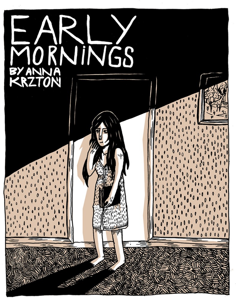
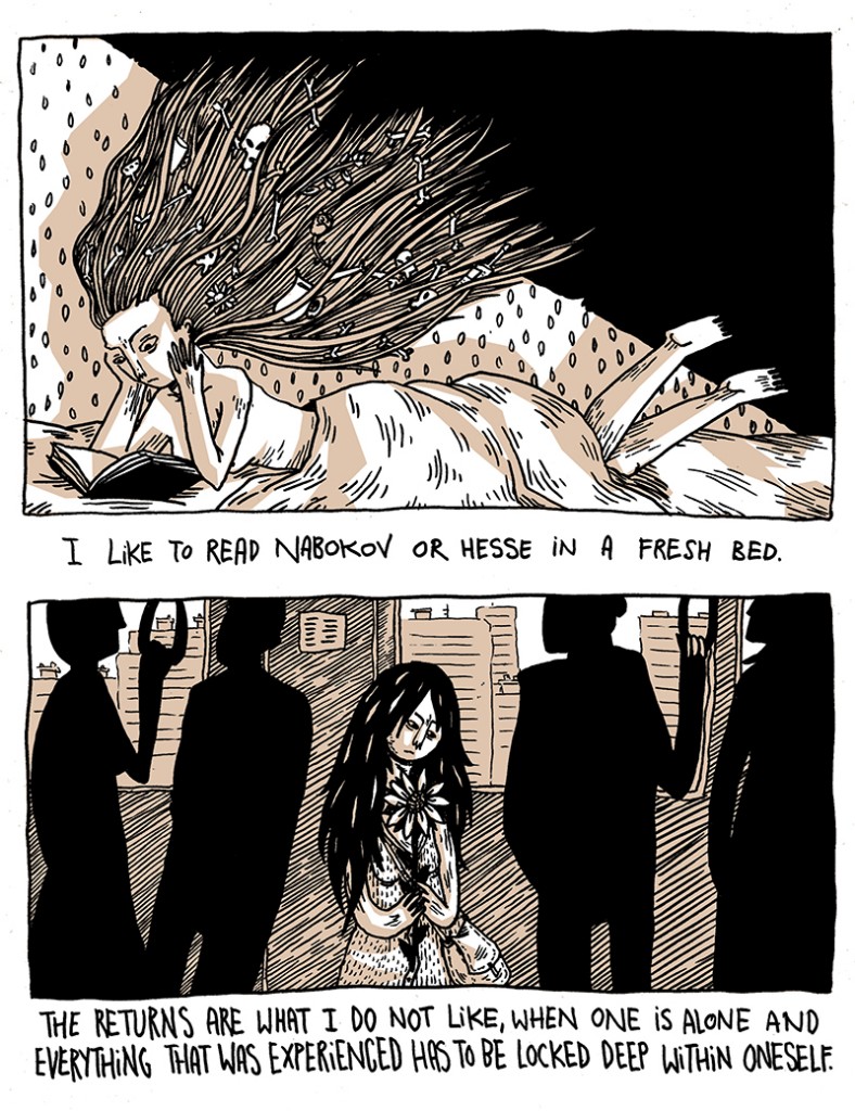
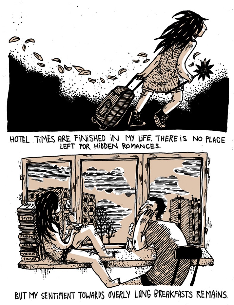
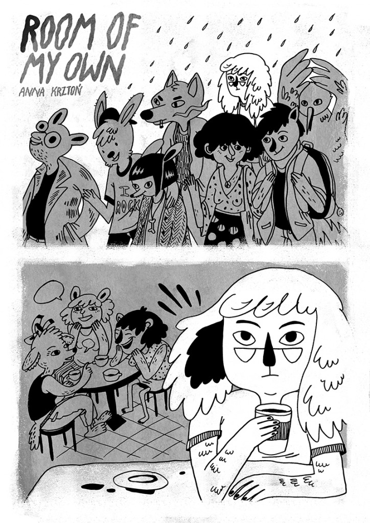
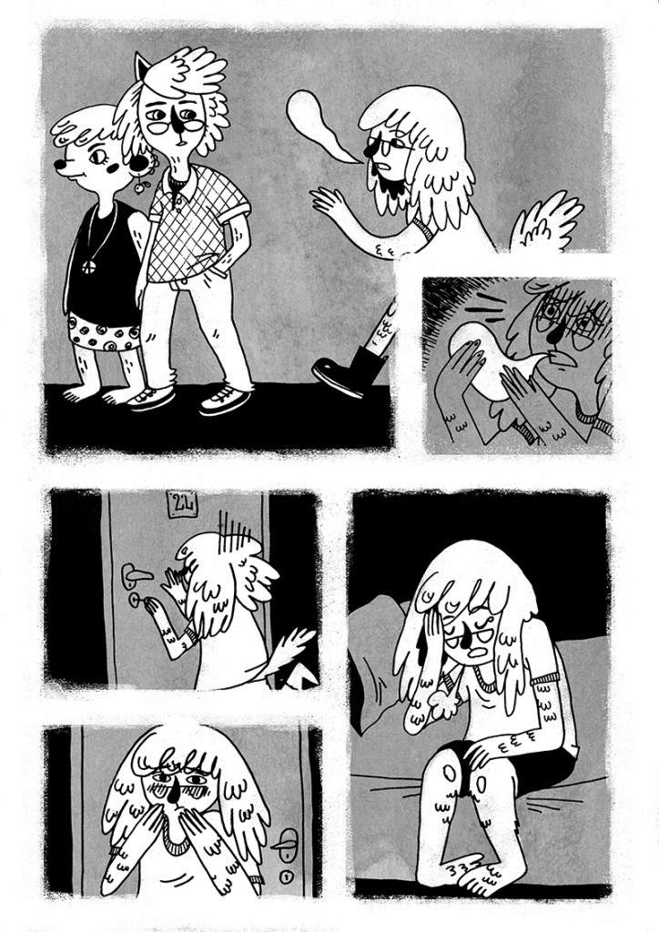
Three comics by Anna Krztoń
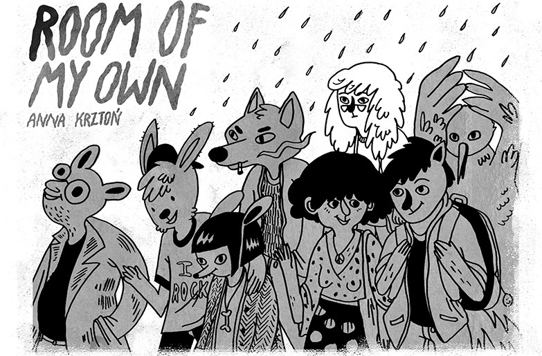
Anna Krztoń is a cartoonist and illustrator based in Warsaw, Poland, where she published various mini-comics by herself or with some local projects. She is also known outside her country for collaborations with international magazines and anthologies, such as Ink Brick, Dirty Diamonds, C’est Bon, Stripburger, Tieten Met Haar, Kuti Kuti, SW/ON. She’s currently working on her first graphic novel, which will be published by Wydawnictwo Komiksowe in 2018.
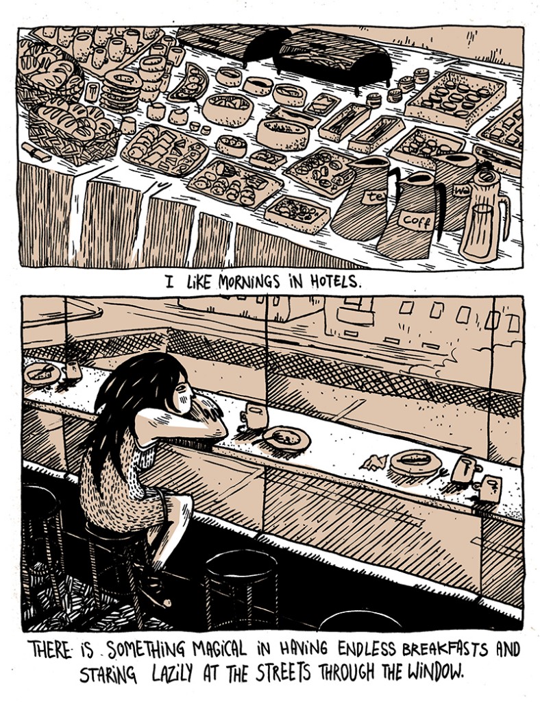
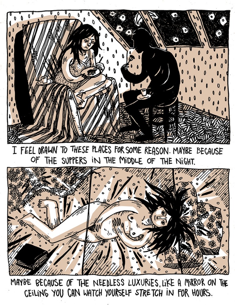
These three stories depict only some of the many nuances of her cartooning, starting with the realism we find both in Constant Sorrow and Early Mornings, similar for mood and topic to First Weeks, a self-published mini-comic I briefly reviewed in this Misunderstanding Comics episode (only in Italian, sorry). Room of My Own is instead a different work, less narrative and more impressionistic, an example of a dreamy mood, abstract and naive, that is an essential feature of Krztoń’s comics.
If you want to find more about Anna, you can have a look at her website. And some copies of First Weeks are available in the Just Indie Comics shop. For now, have a good read.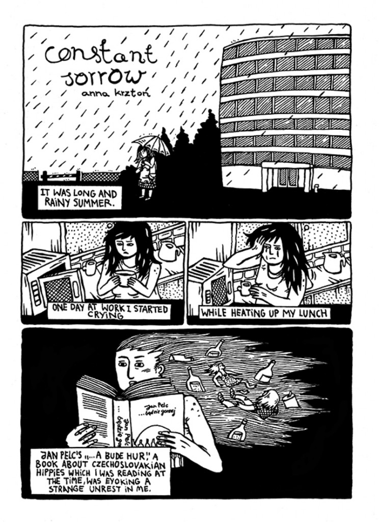
Minicomic of the Month Club 2017

Since a couple of years I have launched the Just Indie Comics Buyers Club, an annual subscription service available only for Italian people that allows to get in the mail four or eight comics during the year. The idea of a subscription service based on a “philosophy” has always intrigued me and so I am pleased to report a similar project coming from Australia, called Minicomic of the Month Club. Now at its 5th edition, the club aims to send to subscribers 12 A6 mini-comics per year. Every monthly mini-comic will be created by an Australian cartoonist. This year’s list includes very different artists, since the project wants to tell the richness and variety of the scene. We have the graphic journalism by Eleri Harris – already known for her work on The Nib and author of the first mini of the series – the surrealist forms of Sean Ed Whelan, the comics-as-poetry by Leonie Brialey and the cartoon characters created by Jake Lawrence. Below you can see some pictures taken from the previous works of these artists, while you can find a complete list of the creators on the Minicomic of the Month Club website. And here you can read some interviews.
If you are interested it’s better to sign up now, because the deadline is at the end of January. The price is 38 Australian dollars for domestic order, 40 for New Zealanders and 52 (about 37 €, or 40 US dollars) for international orders. Have a good mini-read.

