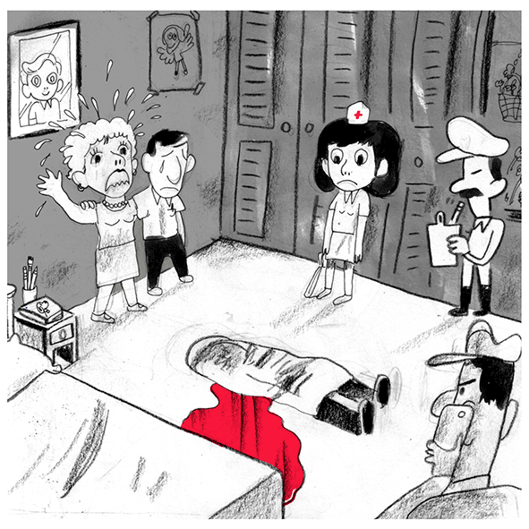
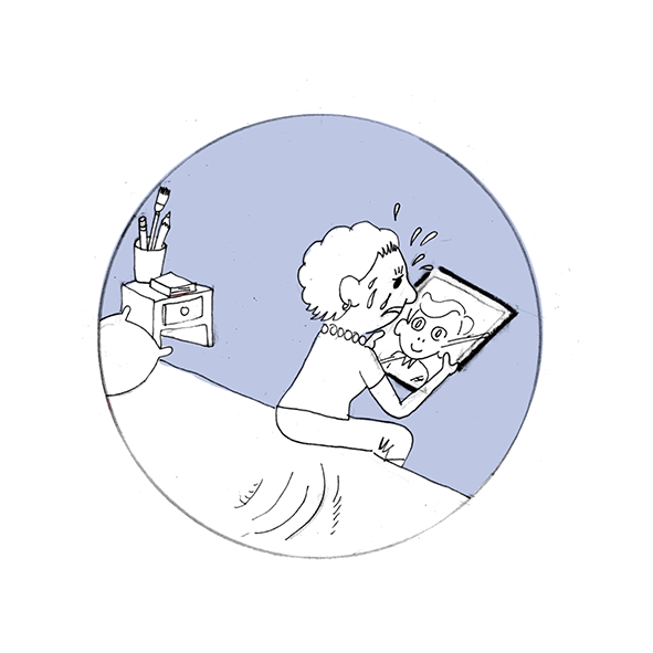
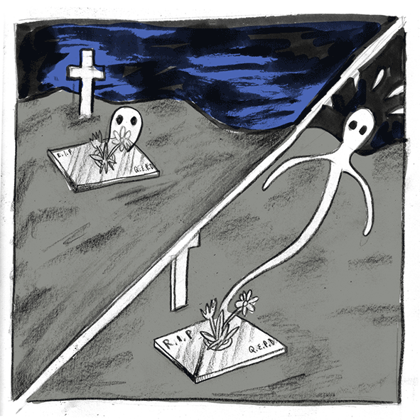
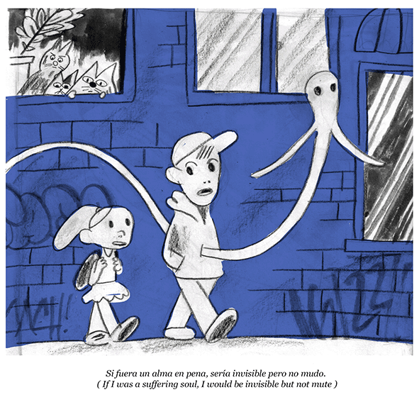
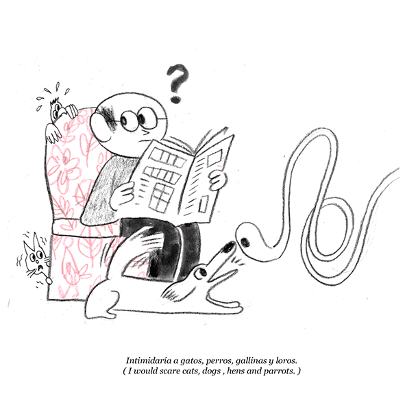
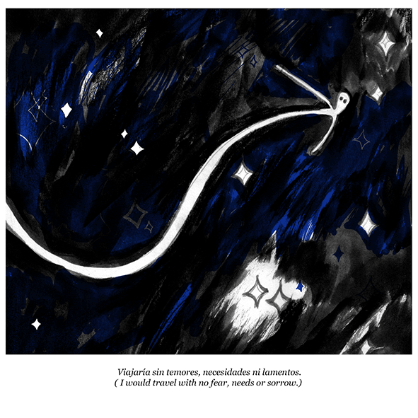
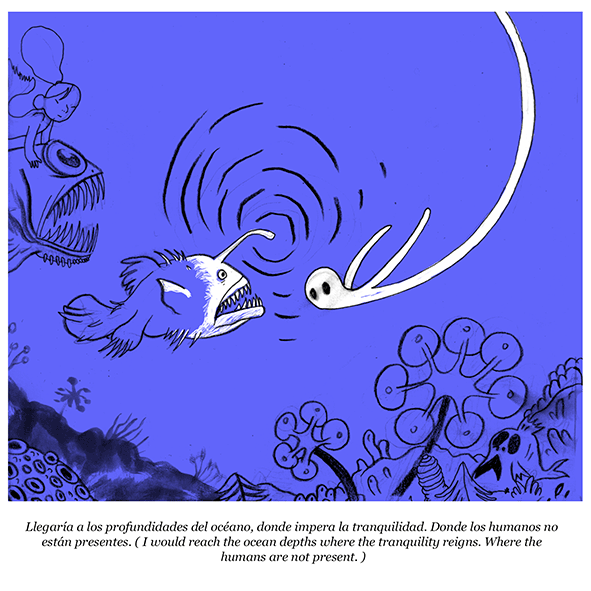
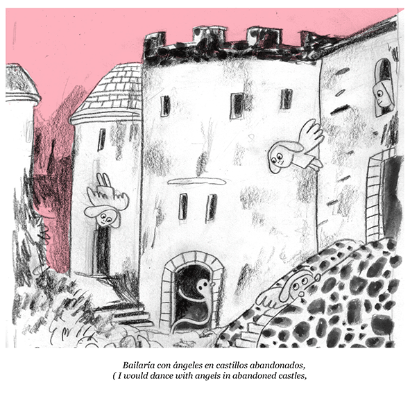
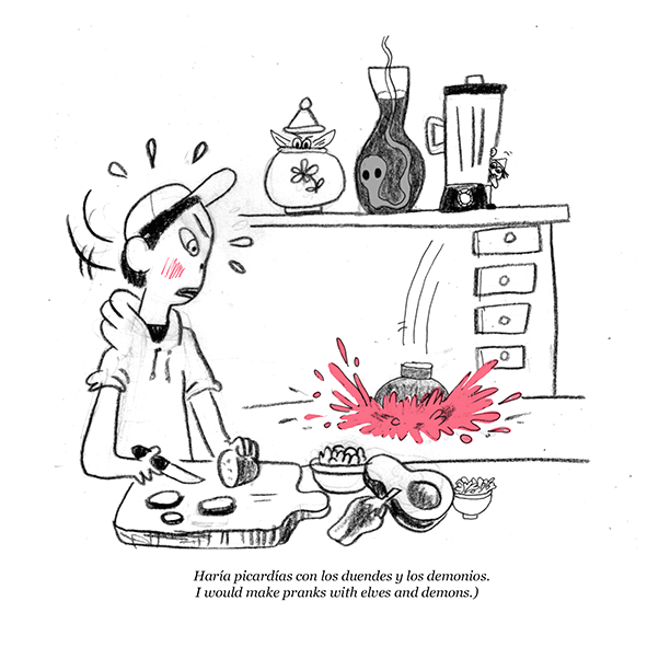
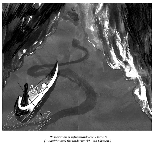
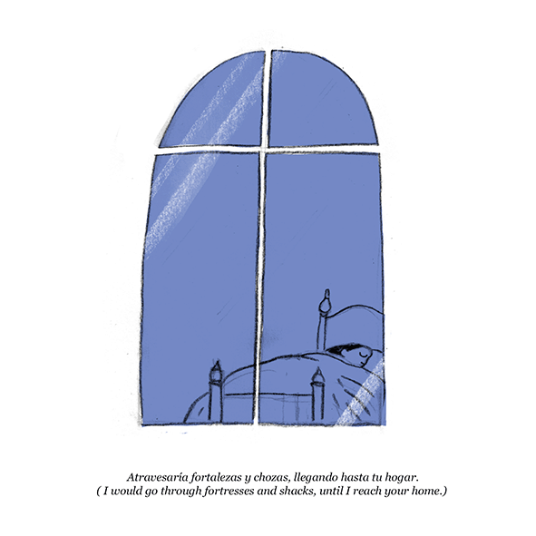
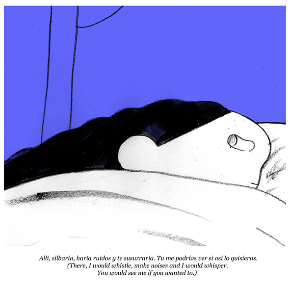
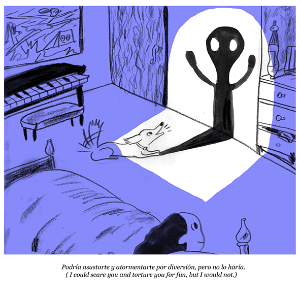
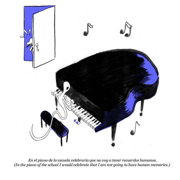
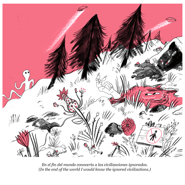
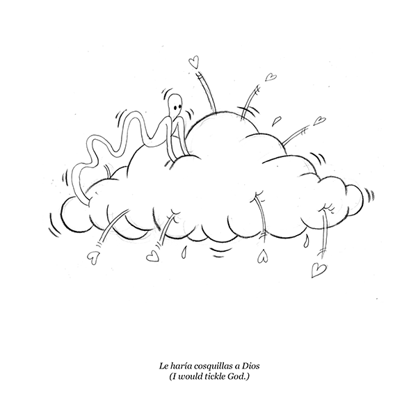
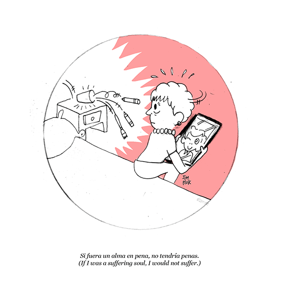
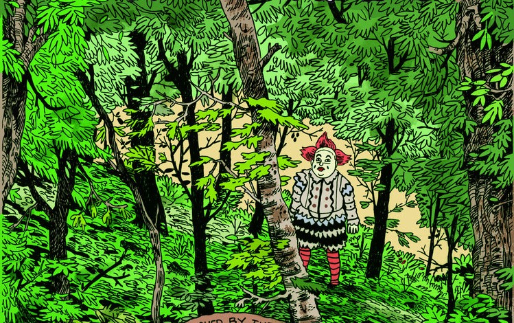
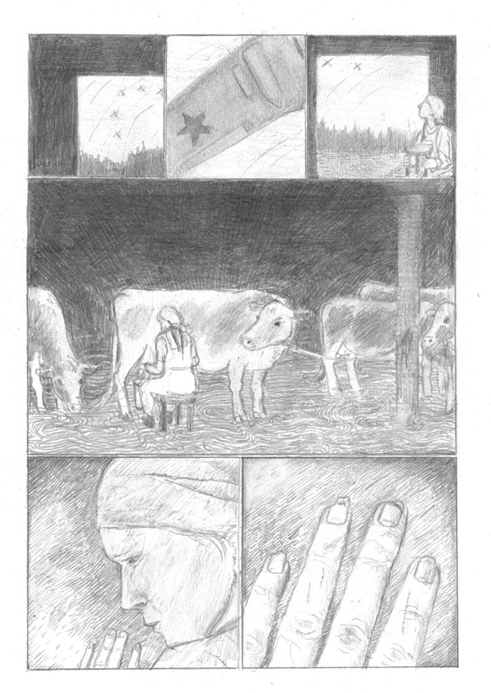
“If I was a Suffering Soul” by Jim Pluk
Jim Pluk is an author of funny and fantastic comics, poetic in their very own way, marked by a round and raw line that revisits with a punk approach the gag cartoon-style. The Colombian cartoonist, who worked for Vice and published the graphic novel Josefina, is coming in Europe to present his comic Canosa’s Welcome and to exhibit some of his paintings and drawings. The first date is Friday January 20 at Fatbottom Books in Barcelona, then the tour will continue January 22 in Lion, February 3 in Berlin at the Neurotitan shop/gallery and February 11 at Studio Pilar in Rome. You can find more details about the events here. In the meantime you can read If I was a Suffering Soul, a comic published in November 2015 by Calipso Press, ironic, sensitive and lyrical. Enjoy!

Best 16 comics of 2016
A year ago I published three lists of good 2015 comics, split in international graphic novels, foreign mini-comics and Italian books. Last year I’ve been a little lazy and so I’m just posting a list of 16 books I really liked among those I managed to read. Yes, the number is a bit strange but 10 seemed too few and 20 too much, and 15 + 1 is a good number in a year marked by the publication of the new comic by Daniel Clowes, for me always out of competition. And then 16 for 2016 sounds good. I didn’t make any distinction of genre, nationality, size and date of publication: you will find in this list new comics, reprints, anthologies, oversized books and minis. And as usual they’re mostly North-American books, as the name of this website easily suggests.
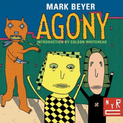
Agony by Mark Beyer (New York Review Comics) – Straight from 1987, when it was published as one-shot of Raw magazine, this essential little book by Mark Beyer comes back in an edition substantially identical to the original one, thanks to New York Review Comics. The story follows the adventures of Amy and Jordan, the two protagonists who in these 173 pages are fired, chased, decapitated, dismembered, thrown underground, launched in the air and so on, in a succession of misfortunes cleverly depicted by a brut and unconventional line.

Amore di lontano by Martoz (Canicola Edizioni) – Martoz was already in the 2015 list with Remi Tot in Stunt published by MalEdizioni and this year the young Italian cartoonist struck again with a new thick book published by Canicola. Amore di lontano is a chivalric poem looking both at Italian popular comics and at artists like Battaglia, Toppi, Crepax and Pratt, with these influences exploding in cubist and hyperkinetic panels. But the experimental approach is only one of the aspects of the book, because this is essentially a love story. In this post you can watch some original artworks by Martoz (the text is only in Italian, sorry!).
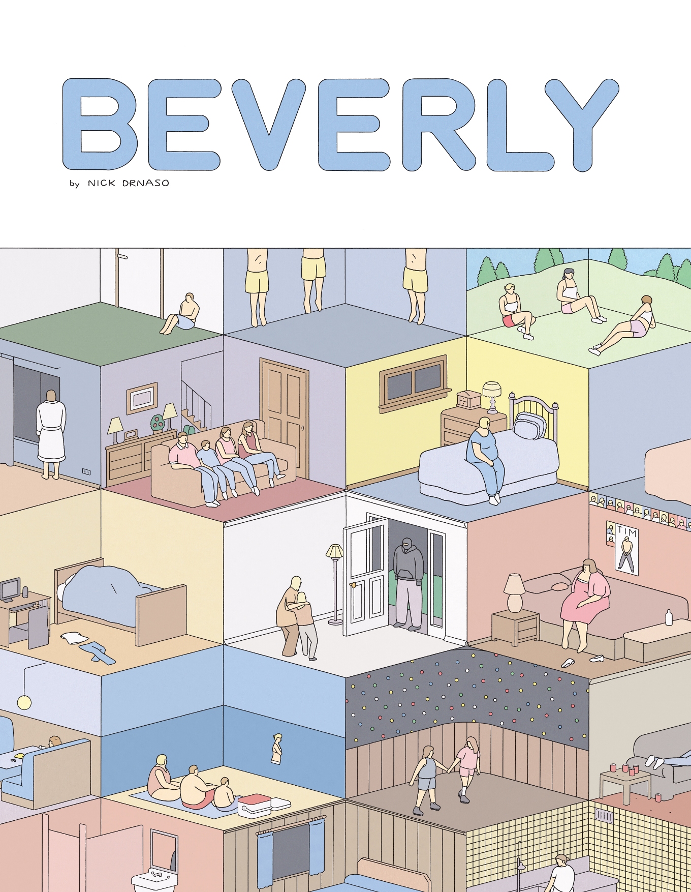
Beverly by Nick Drnaso (Drawn and Quarterly) – This collection of six short comics by Nick Drnaso loosely interconnected combines the formal rigidity of Chris Ware with the themes of Todd Solondz’s films to describe the difficulty of relating to each other. Hidden cruelties, racism, hypocrisy and existential vacuum are told without sensationalism, with a deliberately monotonous style in both design and content. For me one of the discoveries of the year, a work of an author who, at age 27, is already more than just a promise.
Blammo #9 by Noah Van Sciver (Kilgore Books) – Someone will notice I’m obsessed with the same cartoonists, but how can I keep out the new issue of Blammo from this list? Van Sciver alternates autobiography, adaptations of fairy tales, comical interludes, and the vicissitudes of “his” losers using the typical versatility. Furthermore, in the ten-pager set in White River Junction during the residence at the Center for Cartoon Studies, he introduces a more free and fluid structure than usual, suggesting new and interesting developments for his future comics.
Christmas in Prison by Conor Stechschulte (self-published) – Just like Van Sciver, Conor Stechschulte is another artist I’ve often talked about here at Just Indie Comics. This 96-page booklet is carefully printed and hand-bound using various techniques (risograph, silkscreen, offset) and collects a series of “pieces” about Stechschulte’s recurring topics, such as voyeurism, control and metanarrative. The different features culminate in the last one, that begins with a narrative structure to flow into a series of existential questions of increasing intensity, confirming Stechschulte as one of the best contemporary cartoonists.
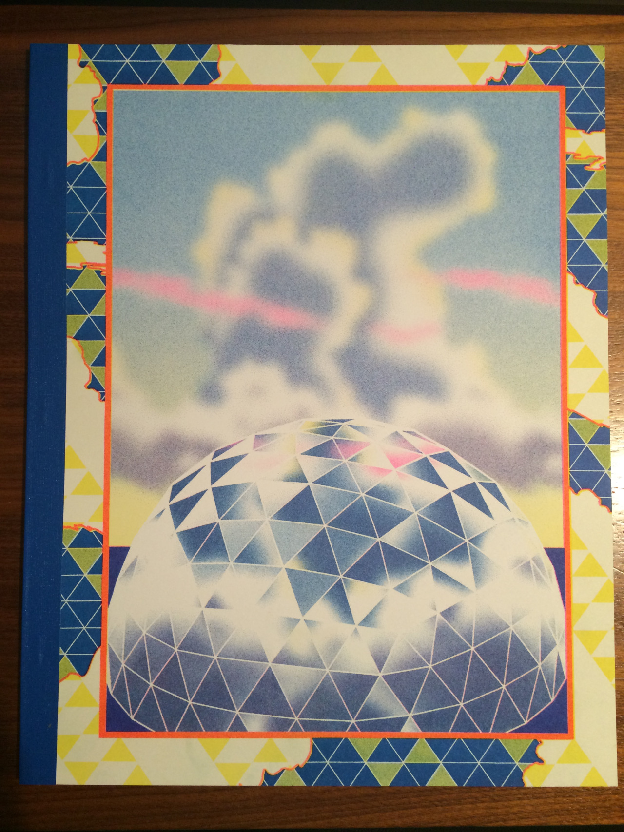
Dôme by various artists (Breakdown Press/Lagon) – I was pretty disappointed from the latest Kramers Ergot, so the year’s best anthology is for me Dôme, an English-French production published by Lagon and Breakdown Press. This large-format book was printed in risograph during the 2016 Angoulême festival. Inside its 40 pages we find short stories by artists such as Lando, Simon Hanselmann, Dash Shaw, Antoine Cossé, Michael DeForge, Olivier Schrauwen, Joe Kessler, Richard Short. The high quality standard and the idea of proposing in the central pages new strips of the different stories help to create an example of really rare aesthetic coherence. The anthology was printed in 500 copies and is now sold-out. You can read more here.
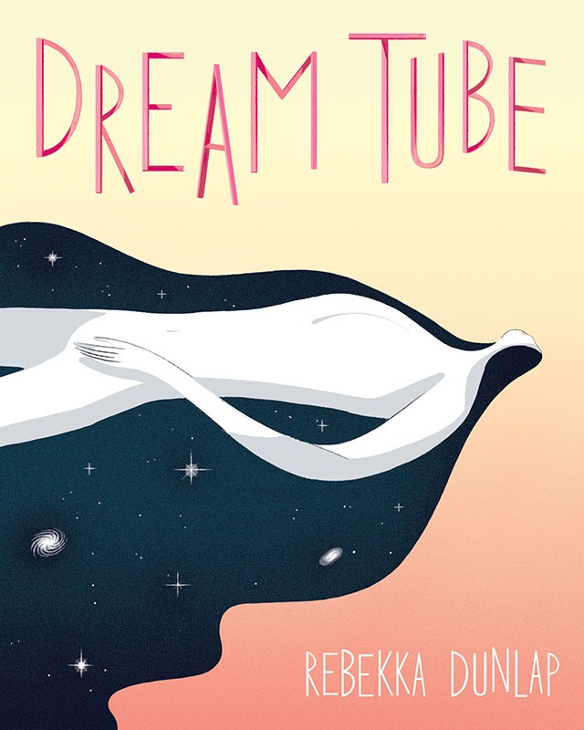
Dream Tube by Rebekka Dunlap (Youth In Decline) – One of the most pleasant surprises of 2016, this book published by Youth In Decline collects three stories by Rebekka Dunlap, clearly contemporary for style and content but that for spirit and mood seem to come straight out of an old issue of Garo. Among new technologies, sorcery and science fiction the pages go on for associations of ideas, interludes and digressions, creating a visual stream of consciousness that draws the reader into a world impossible to understand completely but incredibly fascinating.
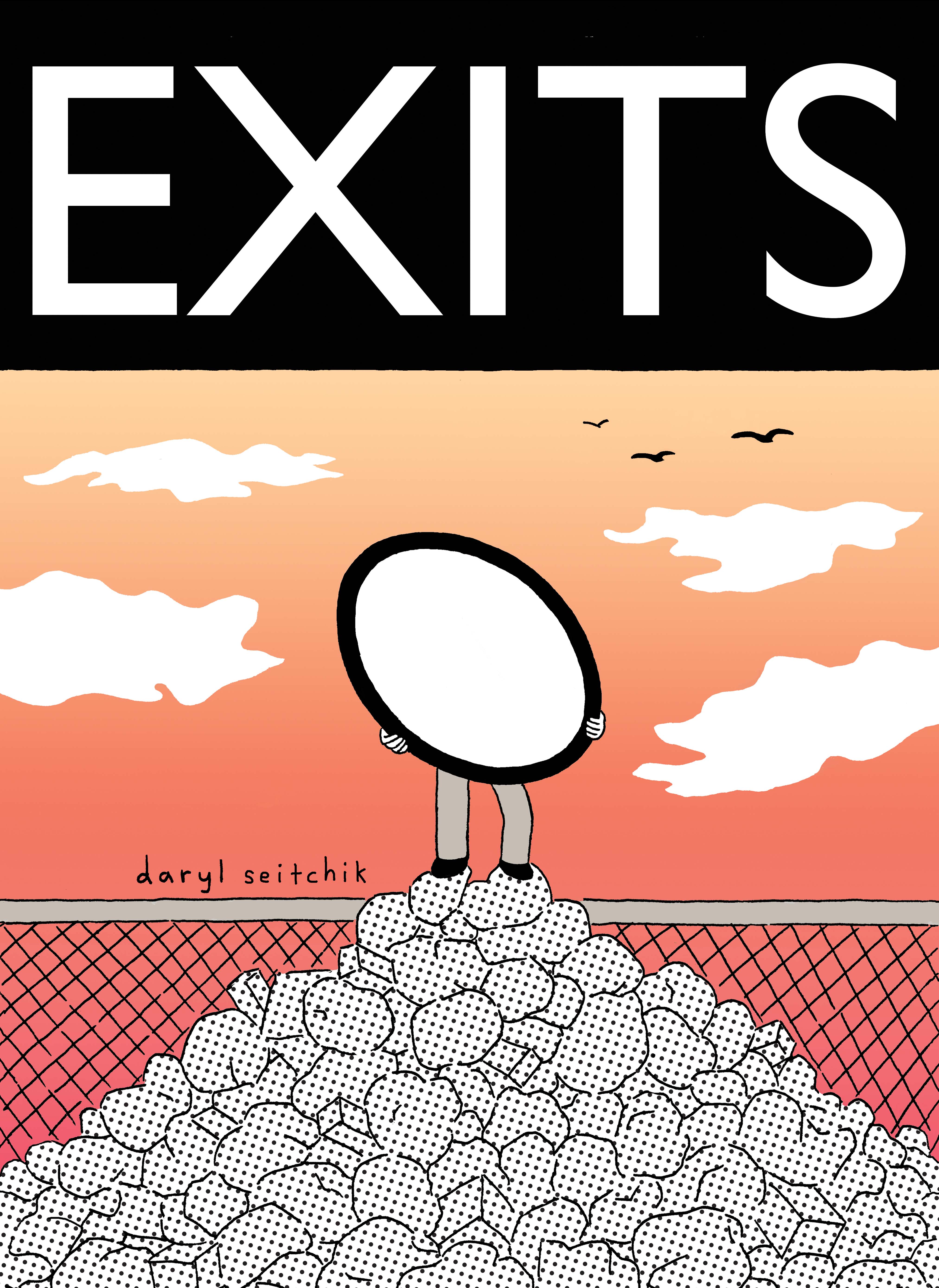
Exits by Daryl Seitchik (Koyama Press) – First long-form comic by Daryl Seitchik, best known for the series Missy, Exits showcases her usual themes overturning the aesthetic dimension. The initial idea of the girl who becomes invisible seems à la DeForge but the development is quite different. Exits is a seemingly simple but actually deep coming of age tale, mature and rich in its different levels, able to convey that sense of funny existential anxiety that is Seitchik’s trademark. It shows the growth process of a young artist who already likes to experiment and change herself.
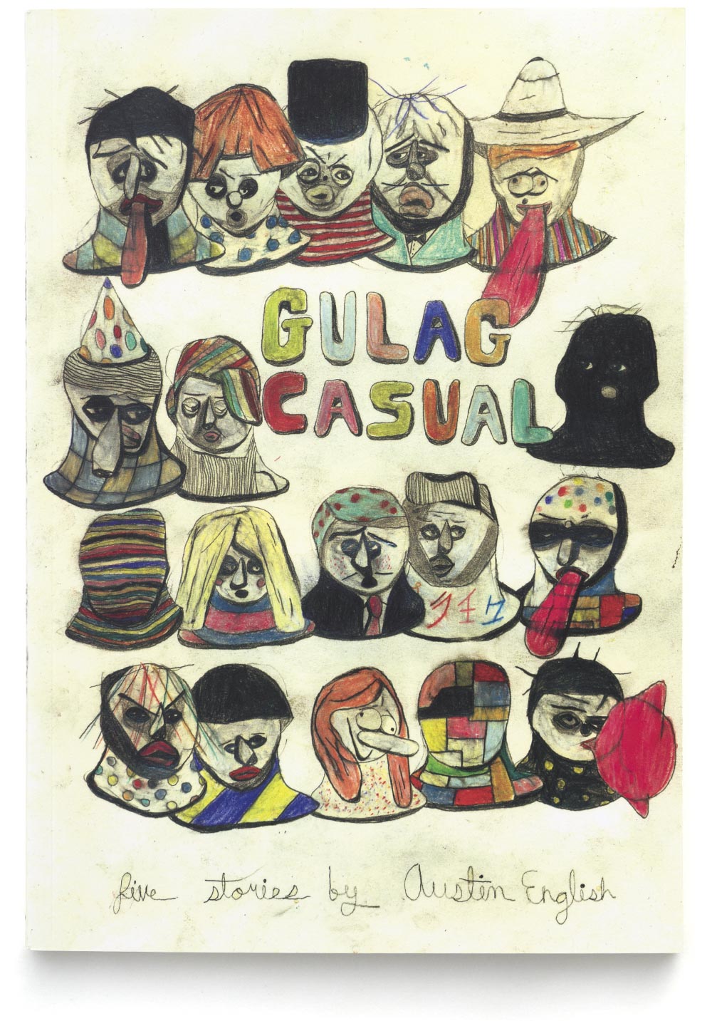
Gulag Casual by Austin English (2dcloud) – Using an uncoventional aesthetics, inspired more by the avant-gardes and abstract expressionism than by other comics, Austin English tells stories of everyday tensions, in which aggressive forces from outside invade familiar and comforting spaces. But there isn’t a real drama in these pages, because the characters are figures performing actions and not subjects with their own personality, as if the power of art could soften pain and anxiety. Gulag Casual is another hit from Minneapolis-based 2dcloud.
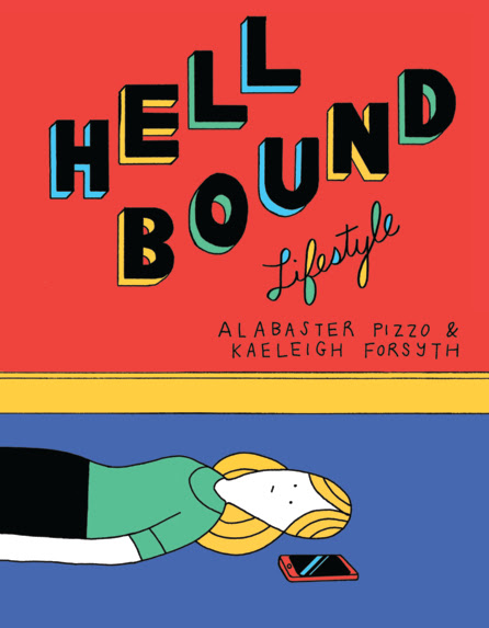
Hellbound Lifestyle by Alabaster Pizzo & Kaeleigh Forsyth (Retrofit Comics) – Despite a subtle sensation of confusion and depression, Hellbound Lifestyle is the funniest work in this list. Alabaster illustrated the notes Forsyth wrote on her phone, creating a hilarious chronicle full of absurd situations, good intentions gone bad, strange thoughts and ideas, ideas, ideas one after the other that you could fill many other comics or complete seasons of TV series. One of those comics that, when you read them, make your day better.
July Diary by Gabrielle Bell (gabriellebell.com) – In 2015 there was no July Diary by Gabriele Bell and I was very pleased this year when I saw the return of her daily comics, because she is simply one of my favorite cartoonists ever. In addition the new diary, recently published with the title Get Out Your Hankies, experiences utter spontaneity, since the artist has given herself the rule to avoid any kind of editing and rewriting. If you still haven’t, read it while waiting for Everything is Flammable, the new unpublished 160-page comic out next April for Uncivilized Books.
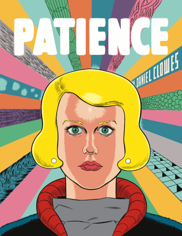
Patience by Daniel Clowes (Fantagraphics Books) – The long-awaited new graphic novel by Daniel Clowes didn’t get so enthusiastic reviews after all, probably because it’s a sort of blockbuster version of Clowes’ stories, with a more conventional structure and less detailed drawings than usual. Yet for me these aren’t flaws but accurate choises that make Patience not only another masterpiece by the author of Ghost World and David Boring but also his most poignant work, the one that most of all succeeds to move the reader.

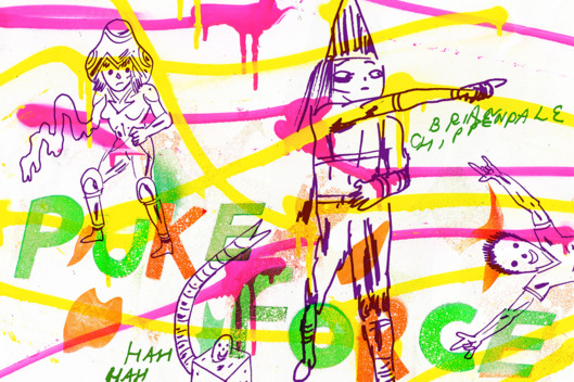
Puke Force by Brian Chippendale (Drawn and Quarterly) – Serialized years ago on the Picture Box website, Puke Force was left unfinished for a long time, without ever being published in print. Tom Devlin, former Highwater Books and now at Drawn and Quarterly, convinced Chippendale to put aside for a while sticks and microphone (he is one half of Lightning Bolt) to conclude this slacker-fantasy tale, maybe the best output from ex-Fort Thunder group along with Multiforce by Mat Brinkman. And the recent release of a new self-published mini-comic, the excellent Atrophy Life, raises hopes for a Chippendale’s return to the world of comics on a permanent basis.
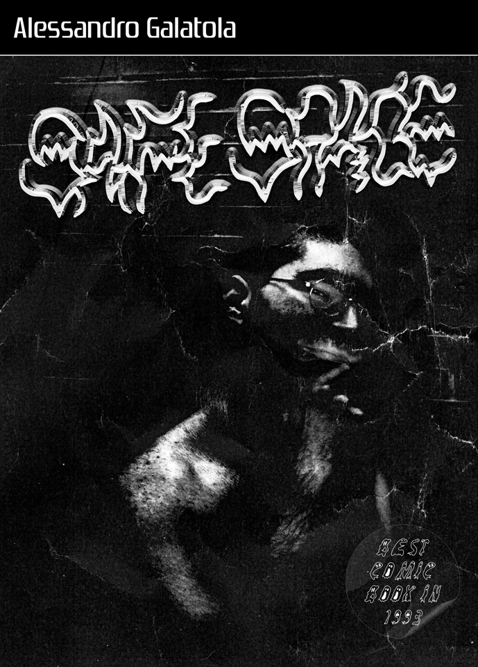
Safe Space #2 by Alessandro Galatola (self-published) – One of the best Italian comics of the year doesn’t really exist, at least for now. Self-printed in only 10 proofs, Safe Space #2 is still looking for a publisher. Alessandro Galatola joins the new frontiers of cartooning with the outré design of the 80’s creating his own style made of a dense and unconventional writing. I talked recently about the book in this post, where I published one of these short stories, Dio di me stesso. Out of any conventions and of the neorealism typical of many Italian graphic novels, these are visceral comics that come straight from the soul of their young creator.
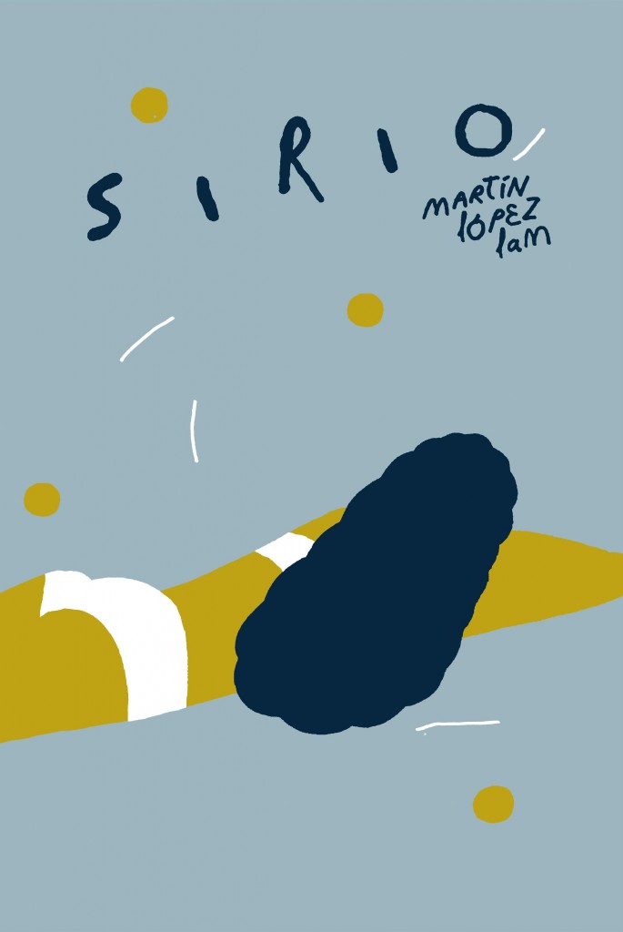
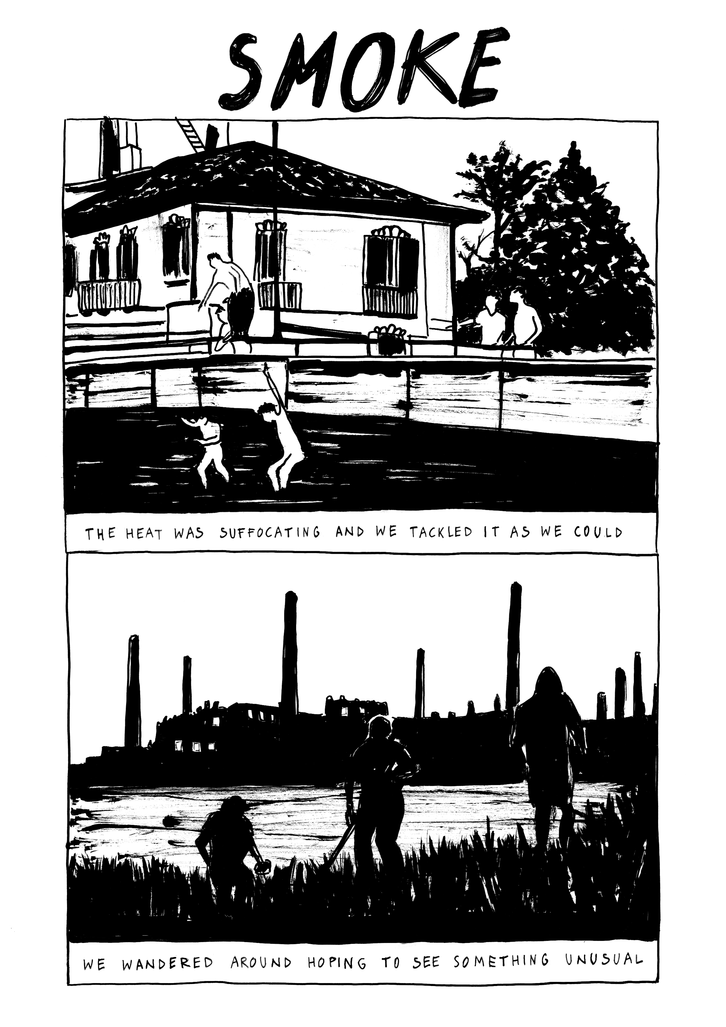
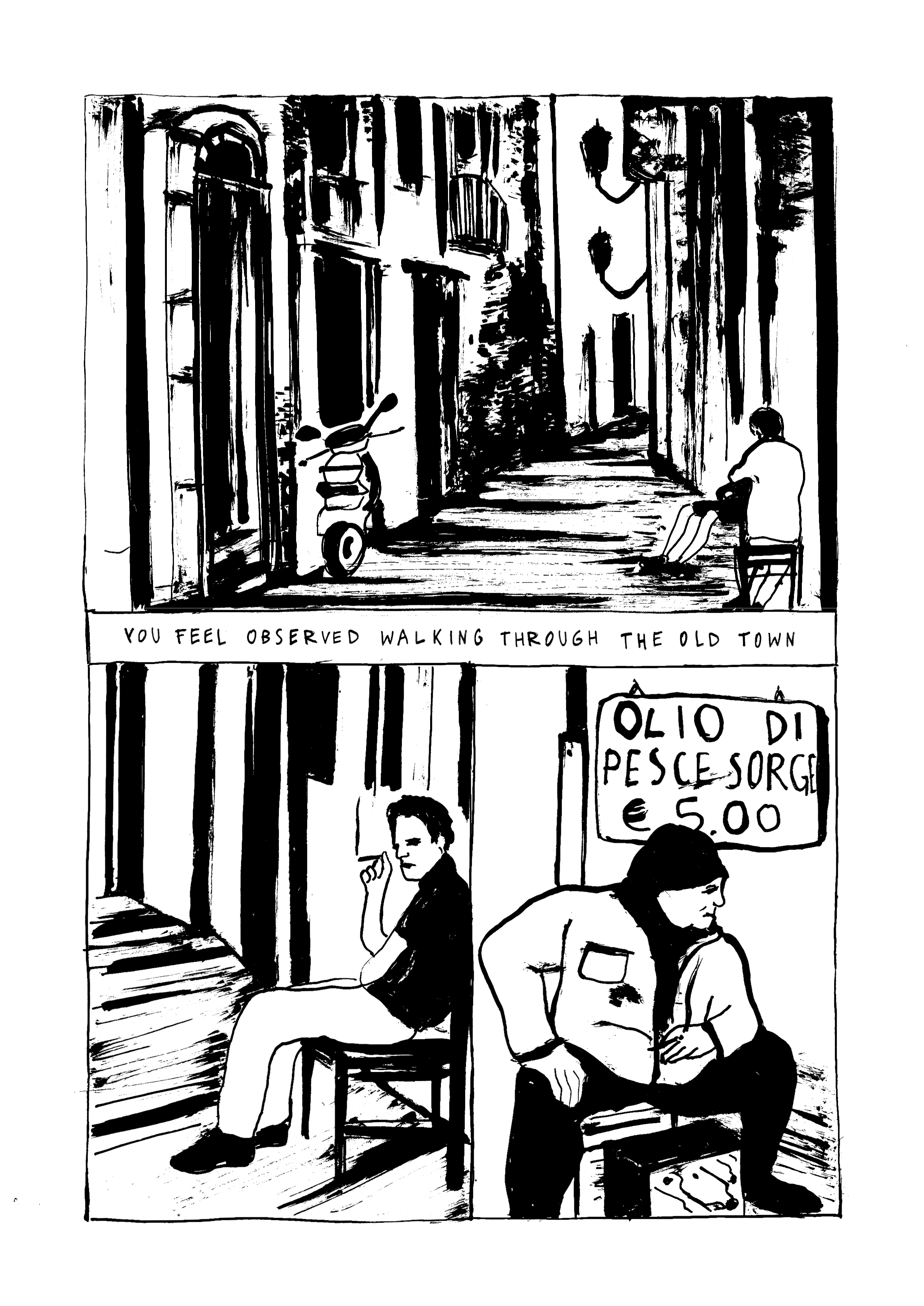
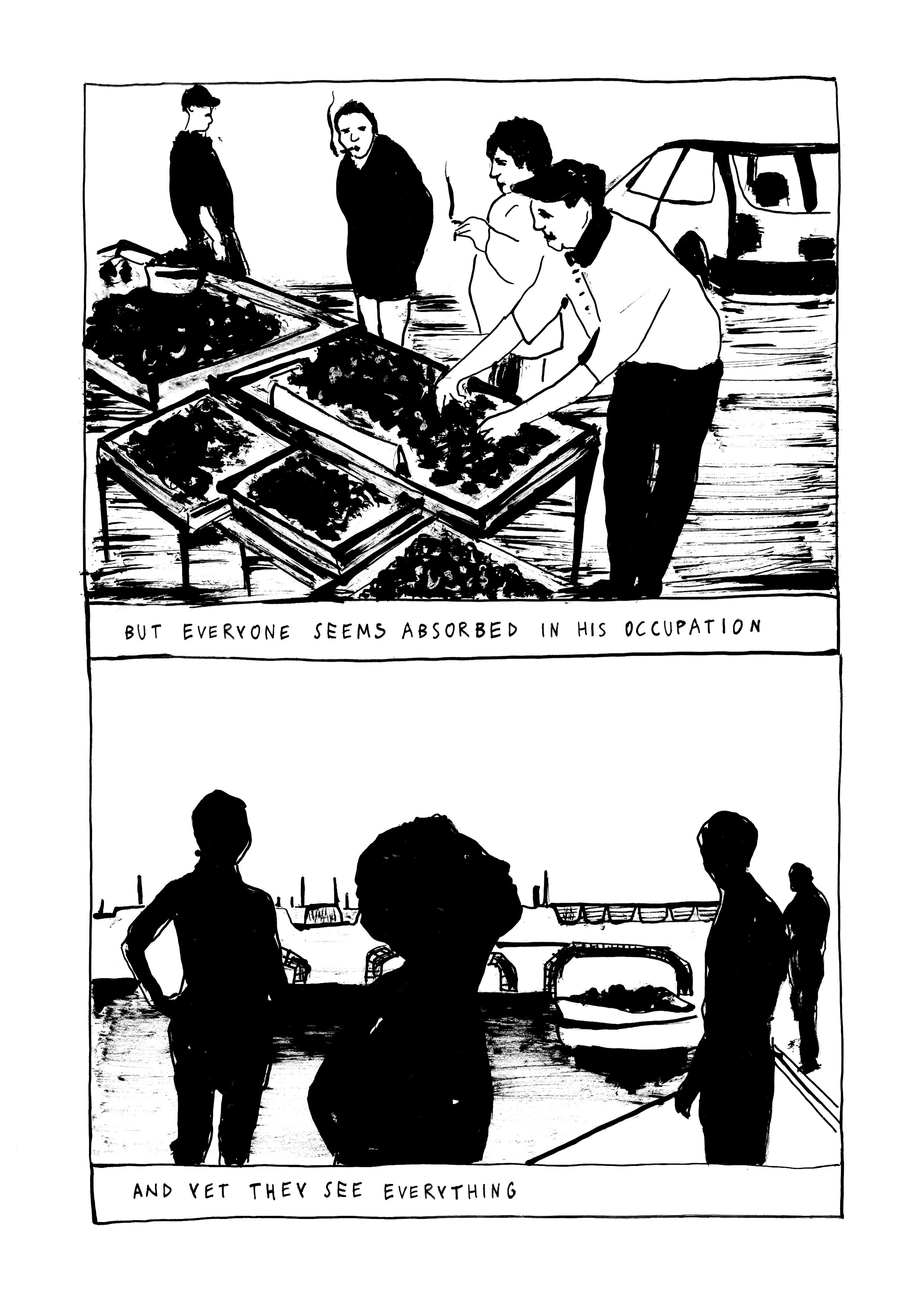
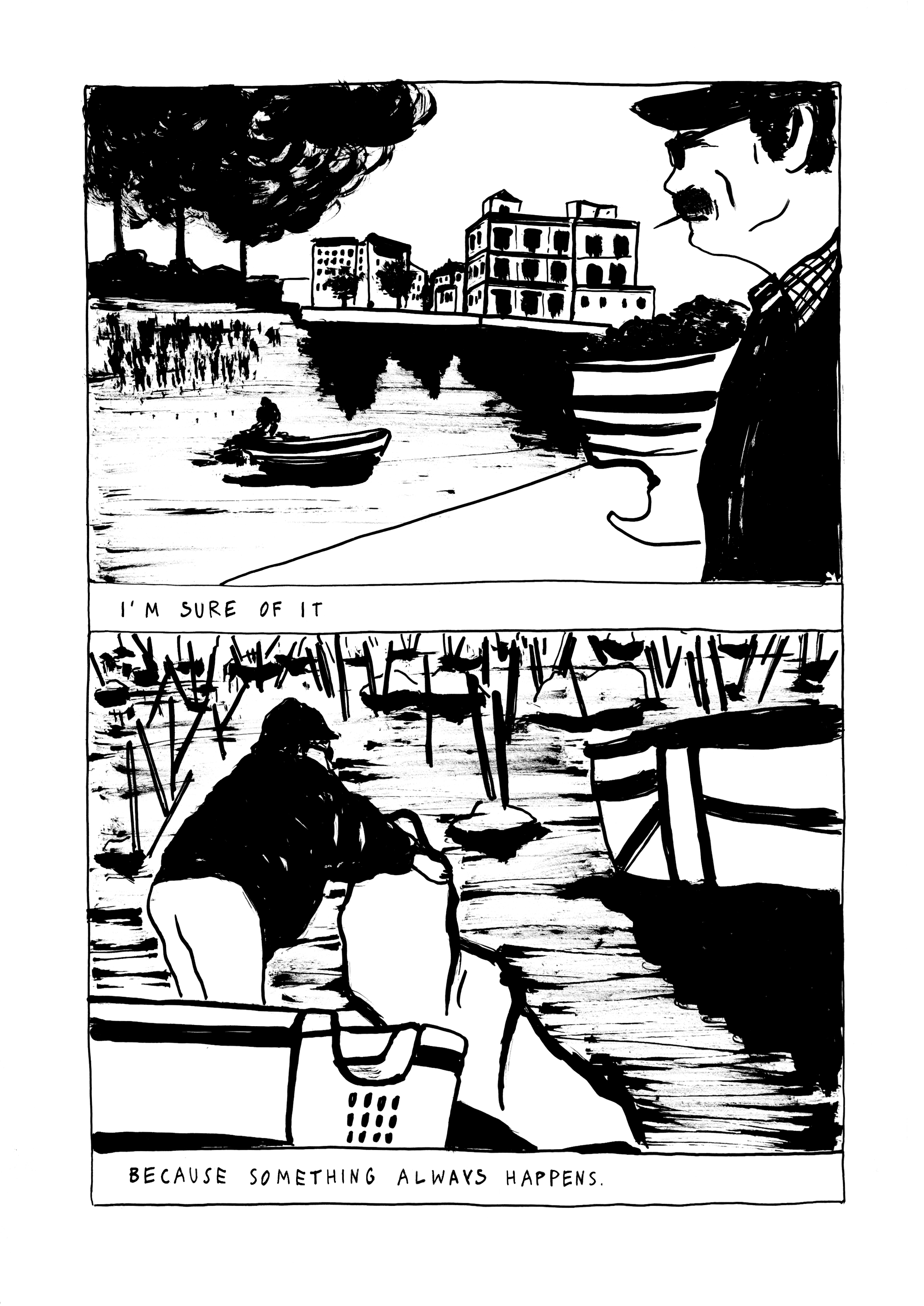
Sirio by Martin López Lam (Fulgencio Pimentel) – Martin López Lam is a Peruvian cartoonist who is living in Spain for a long time, where he runs Ediciones Valientes and the Tenderete festival. He is also well known in Italy for the many projects he worked on during the residency at the Academy of Spain in Rome and the latest BilBOlbul festival in Bologna. All this activism should not lead to forget his artistic outputs, of which Sirio is a great example. Beautifully illustrated in shades of blue and ochre, it begins as a noir but goes on describing hesitant and indolent characters who wander around themselves in a sweltering summer, waiting for something new. And, as it happens sometimes, the wait is more fascinating than a thousand stories.
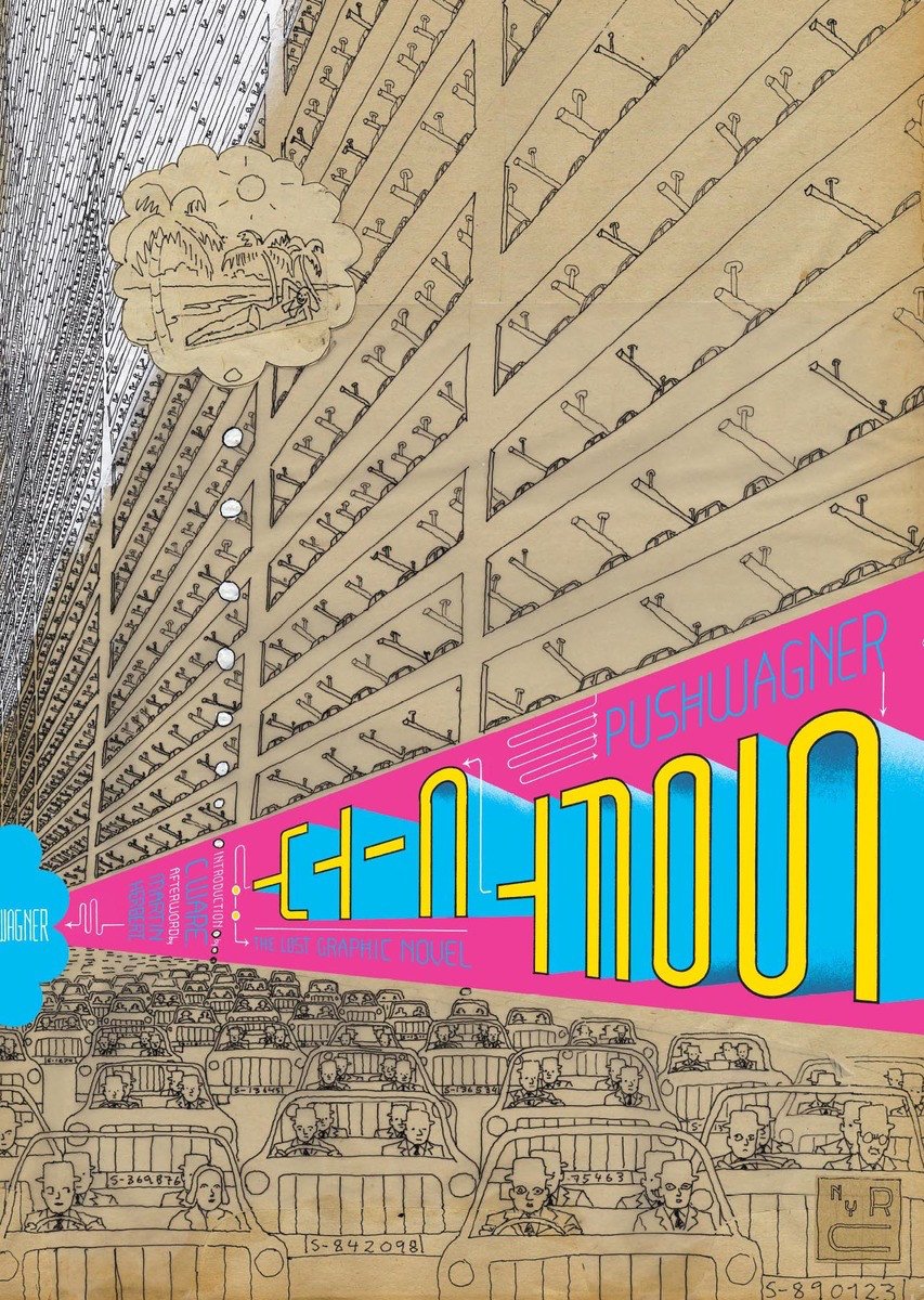
Soft City by Pushwagner (New York Review Comics) – Another remarkable rescue by the New York Review Comics, this elegant hardcover designed by Chris Ware reprints the book published in Norway by No Comprendo Press. It was the beginning of the ’70s when Norwegian artist Pushwagner gave life to an almost wordless comic full of men living in huge residential complexes with their middle-class families, going to work in their cars identical to one other and living a perfectly “normal” life. One of the best representations of urban alienation in comic form, with soft and liquid lines serving as metaphors of the conformism that creeps under the skin of modern man. I had briefly talked about this book here, on the occasion of Pushwagner exhibition at the Fumetto Festival 2015 in Lucerne.
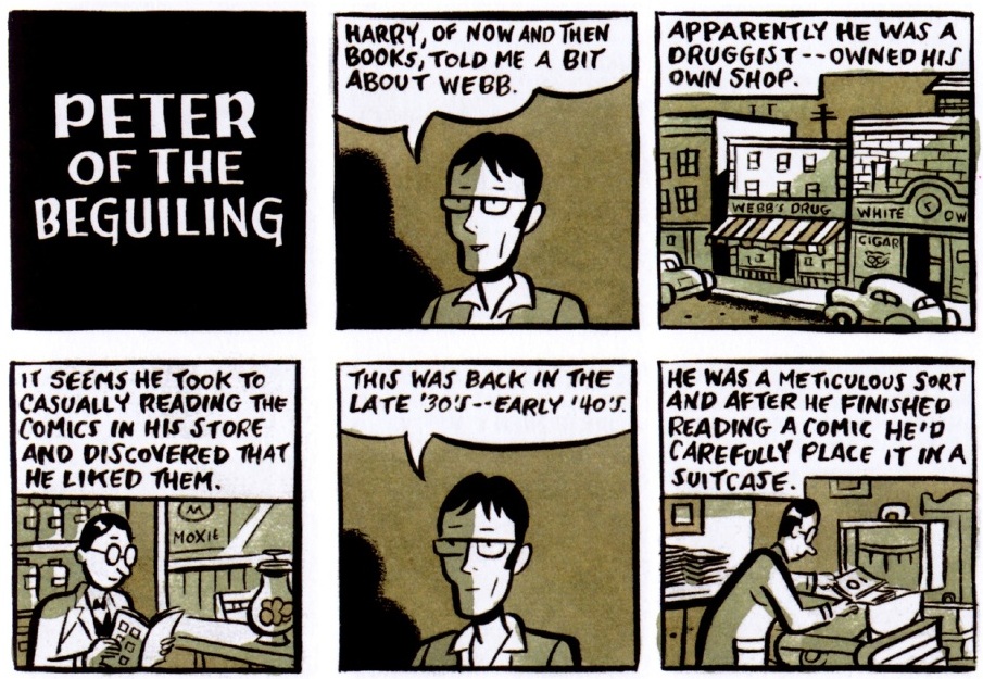
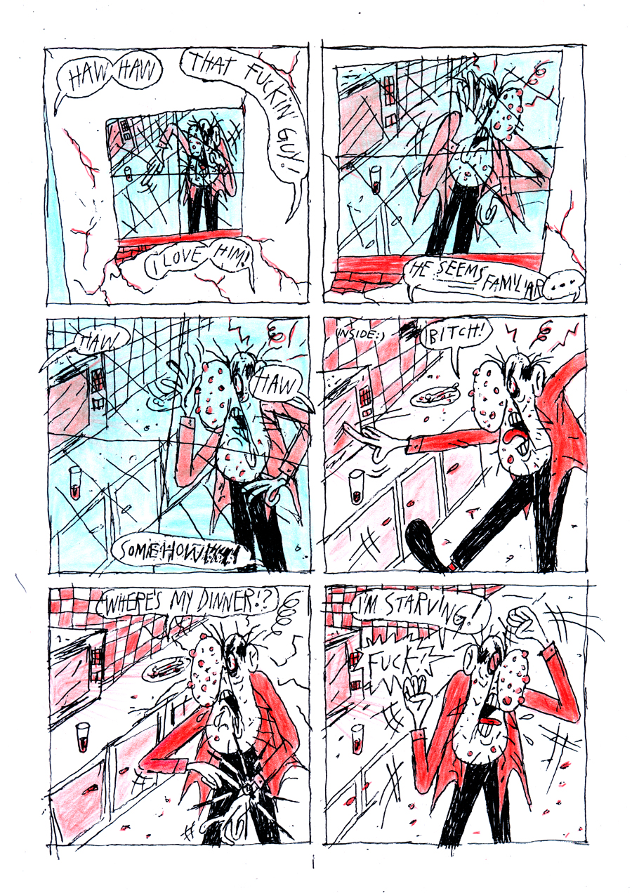
“Suicida” #1 by Abraham Diaz
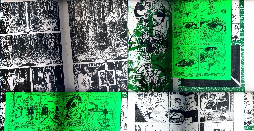
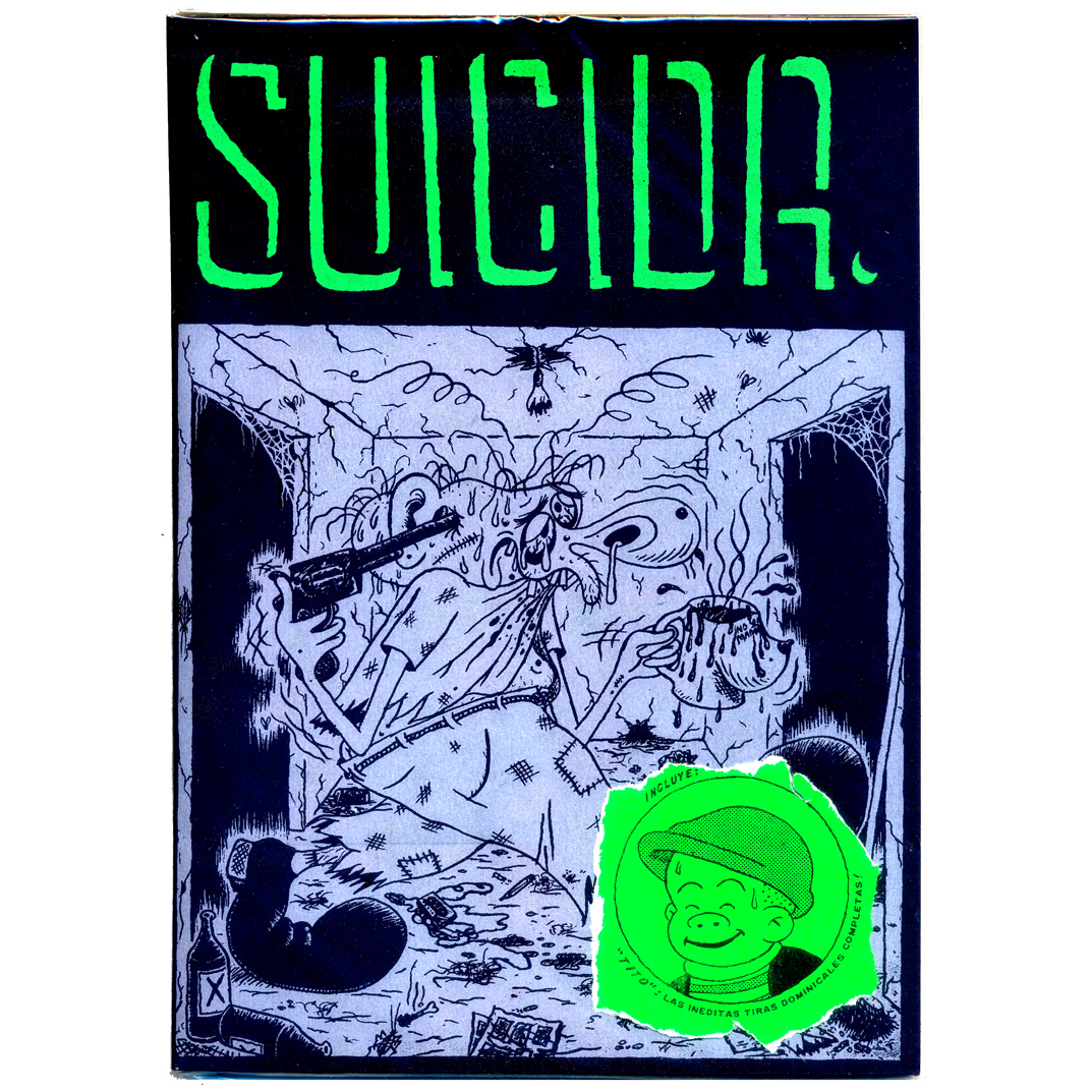
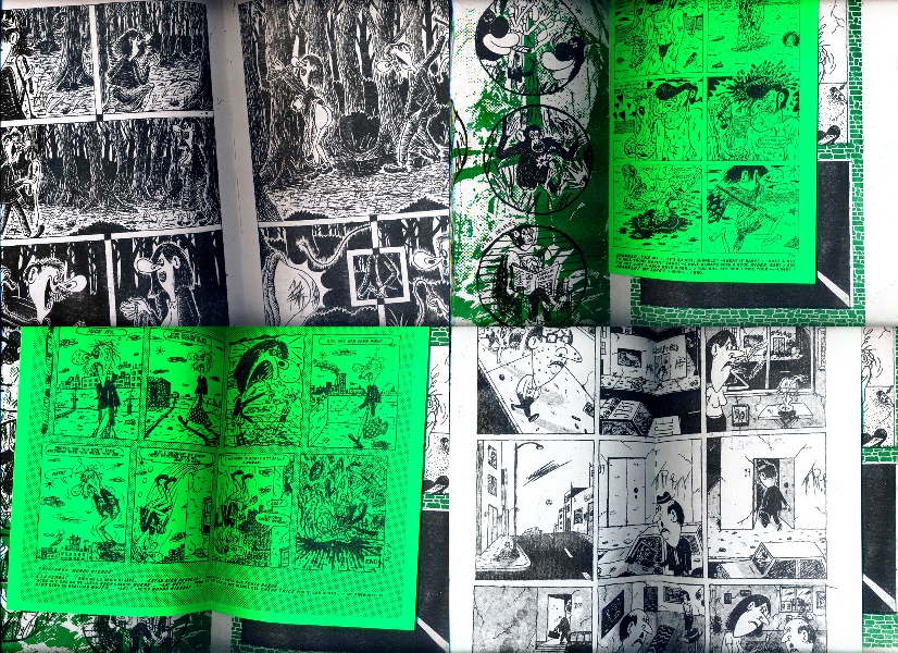
Voyeurism, sadism, masochism, self-mutilation, death, murder, suicide, gratuitous violence, sex, masturbation, TV addiction, urban decay. In his solo debut Suicida #1, Abraham Diaz works with these elements, mixes and molds them at will, creating a solid and always funny cartooning. In late 2015, the Mexican artist published with his imprint Ediciones Joc Doc 200 copies of this 28×20 cm comic book, texts in English and Spanish, a screen-printed cover, white and black paper with the addition of green, sometimes used as ink but also for the pages of the inserts. A good-looking but also dirty object, Suicida #1 digs up the underground punk aesthetics and the tradition of the single-artist floppy anthology in one shot. The opening story is The Witness, starring a lonely middle-aged man telling a policeman about a murder he watched spying in his neighbor’s bathroom. Diaz’s line is grotesque, cripples characters’ bodies, stretches their noses, twists their teeth, in a style that looks at many artists we loved over the last twenty years (Kaz, Ivan Brunetti, Johnny Ryan) but also at Mad magazine, gag cartoons, newspaper strips. And it’s not a case if inside the book we find two half sheets with four Misery Funnies, classic gags with text below the cartoons. One of this shows a man naked on the toilet, a steaming mug in one hand, the handset of the phone in the other and below “You don’t seem to understand… I’m my mother’s only child!”. And the telephone handset is a substantial detail, because the whole book is stuck in the 80’s or even before for aesthetics and settings and there is deliberately no trace of cell phones, computers and Internet.
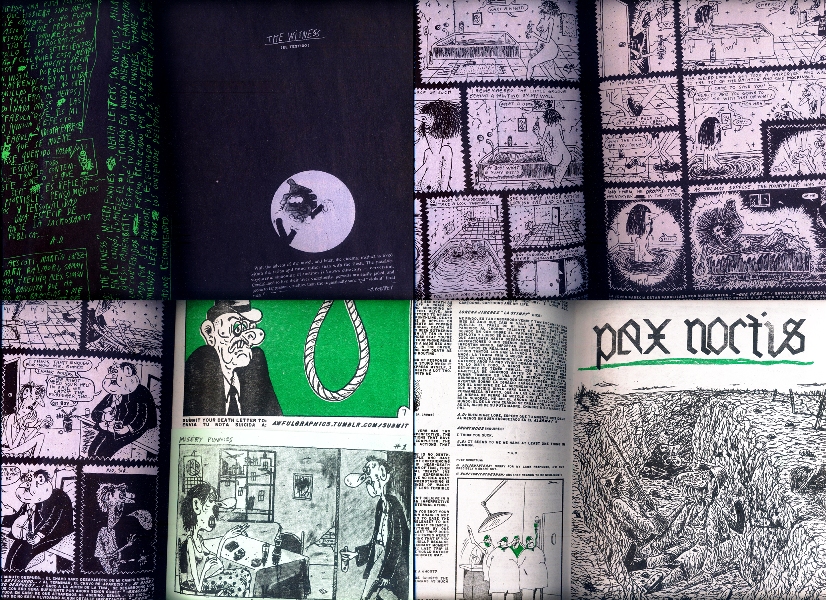
One of the inserts, Tito, moves on the same nostalgic and irreverent references of the Misery Funnies, showing the Diaz take on Sluggo, Nancy’s friend in the Ernie Bushmiller strip (Tito is the name of the character in the Spanish-speaking countries). Pax Noctis, already seen in Kovra #6 published by Ediciones Valientes, is another highlight, a tale of war and desire about a soldier in the trenches recalling, or more probably imagining, a chase in the forest. The situation culminates with a woman tied to a tree and whipped, then Diaz shows again the man, this time masturbating, while the ending combines sex and death like in The Witness. Suicida #1 seems the consequence of a week spent at home in the dark zapping in front of the TV, nerves on edge, eyes pulsing, the body in the grip of a hysterical frenzy that unleashes the most vile urges. But the cartooning of Diaz is more than this, because often he shows and ridicule human foolishness: if Pax Noctis mocked war and sexism, Milagro En El Congo shows a poor chimpanzee suffering the colonial barbarity on a jungle-green background. In another insert we find three one-pagers about the usual topics, reiterated also in the following ¡Esta Fue Tu Vida!, which introduces the novelty of explicit sex without forgetting ruthless irony and storytelling. Home is the last comic of the book, an heap of crazy lines reproducing the urban chaos. A prisoner is released and has to suffer the arousals of the city, as exhibited nudity, women with tight leggings leading men like dogs on a leash, people copulating in every corner. The gory ending is inevitable as magnificent and you can discover it in the few remaining copies of Suicida #1, sold out at the publisher but still available at this moment on Fatbottom Books and Dripper World. Or you can read Kramers Ergot #9, where Pax Noctis, Home and two of the Misery Funnies have been reprinted. In the meantime, Diaz is working at the second issue and so we’ll read soon a new chapter of his old school comics.
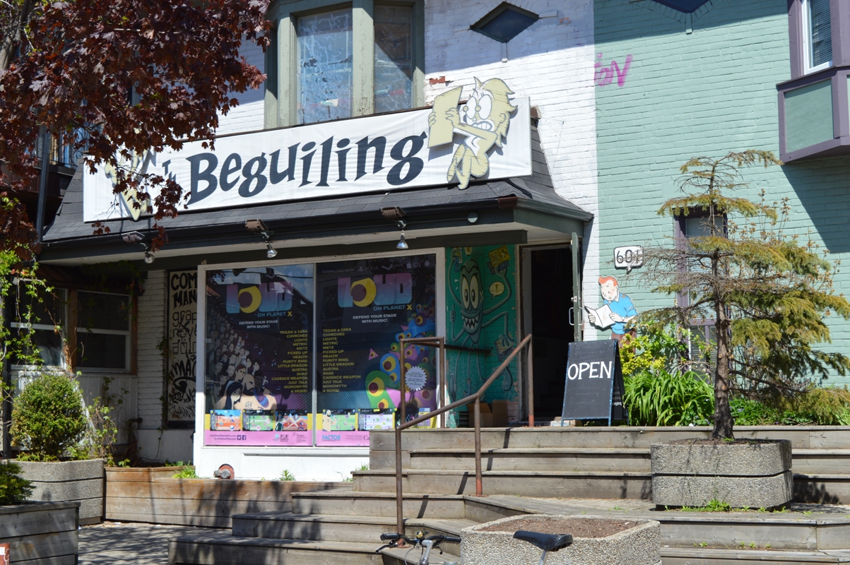
Comic shops of the world: The Beguiling
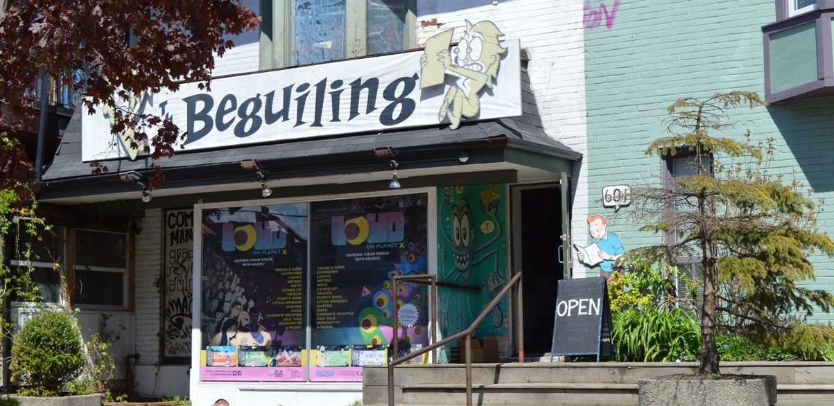
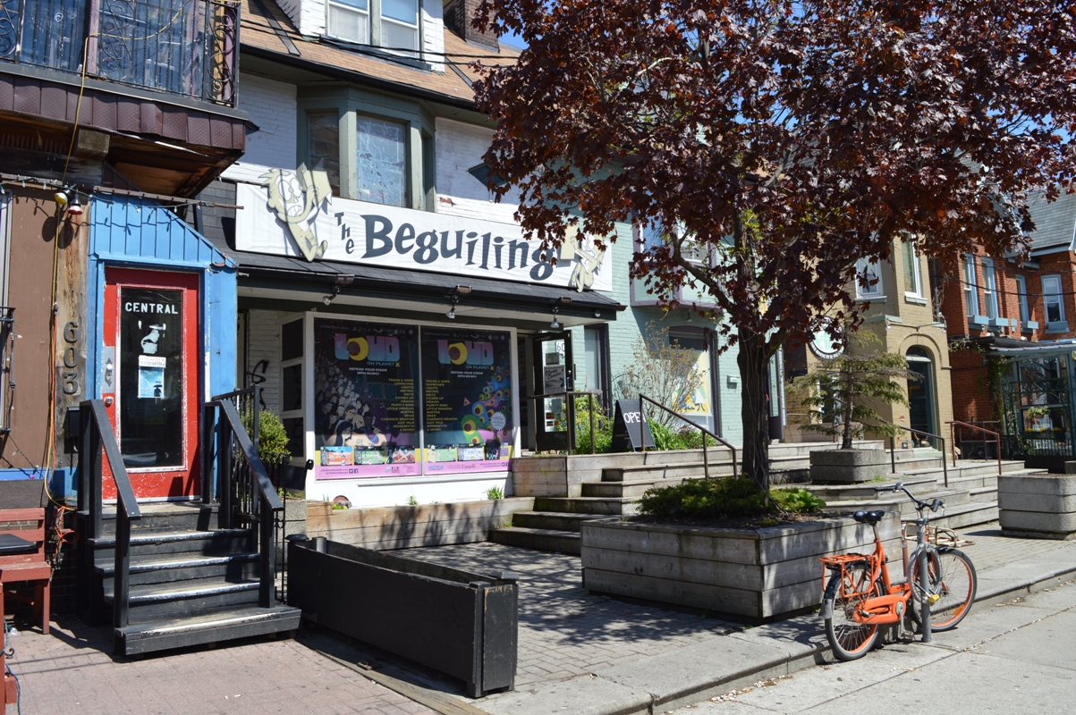
Do you remember the Hicksville‘s lighthouse, where there is a collection of comics so impressive to include unpublished works of cartoonists as Jack Kirby, Harvey Kurtzman and Wally Wood? The Beguiling is the place more similar to that gigantic library I have seen so far. Well, I haven’t found a comic by Federico García Lorca and Pablo Picasso, as the character of the Dylan Horrocks’ book did, but the Toronto store is really packed with obscure and hard-to-find material. I have visited it last May in the days of the Toronto Comic Arts Festival, an event that the owner Peter Birkemoe, along with the manager of The Beguiling Christopher Butcher, helps organize since the foundation in 2003. And I had the opportunity to spend several hours in the store, looking carefully through its huge catalog.
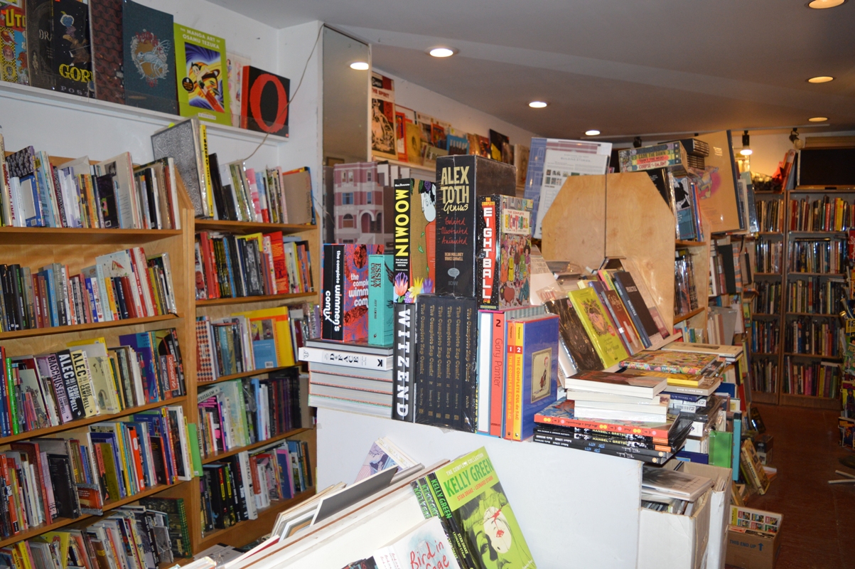
The store is developed on two floors. The first showcases on the central counters the new arrivals in the world of indie, arty and underground comics, with the latest graphic novels from publishers like Fantagraphics, Drawn & Quarterly, Koyama Press, Conundrum Press, Retrofit Comics, Alternative Comics, New York Review of Books, Space Face Books, Landfill Editons, Breakdown Press and so on.
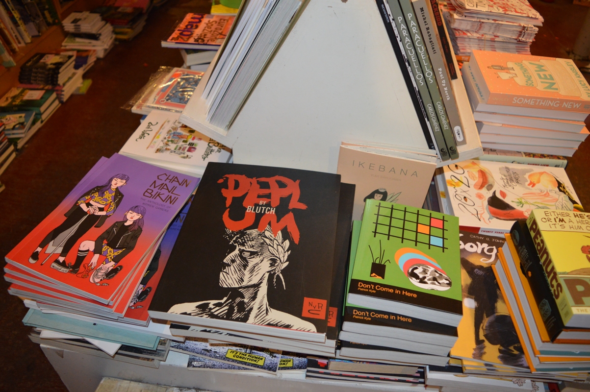

The books of the catalog are on the shelves, organized alphabetically by author. This is the most interesting part, with many rarities coming from the store’s backlist or purchased from fans and private collectors, like several issues of Raw, rare Gary Panter’s comics, Multiforce by Mat Brinkman, publications from the underground era, old collections of newspaper strips. Here are some pictures with a few valuable pieces, chosen according to my personal inclination, partly on the advice of Birkemoe and a bit randomly.
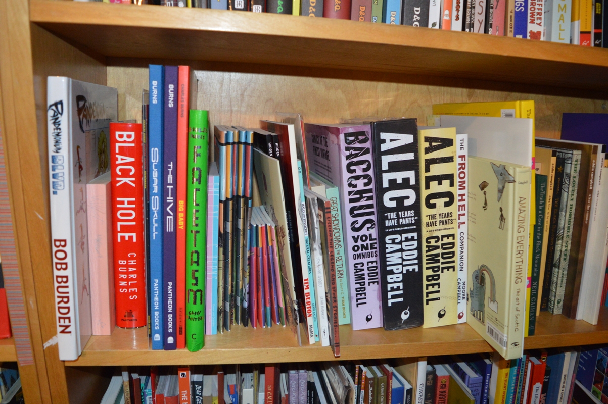
Between B and C, with a close-up on Charles Burns and Eddie Campbell
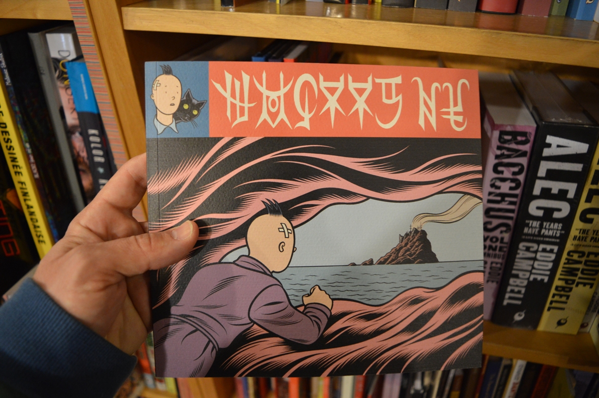
Among the various books, I pull out this now hard-to-find Burns published by Le Dernier Cri

The “Multi-Story Building Model” by Chris Ware, the Eisner corner and, above, “Lontano” by Gabriella Giandelli
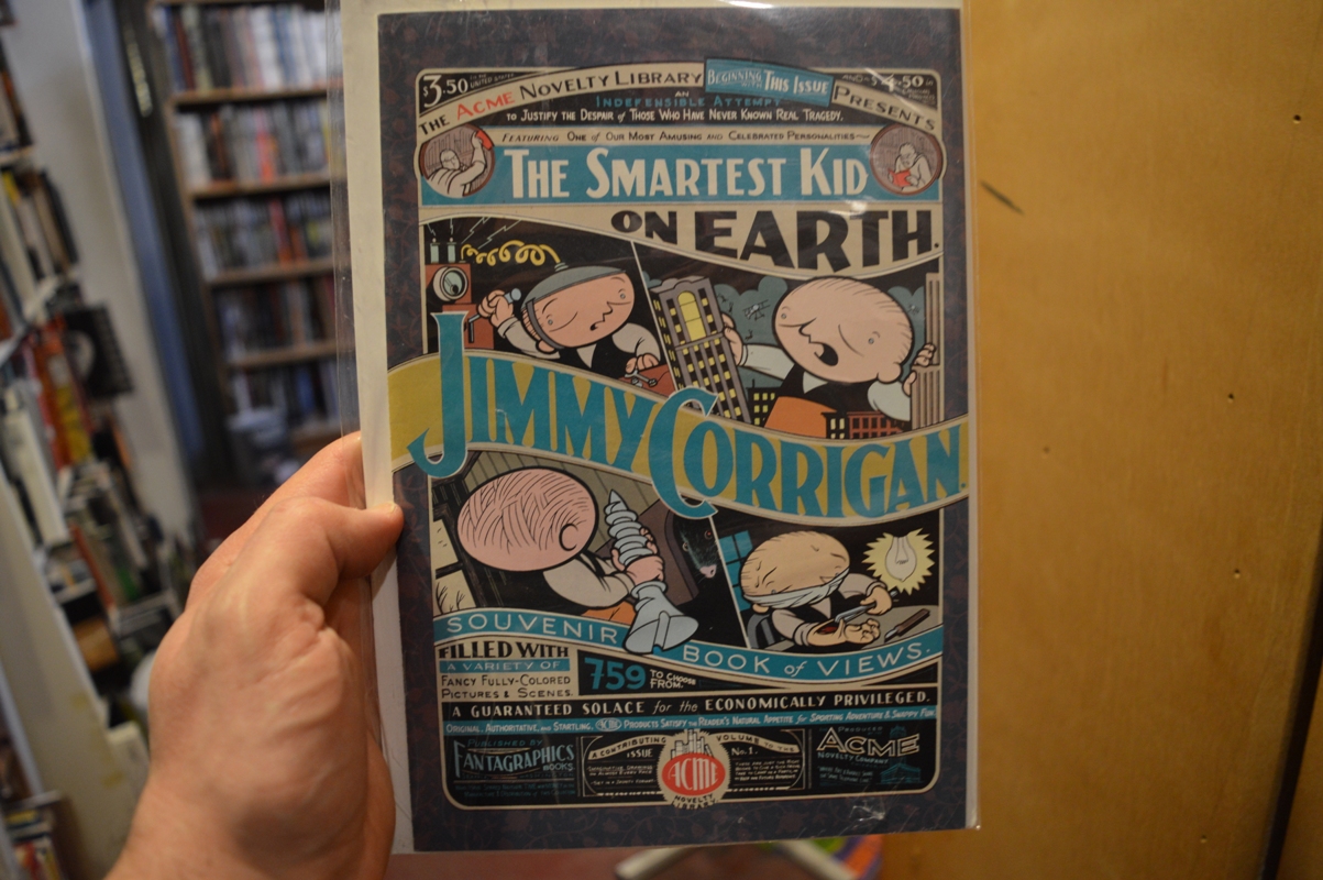
“Acme Novelty Library” #1 by Chris Ware
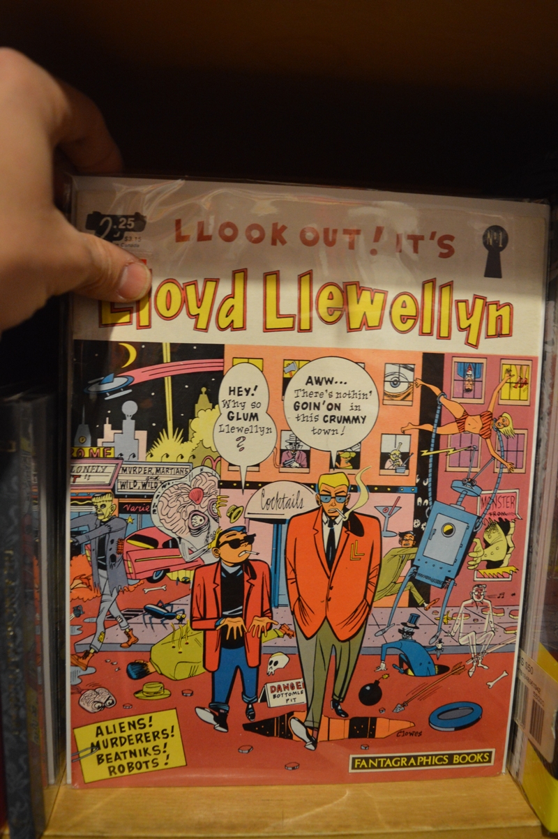
It’s always a pleasure to see a “Lloyd Llewellyn” #1
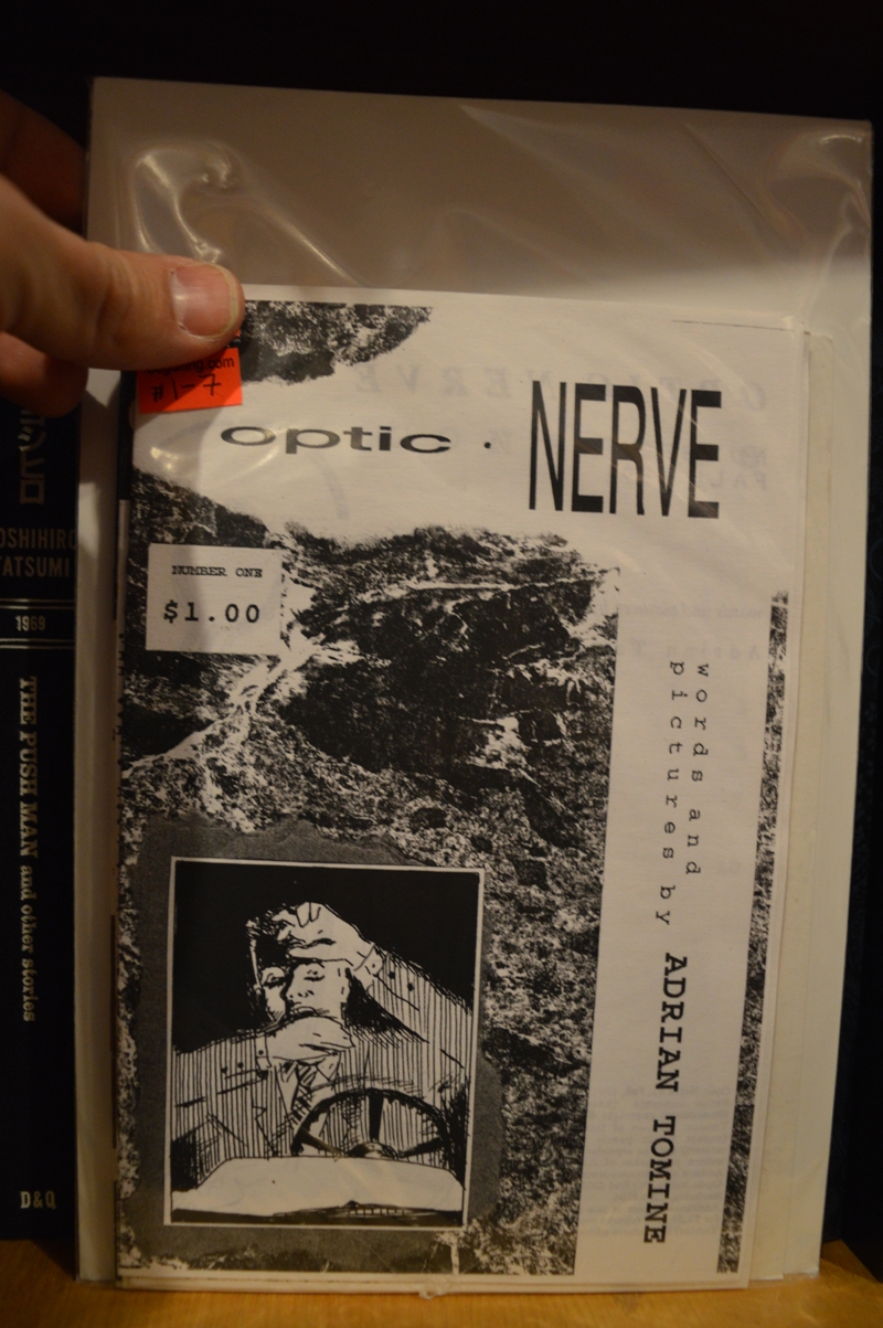
“Optic Nerve” by Adrian Tomine before Drawn and Quarterly
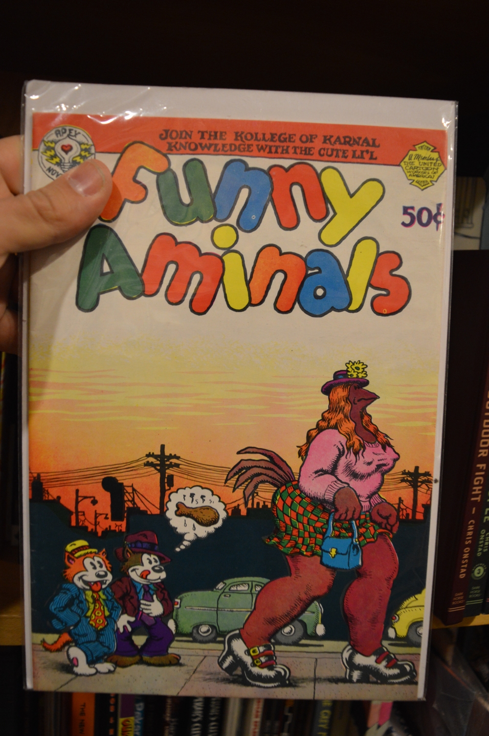
“Funny Animals” #1, 1972
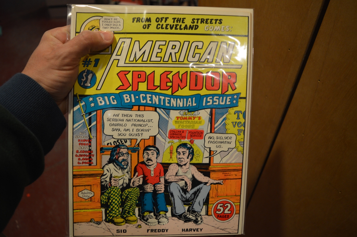
“American Splendor” #1, 1976
The selection of contemporary comics, minis and magazines is a good representation of the “scene” of recent years, with a lot of books that can’t be displayed in the store. When I found an issue of Maré Odomo’s Internet Comics published by Sacred Prism, it came to me I missed from the same series Kickfoot, a 16-page mini-comic by the Norwegian collective Dongery, released in 2014. When I asked Geneve, one of the employees of The Beguiling, she went in the archive and she came back within two or three minutes with the book in hand.
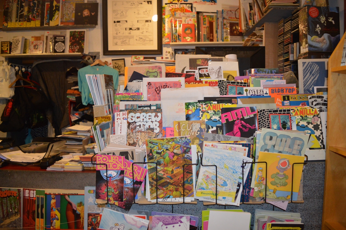

I must also mention the section of illustration books, the well-stocked anthologies bookcase and the rich selection of French and Japanese titles, with several original editions.
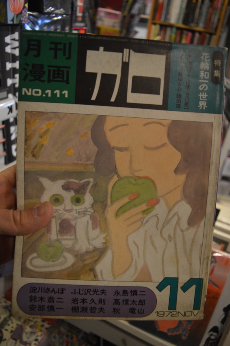
“Garo” #111, November 1972
If the ground floor is a real treat for arty and undeground comics fans, the upper floor is devoted to the mainstream and looks more like the traditional American comic book store. We find there Marvel and DC superheroes, with many vintage titles for collectors, and the publications of indie imprints like Image, Dark Horse, Avatar and so on. Even this selection is very accurate and gives particular attention to the indie scene. There are also author sections for creators like Alan Moore or Neil Gaiman, confirming that the shop is completely aimed at a mature and knowledgeable audience.
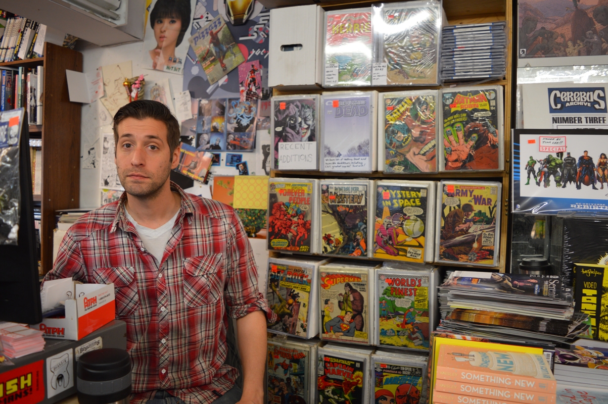
Alex does the honors upstairs, between a “Forever People” and a “Daredevil”… But we talked mostly about Italian comics
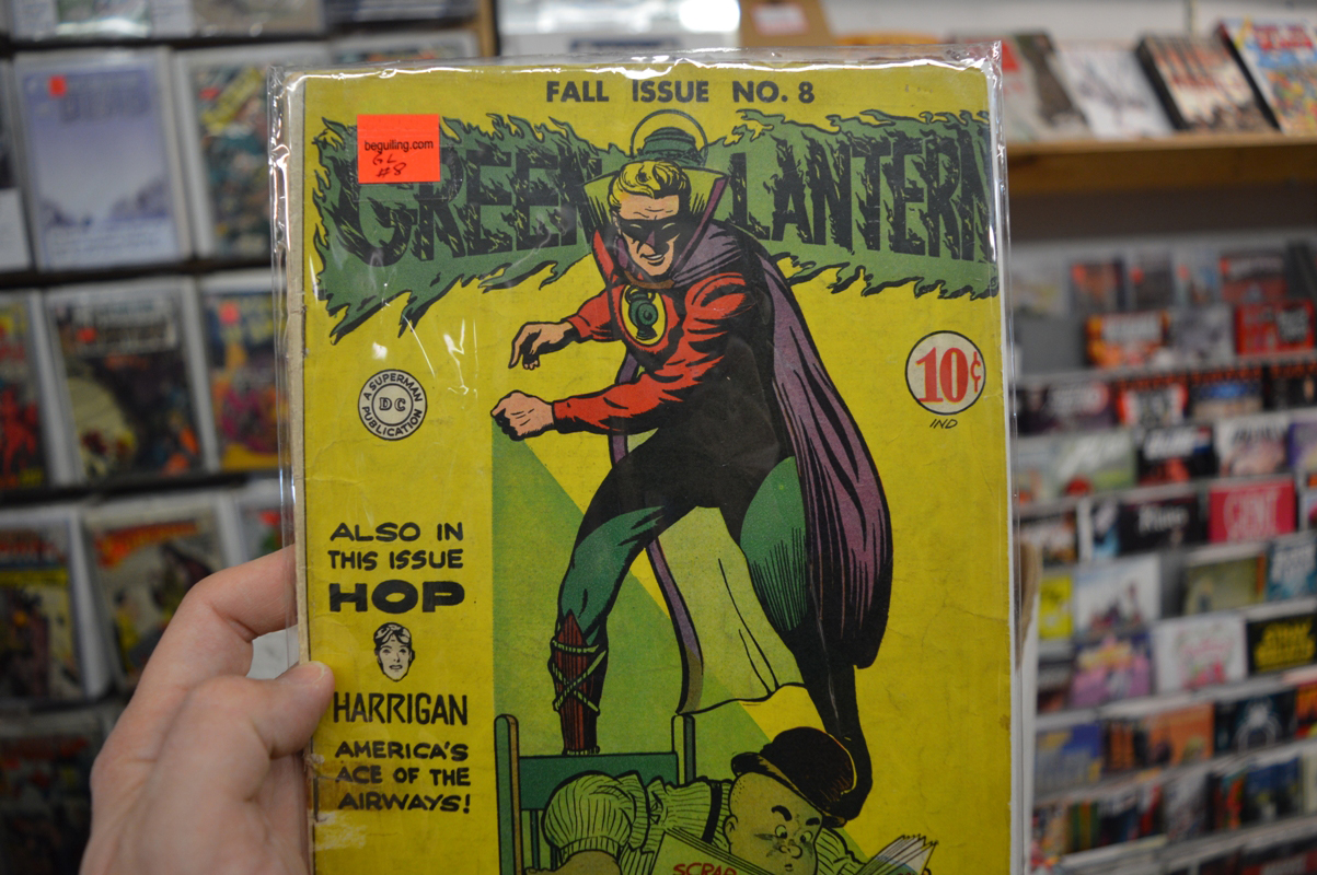
“Green Lantern” #8
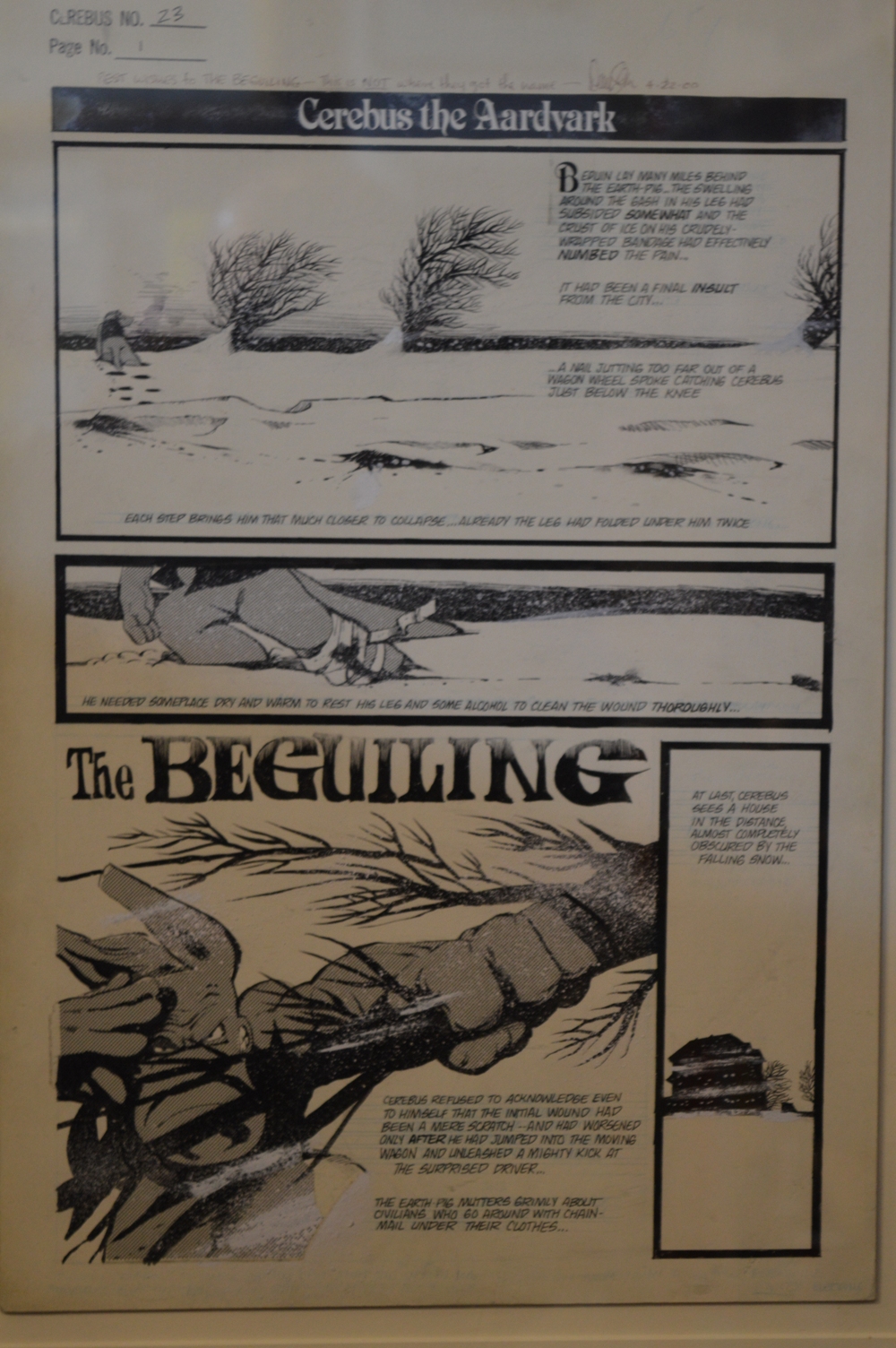
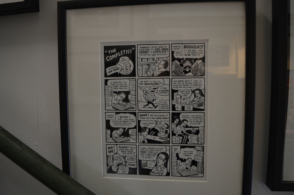
The Beguiling is also well known for its original artwork store, that sells pages and drawings by artists such as Sammy Harkham, Kevin Huizenga, Seth, Michel Rabagliati, Shintaro Kago, Brandon Graham, Farel Dalrymple, Jason Lutes, Jeff Lemire, Paul Pope, Eddie Campbell and many others. A few pieces from the private collection are exhibited on the walls. I’ve taken pictures of the first page of Cerebus #23 from April 1978, with a familiar title, and of a Joe Matt’s page that depicts the cartoonist, a well-known fan of old comics, heading to The Beguiling to sell some Carl Barks’ complete sets.
And speaking of Joe Matt, there is another page from Peepshow #3 depicting first him and his colleagues Seth and Chester Brown out of the store and then Matt inside talking with one of the first owners, Steve Solomos. The Beguiling was in fact founded in 1987, while Birkemoe took over in 1998.
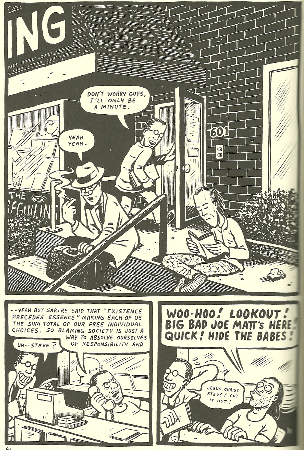
“Peepshow” #3 by Joe Matt
Peter Birkemoe on his throne
Birkemoe is a special guest in “Wimbledon Green” by Seth
During my visit, Birkemoe told me he is looking for a new and more spacious location, in order to display the whole catalog and to acquire more comics. If you are in Toronto, then, you have to visit the shop at 601 Markham Street, because it could be one of your last opportunities.
As Jeet Heer wrote a few years ago on Comics Comics, I don’t know if The Beguiling is the best comic shop in the world, but for sure it is the best one I have visited until now. And it definitely deserved my humble attention.
“š!” #24 + “mini kuš!” #38-42
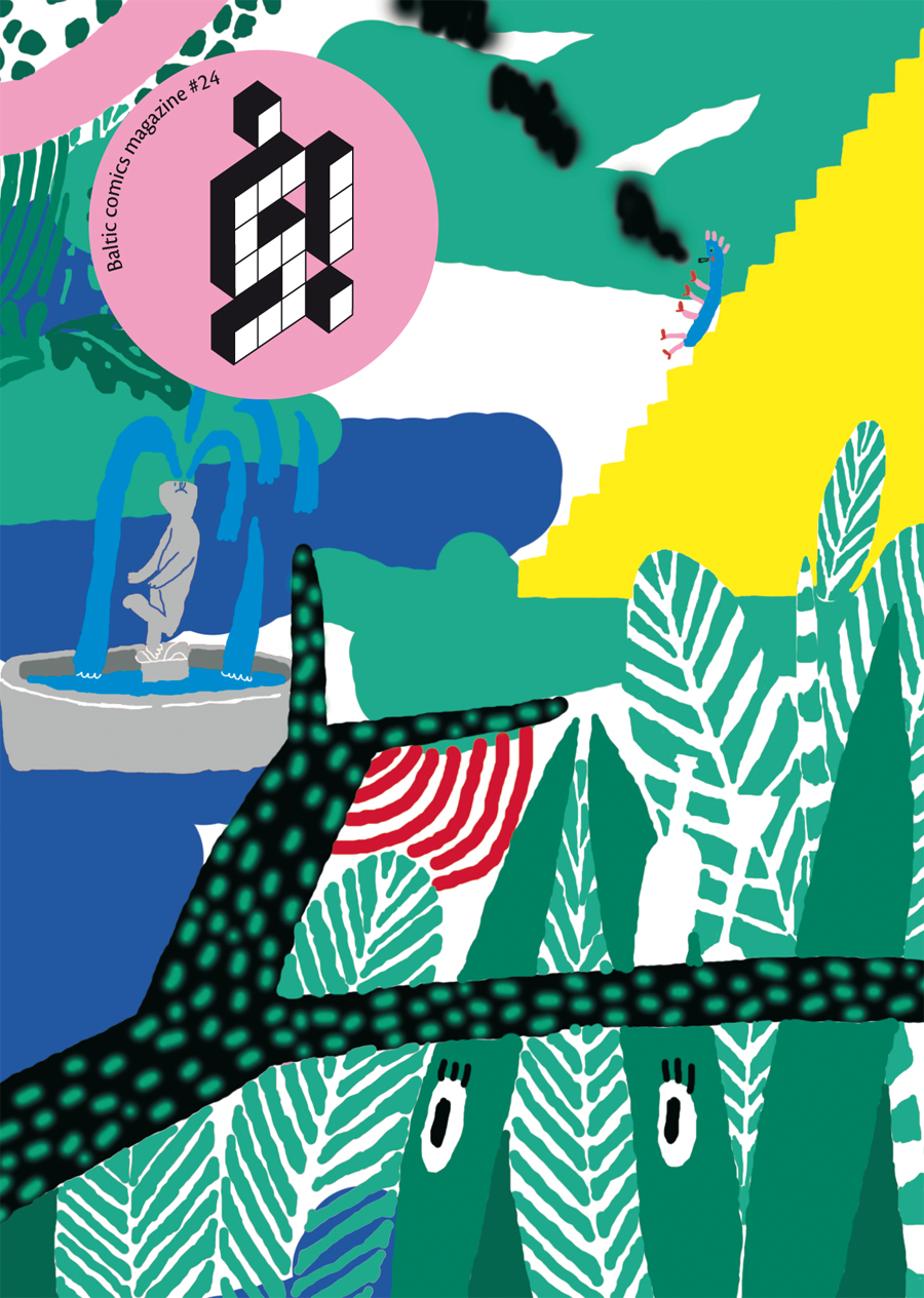
While the new issue of š! is hot off the press featuring Western artists inspired by Japanese manga, I’m taking some time to translate this review I published in Italian a few months ago about the previous release of the Latvian anthology and the latest mini-kuš!, now including the most recent one by Laura Ķeniņš. š! #24 is introduced by a beautiful cover by Līva Kandevica and showcases over twenty short comics by international artists, this time around the theme Urban Jungle. If the mood of these A6 booklets is mostly playful and ironic, in every issue there are some different voices, which can be rough, meditative or abstract. For example, in the fashion-themed anthology (š! # 22), Hetamoé’s and Léo Quievreux’s contributions reinterpreted the main theme as something deeply and disturbingly connected to body and flesh. And the same Marie Jacotey, who created the cover and the opening story, is a pleasantly atypical cartoonist, who hides under her colored pencils a crudeness in both line and content.
Abraham Diaz
And so, which are the “lone voices” of this release? My preference is definitely for Abraham Diaz, a Mexican cartoonist born in 1988 recently seen in Kramers Ergot #9 and of whom I’ll talk again very soon on Just Indie Comics. Diaz has a messed-up cartoon style and draws characters with huge heads and expressions between the stupid and the pissed off. His art is full of lines going on their own, of colors that don’t ever fill the whole space of the figures, of a crooked lettering reporting humorous and absurd dialogues. G.W. Duncanson is another artist aesthetically alien from the rest. His beautiful urban art contribution displays a pictorial black and white made up of graffitis, subways, skyscrapers. This is one of these š! comics I would like to see published in a larger size one day.
G.W. Duncanson
Both Diaz and Duncanson are debuting artists in the magazine and this means the editors David Schilter and Sanita Muižniece are successful in finding new names to add to the usual ones. This is confirmed by two other newcomers, more in line with the general tone of the anthology. The first is Sami Aho of the Finnish collective Kutikuti: Fooled Again is at first sight similar to Anya Davidson’s work and is an entertaining and accomplished short story with a great underground feeling of yesteryear and bright colors. Mathilde Van Gheluwe of Tieten met Haar is another new name in š! and her debut conquers immediately with warm watercolors, a charming style reminiscent of the other Flemish Brecht Evens and a precise and effective storytelling. But there are also interesting contributions by some regulars in this issue. Dace Sietina’s style is constantly growing and now is closer to the aesthetics of Russian art from ’50s and’ 60s, Amanda Baeza leaves aside geometry for once and creates a nice figurative work in black and white, while Jean de Wet confirms the good things he already showed in the mini-kuš! #20 (I talked about it here).
Mathilde Van Gheluwe
And speaking of mini-kuš!, let’s have a quick look at the latest fives, all by female cartoonists. The mini-kuš! #38-41 were published last March, while the #42 was out in May. Three Sisters is the title of the first one by Latvian artist Ingrīda Pičukāne, about three girls who find a drunk and naked man in the middle of the forest. The women speak in French, the man in Russian, and there aren’t subtitles, a choice that gives authenticity to the story. The booklet is a twisted fairy tale developing horizontally, with a white frame at the edges of the pages that encloses the colorful forest, rendered with an appealing mosaic effect, while the women are typified from big, exploding eyes, symbols of an intense sensuality. The charm of Pičukāne‘s work is even more powerful in the original art, that was part of a kuš! exhibition at the latest Ratatà festival in Macerata (you can see some pictures here).
Ingrīda Pičukāne
Colorful but with a more contemporary style is the mini-kuš! #39 by American cartoonist Tara Booth, who has also a funny three-page comic in Urban Jungle. Unwell is the story of an out-of-ordinary day in the life. The protagonist wakes up alongside an unlikely hipster, sneaks away after puking in his toilet, gets on a bike, thinks back to when she put her panties on the lover’s head, creates a painting with the ass (literally), goes out with her dog, meets a pervert in the park, gets drunk again… I won’t tell the ending but everything works perfectly in this wordless comic that might seem a silent film, drawn in a patchwork style reminiscent of South Park and with a great use of color. The page is completely at the service of the girl, so that the panels sequence is often broken by her vertical movements on the page. Unwell is definitely an excellent example of a successful mini-comic.

Tara Booth
If these two booklets have a dionisiac and lively mood, the mini-kuš! #40 by Hanneriina Moisseinen looks algid and rigorous. 1944 tells, as the title suggests, a war episode, namely the evacuation of Carelia, drawn by the Finnish cartoonist in parallel with the birth of an animal, representing the cruelty of nature and war together. The linear plot would need a decisive surge and Moisseinen’s pencils and panel grids are a little too straightforward on this occasion, even if the story is brutally poetic in its very own way.
Hanneriina Moisseinen
The mini-kuš! #41 is a great opportunity to admire a technicolor comic by Aisha Franz, committed to depict a not-so-far future made of apartment complexes, drones, changing sexual identities, pleasure machines. EYEZ isn’t a strong narrative work but relies mostly on the visual approach and on a simplified line compared to previous Franz’s work as the Alien graphic novel. But this hyper-pop version of her fascinates and conquers, so that we want more and more. And soon, if it’s possible.
Aisha Franz
The 42nd mini-kuš! was released in May and features Alien Beings by Latvian-Canadian cartoonist Laura Ķeniņš, whose work was published before in š! #19 Mathematics and in š! #21 Business Time. This is a story about aliens and divorce, with the title indicating both the extraterrestials the family supposedly met in the first pages of the mini-comic and the two parents becoming “aliens” the one with the other (and also with their children). The colored pencils used by Ķeniņš are perfect to illustrate a story saw in first person from the daughter of the couple, a coming-of-age tale about growing up in a divided family. In the end the close encounter seems a too-simplistic justification for the break-up and the human relationships are the real unidentified object. Ķeniņš focuses on the girl’s feelings and on the dynamics of the divorce, building a strong, intense and cohesive story.
Laura Ķeniņš
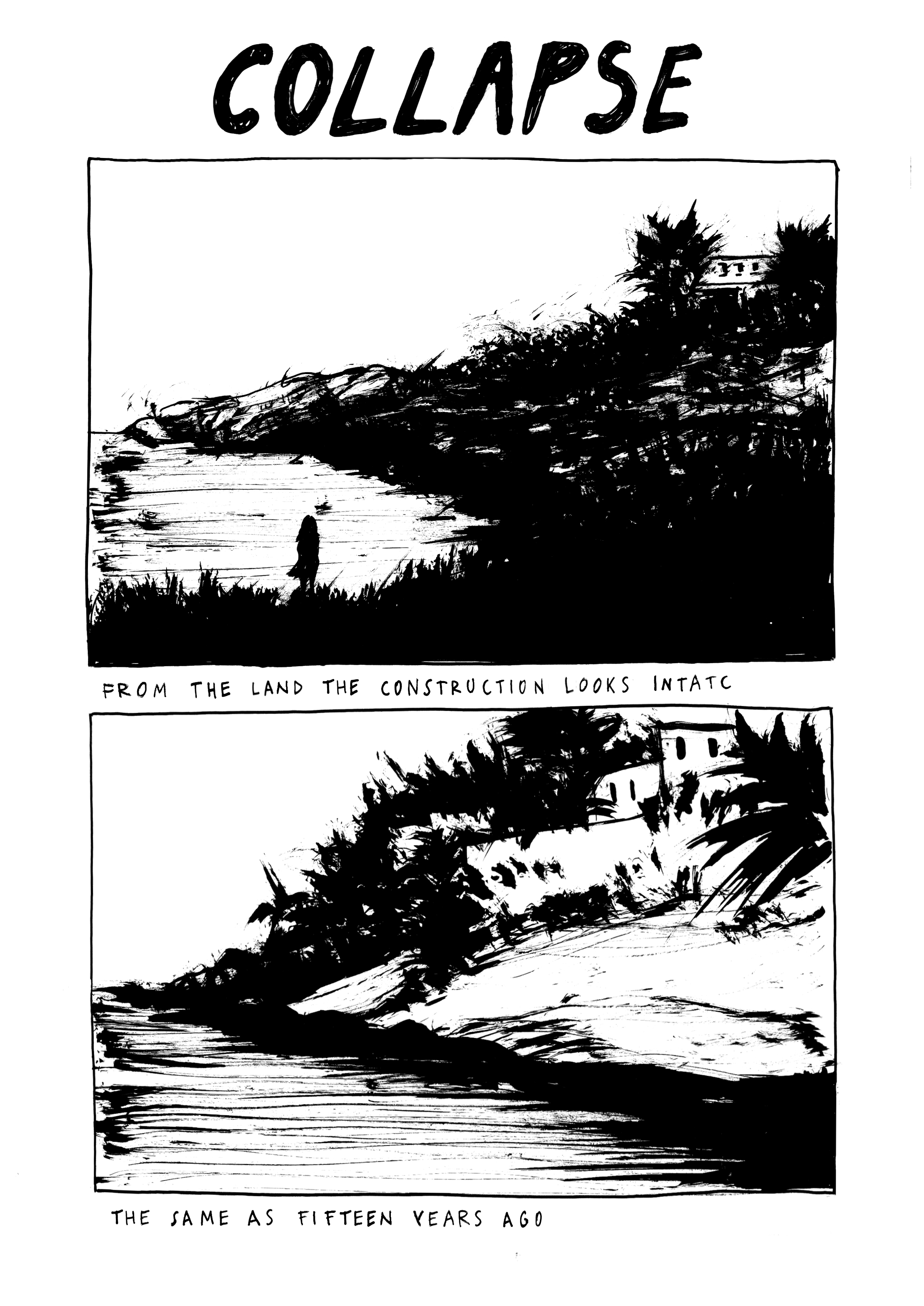
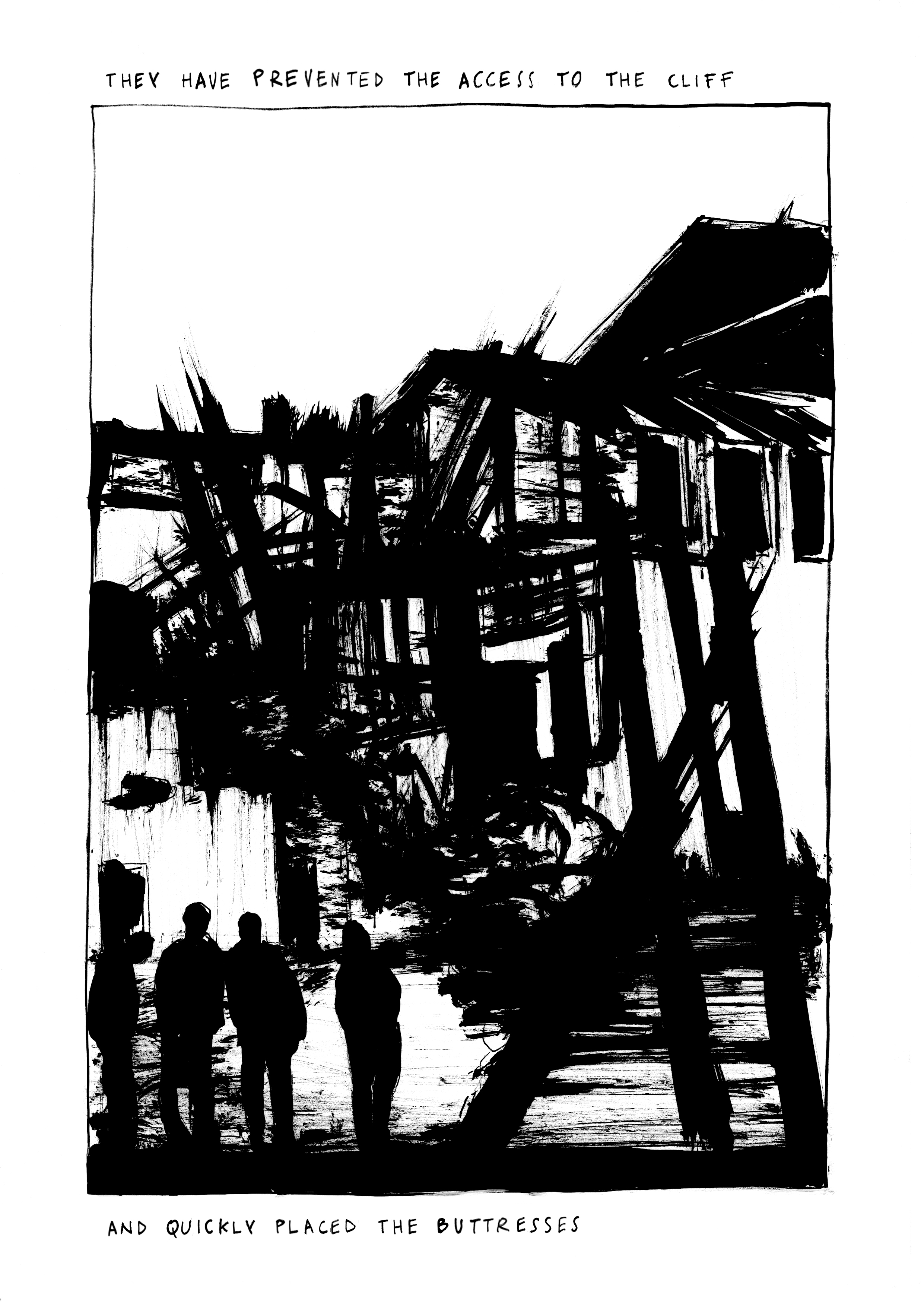
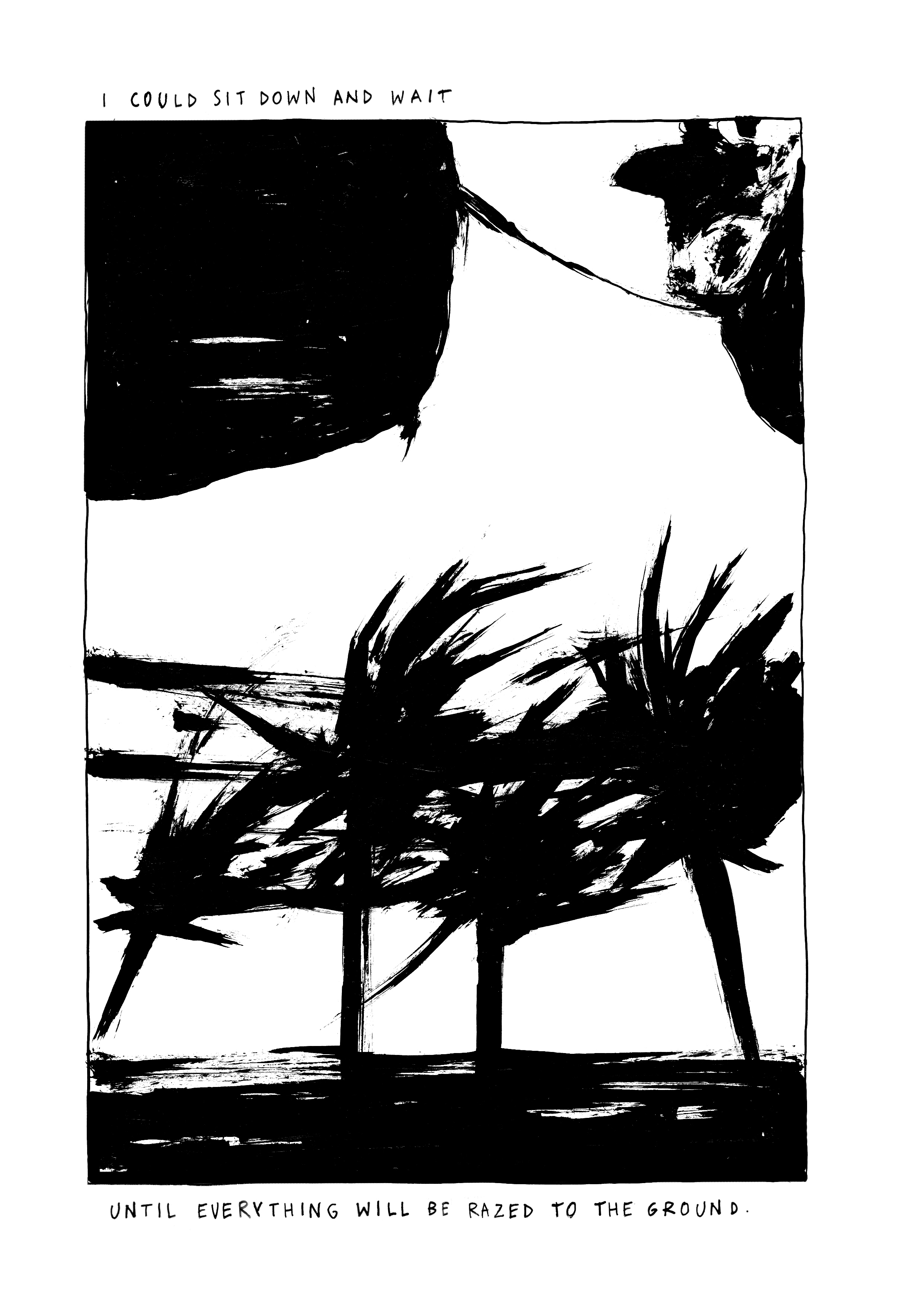
“Drift” by Serena Schinaia
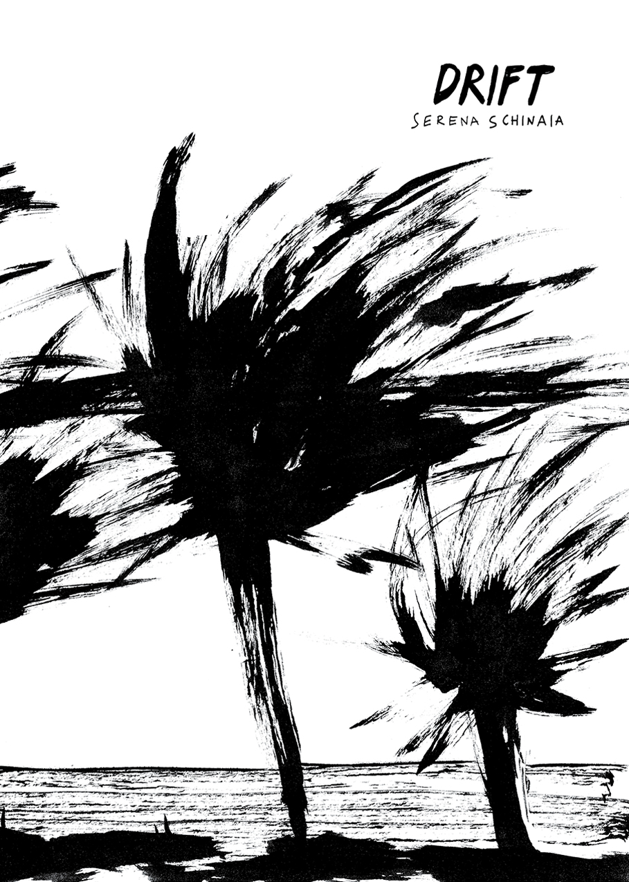
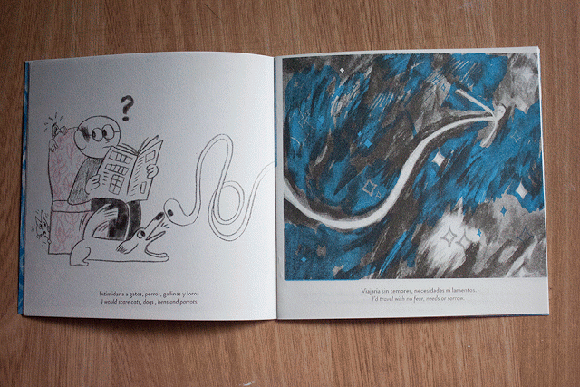
I already wrote about Serena Schinaia on Just Indie Comics when I reviewed her latest solo effort, the comic book Ceniza/Cenere published by Ediciones Valientes and in this post about Una giornata scorsa, the collective project she developed at the Real Academia de España in Rome with Martín López Lam, Silvia Rocchi and Roberto Massó. Schinaia is an artist born in Taranto, 1986 and after studying Aesthetic Philosophy and Theory of Comics in Bologna she moved to Rome, where she currently lives and works. She was featured in several anthologies, collaborated with Lo Straniero, Hamelin, the Goethe Institut and exhibited in various festivals, such as Bilbolbul, Komikazen, Napoli Comicon. She won the prize Reportage for Reality Draws 2012 and the contest Coop for Words 2014. In her work she doesn’t use balloons but only laconic sentences that aren’t simple captions, as they don’t just describe the drawings but give power to what she represents, creating a deeply evocative result. If the recent Ceniza showcases a more defined line, a blue/gray color palette and the use of Italian and Spanish simultaneously, her first self-published 32-page comic book, Drift, is representative of the first phase of her production, marked by an intense black and white made up of impressionist brushstrokes. Below you can read two of the five stories of the comic book, which is available in Just Indie Comics online shop, where you can also find some copies of Ceniza. In the meantime, have a good read.


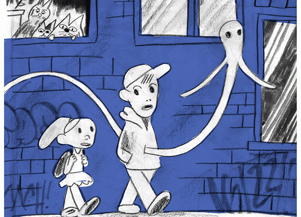
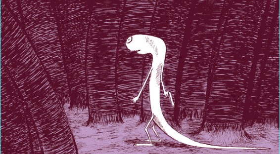
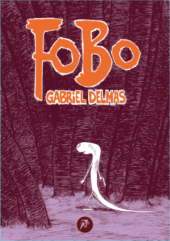
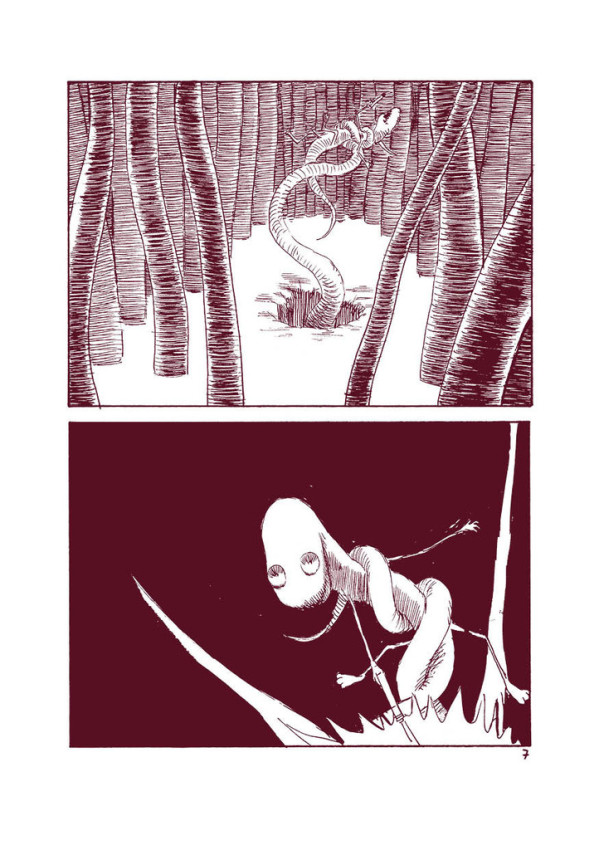
“Fobo” by Gabriel Delmas
by Weedzie Kalashnicock
I think Fobo is a metaphor for the madness of love, a song of chemical imbalance, a poem to all those who would seek and a lament for those who find. In short, a metaphysical mindfuck.
It’s also a comic tale of a sperm, who, like all sperm before him, has a primal urge to find an egg, to secure his spot for all eternity, but who in the process of completing his destiny, becomes obsessed with something else. He wants nothing less than to penetrate the heart of the universe. And this desire has him chasing every glimmer, every flash, every black hole, every distant point as far and as long as he can.
He starts out with high hopes. He manages to climb in and out of every imaginable landscape. He chases and plays with the one-eyed woman. He’s helped by friendly flora, whose curling tentacles lift him out of danger when he thought they might try to strangle him. He’s eaten by strange floating creatures with bloated bellies that are filled to the brim with smiling, slightly idiotic (but endearing) faces, but clearly, they mean him no harm, since he is carried even closer to different and more exciting landscapes. He’s thwarted at various points, but only temporarily. He manages to avert every disaster and move further in his quest. His adventures are scary and fun, and he seems to be (and starts to feel) invincible. He even appoints himself the leader of various creatures he meets along the way. The euphoria swells his head, there seems to be nothing he can’t do.
Fobo feels at one with the universe and all the creatures around him. Everyone seems to be cheering him on. He feels kissed.
But what is really happening? Are they really on Fobo’s side? Everyone brings him closer and closer but where is he really? Is this love or trickery? Where is he?
Fobo looks at the thing in another light. What seems to be one thing is now another. Every time Fobo emerges out of one hole, he finds another and another and another. An endless series of holes stare back at Fobo. He can penetrate the one, but there is always another around the corner. Whether he looks up or down, or goes in or comes out, he is still not on the other side! He’s caught, just like all the others in this sticky, impenetrable labyrinth.
Is he a clone? A drone? He thought he was better! Different! What is he?
What seemed exciting and crazy and mysterious before, now Fobo feels, am I to be perpetually tantalized? Am I never to penetrate the mystery I seek to know? Am I to be teased as long as I live, and all my time, all my efforts, count for nothing?
This is not the story of a race to survive, or even a story about a fierce competition to be the fastest and most successful sperm in the universe. It’s about the disillusionment of the victor. His suffering is existential.
The truth is, he has a loaded gun but perpetually shoots blanks into the universe.
This is a horror story.
Fobo is the latest book by Gabriel Delmas. It’s a 64-page paperback, 15×21 cm, published by Hollow Press
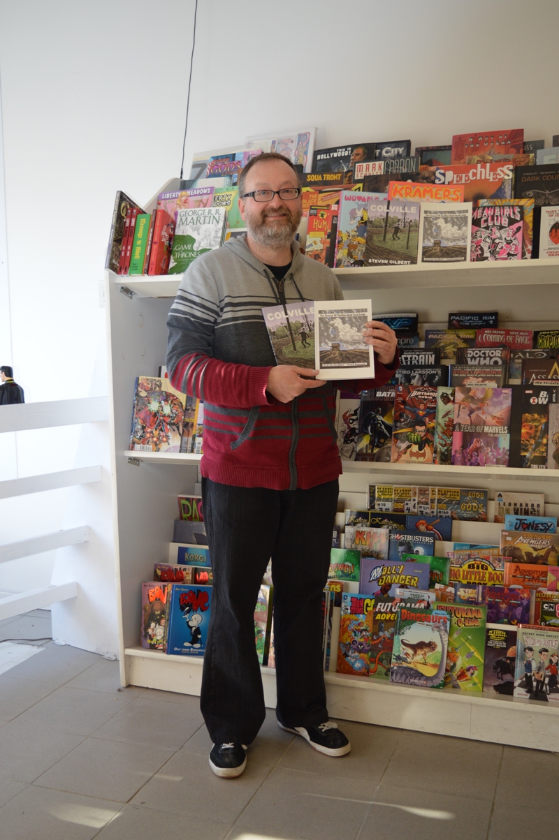
An afternoon with Steven Gilbert
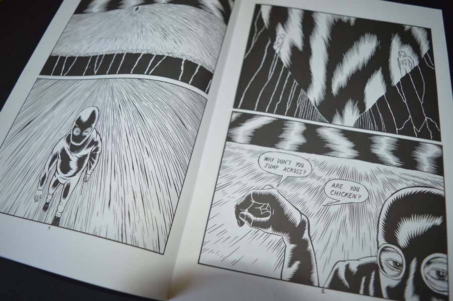
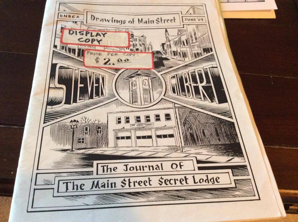
Steven Gilbert is a Canadian cartoonist author of The Journal of the Main Street Secret Lodge, a 2014 Dough Wright Awards winner, and of Colville. Back in the ’90s, he self-published six comic books of a series called I Had a Dream, plus two single issues, Gardenback and The Cult of Gardenback, where he developed the characters and the situations of the previous series. Between the two Gardenback comics, he published Colville, a 64-page comic book that received some good critics at the time. But after 1998 the world of comics lost Gilbert’s tracks and it was very difficult to find informations about him on the web until a few years ago. The most important source, if we can call it in this way, was a 2011 post at the Comics Comics website where Frank Santoro included “the guy who drew a comic from the mid-’90s called Colville” in a list of Good Cartoonists Gone. The same Gilbert contributed at the discussion writing this: “Wow, it’s nice to be remembered…I’m the guy who did the Colville comic. Glad you liked it Frank. I was an exhibitor at the SPX back in ’98 and sold a bunch of Colvilles there. I still draw comics when I can find the time, in fact, there is an entire second chapter of Colville completed (about 48 pages) plus about 25 penciled and lettered pages for a third chapter. Someday it’ll get finished and I’ll get a table at TCAF or sumthin’. Since 1999 I’ve owned and managed my own comics shop here in Newmarket, Ontario called Fourth Dimension. That takes up most of my non-sleeping time. Unfortunately, the drawing board has been back-burnered. I’m probably better at selling other peoples’ comics than I am at making my own!”. But Gilbert came back to comics in 2013 with a 128-page book, The Journal of the Main Street Secret Lodge, which won the Dough Wright Award for Best Spotlight Work the following year. And in 2015 he finally self-published, after nearly two decades in the making, the Colville book, including the original 64-page comic from 1997 and over one hundred pages of new material with the completion of the story.
I found out about Colville online and I was very curious about it for a long time, so when my friend Francesco (best known as the Italian cartoonist Ratigher) told me he had sent an e-mail to Mr. Gilbert ordering a copy of his books, I did the same and asked him if I could also sell Colville in my webshop. Ratigher wrote a review of Colville here at Just Indie Comics and from that moment a lot of people ordered the book or asked me about it. It was very funny to see a lot of Italian comic fans interested in a so obscure work, that it’s hard to find even in North America (Gilbert hasn’t a website and his books have no distribution at the moment). I exchanged some e-mails with Steven in the months after and when I went in Canada for this year’s TCAF I asked him to do an interview in Newmarket, a little town near Toronto where he lives and runs the comic shop Fourth Dimension, in 237 Main Street South. The interview took place on Monday 9th May at the presence of my friend Michele Nitri of Hollow Press and of Gilbert’s girlfriend Stacey.

The Main Street in Newmarket, Ontario
Let’s start from the beginning. Are you born here in Newmarket?
I wasn’t born in Newmarket but I lived in Newmarket literally my entire life, my parents are resident in Newmarket and I always lived here.
And when did you start reading comics?
I was very young. My first recollection of comics is getting my hair cut at the barber and seeing this stack of Archie Comics and Disney Comics with the cover stripped off. But I had no affection for them at that time. When I was a kid I loved cartoons, I watched Bugs Bunny cartoons all the time. I was maybe more interested in animation at that very young age. When I was about 9 years old I had my tonsils removed at the hospital and my mom bought me a Spider-Man comic, that was kind of when I really became interested in comics.
Well, I read comics since I was very young but I was definitely hooked into them with a Spider-Man comic too, it was an issue with Doctor Octopus in the Bill Mantlo-Al Milgrom run.
Sure sure, Al Milgrom, yes… Mine was a Marvel Team-Up with Spider-Man and Doctor Strange.
Ok, and so when you started drawing?
As a young child, I remember drawing a lot before I was in the comics. I liked cartoons, so I doodled all the time. My dad used to bring home stacks of office paper, there was the letterhead on one side so I used the back of the sheets. I think at that age I was really into ninjas, I liked monster movies and I remember being obsessed by werewolves movies for quite a long time. I had tons of drawings with werewolves and monsters and stuff like that.
And this was still before comics?
Yes, and then when I discovered the comics I used to draw recreations of the cover artworks to try to figure out how that style worked. It was probably a little bit more when I was getting into twelve, thirteen, fourteen years of age that I started trying to make my own comics. When I was in high-school age I seriously started drawing comic books. My brother once wrote the script for a sequel to the Frank Miller’s The Dark Knight Returns, it was for a class project. And when I understood it would be about 30 pages I said “I won’t draw 30 pages for free”, so I charged him 200 dollars (laughs). I think my parents gave him the money to pay me, so they technically funded it.
Do you remember the story?
Oh no, it’s been a long time ago, in high school. I remember only I was trying to ink like John Totleben in Swamp Thing. It didn’t look like Frank Miller’s artwork, it looked like John Totleben from Swamp Thing. I should have the artworks somewhere at home but I never look at them and I don’t really want to look at them. The teacher made maybe a dozen of photocopies at the time and I’m petrified that somebody could have a copy of it. It was horrendously awful. Then I remember doing a comic book about the Travis Bickle character of Robert De Niro in Taxi Driver and then I drew another book with Grendel. My big dream at the time was that Matt Wagner could hire me to draw Grendel.
Were you a Matt Wagner’s fan?
Well, Grendel was a comic I read when I was fourteen-fifteen, and it was maybe the first step away from totally mainstream comics, because it was basically a super-hero comic but for grown-ups. The interesting thing is that Matt Wagner, who was a very skilled artist himself, was allowing other cartoonists to draw his character and so I thought “It can be my big chance”. I also thought to send my artworks to Matt Wagner but I never did it. My Grendel comic was a sort of remake of the movie Die Hard but with Grendel in it (laughs). I’m pretty sure the comic ended with the character blowing at the top of a building and it was totally ripped off from the end of Die Hard, I saw it like a month before and it was in my head.
And did you like also Sandman Mystery Theatre by Matt Wagner? It was one of my favorite comics back in the ’90s.
I actually read only a few pages of it, I knew at the time he was doing it because I worked in a comic shop but I never really read it. It was published in a period of my life when I didn’t read any Vertigo stuff, because alternative comics are the blast at the time for me.
So did you learn to draw by yourself, right? You didn’t take lessons or attended some school.
Well, in high school I had an art teacher who was very sympathetic to comics and encouraged me to do them. Well, he is in Colville, I drew this scene where there are my art teacher and my high school. He actually came into the store about two weeks ago, someone showed him the comic and he visited me specifically to say “Don’t put me in your comics anymore”. I think he was ok with the book until he arrived at the last 40 pages… However, in high school I was lucky to have an encouragement to draw comics but I didn’t get any specific instructions, I was purely absorbing from as many comics as I could, lots of copying and trying to figure how to put things on the page.
And what happened until I Had a Dream #1? You self-published it in June 1995 with your own imprint King Ing Empire but you created comics even before I guess, so I’m curious if you made something before that issue.
I tried several times to get a comic put together. I was in my mid-twenties when I published the first issue of I Had a Dream, so it was a lot of time after high school. In the meantime, I worked at a comic store and I also drew comics.
But only for yourself.
Yes, it was my training ground, I drew hundreds of pages of comics and illustrations but I never showed them to anybody, maybe just at few friends. There was a couple of crime comics I worked on, a sort of murder mystery stories I was trying to figure out how to develop and at a certain point the actual events that inspired Colville occurred and I immediately thought “This is the story I want to do”.
And this is before I Had a Dream.
Yes, it was long before I Had a Dream but I already drew a cover for that story, even if it was a different cover both from the one of the Colville comic book than from the one of the Colville graphic novel, but more similar to the latter. At the time I thought the comic should be called Warning Shot but I had this intuition I wasn’t still good enough to do the story I had in my head, because at the time I never drew a comic that was more than 25 pages. I needed to figure out how a comic book works. So, it happened that a friend of mine, one I knew from years without really knowing he drew comics, came in the comic shop…
What was his name?
His name is Jason Williams.
Ah ok, I thought he was him, his name recurs in your first comic books.
Yes, so he came in the shop and showed me a Spider-Man comic he drew, and maybe it was the worst comic I did ever see. It showed me also a rejection letter from Marvel. Then, he started drawing a comic called Underterra and he wanted to publish it but he wasn’t really ready to publish a comic. He also gave me the pages of the first issue asking me to edit them. I read it and it was full of mistakes, so I wrote a lot of notes and at a certain point I begged him to redraw it, proposing to co-write and ink but at the end he published the first Underterra how it was, with all the mistakes. And he printed five thousand copies per issue, distributing all the six issues with Diamond. But I think he sold only 90 copies each.
So, was that an inspiration for you? (laughs)
Well, what I got from him basically was… the name of his printer (laughs). He gave me this contact information and so I made the decision “If this guy can do a comic, I better get off my ass and do a comic”. I already had the first versions of the first three issues of I Had a Dream drew very rough because I made them like 24-hours comics. So I completely redrew them. Looking back, now I’m not satisfied with the results and probably I shouldn’t have published them but at the time they helped me learning cartooning. However I think there is a big shift in the fourth, fifth and sixth, I managed to put my ideas on the pages, the artworks got better. But with those sixth issues I felt I was done with that, I thought I was ready to do the Colville comic. But then I drew a really big picture for a friend of mine as a birthday present and it was a very big comic with like 40 panels. That became the first Gardenback comic and I published it before Colville.
From “I Had a Dream” #1, June 1995
But looking still at the first three issues of I Had a Dream, these follow the same patterns of the newspaper strips, there are these two “guys” in another dimension who face each other, with a lot of situations which can remind Krazy Kat or some cartoons.
I’m sure Krazy Kat didn’t have any kind of influence on me at the time, but as I said before I loved the Warner Brothers-Looney Tunes stuff, just absurd violence, things crashing together, walls being knocked down and so on… They surely influenced me. You know, the firsts I Had a Dream were very nonsensical, I was a huge Chester Brown fan and I remember reading an interview where he talked about his process of doing comics and he said he drew panel after panel, without having a precise idea of the whole…
Yes, like in Ed The Happy Clown…
Exactly, so I worked in that way too.
Then with I Had a Dream #4 you started Slipstream, a very different two-part storyline about Roswell, psychological operations, Russians, conspiracy theories. Did you plan it from the beginning?
Absolutely not. I was probably watching some X-Files episodes and reading about the Kennedy assassination, I read about 40-50 books about it. I was obsessed by conspiracy theories in my twenties, these things took a lot of my attention at the time and comics in some way are what got me out of interest. After doing those comics I never got interested anymore. That was the end of it for me.
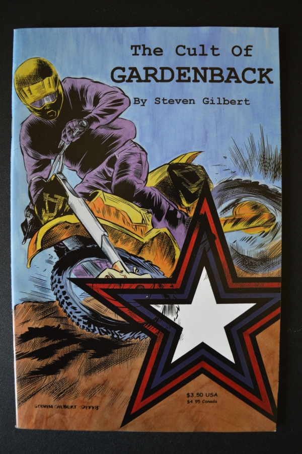
“The Cult of Gardenback”, April 1998
Between Gardenback and The Cult of Gardenback you published the first issue of Colville, right? It should be from 1997…
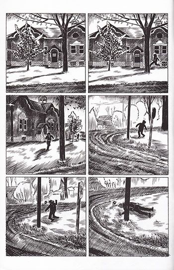
Yes, in the beginning it should have been much smaller, like 25 pages, and it had to be only about the confrontation in the schoolyard. It was loosely based on a true crime story, I clipped the newspaper article when it was happening because I remember reading it and thinking “It could be an interesting comic”. But those were just the bare bones, the story began to grow around the episode of the shooting in the schoolyard. I thought to do a 64-pages comic and I had the bones of the story and a lot of the imagery was in my head. I went up to Keswick, a small town 20 minutes up the highway from Newmarket where the facts actually occurred. My friend Jason Williams lived there, so he knew all the neighborhoods. We drove there one day and took photo references I used for the comic.
Do you use a lot of photo references, right?
Yes, these researches are part of my methodology, because I don’t write scripts…
Never?
I tried but I never successfully wrote one, when I finish and read a traditional script with panel descriptions, dialogues and so on, usually the ideas just seem stupid and I can’t use them. The only way I can make comics is to sit down and draw. My process of writing is the creation of the comic.
The 64 pages of the Colville comic book from 1997 are exactly the first pages of the 2015 book or you changed something?
Yes, the first 64 pages of the graphic novel are the same of the comic book, except for maybe one or two extremely tiny revisions of the artworks.
That comic book was really different from I Had a Dream. There is a new feeling in it, like the inspiration came more from the movies than from other comics or conspiracy theories. I can feel the mood of some American movies from the ’70s or the early ’80s, I think to Brian De Palma, Martin Scorsese or also David Lynch of Blue Velvet.
 I usually deny any influence and I don’t think for cartoonists is a good idea to look at cinematic references, because comics are their own thing. But, having said that, at that time I was a huge fan of David Lynch and of the Blue Velvet movie in particular, that was a small town perverted crime story. I was also a big fan of the Twin Peaks tv show and I can tell you a little trivia about that. I decided on the title Colville from the Canadian painter Alex Colville, even if there isn’t really any direct visual correlation to the comic, it was more about the mood and the atmosphere. But there is a scene in the Twin Peaks tv show where they’re describing the geography of where Twin Peaks is and – it’s been a long time since I watched it but the line of dialogue should say “In the North-East corner of Washington state right on the border with Montana and just below the Canadian border”. And for some reason, I decided to get out a map to look at what’s there and there is a town called Colville. You can look at a map, it isn’t a joke. This was after the Colville comic book was drawn, so I thought “Well, the force of the universe are working together…” (laughs). This is about the Lynchian influence, about Brian De Palma, well, I co-dedicated the graphic novel to Brian De Palma and Nick Cave, and the first is largely for the use of the tracking shot in his movies. I’m a bit of a sucker for tracking shots when I’m watching the movies… The second chapter of the book begins with the character recording with the video camera, so you can read the entire chapter as a long tracking shot, as if the camera never leaves.
Ok, we’ll say more about Colville later, when we’ll arrive to present days. Now I’d like to talk about your long pause if it isn’t a problem. In less than three years, from June 1995 to April 1998, you published 6 issues of I Had a Dream, Gardenback, the first issue of Colville and The Cult of Gardenback. Then between April 1998 and 2013…
Nothing!
Yes, exactly (laughs). Nothing until The Journal of the Main Street Secret Lodge came out in 2013. Fifteen years is a long break.
When I finished the 64 pages of the Colville comic book, I realized that there was room for a couple of more connections. Initially I saw Colville as a 64-pages story with completion and nothing more, but as I was maybe about two-third of the way through I started thinking about it as the first chapter of something larger. But I had also an attachment to the Gardenback comics and I got this idea I should rotate between the two and each year I would do one or the other. So I drew and self-published The Cult of Gardenback in 1998, it was a pretty quick process to draw a comic, then self-publish and sell it through Diamond…
Did you use Diamond since the first issue of I Had a Dream, right? And also Capital City Comics at the time.
Yes, at the beginning I was distributed also through Capital City but then Diamond swallowed everyone up. However, after The Cult of Gardenback was published, I started working at the second chapter of Colville. My plan was that my next book would be Colville #2. In the meantime I was working at a comic book store, The Comic Wizard here in Newmarket, just across the road from where we sit now. Yes, my whole life is in this corner basically (laughs)… As I was working there, the store changed ownership but I continued to work in the shop. The manager bought it in December of 1996 but the business was failing and the store wasn’t doing very well. He owned the store for a couple of years and he struggled to keep it alive. At a certain point I thought to buy the store but then I realized it wasn’t possible. So, I was going to be out of job and I had absolutely no marketable skills to work in the real world. The only thing I ever did at that point was selling comic books, so I decided to open my comic shop.
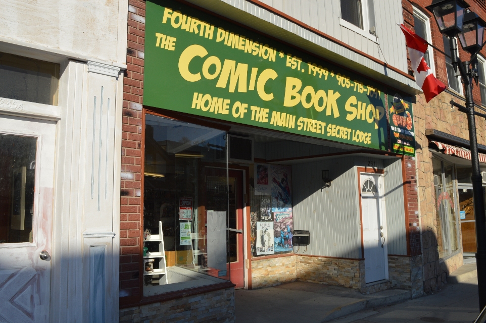
Fourth Dimension, Steven Gilbert’s comic shop
So, did you open Fourth Dimension after The Comic Wizard closed?
Well, it was basically at the same time. At one point it was clear that the comic shop was closing in two weeks, so I immediately signed a lease on my store and called distributors to set up accounts and everything. But the owner of The Comic Wizard attempted to keep things going and so there was actually a very weird time where I opened my store but he was still open trying to liquidate.
So, there were two comic shops? (laughs)
Yeah, within a block, in the same street. But one was closing and I was just getting things started… What happened with cartooning, well, I never worked that hard in my life, opening a business was just insane because I was doing it on my own. My plan was to put the comics aside for six months and then get back to them. But the store was so much hard work, at the end of the day I was exhausted and I couldn’t work on comics when I was at home. That period of six months turned in two years and then three, four, five… I remember pulling out those unfinished pages with the intention of completing the book but I looked at them with my pencil for twenty minutes without drawing a single line and then I put them away. And then a year would go by before I tried again. It happened in 1999, 2000, 2001 and continued for several years. I still did some drawings and caricatures of customers in the store purely for my own enjoyment, but not comics.
And landscapes? There are a lot of landscapes in The Journal of the Main Street Secret Lodge book, did you work at them in those years?
No, no landscapes. I don’t even know, they were mostly wasted drawings. At a certain point I remember having the realization “I’m not a cartoonist anymore, it’s a long time since I’ve done a comic”. But then, after some years, I did start drawing seriously again, when I invented the fanzine Journal of The Main Street Secret Lodge. It was about 2003 when I self-published one of them, just for fun, to give it to friends and customers. Maybe I photocopied a couple of them even before, they were a sort of merchant newsletters. I was interested in the historical side of Main Street, the buildings, and the atmosphere. I started to do it fairly regular, creating little stories about Captain Woodrow Gilbert and his adventures, following more or less the same formulary, usually bad guys coming in Newmarket to rob the bank and Woodrow going to fight and kill them. It was totally for my own amusement. They started to become more and more ambitious, I changed format, some were published like digest size, some had 24 pages, then 36, some 48…
How many of these zines did you publish?
I think I did five or six of them after the one of 2003. The last one was still photocopied but it had 84 pages and I took about a year to finish it. It had a ton of illustrations and a long hand-lettered short story. It was just pure insanity to do that and just photocopy. When one of my customers who used to write comics himself back in the ’80s read it, he came in the store and he gave me a three-pages letter that basically said “You’re an idiot for not doing comics because this is great but it’s not what you should be doing” (laughs). And I just laughed, because these zines were purely for my own self, I didn’t care about people reading it, I produced them only for my satisfaction, to do something creative. But I think at that point I did have the idea for The Journal of the Main Street Secret Lodge. Actually it was an idea that has been in my mind since while I was working on Colville, I thought at this western bank robbery story using Newmarket as the backdrop. And it sat there in my head for years. Then, it happened I found out that article on the website Comics Comics, probably I saw the link on another website I was on, because at the time I didn’t use so much the web, I never googled anything I guess (laughs).
A fanzine from 2003
So, did you know the Comics Comics website?
No, I had never seen that website before. The only thing I knew was that Comics Comics was a print publication, they did a couple of magazines I had in the store but sold out before I even read them. I didn’t know Frank Santoro was involved with them at all, I knew Santoro for his comics like Storeyville that I was a big fan of. However, I think I saw it on Heidi MacDonald’s page, The Comics Beat, there was this link saying something like “Frank Santoro at Comics Comics has an article about cartoonists from the ’90s gone”. I remember I had the mouse cursor over that on the screen thinking “If my name is on that list I’ll shit my pants”. And I clicked on it and I found “The guy who did Colville“. So, I thought “Shit, I’m on this list and that means someone remembers my comics”. And I just knew, it was like a light switch going off in my head saying “You’ve to do another comic book”. So, I immediately started working on The Journal of the Main Street Secret Lodge.
It was 2011, right?
I think so, I’m not so good at archiving things in my mind. However, I started drawing with the idea to do another photocopied zine. The previous one consisted of 21 pieces of paper put together, stapled and then folded to make 84 pages, plus the cover. I had to staple some zines three times and it really pissed me off. So I thought 84 pages were the limit and while working on the Journal I paid attention to the pages and as I got to 70, then 75, 80 and so on, I started worrying. And when I finally finished it and it was 130 pages, I showed the work to my friend Eddie and he told me “This has to be a book, it can’t be just some photocopy bullshit you put near the counter giving away to people who enter the shop”.
Did you think to propose it to a publisher or did you want to self-publish it from the beginning?
I never really thought about sending it to anyone, self-publishing was really my only idea at the time. I thought of something like print on demand or at a very small print run, because I was selling a hundred of the photocopied zines, so I thought I would need a hundred copies even this time. I did a lot of researches about print on demand but when I talked to some people at comics conventions everybody seemed not satisfied with the resulting product, they talked about problems with the binding, the glue and so on. While I was doing these researches on printing, I found somewhere the name of the printer I dealt with 15 years earlier and I thought for the first time to do a proper offset printing. I contacted the same guy I talked 15 years before but I found an old e-mail because somewhere along the line he changed printing company, but he was looking at this old e-mail once in a while and e-mailed me back. Well, I don’t know where I’m going with this answer…
Well, I think this is the point when you decided to do it in offset.
Yeah! (laughs). Well, I think a big fact was the affordability because printing in offset the minimum was typically a thousand copies, you know, it’s a bit more an investment doing that financially that a hundred print on demand copies. But I found out that the costs of print on demand were really high. It was 9 dollars per copy, plus 2 dollars to ship to Canada since it was a USA printer, so I had to pay 11 dollars per copy, plus the exchange rate while to do one thousand copies in offset I would need 2200 Canadian dollars. It was a really good deal. So, that was the point when I said “Ok, I’m going to print it, for real”.
“The Journal of the Main Street Secret Lodge”
That book won the Dough Wright Award for Best Spotlight Work, right?
Yes, things went a little bit crazy, because initially I was just selling it only on the counter here in the store. I had plans to go to TCAF the following year but I didn’t have any thoughts of submitting the book for consideration for Dough Wright Awards. Then a friend of mine, who lives in Winnipeg, had a copy of the book and told me there would be a Chester Brown signing there in a couple of days and I said him “Damn, I’d love to give Chester a copy of the book, but I couldn’t send you one in time” and he said “Well, I’ll give him my copy and you can send me another one”. So he gave a copy to Chester and he e-mailed me “Oh, Chester was so happy to hear you made a new comic”.
You already met Chester Brown at that point, I guess.
Yes, I knew Chester very formally and casually at signings and talked to him. He knew my comics from the ’90s too. I don’t know how many time passed but one day I had this phone call from Chester at the store and he was very complimentary about the comic. And he said he was on the nomination committee of the Dough Wright Awards and he asked me to submit The Journal sending five copies to the members of the committee. He even joked that he tried to buy some copies at The Beguiling in Toronto but they didn’t have it and they didn’t know how to get. I said “I know how to get copies, I’ve boxes full of them” (laughs).
So at that point you hadn’t even sent copies to The Beguiling.
No, I actually called Peter of The Beguiling right after that and I asked if he wanted some copies and he said “Yes”. When the nominations for the Dough Wright Awards came out, it was 2014, my name was on the list with some pretty awesome cartoonists. And it was very very weird to me, there was a lot of disbelief that I had my name written down with those other cartoonists. Well, you know, the Dough Wright Awards people invite you to the party at TCAF because you’re nominated and I said “Well, it would be probably bad form to not be there when you’re nominated and you’re exhibiting at the show”. And they reserve seats for you like in the front row in a sort of VIP section, but even on the day of the awards I wanted to seat in the back because I figured that it could be an easy escape afterwards. We went there with Stacey but we sat midway, we didn’t sit in the VIP section, I didn’t feel it was appropriate for whatever reason…
You found a compromise…
Yeah yeah, midway back. Then, it seemed pretty surreal to me what was going on. The category I was nominated for, there were four other cartoonists that I think they are amazing, there were Dakota McFadzean, Connor Willumsen and… Oh man, I’m drawing a blank on…
But the category Best Spotlight Work was for young cartoonists, right? (laughs)
Yes, it was for upcoming cartoonists, which was a little bit of a joke, I found it was kinda funny. But if you watch the page of the awards, there is no age specify, the category is for emerging cartoonists but they don’t have to be young. I don’t’ really have any nerves about this nomination until I was there, then it was really terrible. In the days before the awards, Stacey looked at me and told me “You’re gonna win” but this seemed totally impossible to me. But she knew it.
The award didn’t change your style, because after that you worked on and finished the Colville book but you didn’t think to propose it to some publisher, right?
Well, not to digress back, but after the Colville comic book in 1997, I sent copies to Seth and Chester Brown, and Seth mailed me a little postcard where he wrote “You should send this to Chris Oliveros at Drawn and Quarterly, I think he’d like to see this”. So I sent a copy to Chris Oliveros and he wrote back saying he saw some merit in it, asking me to keep him informed on my future projects. Of course, right after that I stopped making comics for a long time. But Drawn and Quarterly is probably my favorite publisher of comics and I felt like they were beyond what I thought of my own stuff. Part of me feels like my comics aren’t good enough to be published by the publishers I like…
Do you really think this?
Probably yes, you know, I like Drawn & Quarterly, I like Fantagraphics, I like Conundrum, I like Koyama Press and maybe in a few days at TCAF I’ll give them some copies of the books, I don’t know… I know some of the people know who I am but I’ve never sent a submission. Maybe I can do that with the next Journal, probably I would like to see my comics having wider distribution. I got some ego and I’d like to see a few more people having access to my books easier than finding my e-mail at the bottom of a review. But I also like self-publishing because it’s entirely my own creation, I don’t have to change anything for anybody that I don’t want to change, every single line can be whatever the line that I want to be. I’m grateful also that both Colville and The Journal have broken even, they sold enough copies through the store, TCAF and a handful of locations to cover the costs of printing. And in some way that was my goal, when I did The Journal I thought “If someday I can break even of the printing price, I can consider it commercially successful”.
Very small ambitions (laughs)…
I mean, I never submitted my new books to Diamond Comics for distribution, maybe it’s the fear of possible rejection, that Diamond could say “We don’t think this is good enough to carry”…
Well, you don’t have to care about Diamond’s opinion!
But Diamond represents a huge avenue in the comics stores in North America and around the world, every English language comic store is ordering from Diamond. I mean, I don’t really care about an aesthetic judgment from Diamond… Well, I’ll get around to it, I have the contact information, so at some point I think I’ll do it.
Speaking of The Journal of the Main Street Secret Lodge, the main character is Captain Woodrow Gilbert. Is he based on a real person?
At this point, he totally exists in my head. In full disclosure, the character is completely stolen from this tv miniseries with Tommy Lee Jones and Robert Duvall called Lonesome Dove. It’s a western, and probably it’s the best western I’ve ever seen. It is based on a novel of the same name by Larry McMurtry. In Lonesome Dove, the main character is a cowboy, a former Texas ranger named Captain Woodrow F. Call. The characters go from Mexico to Montana to establish a ranch and all the story is about this giant cattle drive. When I saw this movie, I used to joke with my friend who is now in Winnipeg, James, saying that I would close my store to go in Mexico, rustle five thousand cattle and make my way up to Montana. The two characters in Lonesome Dove are Woodrow and his friend Augustus and I thought the only thing keeping me to go in this cattle run is I don’t know if I’m Woodrow or Augustus. James looked at me one day, like if he was considering the question, and he said “You’re Woodrow”. So I developed this odd idea that I had a distant relative who was this former Texas ranger who had been on a cattle drive and at some point in his old age moved from Montana to Newmarket operating in The Northern American Hotel on Main Street. And he became the character I wrote this Journal story about. The idea of the character is totally taken from Lonesome Dove but I feel like if I made it into something different.
The book includes this main story with Woodrow but also a lot of landscapes, a hand-written text about hotel robberies, women portraits by William Bobo…
Well, I try to satisfy all interests…
Yes, there is a bit of everything. But do you think the real main character is Newmarket?
I think so, and even more as time is going on, I feel like a big part of doing The Journal is drawing the town. There is much more emphasis on this in the second book I’m working on, it’ll be a real travelogue, a visual representation of so much more of the town. It’s a 250-page comic and about 150 pages of it are just touring the town, there are a lot of scenery from real references of Newmarket.
Did you search for actual references to depict Newmarket in the past?
I have tons of reference material of the history of the town and a lot of visual representations. Being a life-long resident, it was very easy to understand what this journey through the town would be. I could sit, close my eyes and know exactly every corner, every location. It isn’t hard to find the locations since I live here, I can go and photograph if I need something, it’s pretty easy to do.
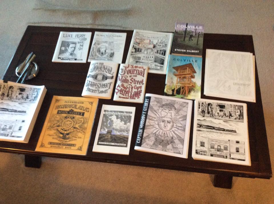
Zines and comics by Steven Gilbert
Ok, let’s talk more about the Colville book. I think the story is really more impressive read as a whole because the reiteration of the key scene is very important and gives power to the entire work. This wasn’t an idea from the first comic book, right?
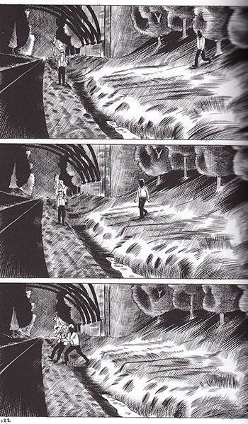
When I had the idea of developing a follow-up to the first comic book I hadn’t any clue visually on how I could connect the story more directly. There was a point in those first 64 pages, when I introduced the Paul Bernardo character, that was a very disturbing thing to do, because he is a real person, he was actually a serial killer and serial rapist in the Toronto area in the early ’90s. His favorite tool was the video camera and when I decided he would play a bigger role in the second and in the third chapter, I had this idea of replaying the crime, so it just seemed the right thing to use this guy in the bushes recording. He really used to do stuff like that, following people, recording them and so on. Colville is a story in three sections but originally I was working on another section, a whole chapter following the police officers who investigate. I actually drew about 25 pages and then scrapped them because they were getting away from the visual replay of that crime. Once I drew them for the second time, they became like in the movie Rashomon, where they replay the same crime from four different perspectives. So at that point it was something that immediately suggested itself as a way of spinning the plot line out in the other characters.
Yes, it’s interesting because this works as a connection between different stories and this makes me think the main character is still the town, Colville, as Newmarket was in The Journal.
Well, I put a lot of effort into making the environment a part of the story, I like stories about a specific region, where you’re finding enough about the characters but you’re also seeing the landscapes, the geography and so on.
And it’s not only about the city but also about the “town criminal organization”, as is the title of the book sent by David’s girlfriend along with his adaptation of Twilight of Superheroes, a never-published comic by Alan Moore…
Well, I call it the Watchmen‘s ending…
In fact it’s very similar and I wanted to ask you about this. Did you want to insert a sort of quotation or to literally reply the Watchmen‘s final scene?
I wasn’t consciously thinking of it as a direct reference, there was a period like years ago, back in the 90’s, when I used to fantasize about the ending of the comic, and I knew there would be this scene where the girl Tracy mails the artwork to me. Initially, I thought about doing that the kid had drawn a mini-comic about this criminal activity, then I thought there would be no book because I wanted to draw this scene in the post office but it should be difficult to take some photo references inside a post office…
And so you used the mail box…
Yes, I thought “I can do it without drawing a post office”. The title of the book, Nomenclature of a Small Town Criminal Organization, was a little bit of a note to my JFK’s days, there was a self-published book I purchased, it was just a photocopied book that you can order through mail, it was called Nomenclature of an Assassination Cabal and I’ve always said “That’s a fucking awesome title”. And so this little idea of this Nomenclature of a Small Town Criminal Organization was a little detail I had in my mind for ten or fifteen years. But definitely as I was drawing it I thought “This is kinda Watchmen‘s ending”.
And this nomenclature is also in the book, page after page the reader is meeting more wicked criminals, so we’ve David, Van, Alan Gold and then Paul, who is the scary guy… Did you imagine it like a sort of crescendo?
I hadn’t the idea of an escalation, no… But I think one of the reasons I didn’t do the book for so long was that I was very uncomfortable with what I decided the ending was gonna be. Originally I decided to draw ten pages of Paul Bernardo in the basement with the girl but I didn’t feel like I had whatever I needed to draw how awful those ten pages were, so I kinda rejected to finish it for a long time. It’s a horrible subject matter.
But you had decided this subject matter had to be in the book.
It’s funny because I could have changed this to do something different but once I decided some years ago that this was the ending, there was no changing option to me.
This could be another reason because you stopped making comics…
You know, opening the store is a big part of it but probably I also felt like I just didn’t have whatever I needed to draw those pages, it was a pretty sickening material to me. I read some books about Paul Bernardo so I knew how horrific the crimes were, so when I came to interpret them fictionally in the comic, to make this character of the girl as a victim of Bernardo, I knew it wouldn’t be pleasant to draw. I didn’t want it to be titillating or exciting, I wanted it to be horrible. And I felt horrible drawing it and I talked to people who felt pretty horrible reading it, so I suppose it was successful if it’s possible to say this.
Finishing the book was a sort of liberation?
I’m glad that I’m done with it and I don’t really have any interest in doing that kind of story again. To me, The Main Street Journal stories have extremely gruesome violence but in the meantime there is a sense of fun and play to them, there isn’t any level of seriousness for the most part.
Yes, and even the drawings are very different, Colville is more realistic.
Well, I think Colville is the best I’ve ever drawn. I’m also very pleased about some pages of the next Main Street Journal but I don’t think I’ll ever put the kind of work I put into Colville into anything else.
I suppose the pages from Colville needed more time than those from The Journal, the cross-hatching is very detailed, especially in the second and third part. And the cross-hatching is a sort of trademark for you.
The Colville pages were drawn much larger for the most part and yes, they took forever. As for the cross-hatching, well, I wouldn’t recommend it to anybody. I think sometimes comic books’ artists put a lot of lines on the page to disguise the fact they can’t draw. But I figure any bad drawing in my comics is there for anyone to see. There is no intention to disguise bad drawings, I’m using the cross-hatching more to create a kind of mood. I think in my earlier comics this was more stylized, then it became more realistic and now I’m going back to a sort of stylized in the next one. I’m going to print in gray tones, drawing in separate black and white layers, a little bit different from the past. It’s hopefully a positive progression, even if I’m sure the next book I’ll do after the new Journal will be the most massively cross-hatching thing I’ve ever done.
So, you’re going back and forth, I guess.
Yeah, I think so (laughs).
Steven Gilbert in his comic shop
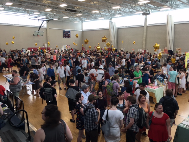
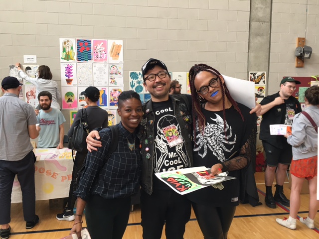
Pics & Words from CAKE 2016
by Corinne Halbert*

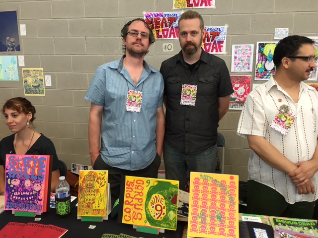
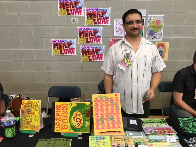
CAKE 2016 was a huge success and a ton of fun, here are some highlights from the 5th installment of the Chicago Alternative Comics Expo.
Chester Brown was signing books and celebrating his newest Graphic Novel Mary Wept Over the Feet of Jesus at the Drawn and Quarterly Table. Leslie Stein and Paco Roca were at the Fantagraphics table. John Pham and Sammy Harkham were slinging the fantastic Kramers Ergot #9 as well as several gorgeous books by Pham. Gabby Schulz was at the Secret Acres table signing his new gut wrenching and exquisitely rendered Graphic Novel Sick. Sacha Mardou and Ted May were at Alternative Press/Revival House Press table. Sadly Trina Robbins had to cancel her appearance due to health issues but Scottish Cartoonist Eddie Campbell, creator of From Hell was able to make a guest appearance and fill in for her panel. Ed Luce of Wuvable Oaf had so many fantastic publications. Krystal DiFronzo created the artwork for CAKE 2016 and had beautiful books available at her table with the amazingly talented Lale Westvind tabling right next to her.
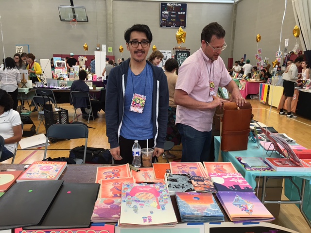
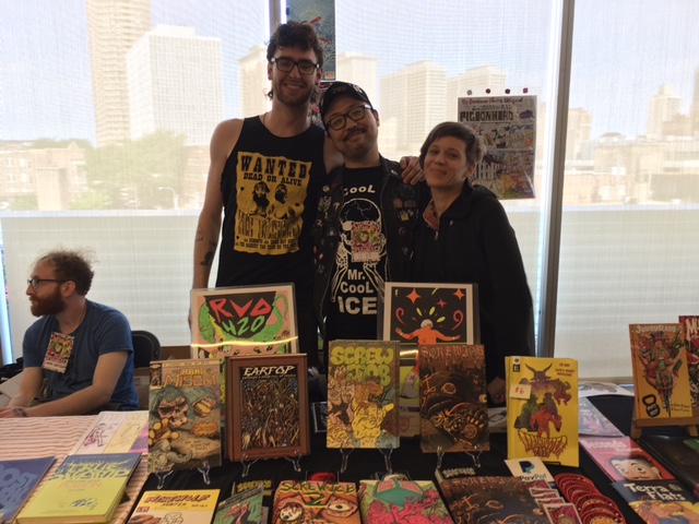
John Pham at Kramers Ergot Table
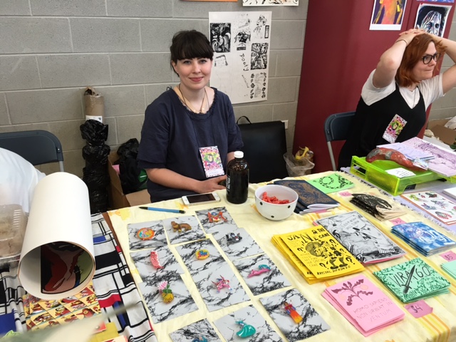
Krystal DiFronzo
Lale Westvind
Quimby’s, the legendary Chicago bookstore, celebrated their upcoming 25th anniversary with a panel discussion with Liz Mason, Gabby Schulz and Laura Park moderated by Jake Austen. Chris Gooch and Sarah McNeil from Melbourne Australia were the CHIPRC inbound TRANSIT artists in residence. Sparkplug Books celebrated 14 years of excellent publications and Cathy G. Johnson lead a roundtable discussion about journal comics.
There were so many great small publication debuts this year at CAKE. Jon Drawdoer had his comic hello, Anya Davidson with her gorgeous comic Gloom Planet risographed by Perfectly Acceptable Press, Lisa Hanawalt with her book Hot Dog Taste Test, Lane Milburn with Broken Panels #1 , Victus #4 by Tyrell Cannon, Bad Dog!!/Good Kitty! by Mike Freiheit and Isabella Rotman, Coin-Op #6 by Peter and Maira Hoey to name a few. A more extensive list can be found here. There were even more debuts than the 30 listed as I know there were artists working up till the last minute to finish up their books.
Jon Drawdoer
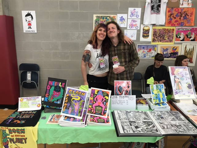
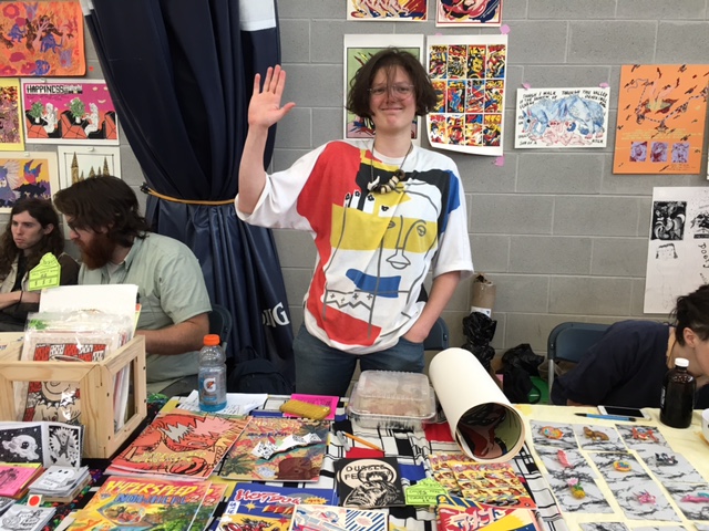
Anya Davidson and Lane Milburn
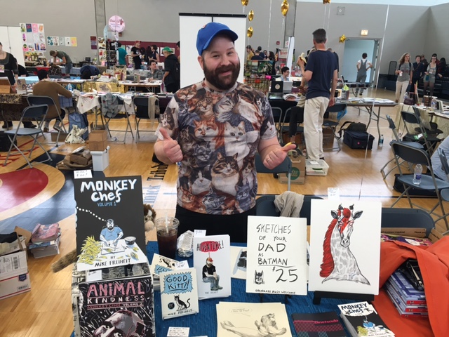
Mike Freiheit

Coin-Op
To mention a few Chicago staples Trubble Club was there debuting their amazing Nate Beaty themed comic Tiger Beaty. Prolific illustrator and comics artist JB Roe was representing Chicago but hanging with the incredibly cool Providence publishers Hidden Fortress Press. Dynamite illustrator and comic’s creator Johnny Sampson had his killer debut Total Fuck Up. Onsmith and Nudd were stirring up trouble as usual and Laura Park had her gorgeous debut Do Not Disturb My Waking Dream #5.
JB Roe and friends
Hidden Fortress Press
Onsmith, Nudd and Chris Cilla
Chris Cilla
Spudnik Press was slinging fabulous publications as usual and Tan and Loose Press had some sexy ass prints for sale. Keith Herzik creator of Alamo Igloo had incredible hand-screen printed books and posters available and Eddy Rivera had his sexy anthology zine Puddin #3 on debut. Scott and Keiler Roberts, Brad Rohloff, Chloe Perkis, Grant Reynolds, Brett Manning, The Ladydrawers, Odin Cabal, Jonathan Bell Wolfe, Cathy Hannah, Gina Wynbrandt, Kevin Budnik, Chris Cilla, Math-you-Land-vote, Jessica Campbell, Danielle Chanette, Josh Cotter, Henry Guerra, Amy Peltz, Tony Breed, Radiator Comics, RJ Casey of Yeti Press, Dave Scheidt, Scott R. Miller, Ian McDuffie, Matt Davis of Perfectly Acceptable Press and Kelsey Choo were all there with beautiful books to list some more.
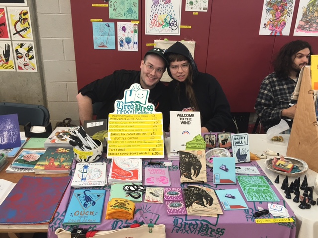
Brad Rohloff of Bred Press and Chloe Perkis
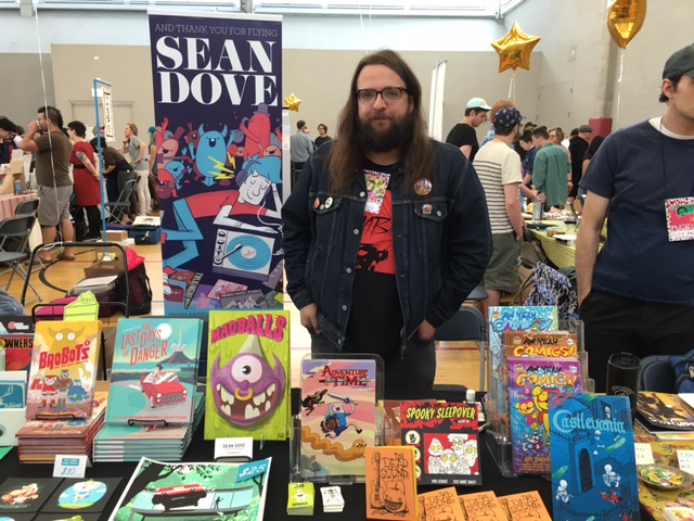
Dave Scheidt
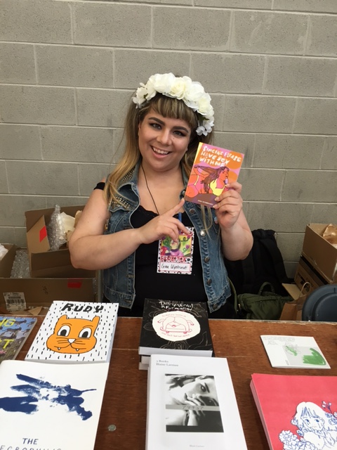
Gina Wynbrandt
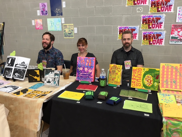
Grant Reynolds, Hannah Chavez and Onsmith
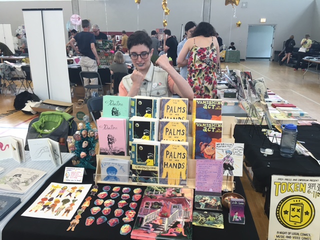
J.D. Lee
Jessica Campbell at Koyama Press table
Jon Drawdoer and Jonathan Bell Wolfe
Keith Herzik and Gina Herzik
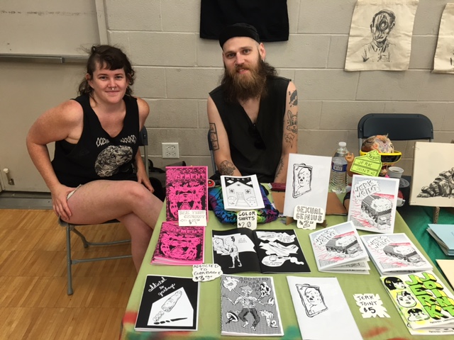
Math-you Land-vote
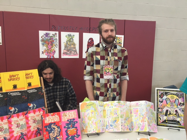
Matt Davis (Perfectly Acceptable Press)
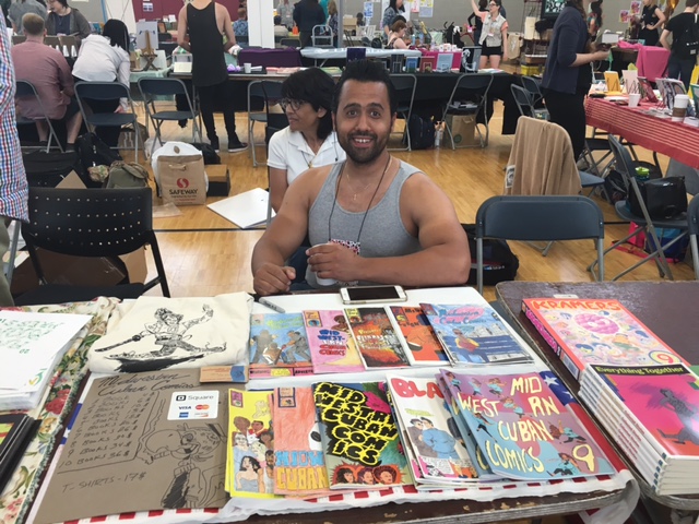
Odin Cabal
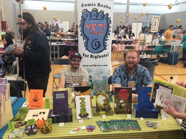
RJ Casey (Yeti Press)
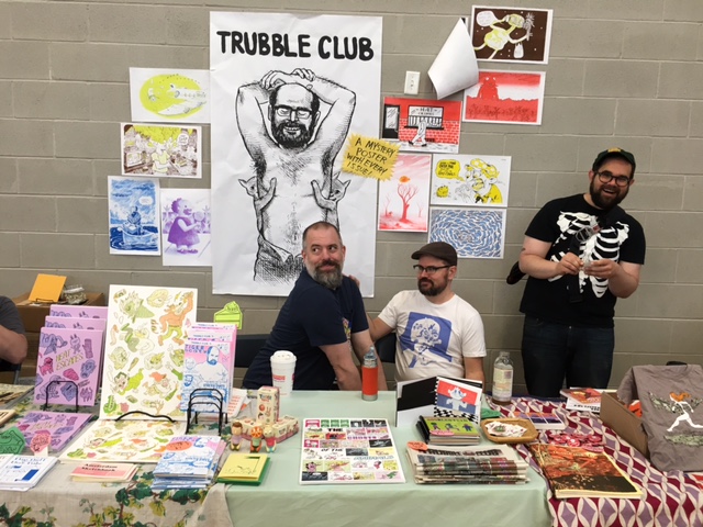
Trubble Club
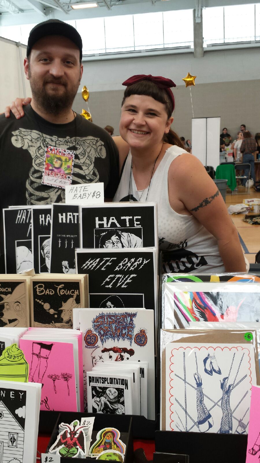
Scott R. Miller and Corinne Halbert
I’d like to take a moment to mention some of the current core organizers of CAKE. Jeff Zwirek, Neil Brideau, Max Morris, Ben Bertin and Alli Alleman. Without their tireless efforts and undying commitment to the alternative comics community in Chicago CAKE wouldn’t be possible. They are all wonderful, generous and devoted people and their continued support of artists both local and from all around the world should be recognized and celebrated.
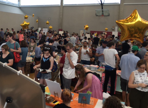
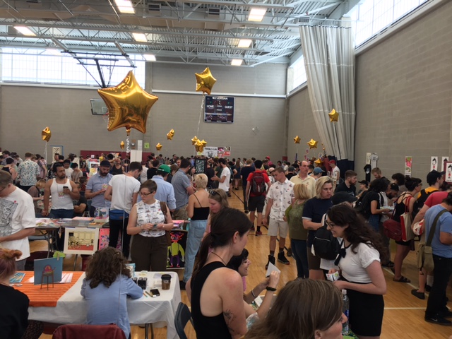
In addition to support the core organizers are the other kick-ass CAKE coordinators Jessica Campbell, Brian Cremins, Mike Freiheit, Amy Peltz, Chris Lopez, Matthew Brady, Isabella Rotman, Henry Guerra, KT Hawbaker-Krohn, Marnie Galloway, Jon Mastantuono. There were too many talented artists to list them all! Thanks to everyone who made it out to CAKE 2016, I hope to see you all in 2017!
*Corinne Halbert is one of CAKE coordinators and exhibited at the show with her mini-comics Honey, Hate Baby and Bad Touch (the latter in collaboration with Scott R. Miller). Below Corinne at her table and her haul at the festival.
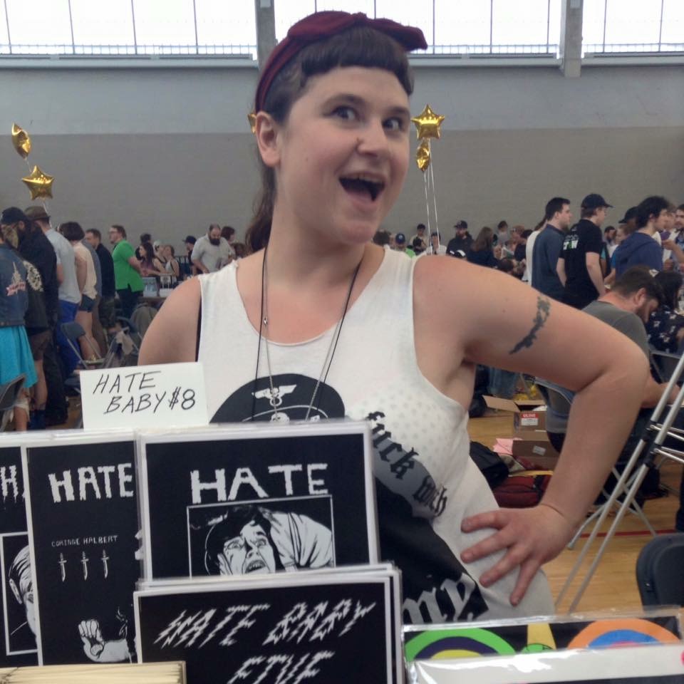
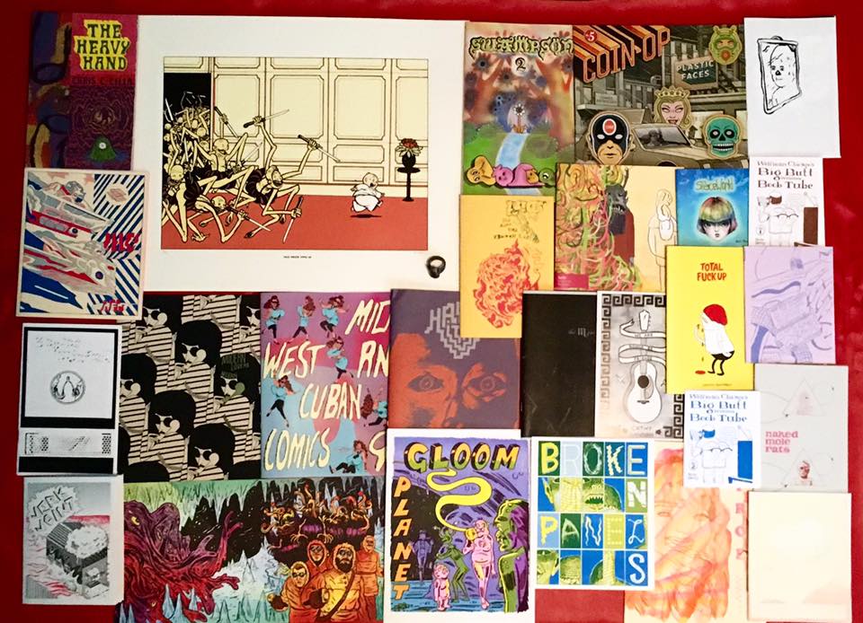
“The Dim Reverberation of the Chaosholder”
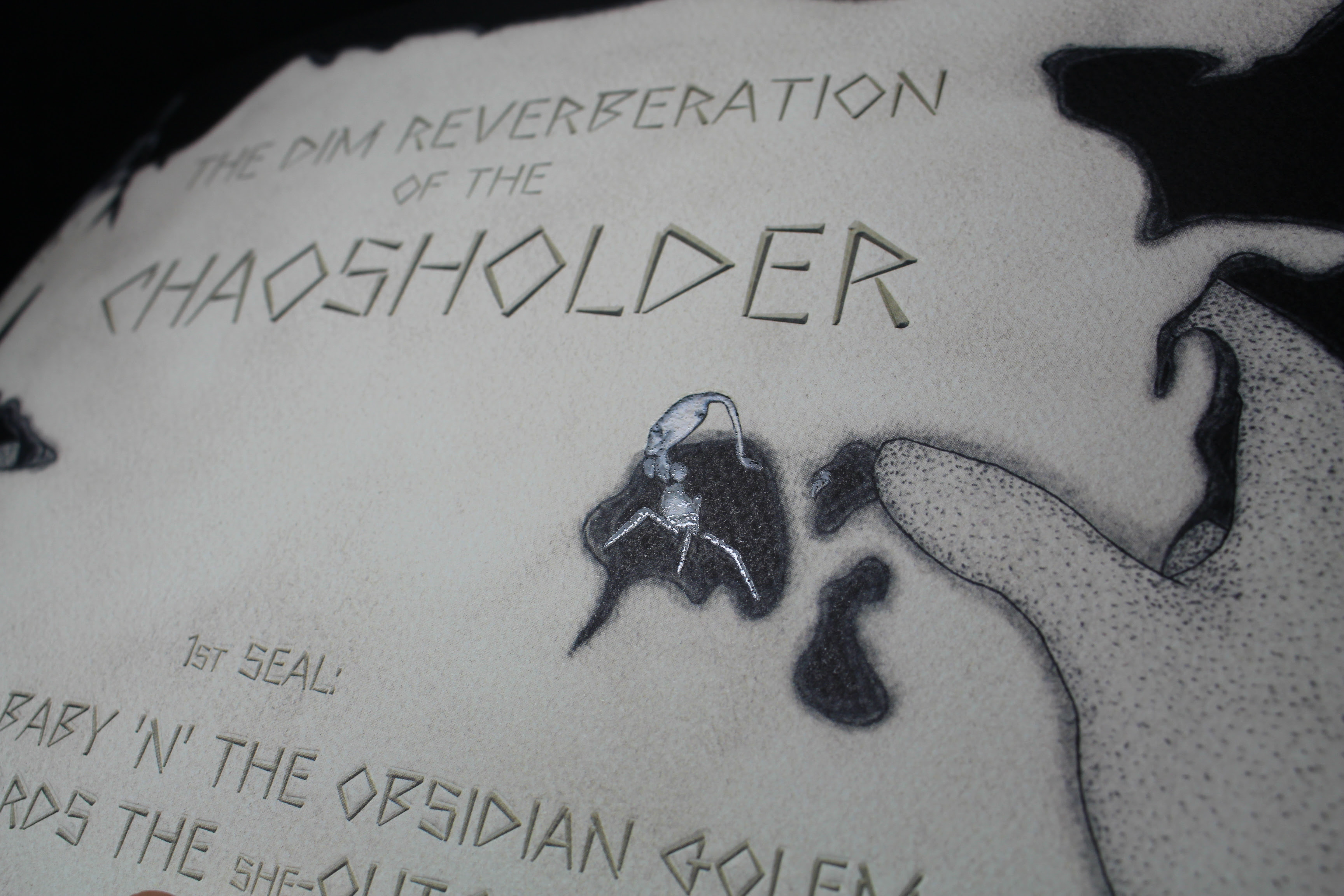
by Arallū, Hollow Press, January 2016, stapled, 32 pages, 34 x 24 cm, 17 euros

After Largemouths by Gabriel Delmas, a wordless opus of nearly 700 pages, Italian publisher Hollow Press tries a new editorial challenge with an eight-part saga created by an obscure artist, known only as Arallū. The first “seal” of The Dim Reverberation of the Chaosholder came out last January under the heading A Crippled Baby ‘n’ the Obsidian Golem, Towards the She-Outcast, confirming the inclination for long titles already highlighted by Under Dark Weird Fantasy Grounds anthology.
Note: The book is on sale, like other Hollow Press titles, in the Just Indie Comics online store. I’ve also collaborated with the publisher for Paolo Massagli’s Toxic Psycho Killer.
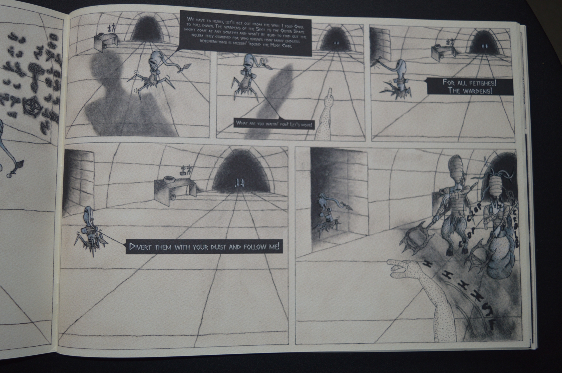
Presented by the publisher as a “dungeon crawler comic”, The Dim Reverberation of the Chaosholder is an alienating trip in an underground and diverse reality. This effect of claustrophobic derangement is achieved by Arallū through two basic narrative stratagems. The first and most obvious is the use of first-person perspective, similar to that of some shooter or fantasy videogames, which makes the reader one with the main character, the Obsidian Golem. The second is represented by the obsessive monologues of N’tar, a long-winded little monster who leads the Golem in the tunnels of the dungeon, carrying out the task assigned to him by the mysterious Hasabbāh. The reader is involved in a totally immersive experience, so that while turning the pages he can almost breathe the dust and humidity of the underground setting. He is essentially in the same situation of the protagonist, still silent, passive, able only to follow N’tar and to listen to his thick litany, full of singular words and of references to events yet undefined but probably essential for the development of the plot. The most intriguing seems the “Disorder”, an expression probably indicating an apocalyptic event of the past.
Arallū doesn’t dwell on explanations but he takes us immediately in his universe, full of connections to mythologies certainly unusual compared to the common background of mainstream comics, as he looks to the East using Persian, Armenian, Turkish or Babylonian terms deliberately mangled: a good example is Hasabbāh, whose name is a crasis of Hassan-i Sabbah, head of the sect of the Assassins formed in Persia in the late 11th century and frequently quoted by William Burroughs. However, these elements aren’t enough to get an accurate connotation of the era and even of the world in which the story is set. But we know this is such a retrograde and dark reality that people are measuring the passage of time according to the regeneration of the wounds they inflict on themselves.

The Dim Reverberation strikes not only for the story – full of text, intricated and intriguing – but also for the ability to join the Hollow Press vein, helping to give strength and cohesion to the catalog of Michele Nitri’s imprint. Here we find particular points in common with the work of Mat Brinkman and Miguel Angel Martin, the first for all his works but in particular for Multiforce – set in an underground world all of its own, although depicted with a more ironic and less solemn approach – the second for the story serialized in the Under Dark Weird Fantasy Grounds anthology, especially for the sexual subtext also present here with allusions to “fetishes” and “excitations of the anomaly”.
Original, almost alien in the context of today’s indie and underground comics, the book confirms its singularity in the package. Stapled, in a horizontal format of 24 x 34 cm, it is in fact characterized by a high-quality 200 grams tintoretto paper and by the use of a translucent paint that enhances some details for every of the 32 pages of the book. The cover with the flaps is just another element that gives a truly remarkable elegance to the whole object. Inside the graphical approach is disturbing in drawing obsessively the desolate landscape of the dungeon and its weird inhabitants. If some details, especially in the anatomy of the characters, are a little rough, the artist takes more and more confidence page after page, managing to build a style still basic but pleasantly unmistakable that culminates in the final scene, where the Obsidian Golem and N’tar meet the She-Outcast. Even the double-page reproduction of the Adwicked’s Creek is particularly successful and reminds Most Ancient’s Scaffold, a comic that for the mood and the nearly abstract drawings has some points of contact with The Dim Reverberation.
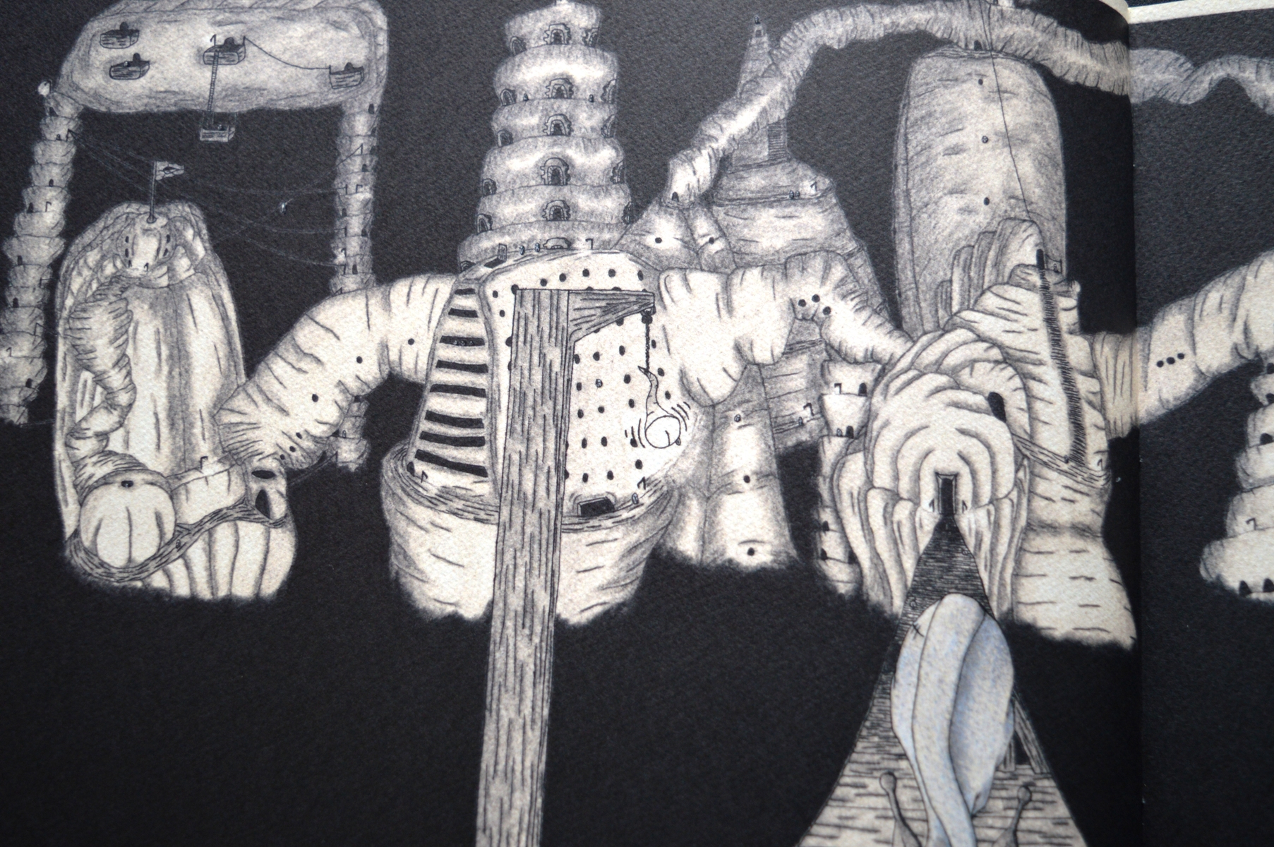
As for other Hollow Press titles, the comic is published in English but this time there is an Italian and a Japanese translation included to give it a widespread distribution. And a huge diffusion would be really deserved, for courage, originality and ability to fit into an increasingly dense catalog, which now includes also three new books: Crystal Bone Drive by Tetsunori Tawaraya, Fobo by Gabriel Delmas and Tract by Shintaro Kago, debuting at the Toronto Comic Arts Festival next 14-15 May at the presence of both the artist and the publisher.