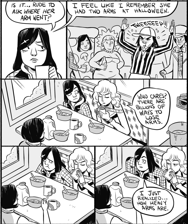
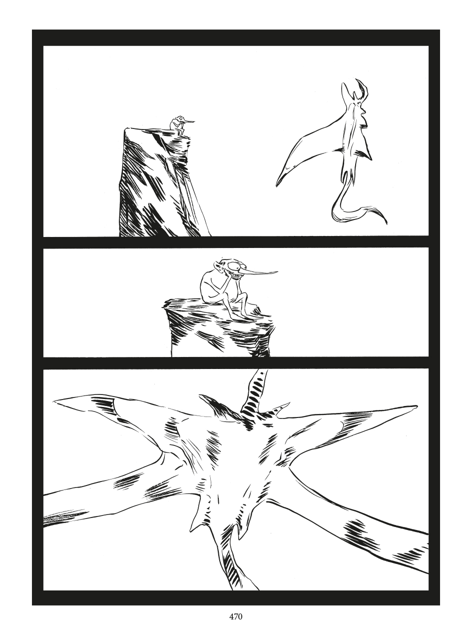
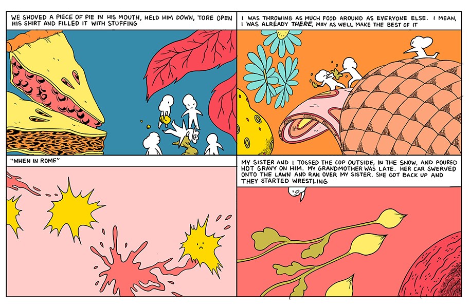
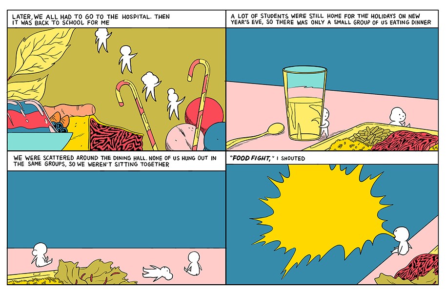
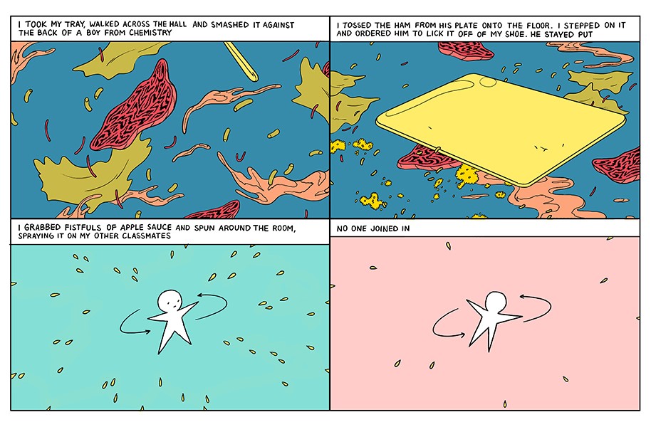
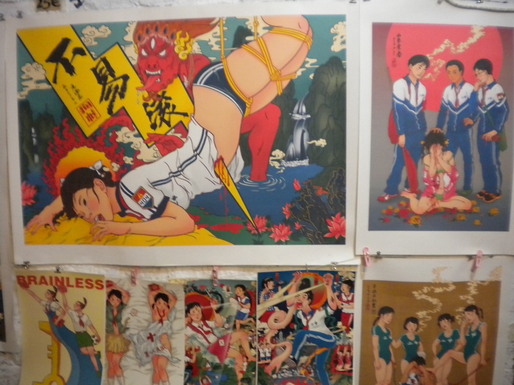
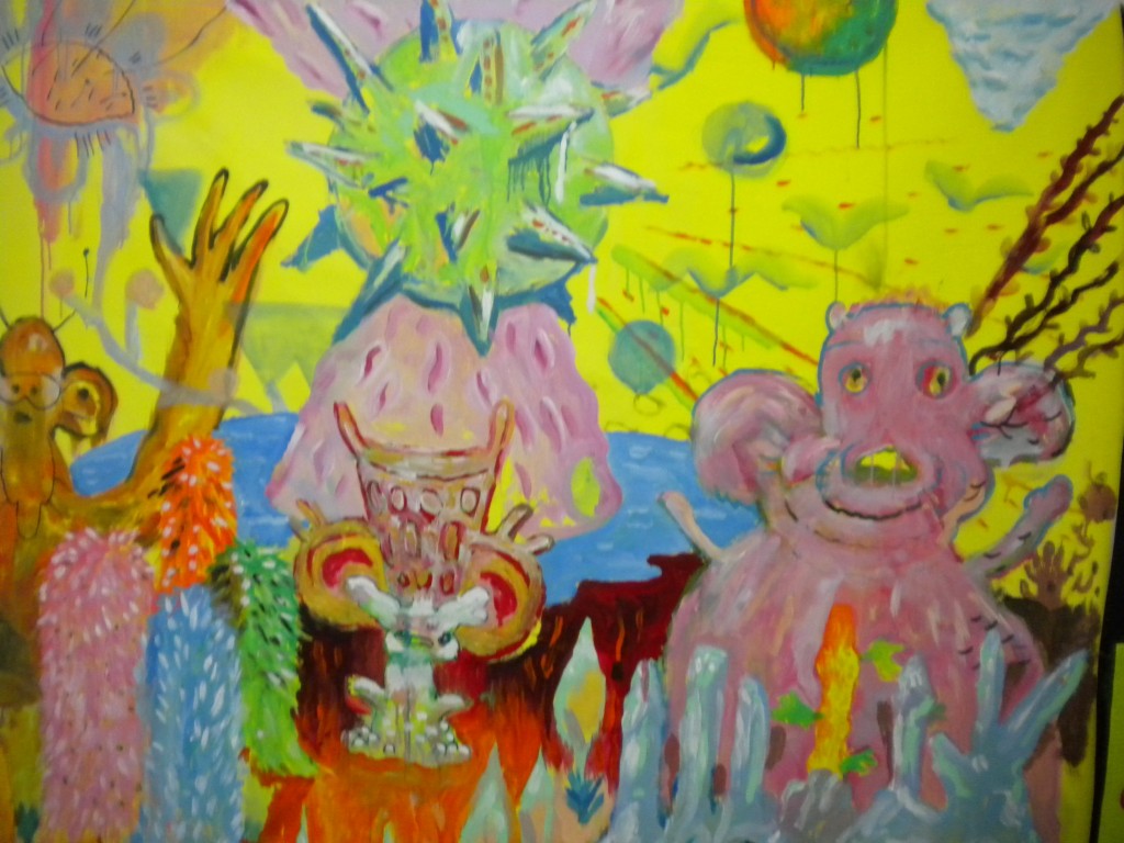
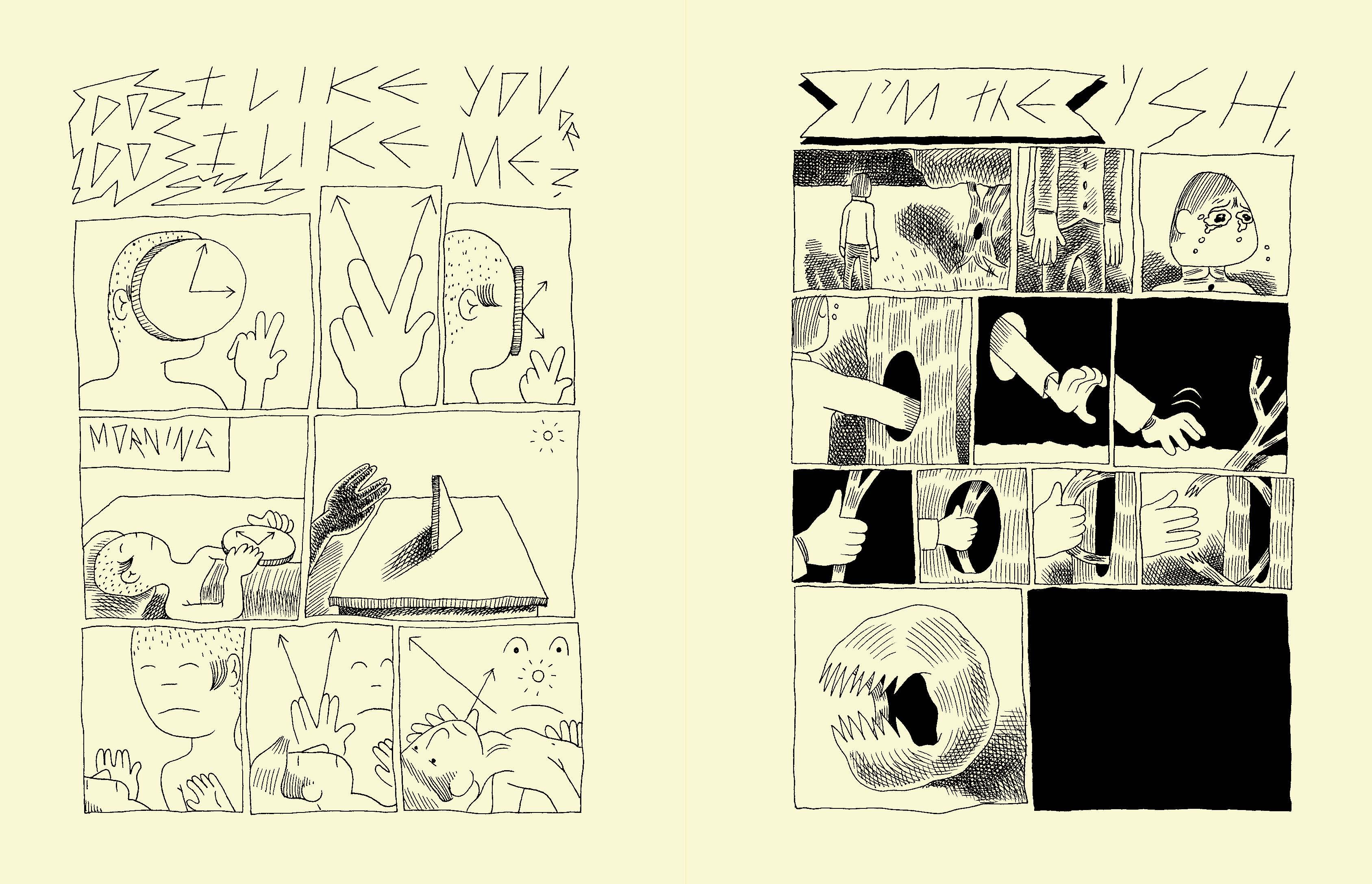
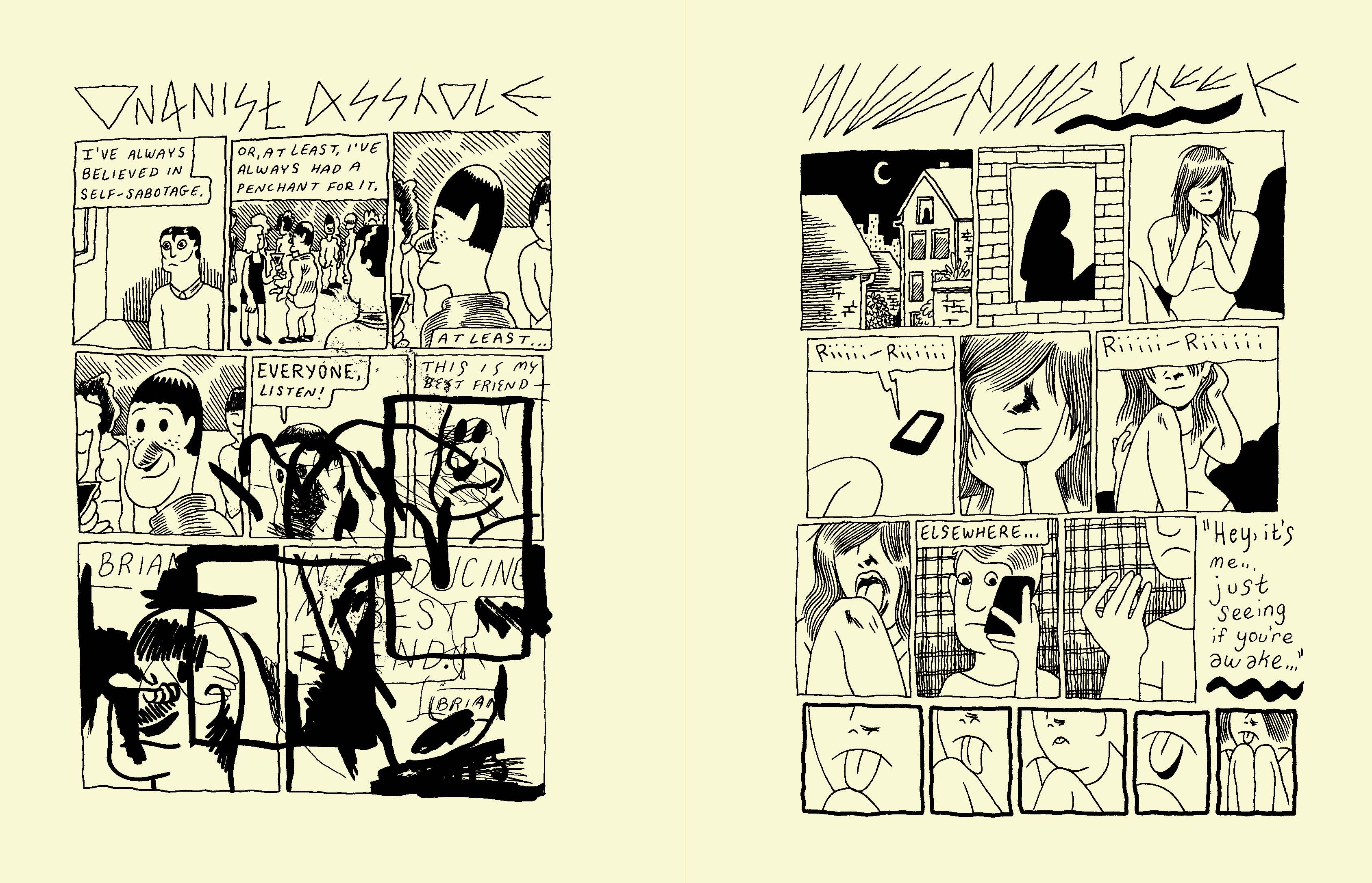
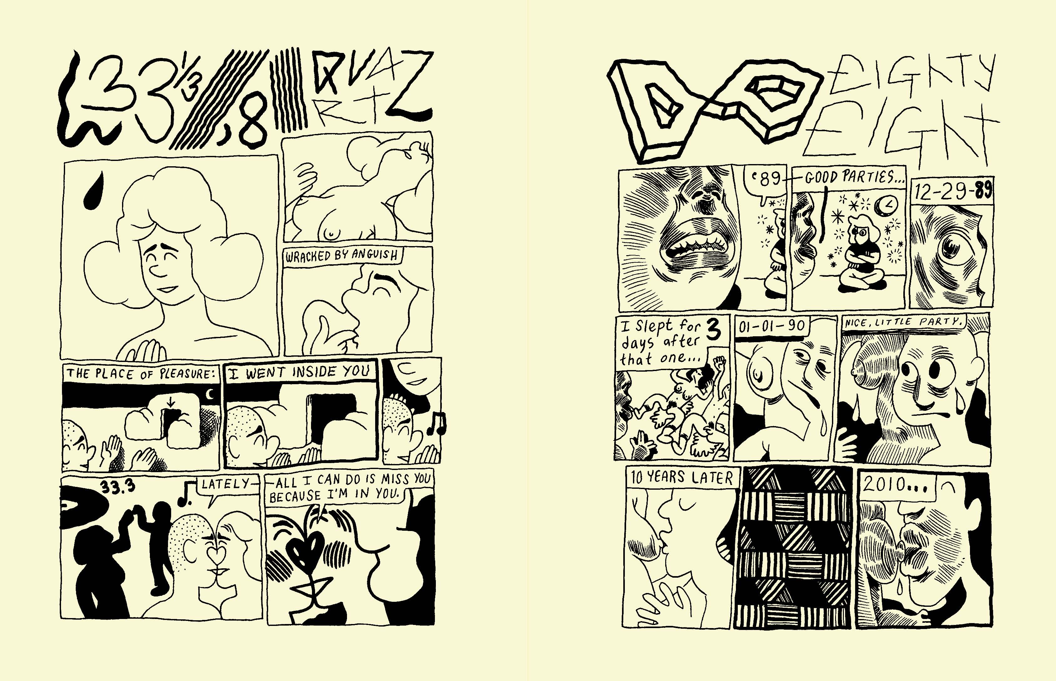
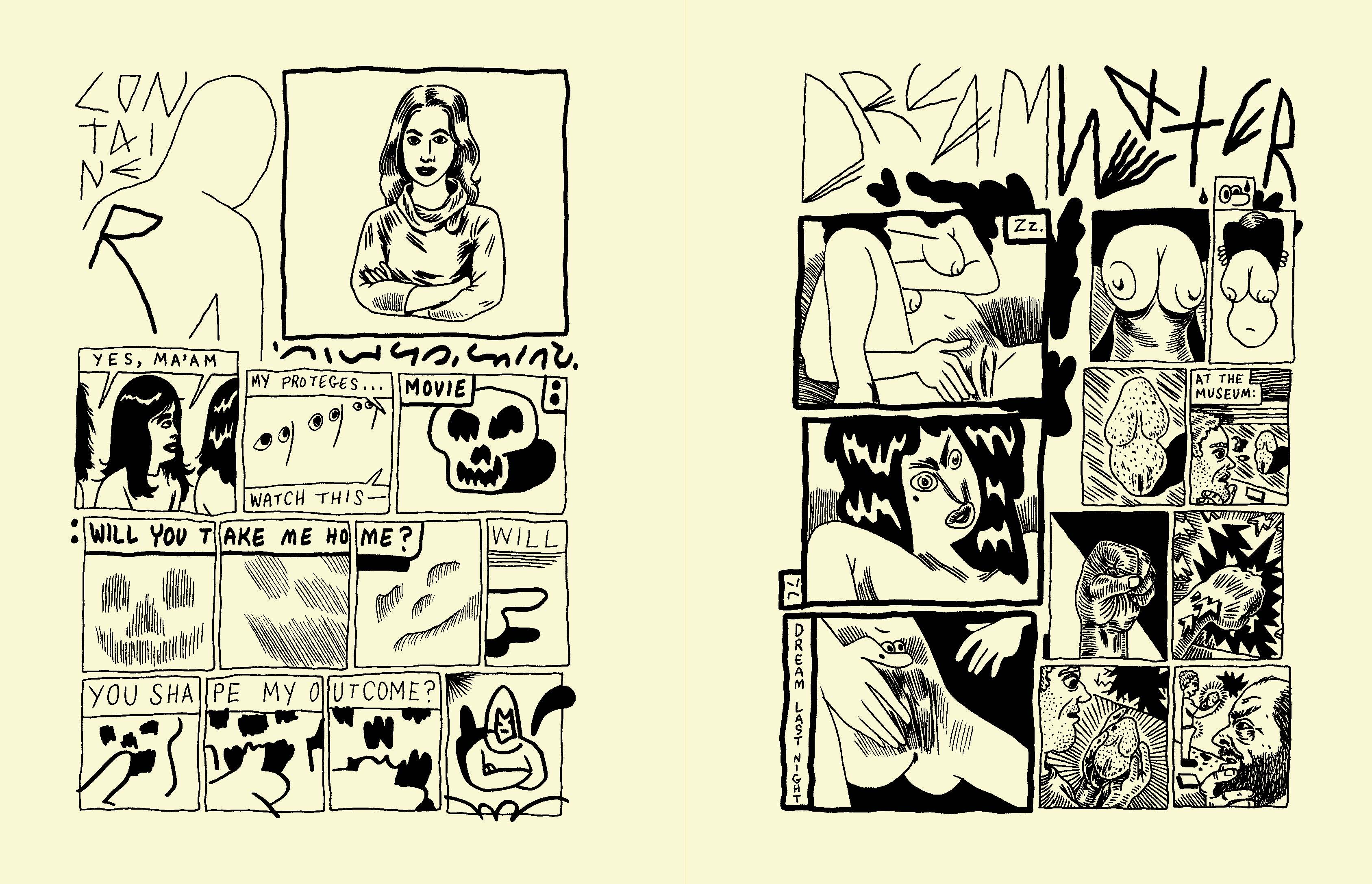
“Irene” #6 preview
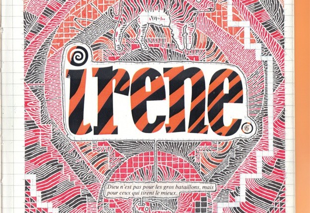
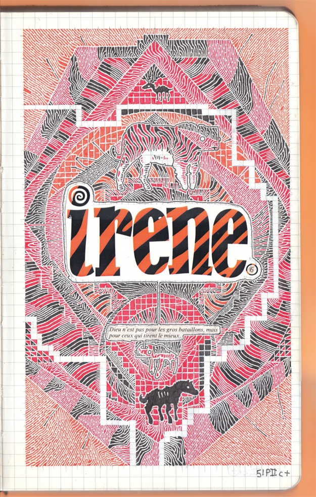
The newest issue of Irene anthology will debut this weekend at Small Press Expo in Bethesda, Maryland. This is undoubtedly the biggest Irene yet, with 216 pages and contributors based in every continent on the planet Earth, even Antarctica. Contributors include: Marc Bell, Lucy Bellwood, Nick Cartwright, Marta Chudolinska, d.w., Jai Granofsky, Leif Goldberg, Luke Howard, Ben Juers, Sean Knickerbocker, Dakota McFadzean, Lena Merhej, No Tan Parecidos, Carolyn Nowak, Katie Parrish, Ben Passmore, Jackie Roche, Shennawy, Frøydis Sollid Simonsen, Kevin Uehlein, Tillie Walden, Andy Warner, and Natsuko Yoshino. Irene is edited by Andy Warner, dw, and Dakota McFadzean. When I reviewed the third and the fourth issue of this comics and art anthology I defined it as one of the best publications in the North-American indie comics scene, so I’m really looking forward to read the new book. For now you can take a look at some preview pics below and pre-order Irene #6 here.
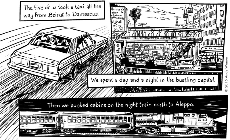
Andy Warner
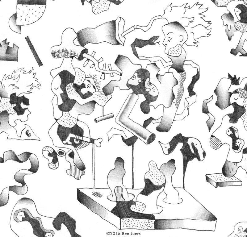
Ben Juers
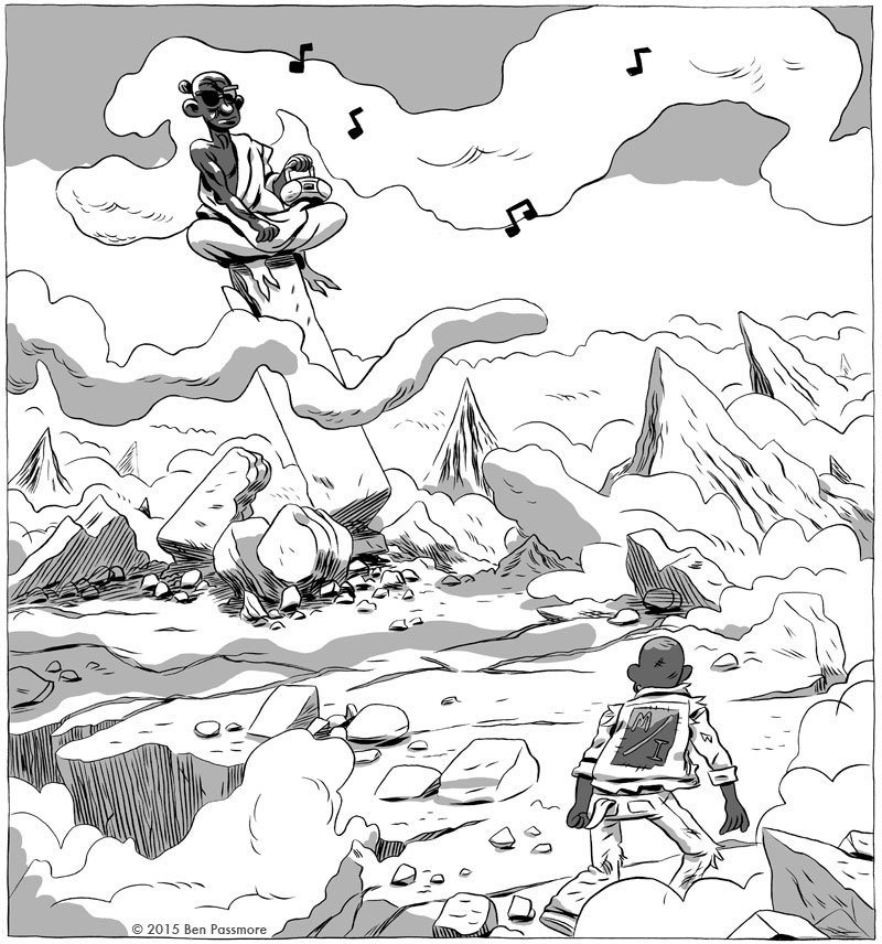
Ben Passmore
Carolyn Nowack
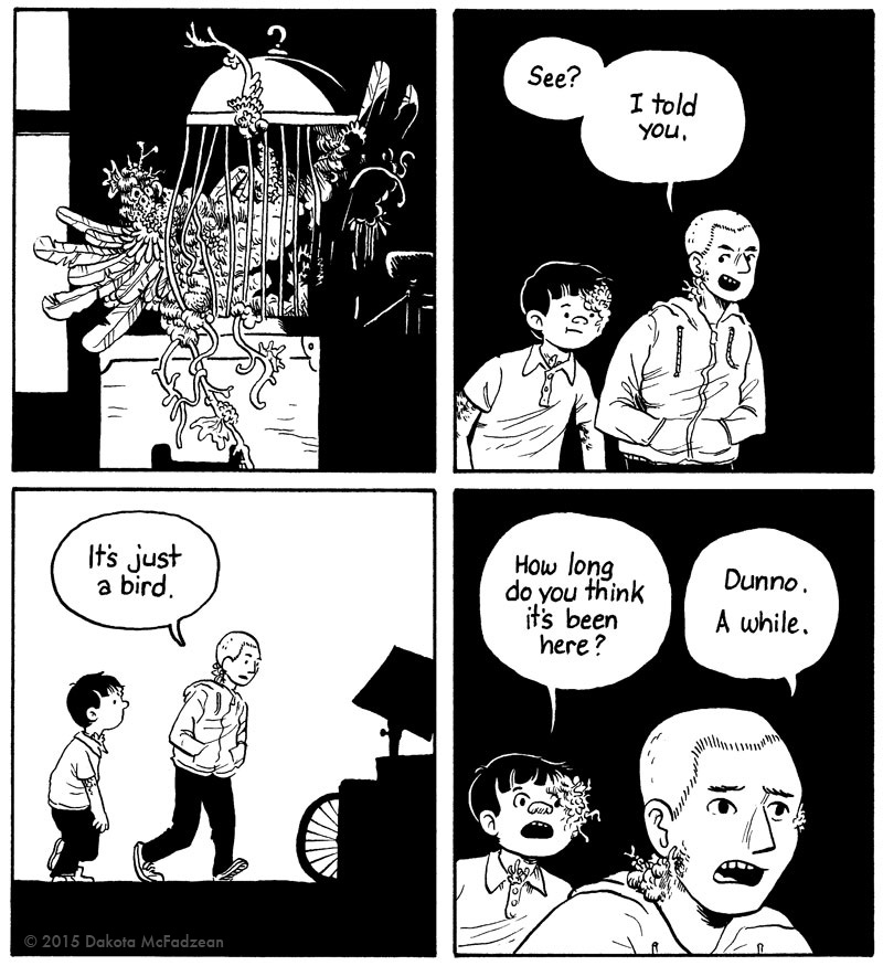
Dakota McFadzean
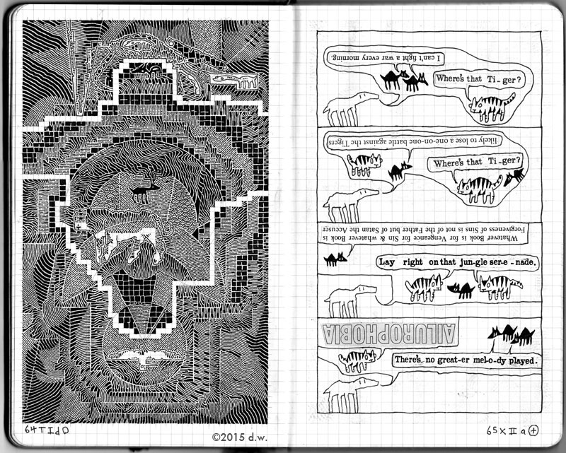
dw
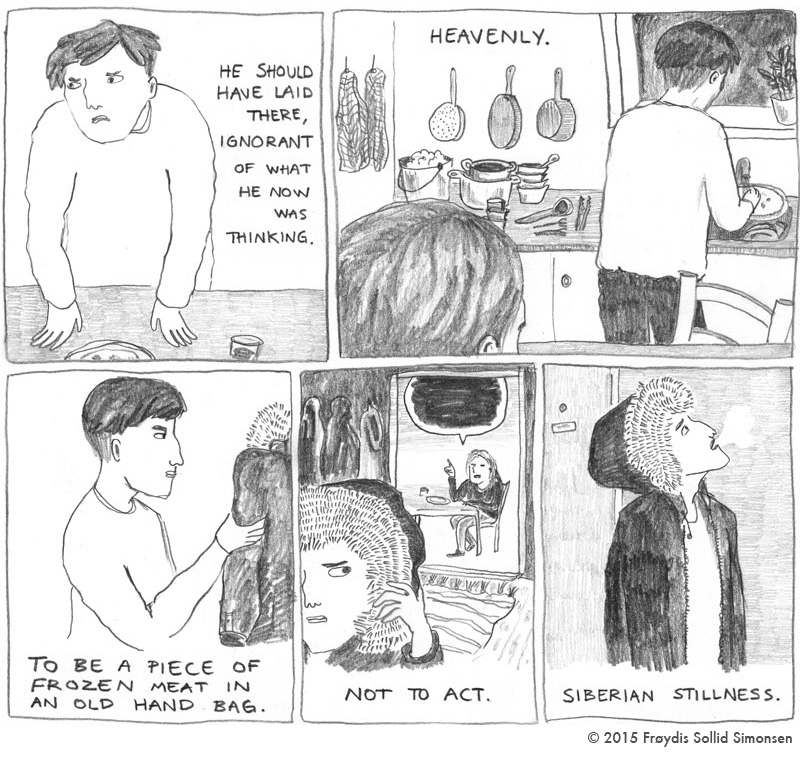
Frøydis Sollid Simonsen
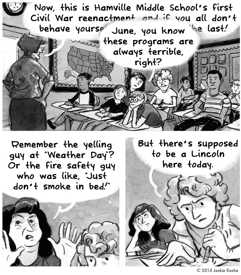
Jackie Roche
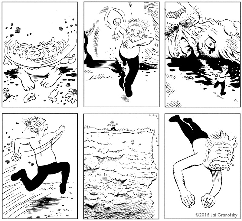
Jai Granofsky
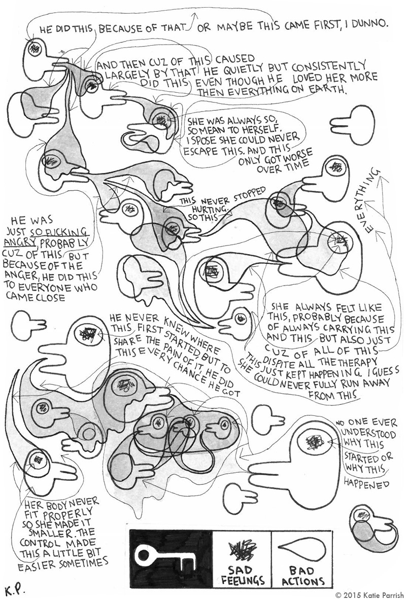
Katie Parrish
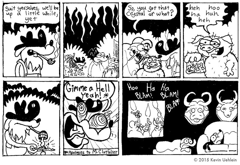
Kevin Uehlein
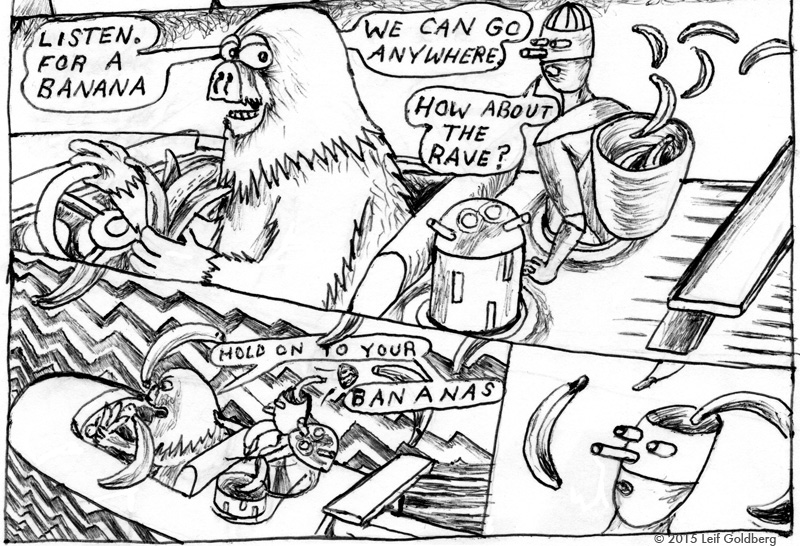
Leif Goldberg
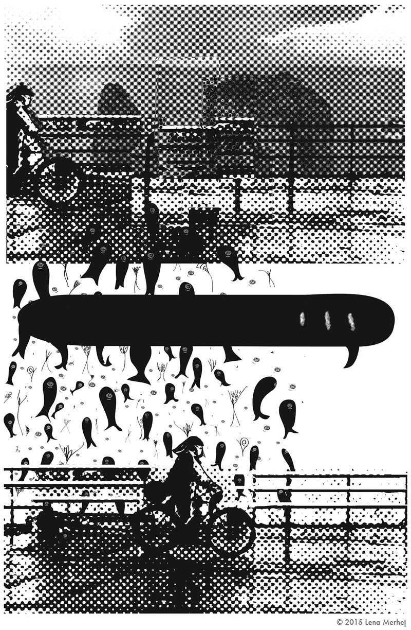
Lena Merhej
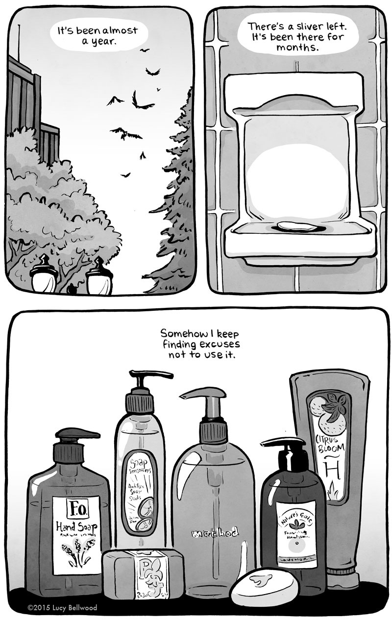
Lucy Bellwood
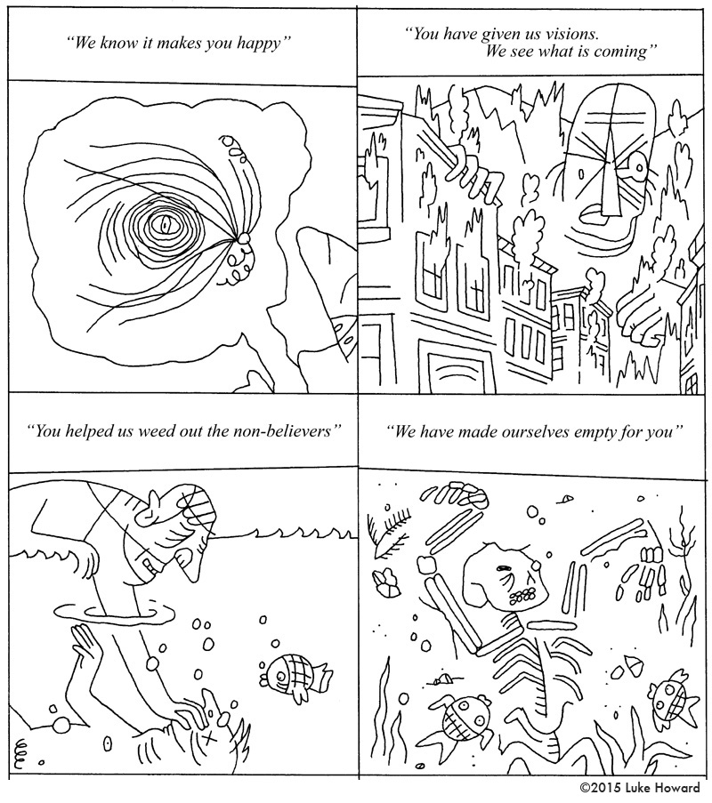
Luke Howard
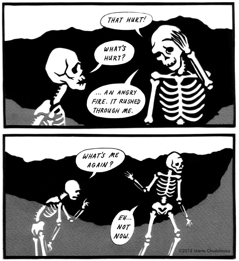
Marta Chudolinska
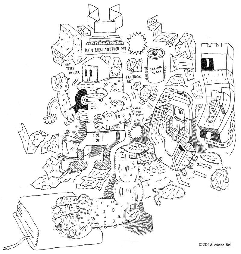
Marc Bell
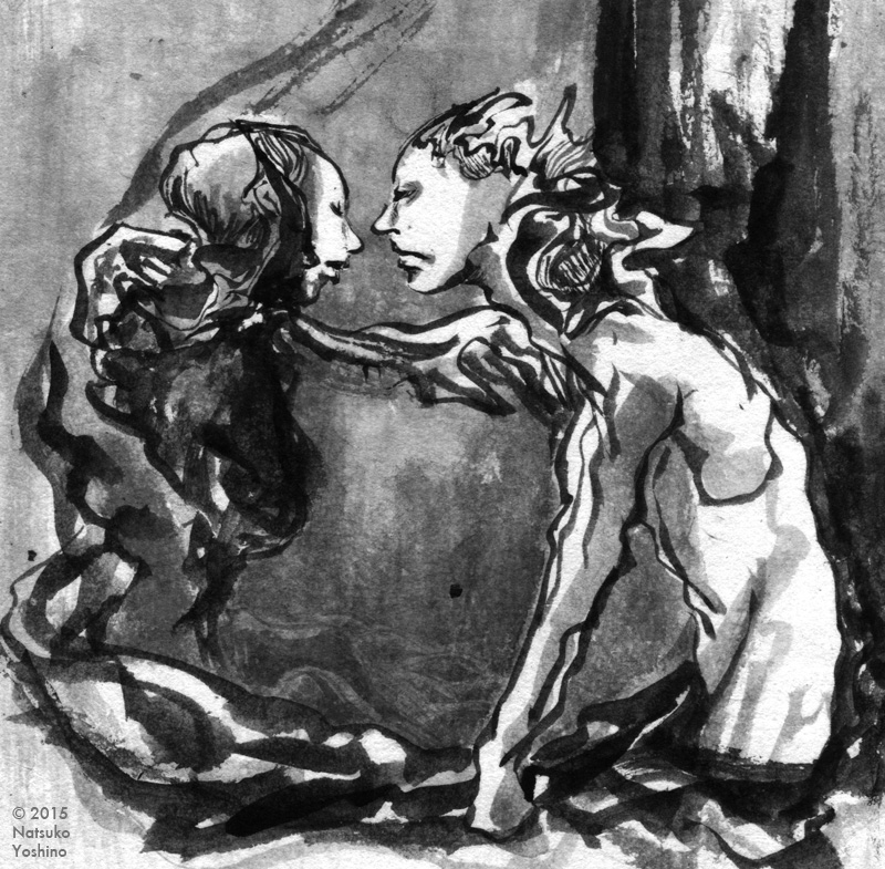
Natsuko Yoshino
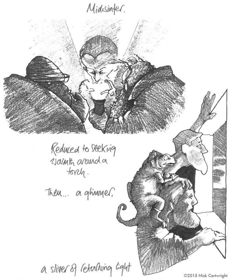
Nick Cartwright
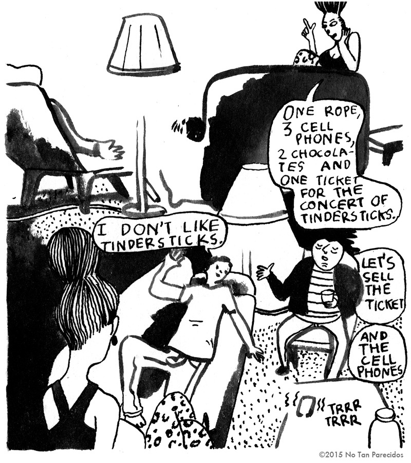
No Tan Parecidos
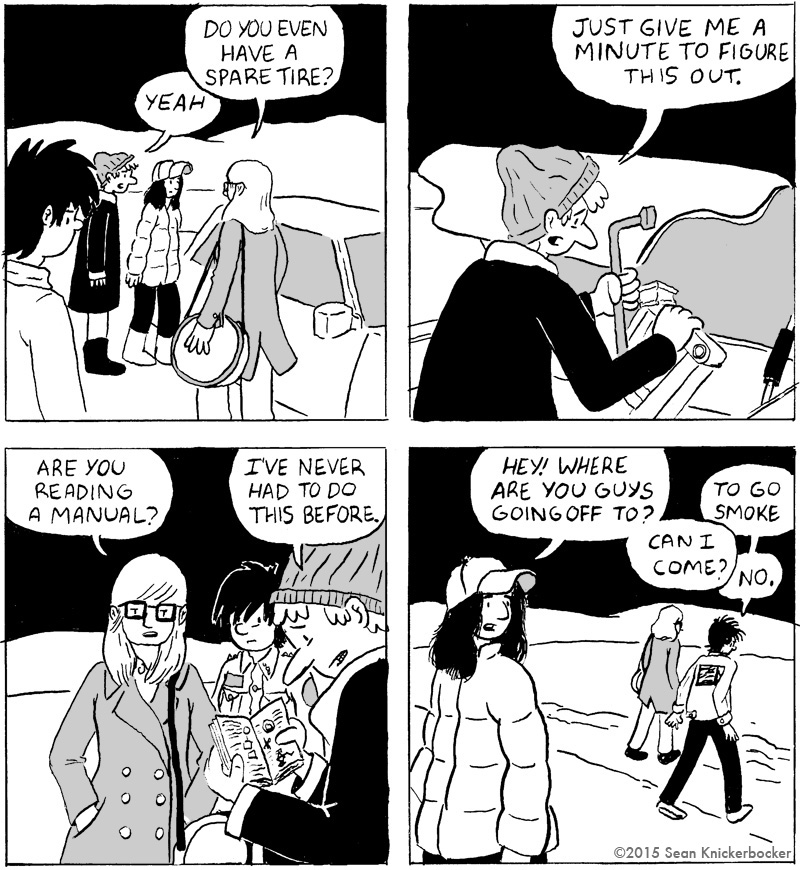
Sean Knickerbocker
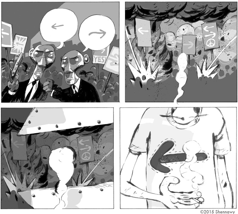
Shennawy
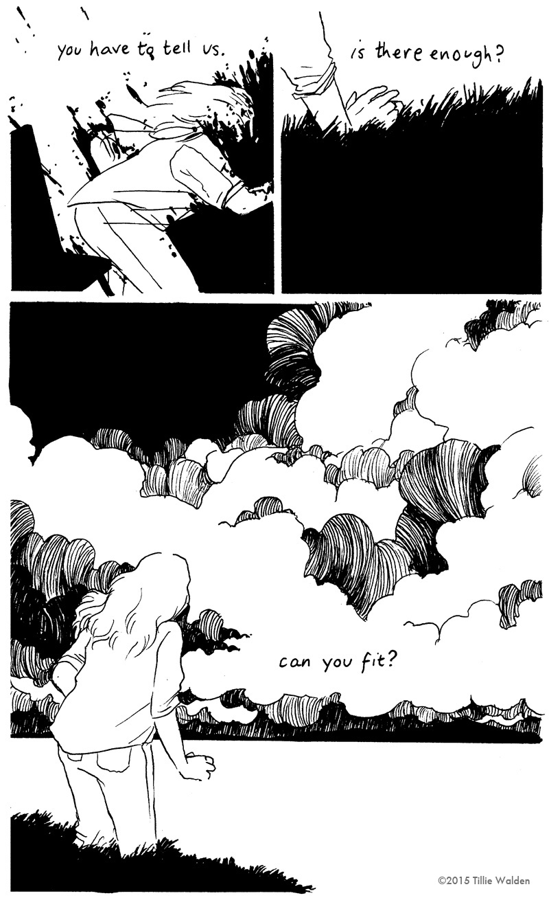
Tillie Walden
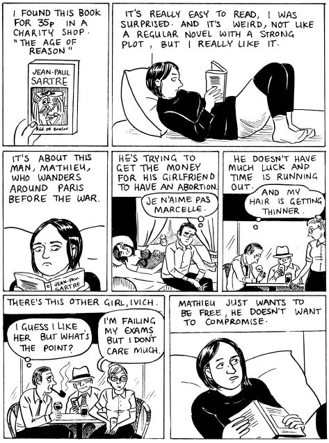
Drawing in the sky – An interview with Mardou
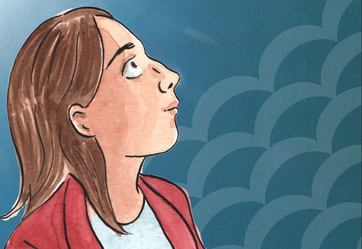
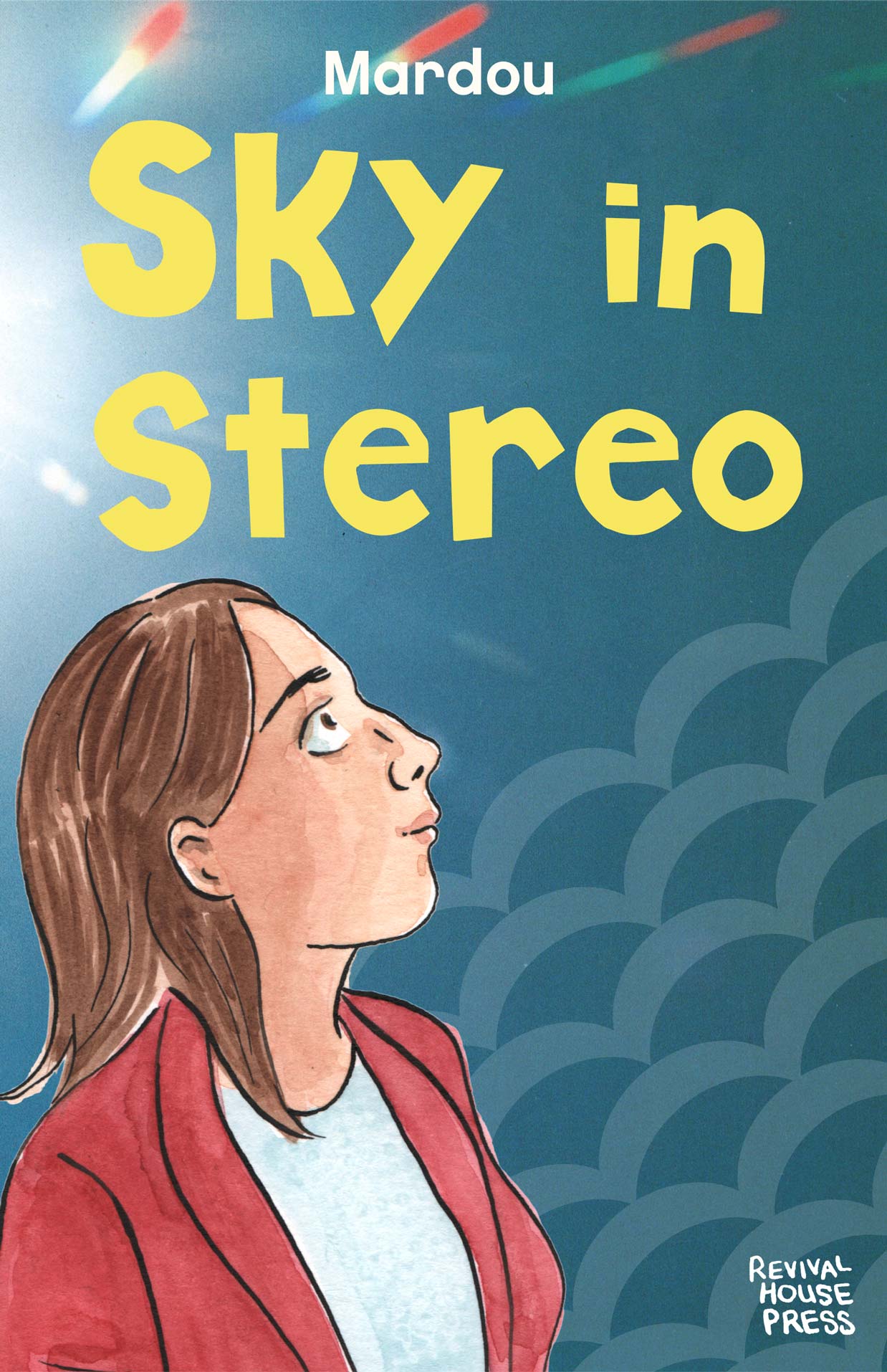
I discovered Mardou with the second issue of Sky In Stereo, released by Yam Books after the first self-published mini-comic. That book included the scene where Iris – a teenage girl based in Manchester, England – took acid and started to wander, confused but happy in the streets of the city. That free moment, artfully depicted by Mardou, could have been a fugue in a piece of classical music or a solo in some rock song and it made me realize I was staring at a sharp and genuine talent with an unique ability to write dialogue and to render body language. After locating and reading the first issue, my initial impression was confirmed. Iris’s story was once again told with a lightness and a fluidity that seems hard to find, especially when you consider that behind the lightness there are big issues at play, such as love (for her fast-food coworker Glenn), drugs (ecstasy, acid but also heroin) and now, religion. I say “now” because Sky In Stereo is finally back on track with a definitive edition in two volumes published by Revival House Press. The first will be available in October, featuring a 180-page story with an unreleased prologue, the two previously-mentioned mini-comics and the never-published third issue. I read a preview and I talked about it with Mardou.
Hello Sacha, since this interview is a sort of preview of Sky In Stereo vol. 1, I’ll leave it to you to introduce the book.
Hi Gabriele, Sky in Stereo is a two part graphic novel about a teenager called Iris, her crummy job and school life and her slide into a mental breakdown. It sounds depressing but it’s not. There’s some good times along the way.
The first thing that comes to my mind talking about Sky In Stereo is that many parts may seem autobiographical, starting with the fact that the story takes place in the ’90s in Manchester, England, where you grew up. Anyone can speculate about how much of the book is autobiographical… Instead I’d like to ask you if Sky In Stereo takes its cue from some diary, novel or comic you have written and/or drawn during your college years, because some parts seem very accurate and true to life.
Nope, I didn’t keep a journal back then. Many of the main events are taken from my own life but I made a choice to turn this into fiction. Plus you know, this material goes a long way back, over twenty years. I can’t remember conversations from that long ago, so it becomes invention. Fiction gave me much more freedom to explore true things from a different angle and also compress the unwieldy aspects of real life into something simpler, a story with its own arc.
Many characters are made up, Iris’s stepdad Doug for instance. My mum was married to a guy but he was very different to Doug. I really like that character actually, he was fun to write and the bickering between him and Iris’s mum really helped reveal aspects of Iris’s decisions in the story. My own mum IS a Jehovah’s Witness in real life but she’s not like Gina. Gina’s quite staunch and conservative. It served the story to make her that way. My mum in real life is lovely and I have a pretty close relationship with her. Always did.
I’m glad the story seems real though. I wanted it to be relatable.
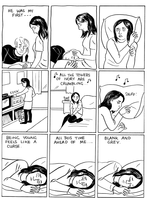
Yes, the whole story sounds real and some moments in particular are very vivid, for example the break-up between Iris and John features a depth of emotion that is hard to evoke…
Thanks. When we get older I think we dismiss and forget how intense young love is. I was hoping to capture that intensity of feeling and futility.
With regards to the first part where you’re exploring the family environment and the religious education of Iris, these scenes were never published before. In fact, Sky In Stereo # 1 opened with what is now the second chapter where Iris is in the car with her friends before entering a club… Why have you added it in this edition?
It was always the plan, I just thought it would be more interesting to start the mini-comics in the heart of the action, rather than deal with the backstory. In the second book (it’s all thumbnailed and ready to be penciled and inked this autumn), the religious stuff becomes a theme of Iris’s time in the psychiatric hospital.
In fact the original manuscript I wrote was huge, it went back even further to when Iris was seven years old and her parents were divorcing. The story we have now emerged in the editing. I chopped off two whole chapters, about 100 pages, which had even been thumbnailed and felt great about it. “Yay, now I don’t have to draw all this stuff!” The book is better for it.
An important moment is when Iris is reading Jean-Paul Sartre’s The Age of Reason and her religious beliefs fall apart. I found this very appropriate, a lot of people in their teenage years question the teachings passed down from family and society after approaching some novel or philosophical text.
Yep. I read a really key book, Confessions of a Teenage Jesus Jerk by Tony DuShane and that happens to him, exactly. He was spurred into rocking the boat in his Jehovah’s Witness family by reading a book of ill-repute. I read this book after I written Sky in Stereo, but it really spoke to me.
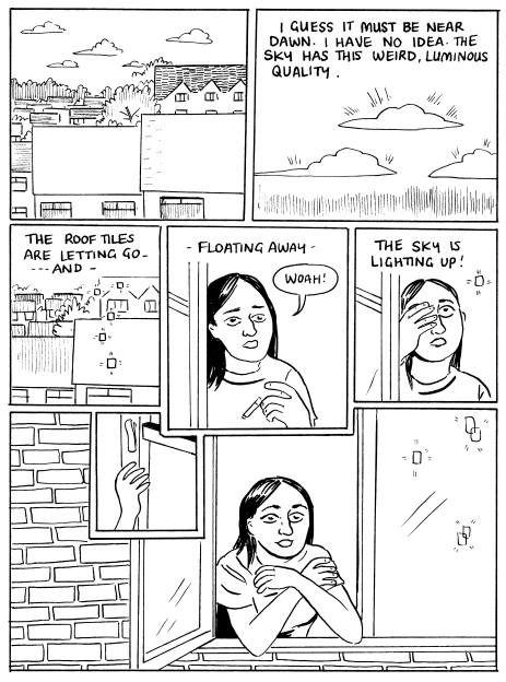
Another key scene is when Iris takes acid, in fact her visions of the sky give the book its title. In the beginning, she is spaced out, happy, excited. But in the following days, it’s like this experience has given her not only “good vibrations” but also a new general awareness, as if the acid had shown her the way to leave behind awkwardness and her lack of self-confidence…
The day after that’s how she feels, she feels special and buoyant. But the days that follow she’s not slept or eaten even… The euphoric confidence doesn’t last. Can’t last.
And in fact, this leads her towards her mental breakdown which is the theme of the second book, due in 2016…
Yes, the second book is the same length, deals with Iris locked up for the summer. There’s a three-page excerpt at the end of this book, it gives you an idea of what lies ahead. I was quite influenced by The Bell Jar by Sylvia Plath.
Iris listens to a lot of ‘90s music, there are references to Pixies, Blur, Pavement, Nick Cave, Orbital… But there are also David Bowie and The Velvet Underground… What did you listen to in your college years?
All that stuff. Except Orbital. Techno and Dance music was still huge in Manchester even though by the early ‘90s it had peaked. I was never into those scenes. That Pulp song Sorted For E’s & Wizz was so true, not for me, but I’d see that culture around me. I remember reading a ‘90s interview with Nick Cave saying when he tried Ecstacy he got into a fist fight with someone. Ha ha, that’s my man!
And what about The Smiths? I don’t know if you liked them, but there are some moments that remind me of Morrissey’s lyrics. For example, when at the end of the first chapter, Iris thinks “He was my first… Being young feels like a curse. All this time ahead of me… Blank and grey”. And they’re from Manchester like you.
They were a bit before my time and I was never a fan. Johnny Marr’s guitars always jangled my nerves. I like Joy Division and New Order, who also were important Manchester bands. When I was in high school the Happy Mondays and James were really big. I think the point is, the book is set in Manchester and music is somehow integral to the city. It was a place to see bands and great bands came from there. It gave this otherwise unimportant city a sense of itself.
It’s hard to explain but I was trying to make music part of the weave of the book the way music is woven into the city Manchester’s culture.
Stepping back, I initially discovered your work with the Sky In Stereo’s minis, but I know that you published a lot of comics before, such as Anais In Paris and Manhole. I saw a few stories online from the all-girl anthology Whores of Mensa and they are short and funny, yet very different from Sky In Stereo, where you’re focusing on storytelling. Is there any artist that influenced you while doing your early comics?
Dan Clowes and Julie Doucet were two. But they were both such great artists. I figured out that writing was my strength so finding a style of drawing that would serve my stories was my long term goal. It still is!
In that sense, the first collection of Sky In Stereo also marks a progression in your linework, it seems to me that the new pages are more defined and your style is becoming increasingly meticulous…
I’m much more comfortable with my art now, I think that shows. Discovering Gabrielle Bell’s work about ten years ago was really important to me. Not that I’m trying to ape her, but that there’s this comfortable flow in her drawing that was so inspiring to me. She wasn’t trying so hard, she was just being herself. It informed me!
I think I’ve unconsciously picked up some things from Ted May, my husband. He’s an incredibly skilled artist, I’m not in his league. But I was looking at the way I draw eyes now and realized that I totally swiped that off Ted. Well, we’re married so I’m allowed I guess.
I don’t think he’ll sue you for this… The comparison with Gabrielle Bell is perfect, she is one of my favorite cartoonists and both your stories and those of Gabrielle flow quite well. They’re very fluid, readable and never boring. Furthermore, you’re two artists who are very adept at depicting body language…
Thanks. I really love her work, and she has such an interesting life. Have you noticed that Gabrielle rarely uses close-ups? She draws full figures or ¾ figures in most of her panels. She reminds me of Ozu, his films were like that.
Ok, we’re near to the end of the interview and so I have to ask you if there is something that is exciting you at the moment, if there is a comic, a novel or a movie you enjoyed recently…
I thought Julie Delporte’s Everywhere Antennas was beautiful. I loved it. And Michel Rabagliati’s Paul Joins the Scouts was amazing. He’s such a great writer and cartoonist. I’m really keen on Melissa Mendes work too. Ted’s next Men’s Feelings comic is in progress so I’m reading bits of that when I sneak over to his desk without asking. It’s really great!
And with novels? I read you studied English literature in college, so I’m curious to know about some books you’re loving now and even something about your favorite authors…
I like to go on reading tours of people’s lives, reading everything they’ve done and then their biography or autobiography. I’ve been reading Doris Lessing for the past two years. She’s possibly my favorite person ever. Or top five at least. Her book Shikasta is unlike anything I’ve read before.
I like John Updike a lot also, people accused him of sexism because he was such a ladies man but actually he wrote women characters incredibly well. I mean, you read Erica Jong’s stuff from the same era and the guys seems so dated and corny. But Updike’s housewives seem real and touching.
I read a lot of kid’s books with my daughter. We loved The Borrowers series and we’re just finishing the Moomins novels, Tove Jansson was so great. They’ve influenced my dreams. I dreamed of jewels underwater again last night, so thanks Tove!
Speaking of dreams, in Italy we have a famous anchor-man, Gigi Marzullo, who does a nightly tv show where he poses a lot of absurd questions to his guests, like “Is life a dream or do dreams help to live better?”. He closes every interview with the classic “ask yourself a question and give yourself an answer”. So, let’s try that last one!
Q- Seen anything cool lately?
A- I disturbed two mating ladybugs in my garden yesterday. I was checking my cucumber plants to see if any were ready to pick and found a trysting pair, they’d really tucked themselves away in a private spot against a garden cane, hidden by a leaf. One was yellowish with loads of spots and the female was red with two spots. I thought that was pretty cool.
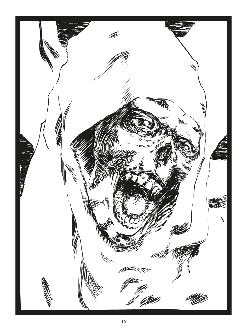
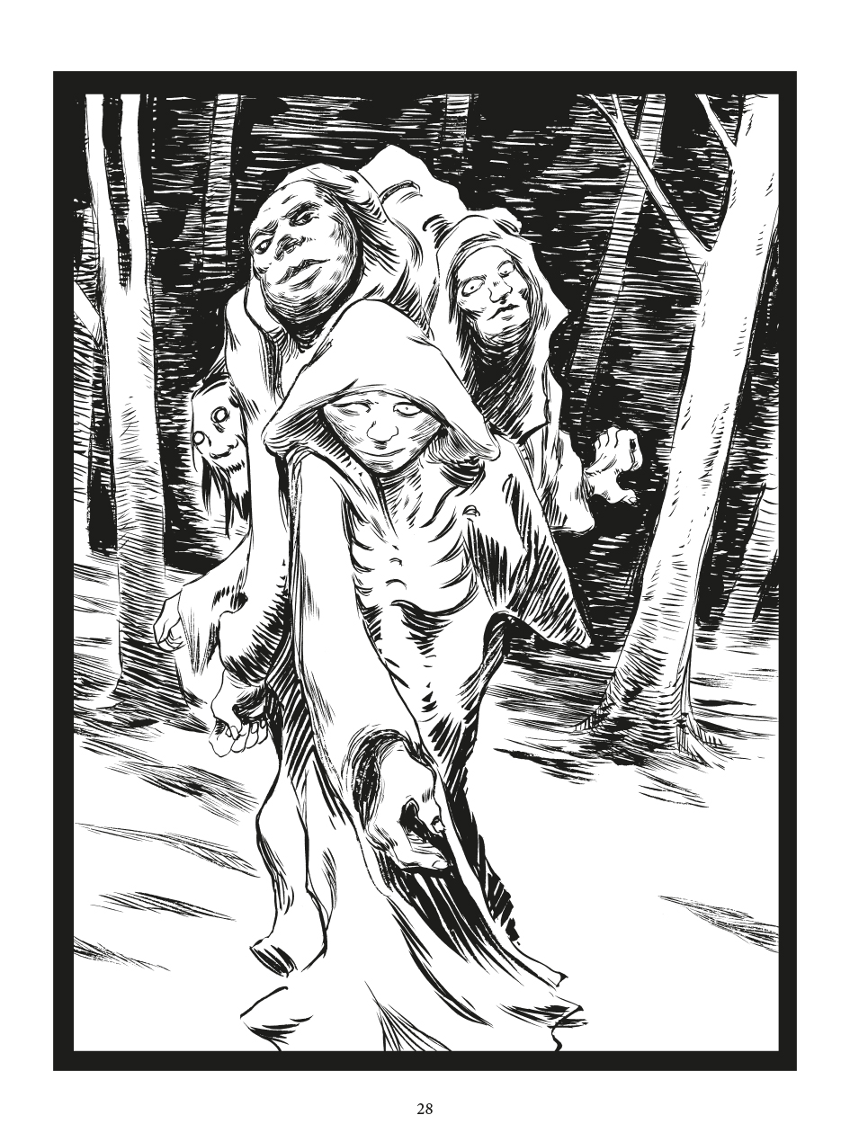
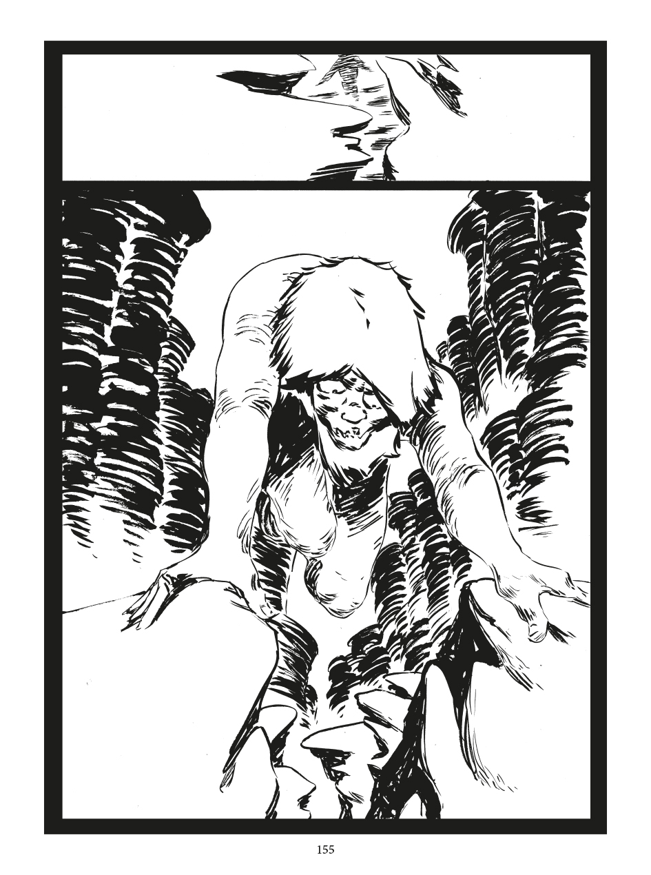
“Largemouths” by Gabriel Delmas preview
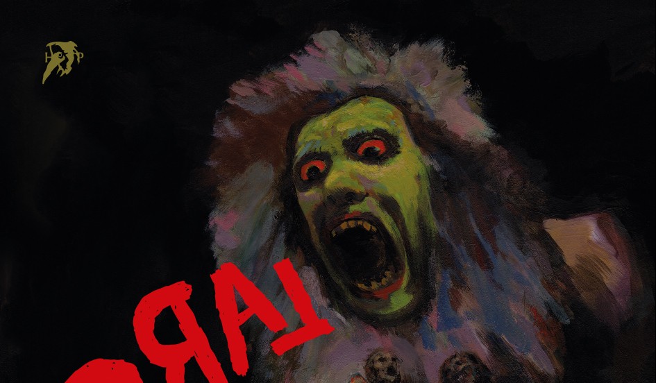
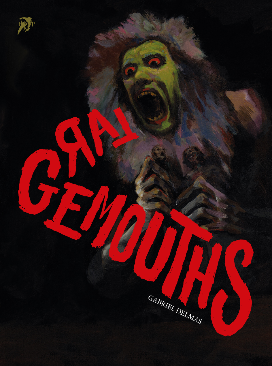
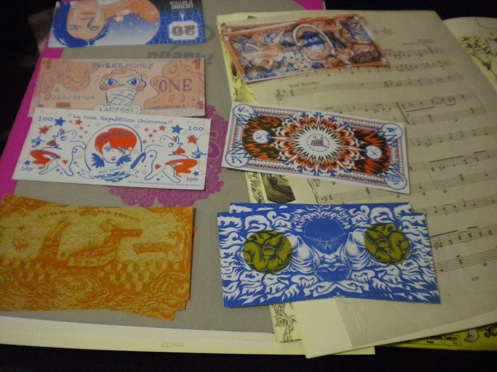
Italian publisher Hollow Press continues to wander into the international underground scene and, after releasing books by Japanese Tetsunori Tawaraya and Shintaro Kago earlier this year, comes back in the old continent with French artist Gabriel Delmas. Inspired by Francisco Goya’s Saturno devorando a un hijo, Delmas tells a story from the dawn of time, when the world was obscure and hostile, inhabited by strange and frightful creatures. The greatest among them, the Largemouths, fought for the domination of the continents, while men took their first step on Earth and spectral entities created the earliest forms of art.
Largemouths is a wordless book of 688 black and white pages, printed in size 16 x 21,5 cm on munken paper of 80g, 2 full-color interior pages, full-color cover and backcover, stitched paperback binding, “mushroom” plasticization, price 29 eur. The book is out on September 15th but you can pre-order it with a 15% discount until September 13th. Hollow Press is also selling a few original artworks and a Giclée print signed by Delmas in a limited edition of 18.
Below a preview of some interior pages.


Defining a style: One Percent Press
There have always been record labels that defined a style, combining a specific genre with very distinctive aesthetics: Factory and Sarah Records are a couple of examples, though I could offer a lot more. In comics, this phenomenon can’t exist in the same way; if it’s difficult to demarcate boundaries between one genre and another in music, it is almost impossible to do so in an art form as articulate and complex as comics. The usual distinction made in the US market distinguishes between general or mainstream comics and “indie” comics, with mainstream comics linked economically to large corporations and aesthetically to contents appreciated by the mass public, and indie products made outside mass production. It goes without saying that the indie world should also convey different contents from those of Marvel or DC, but this isn’t really the case, because independent labels like Image are giants that publish a lot of comics that are far from revolutionary or unconventional. In comics, “indie” and “alternative” are no longer synonymous, and to find things that are truly different we have to explore the underground, that is no longer a genre born in the 60s and characterized by the satire of the status quo and by the presence of sex, drugs and various obscenities, but an “underworld” of small publishers that is more and more fruitful and interesting in the North American scene.
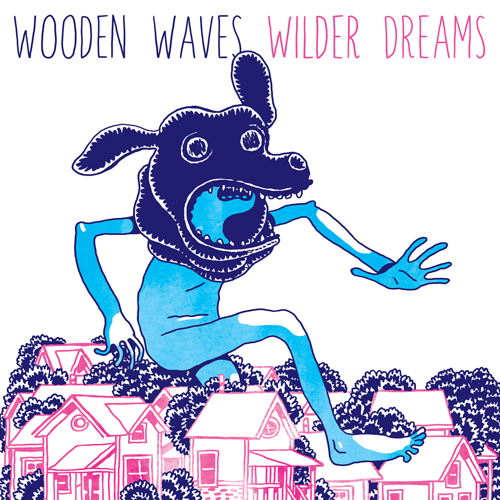
One of these small publishers is One Percent Press, a label that not only publishes comics without worrying about eventual commercial success, but that also does its own thing according to the modus operandi of a record label of the past. So it isn’t a coincidence if the brand founded in 2004 by Stephen Floyd and JP Coovert publishes and distributes not only comics but also LPs and CDs of bands such as Wooden Waves and Tin Armor, in a spirit that takes its cue from the Do It Yourself philosophy. And they do it with a reasonable continuity, since the two have released over 50 comics and 25 albums in the past ten-odd years.
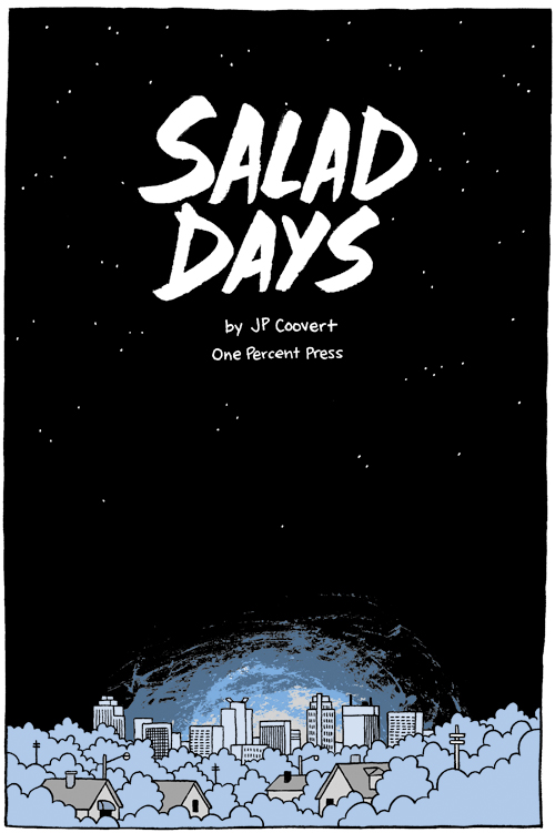
To define the “sound” of One Percent Press comics is neither the package, which differs from comic to comic, nor the clean lines of the drawings, even if this is a recurring feature. The point of contact is rather the subject matter, since most of the books are a reinterpretation of the coming-of-age genre, exploring the concerns of children and adolescents or showing people in their twenties and thirties who still are looking for their place in the world. In this sense, the book to better understand the idea behind this editorial project is Salad Days by JP Coovert. Brandon comes to Minneapolis to meet an old friend and spend a weekend of “movies, videogames, and pizza”. One is forced to wear a tie for his work as a designer in a corporation, the other still doesn’t know what kind of career he would like to choose. Both have family and have to face the consequences of growing up, included the fact they now have little time to devote themselves to their passions. The memory of past times drives them to get out of the usual routine, to do something different, so that they end up chased by a police car.
I don’t know how many autobiographical elements are behind the angular lines and the essential drawings of Coovert, but one of the two characters could be the author himself, wishful to stay true to the dreams of his youth. Moreover, the history of One Percent Press is more or less this: that of two guys who met in their twenties and have created this micro-reality to keep in touch and do something together, even though they’ve always lived in different cities (the label is currently located between Buffalo and Minneapolis). As for the name, One Percent Press refers to the fact that only 1% of life is truly excellent, only 1% of food is very good and only 1% of comics and music is really noteworthy: a concept that, according to the same Stephen Floyd, is typical of twenty-somethings, of young people seeking their way not so much in the world, but against the world.
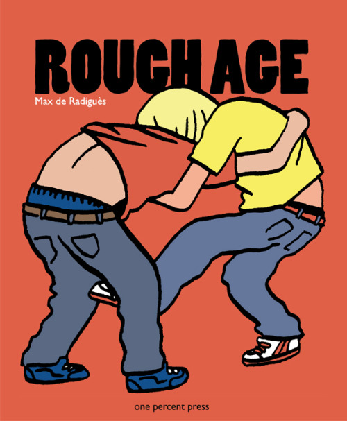
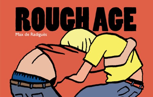
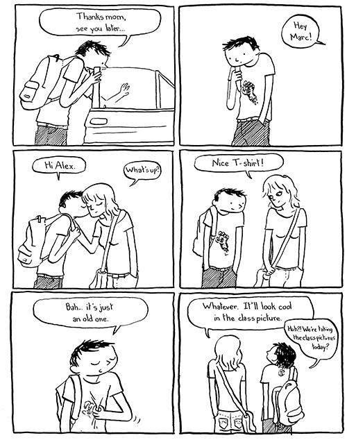
The most important release to date is the English version of L’Âge Dur by Max de Radiguès, translated under the title of Rough Age, which unfortunately loses the wordplay of the original. But the content doesn’t change and so the American readers can enjoy in this 128-page book from 2014 the original zines self-published by the Belgian cartoonist between 2009 and 2010. The style is clean on the surface but nervous underneath, and it shows deviations from the reassuring forms of ligne claire, as if the shakes of the pen reflect the concerns of the characters, schoolchildren who think above all of relationships with the opposite sex while they argue, fight, copy homework and gossip about each other. The different plots intertwine, and a lot of characters stand out: Roman is mocked by a classmate and invents an imaginary girlfriend, Gary has an affair with Louise but is secretly in love with Marc, Ron breaks up with his girlfriend and shows indifference while suffering in secret. Lightly we reach the conclusion, when the boys have to pose for a class picture with broken noses, sullen faces and black eyes after all that has happened in the pages of the book. Rough Age is in many ways a classic French-Belgian bande-dessinée, but the minimalist approach recalls American indie comics. In the end it comes out a universal story that could tell the life of children from much of the Western world.
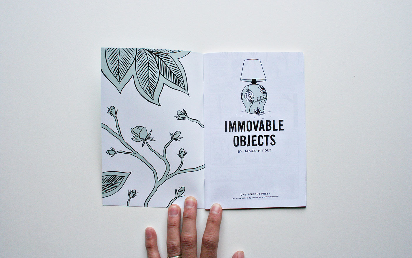
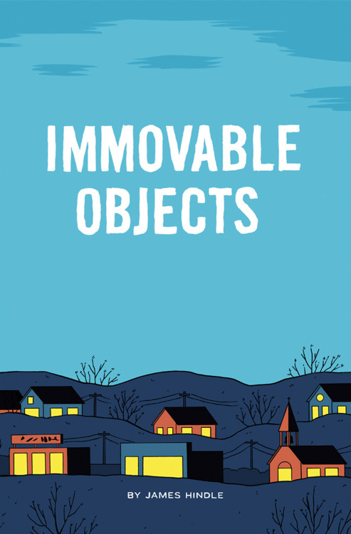
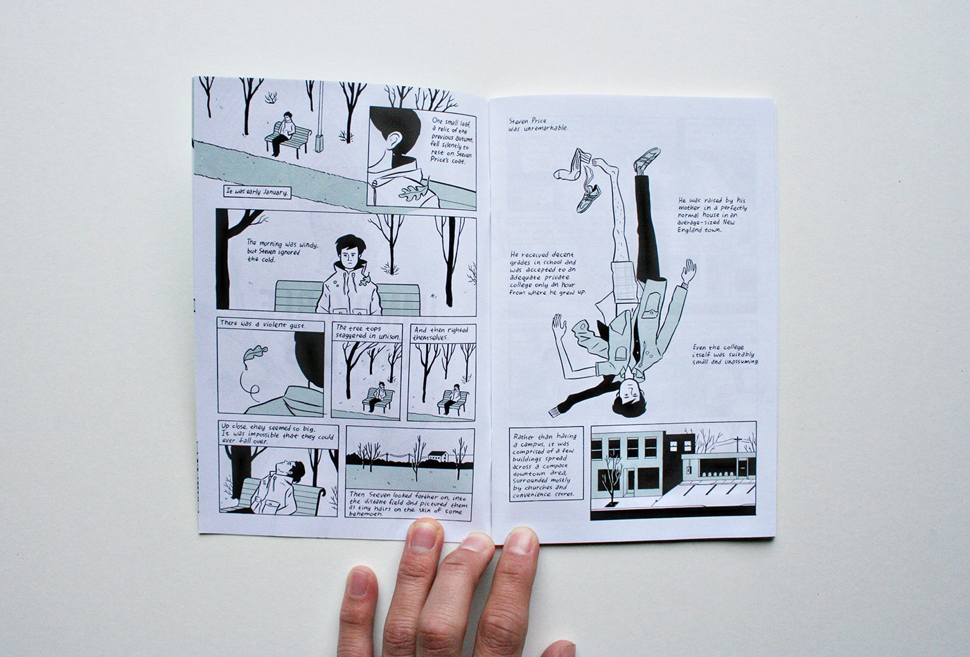
The One Percent Press book fitting perfectly in the coming-of-age genre is Immovable Objects by James Hindle, an author whom I already knew for the brief Yellow Plastic published in the fourth issue of Irene anthology (my review is here). The two stories have different points in common, since both make extensive use of voiceover in the captions to tell a relationship between a very awkward boy and a troubled girl smarter than him. Here in particular we follow the ordinary adventures of Steven Price, an “unremarkable” boy, “raised by his mother in a perfectly normal house in an average-sized New England town”. Steven “received decent grades in school and was accepted to an adequate private college only an hour from where he grew up”, a college that was “suitably small and unassuming”. Isolated from school friends, lonely, contemplative and with the recurring thought of a father he never knew, Steven is initially depicted sitting alone on a park bench, while tree leaves fall on his shoulder. Things change when he meets Caroline and builds with her a confidential but lacking of any sexual implication relationship. As often happens in these situations, the friendship falls apart when a third person comes into play, in this case a professor of drawing to whom Caroline is increasingly attracted. Jokes and winks give way to jealousy and repressed desires, so that Steven is forced to overcome the easy support of the relationship with the girl to look inside himself, become more confident and perhaps mature.
Like the aforementioned Coovert and de Radiguès, Hindle has a simple and clean line, although more round than that of his colleagues. Immovable Objects presents a lot of interesting graphic solutions, often obtained with the juxtaposition of black, white and light green. Steven’s mother is depicted by a white shape with black outlines: she is a background character, so she isn’t defined as the protagonists. Even the father figure is undefined, but this time is completely black, even more mysterious. And when the story reaches its conclusion the figure of Steven becomes blurry too, made of light green. The circle is closed and also the main character can become a vague shape. Yet Hindle managed to make him familiar to us in these 36 pages, providing a deep and nuanced story.
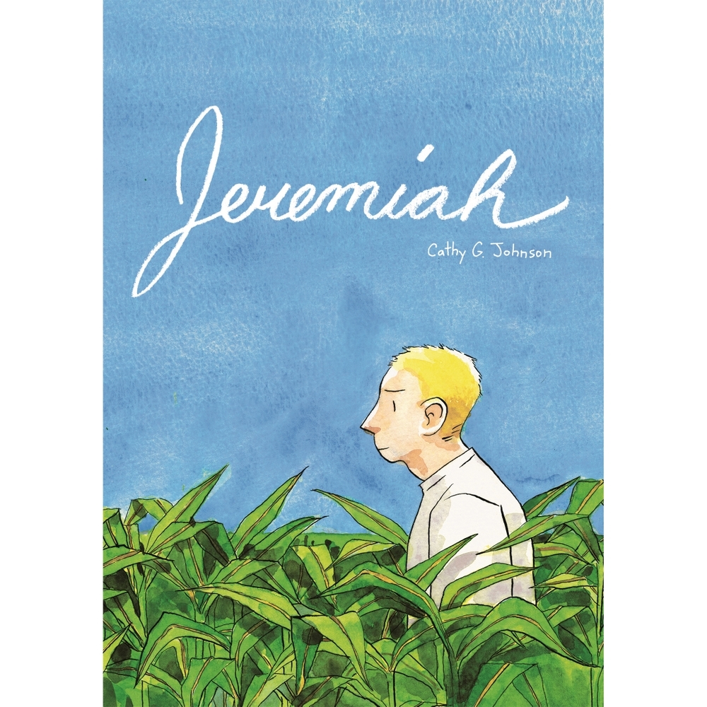
Other recent titles published by One Percent Press are Dakota McFadzean‘s Hollow In The Hollows, a story starring two children struggling with dark omens (I talked about it last year), and Present Tense by Buffalo-based illustrator and photographer Emily Churco, which collects mostly autobiographical one-page stories, alternating moments of reflection and impromptu gags. The next books are due for Small Press Expo in Bethesda on 19-20 September and are the collection of Jeremiah by Cathy G. Johnson (winner of an Ignatz at the latest SPX as Promising New Talent) and the twentieth issue of the series Simple Routines by JP Coovert, in addition to the reprint of The Aeronaut by Alexis Frederick-Frost.
“mini kuš!” #34-37
Four mini kuš! are due next 22th August along with the 22th issue of š! anthology, this time dedicated to fashion. Waiting to see how the various cartoonists have exalted, mocked, reinvented the world of fashion, now I’ll take a look at the new mini-comics, 28 color pages each, stapled in A6 size and printed on a beautiful thick and opaque paper.
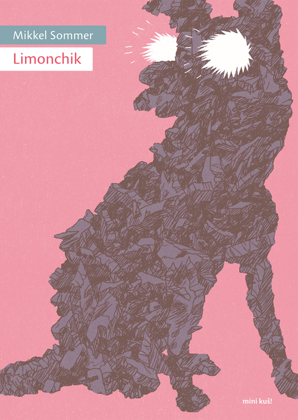
The 33th mini kuš! is by Mikkel Sommer, a Danish artist born in ’87 who has already published in France with Casterman and in England for Nobrow. Limonchik is an almost wordless story (only 2 of the 24 pages have a bit of text) about the return to our planet of Laika, the dog “lost in space” (Limonchik was one of the nicknames Soviets gave her). The cover with lightnings bursting out of the eyes of the dog is a prelude to the second part of the mini-comic, full of storms and destructions, in an apocalyptic scenario alternating pages on pink background with others where a deep dark blue prevails, in a juxtaposition of day and night, Earth and space. Mankind is totally absent here, there are only a dog and an asleep and then devastated civilization.
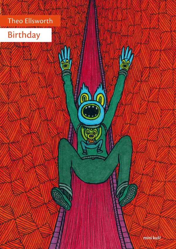
If Sommer’s idea is effective but at the same time rather simple, American cartoonist Theo Ellsworth, best know for his series Capacity and for the two books of The Understanding Monster, deals in Birthday with more complex and even psychedelic topics. Probably because when I discovered the world of underground comics his illustrations were almost everywhere, but in these visionary games about rituals of physical and mental rebirth I see always the echo of Italian artist Matteo Guarnaccia, even if I don’t know if Ellsworth has ever heard of him. Jim Woodring could be an influence too, however putting comparisons aside this totally silent story is funny, disturbing and at the end liberating.
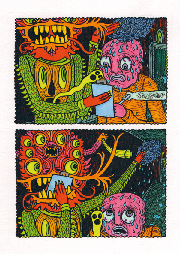
I think it’s easy reading Ellsworth’s comics admiring his dreamlike and fantastic worlds, but he is also a master in illustrating human faces, as we can see from the desperate expression of the main character in the first page, from his dread when he agrees to subject himself to the initiation ceremony on page 4, from his disbelief when he realizes what is happening in the final sequence.
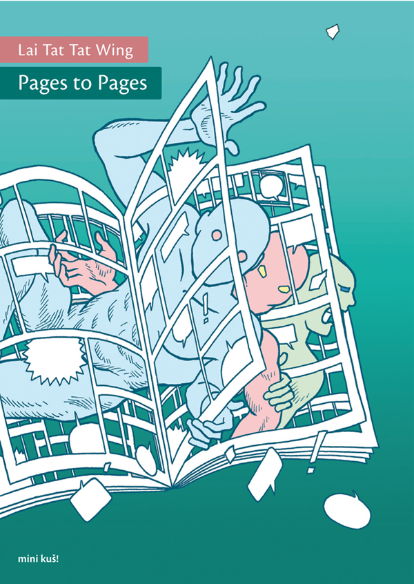
Another wordless mini-comic is Pages to Pages by Hong Kong artist Lai Tat Tat Wing, an habitué in Latvian anthologies who gets now a mini kuš! all for him. Protagonists of this short tale are two faceless men who laugh together, start arguing and then chase each other, in a crescendo of cartoon-like situations filled with surrealist elements. I’ll seem a fool but I saw the echo of Grant Morrison’s Doom Patrol, for example in the books that open their pages like possessed or in the hands coming from the sky. Even the metanarrative theme can remember Doom Patrol, but here this topic is mixed with that of conflict between traditional books and technology. Both culminate in the whimsical and in some way disturbing final scene, where faceless men use their technological devices all together. The colors are a little bit feeble in this book – I would have preferred brighter tones – but probably it’s only a matter of taste.
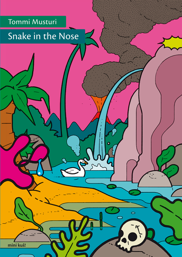
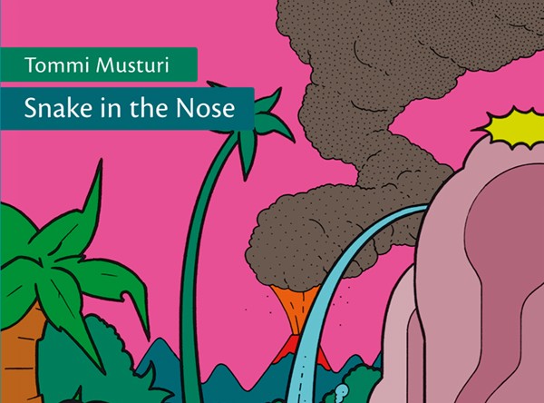
Who certainly didn’t skimp on bright colors is the veteran of European underground comics Tommi Musturi, for whom 2015 is a particularly important year, since Fantagraphics will release the collection of his The Book of Hope in November. The mini opens with a blonde lady drinking a cocktail and smoking, until something falls on her head… I won’t say what it is, but I assure you this is a scene that represents at full the hatred of the protagonist towards the whole world, worthy of a character of an Ivan Brunetti’s comic. But in the end the man isn’t so terrible as he seems if he dreams rainbows and unicorns and if we catch him dancing naked on Like a Virgin… Beyond the funny plot, the Finnish cartoonist is at his best in some brilliant pages that combine inventiveness and storytelling: see for example the one in which Musturi describes a series of possible suicides or the whole colorful dream sequence. Along with that of Ellsworth, Snake in the Nose is the most successful mini kuš! of this summer batch.
 You can pre-order right now these four mini kuš! here at $6 each (worldwide shipping included in price).
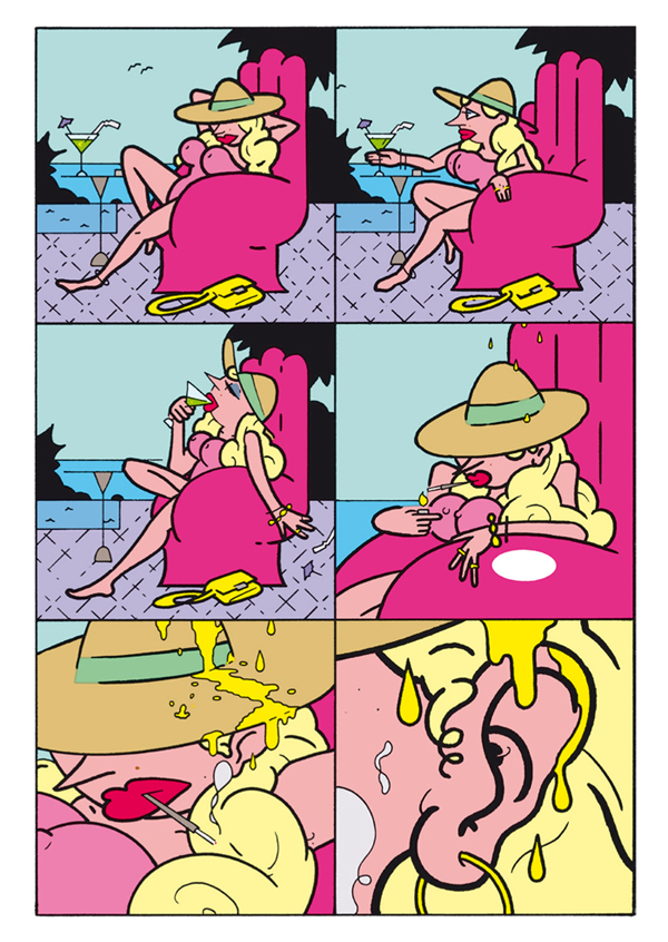
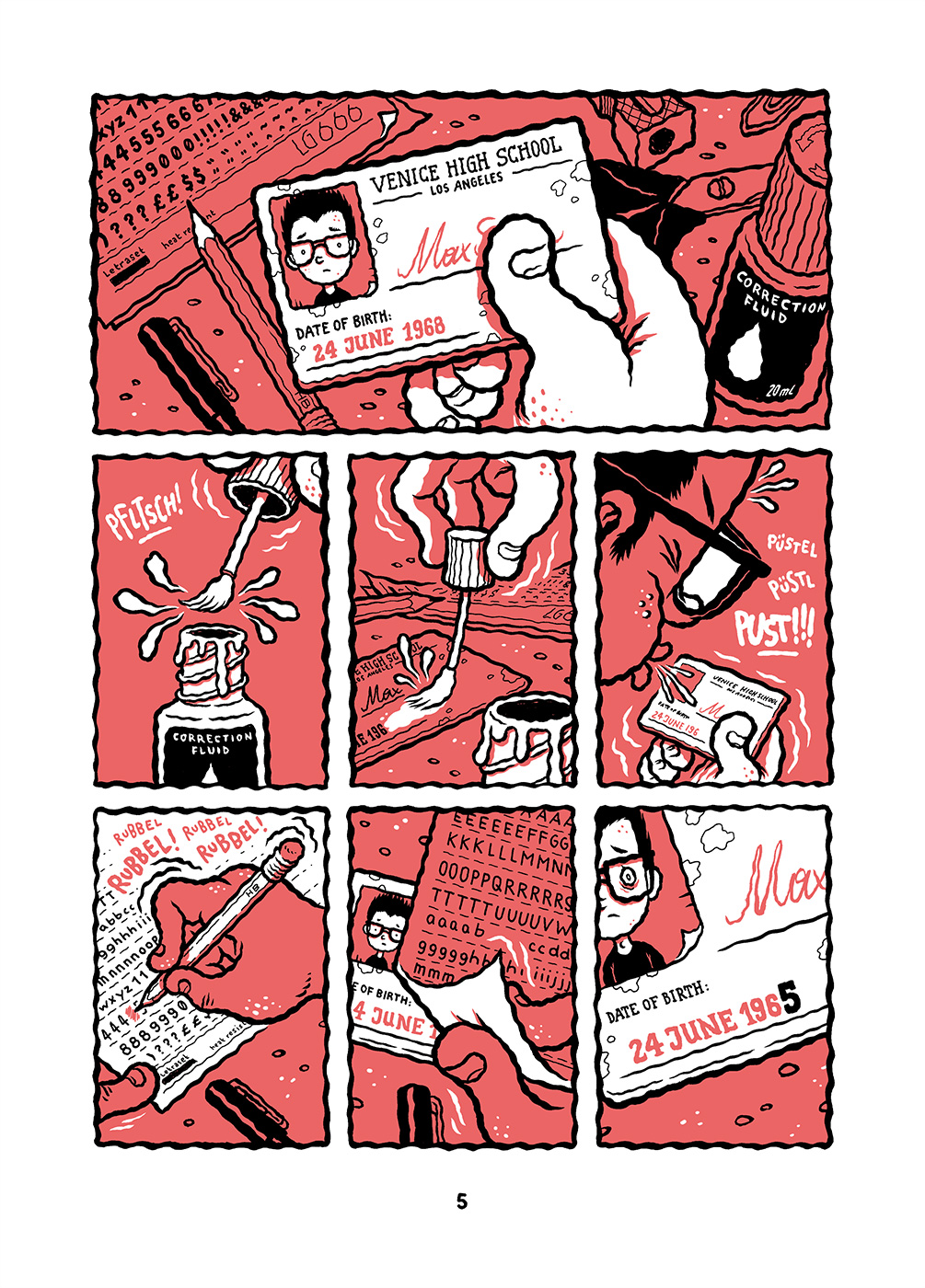
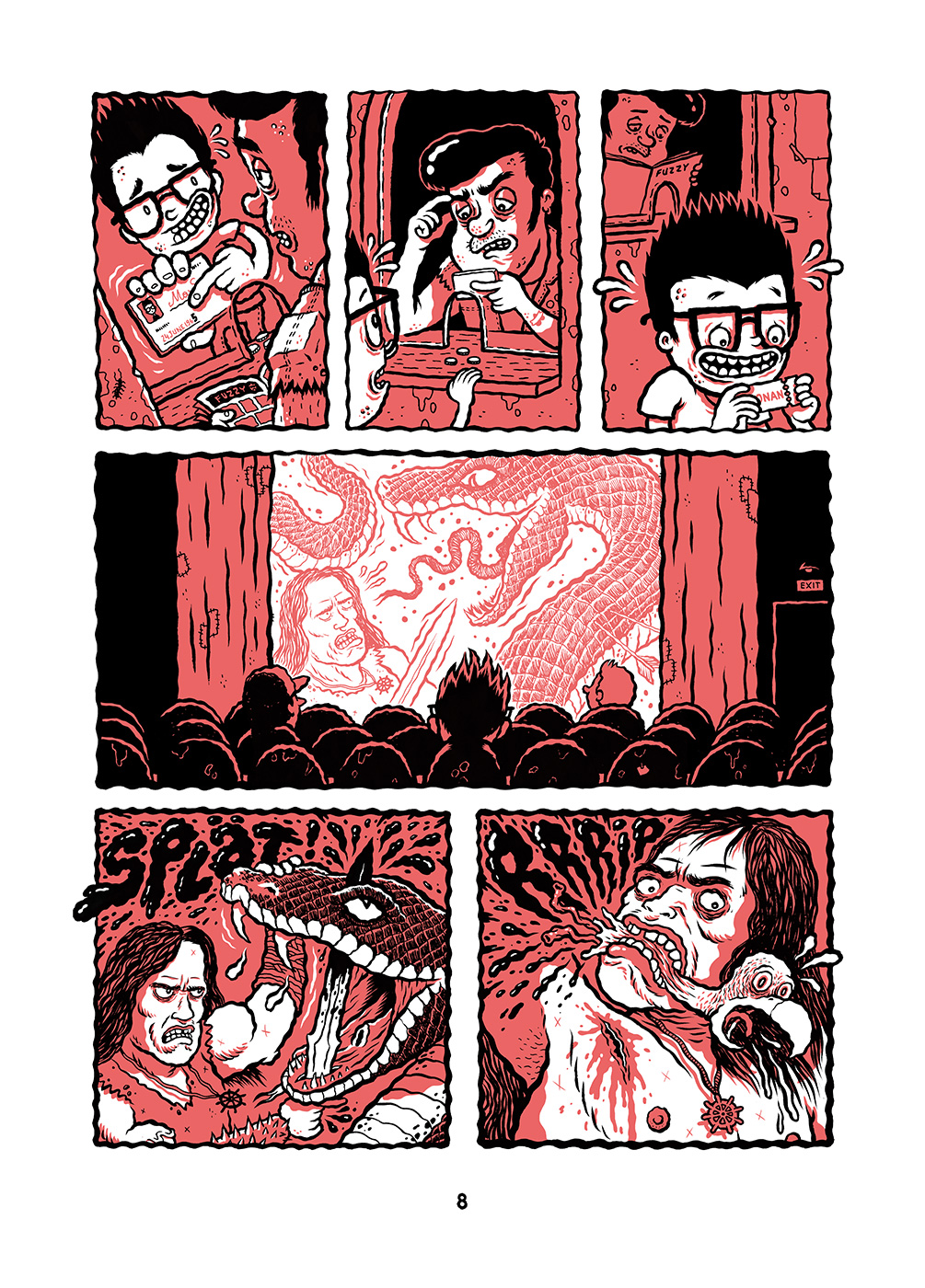
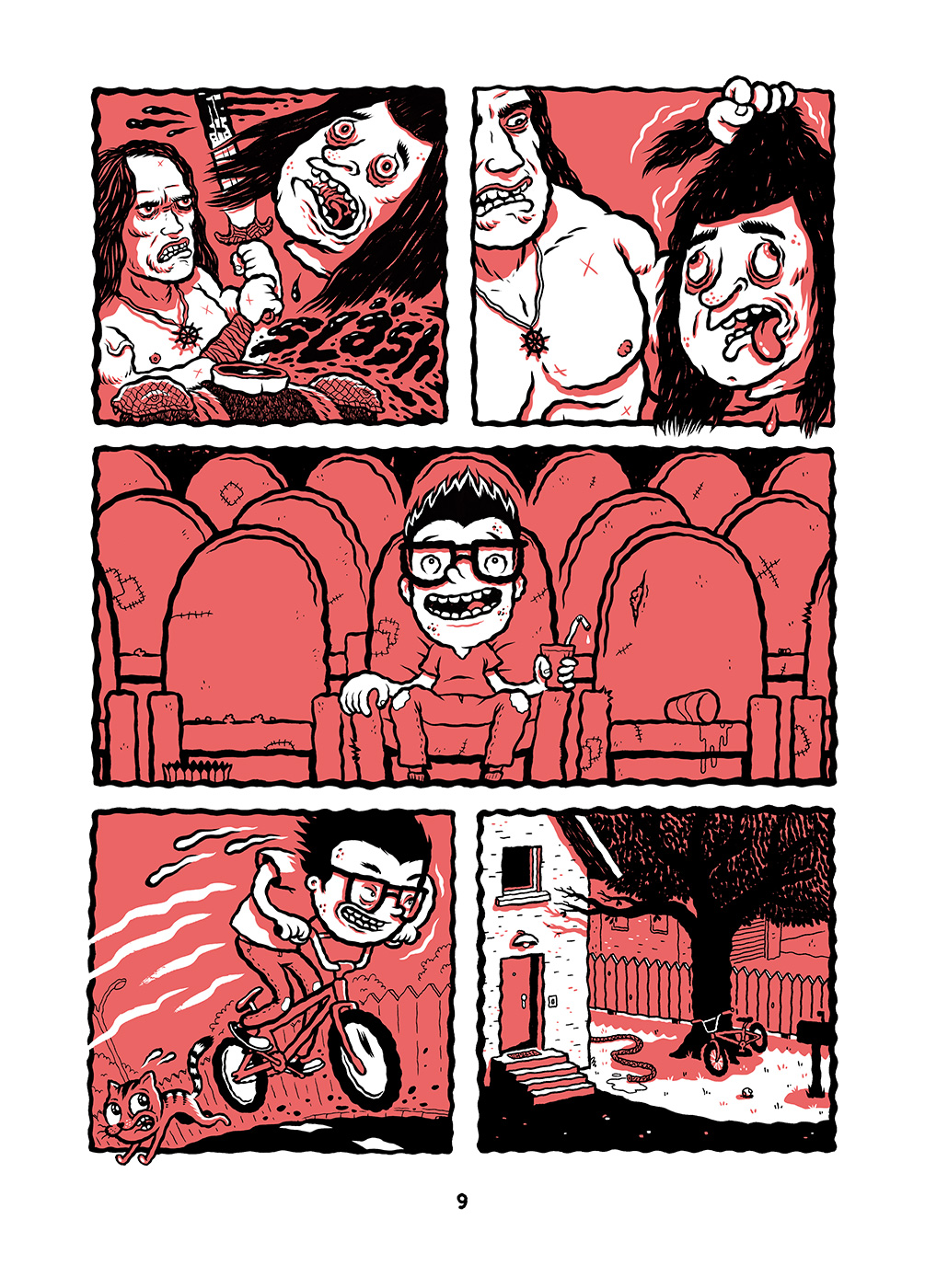
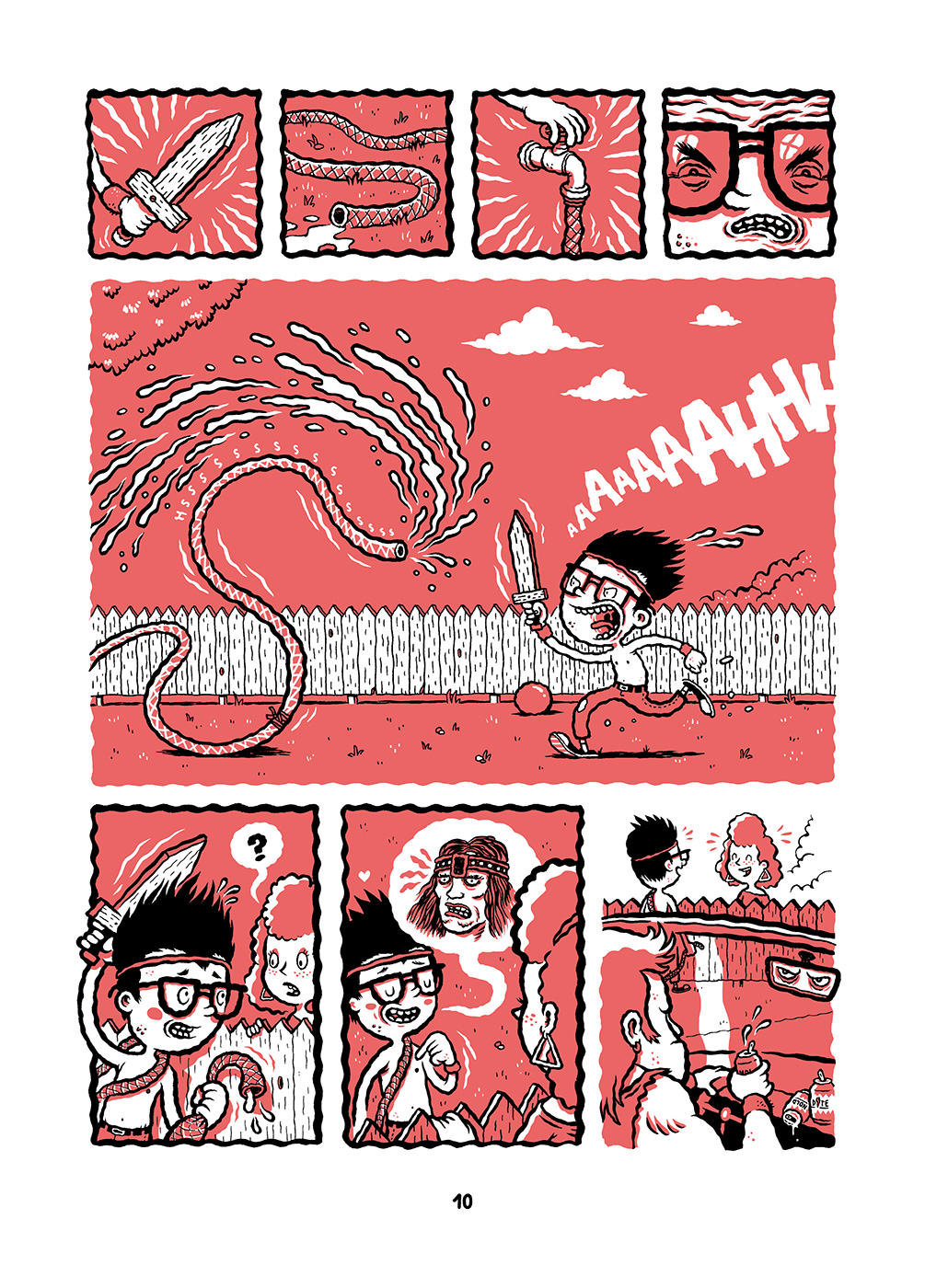
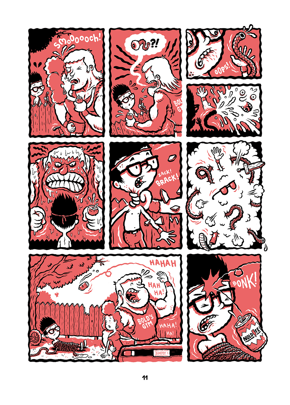
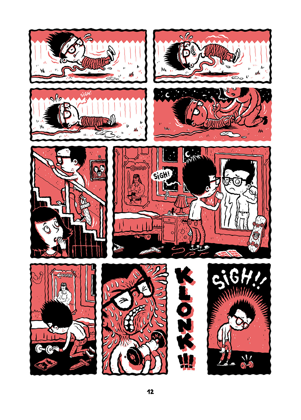
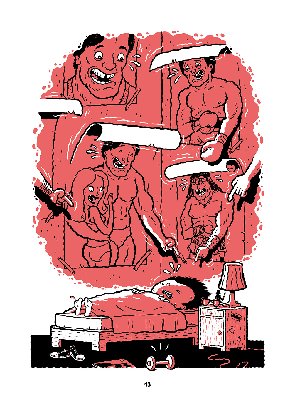
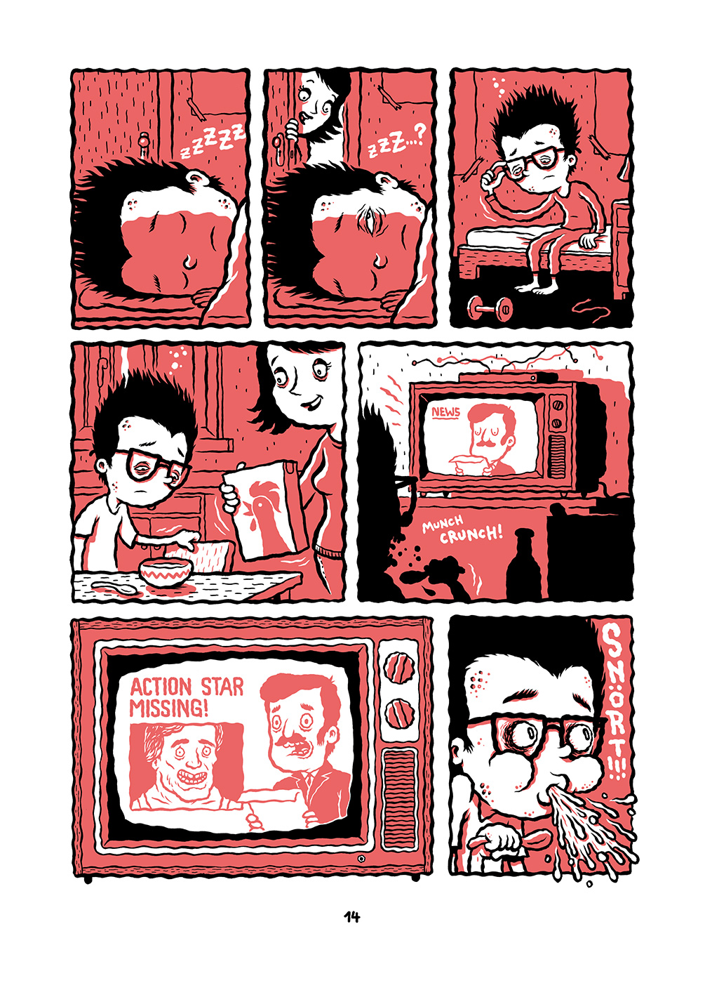
An excerpt from “Steroid Max” by Michael Hacker
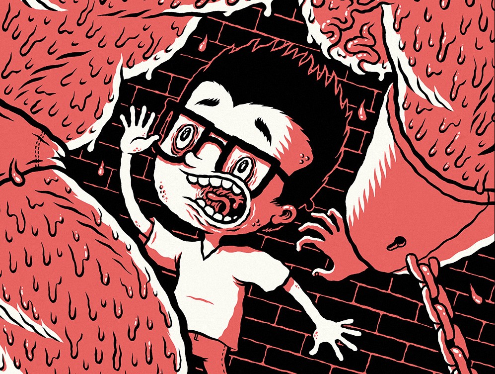
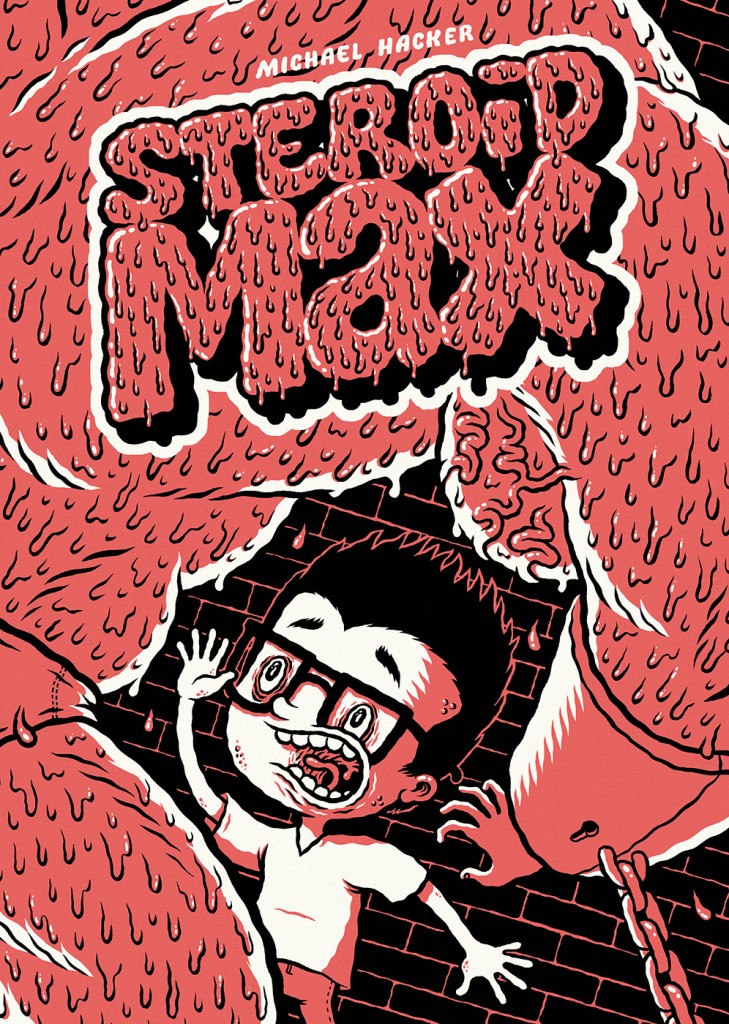
Michael Hacker is an Austrian illustrator and cartoonist born in 1981, author of advertising works, gigposters for bands such as Mudhoney, Fu Manchu, Melvins, Sonic Youth, Dinosaur Jr. and of self-published comic book. If Häcksler from 2010 is a stapled mini-comic collecting some funny gags about Tarzan, chickens and skulls, the new Steroid Max is a 48-page paperback including a self-contained story. Los Angeles, 1982: stunned by the vision of Conan The Barbarian, the young and uncool Max becomes a great fan of Arnold Schwarzenegger, so that when the movie-star disappears he tries to solve the mystery behind his kidnapping. The cartoony and expressive line of Hacker builds a wordless and funny story, a tribute to 1980s action films full of blood and sweat. Below the first pages of the book, available at the cartoonist’s webshop.


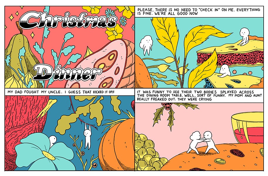
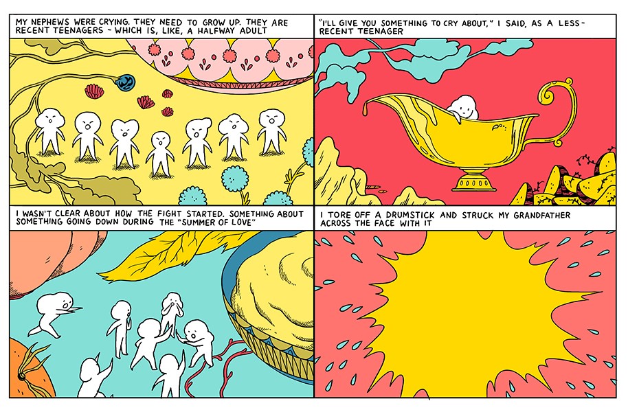
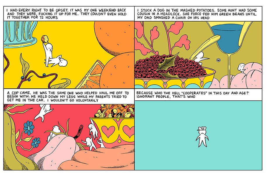
A story from “Dressing” by Michael DeForge
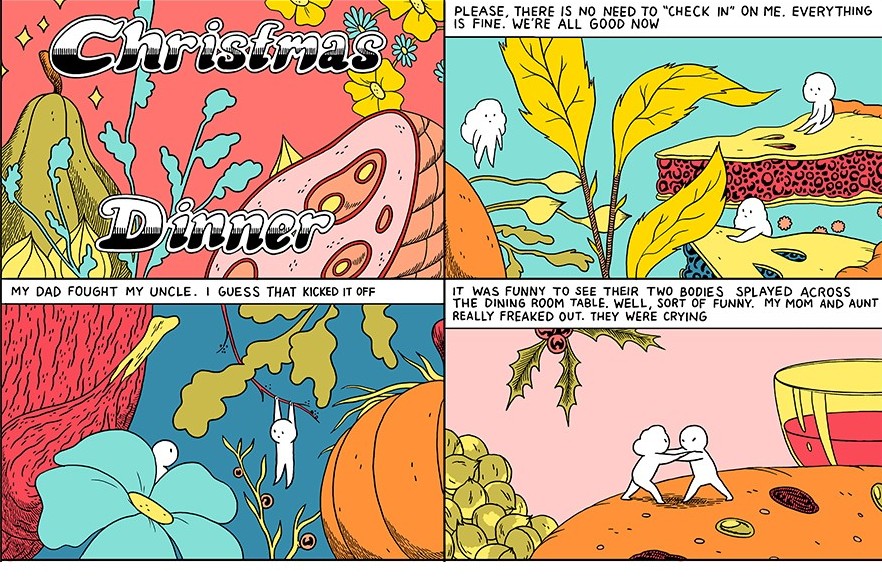
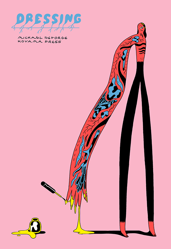
By now the most of you will know Michael DeForge, the prolific Canadian cartoonist author of webcomics, mini-comics, anthologies, graphic novels and of his one-man series Lose. If we can consider the same Lose, of which the book A Body Beneath collects issues from 2 to 5, and Ant Colony, an on-line comic published from Drawn and Quarterly in a stylish hardcover book, as his most important outcomes at the moment, DeForge has an high-standard even in the short stories created for the most diverse publications. Some of these comics will be published next September in a new anthology for Koyama Press, Dressing, similar to Very Casual from 2013 and from which this Christmas Dinner is excerpted. The combination between colorful drawings and raw situations is pure DeForge, giving at the story his typical mix of irony and cruelty.
If you still don’t know DeForge’s work, I talked briefly about Lose #5, Very Casual and Lose #6, but for a deep and detailed analysis of his opus you can check out this long piece by Rob Clough at High-Low. Enjoy the reading.
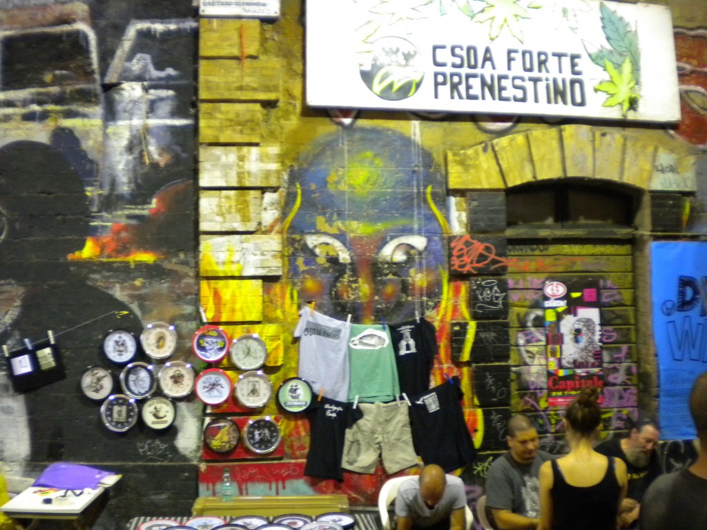
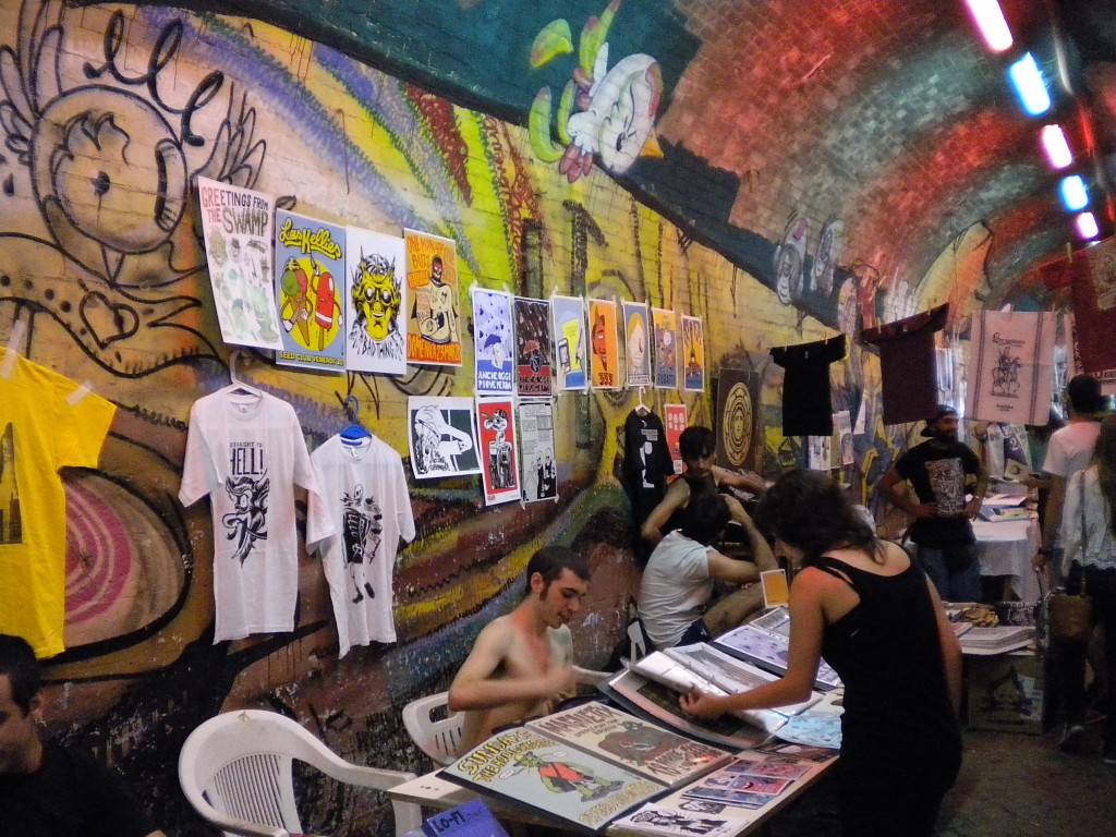
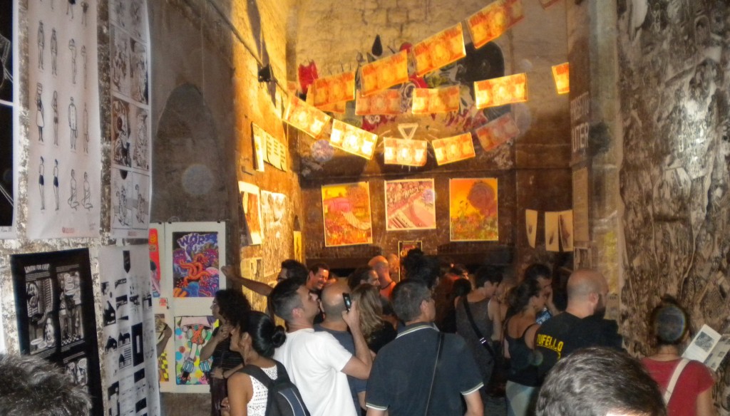
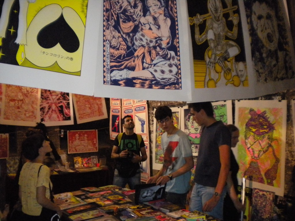
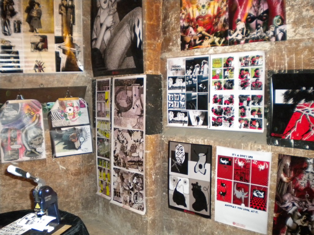
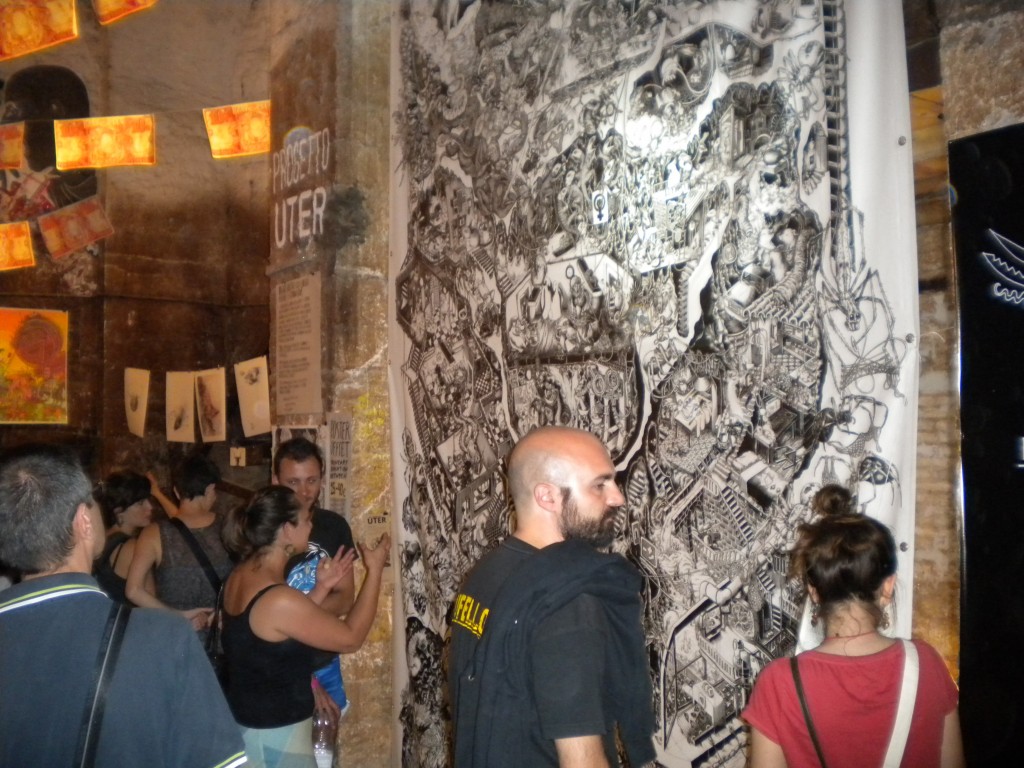
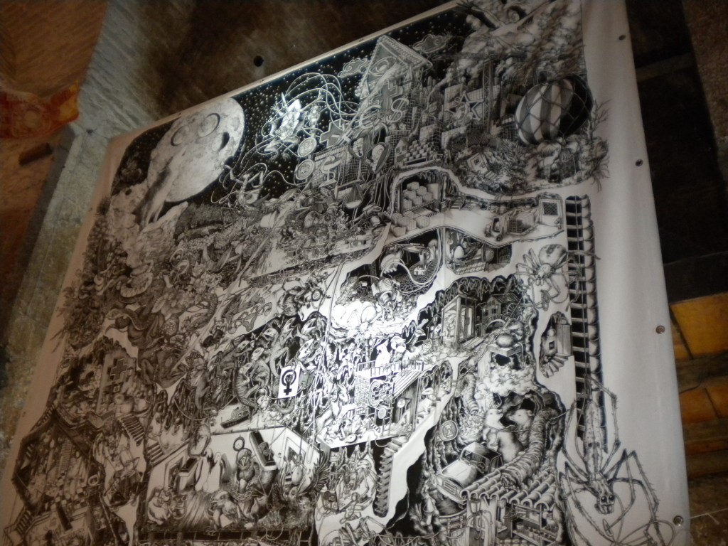
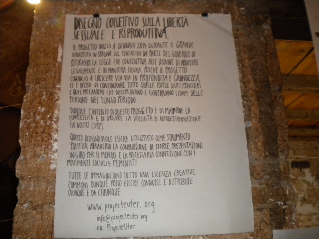
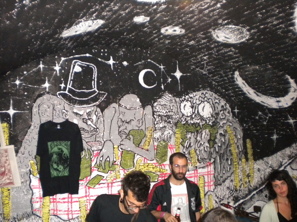
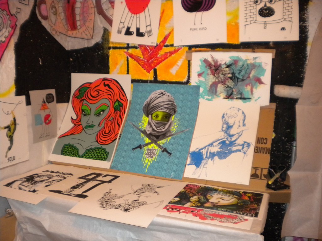
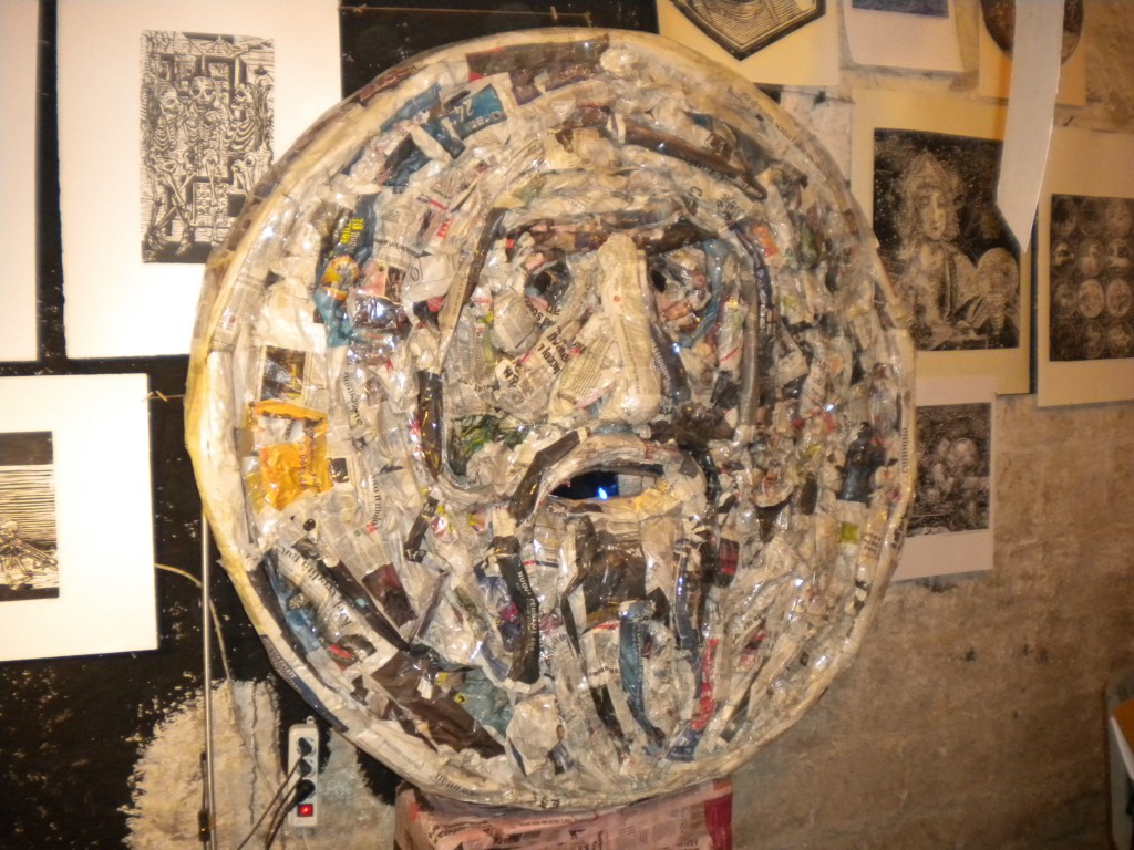
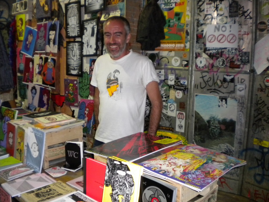
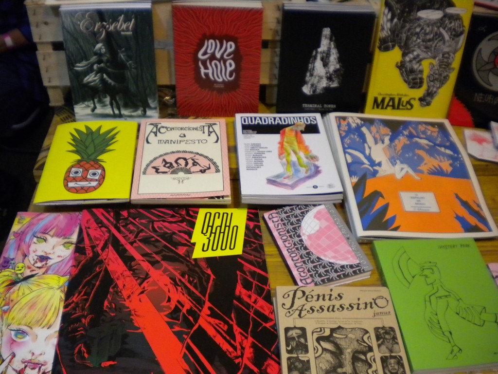
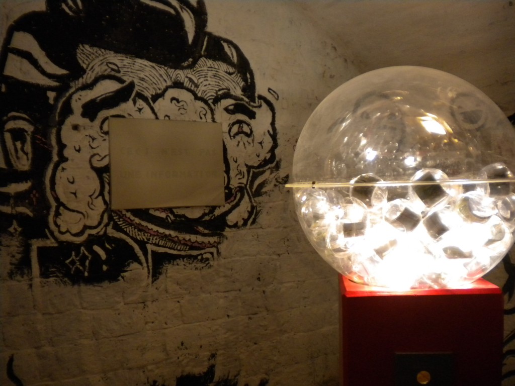
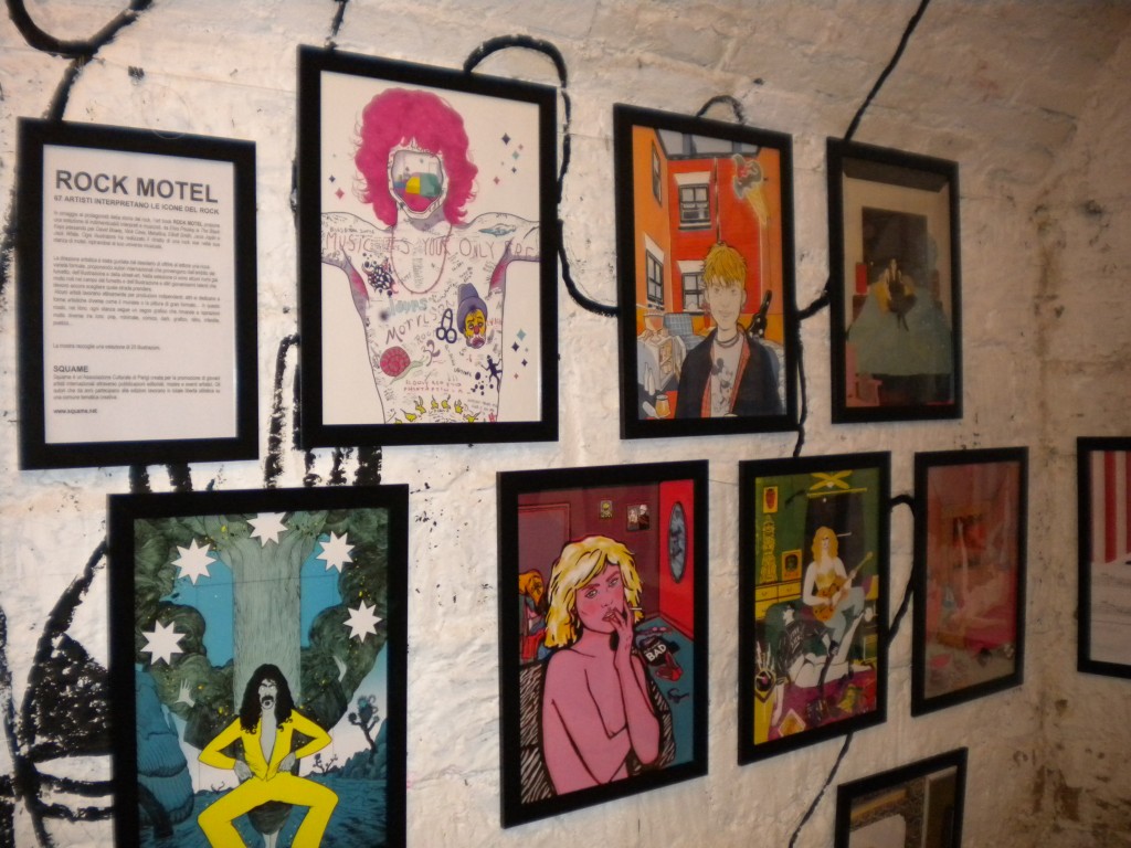
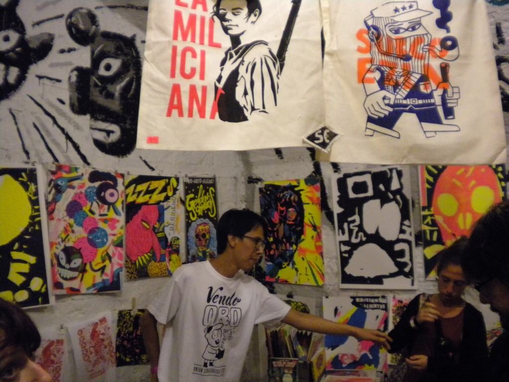
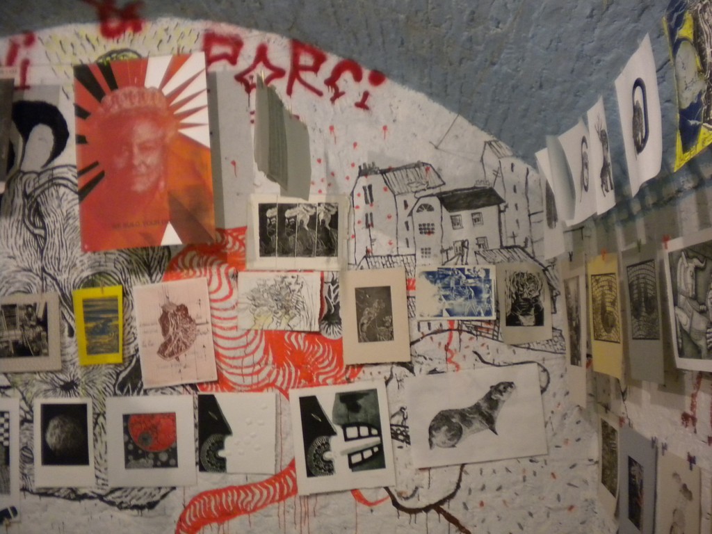
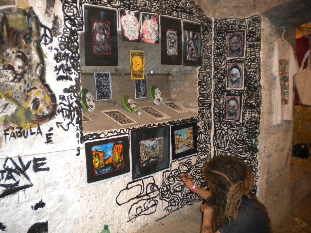
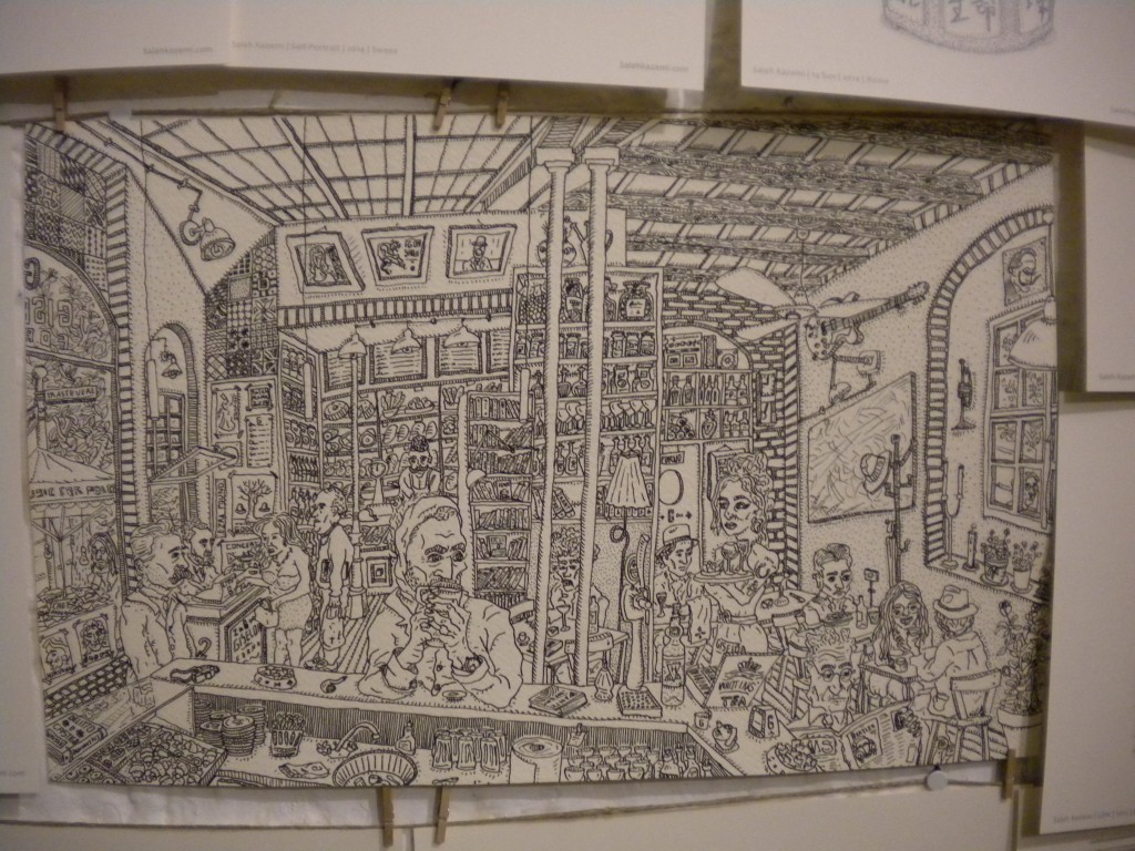
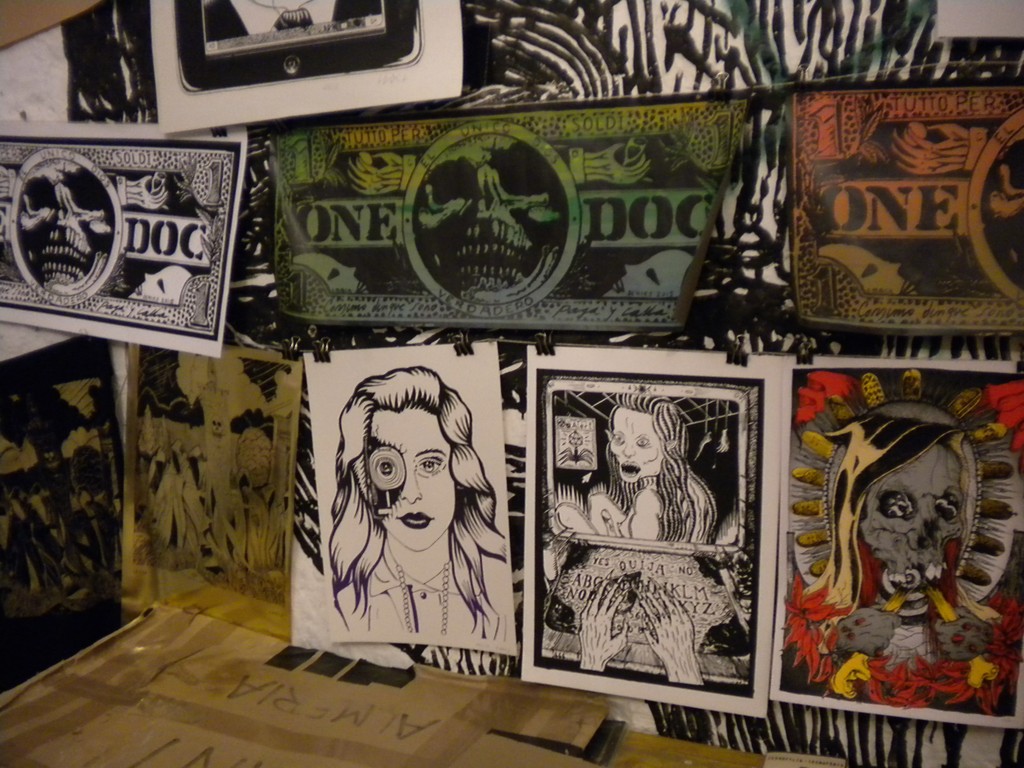
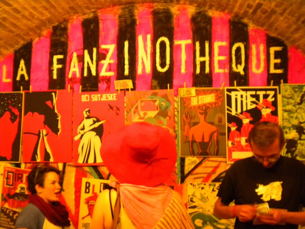
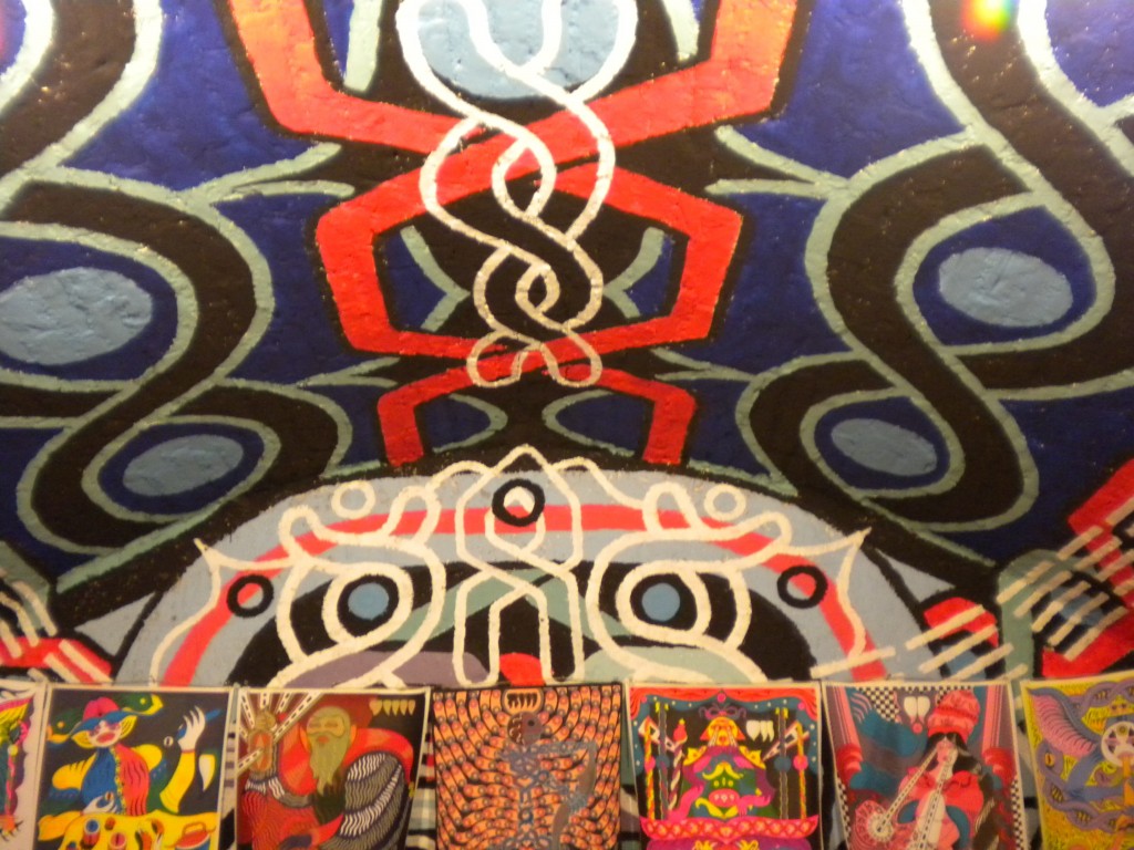
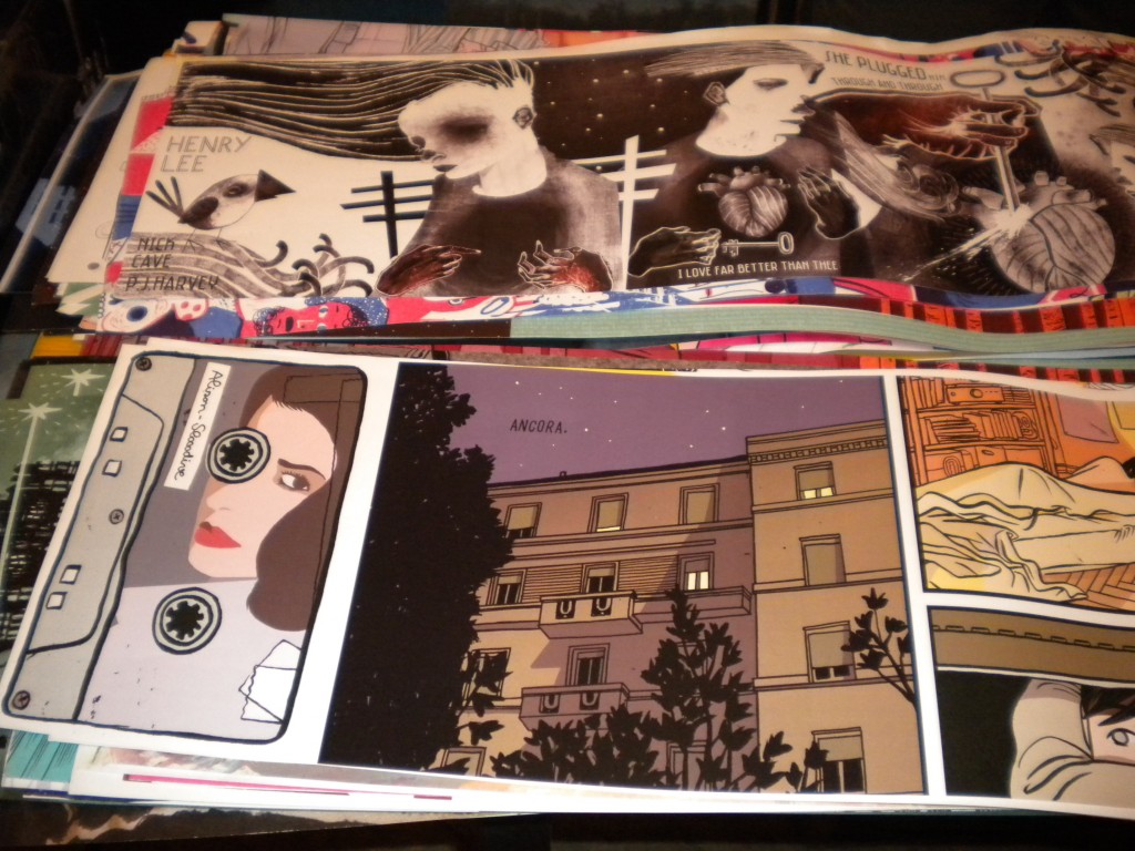
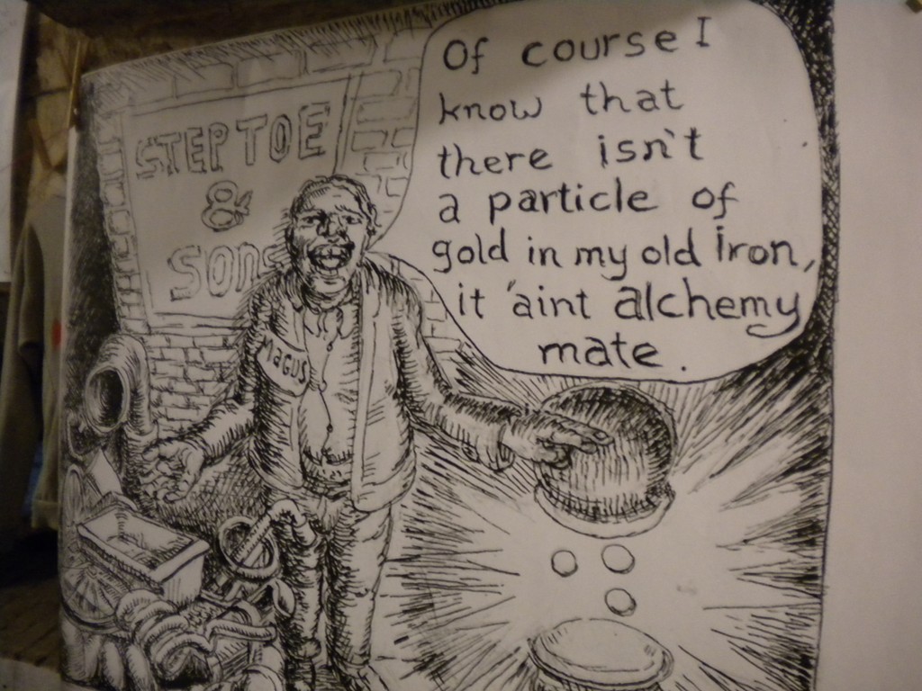
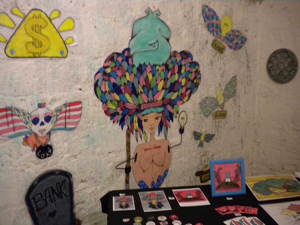
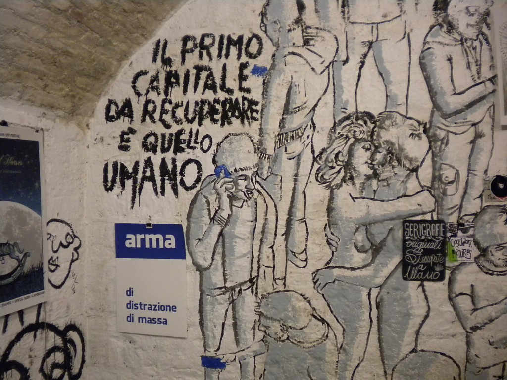
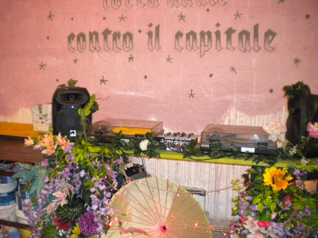
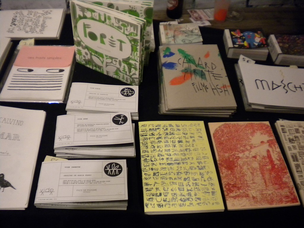
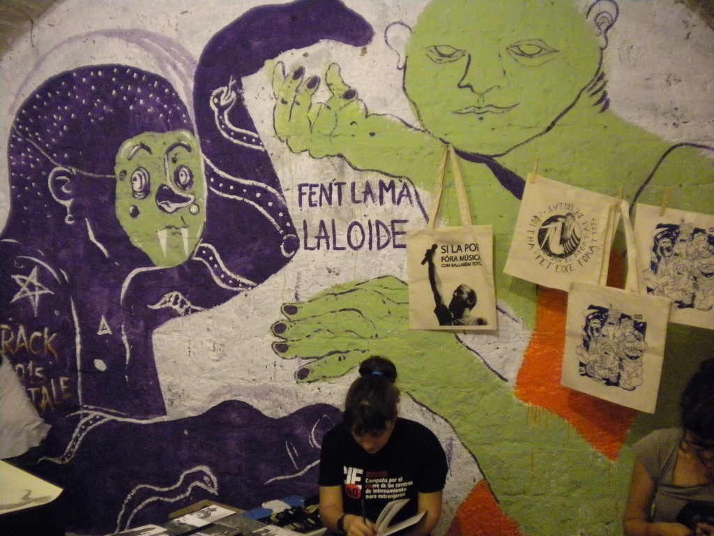
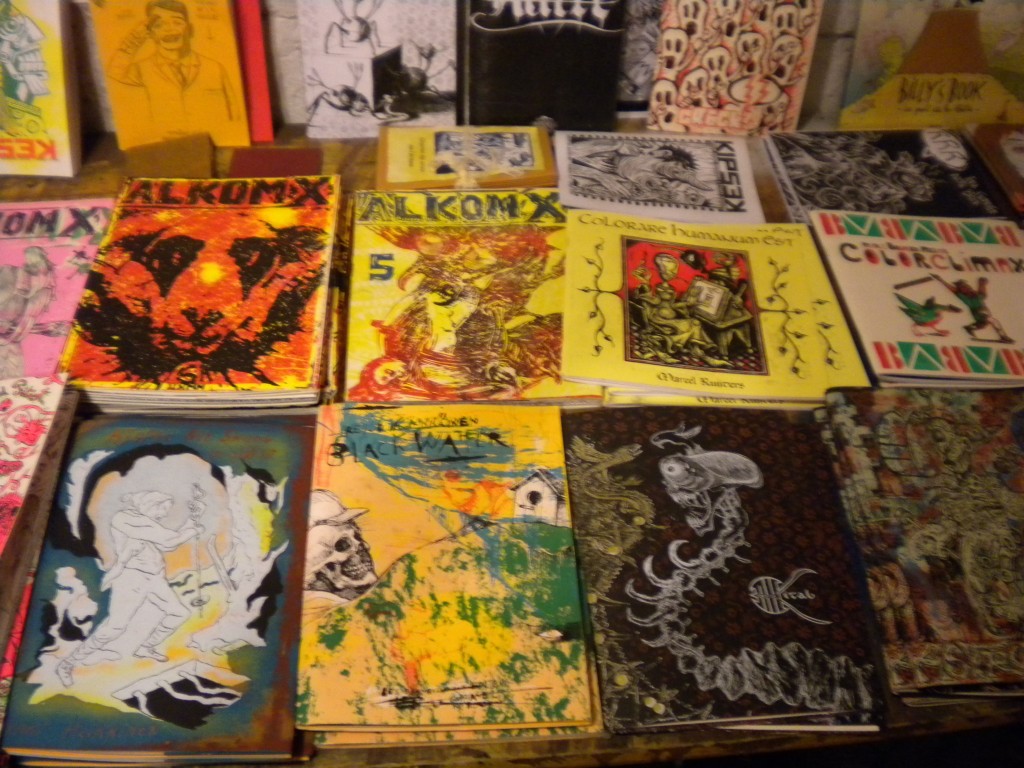
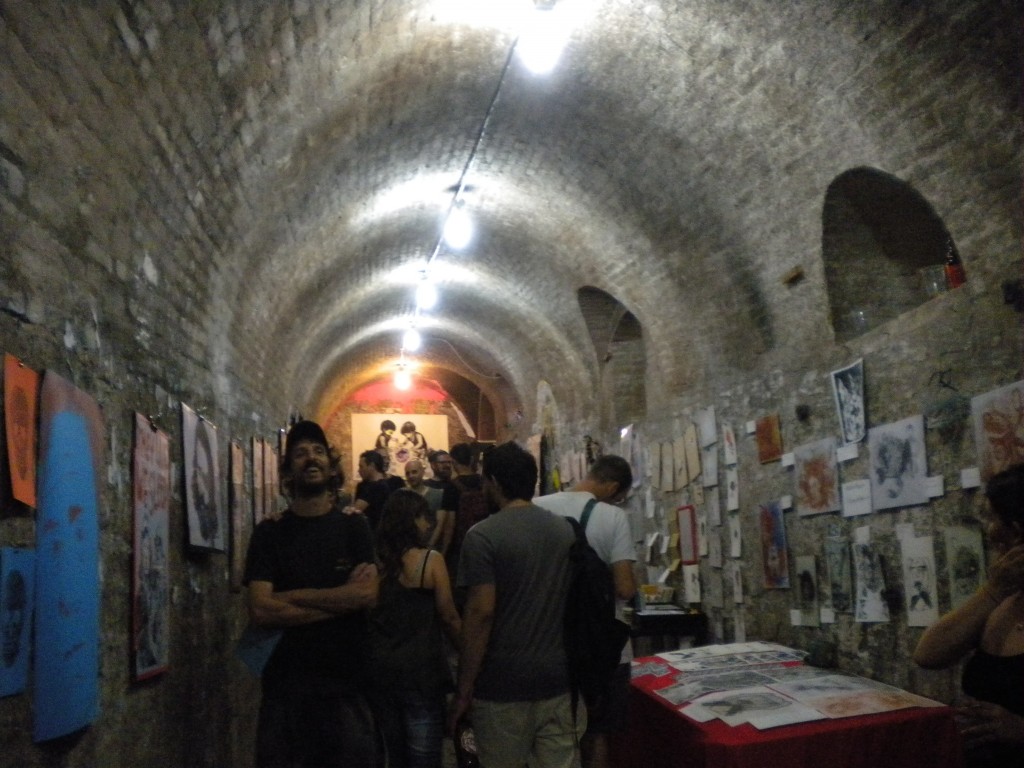
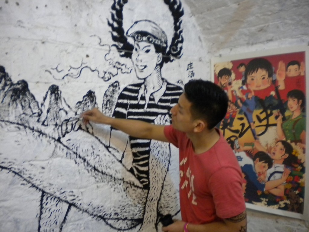
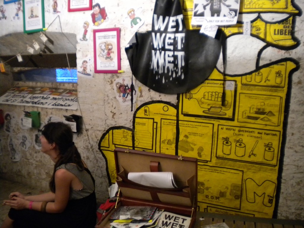
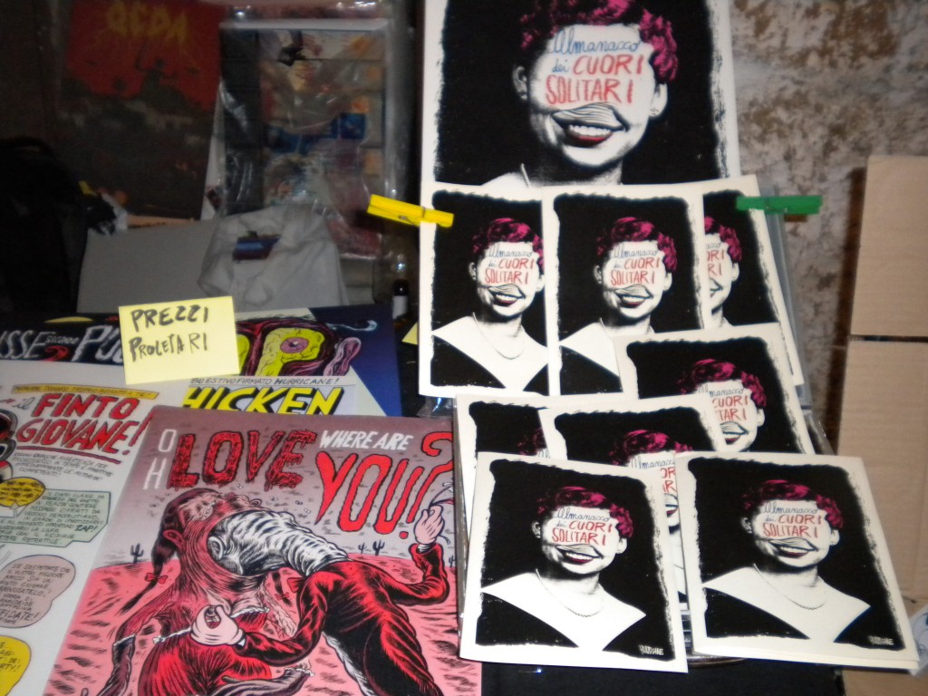
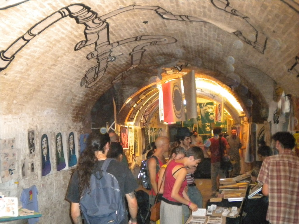
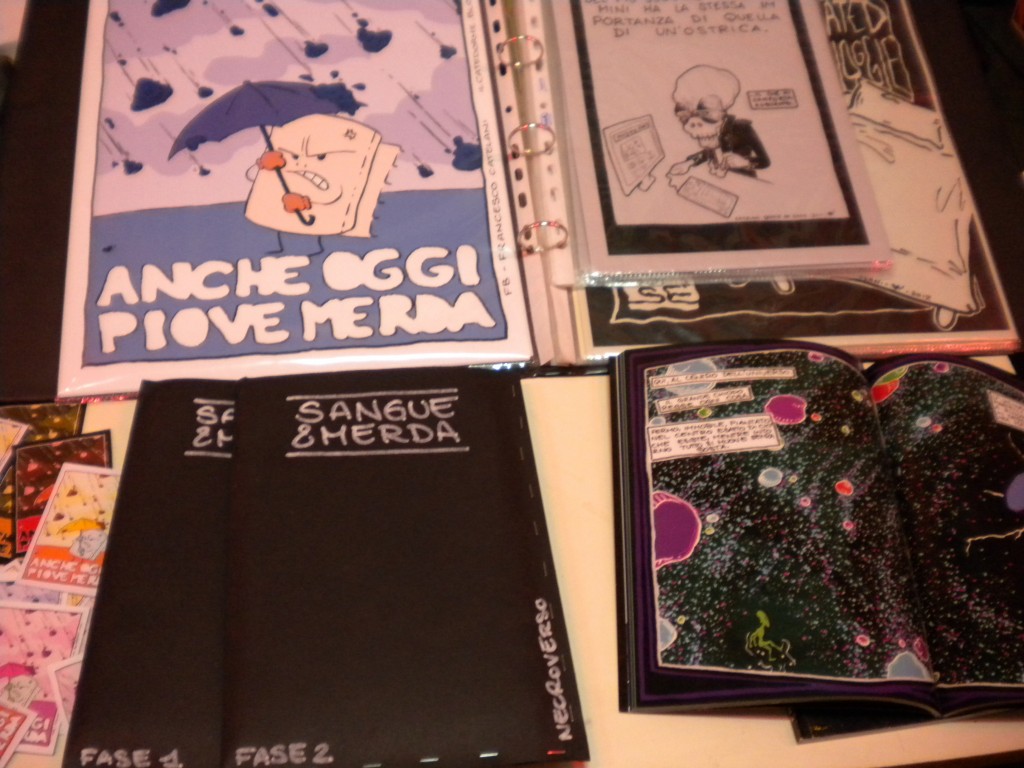
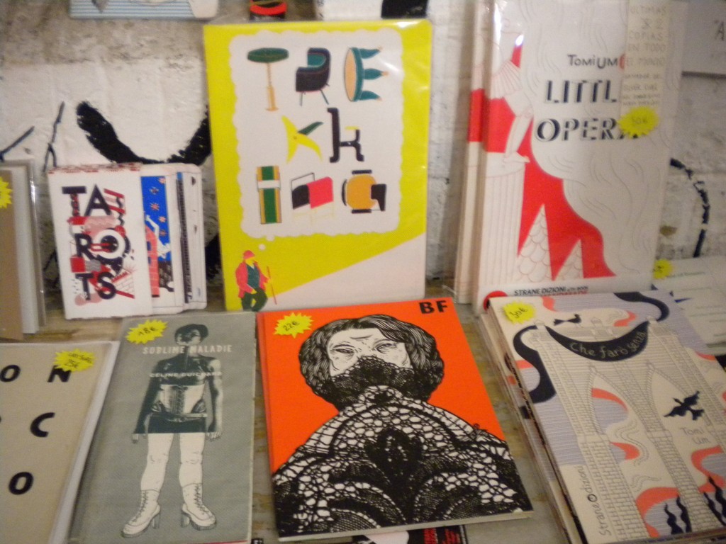
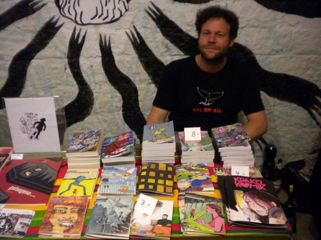
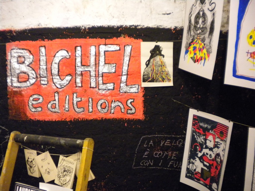
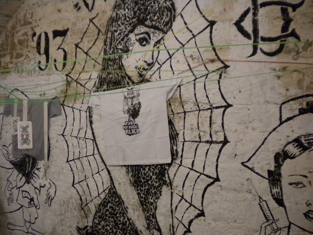
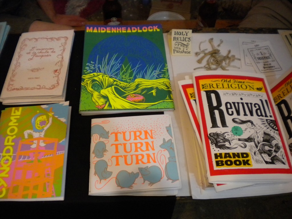
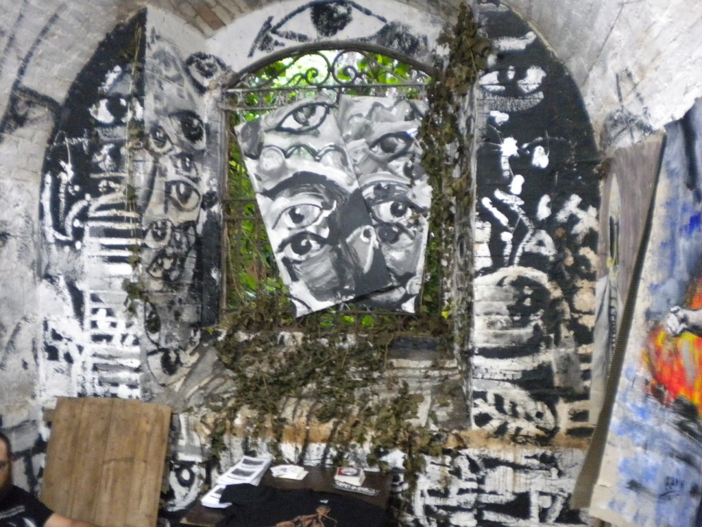
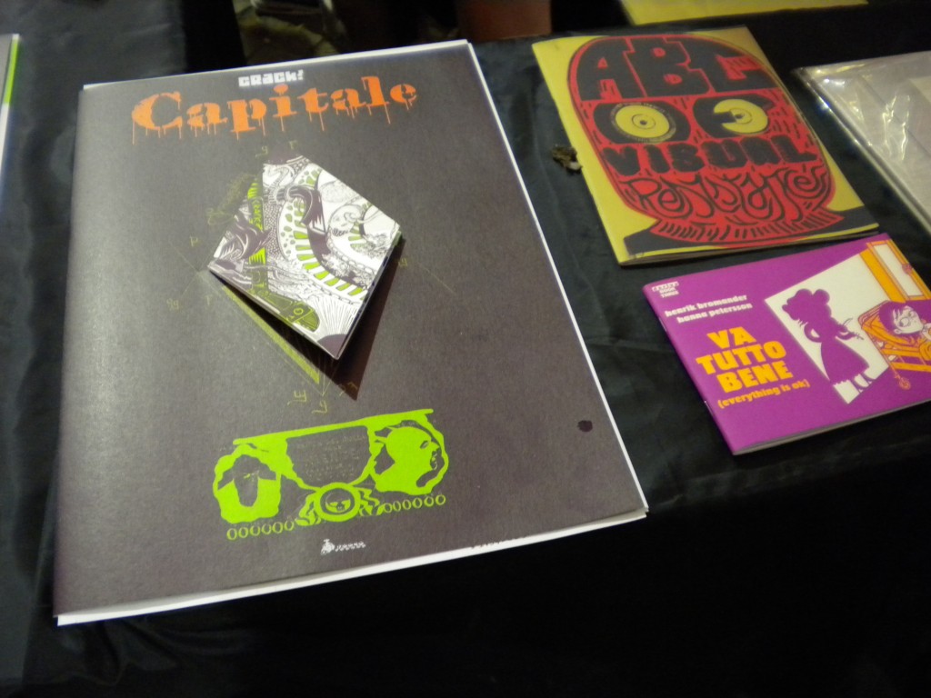
A photo gallery from Crack! Festival in Rome

While I’ll work to a more complete report in the next days, I’m publishing right now some lo-fi photos I did at this year’s Crack! The festival took place for the eleventh year at Forte Prenestino, a squat set in an old fort that is a point of meeting for a lot of non-aligned people in Rome. Many cartoonists, artists and publishers from all over the world crowded the alleys and the gardens of the fort from Thursday 25th June to Sunday 28th. This year the standard of the paintings, the screenprints and the various artefacts was very high and I hope these pictures will give you an idea of the general feeling. Just click on any image to open the gallery. Have a good trip.


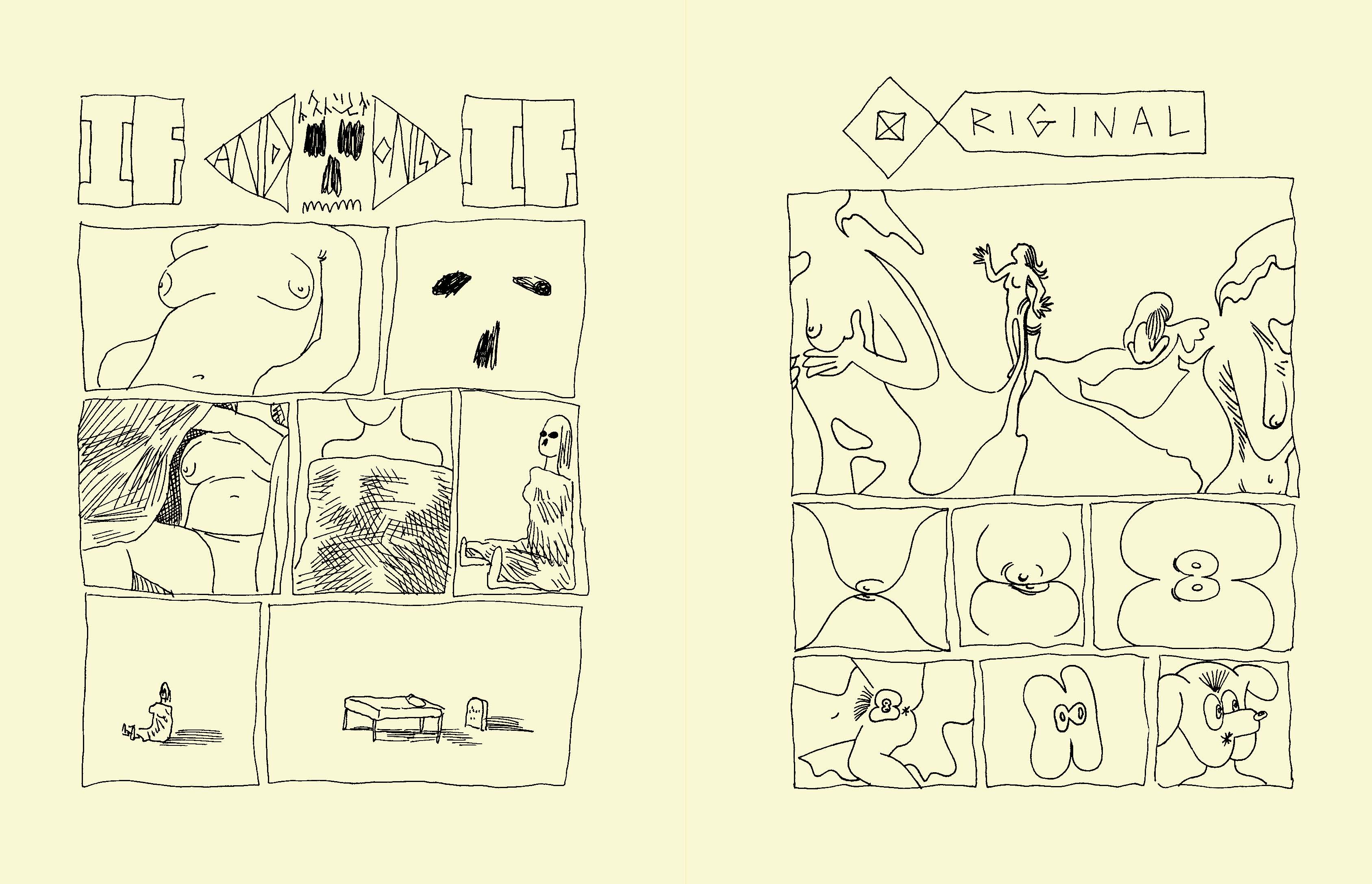
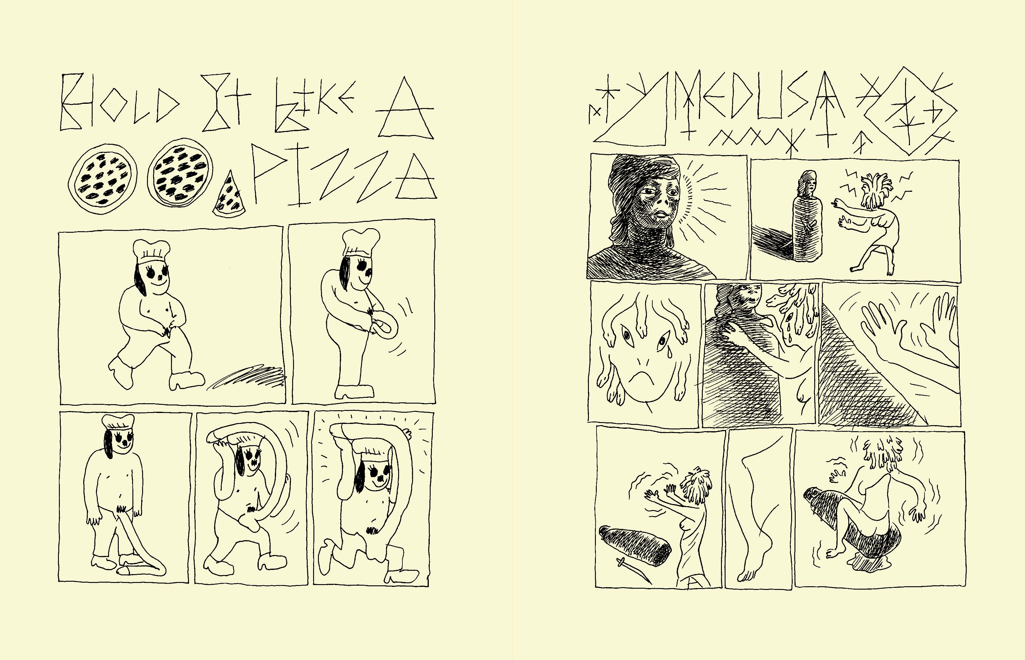
Preview of Andy Burkholder’s “Qviet”
Andy Burkholder’s new book Qviet, published by 2D Cloud, has officially debuted at CAKE last weekend, amplified by an exhibition at the Learning Machine Gallery featuring the entire collection, open through June 19th. Initially appearing on Tumblr in 2011 as the work of an artist operating under the sole name of Tracy, Qviet intrigued the underground community for not only the mystery surrounding its creator but also for its unique style. In one-page comics, Burkholder revisited the language of the strip with an avant-garde attitude. The lines, the shapes, the symbols are the core of his work, particularly in the initial phase, but at the same time they’re a starting point to move from the abstract to the physical, investigating sexual themes with irony and stark realism. Over time, the line became thicker and so Burkholder created more accomplished comics, very incisive and also refined. Below a preview of the 248-page book, in stores on June 15th for $22.95.
“Kramers Ergot” #9 is coming
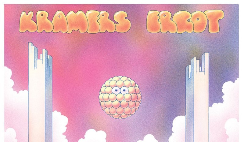
After the publication of the eighth issue of Kramers Ergot in 2011 for Picture Box, in June of 2012 the editor Sammy Harkham announced with a tweet to be already working to a new issue, describing it as “350 pages of wicked wanda and Ian Svenonius essays” (Svenonius, better known as the frontman of The Nation of Ulysses and The Make-Up, had already contributed to issue 8 with the essay Notes on Camp, part 2). Since then Picture Box closed, Harkham published the fourth issue of Crickets and there wasn’t any news about Kramers Ergot. At least until today, when this cover (by John Pham, I guess) showed up on Amazon, with the pre-order of the ninth issue of this essential anthology. The new publisher will be Fantagraphics, the expected release date is next March 18th and the pages are 250 (and not 350), with comics and illustrations by Michael DeForge, Noel Freibert, Steve Weissman, Anya Davidson, Stefan Marx, Abraham Diaz, Leon Sadler, Julia Gfrörer, Adam Buttrick, Kim Deitch, Ben Jones, Andy Burkholder, Antony Huchette, Trevor Alixopulos, Antoine Cossé, Archer Prewitt, Kevin Huizenga, Renée French and others to be announced.